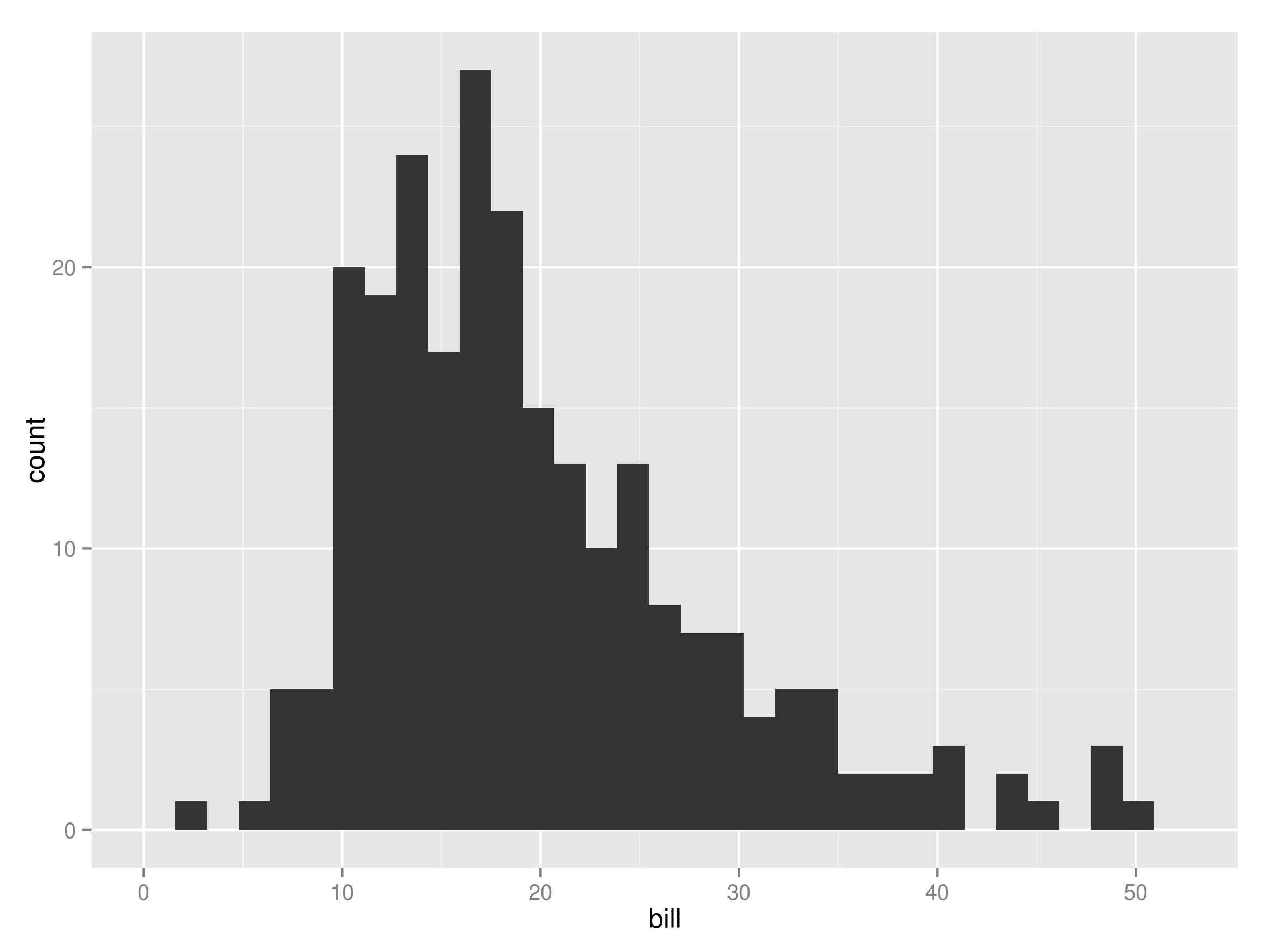
Histograms are essential tools in data analysis, offering a visual representation of the frequency distribution of data. They enable you to identify patterns and trends, such as determining the most frequent age group among customers or evaluating student performance in Malaysia's schools. For instance, financial analysts in Malaysia utilize histograms to evaluate market risks, while healthcare professionals depend on them to monitor patient recovery times.
If you're wondering how to make histogram in Excel, the process is simple and versatile. Excel provides multiple options, including built-in chart tools, the Data Analysis ToolPak, and formulas, to create clear and impactful visualizations. Each approach allows you to analyze your data effectively and gain valuable insights in Malaysia.
Key Takeaways
- Histograms show how often data appears. They help find trends in areas like money and health.
- Get your data ready by organizing it, choosing bins, and cleaning it for a correct histogram.
- Use Excel’s chart tool to easily make a histogram, or try the Data Analysis ToolPak for deeper stats.
- Change your histogram by resizing bins and editing the chart to make it clearer and easier to understand.
- For extra features, try FineReport. It gives live updates and lets you customize charts for professional use.
How to Create a Histogram in Excel Using the Built-in Chart
Preparing Your Data for a Histogram
Before creating a histogram in Excel, you need to prepare your data properly. This step ensures that your chart accurately represents the data distribution. Follow these tips to prepare your data:
- Sort your data in ascending order. This makes it easier to analyze and visualize.
- Define bins beforehand. Bins are intervals that group your data, and they should be listed in ascending order without overlapping values.
- Ensure your dataset is clean and free of errors. Remove duplicates or irrelevant entries to avoid skewed results.
For example, if you are analyzing quarterly revenue trends across banking segments, sorting the data and defining bins can help uncover insights about revenue distributions, outliers, and variability. Investment bankers often use these insights to make informed decisions and provide strategic advice.
Steps to Insert a Histogram Chart
Excel's built-in histogram chart feature simplifies the process of creating a histogram. Here’s a step-by-step guide to help you:
- Select Your Data: Highlight the range of data you want to visualize, including headers if applicable.
- Access the Histogram Option: Go to the 'Insert' tab on the Excel ribbon. Under the 'Charts' group, click on 'Insert Statistic Chart' and select 'Histogram.'
- Generate the Chart: Excel will automatically create a histogram based on your selected data.
- Refine the Chart: Adjust the axis labels, chart title, and color scheme to make the chart more informative and visually appealing.
This step-by-step process is straightforward and user-friendly, making it ideal for beginners in Malaysia. Whether you are working on a basic histogram or a more complex dataset, Excel's built-in tools provide a seamless experience.
Customizing Bins and Chart Design
Customizing bins and chart design enhances the clarity and interpretability of your histogram. Here’s how you can do it:
- Adjust Bin Width: Right-click on the category axis and select 'Format Axis.' Specify the bin width to control the granularity of your data grouping. For example, setting a smaller bin width reveals finer details, while a larger width provides a broader overview.
- Set Overflow and Underflow Bins: Use these options to group data points that fall outside the main range. This helps in identifying outliers effectively.
- Enhance Chart Design: Modify the chart style, colors, and fonts to improve readability. Adding data labels can also make the chart more informative.
Customizing your histogram allows you to tailor it to your specific needs in Malaysia. For instance, adjusting bin limits can highlight outliers, while using overlapping histograms enables comparative analysis between datasets. These features make Excel's built-in histogram chart a powerful tool for data visualization.
How to Make a Histogram in Excel with the Data Analysis ToolPak
The Data Analysis ToolPak is a powerful Excel add-in that simplifies statistical and engineering analysis. It includes tools for regression, descriptive statistics, and histograms, making it an excellent choice for creating a histogram in Excel. Follow this tutorial to enable the ToolPak, set up your data, and generate a histogram chart.
Enabling the Data Analysis ToolPak
To access the Data Analysis ToolPak, you need to enable it first. This process is straightforward and ensures you can use its advanced features for creating a histogram.
Tip: The ToolPak provides 19 functional tools for statistical analysis, making it a valuable resource for data-driven tasks.
Here’s how to enable the ToolPak:
- Navigate to File > Options (Excel 2010 - 365) or click the Microsoft Office button (Excel 2007).
- Select Add-Ins from the menu.
- Check the Analysis ToolPak box and click OK.
Once enabled, the ToolPak appears under the Data tab, ready for use. Its accessibility and user-friendly interface make it ideal for analyzing frequency distribution and other statistical data.
Setting Up Data and Bin Ranges
Before creating a histogram, you need to prepare your data and define bin ranges. Proper preparation ensures accurate results and a clear visualization of your data distribution.
Follow these steps to prepare your data:
- Organize your dataset in a single column. Ensure it is clean, sorted, and free of duplicates.
- Define bins in a separate column. Enter bin numbers in ascending order to group your data effectively in Malaysia.
For example, if you are analyzing sales data, bins can represent revenue intervals such as $0-$500, $501-$1000, and so on. This setup allows you to visualize trends and identify outliers in your dataset.
Generating the Histogram and Interpreting Results
Once your data and bins are ready, you can use the ToolPak to create a histogram chart. The process is simple and produces both a frequency table and a histogram chart for analysis.
| Aspect | Description |
|---|---|
| Function | A histogram displays the frequency distribution of numerical data, dividing it into 'bins' and showing the frequency in each bin. |
| Examples in HR | 1. Performance Review Scores: Visualize employee performance levels. 2. Salary Distribution: Analyze salary fairness. 3. Applicant Ages: Assess age distribution of job applicants. |
| Steps to Create in Excel | 1. Select 'Data Analysis'. 2. Choose 'Histogram'. 3. Enter Input Range. 4. Define bin range or let Excel create it. 5. Specify output location. Excel generates a frequency table and Histogram chart. |
After generating the histogram, interpret the results by analyzing the frequency distribution. For instance, in HR analytics, you can use histograms to evaluate salary fairness or identify age trends among job applicants. This visualization helps you make informed decisions based on data patterns.
By using the Data Analysis ToolPak, you can create a histogram in Excel efficiently and gain deeper insights into your data. Whether you are working with sales figures, employee performance metrics, or customer demographics, this tool simplifies the process and enhances your analysis.
Creating a Histogram in Excel Using the FREQUENCY Formula

Preparing Data and Bins for the FREQUENCY Formula
Proper preparation of data and bins is essential when creating a histogram. Start by analyzing the distribution of your data. This helps you understand its range and variability. Next, choose a binning method that aligns with your analysis goals in Malaysia. Common methodologies include Sturges’ Rule, Scott’s Method, and the Freedman-Diaconis Rule. These methods provide guidelines for determining bin width and the number of bins based on your dataset.
| Methodology | Description |
|---|---|
| Sturges’ Rule | Provides a guideline for determining the number of bins based on sample size. |
| Scott’s Method | Suggests bin width based on the standard deviation of the data. |
| Freedman-Diaconis Rule | Uses the interquartile range to determine bin width, suitable for non-normally distributed data. |
Follow these best practices to prepare your data effectively:
- Analyze the data distribution to identify patterns.
- Select a binning method that suits your analysis.
- Validate the bins by checking the data distribution within each bin.
- Use domain knowledge to define meaningful bin boundaries.
- Maintain consistent binning criteria for comparisons across datasets.
By preparing your data and bins carefully, you ensure that your histogram chart accurately represents the frequency distribution of your data.
Applying the FREQUENCY Formula
The FREQUENCY formula in Excel calculates how often values occur within specified intervals. To use this formula, organize your data into a single column and define your bins in another column. Then, follow these steps:
- Open your Excel spreadsheet and copy the data into a column.
- Determine the number of bins using the 2k rule.
- Find the minimum and maximum values using the MIN and MAX functions.
- Calculate the class width based on the range of your data.
- Enter the bins into the spreadsheet.
- Apply the FREQUENCY formula to calculate the frequency for each bin.
For example, if you are analyzing sales data, bins could represent revenue intervals such as $0-$500, $501-$1000, and so on. The FREQUENCY formula groups the data into these intervals, providing a clear view of the frequency distribution.
Converting FREQUENCY Results into a Chart
Once you have calculated the frequency distribution, you can convert the results into a histogram chart. Follow these steps:
- Organize your frequency data in a column adjacent to your bins.
- Highlight the frequency data and bins.
- Use Excel’s chart tools to create a histogram chart.
To enhance your chart, consider these tips:
- Change the colors to highlight key data points.
- Add data labels to display exact frequency counts.
- Adjust the axis labels for clarity.
This tutorial simplifies the process of creating a histogram in Excel using the FREQUENCY formula. By following these steps, you can visualize your data effectively and gain valuable insights into its distribution in Malaysia.
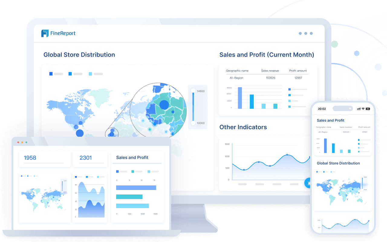
Customizing and Enhancing Your Histogram with FineReport
How to Make a Histogram in Excel vs. FineReport: A Feature Comparison
When you make a histogram in Excel, you rely on its built-in tools or formulas. These options are effective for basic visualizations. However, FineReport offers advanced features that take your data visualization in Malaysia to the next level.
| Feature | Excel | FineReport |
|---|---|---|
| Ease of Use | User-friendly for basic charts. | Drag-and-drop interface for quick customization. |
| Customization | Limited design options for bins and styles. | Extensive customization for colors, styles, and interactivity. |
| Data Integration | Works well with Excel files and basic sources. | Connects to 100+ data sources, including databases and APIs. |
| Real-Time Updates | Requires manual updates. | Supports real-time data synchronization. |
| Advanced Visuals | Basic chart styles. | Over 70 chart styles, including interactive options. |
FineReport excels in customization and real-time data integration. It allows you to create visually stunning and interactive histograms. If you need advanced features, FineReport is a better choice for professional data visualization.
Going Beyond Excel: Customization Features in FineReport Histograms
FineReport provides unmatched customization options for histograms. You can adjust every detail to suit your needs in Malaysia. For example, you can modify bin widths, colors, and labels with just a few clicks. The software also supports interactive features like drill-downs, which let you explore data in greater detail.
FineReport’s ability to connect to multiple data sources enhances its flexibility. You can integrate data from databases, APIs, or spreadsheets. This feature ensures your histogram reflects the most up-to-date information. Additionally, FineReport offers over 70 chart styles, allowing you to choose the perfect design for your analysis.
Another standout feature is its real-time data synchronization. Unlike a histogram in Excel, which requires manual updates, FineReport automatically refreshes your data. This capability is especially useful for monitoring dynamic datasets, such as sales trends or production metrics.
By using FineReport, you can create professional-grade histograms that go beyond Excel’s capabilities. Its advanced features make it an excellent tool for businesses and analysts in Malaysia who need detailed and interactive visualizations.

Common Mistakes When Creating a Histogram in Excel
Avoiding Incorrect Bin Sizes
Choosing the right bin sizes is crucial for creating an accurate histogram in Excel. Incorrect binning can distort the frequency distribution, leading to misinterpretation of data. For example, bins that are too large merge distinct data groups, hiding important details. On the other hand, bins that are too small clutter the chart, making random noise appear as significant trends.
Binning is a foundational step in histogram creation. Properly sized bins reveal patterns like central tendencies and outliers, helping you make informed decisions. Poorly sized bins obscure these patterns, which can result in flawed strategies. For instance, a retail manager might misinterpret sales data due to incorrect binning, leading to poor stock decisions.
To avoid these mistakes, ensure your bins are equal in size and align with the range of your data. Unequal bin sizes complicate interpretation because the area of the bars no longer represents frequency accurately. Always use continuous numeric data for histograms. If your data is categorical, opt for a bar chart instead.
Ensuring Proper Data Preparation
Preparing your data correctly prevents errors and ensures your histogram accurately represents the frequency distribution. Follow these guidelines to avoid common pitfalls:
- Label axes clearly to provide context and make the chart easier to interpret.
- Account for outliers to avoid skewing the data and misrepresenting patterns.
- Choose an appropriate number of bins. Too few bins can oversimplify the data, while too many introduce unnecessary noise.
For example, if you’re analyzing sales trends, clean your dataset by removing duplicates and irrelevant entries. Define bins that align with your analysis goals in Malaysia, such as revenue intervals. Proper preparation ensures your histogram highlights meaningful insights without distortion.
Troubleshooting Chart Errors
Excel users often encounter errors when creating histograms. These issues can disrupt your workflow and lead to inaccurate results. Here’s a quick reference table for common errors and their descriptions:
| Error Code | Description |
|---|---|
| #DIV/0! | Division by zero error. |
| #N/A | Value not available. |
| #VALUE! | Wrong type of argument or operand. |
| #REF! | Reference to a non-existent cell. |
| #NAME? | Unrecognized name in formula. |
| #NUM! | Problem with a number in a formula. |
| #NULL! | Intersection of two areas that don’t intersect. |
To resolve these errors, double-check your formulas and ensure your data ranges are correctly defined. For example, if you encounter a #DIV/0! error, verify that no division by zero occurs in your calculations. Addressing these issues promptly ensures your histogram in Excel remains accurate and reliable.
Creating histograms in Excel offers flexibility and accessibility. You can use the built-in chart for quick visualizations, the Data Analysis ToolPak for statistical insights, or the FREQUENCY formula for detailed customization. Each method serves different needs in Malaysia, making them valuable tools for data analysis.
Experiment with these approaches to find the best fit for your data. For advanced customization, FineReport provides unmatched features like real-time updates and interactive designs. Its capabilities elevate your visualizations, helping you uncover deeper insights in Malaysia. FanRuan’s solutions empower you to transform data into actionable intelligence, enhancing decision-making and business growth in Malaysia.
Click the banner below to try FineReport for free and empower your enterprise to transform data into productivity!
Continue Reading About Histogram


FAQ

The Author
Lewis
Senior Data Analyst at FanRuan
Related Articles

What Recruiters Look for in a Data Analysis Portfolio: 10 Criteria to Score Yours Fast
A $1 is not judged like a school assignment. It is judged like a hiring shortcut. Recruiters, hiring managers, and analytics leads use it to answer one question fast: Can this person solve business problems with data in
Lewis Chou
May 29, 2026

What Is Data Analytics Consulting? Beginner’s Guide to Services, Deliverables, and Business Value
$1 helps organizations turn raw data into decisions they can trust. For many business leaders, the challenge is not a lack of data. It is a lack of clarity. Reports conflict, teams track different KPIs, dashboards are un
Lewis Chou
Jun 03, 2026

Data Analyst Job Description [+2026 Guide]: Compare Responsibilities, Skills, and Salary by Industry
A strong $1 does more than list tasks. It defines how a company turns raw data into business decisions, which teams the analyst supports, and what measurable outcomes the role is expected to influence. For employers, tha
Lewis Chou
Jun 02, 2026