

Time Series Charts are powerful tools that help you visualize data over time. By mapping data points across time, these charts reveal trends and patterns that might otherwise go unnoticed. Imagine seeing how sales numbers rise and fall throughout the year or tracking temperature changes over decades. This kind of visualization transforms raw data into insights you can easily understand and act upon. Whether you're analyzing business performance or studying climate data, time series charts make complex information accessible and actionable.
Understanding Time Series Chart
Definition and Components of a Time Series Chart
A Time Series Chart is a powerful tool that helps you visualize data points over specific intervals of time. This type of chart allows you to see how data changes over time, making it easier to identify trends and patterns. Let's break down its key components:
Data Points and Time Intervals
In a Time Series Chart, data points represent the values of a variable at different times. These points are plotted on a graph, with each point corresponding to a specific time interval. You might use daily, monthly, or yearly intervals, depending on the data you want to analyze. For example, if you're tracking sales data, each point could represent the total sales for a month. This setup helps you see how the data evolves over time.
Axes and Labels
The axes in a Time Series Chart play a crucial role. The horizontal axis (x-axis) typically represents time, while the vertical axis (y-axis) shows the variable's value. Labels on these axes provide context, helping you understand what each point represents. Clear labeling ensures that you can quickly grasp the information the chart conveys. For instance, if you're looking at a chart of temperature changes, the x-axis might show months, and the y-axis might display temperature in degrees.
Historical Background of a Time Series Chart
Time Series Charts have a rich history that has shaped how we analyze data today. Understanding their evolution gives you insight into their importance and versatility.
Evolution of Time Series Analysis
The concept of time series analysis dates back centuries. Early statisticians used simple line charts to track changes in variables over time. These charts connected data points with straight lines, allowing people to visualize trends easily. Over time, these methods evolved, leading to more sophisticated techniques for analyzing time series data. Today, you can use advanced software to create complex visualizations that reveal intricate patterns.
Key Developments in Visualization
Visualization techniques have come a long way since the early days of time series analysis. Initially, line charts were the primary method for displaying time series data. However, as technology advanced, new types of charts emerged, offering fresh perspectives on data. For example, bar charts and area charts provide alternative ways to visualize time series data, each with its own strengths. These developments have made it easier for you to explore and understand complex datasets.
Types of a Time Series Chart
Time Series Charts come in various forms, each serving a unique purpose. Understanding these types helps you choose the right one for your data analysis needs.
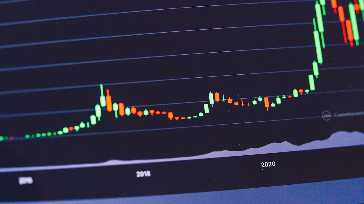
Line Charts
Line charts are the most common type of Time Series Chart. They connect data points with straight lines, making it easy to see trends over time.
Characteristics and Uses
Line charts are ideal for displaying continuous data. You can use them to track changes in variables like stock prices, temperature, or sales figures. The simplicity of line charts makes them perfect for identifying trends and patterns quickly.
Advantages and Limitations
Line charts offer a clear view of data trends. They allow you to compare multiple data series on the same chart. However, they might not be the best choice for data with large fluctuations or when you need to highlight individual data points. In such cases, other types of Time Series Charts might be more effective.
Bar Charts
Bar charts represent data with horizontal or vertical bars. They are useful for comparing different variables over time.
When to Use Bar Charts
You should use bar charts when you want to compare discrete data points. For example, if you're analyzing monthly sales figures for different products, bar charts can help you see which product performs best each month.
Comparing with Line Charts
While line charts show trends over time, bar charts emphasize individual data points. If you need to highlight specific values or compare categories, bar charts are more suitable. However, they might not provide the same level of trend analysis as line charts.
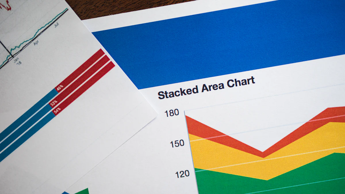
Area Charts
Area charts fill the space between the line and the axis, showing cumulative data over time.
Visualizing Cumulative Data
Area charts are excellent for visualizing cumulative data. They allow you to see the total value of multiple data series stacked on top of each other. This makes them ideal for showing how different components contribute to a whole over time.
Best Practices
When using area charts, ensure that the data series are stacked in a logical order. This helps you understand the contribution of each series to the total. Avoid using too many data series, as this can make the chart difficult to read. Keep the design simple to enhance clarity.
By understanding these types of Time Series Charts, you can better visualize your data and extract meaningful insights. Whether you're tracking trends, comparing variables, or visualizing cumulative data, choosing the right chart type is crucial for effective data analysis.
Applications of the Time Series Chart
Time Series Charts are incredibly versatile and find applications across various fields. They help you uncover insights, detect trends, and make informed decisions.
Business and Finance
Stock Market Analysis
In the world of finance, Time Series Charts are essential. You can track stock prices over time, revealing trends and patterns that guide investment decisions. By analyzing these charts, you identify when to buy or sell stocks, maximizing your returns. The ability to visualize fluctuations helps you understand market behavior and predict future movements.
Sales Forecasting
Time Series Charts play a crucial role in sales forecasting. By mapping sales data over time, you can spot seasonal trends and anticipate future demand. This insight allows you to adjust inventory levels and optimize marketing strategies. With clear visualizations, you make data-driven decisions that enhance business performance.
Science and Research
Climate Data Visualization
In scientific research, Time Series Charts are invaluable for visualizing climate data. You can track temperature changes, rainfall patterns, and other environmental variables over decades. These charts help you understand long-term trends and assess the impact of climate change. By presenting complex data in an accessible format, they support informed discussions and policy-making.
Epidemiological Studies
Time Series Charts are also vital in epidemiology. They allow you to monitor the spread of diseases over time, identifying outbreaks and trends. By visualizing infection rates, you can evaluate the effectiveness of interventions and allocate resources efficiently. These charts provide a clear picture of public health dynamics, aiding in the development of strategies to combat diseases.
Time Series Charts transform raw data into actionable insights across various domains. Whether you're in business, finance, science, or research, these charts offer a powerful way to visualize and interpret data over time.
Benefits of Using the Time Series Chart
Time Series Charts offer a wealth of benefits that can transform how you interpret and utilize data. By visualizing data over time, these charts help you uncover trends and patterns that might otherwise remain hidden.
Identifying Trends and Patterns
Time Series Charts excel at revealing trends and patterns in your data. By plotting data points against time, you can easily spot long-term and short-term trends, as well as seasonal patterns.
Long-term vs Short-term Trends
When you use a Time Series Chart, you can distinguish between long-term and short-term trends. Long-term trends show the overall direction of your data over an extended period. For instance, you might observe a steady increase in sales over several years. Short-term trends, on the other hand, highlight fluctuations within a shorter timeframe, such as monthly or quarterly changes. This distinction helps you make informed decisions based on both immediate and future projections.
Seasonal Patterns
Time Series Charts are particularly useful for identifying seasonal patterns. These patterns repeat at regular intervals, such as monthly or annually. For example, you might notice that sales spike during the holiday season each year. Recognizing these patterns allows you to anticipate changes and adjust your strategies accordingly, ensuring you're prepared for predictable shifts in your data.
Enhancing Data Interpretation
Time Series Charts not only help you identify trends but also enhance your ability to interpret complex data. By simplifying the presentation of data, these charts make it easier for you to draw meaningful conclusions and make informed decisions.
Simplifying Complex Data
Complex datasets can be overwhelming, but Time Series Charts simplify them by providing a clear visual representation. Instead of sifting through endless rows of numbers, you can quickly grasp the overall picture by looking at a chart. This simplification makes it easier for you to communicate insights to others, whether you're presenting to colleagues or stakeholders.
Improving Decision Making
With a Time Series Chart, you can improve your decision-making process. By visualizing data trends and patterns, you gain a deeper understanding of your data's behavior. This understanding enables you to make data-driven decisions with confidence. Whether you're planning a marketing campaign or forecasting future sales, Time Series Charts provide the insights you need to choose the best course of action.
Challenges in Time Series Chart Analysis
When working with a Time Series Chart, you might face several challenges that can affect your analysis. Understanding these obstacles helps you navigate them effectively.
Data Quality and Availability
Data quality plays a crucial role in the accuracy of a Time Series Chart. Poor data can lead to misleading insights.
Handling Missing Data
Missing data is a common issue in time series analysis. Gaps in data can distort trends and affect predictions. You need strategies to handle these gaps, like interpolation or using algorithms that can manage incomplete data. By addressing missing data, you ensure your Time Series Chart remains reliable.
Ensuring Data Accuracy
Accurate data is essential for meaningful analysis. Noise and errors can creep into your dataset, leading to incorrect conclusions. Regularly check your data for accuracy and clean it as needed. This practice keeps your Time Series Chart precise and trustworthy.
Complexity in Interpretation
Interpreting a Time Series Chart can be tricky. Complex patterns and potential pitfalls require careful attention.
Overfitting and Underfitting
Overfitting occurs when your model captures noise instead of the actual trend. Underfitting happens when the model is too simple to capture the underlying pattern. Both issues can mislead your analysis. Striking the right balance ensures your Time Series Chart accurately reflects the data.
Misleading Visualizations
Visualizations can sometimes deceive. A poorly designed Time Series Chart might exaggerate trends or hide important details. Use clear labels, appropriate scales, and honest representations to avoid misleading your audience. A well-crafted chart provides genuine insights.
By understanding these challenges, you can create more effective Time Series Charts. Addressing data quality and mastering interpretation techniques will enhance your ability to extract valuable insights from your data.
Techniques for Effective Time Series Chart Visualization

Creating an effective Time Series Chart involves more than just plotting data points. You need to consider various factors to ensure your chart communicates the intended message clearly and accurately. Let's explore some techniques to enhance your Time Series Chart visualization.
Choosing the Right Chart Type
Selecting the appropriate chart type is crucial for effective data visualization. Different types of Time Series Charts serve different purposes, and choosing the right one can make a significant difference in how your data is perceived.
Factors to Consider
When deciding on a chart type, think about the nature of your data and the story you want to tell. Consider the following factors:
- Data Continuity: If your data is continuous, like temperature changes over time, a line chart might be the best choice. It shows trends clearly and allows for easy comparison.
- Data Comparison: For comparing discrete data points, such as monthly sales figures for different products, bar charts can be more effective. They highlight individual values and make comparisons straightforward.
- Cumulative Data: If you want to show cumulative data, like total sales over time, area charts can provide a clear visual representation. They help you see how different components contribute to the whole.
Common Mistakes to Avoid
Avoid these common pitfalls when creating a Time Series Chart:
- Overcrowding: Including too many data series can make your chart cluttered and hard to read. Stick to the most relevant data to maintain clarity.
- Inappropriate Scales: Using incorrect scales can distort your data's message. Ensure your axes are appropriately scaled to reflect the true nature of your data.
- Ignoring Context: Always provide context with labels and annotations. Without them, your audience might misinterpret the data.
Enhancing Chart Readability
A well-designed Time Series Chart should be easy to read and understand. Enhancing readability ensures your audience can quickly grasp the insights your data provides.
Use of Colors and Annotations
Colors and annotations play a vital role in making your Time Series Chart more engaging and informative:
- Color Coding: Use colors to differentiate between data series. This helps your audience distinguish between different trends and patterns at a glance. However, avoid using too many colors, as this can be overwhelming.
- Annotations: Add annotations to highlight key data points or trends. Annotations provide additional context and guide your audience's attention to important aspects of the chart.
Simplifying Data Presentation
Simplifying your data presentation makes your Time Series Chart more accessible:
- Minimalist Design: Keep your chart design simple. Avoid unnecessary elements that can distract from the main message. A clean design helps your audience focus on the data.
- Clear Labels: Ensure all axes and data points are clearly labeled. This clarity helps your audience understand what each part of the chart represents without confusion.
By applying these techniques, you can create Time Series Charts that effectively communicate your data's story. Whether you're presenting to colleagues, stakeholders, or the public, a well-crafted chart enhances understanding and facilitates informed decision-making.
Future Trends in Time Series Chart Visualization
Technological Advancements
AI and Machine Learning Integration
You might wonder how artificial intelligence (AI) and machine learning (ML) are changing the way we visualize time series data. These technologies can automatically detect patterns and anomalies in your data, making your analysis more efficient. Imagine a system that learns from your data and suggests the best ways to visualize it. AI and ML can help you uncover insights that might take hours to find manually. They can also predict future trends based on historical data, giving you a head start in decision-making.
Real-time Data Visualization
Real-time data visualization is becoming increasingly important. You want to see what's happening now, not just what happened in the past. With advancements in technology, you can now visualize data as it streams in. This capability allows you to respond to changes instantly. For example, businesses can monitor sales in real-time and adjust strategies on the fly. Real-time visualization keeps you informed and ready to act, no matter the situation.
Emerging Applications
Internet of Things (IoT)
The Internet of Things (IoT) is revolutionizing how we collect and use data. With IoT devices, you can gather data from various sources, like smart home devices or industrial sensors. Time series charts help you make sense of this data by showing how it changes over time. For instance, you can track energy usage in a smart home and identify patterns that lead to cost savings. IoT and time series visualization work together to provide actionable insights from vast amounts of data.
Smart Cities and Infrastructure
Smart cities rely on data to improve urban living. Time series charts play a crucial role in this transformation. You can use them to monitor traffic patterns, energy consumption, and public transportation usage. By visualizing this data, city planners can make informed decisions to enhance infrastructure and services. For example, understanding peak traffic times can lead to better traffic management solutions. Time series visualization helps cities become more efficient and responsive to residents' needs.
Scientific Research Findings: Time series visualization allows for rapid data interpretation, pattern recognition, anomaly detection, data quality assessment, and validation of analytical models. These capabilities are essential for extracting meaningful information from complex datasets.
Time series charts are essential tools for visualizing data over time. They help you spot trends, detect anomalies, and make informed decisions. By using these charts, you can transform complex datasets into clear, actionable insights. Whether you're in business, science, or any other field, leveraging time series visualization enhances your ability to understand and predict changes. As technology evolves, these charts will continue to play a crucial role in data analysis, offering new ways to explore and interpret information. Embrace them to unlock deeper insights and drive smarter decisions.
FAQ
A Time Series Chart is a visual representation of data points plotted over time. It helps you see trends, patterns, and changes in data across specific intervals. This type of chart is ideal for tracking variables like stock prices, temperature, or sales figures over time.
You should use a Time Series Chart to identify trends and patterns in your data. It simplifies complex datasets, making it easier to interpret and communicate insights. Whether you're analyzing business performance or studying climate data, these charts provide a clear picture of how data evolves over time.
Consider the nature of your data and what you want to convey. For continuous data, like temperature changes, a line chart works well. If you need to compare discrete data points, such as monthly sales figures, bar charts might be more suitable. Area charts are great for visualizing cumulative data, like total sales over time.
You might face challenges like handling missing data, ensuring data accuracy, and avoiding misleading visualizations. It's important to address these issues to maintain the reliability of your analysis. Techniques like interpolation can help manage missing data, while clear labeling and appropriate scales prevent misinterpretation.
Yes, Time Series Charts can visualize anomaly detection by identifying data that doesn't conform to expected patterns. This capability is useful for spotting unusual trends or outliers that might require further investigation.
Time Series Charts are used in various fields, including business, finance, science, and research. They help with stock market analysis, sales forecasting, climate data visualization, and epidemiological studies. These charts transform raw data into actionable insights, aiding decision-making across different domains.


