A DEI dashboard should do more than show who is in the company. It should help leaders understand who gets hired, who advances, who gets paid fairly, who stays, and who feels they belong. That is the difference between reporting and management.
Too many organizations still rely on static diversity reports that summarize workforce composition once or twice a year. Those reports may satisfy a disclosure need, but they rarely guide action. A high-value DEI dashboard is different. It links demographic patterns to talent outcomes and gives leaders a practical way to intervene earlier, redesign broken processes, and track progress with accountability.
For CHROs, HR leaders, DEI practitioners, and business executives, the goal is not to collect more data. The goal is to make better decisions. This guide explains what a modern DEI dashboard should include, how to design it for actual leadership use, and how to launch one without losing trust, privacy, or momentum.
DEI Dashboard: what it is, why it matters, and what outcomes it should influence
A DEI dashboard is a decision-support tool that brings together diversity, equity, and inclusion data into one visual environment. In practical terms, it should help leaders answer questions like:
- Where are representation gaps most severe?
- At which stage of hiring or promotion do certain groups drop off?
- Are compensation outcomes equitable after controlling for role and level?
- Which teams show stronger inclusion and belonging scores?
- Where is regrettable attrition creating long-term equity risk?
A basic representation report shows percentages by gender, race, ethnicity, age, disability status, veteran status, or other self-identified dimensions. That is useful, but incomplete. Representation tells you who is present. A strong DEI dashboard tells you what is happening to people over time.
That distinction matters. A company can improve entry-level representation while still underrepresenting certain groups in leadership. It can hire more diverse talent while losing them faster than peers. It can celebrate workforce diversity while overlooking pay compression, low promotion velocity, or poor belonging scores in critical teams.
Leaders therefore need to connect workforce demographics to six key outcome areas:
| Outcome area | Core leadership question | Why it matters |
|---|---|---|
| Hiring | Are we converting diverse talent equitably through the funnel? | Reveals bias or friction in sourcing and selection |
| Promotion | Who advances, and how fast? | Shows whether career opportunity is truly equitable |
| Pay | Are compensation outcomes fair for similar work? | Protects trust, retention, and legal risk posture |
| Retention | Who leaves, when, and from where? | Surfaces hidden inclusion and management issues |
| Engagement | Which groups feel motivated and heard? | Indicates cultural health and team effectiveness |
| Belonging | Do people feel safe, respected, and included? | Predicts performance, innovation, and long-term retention |
A strong DEI dashboard should answer three categories of questions.
Business questions
- Where are talent bottlenecks hurting performance?
- Which roles or units face the greatest diversity pipeline risk?
- How do equity gaps affect succession strength and leadership readiness?
People questions
- Which employee groups have different experiences in hiring, growth, pay, and culture?
- Where does belonging break down?
- Which managers or functions may need targeted support?
Accountability questions
- Who owns each metric?
- What target was set?
- Is progress on track, stalled, or reversing?
When built well, a DEI dashboard becomes part of operating rhythm. It supports quarterly talent reviews, workforce planning, manager calibration, succession discussions, and executive performance conversations.
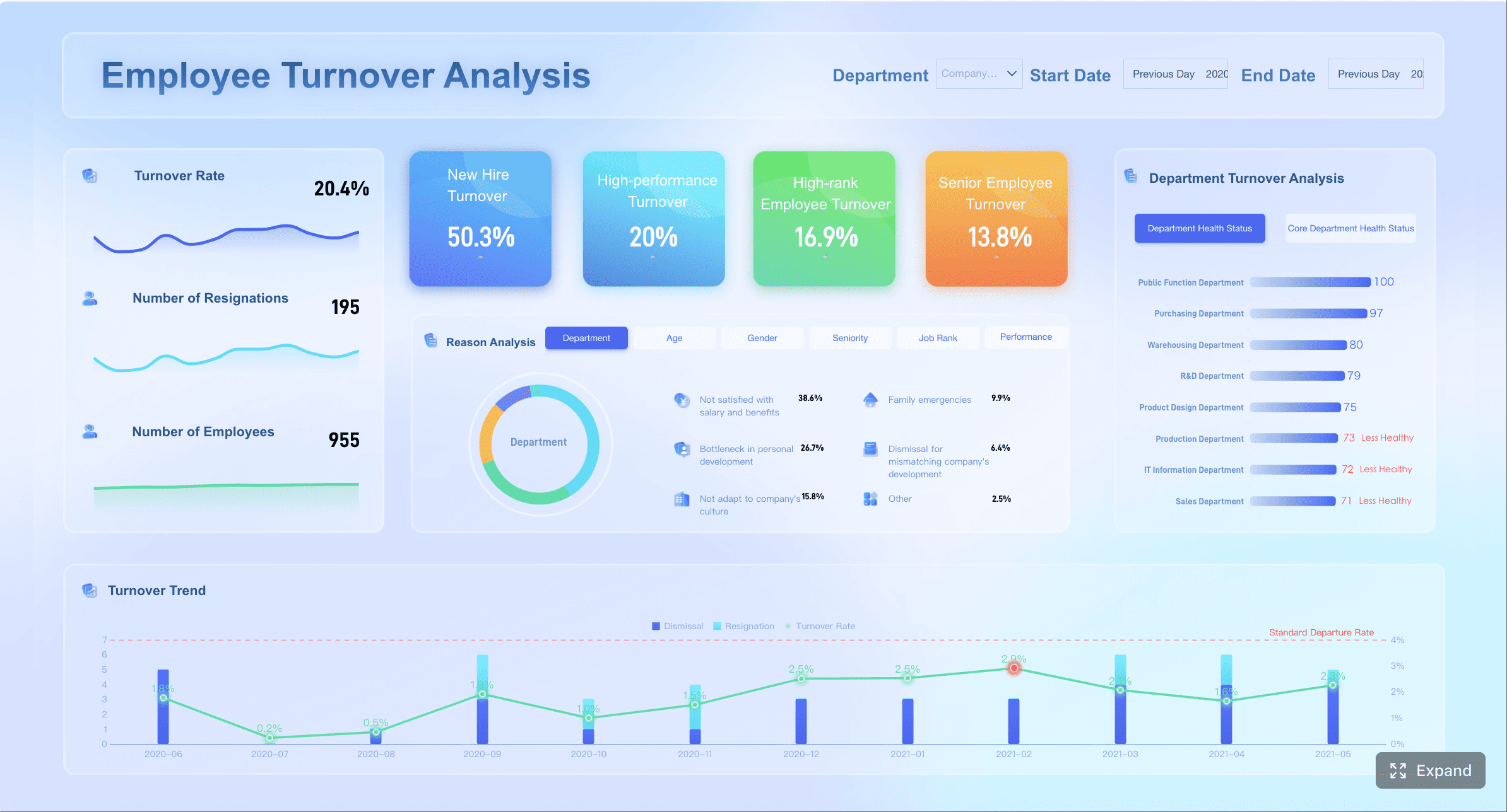 A dashboard example, showing employee turnover
All dashboard examples in this article were created by FineBI.
The core metrics to include in a DEI dashboard beyond representation
The most effective dashboards balance four metric types:
- Representation metrics: who is in the workforce
- Process metrics: what happens in hiring, promotion, and mobility
- Outcome metrics: what employees receive or experience
- Experience metrics: how people feel about inclusion and fairness
That balance is what moves a DEI dashboard from descriptive to operational.
Workforce, hiring, and promotion metrics
Start with workforce composition, but do not stop there. Representation should be visible by:
- Job level
- Function
- Geography
- Business unit
- Leadership tier
- Manager population
- Critical role family
This helps leaders see where diversity is concentrated and where it thins out. Enterprise averages often hide structural concentration in lower levels or support functions.
Next, track the hiring funnel across each key stage:
- Applicants
- Screened candidates
- Interviews
- Offers
- Acceptances
- Hires
The purpose is to identify conversion gaps, not just end-state hiring numbers. If one group enters the funnel at healthy rates but exits disproportionately at interview or offer stage, leaders can investigate process design, interviewer calibration, role requirements, or sourcing mix.
Promotion analysis is equally important. Track:
- Promotion rate by demographic group
- Time to promotion
- Promotion rate by level and tenure band
- Readiness pool participation
- Succession slate representation
- Movement into people-manager roles
- Assignment to high-visibility, high-growth roles
This last category is often overlooked. Formal promotions matter, but career acceleration also depends on access to stretch assignments, leadership programs, and strategic projects. A DEI dashboard should expose whether opportunity is distributed fairly before title changes appear.
Useful views include:
| Metric | What it reveals | Common action |
|---|---|---|
| Representation by leadership tier | Leadership pipeline health | Rebuild feeder roles and succession plans |
| Interview-to-offer conversion | Selection fairness | Review interview panels and criteria |
| Promotion rate by tenure | Advancement velocity | Audit calibration and manager sponsorship |
| Participation in succession pools | Access to future leadership | Redesign nomination process |
Pay, retention, and experience metrics
If your DEI dashboard does not include pay, retention, and employee experience, it is missing the metrics leaders care about most when risk becomes real.
For pay, include indicators such as:
- Pay equity index by group
- Median pay by demographic segment within comparable roles
- Compa-ratio distribution
- Starting pay differences
- Bonus allocation patterns
- Merit increase distribution
The goal is not to create simplistic comparisons across unlike jobs. It is to surface where further analysis is needed and where pay outcomes diverge beyond expected business factors.
For retention, track:
- Overall retention by cohort
- Voluntary attrition
- Regrettable attrition
- Early tenure attrition
- Retention by manager population
- Internal mobility rate
- Exit reasons by segment where available
Retention metrics become far more actionable when cut by career stage, function, and manager status. A company may discover that diverse hiring is strong in one business unit, but early attrition spikes within the first 12 months because onboarding, management quality, or role design fails.
Experience metrics add the human dimension. Include survey measures such as:
- Inclusion
- Belonging
- Psychological safety
- Fairness
- Trust in leadership
- Confidence in reporting concerns
- Perceived access to opportunity
These should be paired with demographic cuts and trend lines. Enterprise survey scores may look stable while specific cohorts report declining fairness or belonging.
A practical rule: never present engagement or belonging scores without context. Show:
- Participation rate
- Time trend
- Team or function comparison
- Demographic breakdown
- Major events that may explain movement
Accountability and progress indicators
Metrics alone do not create accountability. The dashboard needs explicit management logic.
Each major metric should include:
- A baseline
- A target
- A threshold or tolerance band
- A trend line
- A current status indicator
- A named owner
That owner may vary by metric. For example:
| Metric | Primary owner | Supporting owner |
|---|---|---|
| Hiring conversion by demographic group | Talent acquisition leader | Business unit hiring leaders |
| Promotion rate by level | HR business partner / talent leader | Functional executives |
| Pay equity indicators | Compensation leader | CHRO, finance partner |
| Inclusion and belonging scores | Business leader | HR, DEI leader |
| Regrettable attrition | Line executive | HRBP, people managers |
It is also important to distinguish leading indicators from lagging indicators.
Leading indicators may include:
- Diverse candidate slate rate
- Interview panel diversity
- Participation in leadership programs
- Internal mobility applications
- Belonging pulse scores
- Manager inclusion training completion
Lagging indicators may include:
- Leadership representation
- Annual promotion outcomes
- Pay gap findings
- Year-end attrition
- Succession representation
This distinction matters because lagging indicators tell you what already happened. Leading indicators tell you where to act before results deteriorate further.
How to design a DEI dashboard that leaders can actually use
A DEI dashboard fails when it is statistically rich but operationally weak. Leaders do not need fifty charts. They need a few trusted views that support recurring decisions.
Start with decisions, not just data
The most important design principle is simple: start with decisions.
Ask first:
- What decisions should this dashboard support?
- Which leaders will make those decisions?
- What action should follow if a metric moves above or below threshold?
Typical decisions include:
- Where should we intervene in the hiring funnel?
- Which business units need manager capability support?
- Which populations need targeted retention action?
- Where should we redesign promotion criteria or talent review practices?
- Which teams need deeper listening or qualitative follow-up?
Once the decision set is clear, each dashboard page should focus on a small number of high-value metrics tied to action. In most cases, an executive view should not exceed 5 to 8 top-level KPIs, with drill-down available below.
A practical structure is:
- Executive summary: enterprise trend and top risks
- Talent flow view: hiring, promotion, mobility
- Pay and retention view: equity and attrition outcomes
- Experience view: inclusion, belonging, fairness
- Manager or team drill-down: local patterns and actions
This role-based design improves adoption because it respects how leaders work. Executives need overview and exceptions. HR teams need process diagnostics. Managers need narrow, team-relevant views.
Choose the right cuts, comparisons, and benchmarks
Segmentation is what turns broad DEI reporting into usable insight. The most useful cuts often include:
- Level
- Tenure
- Function
- Geography
- Business unit
- Manager status
- Employment type
- Intersectional groups where sample size allows
Intersectional analysis is especially important because outcomes often diverge most sharply at the overlap of identities. But it must be handled carefully. Small populations can create both privacy risk and unstable interpretation.
Use these comparison types thoughtfully:
| Comparison type | Best use | Caution |
|---|---|---|
| Baseline vs current | Track change over time | Ensure definitions stayed constant |
| Target vs actual | Measure progress | Avoid unrealistic targets with no action plan |
| Internal comparison | Compare units, levels, or teams | Control for structural differences |
| External benchmark | Assess market position | Be transparent about source and comparability |
Two governance rules are essential:
-
Protect privacy through aggregation and suppression.
If a group is too small, combine categories or suppress the value. -
Be transparent about data limitations.
Self-identification data is valuable but incomplete. Leaders should know when metrics reflect partial participation or unavailable fields.
The dashboard should clearly indicate when values are suppressed, estimated, or not comparable due to low sample size or recent definition changes.
Make the dashboard readable and credible
Readability is not cosmetic. It affects trust.
A credible DEI dashboard uses:
- Clear metric names
- Plain-language definitions
- Consistent time windows
- Simple chart types
- Limited color coding
- Transparent calculation rules
Avoid decorative visuals that obscure trends. In most cases, the best options are:
- Line charts for trends
- Bar charts for comparisons
- Funnel charts for conversion stages
- Heatmaps for survey dimensions
- Scorecards for targets and status
Also annotate major shifts. If attrition rises sharply after a reorganization, hiring freeze, policy change, leadership transition, or acquisition, the chart should say so. This prevents false conclusions and improves executive confidence in the data.
Drill-down paths matter as well. A leader should be able to move from:
- Enterprise
- To business unit
- To function
- To level
- To manager population or team, where access rules allow
This preserves strategic visibility while enabling local action.
Platform FineBI provides drill-down function.
A practical 7-step process to build and launch your DEI dashboard
The fastest way to lose momentum is to overbuild. The smarter path is phased, governed, and decision-led.
Step 1–3: define purpose, data sources, and governance
Step 1: Define the purpose and audience
Start by naming the audience and the decisions they need to make. A dashboard for the board should not look like one for HR business partners. Clarify the priority outcomes first: hiring equity, promotion fairness, pay transparency, retention risk, belonging, or all of the above in phased order.
Step 2: Audit the data landscape
Most DEI dashboards require data from multiple systems, including:
- HRIS
- ATS
- Compensation systems
- Performance management tools
- Engagement survey platforms
- Learning or succession systems
Before design begins, audit:
- Data completeness
- Identifier consistency across systems
- Demographic field availability
- Historical depth
- Refresh cadence
- Known quality issues
Step 3: Set governance rules
DEI data is sensitive. Governance should define:
- Who can access what level of detail
- Which values are suppressed
- Which groups are aggregated
- How often the dashboard updates
- How discrepancies are escalated
- Who approves metric definitions and changes
Without governance, trust breaks quickly. With strong governance, the dashboard becomes safer and more sustainable.
Step 4–5: select metrics and design the experience
Step 4: Select a balanced scorecard
Choose a compact set of metrics across representation, process, outcomes, and experience. Resist the temptation to add every available field. A dashboard should help decisions, not replicate the data warehouse.
A balanced scorecard might include:
- Representation by level and leadership tier
- Hiring funnel conversion by segment
- Promotion rate and time to promotion
- Pay equity indicator
- Regrettable attrition
- Internal mobility
- Inclusion and belonging scores
- Goal status and owner
Step 5: Design role-based experiences
Prototype views for:
- Executives
- HR and people analytics teams
- Business leaders
- Managers
- DEI practitioners
Before launch, write metric definitions and calculation rules. This is not optional. If promotion rate, regrettable attrition, or pay equity index means different things to different users, adoption will stall.
Step 6–7: pilot, train, and improve
Step 6: Pilot with a small user group
Launch first with a limited set of leaders. Test for:
- Clarity
- Relevance
- Perceived trustworthiness
- Ease of navigation
- Actionability
Ask users not only what they like, but what decision they would make after viewing each section. If they cannot answer that question, redesign.
Step 7: Train, review, and refine
Leaders need training on interpretation. They should understand:
- The difference between signal and noise
- Why small groups may show volatility
- How to avoid overreacting to one period
- When to combine quantitative and qualitative follow-up
After launch, review:
- Dashboard adoption
- Which views are most used
- Which actions were taken
- What business impact followed
The best DEI dashboards improve over time because they are treated as management systems, not one-time deliverables.
Common mistakes that weaken a DEI dashboard
Many dashboards fail for predictable reasons. Most are not technical problems. They are design and governance problems.
1. Treating the dashboard as a compliance artifact
If the dashboard exists only for reporting, it will not change outcomes. Compliance metrics matter, but leaders need tools that help them decide where to act next.
2. Reporting only representation
Representation is necessary, not sufficient. Without links to advancement, pay, experience, and retention, the dashboard cannot explain whether equity is improving.
3. Using too many metrics
More metrics do not create more insight. They create noise. Focus on a small, balanced scorecard tied to leadership action.
4. Using unclear definitions
If users debate how a metric is calculated, they stop trusting the story. Publish metric definitions, time windows, and inclusion rules inside the dashboard.
5. Ignoring privacy and small-group suppression
DEI dashboards deal with highly sensitive data. Small groups should be aggregated or suppressed to protect identity and prevent misuse.
6. Overstating certainty from self-identification data
Demographic data is often incomplete. Participation varies by region, legal context, and employee trust. Be transparent about where data is partial.
7. Failing to assign owners and timelines
If a metric misses target and no one owns the response, the dashboard becomes performative. Every high-priority KPI needs an accountable leader and a review cadence.
Turn your DEI dashboard into an action system with FineBI
Design is only half the job. The other half is execution. To drive results, organizations need a BI platform that makes DEI data accessible, governed, drillable, and actionable across roles.
This is where FineBI fits naturally.
FineBI helps enterprises build DEI dashboards that go beyond static reporting by combining data from HRIS, ATS, compensation, survey, and performance systems into interactive, role-based views. Instead of manually stitching spreadsheets together each quarter, teams can create a governed analytics environment where leaders see the right metrics, at the right level, with the right permissions.
FineBI is especially well suited to DEI dashboard scenarios because it supports:
- Multi-source data integration for HR and talent systems
- Self-service analytics for business users and HR teams
- Role-based permissions to protect sensitive people data
- Drill-down and interactive filtering from enterprise to team level
- Clear visual dashboards for trends, funnels, scorecards, and heatmaps
- Repeatable refresh cycles that improve trust and operating rhythm
For executive teams, that means faster visibility into representation, hiring conversion, promotion equity, attrition risk, and belonging outcomes. For HR and DEI teams, it means less manual reporting and more time spent on insight, intervention, and stakeholder alignment.
A practical implementation approach with FineBI would be:
| Phase | Objective | FineBI value |
|---|---|---|
| Phase 1 | Build executive DEI scorecard | Rapid dashboard assembly with governed KPIs |
| Phase 2 | Add hiring, promotion, and retention drill-down | Cross-system integration and filterable analysis |
| Phase 3 | Expand to survey and experience metrics | Unified experience and workforce outcome view |
| Phase 4 | Operationalize accountability | Shared access, metric ownership, recurring review rhythm |
The strategic advantage is not just visualization. It is the ability to move from fragmented DEI reporting to a trusted management system.
If your organization wants a DEI dashboard that leaders will actually use, start with the decisions that matter, define the metrics that signal action, and deploy them on a platform built for business adoption. FineBI can help you do that with speed, clarity, and governance.
FAQs
A DEI dashboard is an ongoing decision tool that connects workforce demographics to outcomes like hiring, promotion, pay, retention, and belonging. Unlike a static diversity report, it helps leaders spot gaps early and take action throughout the year.
A strong DEI dashboard should include hiring funnel conversion, promotion rates and time to promotion, pay equity measures, attrition trends, engagement results, and belonging scores. These metrics show not just who is in the organization, but how people experience opportunity and fairness over time.
It reveals where different groups drop off in the hiring funnel or advance more slowly after joining. That allows leaders to review sourcing, interview processes, manager decisions, and access to high-visibility opportunities.
Use clear governance, protect privacy with aggregated views, and collect only data that supports real decisions. Trust also improves when leaders explain why the data is being used and act on findings responsibly.
DEI dashboards are most useful for CHROs, HR leaders, DEI teams, executives, and business managers who influence talent decisions. The dashboard should support regular reviews in workforce planning, talent discussions, and accountability conversations.


The Author
Yida Yin
FanRuan Industry Solutions Expert
Related Articles

Portfolio Reporting for PMOs: 9 Executive Metrics Every Weekly Portfolio Dashboard Should Include
Weekly portfolio reporting should help executives answer three questions fast: Are we delivering the right initiatives, are we putting outcomes at risk, and what decisions need leadership this week? For PMOs, that means
Yida Yin
Jul 01, 2026

How to Build an Investment Portfolio Reporting Dashboard for Executives: KPIs, Benchmarks, and Drill-Down Views
Investment portfolio reporting for executives is not about showing every holding, transaction, and chart your investment team can produce. It is about giving CEOs, CFOs, CIOs, boards, and investment committees a fast, re
Yida YIn
Jun 25, 2026

12 KPI Reporting Examples for Executive Dashboards: What to Show in Weekly, Monthly, and Quarterly Reviews
Executive leaders do not need more data. They need decision ready $1 examples that match how often they review the business and what actions they are expected to take. A weekly $1 should surface fast moving risks and per
Yida YIn
Jun 25, 2026