A Gantt chart is a visual tool that helps you organize and manage projects effectively. It displays tasks, timelines, and dependencies in a clear, horizontal bar format. This makes it easier to track progress and ensure your team in Malaysia stays on schedule.
When preparing a project proposal, a Gantt chart plays a vital role. It helps you showcase the timeline and task relationships, giving stakeholders a clear understanding of the project’s structure. A well-designed chart can improve communication and boost confidence in your plan.
To create a Gantt chart example for project proposal, follow these steps:
- Define your project’s scope and objectives.
- Break the project into smaller, manageable tasks.
- Assign timelines and identify task dependencies.
- Add milestones to highlight key achievements.
- Use a suitable tool to build the chart and keep it updated.
By keeping your chart simple and visually appealing, you can make your project proposal in Malaysia more compelling.
Key Takeaways
- A Gantt chart shows tasks and timelines in a clear way.
- It helps track progress and manage how tasks depend on each other.
- To make a good Gantt chart, break the project into smaller tasks.
- Adding milestones helps check big goals and stay on schedule.
- Tools like FineBI and FineReport make Gantt charts easy to create.
- A clear Gantt chart helps explain plans to others and builds trust.
Understanding Gantt Chart Example for Project Proposal
What is a Gantt Chart?
A Gantt chart is a visual tool that helps you organize and track project activities over time in Malaysia. It uses horizontal bars to represent tasks, showing their start and end dates along a timeline. This format makes it easy to see how tasks overlap and depend on each other.
The Gantt chart was developed by Henry L. Gantt in the 1910s during a period of rapid industrialization. He created it to improve project management by combining timelines with task bars. Its first major use was in managing armament production for the US military, proving its value in coordinating complex projects.
Why Use a Gantt Chart Example for Project Proposal?
Including a Gantt chart in your project proposal can make your plan more effective and easier to understand in Malaysia. It provides a clear timeline, helping stakeholders visualize the sequence of tasks and their dependencies. This clarity improves communication and ensures everyone understands the project’s structure.
Studies show that Gantt charts enhance project planning and execution in several ways:
- Improved task coordination: Teams in Malaysia can better understand task sequences and hand-offs.
- Enhanced communication: Stakeholders find it easier to follow progress and expectations.
- Timely project completion: Projects using Gantt charts are more likely to stay on schedule.
| Benefit | Description |
|---|---|
| Improved task coordination | Teams in Malaysia better understood task sequences, dependencies, and hand-offs. |
| Enhanced communication | Stakeholders found it easier to follow project progress and expectations. |
| Timely project completion | Projects using Gantt charts were more likely to stay on schedule. |
Key Elements of a Gantt Chart Example for Project Proposal
To create an effective Gantt chart for your project proposal in Malaysia, include these essential elements:
| Element | Description |
|---|---|
| Clear Timeline | Develop a timeline detailing activities for each project phase. |
| Detailed Scheduling | Provide specifics on when each step will be completed and when subsequent steps can begin. |
| Visual Representation | Use Gantt charts to illustrate the sequence and interrelationship of events, ensuring careful planning. |
These elements ensure your Gantt chart communicates the project’s structure and timeline effectively. By including them, you can make your proposal more compelling and professional in Malaysia.
Step-by-Step Gantt Chart Example for Project Proposal
Define the Project Scope and Objectives
Defining the scope and objectives is the foundation of any project proposal. Start by identifying the overall goal of your project. What are you trying to achieve? Break this goal into measurable objectives that align with your organization’s priorities in Malaysia.
Next, outline the scope of the project. This includes specifying the deliverables, the resources required, and the constraints you might face in Malaysia. A clear scope prevents misunderstandings and ensures everyone involved understands the boundaries of the project.
For example, if you’re planning a marketing campaign, your scope might include designing promotional materials, running ads, and tracking engagement metrics. Your objectives could focus on increasing brand awareness or boosting sales by a specific percentage.
By defining the scope and objectives early, you set the stage for effective gantt charts that clearly illustrate your project’s timeline and progress tracking in Malaysia.
Break Down the Project into Tasks
Breaking the project into smaller tasks simplifies planning and execution. Each task should represent a specific activity or milestone that contributes to the overall goal.
To do this, list all the activities required to complete the project. Group related tasks into phases or categories. For instance, a software development project might include phases like requirement gathering, coding, testing, and deployment.
Empirical evidence highlights the importance of task breakdown in project management. The quality of project management information systems (PMIS) plays a significant role in improving task scheduling and overall project success. Here’s a breakdown:
| Construct | Description |
|---|---|
| Quality of PMIS | Refers to the effectiveness and efficiency of the project management system. |
| PMIS Information Output | The relevance of the information generated for task planning. |
| Use of PMIS | The extent to which managers utilize PMIS for task scheduling. |
| Individual Impacts | Benefits experienced by project managers from using PMIS. |
| Project Success | Success influenced by PMIS, including budget control and meeting deadlines. |
By organizing tasks into manageable units, you make it easier to create a gantt chart that visually represents the sequence and duration of activities. This approach also enhances progress tracking and ensures smoother execution.
Assign Timelines and Dependencies
Assigning timelines and dependencies is crucial for task scheduling. Begin by estimating the duration of each task. Use historical data from similar projects to improve accuracy. Input from experienced professionals can also provide valuable insights into unique aspects of your project in Malaysia.
Once you’ve estimated durations, sequence the tasks logically. Determine which tasks must be completed before others can begin. For example, in event planning, venue booking must precede decoration setup.
Industry benchmarks validate the importance of assigning timelines and dependencies:
- Utilizing historical data enhances the accuracy of task duration estimates.
- Input from professionals provides insights into unique project aspects.
- Sequencing tasks logically ensures smooth progression.
- Understanding task relationships helps identify dependencies.
- Techniques like gantt charts visualize dependencies effectively.
When you create a gantt chart, use these dependencies to map out the timeline. This ensures stakeholders can see how tasks interconnect and progress over time. A well-structured timeline improves project management and keeps everyone aligned with the plan.
Add Milestones to the Gantt Chart
Milestones are critical points in your project timeline. They represent significant achievements or events that mark progress toward your objectives. Adding milestones to your Gantt chart helps you track key moments and ensures your project stays on course in Malaysia.
To add milestones effectively:
- Identify Key Events: Pinpoint the major deliverables or deadlines in your project. These could include the completion of a phase, approval of a design, or the launch of a product.
- Set Specific Dates: Assign exact dates to each milestone. This ensures clarity and helps you monitor progress in Malaysia.
- Visualize Milestones: Use distinct markers, such as diamonds or stars, to differentiate milestones from regular tasks. This makes them stand out on the Gantt chart.
- Align with Dependencies: Ensure milestones reflect task dependencies. For example, a milestone for "Testing Completion" should follow tasks like "Code Development" and "Bug Fixing."
Tip: Milestones act as checkpoints in your project planning. They help you evaluate whether your project is on schedule and identify areas needing attention.
Adding milestones to your Gantt chart enhances project management by providing a clear overview of progress. Stakeholders can quickly assess the timeline and understand the project's status.
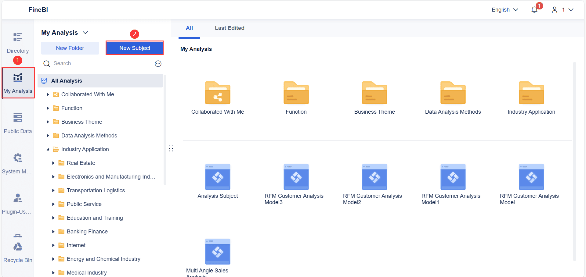
Use Tools Like FineBI and FineReport to Create a Gantt Chart Example for Project Proposal
Creating a Gantt chart becomes easier with tools like FineBI and FineReport. These tools simplify the process and offer features that enhance visualization and usability.
FineBI
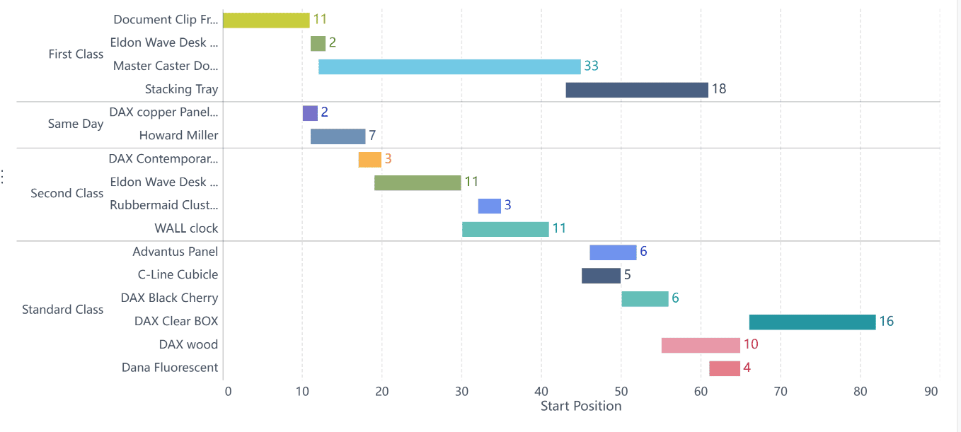
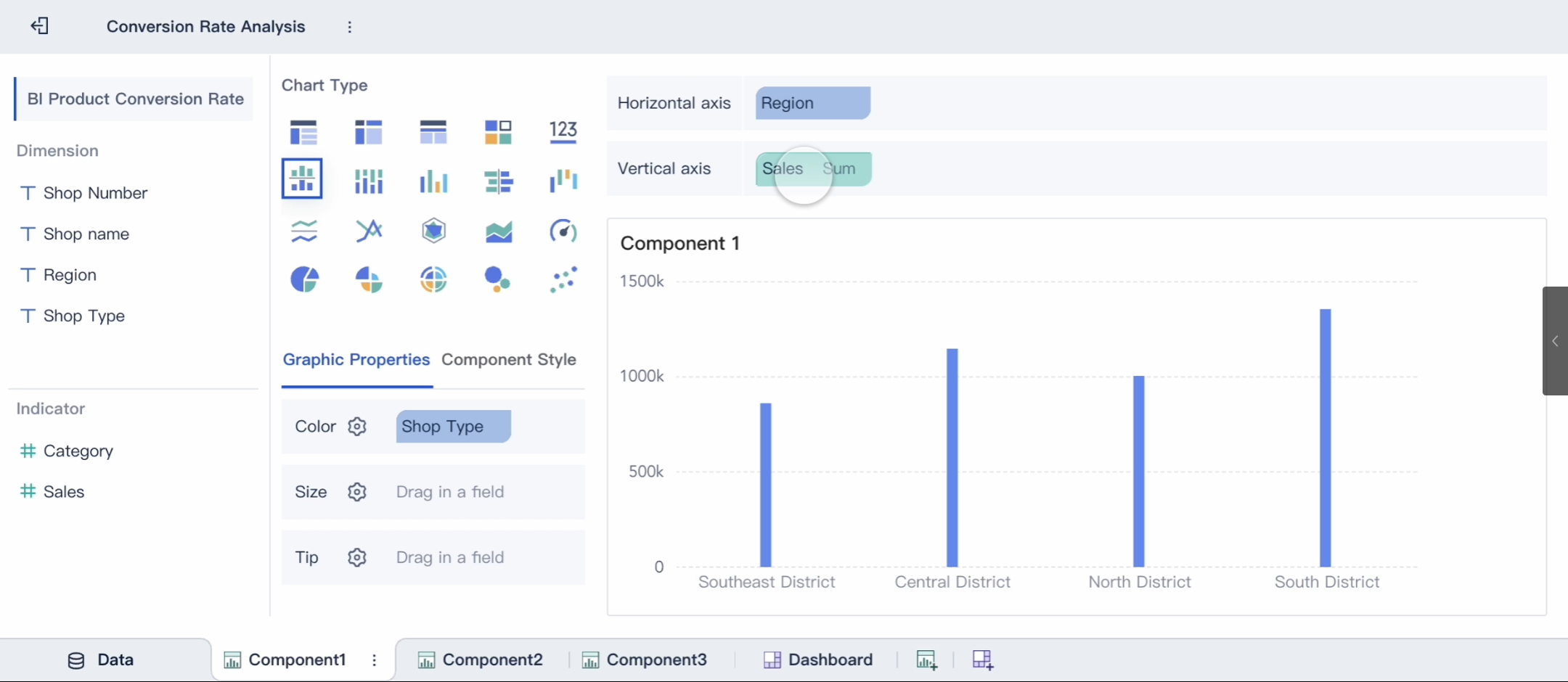
FineBI allows you to create a Gantt chart using its custom chart functionalities. Start by preparing your project data. Upload your Excel file and define key indicators like task start times and durations. Use the DATESUBDATE function to calculate the starting positions of tasks.
Next, select the Custom Chart option and choose Rectangular Block as the graphic property. This lets you replicate the Gantt chart effect. Adjust display settings to improve readability, such as hiding legends for a cleaner look.
FineBI empowers you to visualize project timelines effectively. Its flexibility ensures you can tailor the chart to meet your specific needs in Malaysia. By transforming complex data into intuitive visuals, FineBI enhances project management and keeps your team in Malaysia organized.

FineReport
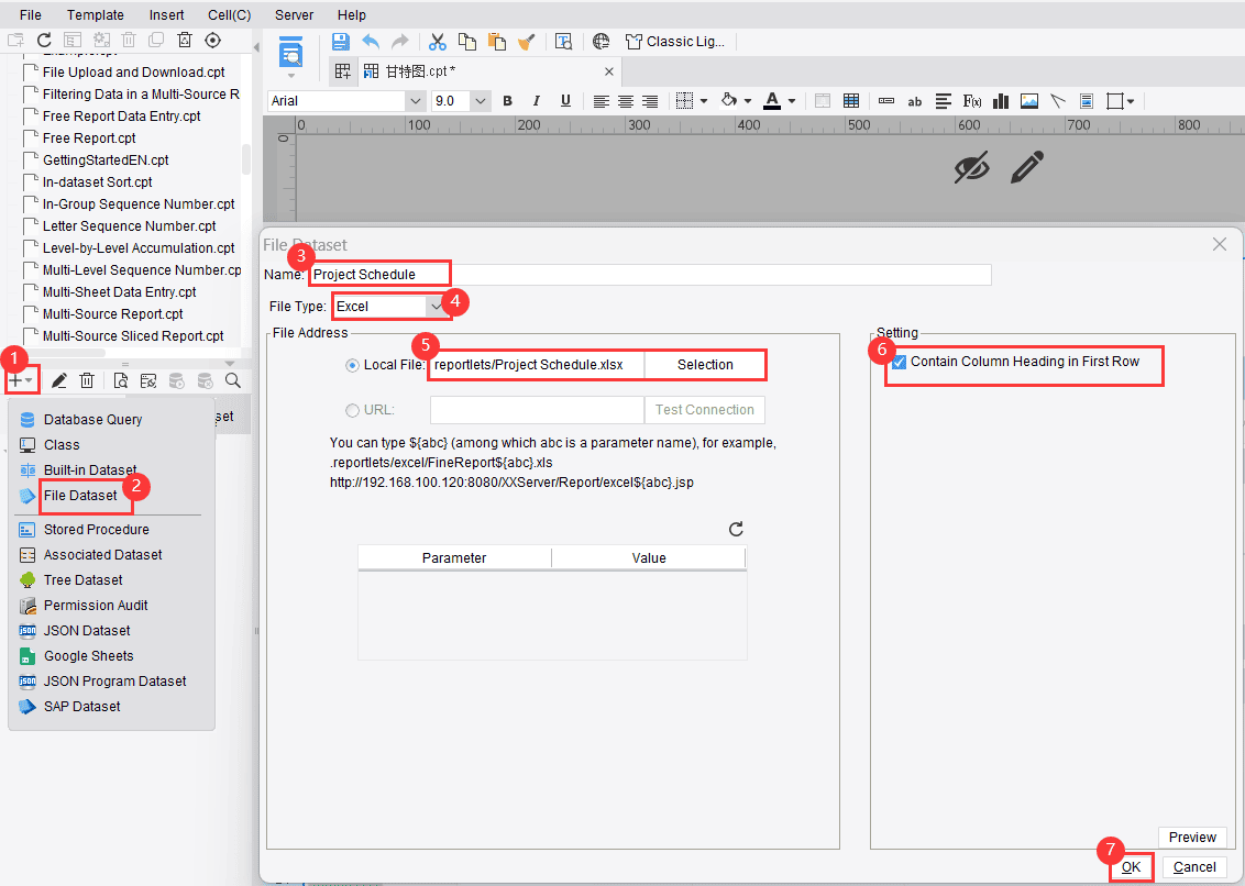
FineReport offers a straightforward approach to creating Gantt charts. Begin by selecting a new general report and adjusting the page settings. Import your project data from an Excel file and bind it to the chart. Configure details like task names, start and end times, and progress indicators.
FineReport supports advanced features like milestone tracking and task associations. You can customize the chart’s style, modify axis borders, and optimize time display effects. Preview the chart on both PC and mobile platforms to ensure accessibility.
FineReport simplifies the process of creating a Gantt chart. Its user-friendly interface and robust features make it ideal for visualizing project timelines and tracking progress.
Note: Both FineBI and FineReport provide powerful tools for creating Gantt charts. Choose the one that aligns with your project requirements in Malaysia and data complexity.
Using these tools, you can create a Gantt chart that enhances your project proposal in Malaysia. A well-designed chart improves communication, boosts stakeholder confidence, and ensures your project in Malaysia stays on track.

How to Create Gantt Chart example for project proposal in FineBI
Data Preparation
To create a Gantt chart example for your project proposal in FineBI, start by preparing your data. Organize your project details in a structured format, such as an Excel file. Include columns for task names, start dates, durations, and dependencies. This data forms the foundation of your Gantt chart.
Upload your file to FineBI’s interface. Use the platform’s data preparation tools to clean and validate your data. For instance, ensure that all dates are in the correct format and that task durations are accurate. You can also calculate additional metrics, such as task end dates, using FineBI’s built-in functions. This step ensures your data is ready for visualization in Malaysia.
Component Creation
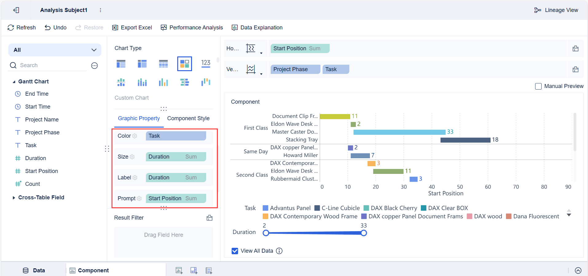
Once your data is prepared, move on to creating the Gantt chart. In FineBI, select the Custom Chart option and choose Rectangular Block as the graphic property. This feature allows you to replicate the Gantt chart format.
Define the key indicators for your chart. Use the DATESUBDATE function to calculate the starting position of each task. Assign the task durations to the rectangular blocks, ensuring they align with your project’s timeline. FineBI’s drag-and-drop interface makes this process intuitive and user-friendly.

Component Beautifying
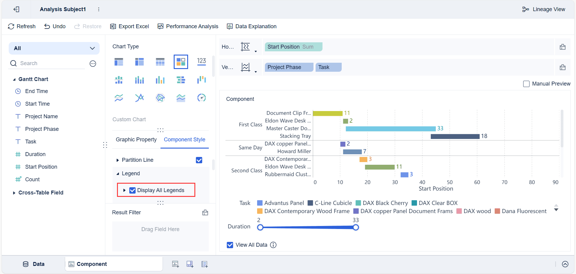
Enhance the visual appeal of your Gantt chart to make it more engaging. Adjust the colors of the rectangular blocks to differentiate tasks or phases. Hide unnecessary legends for a cleaner look. You can also customize the chart’s axis labels to improve readability.
FineBI allows you to preview your Gantt chart on different devices, ensuring it looks professional on both PCs and mobile platforms. A well-designed chart not only improves project planning but also communicates your proposal effectively to stakeholders in Malaysia.
Tip: Use consistent colors and clear labels to make your Gantt chart easy to understand. This enhances its impact in your project proposal.
By following these steps, you can create a Gantt chart example for your project proposal in FineBI. This tool simplifies project management by turning complex data into a clear and actionable timeline.
How to Create Gantt Chart example for project proposal in FineReport
Template Preparation
Start by preparing the template for your Gantt chart in FineReport. Open the software and create a new general report. Adjust the page settings to ensure the chart fits well within the display area. Use the layout options to define the structure of your report in Malaysia.
Import your project data from an Excel file. Include columns for task names, start dates, end dates, and progress indicators. Ensure the data is clean and formatted correctly. This step lays the foundation for your Gantt chart and ensures accurate visualization.
Tip: Organize your data systematically before importing it. This reduces errors and speeds up the chart creation process.
Chart Insert
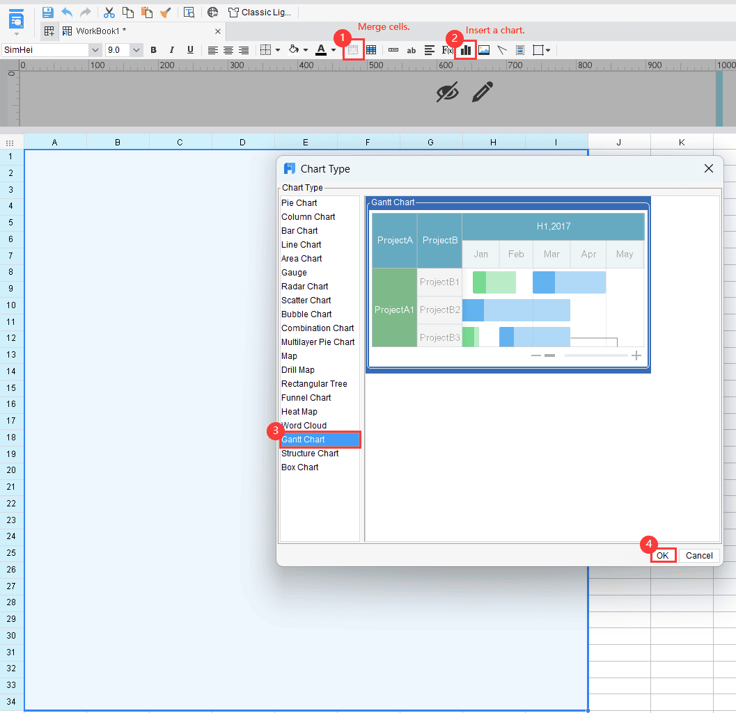
Once the template is ready, insert the Gantt chart into your report. Navigate to the chart options and select the Gantt chart type. Bind your project data to the chart by linking the relevant columns.
Configure the chart settings to match your project’s requirements in Malaysia. Assign task names to the vertical axis and timelines to the horizontal axis. Use the progress indicators to show the completion status of each task.
FineReport allows you to customize the chart’s appearance. Modify the axis borders, adjust the colors, and optimize the time display effects. These features help you create a visually appealing chart that communicates your project timeline effectively.
Chart Data
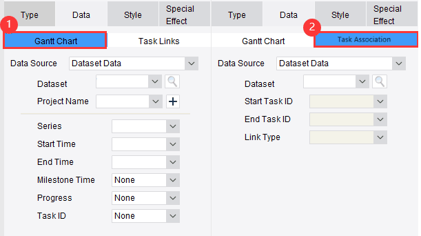
After inserting the chart, focus on refining the data representation. Use FineReport’s data binding tools to ensure the chart reflects your project’s timeline accurately. Highlight task dependencies and milestones to provide a clear overview of the project’s progress.
You can add advanced features like task associations and milestone tracking. These elements enhance the chart’s functionality and make it more informative. Preview the chart on different devices to ensure it looks professional and is easy to understand.
Note: A well-structured Gantt chart improves project management by providing clarity and insight into task scheduling and progress tracking.
By following these steps, you can create a Gantt chart example for your project proposal in FineReport. This tool simplifies planning and helps you present your project timeline effectively to stakeholders in Malaysia.
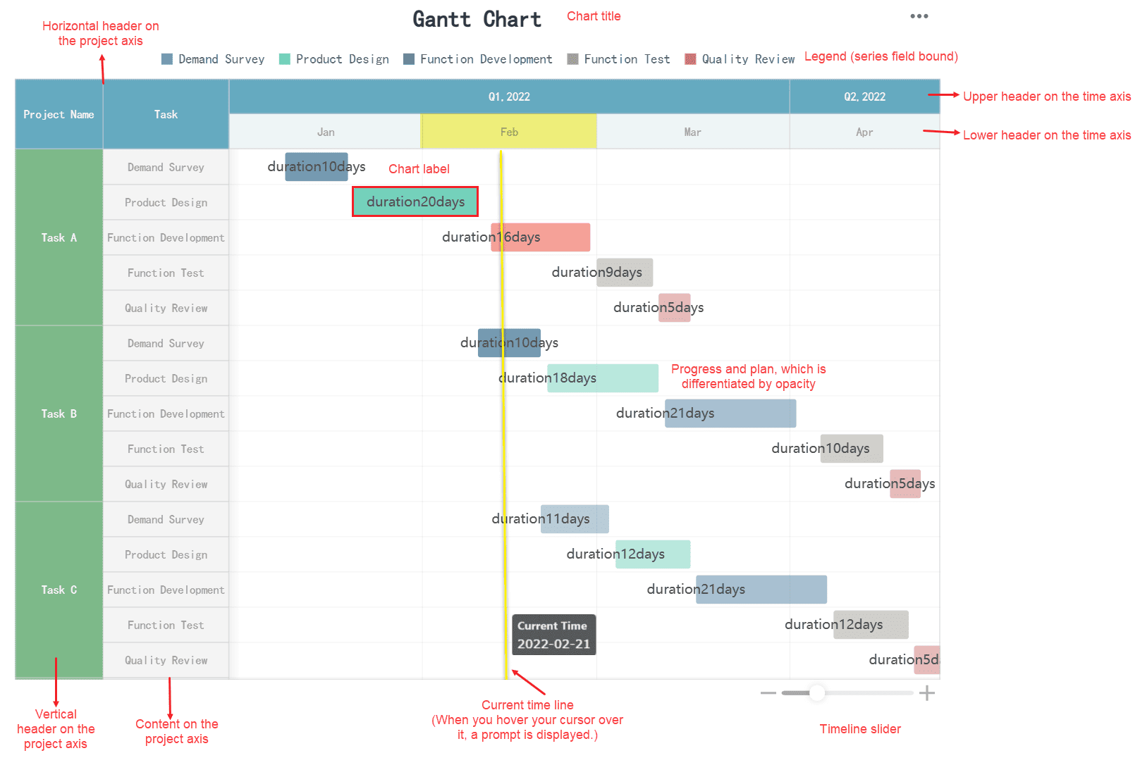
Chart Style
Customizing the style of your Gantt chart enhances its visual appeal and makes it easier to interpret. FineReport offers several options to help you tailor the chart to your project’s needs in Malaysia.
- Adjust Colors: Use distinct colors to differentiate tasks, phases, or milestones. For example, you can assign blue for completed tasks and green for ongoing ones. This color coding simplifies progress tracking.
- Modify Axis Borders: Customize the borders of the horizontal and vertical axes to improve clarity. Thicker borders can make timelines and task names stand out.
- Optimize Time Display: Fine-tune the time intervals on the horizontal axis. Choose between daily, weekly, or monthly views based on your project’s duration.
Tip: Consistent styling improves readability. Avoid using too many colors or overly complex designs, as these can confuse stakeholders.
FineReport also allows you to preview your chart during the styling process. This ensures your adjustments align with your project’s requirements and look professional across different devices.
Effect Display
Displaying the final Gantt chart effectively ensures stakeholders understand your project timeline. FineReport provides tools to enhance the chart’s presentation.
- Interactive Features: Add interactive elements like tooltips. These allow viewers to hover over tasks and see additional details, such as task descriptions or dependencies.
- Milestone Markers: Use distinct shapes like diamonds or stars to highlight milestones. This makes key events stand out and draws attention to critical points in the timeline.
- Device Compatibility: Preview the chart on both desktop and mobile platforms. FineReport optimizes the display for various screen sizes, ensuring accessibility for all stakeholders.
Note: A well-displayed Gantt chart improves communication. Stakeholders can quickly grasp the project’s structure and progress, boosting confidence in your proposal in Malaysia.
By focusing on chart style and effect display, you create a Gantt chart that is both visually appealing and informative. FineReport’s features make this process simple and effective.
Practical Gantt Chart Example for Project Proposal
Gantt Chart Example for a Marketing Campaign Proposal
A marketing campaign involves multiple tasks, such as designing promotional materials, scheduling advertisements, and tracking engagement metrics. A Gantt chart helps you organize these tasks into a clear project timeline, ensuring smooth execution.
To create a Gantt chart for a marketing campaign, start by listing all the activities required. For example, you might include tasks like brainstorming ideas, creating content, and launching ads. Assign start and end dates to each task and identify dependencies. For instance, content creation must precede ad scheduling.
Milestones play a key role in marketing campaigns. Add milestones like "Content Approval" or "Ad Launch" to your Gantt chart. These checkpoints help you monitor progress and ensure deadlines are met.
Tip: Use distinct colors to differentiate tasks and milestones. This makes your chart visually appealing and easier to understand.
Gantt charts have proven their effectiveness in project management. For instance, research proposals often use Gantt charts to define timelines and monitor goals. This approach ensures that planned activities align with actual progress.
| Example | Description |
|---|---|
| Research Proposals | Gantt charts help define timelines and monitor project goals against actual work timelines. |
By using a Gantt chart, you can streamline your marketing campaign planning and improve communication with your team in Malaysia.
Gantt Chart Example for a Software Development Proposal
Software development projects often involve complex planning, multiple teams in Malaysia, and changing deadlines. A Gantt chart simplifies this process by providing a high-level overview of tasks, milestones, and dependencies.
To create a Gantt chart for software development, begin by breaking the project into phases. These might include requirement gathering, coding, testing, and deployment. Assign timelines to each phase and identify dependencies. For example, testing cannot start until coding is complete.
Include milestones like "Prototype Completion" or "Final Testing" in your chart. These markers help you track progress and ensure the project stays on schedule.
Gantt charts offer significant advantages in software development proposals. They simplify complex planning and enhance task scheduling and resource allocation.
| Benefit | Description |
|---|---|
| Simplifies complex planning | Gantt charts facilitate the creation of intricate plans, especially for projects with multiple teams in Malaysia and changing deadlines. |
| Enhances task scheduling and resource allocation | They provide a high-level overview of tasks, including start and end dates, milestones, and dependencies, aiding in efficient resource management. |
Note: A well-structured Gantt chart improves project management by providing clarity and insight into task scheduling.
By using a Gantt chart, you can present a clear project timeline to stakeholders, boosting confidence in your software development proposal.
Gantt Chart Example for an Event Planning Proposal
Event planning requires careful coordination of tasks like venue booking, decoration setup, and guest management. A Gantt chart helps you organize these activities into a structured timeline, ensuring nothing gets overlooked.
Start by listing all the tasks involved in your event. Group related tasks into categories, such as logistics, marketing, and operations. Assign start and end dates to each task and identify dependencies. For example, venue booking must precede decoration setup.
Add milestones like "Venue Confirmation" or "Event Day" to your Gantt chart. These markers help you track progress and ensure the event stays on schedule.
The Hoover Dam construction project demonstrates the success of Gantt charts in managing timelines. This project started in 1931 and finished ahead of schedule by using Gantt charts for progress tracking.
| Example | Description |
|---|---|
| Hoover Dam Construction | Started in 1931 and finished ahead of schedule using Gantt charts for progress tracking. |
Tip: Use interactive features like tooltips to provide additional details about tasks and milestones. This enhances the chart’s functionality and makes it more informative.
By using a Gantt chart, you can simplify event planning and ensure your project timeline is clear and actionable.
Tools to Create a Gantt Chart Example for Project Proposal
Overview of Gantt Chart Tools (Including FineBI and FineReport)
Choosing the right gantt chart tool can significantly enhance your project management process in Malaysia. Tools like FineBI and FineReport offer unique features tailored to different user needs. FineBI provides a user-friendly interface, making it ideal for business users who require intuitive tools for creating gantt charts. It excels in OLAP analysis and allows you to visualize timelines effectively. On the other hand, FineReport caters to IT specialists, offering advanced capabilities for intricate reporting and gantt chart creation. Its robust features make it suitable for handling complex project timelines.
| Tool | Strengths | Weaknesses |
|---|---|---|
| FineBI | User-friendly interface for business users, focuses on OLAP analysis | May lack advanced features for complex reporting |
| FineReport | Suited for IT specialists, handles intricate reporting needs | Less accessible for non-technical users |
By understanding the strengths of these tools, you can select the one that aligns with your project’s requirements in Malaysia.
Features to Look for in Gantt Chart Tools
When selecting a gantt chart tool, prioritize features that streamline planning and enhance collaboration. Industry metrics highlight the importance of functionalities like workload view, collaboration tools, and customizable dashboards. For example, tools like GanttPro offer workload views and capacity planning, while Wrike excels in real-time collaboration and workflow automation.
| Feature | GanttPro | Wrike | Gantter |
|---|---|---|---|
| Workload View | Yes | No | No |
| Collaboration Tools | Yes | Yes | No |
| Capacity Planning | Yes | No | No |
| Real-Time Collaboration | No | Yes | No |
| Core Gantt Chart Functionality | No | No | Yes |
Focus on tools that provide core gantt chart functionality and support features like time tracking and customizable templates. These features ensure your gantt chart effectively communicates timelines and task dependencies.
Comparing Free and Paid Gantt Chart Tools
Free gantt chart tools often provide basic functionalities, making them suitable for small projects. However, they may lack advanced features like workflow automation or real-time collaboration. Paid tools, such as FineBI and FineReport, offer comprehensive capabilities, including detailed timelines, milestone tracking, and enhanced visualization. While free tools like Gantter are budget-friendly, investing in paid options ensures better scalability and support for complex project management needs.
Evaluate your project’s complexity and budget to decide between free and paid tools. Paid tools often deliver higher efficiency and better results for large-scale projects.
Gantt charts play a vital role in project proposals by offering a clear visual timeline. They reduce meeting frequency, enhance team collaboration in Malaysia, and prevent resource bottlenecks. Milestone markers help you track progress, while centralized timelines streamline remote coordination. Tools like FineBI and FineReport simplify chart creation, making it easier to manage tasks and deadlines. By applying these steps, you can improve accountability and ensure project success. A well-structured Gantt chart not only organizes your plan but also builds confidence among stakeholders in Malaysia.
Click the banner below to try FineReport for free and empower your enterprise to transform data into productivity!
Continue Reading About Gantt Chart


FAQ

The Author
Lewis
Senior Data Analyst at FanRuan
Related Articles

What Recruiters Look for in a Data Analysis Portfolio: 10 Criteria to Score Yours Fast
A $1 is not judged like a school assignment. It is judged like a hiring shortcut. Recruiters, hiring managers, and analytics leads use it to answer one question fast: Can this person solve business problems with data in
Lewis Chou
May 29, 2026

What Is Data Analytics Consulting? Beginner’s Guide to Services, Deliverables, and Business Value
$1 helps organizations turn raw data into decisions they can trust. For many business leaders, the challenge is not a lack of data. It is a lack of clarity. Reports conflict, teams track different KPIs, dashboards are un
Lewis Chou
Jun 03, 2026

Data Analyst Job Description [+2026 Guide]: Compare Responsibilities, Skills, and Salary by Industry
A strong $1 does more than list tasks. It defines how a company turns raw data into business decisions, which teams the analyst supports, and what measurable outcomes the role is expected to influence. For employers, tha
Lewis Chou
Jun 02, 2026