
What is a KPI Dashboard?
KPI vs. KPI Dashboard
While they go hand-in-hand, a KPI and a KPI dashboard serve two distinct roles in your performance management strategy:
- A KPI (Key Performance Indicator) is the specific, quantifiable metric you are measuring to evaluate success toward a strategic goal. It is the "what." An example of a KPI is "Increase Monthly Recurring Revenue (MRR) by 10%."
- A KPI Dashboard is the visual interface and software tool used to monitor those metrics. It is the "how" and "where." The dashboard is the screen that automatically pulls your sales data, calculates the MRR, and displays whether you are hitting that 10% target today.
Don’t just collect data. Visualize what matters.
Download the KPI Dashboard Guide to learn:
- 10 essential steps to build effective KPI dashboards
- How to choose the right charts and avoid visual clutter
- 15 top-notch dashboard templates for 2026

Why Do You Need a KPI Dashboard?
Tracking KPIs manually is time-consuming and prone to error. Here is why modern organizations rely on interactive KPI dashboards to stay competitive:
- Single source of truth: KPI dashboards eliminate data silos by automatically pulling metrics from your CRM, ERP, and marketing platforms into one centralized view.
- Real-time performance tracking: Stop waiting for end-of-month reports. Dashboards provide a live health check of your business, allowing you to spot red flags and address them immediately.
- Enhanced team alignment: When everyone has access to the same visual data, it’s easier to keep all departments focused on the same strategic objectives and hold teams accountable.
- Actionable insights at a glance: By using color-coded alerts and intuitive charts, KPI dashboards make it easy for anyone—regardless of their data literacy—to understand complex trends and make fast decisions.
Types of KPI Dashboards
KPI dashboards come in many flavors. While some are used to monitor daily progress against operational goals, others have a longer-term focus. The one thing all effective dashboards have in common is that they turn complex metrics into visual, actionable insights. Here’s an overview of the most common types of KPI dashboards.
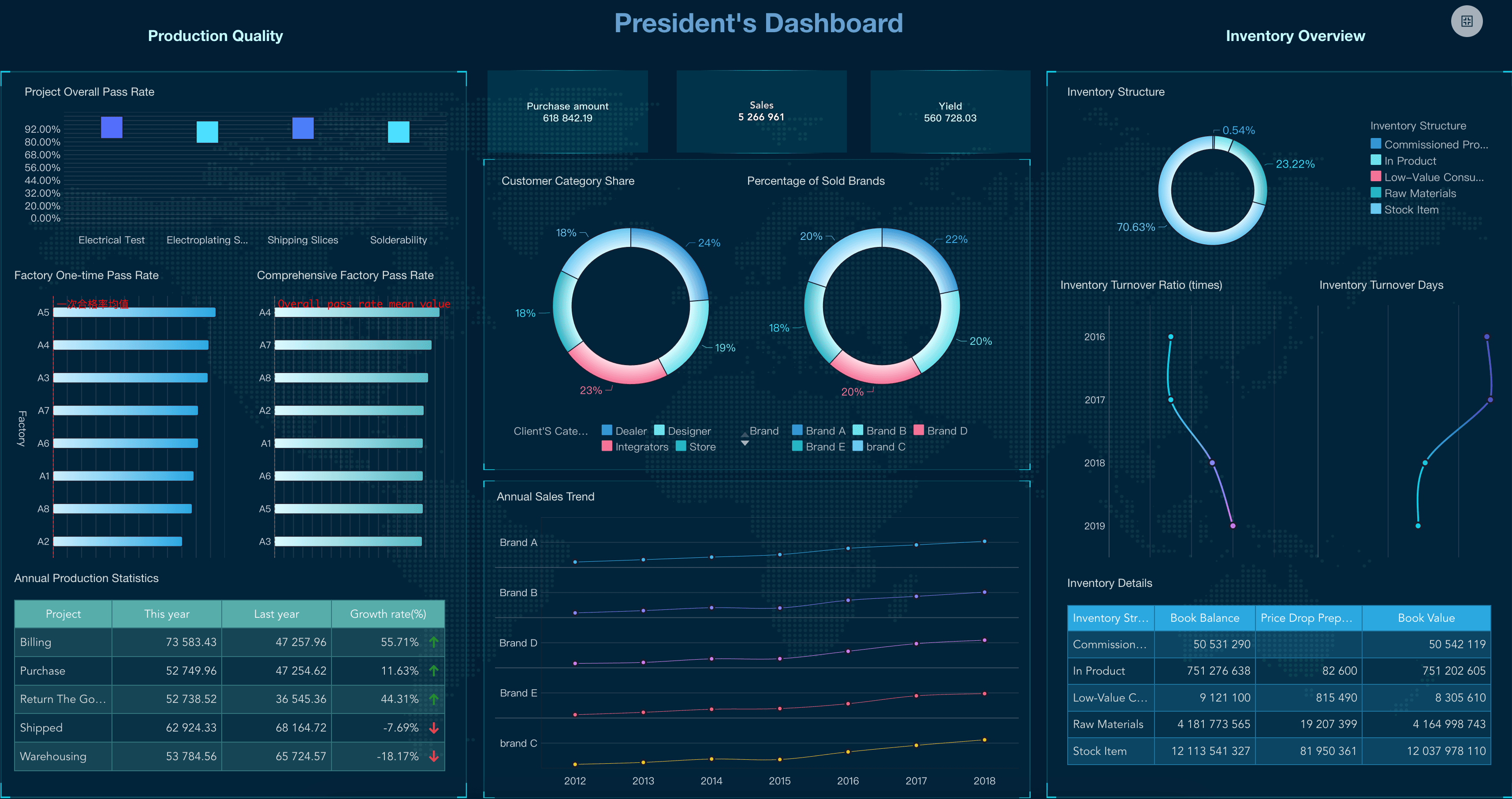
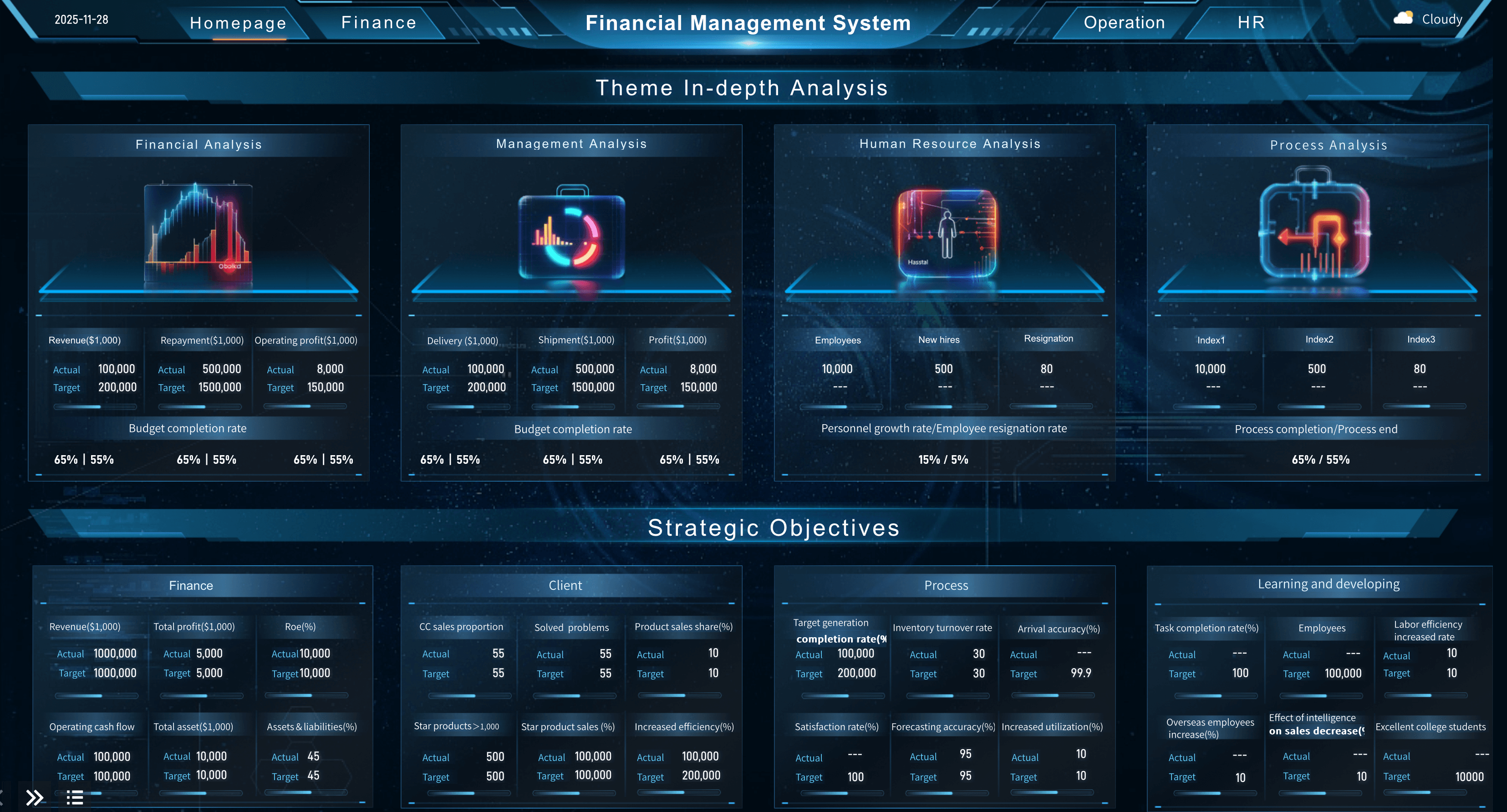
Strategic Dashboard
These big-picture interfaces monitor long-term organizational goals. Executives typically use an executive dashboard or ceo dashboard to find out how the entire organization is doing at any given time. Examples include visual summaries of total revenue, profitability, and enterprise-wide market share.
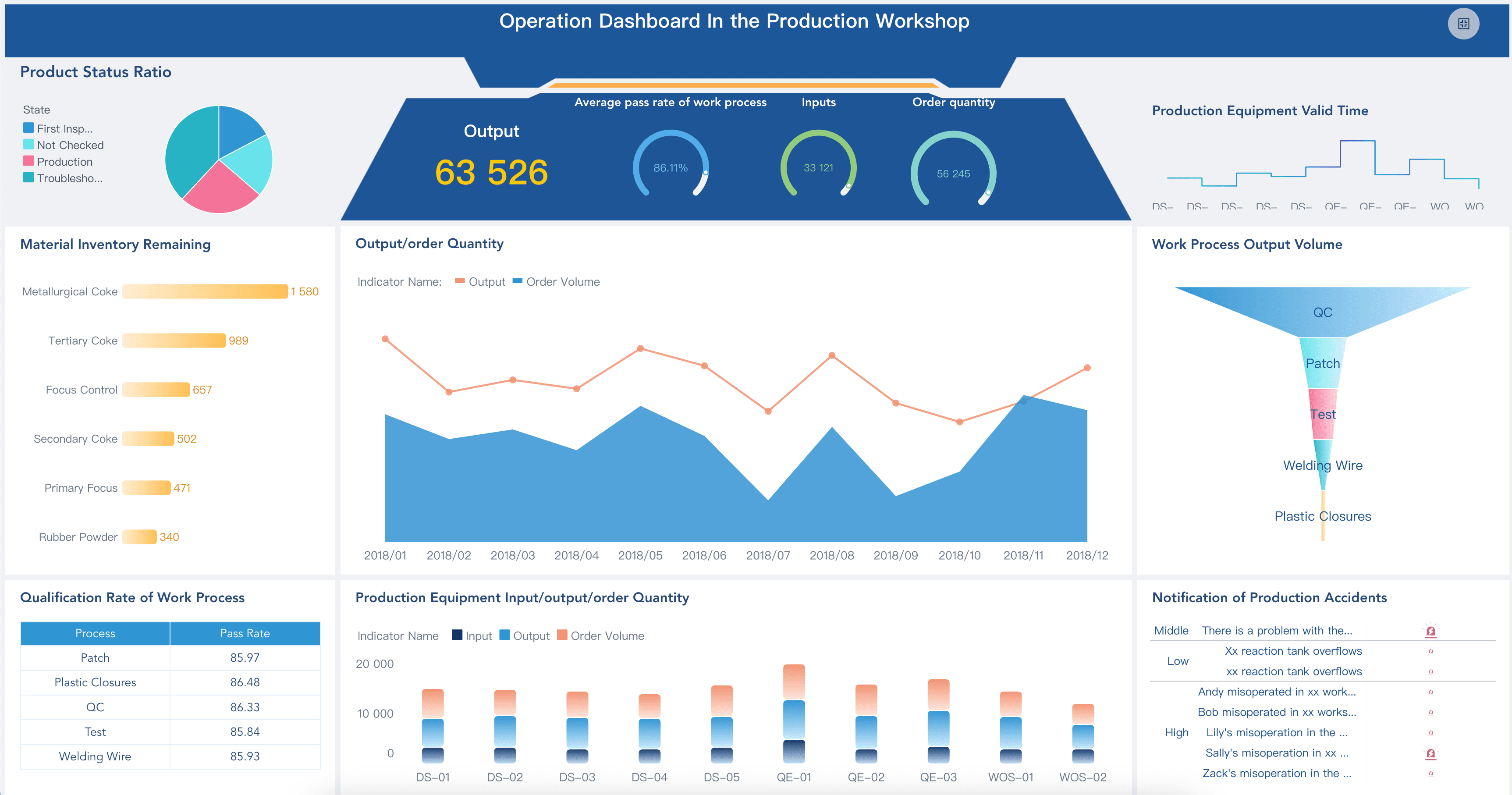
Operational Dashboard
These dashboards typically measure performance in a shorter time frame, tracking daily processes and efficiencies. Frontline managers use an operational dashboard to spot issues immediately. Some examples include a live call center kpi dashboard or a real-time manufacturing kpi dashboard.
Analytical Dashboard
Regardless of the type of dashboard you build, you should know the difference between simply monitoring data and deeply exploring it. An analytical dashboard allows data analysts to drill down into vast amounts of historical data to uncover hidden trends, often utilizing advanced business intelligence dashboard features.
How to Build a KPI Dashboard
With so much data available, it can be tempting to measure everything—or at least the metrics that are easiest to pull. However, you need to be sure you’re including only the key performance indicators that will help you reach your business goals. Here are some best practices for designing the right KPI dashboard:
- Define how the dashboard will be used: Talk to the people who will be using the reporting dashboard to find out what they want to achieve. This will help you define visualizations that are relevant and valuable to business users.
- Tie metrics to strategic goals: If your charts don’t relate to what you’re trying to achieve, you’re wasting screen space. While they may be related to a specific function, every widget on your performance dashboard should tie directly back to overall business goals.
- Keep it clear-cut (Avoid Clutter): Everyone in the organization should understand your dashboard at a glance. Applying strict dashboard design best practices ensures that when people look at the data, they can make decisions that will move the needle in the right direction.
- Avoid KPI overload: Business intelligence tools give organizations access to mounds of data, making it easy to measure anything and everything. Steer clear of visual overload by focusing on the most impactful measures. A custom dashboard should only display the "key" indicators, not every single metric.
KPI Dashboard Examples
Every business unit has unique reporting needs to help them track progress. Many organizations use an interactive dashboard to help them visualize, review, and analyze their performance metrics all in one place. Here are a few essential examples by department to inspire your next project.
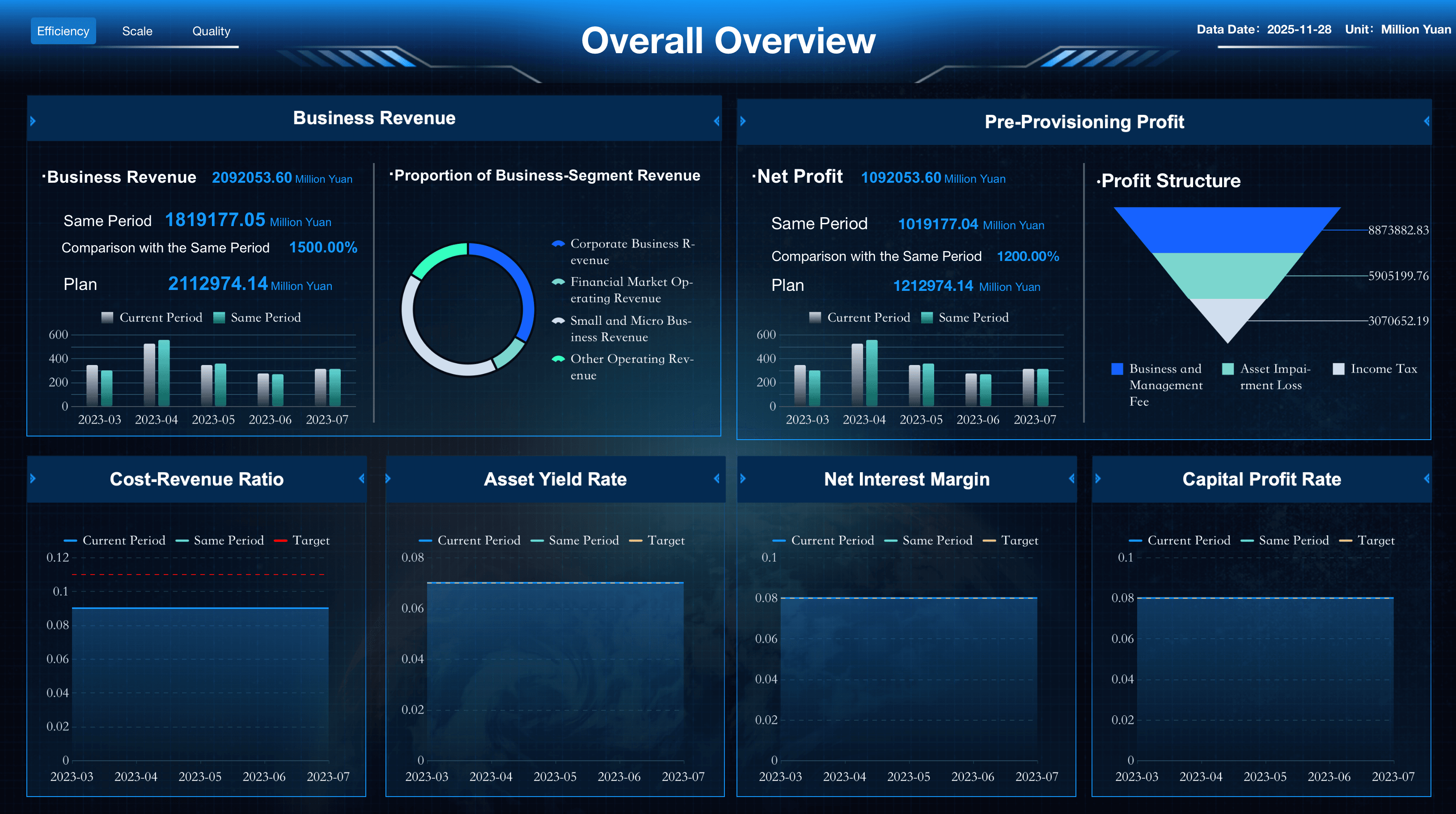
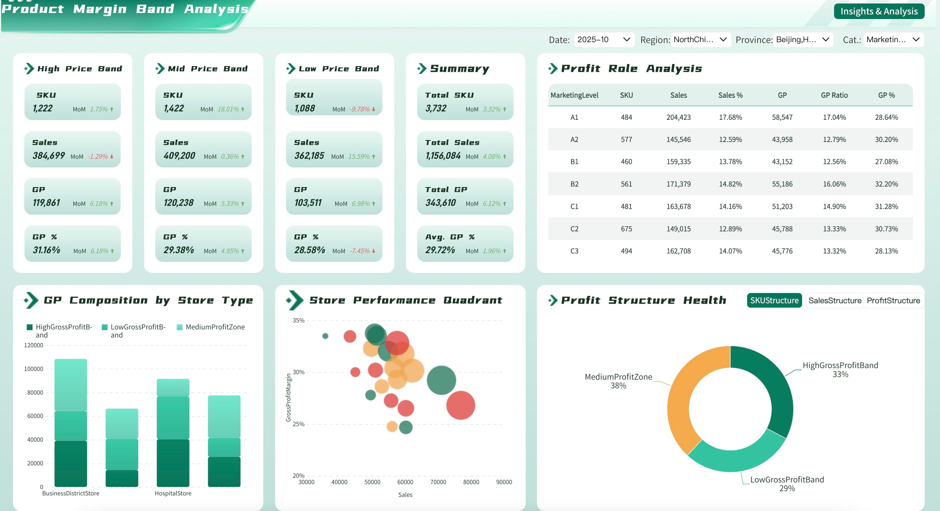
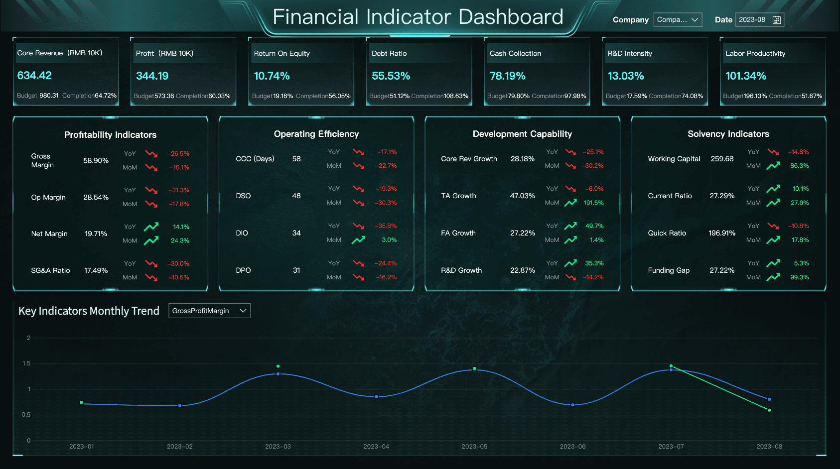
Finance KPI Dashboard
From expense and revenue tracking to cash flow management, finance leaders have many choices when visualizing financial health. A strong financial kpi dashboard or profitability dashboard typically tracks metrics like Gross Profit Margin, Working Capital, and Operating Expenses.
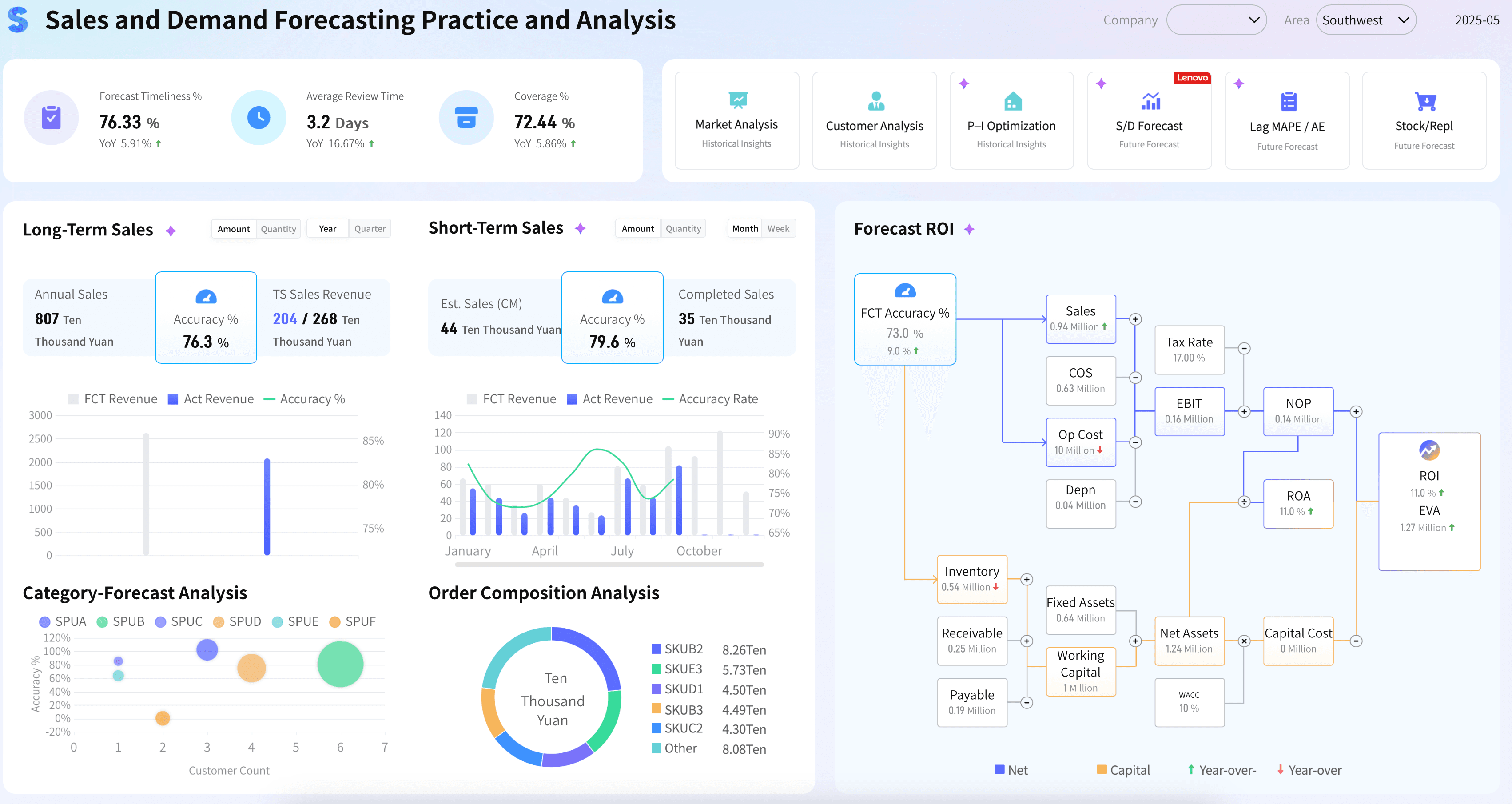
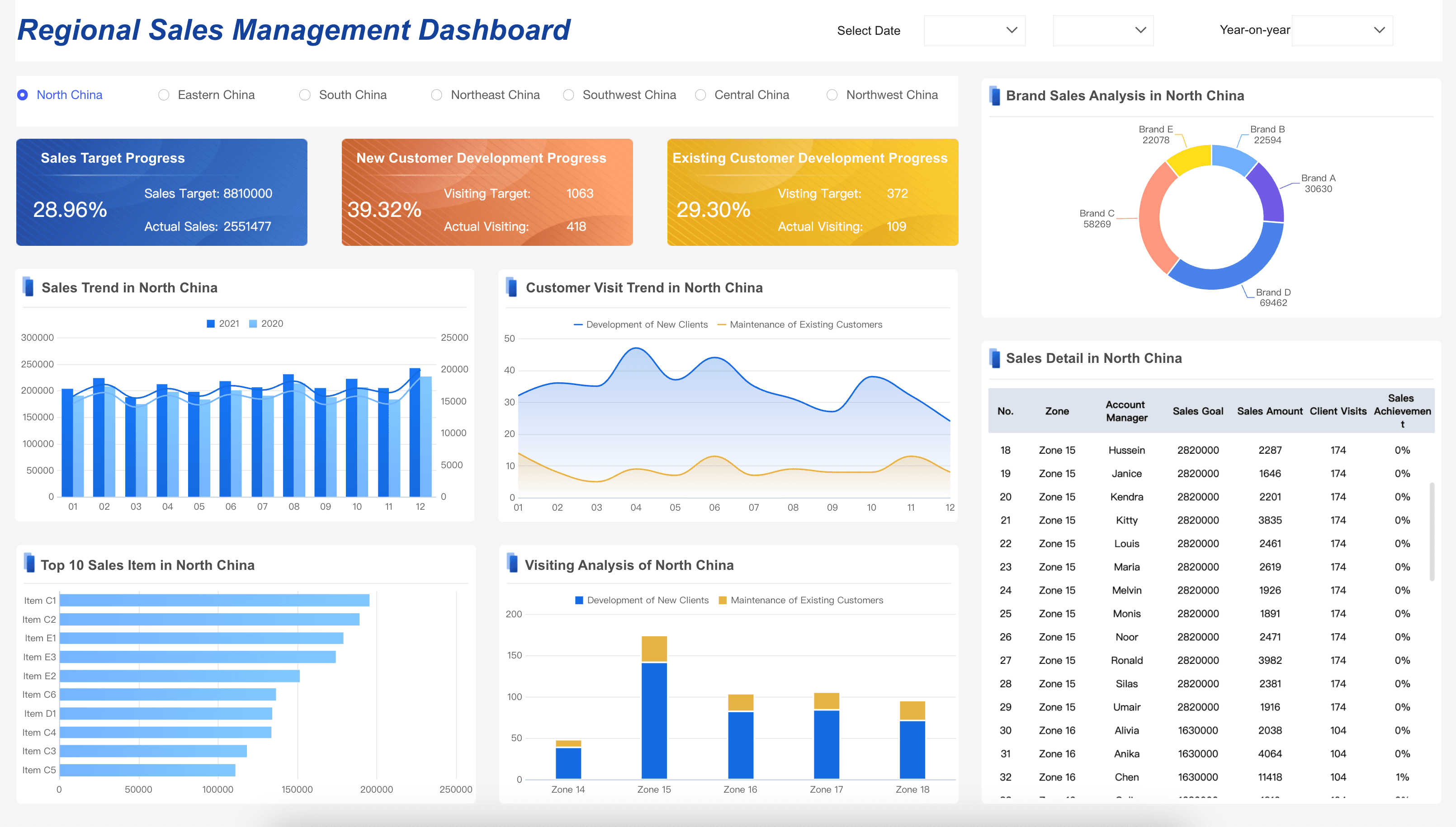
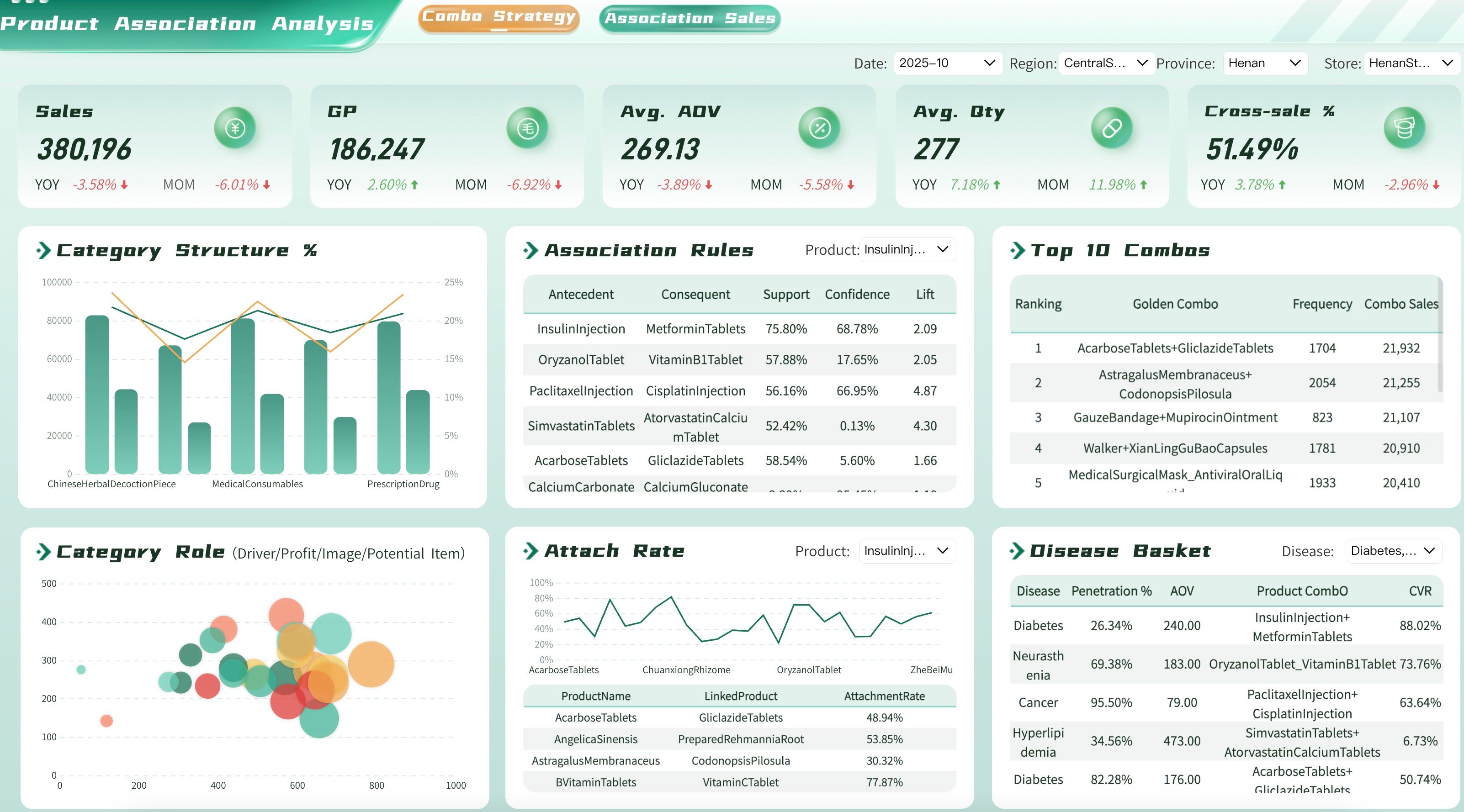
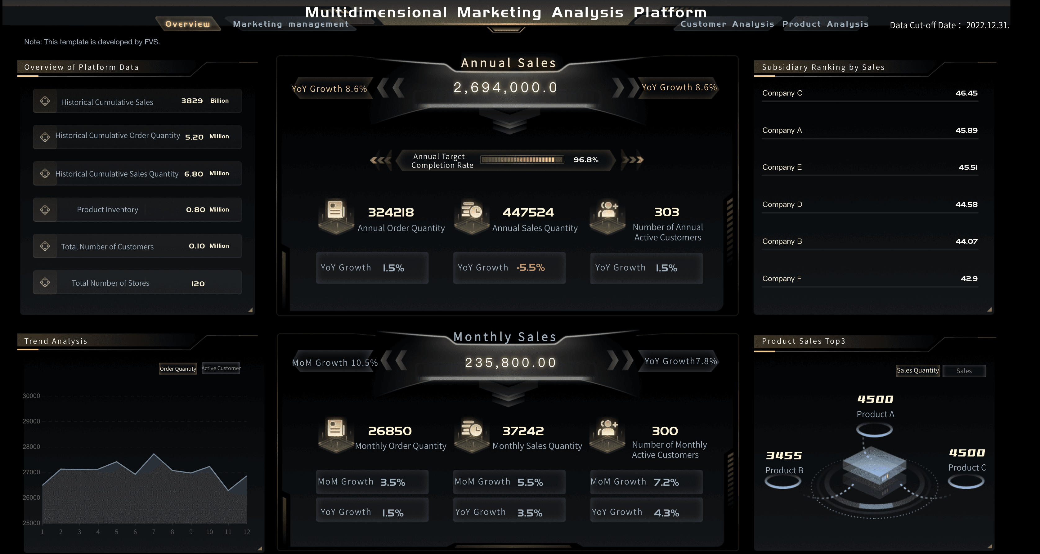
Sales & CRM KPI Dashboard
Ensure your teams are meeting targets by regularly reviewing a centralized sales kpi dashboard. By visualizing pipeline health, win rates, and volume in a sales performance dashboard, managers can accurately forecast revenue and adjust strategies on the fly.
Marketing KPI Dashboard
Get a handle on campaign spend, conversion rates, and ROI by clearly defining your metrics in a marketing kpi dashboard. A well-designed marketing analytics dashboard aligns daily marketing activities with your organization’s strategic growth goals.

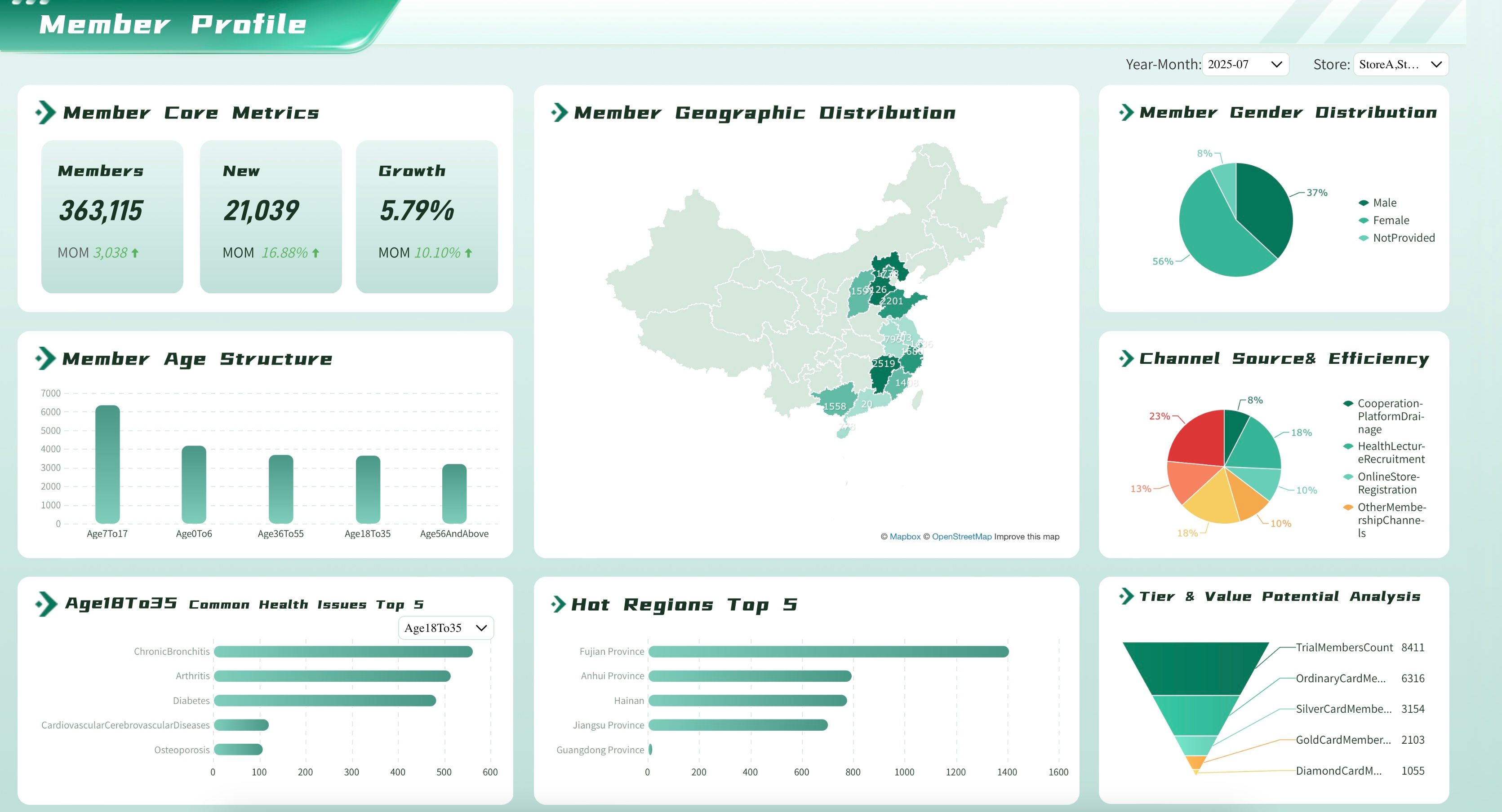
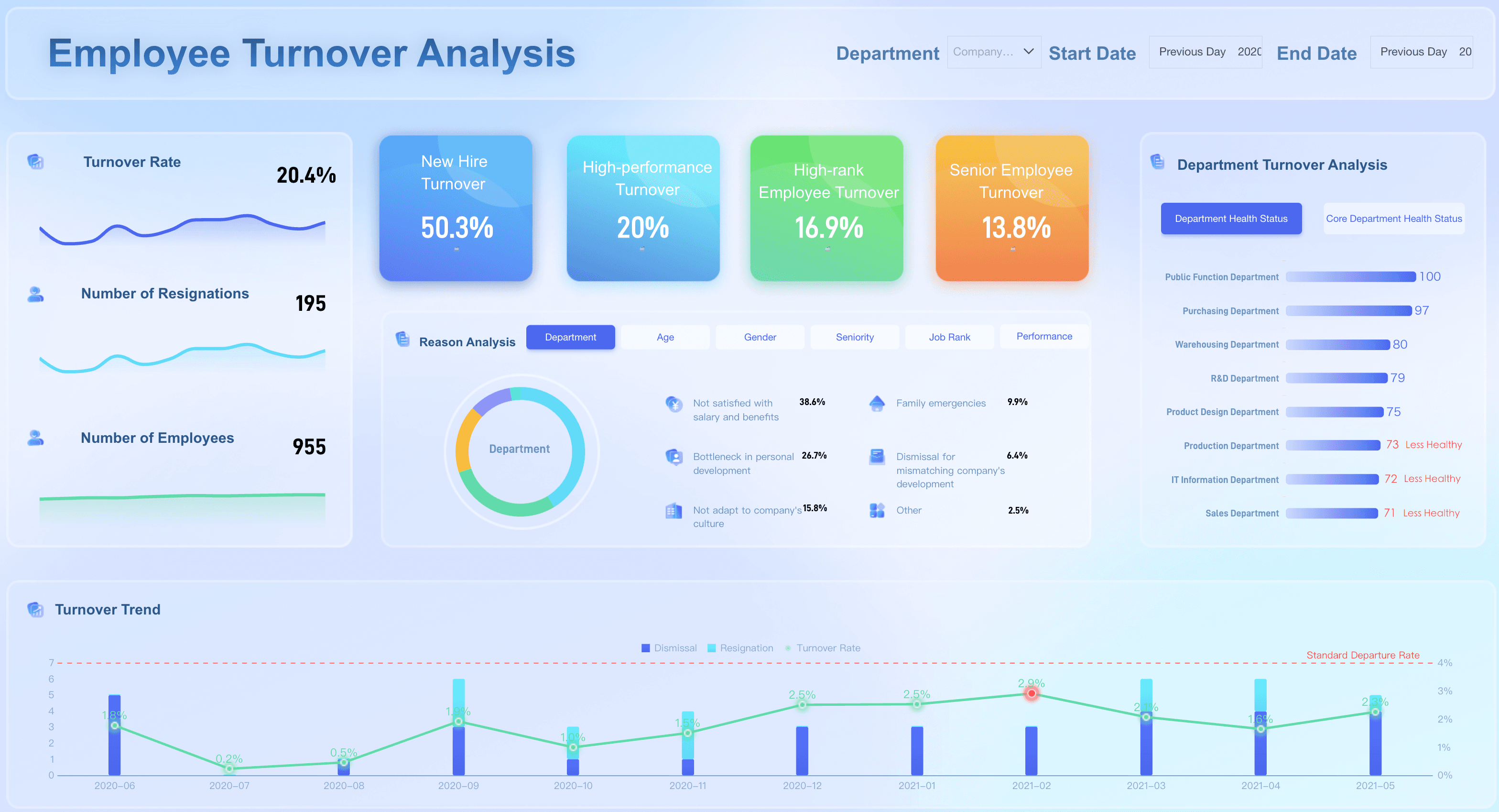
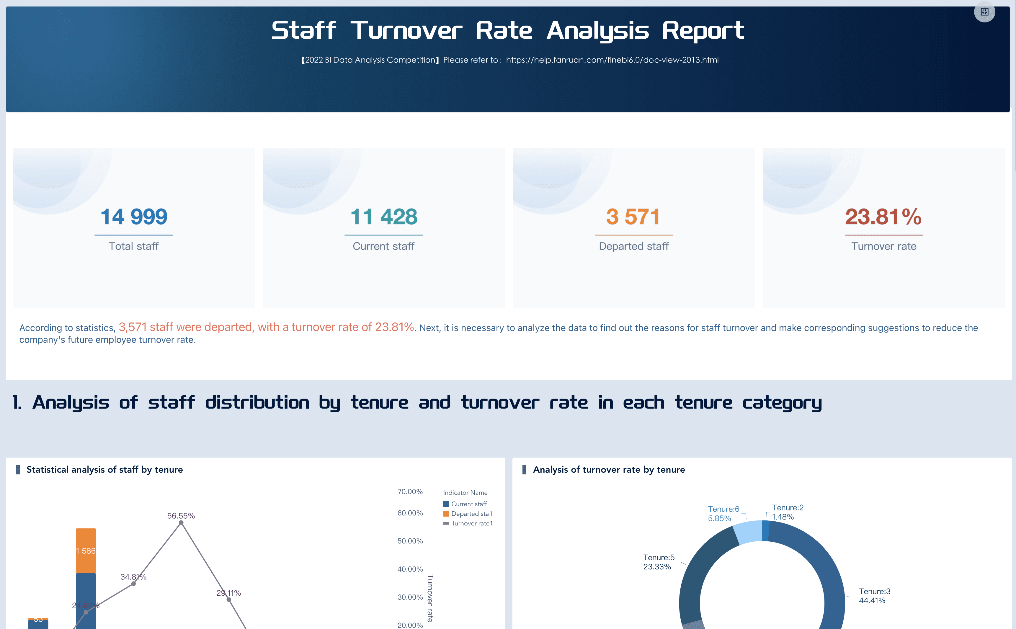
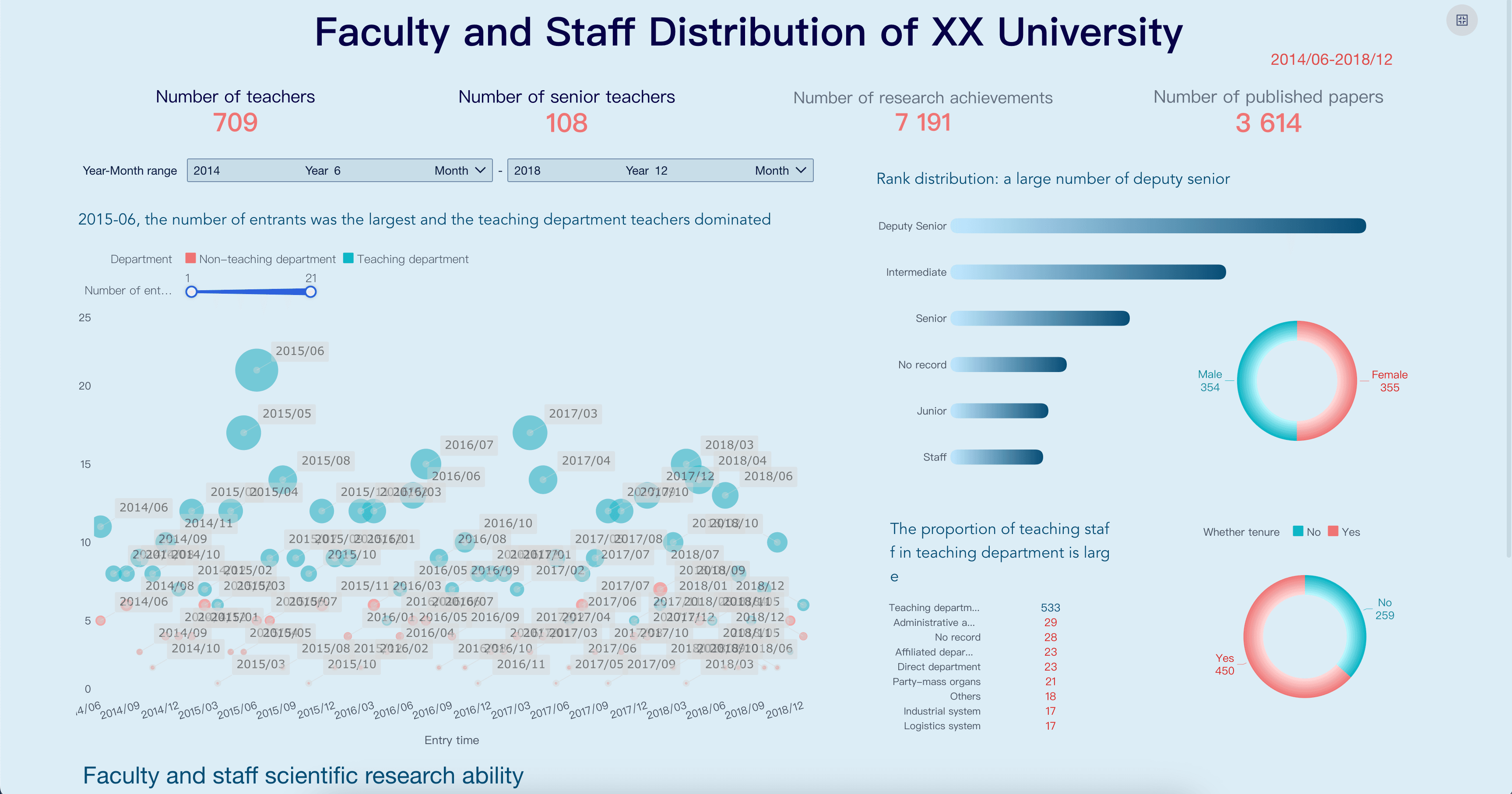
HR KPI Dashboard
HR leaders must track progress related to employee retention, recruitment efficiency, and diversity. Utilizing an hr metrics dashboard or a comprehensive workforce analytics dashboard helps ensure the company is attracting and retaining top talent.
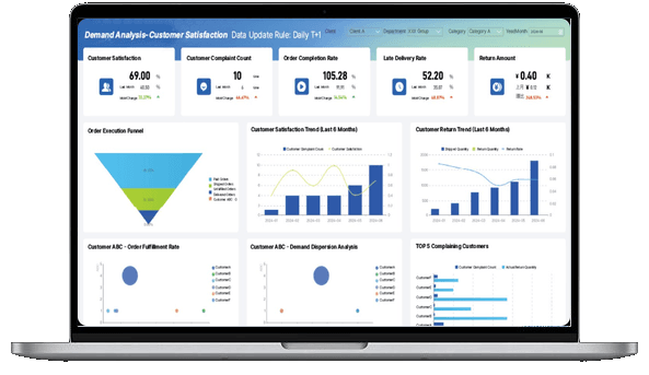
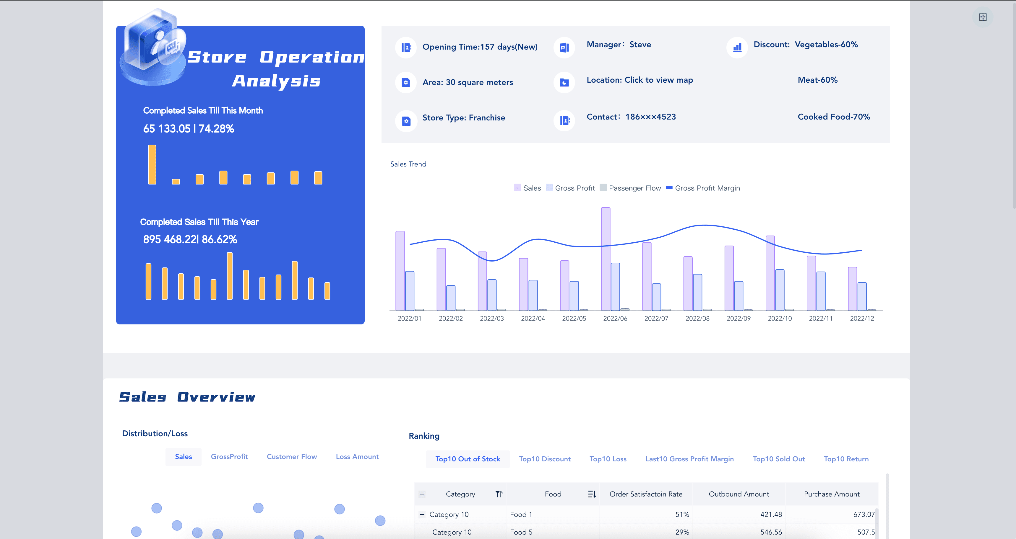
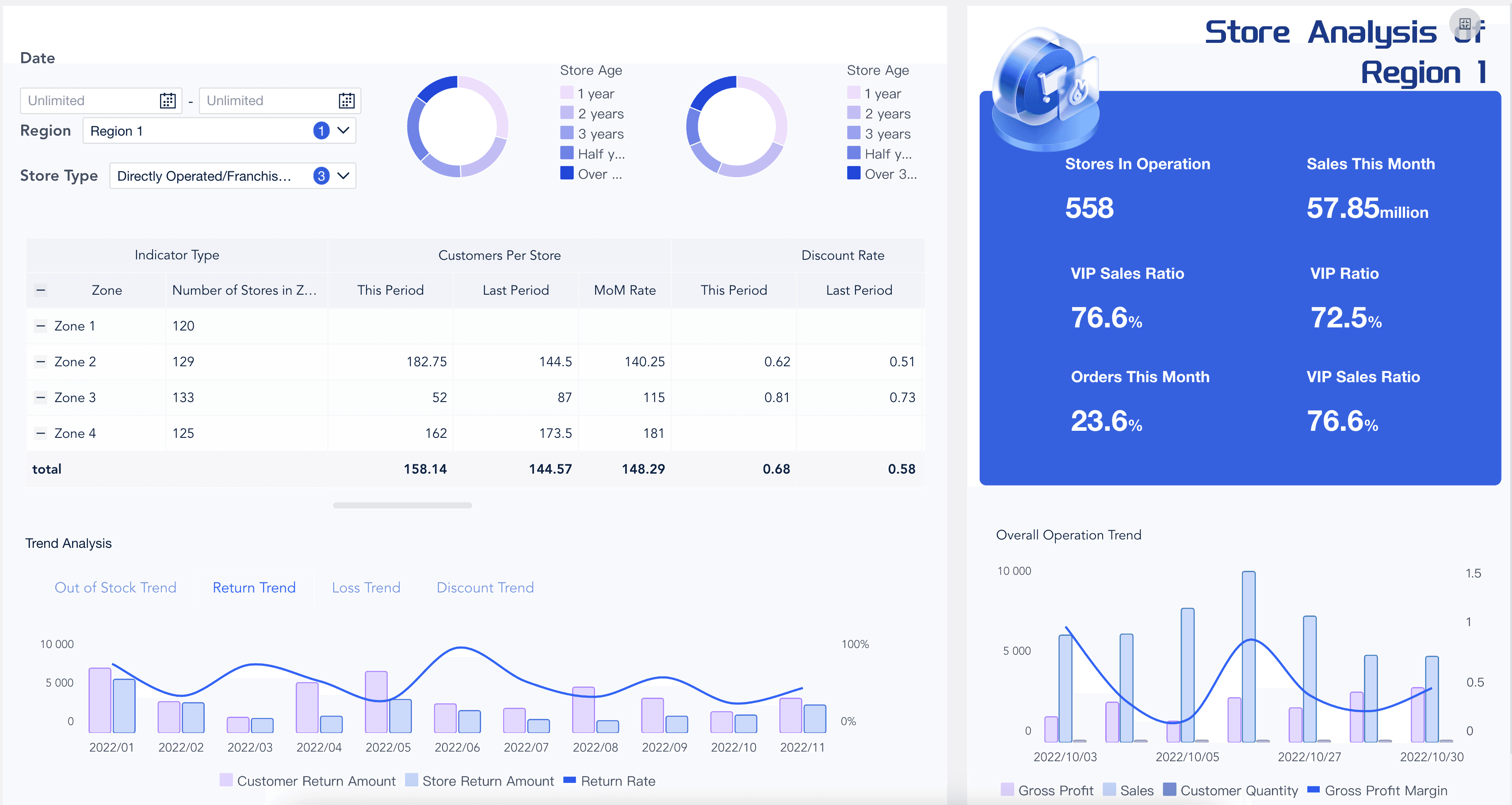
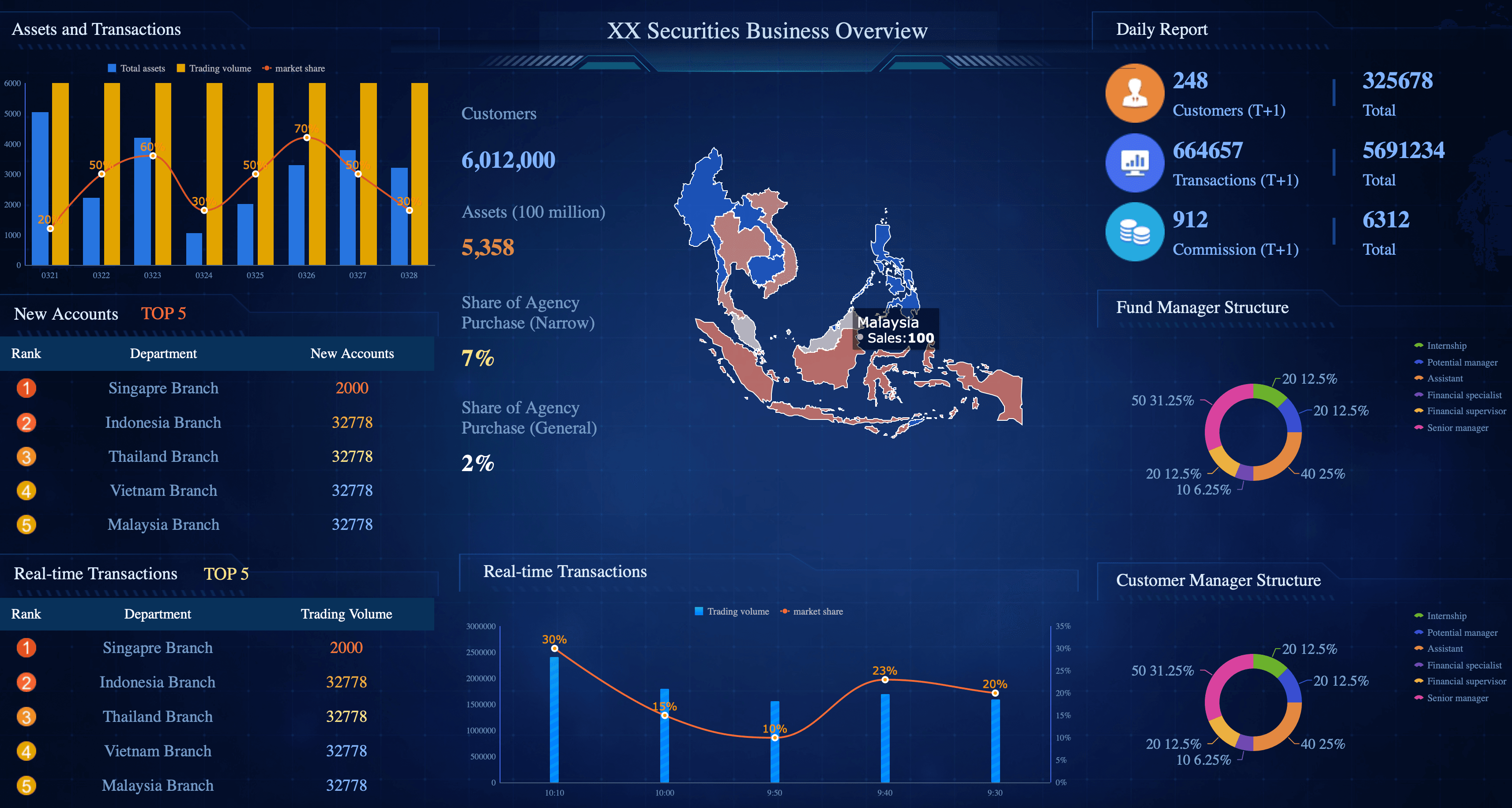
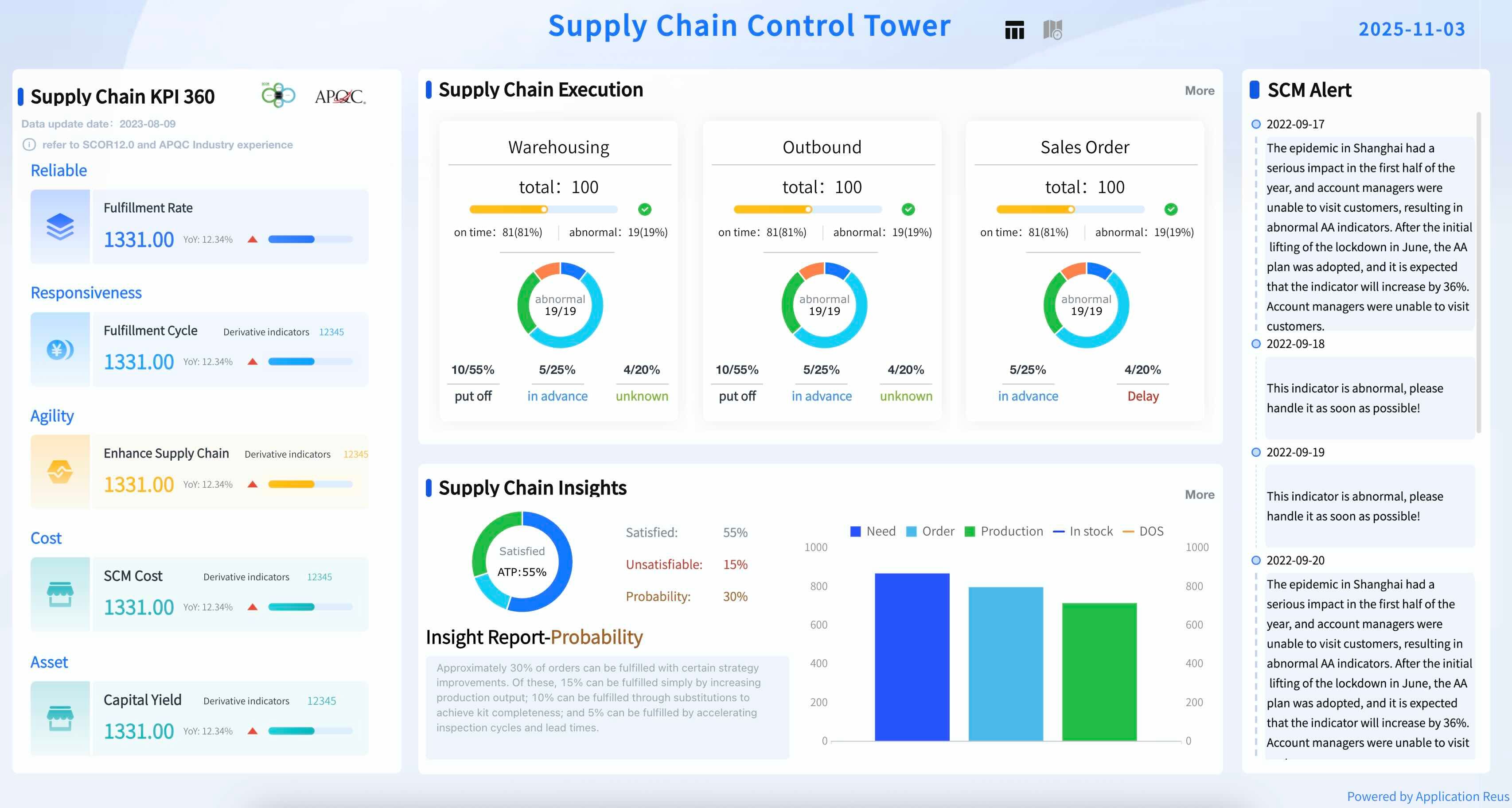
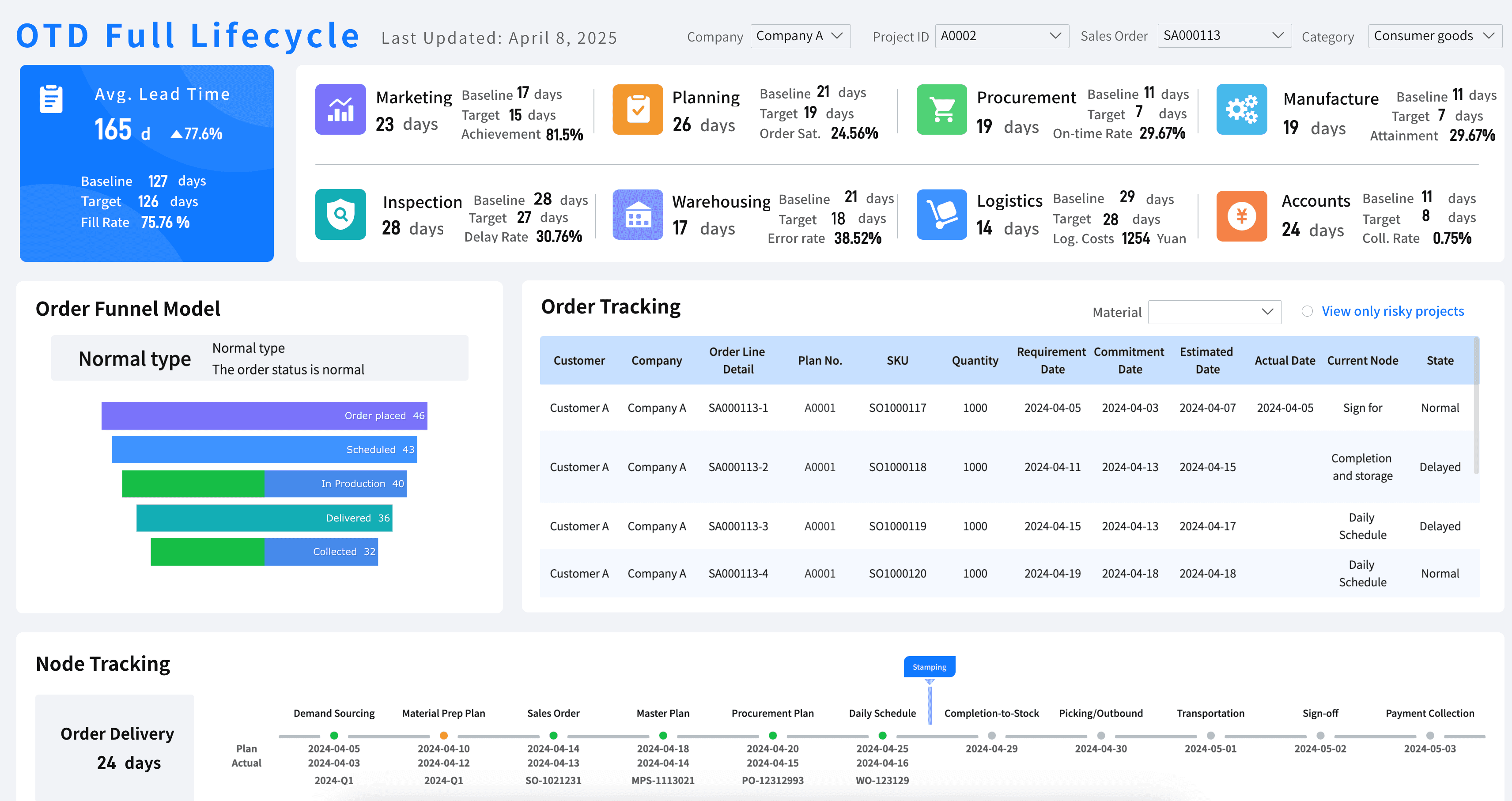
Supply Chain & Operations KPI Dashboard
From logistics tracking to inventory turnover, operations managers rely heavily on data. A dedicated supply chain kpi dashboard or a warehouse metrics dashboard can alert teams to potential bottlenecks before they impact the customer experience.
Rolling Out Your KPI Dashboard: A Simple Checklist
Congrats—you’re ready to create a beautiful KPI dashboard! But before you share your new custom dashboard with your audience:
- Double-check that the KPIs and questions support the story you want to tell.
- Remove anything that creates clutter and doesn’t support your story, ensuring you adhere to strict dashboard design best practices.
- Confirm that your dashboard is consistent with your company design standards for items such as colors, fonts, and graphics.
- Test your visualizations with a few trusted colleagues and incorporate their feedback before rolling out the final dashboard system.
After you share your dashboard:
- Identify what's working and what's not. Take notes so that you can make improvements, and your next reporting dashboard can be even better.
- Observe how your users are using it to ensure your interactive dashboard is driving maximum user adoption and business value.
FAQs
A KPI dashboard is a visual management tool that consolidates and displays an organization's most critical key performance indicators in one centralized interface. It transforms raw data into charts, graphs, and scorecards that allow teams to monitor performance in real time, track progress toward strategic goals, and make faster, data-driven decisions — without digging through spreadsheets or separate reports.
The KPIs you include should directly reflect your business objectives. For example, a sales KPI dashboard might track revenue growth, conversion rate, and average deal size, while an HR KPI dashboard would focus on employee turnover rate, time-to-hire, and engagement scores. A good rule of thumb is to ask: "Would acting on this metric move the needle on a key business goal?" If the answer is no, leave it off the dashboard.
All KPI dashboards are dashboards, but not all dashboards are KPI dashboards. A general dashboard might display any relevant data or operational metrics for monitoring purposes, while a KPI dashboard is specifically built around a defined set of performance indicators tied to strategic targets. KPI dashboards typically include goal benchmarks, trend comparisons, and variance indicators so users can immediately see whether performance is on track, ahead, or falling behind.
It depends on the nature of the KPIs being tracked. Operational KPI dashboards — such as those monitoring daily sales, website traffic, or customer service queues — benefit from real-time or daily data refresh. Strategic KPI dashboards used by executives to track quarterly or annual goals may only need weekly or monthly updates. The key is to align the data refresh frequency with the decision-making cycle of the people using it.
An effective KPI dashboard is focused, actionable, and easy to understand at a glance. It should display a limited number of high-impact metrics rather than overwhelming users with data, use clear and consistent visualizations, and be tailored to the specific audience using it. The best KPI dashboards also include context — such as targets, historical comparisons, or period-over-period changes — so users know not just what the numbers are, but whether they represent good or poor performance.
