

Data storytelling combines data, narrative, and visuals to create meaningful insights. It transforms raw data into stories that are easy to understand and act upon. By 2025, this approach will dominate analytics consumption, with 75% of data stories generated using augmented intelligence and machine learning. You can use it to simplify complex information, making it accessible to broader audiences. Companies like PepsiCo and Target already leverage storytelling to improve decision-making, achieving up to a 20% boost in alignment and outcomes. This method fosters collaboration, identifies trends, and ensures confidence in data-driven strategies.
Key Takeaways
- Data storytelling mixes data, stories, and pictures to explain hard ideas simply.
- By 2025, AI will create 75% of data stories, making them faster and more correct.
- Good data storytelling helps people by showing useful and easy-to-understand insights.
- Companies using data storytelling well will make better choices and share ideas clearly.
What Is Data Storytelling?
Defining Data Storytelling
Data storytelling is the art of transforming raw data into meaningful narratives that resonate with your audience. It combines three essential elements: data, narrative, and visuals. This approach goes beyond presenting numbers or charts. It weaves insights into a story that informs, engages, and inspires action. Unlike traditional reporting, which often focuses on delivering facts, storytelling contextualizes data to make it relatable and actionable.
Many people assume that creating a data visualization automatically tells a story. However, storytelling requires more than visuals. It demands a clear narrative structure and emotional resonance to connect with your audience. By 2025, data storytelling will play a pivotal role in bridging the gap between analysts and decision-makers, ensuring insights are not only understood but also acted upon.
Core Components of Data Storytelling
Data: The foundation of insights
Data serves as the backbone of every story. It provides the evidence you need to support your narrative. However, not all data is equal. You must carefully select and analyze relevant data to uncover meaningful patterns and trends. This ensures your story remains focused and impactful.
Narrative: Crafting a compelling story
A strong narrative transforms data into a journey. It guides your audience through the insights, starting with a clear introduction and ending with a memorable conclusion. A well-crafted narrative answers the "why" behind the data, helping your audience understand its significance. For example, data storytelling examples from companies like Netflix show how narratives can personalize recommendations, enhancing user experiences.
Visuals: Enhancing understanding through design
Visuals make complex information easier to digest. Charts, graphs, and infographics simplify data, making it accessible to a broader audience. Engaging visuals also capture attention and reinforce key points. However, not all visuals are effective. Poorly designed graphics can confuse rather than clarify. Always ensure your visuals align with your narrative and highlight the most critical insights.
How Data Storytelling Differs from Traditional Reporting
Data storytelling and traditional reporting may seem similar, but they serve different purposes. Here’s how they differ:
- Data storytelling uses narratives tailored to your audience, while traditional reporting focuses on presenting raw facts.
- Storytelling engages your audience with a storyline, whereas reporting often lacks context or emotional appeal.
- Reporting typically follows a structured format, while storytelling revolves around insights discovered after analysis.
- Storytelling bridges the gap between data analysts and decision-makers by translating complex analytics into relatable narratives.
By focusing on storytelling, you can transform static reports into dynamic tools that drive decisions and inspire change.
Why Is Data Storytelling Important in 2025?
Simplifying Complex Data for Broader Audiences
Data storytelling helps you break down complex information into digestible pieces. By using relatable scenarios and plain language, you can make data accessible to non-technical audiences. For example:
- Tell real stories that guide your audience through the data.
- Use plain language to explain concepts without technical jargon.
You can also apply techniques like analogies and visual metaphors to simplify data. Consider this table of methods:
| Technique | Description | | --- | --- | | Use Analogies | Relate complex data concepts to everyday experiences or familiar situations. | | Focus on Key Insights | Identify the most important insights from your data and prioritize them. | | Limit Jargon | Minimize the use of technical terms and provide clear explanations in simple language. | | Visualize Simply | Choose visuals that are easy to understand, avoiding clutter and unnecessary complexity. |
By focusing on clarity, you ensure your audience understands the story behind the data, regardless of their technical expertise.
Engaging Stakeholders and Driving Decisions
Data storytelling engages stakeholders by tailoring insights to their needs. Unlike traditional methods that present raw data, storytelling adds context and emotional appeal. This approach bridges the gap between technical teams and decision-makers. For instance, organizations working on refugee employment use storytelling to highlight the human impact of their initiatives. These narratives resonate with stakeholders, fostering understanding and inspiring action.
When you use storytelling, you transform numbers into relatable stories. This makes it easier for stakeholders to connect with the data and make informed decisions. By 2025, this skill will be essential for driving collaboration and achieving alignment across teams.
Turning Insights into Actionable Strategies
Data-driven storytelling turns insights into strategies that deliver results. Many organizations have already seen success with this approach. For example:
- A retail company used customer segmentation data to create a retention campaign, boosting customer lifetime value by 15%.
- A manufacturing firm identified supply chain bottlenecks and switched suppliers, saving $1.2 million annually.
- A nonprofit secured funding by illustrating the ROI of healthcare initiatives, improving access for underserved communities.
These examples show how data stories can lead to measurable outcomes. By framing insights within a narrative, you can inspire action and drive meaningful change. Whether you're addressing operational challenges or exploring new markets, storytelling ensures your data leads to impactful decisions.
The Role of Data Storytelling in a Data-Driven World
In today’s data-driven world, you need more than just numbers to make an impact. Data storytelling bridges the gap between raw data and actionable decisions. It transforms complex information into relatable narratives that inspire action and foster understanding. This skill has become essential for organizations aiming to thrive in a competitive landscape.
Data storytelling is not just a skill — it’s a bridge between data and decisions. By transforming raw information into compelling narratives, organizations can foster clarity, inspire action, and achieve their goals more effectively.
When you use data storytelling, you make it easier for audiences to connect emotionally with the information. This approach simplifies complex data, improving retention and influencing decision-making. For example, a company analyzing customer feedback can use storytelling to highlight trends and propose solutions. This method ensures that insights resonate with stakeholders, leading to better outcomes.
FineVis enhances this method by enabling organizations to visualize their data in a way that resonates with stakeholders across all levels. For example, a semiconductor manufacturing team used FineVis to visualize the performance of their wafer process chambers, including real-time production progress, equipment efficiency, and personnel attendance. By integrating real-time data from different stages of the production cycle, the team improved the overall production rate by 10%. The ability to generate customized, real-time reports allowed managers to share insights quickly with both technical and non-technical stakeholders, ensuring everyone was aligned on production goals and maintenance needs.
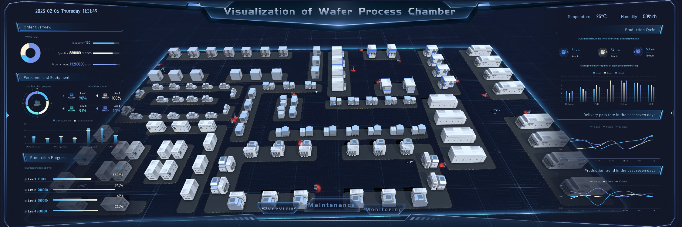
Visualization of Water Process Chamber Dashboard Created By FineVis
To integrate data-driven storytelling effectively, consider these steps:
- Provide data storytelling training to your team to help them understand the language of data.
- Focus on real-world data that addresses actual business challenges.
- Promote a culture of data-driven decision-making across all levels of your organization.
These practices ensure that your team can turn data into stories that drive results. By 2025, data storytelling will play a critical role in helping businesses adapt to the growing demand for data-driven insights. It will empower you to communicate findings clearly, engage stakeholders, and make informed decisions. Whether you’re in healthcare, retail, or education, this skill will help you stay ahead in a data-driven world.
Trends Shaping Data Storytelling in 2025
Augmented Analytics and AI Integration
Augmented analytics and AI are revolutionizing data storytelling. These technologies automate data analysis, making it easier for you to uncover hidden patterns and trends. For example:
- AI and machine learning tools can process vast datasets, revealing relationships that might otherwise go unnoticed.
- Machine learning enables you to predict customer needs, helping you craft data stories that resonate with your audience.
By 2025, Gartner predicts that 75% of data stories will be generated automatically through augmented intelligence. This shift will save time and improve accuracy. Companies like PepsiCo already use AI-driven storytelling to enhance marketing campaigns. They achieved a 10% increase in customer engagement by visualizing customer data effectively. These advancements ensure your storytelling remains relevant and impactful in a fast-paced world.
Personalization of Data Stories
Personalization is becoming a cornerstone of data storytelling. Tailoring your data stories to specific audiences ensures they connect with the insights. To achieve this, you need to:
- Understand your audience’s background and interests.
- Use relatable examples to make the data meaningful.
- Provide context that enhances understanding.
Personalized storytelling helps you address unique challenges and opportunities. For instance, a retail company might use customer purchase data to create targeted campaigns. This approach not only improves customer experience but also drives better business outcomes. By focusing on personalization, you can make your data stories more engaging and actionable.
FineVis enhances this method by enabling organizations to visualize their data in a way that resonates with stakeholders across all levels.For example, in a large business district, FineVis enabled urban planners and district managers to create custom dashboards to monitor foot traffic, transaction volume, and industrial system performance across various districts. By providing personalized insights, such as peak traffic hours and performance trends in different sectors like finance, service, and tourism, FineVis helped optimize the allocation of resources and improve public services. This allowed the district management team to improve operational efficiency, reduce congestion, and enhance the overall business district experience.

Business district visualization Dashboard Created By FineVis
Real-Time Data Integration for Immediate Insights
Real-time data integration is transforming how you create and share insights. Access to up-to-date information allows you to respond quickly to changes. Here are some benefits:
| Benefit | Description | | --- | --- | | Competitive Advantage | Staying ahead of trends and market changes with real-time insights can provide a significant edge over competitors. | | Enhanced Decision Making | Access to up-to-date information allows businesses to make better and faster decisions. | | Increased Efficiency | Real-time data helps teams identify and address issues promptly, reducing downtime and improving operational efficiency. | | Improved Customer Experience | By automating your understanding of customer behavior in real-time, businesses can deliver more personalized and timely responses. |
Real-time storytelling also enhances engagement. By using compelling visuals, you can transform raw data into narratives that are easy to understand. This approach helps you communicate insights effectively, driving better decisions and improving outcomes.
The Rise of Interactive and Immersive Storytelling
Interactive and immersive storytelling is transforming how you experience and engage with data in 2025. This approach combines advanced technologies with creative techniques to make stories more engaging and memorable. By involving your senses and emotions, it creates a deeper connection to the insights being shared.
One of the most exciting developments is the use of 4D animation. In entertainment and film, 4D animation enhances cinema experiences by adding physical effects like wind or vibrations. You feel like you are part of the story, not just watching it. Marketing and branding also use this technology to create immersive advertisements and interactive installations. These experiences capture attention and leave a lasting impression on audiences.
In education and training, 4D content is revolutionizing learning. Medical students, for example, can practice virtual surgeries in a realistic environment. This hands-on approach improves understanding and retention. Gaming and virtual reality take immersion even further. Hyper-realistic environments with sensory feedback make you feel like you are inside the game. These techniques are not just entertaining; they also help you process complex data in a more intuitive way.
Interactive storytelling tools allow you to explore data dynamically. Instead of passively viewing a chart, you can interact with it, zooming in on details or filtering information. This makes data storytelling more engaging and accessible. By 2025, these innovations will redefine how you connect with data, making it easier to understand and act on insights.
Immersive storytelling is not just about technology. It’s about creating meaningful experiences that help you see the story behind the data.
Practical Applications of Data Storytelling
Healthcare: Improving Patient Outcomes with Data
Data storytelling is transforming healthcare by focusing on the human side of data. It helps you connect metrics to real patient experiences, making insights more relatable. For example:
- During the COVID-19 pandemic, data stories provided essential context about patient challenges and healthcare provider struggles.
- By uncovering the reasons behind the numbers, healthcare teams built trust and engaged patients more effectively.
- This approach also supports patient-centered care by highlighting the people behind the data.
When you use storytelling in healthcare, you can improve communication and decision-making. It allows you to identify trends, predict outcomes, and create strategies that enhance patient care. For instance, hospitals can use patient data to track recovery rates and adjust treatment plans. This ensures better outcomes and fosters a deeper understanding of patient needs.
Retail: Enhancing Customer Experiences
In retail, data storytelling helps you understand customer behavior and improve their experiences. By defining the main characters in your data story, such as customers or products, you create narratives that resonate. This makes it easier for your audience to connect with the insights.
Salesforce’s Einstein Analytics is a great example. It transforms raw CRM data into actionable stories, helping companies analyze customer behavior at every stage of their journey. Businesses using this tool have seen a 26% boost in sales productivity and a 17% increase in customer satisfaction.
Retailers also use data stories to predict future demand. For example, a company might analyze past sales trends and seasonal demand to forecast upcoming needs. This helps you plan better, reduce stock issues, and improve customer satisfaction. By turning data into relatable stories, you can create personalized experiences that keep customers engaged.
Supply Chains: Optimizing Operations and Logistics
Data storytelling plays a critical role in optimizing supply chains. It helps you visualize complex logistics and identify areas for improvement. For example:
- By analyzing historical data and market indicators, you can predict future demand and manage inventory more effectively.
- Visualizing past sales trends and seasonal patterns allows you to enhance planning and reduce stock shortages.
- This approach improves operational efficiency and ensures better customer satisfaction.
When you use storytelling in supply chains, you can simplify complex processes and make informed decisions. It enables you to communicate insights clearly, helping teams collaborate and address challenges quickly. This ensures smoother operations and better outcomes for your business.
Education: Enhancing Learning Outcomes
Data storytelling is revolutionizing education by making learning more engaging and effective. You can use this approach to help students grasp complex concepts and retain information more easily. By presenting data in a narrative format, you create a connection between abstract numbers and real-world applications. This method transforms traditional teaching into an interactive and memorable experience.
Teachers now use storytelling techniques to present data in ways that captivate students. For example:
- Educational institutions employ data storytelling to improve learning experiences.
- Teachers craft narratives around data to make lessons more relatable.
- Visuals, such as charts and infographics, illustrate trends and patterns, helping students understand abstract ideas.
- Storytelling simplifies complex topics, making them accessible to learners of all levels.
When you combine visuals with narratives, you create a learning environment that fosters curiosity and engagement. Imagine a history teacher using data to show population growth over centuries. Instead of just numbers, the teacher weaves a story about migration, innovation, and societal changes. This approach not only informs but also inspires students to explore further.
Data storytelling also supports personalized learning. By analyzing student performance data, educators can identify strengths and weaknesses. They can then tailor lessons to meet individual needs, ensuring every student progresses at their own pace. For instance, a math teacher might use data to pinpoint areas where students struggle and adjust their teaching strategies accordingly.
Incorporating storytelling into education bridges the gap between raw data and meaningful insights. It empowers you to create lessons that resonate with students, making learning both effective and enjoyable. By 2025, this approach will play a vital role in shaping the future of education.
How to Apply Data Storytelling Effectively
Understanding Your Audience
Understanding your audience is the first step in effective data storytelling. Tailoring your narrative to their needs ensures your story resonates and addresses their concerns. Start by identifying who will engage with your data. Are they executives, managers, or technical experts? Each group has unique expectations. Executives focus on big-picture insights, while experts may challenge your data. Managers often want to understand the logistics and implications of decisions.
To connect with your audience, consider their perspective. Use relatable examples and avoid unnecessary jargon. For instance, when addressing observers who have no stake in the story, create a compelling narrative to capture their interest. Gatekeepers, on the other hand, need to see how your recommendations minimize risks and maximize gains. By tailoring your approach, you make your data storytelling more relevant and impactful.
Choosing the Right Tools and Platforms
Selecting the right tools is essential for creating engaging data stories. Spreadsheets like Google Sheets or Excel work well for basic analysis and visualization. For more advanced needs, business intelligence platforms such as Tableau or Microsoft Power BI allow you to create interactive dashboards.
FineVis, developed by FanRuan, is another robust business intelligence platform that allows users to create dynamic and interactive dashboards. It provides powerful visualization tools designed for efficient data exploration and analysis, empowering users to tell compelling data stories. With its real-time analytics capabilities and ease of use, FineVis is particularly suited for organizations looking to enhance their data visualization and decision-making processes.
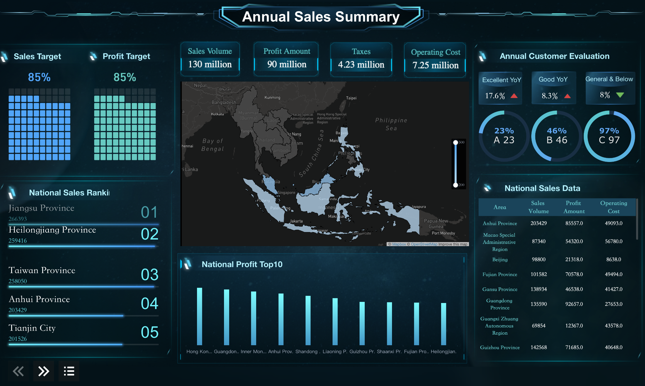
Annual Sales Summary Dashboard Created By FineVis
In 2025, augmented analytics tools will play a significant role. These tools use AI to automate data analysis, saving time and improving accuracy.
FineVis incorporates advanced AI capabilities that enhance its ability to analyze and visualize complex data. By leveraging machine learning, FineVis automatically identifies key insights, helping users create personalized data stories faster. For example, an office building management team used FineVis to monitor real-time occupancy and parking usage, which allowed them to optimize space allocation and reduce congestion. This led to a 15% improvement in space efficiency. Its intuitive interface allows non-technical users to generate sophisticated reports with ease, making it an ideal tool for businesses managing large facilities like office buildings.

Office Building Data Visualition Dashboard Created By FineVis
No- and low-code software also empowers users without programming expertise to craft compelling stories. By leveraging these data storytelling tools, you can streamline your process and produce impactful narratives.
Balancing Data Accuracy with Narrative Simplicity
Balancing accuracy with simplicity is crucial in data storytelling. Focus on the most important insights that support your main message. Simplify your language and visuals to make your story accessible to a broader audience. Provide context to help your audience understand the significance of the data.
Invite feedback to refine your narrative and validate your assumptions. This ensures your story remains accurate while resonating with your audience. By prioritizing clarity and relevance, you can maintain credibility without overwhelming your audience with unnecessary details.
Achieving this balance allows you to create stories that are both truthful and engaging, ensuring your data drives meaningful action.
Measuring the Impact of Your Data Stories
Measuring the impact of your data stories ensures they achieve their intended goals. You can evaluate their success by analyzing both qualitative and quantitative metrics. This approach helps you understand how well your audience connects with the story and whether it drives meaningful action.
Start by focusing on key metrics that reflect the effectiveness of your storytelling. These include reach, engagement, conversion, and satisfaction. Each metric provides unique insights into how your audience interacts with your data story:
| Metric | Description | | --- | --- | | Reach | Measures how many people saw your data story. | | Engagement | Assesses how people interacted with the data story. | | Conversion | Evaluates how many people took the desired action after viewing the story. | | Satisfaction | Gauges how satisfied or dissatisfied the audience was with the story. |
You can also use qualitative feedback to assess the emotional and intellectual impact of your story. Ask your audience for their thoughts. Did they find the story clear and engaging? Did it inspire them to take action? Combining this feedback with quantitative data gives you a complete picture of your story’s success.
Simplifying complex information into digestible points builds trust with your audience. When your story fosters credibility, it becomes easier to derive actionable strategies. For example, if your data story highlights inefficiencies in a process, you can use the insights to propose solutions.
By tracking these metrics, you ensure your data storytelling efforts remain impactful. Regular evaluation helps you refine your approach, making future stories even more effective. This process not only improves your storytelling skills but also strengthens your ability to drive results.
Data storytelling transforms raw data into engaging narratives that simplify complex information. By 2025, it will dominate analytics consumption, driven by trends like AI-powered automation and real-time data integration. Effective storytelling enhances decision-making by making insights accessible and actionable for all stakeholders. Organizations that excel in this skill will gain a competitive edge, as visuals and narratives improve comprehension and foster collaboration.
To stay ahead, you must embrace data storytelling. It empowers you to identify trends, inspire confidence in decisions, and align teams toward shared goals. This approach ensures your data drives meaningful outcomes in an increasingly data-driven world.
FAQ
Data visualization focuses on presenting data through charts or graphs. Data storytelling combines visuals, narratives, and insights to create a meaningful story. It explains the "why" behind the data, helping you connect emotionally and make informed decisions.
Begin by understanding your audience and their needs. Practice analyzing data to find key insights. Use tools like Tableau or Power BI to create visuals. Focus on crafting clear narratives that explain the data's significance. Online courses and tutorials can also help.
Data storytelling simplifies complex information, making it accessible to everyone. It helps you communicate insights effectively, engage stakeholders, and drive decisions. Businesses use it to identify trends, solve problems, and align teams toward shared goals.
For beginners, tools like Google Sheets or Excel work well. Advanced users can explore Tableau, Power BI, or Python for interactive visuals. AI-powered platforms like Qlik Sense automate analysis, making storytelling faster and more accurate.
Track metrics like audience engagement, reach, and conversions. Use feedback to understand if your story resonates. Evaluate whether it inspires action or drives decisions. Combining qualitative and quantitative data ensures you refine your storytelling approach effectively.

Continue Reading About Data Storytelling
Augmented Analytics: Unlock the Core Concepts & Benefits!
Discover augmented analytics—where AI and ML automate data prep and insights, revolutionizing decision-making for smarter, faster business strategies!
Lewis
Mar 04, 2025
Dynamic Dashboard: A Game Changer for Data Analysis
Dynamic dashboard revolutionize data analysis with real-time insights, customization, and improved decision-making. Explore their impact and future trends.
Lewis
Oct 11, 2024
How to Design an Effective Data Pipeline Diagram
Design a data pipeline diagram to streamline data flows, reduce errors, and enhance decision-making with tools like FineDataLink and FineBI.
Howard
Nov 11, 2024
How to Create a Dynamic Chart in Excel Using Named Ranges
Create a dynamic chart in Excel that updates automatically using named ranges and formulas. Learn step-by-step methods for accurate, flexible visualizations.
Lewis
Mar 11, 2025
Explore the Best Data Visualization Projects of 2025
Discover 2025's top data visualization projects that transform data into insights, enhancing decision-making across industries with innovative tools.
Lewis
Nov 25, 2024
How to Design an Interactive Dashboard in Excel
Learn how to create a dashboard in Excel step-by-step. From planning and data preparation to adding visuals and interactivity, build a professional dashboard.
Lewis
Jan 14, 2025

