A dynamic chart adjusts automatically as your data changes, making it a powerful tool for visualizing trends and patterns. Using named ranges simplifies this process by creating flexible references that update as you add or remove data. This approach saves time and ensures accuracy. Studies show that dynamic graphs can reduce report creation time by up to 40%, while 73% of Excel users report better data comprehension when using them. This tutorial will guide you through creating dynamic charts, helping you visualize data effectively.
All dynamic charts in this article are created with the self-service analytics tool FineBI. Click the button below to try FineBI for free and start your self-service analytics journey!
A dynamic chart is a type of graph that updates automatically when you add, remove, or modify data in your worksheet. Unlike static charts, which require manual adjustments, dynamic charts adapt to changes in your dataset. This feature makes them ideal for tracking trends, analyzing performance, or presenting evolving data over time. For example, if you’re monitoring monthly sales, a dynamic chart will automatically include new months as you add them to your data table.
Dynamic charts save you time and effort. They eliminate the need to recreate or adjust charts whenever your data changes. This automation ensures your visualizations remain accurate and up-to-date, making them a powerful tool for data analysis.
Key advantages of dynamic chart in Excel
Dynamic charts offer several benefits that enhance your data visualization experience:
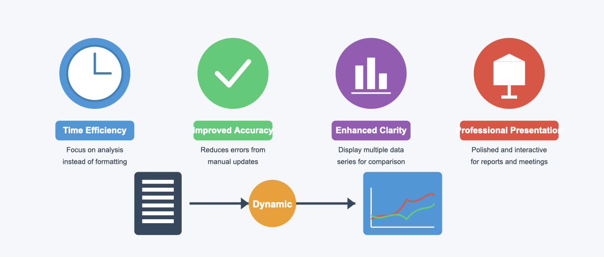
Time Efficiency: You don’t need to manually update your chart every time your data changes. This automation allows you to focus on analysis rather than formatting.
Improved Accuracy: Dynamic charts reduce the risk of errors caused by manual updates. They ensure your chart always reflects the latest data.
Enhanced Clarity: These charts can display multiple data series on a single graph, making it easier to compare trends or categories.
Professional Presentation: Dynamic charts provide a polished and interactive way to present data, which is especially useful in reports or meetings.
By using dynamic charts, you can streamline your workflow and create more effective visualizations.
How named ranges enhance dynamic chart functionality
Named ranges play a crucial role in making dynamic charts more functional and accurate. They allow you to define flexible references for your data, which automatically adjust as your dataset grows or shrinks. Here’s how they enhance your charts:
The OFFSET formula helps create dynamic chart ranges. It ensures your chart updates automatically when you add new rows or columns to your data.
Including the worksheet name followed by an exclamation mark when defining a named range ensures proper referencing. This step is essential for linking your chart to the correct data source.
Adding a secondary axis to your chart allows you to display multiple data series effectively. This feature improves clarity, especially when comparing datasets with different scales.
Using named ranges simplifies the process of managing dynamic charts. It ensures your visualizations remain accurate and adaptable, even as your data evolves.
Tip: When defining named ranges, choose descriptive names that reflect the data they represent. This practice makes it easier to manage and update your charts.
Step-by-Step Guide to Create a Dynamic Chart
Using Excel tables for dynamic chart
Using a table is one of the simplest ways to create a dynamic chart in Excel. Tables automatically adjust their size when you add or remove data, ensuring your chart stays updated without manual intervention. This feature makes tables an excellent choice for managing dynamic data.
Here’s why using a table is effective for dynamic charts:
Feature
Description
Automatic Updates
Tables expand or contract with new data entries, ensuring linked charts reflect changes.
Time Efficiency
Eliminates manual adjustments, saving time and effort in data management.
Accuracy and Organization
Keeps work accurate and organized as data changes, enhancing the reliability of visualizations.
To create a dynamic chart using a table, follow these steps:
Select your source data and press Ctrl + T to convert it into a table.
Insert a chart based on the table. Excel will automatically update the chart as you modify the table.
This method is ideal for beginners and ensures your visualizations remain accurate and up-to-date.
Creating a dynamic chart range with named ranges
Overview of the OFFSET function
The OFFSET function is a powerful tool for creating a dynamic chart range. It allows you to define a range that adjusts automatically as your source data changes. For example, if you add new rows to your dataset, the OFFSET function ensures your chart includes the new data.
Here’s how to use OFFSET to define a dynamic range:
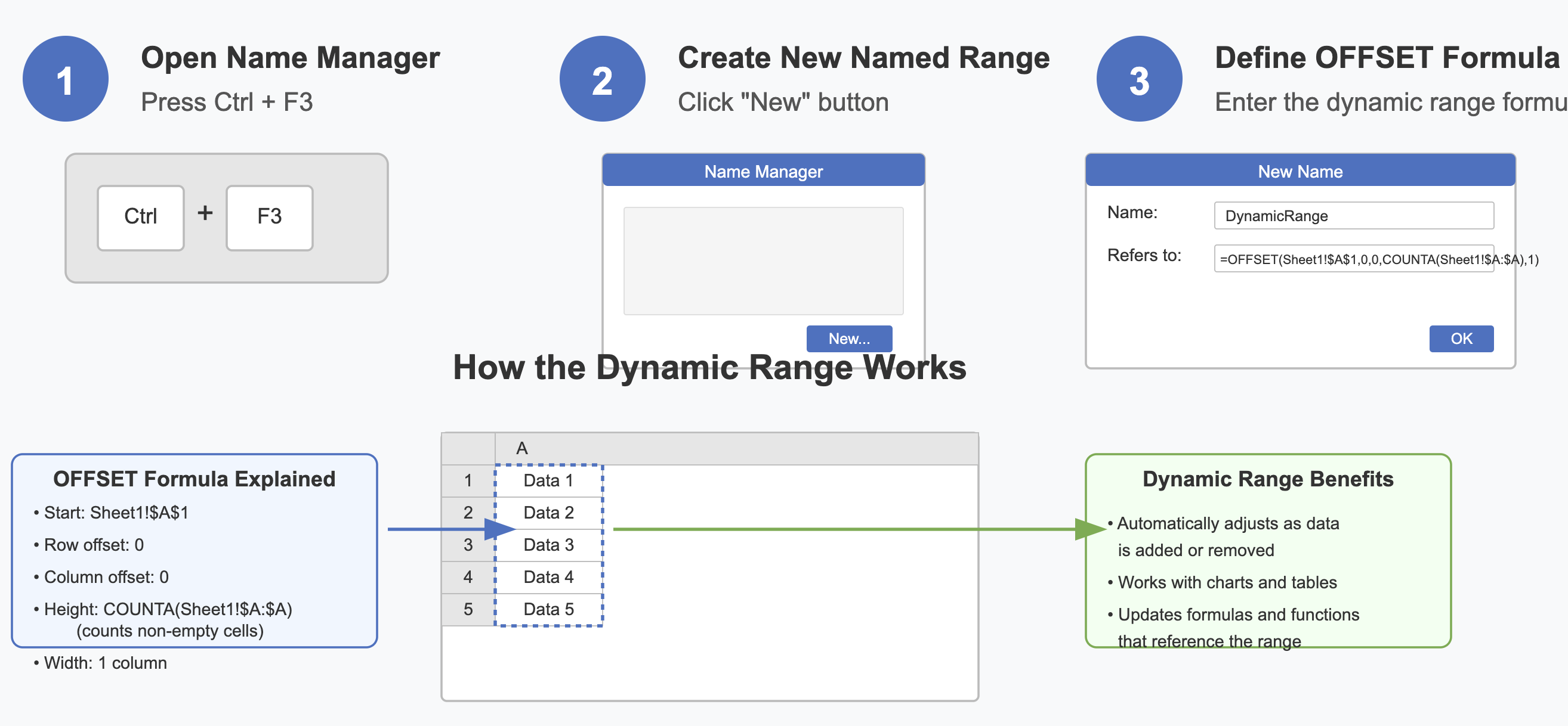
Open the Name Manager in Excel (Ctrl + F3) and create a new named range.
Use the formula =OFFSET(Sheet1!$A$1,0,0,COUNTA(Sheet1!$A:$A),1) to define the range.
This formula starts at cell A1 and adjusts the range based on the number of non-empty cells in column A.
Tip: Use descriptive names for your ranges, such as "SalesData" or "MonthlyTrends," to make them easier to manage.
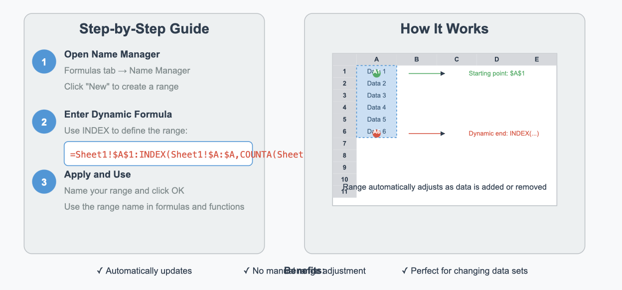
Using the INDEX function for dynamic ranges
The INDEX function offers another way to create a dynamic chart range. It is particularly useful when working with large datasets or when OFFSET becomes too complex. Unlike OFFSET, INDEX does not rely on volatile calculations, making it more efficient.
To define a dynamic range with INDEX:
Open the Name Manager and create a new named range.
Use a formula like =Sheet1!$A$1:INDEX(Sheet1!$A:$A,COUNTA(Sheet1!$A:$A)).
This formula creates a range from A1 to the last non-empty cell in column A.
Both OFFSET and INDEX are excellent tools for creating dynamic ranges. Choose the one that best suits your dataset and Excel version.
Comparing Excel tables and named ranges for dynamic chart
When deciding between using a table or named ranges for dynamic charts, consider the following:
Statistic
Description
70%
Nearly 70% of professionals rely on spreadsheets for decision-making.
Time Savings
Dynamic tables significantly reduce the time spent on manual adjustments.
Tables simplify data management with built-in features like auto-update.
Named ranges offer greater flexibility for complex datasets.
Tables provide enhanced visualization options, while named ranges excel in customization.
Both methods have their strengths. If you’re new to Excel, start with tables. For advanced users, named ranges offer more control over your dynamic chart range.
How to Define Named Ranges for Dynamic Chart
Step-by-step instructions for creating named ranges
Using the Name Manager in Excel
Defining dynamic named ranges in Excel begins with the Name Manager. This tool allows you to create and manage named ranges that update automatically as your data changes. Follow these steps to get started:
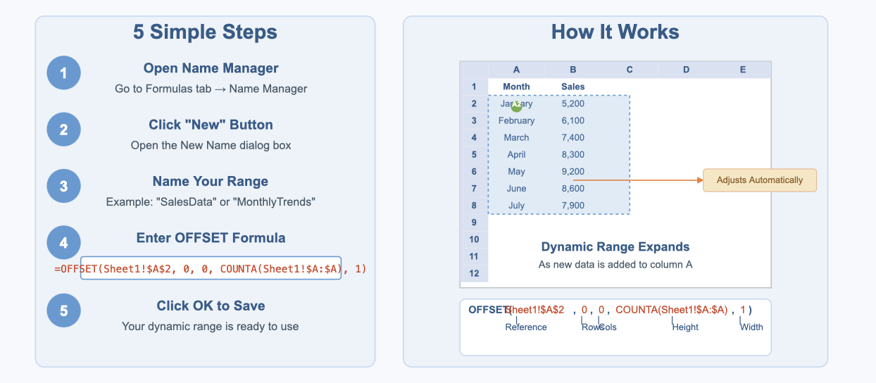
Open Excel and navigate to the Formulas tab. Click on Name Manager.
In the Name Manager window, click the New... button.
Enter a descriptive name for your dynamic named range, such as "SalesData" or "MonthlyTrends."
In the Refers to: field, insert a formula using the OFFSET function. For example:
This formula creates a dynamic range starting at cell A2 and adjusts its height based on the number of non-empty cells in column A.
Click OK to save your named range.
Using the Name Manager simplifies the process of creating dynamic named ranges, ensuring your charts remain accurate and up-to-date.
Tips for naming ranges effectively
When naming your ranges, choose names that clearly describe the data they represent. This practice makes it easier to manage and update your dynamic named ranges. Here are some tips:
Use short, meaningful names like "Revenue2023" or "ProductSales."
Avoid spaces in names. Instead, use underscores (e.g., "Quarterly_Sales").
Keep names consistent across your workbook to maintain clarity.
Tip: Descriptive names not only improve organization but also make it easier to troubleshoot issues in your dynamic chart range.
Formulas for dynamic chart ranges
OFFSET formula for dynamic ranges
The OFFSET function is a versatile tool for creating dynamic named ranges. It defines a range that adjusts automatically as your data changes. Here's how it works:
Syntax:
=OFFSET(reference, rows, cols, [height], [width])
reference: The starting point of your range (e.g., $A$2).
rows and cols: The number of rows and columns to offset from the reference point.
[height] and [width]: The size of the range.
For example, the formula =OFFSET(Sheet1!$A$2, 0, 0, COUNTA(Sheet1!$A:$A), 1) creates a dynamic range that expands as new rows are added to column A.
MATCH and INDEX formulas for dynamic ranges
The MATCH and INDEX functions offer an alternative to OFFSET for creating dynamic named ranges. These functions are less volatile, making them more efficient for large datasets.
MATCH: Finds the position of a value in a range.
INDEX: Returns the value of a cell based on its row and column numbers.
To create a dynamic range using MATCH and INDEX:
Use MATCH to find the last non-empty cell in your dataset.
In the Select Data Source dialog box, click Edit under the "Legend Entries (Series)" section.
Replace the current range with your named range. For example, type =Sheet1!SalesData in the Series Values box.
Repeat this step for the horizontal axis labels, linking them to the "Months" named range.
Your chart is now connected to dynamic chart ranges. It will automatically update as you add or remove data from your worksheet.
Troubleshooting common issues with dynamic chart
While linking named ranges, you might encounter some challenges. Here are solutions to common issues:
Error in the OFFSET formula: Double-check the syntax and ensure the reference cells match your dataset. For instance, if your data starts in row 2, adjust the formula accordingly.
Chart not updating: Verify that the named ranges are correctly linked to the chart. Use the Name Manager to confirm the ranges are dynamic.
Incorrect data display: Ensure your data is clean and free of blank cells or errors. Blank cells can disrupt the COUNTA function, leading to incorrect ranges.
Tip: Use descriptive names for your named ranges to make troubleshooting easier. For example, "SalesData" is more intuitive than "Range1."
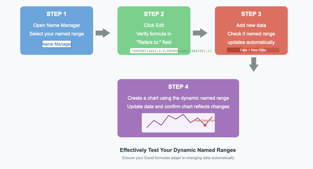
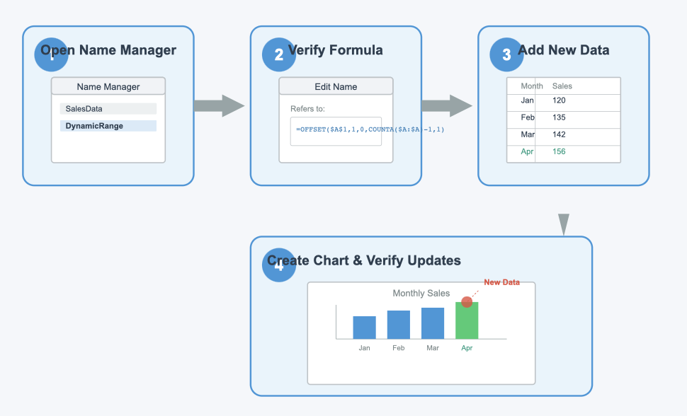
Testing the dynamic functionality of the chart
After linking your chart to dynamic ranges, test its functionality to ensure it works as expected:
Add new rows of data to your worksheet. For example, if your dataset tracks monthly sales, add a new month and its corresponding value.
Check if the chart updates automatically to include the new data.
Remove a row from your dataset and verify that the chart adjusts accordingly.
Modify existing data points to confirm that the chart reflects the changes.
Testing ensures your dynamic chart updates accurately and remains reliable for data visualization. By following these steps, you can confidently create a chart that adapts to your changing source data.
Practical Examples of Creating a Dynamic Chart in Excel
Example 1: Sales trends over time
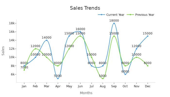
Dynamic charts are particularly effective for visualizing sales trends. They allow you to track changes over time and compare performance across different periods. For instance, consider the following sales data for the current and previous years:
Months
Current Year
Previous Year
Jan
8000
7000
Feb
10000
12000
Mar
14000
10000
Apr
5000
8000
May
15000
12000
Jun
16000
15000
Jul
8000
10000
Aug
8000
5000
Sep
18000
15000
Oct
6000
8000
Nov
12000
10000
Dec
15000
8000
Using this data, you can create a line chart to visualize monthly sales trends. Dynamic charts automatically update when you add new months or adjust existing values. This feature saves time and ensures accuracy. Below is an example of how the chart might look:
Dynamic charts streamline reporting processes, especially for weekly or monthly updates. They are ideal for sales forecasts and help you identify patterns or anomalies in your data.
Example 2: Comparing product categories dynamically
Dynamic charts also excel at comparing product categories. For example, you can analyze sales performance across different product lines. This approach highlights which categories perform well and which need improvement. Studies show that dynamic charts reduce report creation time by up to 40%, with 73% of users reporting improved data comprehension.
To illustrate, imagine you manage three product categories: Electronics, Furniture, and Clothing. A dynamic chart can display their sales trends side by side. You can use a stacked bar chart or a dual-axis chart to compare their performance effectively. These visualizations make it easier to spot trends and make informed decisions.
Example 3: Tracking performance metrics with dynamic chart
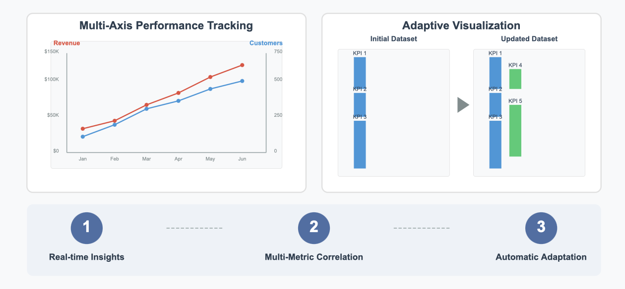
Dynamic charts are invaluable for tracking performance metrics. Whether you monitor employee productivity, project timelines, or financial KPIs, these charts provide real-time insights. For instance, you can use a multi-axis line chart to track revenue growth alongside customer acquisition rates. This dual perspective helps you understand how different metrics influence each other.
Dynamic charts also adapt to changing datasets. If you add new metrics or update existing ones, the chart adjusts automatically. This flexibility ensures your visualizations remain relevant and actionable.
Tip: Use descriptive labels and consistent formatting to make your dynamic charts more intuitive. Clear visuals enhance understanding and improve decision-making.
Dynamic charts are a powerful tool for analyzing trends, comparing categories, and tracking metrics. By incorporating them into your Excel workflows, you can save time, improve accuracy, and gain deeper insights into your data.
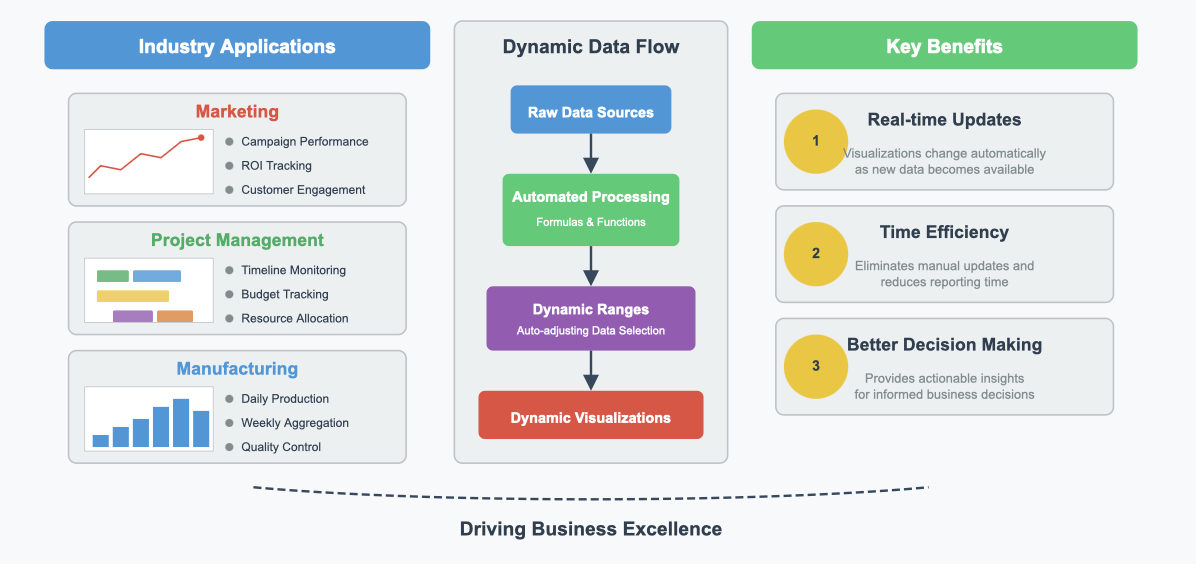
Real-world applications of dynamic chart in Excel
Dynamic charts in Excel are not just tools for visualizing data; they are solutions to real-world challenges. You can use them in various scenarios to simplify complex tasks and make informed decisions. Let’s explore some practical applications where dynamic charts can transform your workflow.
1. Business Performance Tracking
Dynamic charts are essential for monitoring business performance. Imagine you manage a sales team and need to track monthly revenue. A dynamic chart can automatically update as you input new sales data. This feature ensures you always have the latest insights at your fingertips. You can also compare performance across regions or products, helping you identify trends and make strategic decisions.
Tip: Use a combination of line and bar charts to visualize revenue trends and category comparisons simultaneously.
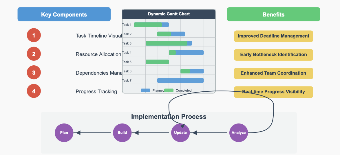
2. Project Management
In project management, keeping track of timelines and progress is crucial. Dynamic Gantt charts in Excel allow you to visualize project schedules. As tasks are completed or deadlines shift, the chart updates automatically. This flexibility helps you stay organized and ensures your team meets its goals.
For example, you can create a dynamic chart to display task completion rates. This chart can highlight delays or bottlenecks, enabling you to take corrective action quickly.
3. Financial Analysis
Dynamic charts are invaluable for financial analysts. You can use them to track expenses, revenue, and profit margins over time. For instance, a dynamic pie chart can show how your budget is allocated across departments. As you adjust spending, the chart reflects the changes instantly.
Note: Dynamic charts make it easier to present financial data to stakeholders, ensuring clarity and transparency.
4. Educational Data Visualization
Teachers and educators can use dynamic charts to analyze student performance. For example, you can create a chart to track test scores across subjects. As new scores are added, the chart updates automatically. This feature helps you identify areas where students excel or need improvement.
5. Inventory Management
Dynamic charts simplify inventory tracking. You can monitor stock levels and identify trends in product demand. For instance, a dynamic bar chart can display the quantity of items in stock. As inventory changes, the chart updates, helping you avoid overstocking or shortages.
Emoji Insight: Dynamic charts turn raw data into actionable insights, making them a must-have tool for professionals and educators alike.
Dynamic charts in Excel offer practical solutions for a wide range of real-world challenges. Whether you’re managing a business, analyzing finances, or teaching a class, these charts provide clarity and efficiency. Start using them today to unlock the full potential of your data.
Best Practices for Creating Dynamic Chart in Excel
Organizing data for dynamic chart ranges
Organizing your data effectively is the foundation of creating dynamic charts in Excel. Start by structuring your dataset in a clean and logical format. Ensure each column has a clear header, and avoid leaving blank rows or columns. This organization helps Excel recognize patterns and makes it easier to define named ranges.
Dynamic graphs are widely used across industries. Marketing teams use them to track campaign performance, while project managers rely on them to monitor timelines and budgets. For example, an organization that generates daily production data can use formulas to group days into weeks. This setup allows dynamic ranges to create weekly charts that adjust automatically as new data is added.
Dynamic table ranges in Excel are particularly useful. They expand or contract as you add or remove entries, ensuring your charts always reflect the latest data. Studies show that dynamic graphs can reduce report creation time by up to 40%, with 73% of users reporting improved data comprehension.
Tip: Use Excel tables for datasets that frequently change. They simplify data management and ensure your charts remain accurate.
Choosing the right chart type for your data
Selecting the appropriate chart type is crucial for effective data visualization. Different charts highlight specific aspects of your data, so choose one that aligns with your goals. For example, use a bar chart to compare quantities across categories or a line chart to show trends over time.
Choosing the right chart maximizes the impact of your presentation. Misusing chart types, however, can make your data harder to understand. For instance, a pie chart with too many categories becomes cluttered and ineffective.
Note: Always match your chart type to the story you want your data to tell. This approach ensures clarity and engagement.
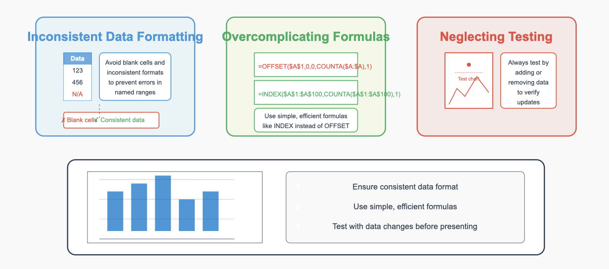
Avoiding common mistakes when creating dynamic chart
Mistakes can undermine the effectiveness of your dynamic charts. Avoid these common pitfalls to ensure your charts work as intended:
Inconsistent Data Formatting: Ensure your dataset is free of blank cells or mismatched formats. Inconsistent data can disrupt named ranges and lead to errors.
Overcomplicating Formulas: Use simple and efficient formulas like INDEX instead of volatile ones like OFFSET for large datasets.
Neglecting Testing: Always test your dynamic chart by adding or removing data. Verify that the chart updates correctly to avoid surprises during presentations.
Dynamic charts are powerful tools, but they require careful setup. By avoiding these mistakes, you can create charts that are both accurate and visually appealing.
Tip: Well-organized data and thoughtful chart selection lead to impactful visualizations.
Maintaining and updating dynamic chart effectively
Maintaining your dynamic charts ensures they remain accurate and functional as your data evolves. Regular updates and proper management prevent errors and keep your visualizations reliable. Follow these tips to maintain and update your charts effectively.
1. Keep your data clean and error-free
Clean data is the foundation of accurate charts. Errors like typos, blank cells, or inconsistent formatting can disrupt dynamic ranges and lead to incorrect visualizations. Always review your dataset before updating your chart. For example, ensure all columns have consistent headers and avoid leaving unnecessary gaps in your data.
Tip: Use Excel’s built-in tools like Data Validation to prevent incorrect entries and maintain data integrity.
2. Use dynamic named ranges and tables
Dynamic named ranges and tables simplify chart updates. These features automatically adjust to include new data, reducing manual effort. For instance, if you add a new row to your dataset, your chart will update instantly without requiring additional adjustments. This technique is especially useful for recurring reports or datasets that grow frequently.
Maintenance Tip
Description
Use Dynamic Named Ranges and Tables
Automates chart updates with new data, reducing manual effort in recurring reports.
Keep Data Clean and Error-Free
Ensures data is free of typos and inconsistencies, enhancing chart accuracy and reliability.
3. Test your chart regularly
Testing ensures your chart functions as expected. Add new data to your worksheet and verify that the chart updates automatically. Remove or modify existing data to confirm the chart adjusts correctly. This practice helps you identify and fix issues early, avoiding problems during presentations or reports.
4. Document your chart setup
Documenting your chart setup makes future updates easier. Include details like the formulas used for named ranges, the data source location, and the chart type. This information helps you or your team troubleshoot and update the chart efficiently.
Note: Save a backup of your workbook before making significant changes. This precaution protects your work from accidental errors.
5. Update chart formatting as needed
As your data changes, your chart’s formatting may need adjustments. For example, if your dataset grows significantly, you might need to resize the chart or update axis labels for better readability. Regularly review your chart’s appearance to ensure it remains clear and professional.
By following these tips, you can maintain dynamic charts that are accurate, reliable, and easy to update. Proper maintenance not only saves time but also ensures your visualizations effectively communicate your data insights.
How FanRuan Products Enhance Dynamic Chart Creation
Using FineBI for advanced dynamic charting
FineBI simplifies the process of creating advanced dynamic charts by offering a user-friendly interface and powerful features. You can connect to multiple data sources, such as relational databases or Excel files, and visualize your data effortlessly. FineBI’s drag-and-drop functionality allows you to build dynamic charts without needing coding skills. This feature makes it accessible even if you are new to data visualization.
One standout feature of FineBI is its ability to handle real-time data updates. For example, if you are tracking sales performance, FineBI ensures your chart reflects the latest figures as soon as the data changes. Additionally, its OLAP (Online Analytical Processing) capabilities let you drill down into specific data points. This helps you uncover deeper insights and make informed decisions.
Tip: Use FineBI’s alert system to receive notifications when key metrics in your chart exceed predefined thresholds. This ensures you stay updated on critical changes.
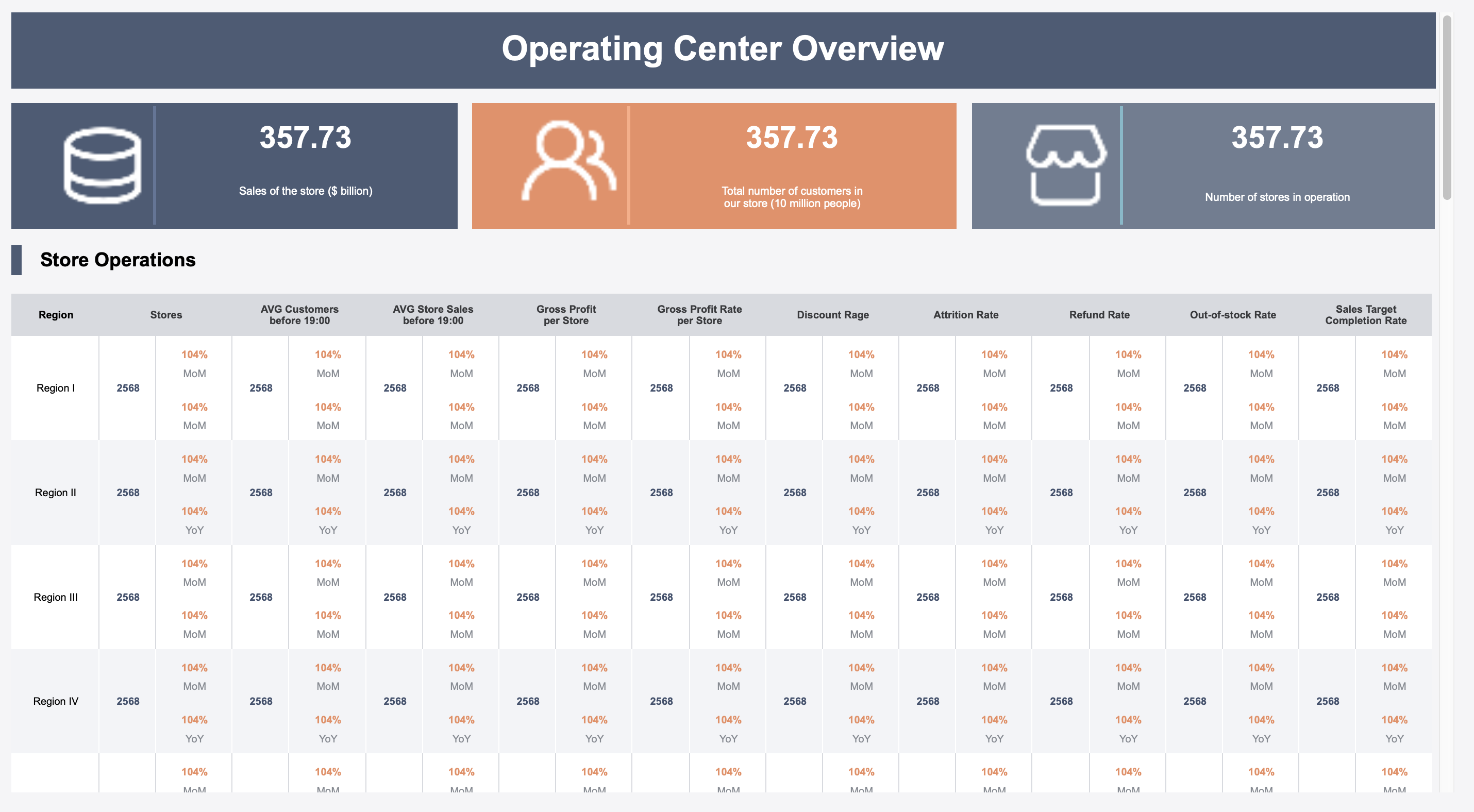
Leveraging FineReport for pixel-perfect dynamic reports
FineReport excels at creating pixel-perfect dynamic reports, making it ideal for scenarios where precision matters. You can use it to design highly customized charts and reports that integrate seamlessly with your existing Excel workflows. FineReport supports named ranges, allowing you to link your charts to dynamic data sources. This ensures your visualizations remain accurate as your dataset evolves.
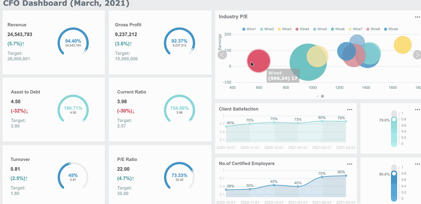
Operation Center Overview Dashboard Created By FineReport
The software also offers advanced formatting options. For instance, you can adjust every detail of your chart, from axis labels to color schemes, to match your branding. FineReport’s ability to handle large datasets without compromising performance makes it a reliable choice for enterprise-level reporting.
Note: FineReport includes a scheduling feature that automates report generation and distribution. This saves time and ensures stakeholders always have access to the latest data.
Exploring FineVis for interactive and dynamic visualizations
As an important core function of FineReport, FineVis takes dynamic charting to the next level by focusing on interactivity and storytelling. You can create dashboards with over 60 chart types, including 3D visualizations, to present your data in an engaging way. FineVis’s zero-code interface makes it easy to customize your charts, even if you lack expertise.
You can try it out in the FineVis demo model below:
One of FineVis’s key strengths is its real-time analytics capability. For example, you can monitor inventory levels or customer behavior as the data updates in real time. The platform’s adaptive design ensures your charts look great on any device, whether it’s a smartphone, tablet, or desktop.
Tip:FineVis transforms static data into dynamic stories, helping you communicate insights effectively.
By using FineBI, FineReport, and FineVis, you can enhance your dynamic chart creation process. These tools simplify complex tasks, improve accuracy, and make your visualizations more impactful.
Creating a dynamic chart in Excel offers you a powerful way to visualize data that evolves over time. It saves effort, improves accuracy, and enhances your ability to analyze trends. Start practicing today by experimenting with named ranges and tables. Tools like FineBI, FineReport simplify this process, offering advanced features for dynamic visualizations. Explore their capabilities to elevate your charting experience. For further learning, check out Excel tutorials or guides on dynamic charts to refine your skills.
Tip: Visit FanRuan for tools that make dynamic chart creation effortless.
Click the banner below to try FineBI for free and empower your enterprise to transform data into productivity!
Smarter product, pricing, and inventory management across retail sectors.
FAQ
What is the main benefit of using dynamic charts in Excel?
Dynamic charts save time by automatically updating as your data changes. You don’t need to manually adjust the chart every time you add or remove data. This feature ensures accuracy and keeps your visualizations up-to-date.
How do named ranges improve dynamic charts?
Named ranges create flexible references that adjust automatically as your dataset grows or shrinks. They simplify chart management and ensure your visualizations remain accurate. Using named ranges also makes it easier to troubleshoot and update your charts.
Which is better for dynamic charts: Excel tables or named ranges?
Excel tables are easier for beginners and automatically expand with new data. Named ranges offer more customization and flexibility for advanced users. Choose based on your data complexity and experience level.
Can I use dynamic charts for real-time data?
Yes, dynamic charts work well with real-time data. As you update your dataset, the chart reflects the changes instantly. This feature is especially useful for tracking metrics like sales, inventory, or performance.
What should I do if my dynamic chart doesn’t update?
Check your named range formulas or table references. Ensure your data has no blank cells disrupting the range. Use the Name Manager to verify your dynamic ranges and test the chart by adding new data.
Are OFFSET and INDEX functions interchangeable for dynamic ranges?
Both functions create dynamic ranges, but they differ in efficiency. OFFSET is volatile and recalculates frequently, which may slow large datasets. INDEX is non-volatile and better for performance. Choose based on your dataset size and needs.
Can I use dynamic charts for multiple data series?
Yes, dynamic charts can handle multiple data series. Use named ranges for each series and link them to your chart. This setup allows you to compare trends or categories effectively.