


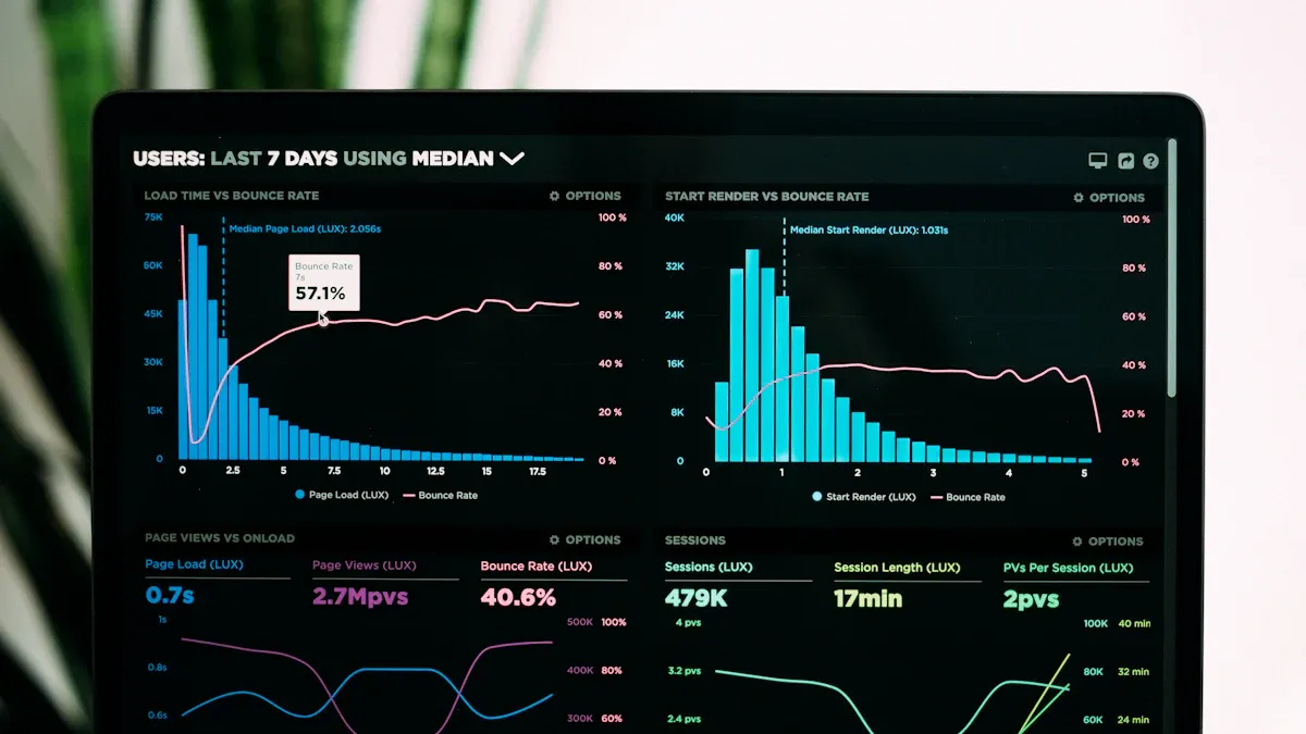
A time series plot is a graph that shows how data changes over time. It uses time intervals, like days or months, to organize data points in chronological order. This type of graph helps you visualize trends, patterns, and seasonal changes in time-dependent data. For example, you can track stock prices, weather conditions, or sales figures over time.
Time series plots play a key role in time-series analysis. They allow you to identify meaningful trends, such as rising or falling patterns, and recognize seasonal fluctuations. By spotting these patterns, you can improve decision-making and optimize processes. Whether you are analyzing long-term trends or detecting anomalies, these plots make complex data easier to understand.
Key Takeaways
- A time series plot shows how data changes over time. It helps you see trends and patterns clearly.
- Putting data in time order is important for correct analysis. This helps you find useful information.
- Time series plots are useful in many areas like money, health, and weather.
- These plots make hard data simple, so it’s easier to understand. They help you make smart choices.
- Tools like Excel or Python can help you make better time series plots.
Understanding Time Series Plots

What Is a Time Series Plot?
A time series plot is a type of graph that helps you visualize how data changes over time. It organizes time-series data into a sequence of points, each representing a specific time interval. These intervals could be daily, monthly, or even yearly, depending on the data you are analyzing.
Time-series plots are particularly useful for identifying trends, patterns, and seasonal variations in time-series data. For example, you can use them to track stock prices, monitor weather conditions, or analyze sales performance.
It’s important to note that time-series plots differ from time-series graphs. The table below highlights some key differences:
| Aspect | Time-Series Plot | Time-Series Graph | | --- | --- | --- | | Variable Representation | Typically plots a single variable against time. | Can display multiple variables over time. | | Visualization Type | Displays data as a line or scatter plot. | Can use various visualizations, including line graphs, scatter plots, heat maps, etc. | | Analysis Focus | Best for analyzing trends and patterns over time. | Best for visualizing system behavior over time. | | Data Representation | All time-series plots are graphs that display numerical data visually. | Not all time-series graphs are plots; they can represent various data types. | | Usage | Used in statistical analysis and forecasting. | Used in fields like engineering and biology to study systems over time. |
Components of a Time Series Plot
A time series plot consists of several essential components that make it a powerful tool for time-series analysis:
- Trend: This shows the long-term direction of the data, whether it’s increasing, decreasing, or remaining stable.
- Seasonality: These are regular, short-term cycles that repeat over time, such as monthly sales spikes during holidays.
- Cyclic Patterns: These represent fluctuations influenced by external factors, like economic cycles.
- Noise or Irregularity: Random variations that don’t follow any pattern.
- Outliers: Data points that deviate significantly from the rest of the dataset.
The X-axis of a time series plot represents time intervals, while the Y-axis displays the corresponding data values. By plotting time-series data, you can easily identify trends, seasonality, and anomalies. For instance, a sudden spike or drop in the data might indicate an outlier or a shift in the pattern.
Time-series plots are indispensable for time-series analysis. They allow you to uncover hidden insights and make informed decisions based on the data.
How Time Series Plots Work
Collecting and Organizing Data
Importance of chronological order
When working with time series data, you must organize it in chronological order. This ensures that the sequence of events or measurements reflects their natural progression over time. Without this order, identifying trends, seasonality, or patterns becomes challenging. For example, if you analyze daily sales data but mix up the dates, the resulting time series plot will not provide meaningful insights.
Examples of time intervals (daily, monthly, yearly)
Time intervals play a crucial role in time-series analysis. Depending on your data, you might use:
- Daily intervals: Ideal for tracking short-term changes, such as website traffic or stock prices.
- Monthly intervals: Useful for analyzing medium-term patterns, like sales performance or weather trends.
- Yearly intervals: Best for long-term studies, such as population growth or climate change.
Plotting the Data
Visualizing data points on a graph
Once you organize your time series data, you can plot it on a graph. The X-axis represents time intervals, while the Y-axis shows the corresponding data values. Tools like Matplotlib, Tableau, and Excel make this process straightforward. For example, you can use Python with Matplotlib to create a simple line plot of your data.
Connecting data points to reveal trends
After plotting the data points, connect them to form a line. This line helps you visualize trends and patterns in the data. For instance, a steadily rising line might indicate growth, while a fluctuating line could suggest seasonality. Tools like Microsoft Power BI and Grafana offer advanced visualization options to enhance your analysis.
Interpreting the Plot
Recognizing trends, seasonality, and patterns
Interpreting a time series plot involves identifying key features like trends, seasonality, and patterns. Line charts are particularly effective for spotting these elements. Seasonal plots can help you detect recurring patterns, such as higher sales during holidays. Moving average smoothing is another technique that reduces noise, making trends easier to see.
Identifying outliers and anomalies
Outliers and anomalies stand out as unusual data points that deviate from the overall pattern. Techniques like heat maps and box plots can help you spot these irregularities. For example, a sudden spike in website traffic might indicate a viral event. Recognizing these anomalies is essential for accurate time-series analysis and forecasting.
Applications of Time Series Plots
Time series plots have a wide range of applications across various fields. They help you analyze time-series data, identify trends, and make accurate forecasts. Below are some key areas where time-series analysis proves invaluable.
Finance
Stock market analysis and time-series forecasting
In finance, time series plots are essential for analyzing stock time series data. They allow you to track daily stock prices, monitor market volatility, and identify long-term trends. Companies like Goldman Sachs use time-series analysis for Value at Risk (VaR) modeling, helping them manage market risks effectively. By visualizing financial time series data, you can also perform time series forecasting to predict future stock prices or market movements.
Monitoring economic indicators
Time series plots play a crucial role in tracking economic indicators. They help you visualize trends in data like GDP growth, unemployment rates, or inflation. For example, Exelon uses time-series analysis to uncover trends in financial processes over a year. These plots also enable you to monitor changes and forecast future economic conditions, aiding in strategic decision-making.
Healthcare
Tracking patient vitals over time
In healthcare, time-series data helps you monitor patient vitals such as heart rate, blood pressure, or oxygen levels. Time series plots make it easier to detect trends or anomalies in these metrics. For instance, a sudden spike in heart rate could indicate a medical emergency.
Analyzing disease outbreaks and trends
Time-series analysis is vital for understanding disease outbreaks. It helps you forecast future outbreaks, assess the effectiveness of control measures, and guide public health policies. The table below highlights its key roles:
| Role of Time Series Plots in Disease Analysis | Description | | --- | --- | | Forecasting disease trends | Helps predict future outbreaks based on historical data. | | Assessing control measures | Evaluates the effectiveness of interventions. | | Guiding decision-making | Informs public health policies and responses. | | Identifying epidemiological characteristics | Reveals patterns and behaviors in disease spread. | | Investigating uncertainty | Analyzes variability in disease transmission. |
Weather Forecasting
Visualizing temperature and precipitation trends
Time series plots are indispensable in weather forecasting. They allow you to analyze time-series data like temperature and precipitation over time. By identifying trends, you can understand seasonal variations, such as higher rainfall during monsoon months.
Predicting future weather patterns
Time-series forecasting helps you predict future weather conditions based on historical data. For example, meteorologists use time-series analysis to forecast storms, heatwaves, or snowfall. These predictions are crucial for planning and disaster management.
Other Fields
Energy consumption analysis
Time series plots play a vital role in understanding energy consumption patterns. By analyzing time series data, you can track how energy usage changes over time. For example, you might observe higher electricity consumption during summer months due to air conditioning. These insights help you identify trends and seasonal variations in energy use.
Time-series analysis allows you to forecast future energy needs. Utility companies use this data to plan resource allocation and prevent shortages. For instance, a time series plot of hourly energy usage can reveal peak demand periods. This information helps optimize energy distribution and reduce costs.
You can also use time-series data to detect anomalies in energy consumption. A sudden spike in usage might indicate equipment malfunction or energy wastage. By addressing these issues, you can improve efficiency and save money.
Social media engagement tracking
Time series plots are essential for tracking social media engagement. They help you visualize how metrics like likes, shares, and comments change over time. For example, you can analyze time series data to see how a marketing campaign impacts user interactions.
Time-series analysis helps you identify trends in engagement. You might notice that posts perform better at specific times of the day. This insight allows you to schedule content for maximum impact. Additionally, you can detect seasonal patterns, such as increased activity during holidays.
By examining time series data, you can also spot anomalies in engagement. A sudden drop in interactions might signal a problem with your content strategy. Addressing these issues ensures consistent audience engagement.
Benefits of Using Time Series Plots
Simplifying Complex Data
Making large datasets easier to understand
Time series plots simplify complex time-series data by organizing it into a visual format. Instead of sifting through raw numbers, you can see how data changes over time. For example, a line graph can display daily sales figures, making it easier to identify patterns.
Time series plots highlight key trends and patterns in complex data:
- They display data points collected over time, helping you recognize seasonal fluctuations.
- Long-term trends become more apparent through these visualizations.
- Cyclic patterns, such as economic cycles, can also be observed.
By presenting data visually, time series plots make it easier to interpret and analyze large datasets.
Highlighting key trends and patterns
Time-series analysis often involves identifying trends and patterns. Time series plots excel at this by connecting data points to reveal underlying behaviors. For instance, you can spot a steady upward trend in website traffic or seasonal spikes in retail sales. These insights are crucial for understanding time-series metrics and making informed decisions.
Supporting Decision-Making
Providing insights for strategic planning
Time series plots provide valuable insights that support strategic planning. They allow you to analyze time-series data and anticipate future trends. The table below highlights examples of strategic decisions supported by time-series analysis:
| Strategic Decision | Description | | --- | --- | | Improved forecasting accuracy | Enables more accurate predictions of future trends, enhancing decision-making. | | Enhanced risk management | Helps assess and mitigate risks by predicting market fluctuations in finance. | | Optimized inventory management | Anticipates demand, reducing stockouts and excess inventory, saving costs. | | Efficient resource allocation | Forecasts consumption patterns, ensuring a balance between supply and demand. | | Data-driven decision-making | Provides insights into trends, enabling informed strategic decisions. |
Enabling accurate time-series forecasting
Time-series forecasting relies on time series plots to predict future values. These plots help you understand trends, seasonality, and cyclic behaviors in time-series data. For example:
- Improved forecasting accuracy enhances decision-making.
- Enhanced risk management predicts market fluctuations.
- Optimized inventory management reduces stockouts and excess inventory.
By leveraging time-series analysis, you can make precise forecasts that guide your business strategies.
Enhancing Communication
Presenting data in a visually appealing way
Time series plots present time-series data in a clear and visually appealing manner. Tools like line graphs, scatter plots, and trend lines make it easy to convey information. For example, a line graph can show how sales have grown over the past year, while a trend line highlights the overall direction. These visualizations ensure that your audience quickly grasps the key points.
Improving stakeholder understanding
Time series plots improve stakeholder understanding by offering a clear view of data trends. They help you identify patterns, fluctuations, and anomalies in time-series data. This clarity fosters better communication and ensures that stakeholders make informed decisions. For instance, a time series plot of energy consumption can reveal peak usage periods, aiding in resource planning.
Time series plots are powerful tools for understanding how data changes over time. They allow you to visualize trends, seasonal fluctuations, and cyclic patterns, making complex datasets easier to interpret. By focusing on components like trends, seasonality, and irregularities, you can uncover valuable insights for time-series analysis. These plots are essential for forecasting and decision-making, as they reveal patterns that might otherwise go unnoticed. Whether you’re analyzing stock prices, weather data, or social media engagement, time series plots provide clarity and direction. Start exploring them today to enhance your data analysis skills and make informed decisions.
FAQ
A time series plot helps you visualize how data changes over time. It reveals trends, patterns, and seasonal variations, making it easier to analyze and interpret time-dependent data.
Look for consistent upward or downward movements in the data points. These trends indicate long-term changes, such as growth or decline, over time.
Yes, but you need to address missing data first. You can use techniques like interpolation or forward-filling to estimate the missing values before plotting.
You can use tools like Python (Matplotlib, Seaborn), Excel, Tableau, or Power BI. These tools make it easy to organize and visualize your data.
Time series plots help you identify patterns like seasonality and trends. These insights allow you to predict future values accurately, which is essential for planning and decision-making.

Continue Reading About Time Series Plot
10 Must-Have Marketing Agency Reporting Tools for Your Success
Optimize your agency's performance with top reporting tools. Explore analytics, social media, SEO, and more for data-driven decisions and efficiency.
Lewis
Oct 09, 2024
2025's Best Data Validation Tools: Top 7 Picks
Explore the top 7 data validation tools of 2025, featuring key features, benefits, user experiences, and pricing to ensure accurate and reliable data.
Howard
Aug 09, 2024
Best Data Integration Vendors for Seamless Workflows
Discover the top 20 data integration vendors of 2025 for seamless workflows. Compare tools like Talend, AWS Glue, and Fivetran to optimize your data processes.
Howard
Jan 22, 2025

