Excel dashboards offer a powerful way to consolidate and visualize large amounts of data in a single view. They provide real-time updates and allow you to filter and drill down into specific data points for deeper analysis. This flexibility and interactivity make them invaluable for informed decision-making. By offering a detailed overview of Key Performance Indicators, dashboards add a sense of accountability and enhance your analytical capabilities. Tools like FineBI further enhance these capabilities, enabling you to create customized, dynamic reports that support better business decisions.

Understanding Excel Dashboard
What is an Excel Dashboard?
Definition and purpose
An Excel Dashboard is a versatile tool designed to consolidate, summarize, and visualize key business data in one intuitive interface. It takes large, complex datasets and transforms them into a digestible format through a combination of charts, tables, and key performance indicators (KPIs). By centralizing information from various sources onto a single screen, users can monitor business performance, track trends, and analyze data in real time. The visual nature of Excel Dashboards simplifies the interpretation of data, enabling faster and more informed decision-making for businesses.
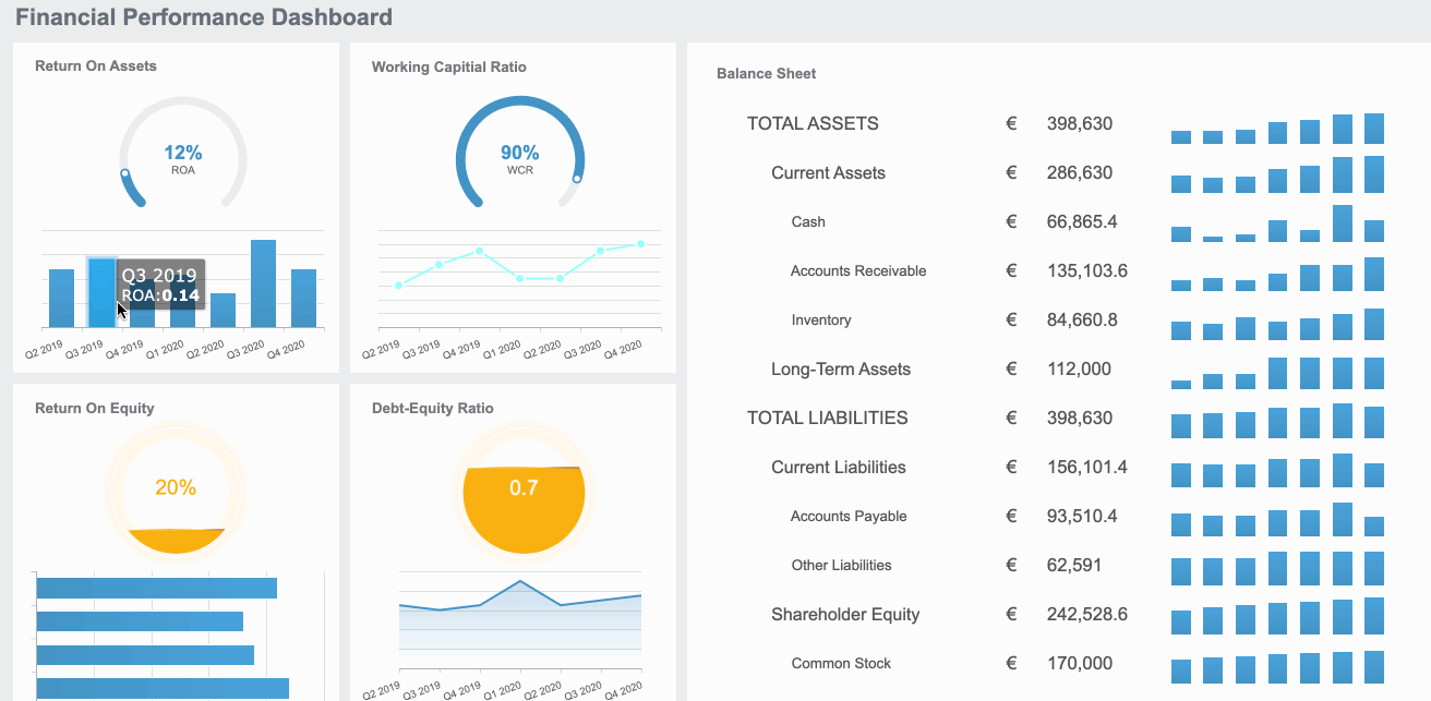
Key components of a dashboard
A well-designed Excel Dashboard consists of several essential elements, each serving a unique purpose to enhance data presentation and user interaction:
- Tables and Charts: These foundational components organize raw data and present it in a clear, easy-to-interpret format. Charts help visualize trends and patterns, while tables provide a structured view of the underlying data.
- PivotTables and PivotCharts: These dynamic tools allow for in-depth data analysis, enabling users to explore different perspectives of key business metrics by aggregating, filtering, and summarizing data on the fly.
- Slicers and Timelines: Slicers and timelines are interactive filters that allow users to segment data quickly and derive insights with precision. These features make it easy to drill down into specific time periods or categories, enhancing the dashboard’s flexibility.
- Conditional Formatting: This feature brings key data points into sharp focus by applying custom formatting rules. Important trends or anomalies are highlighted, making it easier to spot significant changes or outliers at a glance.
- Interactive Controls: Features such as drop-down menus, buttons, and sliders empower users to interact with the dashboard. These controls enable customization of the data displayed, fostering a more personalized and insightful analysis experience.
With these components, an Excel Dashboard becomes a powerful, interactive hub for data-driven decision-making, tailored to suit business needs.

Benefits of Using Excel Dashboard
Improved data visualization
Excel Dashboards greatly enhance data visualization by presenting key information in a clear, concise format. By leveraging features such as charts, tables with conditional formatting, and interactive controls, dashboards transform raw data into visually engaging, easy-to-read displays. This allows users to quickly identify trends, patterns, and anomalies, facilitating a deeper understanding of business performance. The use of color-coded highlights, dynamic graphs, and visual summaries provides immediate clarity, enabling you to focus on the most critical data points at a glance.
Enhanced decision-making
The interactive capabilities of Excel Dashboards enable quicker, more informed decision-making. With tools like slicers and timelines, users can filter and analyze data from multiple perspectives, uncovering valuable insights. This flexibility allows for real-time exploration of KPIs, enabling you to respond rapidly to emerging trends or changes in business conditions. By providing a holistic view of critical metrics and performance indicators, Excel Dashboards support data-driven decision-making, helping businesses stay agile and proactive in their strategic planning.
Preparing Your Excel Dashboard Data
Importing Data into Excel
To create an effective Excel dashboard, you first need to import your data into Excel. Excel supports a variety of data formats, making it versatile for different data sources.
Supported data formats
Excel can handle multiple data formats, including:
- CSV (Comma-Separated Values): Ideal for simple data structures.
- XLS/XLSX: Native Excel formats for complex data with formulas.
- XML (Extensible Markup Language): Useful for structured data exchange.
- JSON (JavaScript Object Notation): Commonly used for web data.
- TXT (Text Files): Suitable for unformatted text data.
These formats ensure that you can bring in data from various systems and applications seamlessly.
Import techniques
You have several techniques at your disposal for importing data into Excel:
- Copy and Paste: Quick and easy for small datasets.
- Data Connection: Establish connections to external databases or other Excel workbooks. This method keeps your data updated automatically.
- Power Query: A powerful tool for importing and transforming data from multiple sources. It allows you to clean and shape your data before bringing it into Excel.
- External Data Sources: Connect to databases like FineDataLink, SQL Server, Access, or online services. This ensures that your dashboard reflects the latest data.
By choosing the right technique, you can streamline your data import process and maintain data accuracy.
Cleaning and Organizing Data
Once your data is in Excel, the next step is to clean and organize it. This ensures that your dashboard displays accurate and meaningful information.
Removing duplicates and errors
Data cleaning involves:
- Identifying and removing duplicates: Use Excel's built-in tools to find and eliminate duplicate entries.
- Correcting errors: Check for and fix any data entry mistakes or inconsistencies.
These steps help maintain data integrity and improve the reliability of your dashboard.
Structuring data for analysis
Proper data organization is crucial for effective analysis:
- Use tables: Convert your data range into an Excel table. This makes it easier to manage and analyze.
- Apply consistent naming conventions: Label your columns and rows clearly to avoid confusion.
- Segregate data logically: Group related data together for better analysis.
By structuring your data effectively, you set the foundation for a functional and insightful Excel dashboard.
Setting Up Your Workbook for Excel Dashboard
Creating a New Workbook
When you start building an Excel dashboard, the first step is to create a new workbook. This serves as the foundation for your dashboard, so it's crucial to get it right.
Workbook layout and design
Designing your workbook layout effectively is essential. You should aim for a clean and organized structure that facilitates easy navigation and data analysis. Consider the following tips:
- Use separate sheets for raw data, calculations, and the dashboard itself. This keeps your data organized and prevents clutter.
- Maintain a consistent layout across all sheets. This helps you and others understand the flow of information.
- Include a cover sheet with an overview or instructions. This can guide users on how to interact with the dashboard.
Naming conventions
Adopting clear naming conventions is vital for maintaining order in your workbook. Use descriptive names for sheets, tables, and ranges. This practice makes it easier to locate and understand different components of your dashboard. For example:
- Sheet Names: Use names like "Raw Data," "Calculations," and "Dashboard" to clearly indicate each sheet's purpose.
- Table Names: Name tables based on their content, such as "SalesData" or "CustomerInfo."
- Range Names: Assign names to important ranges, like "TotalSales" or "MonthlyGrowth."
Organizing Sheets and Data
Proper organization of sheets and data ensures that your dashboard functions smoothly and efficiently.
Sheet naming and arrangement
Arrange your sheets logically to enhance workflow and accessibility. Place the most frequently accessed sheets, like the dashboard, at the beginning. Follow these guidelines:
- Order sheets by importance: Start with the dashboard, followed by calculations, and end with raw data.
- Group related sheets: If you have multiple sheets for calculations, group them together for easy access.
- Use color coding: Apply different colors to sheet tabs to visually distinguish between different types of data.
Data segregation techniques
Segregating data effectively is crucial for accurate analysis and visualization. Implement these techniques:
- Separate data by category: Divide data into categories such as sales, marketing, and finance. This helps in targeted analysis.
- Use filters and sorting: Apply filters to focus on specific data subsets. Sort data to identify trends and patterns easily.
- Create summary tables: Summarize large datasets into smaller, manageable tables. This simplifies data interpretation and enhances dashboard performance.
An interactive dashboard in Excel provides a concise visualization of data in real-time. It may also include the ability to click on elements and get additional information, making data segregation even more critical for effective interaction.
By setting up your workbook thoughtfully, you lay the groundwork for a successful Excel dashboard. This preparation ensures that your dashboard is not only functional but also user-friendly and insightful.
Building the Excel Dashboard
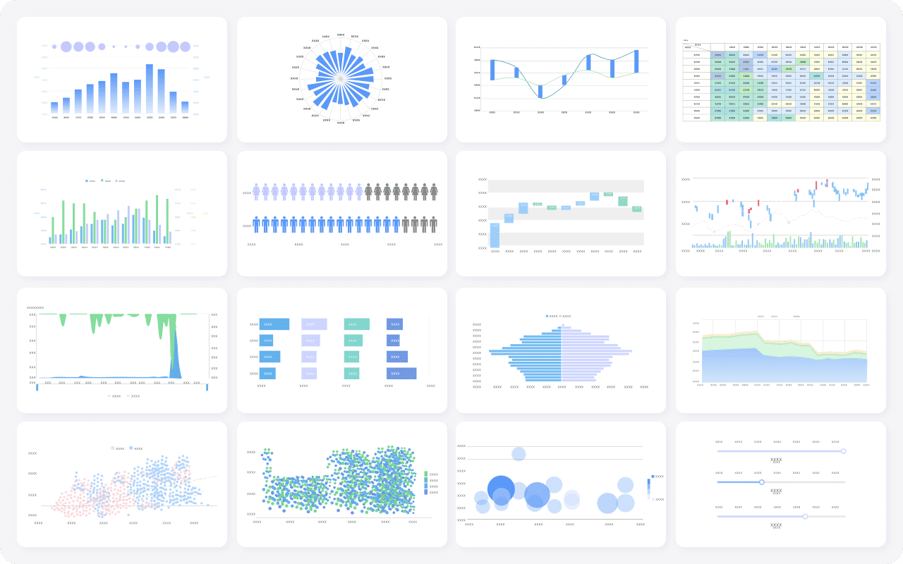
Creating Charts and Graphs
Charts and graphs are essential components of an Excel Dashboard, as they transform raw data into visually digestible insights. These visual elements enable you to quickly grasp trends, patterns, and relationships within the data, offering a clearer understanding of business performance.
Selecting the right chart type
Choosing the appropriate chart type is critical to effectively communicate your data. Different types of charts serve different purposes, and selecting the right one can significantly impact how your insights are perceived. Here are some common chart types and their ideal use cases:
- Bar Charts: Best for comparing values across different categories, such as sales performance across regions or product lines.
- Line Charts: Ideal for illustrating trends or changes over time, such as monthly sales growth or stock prices.
- Pie Charts: Useful for displaying the proportions of a whole, such as the market share of different competitors.
- Scatter Plots: Effective for identifying correlations or relationships between variables, such as the relationship between marketing spend and revenue.
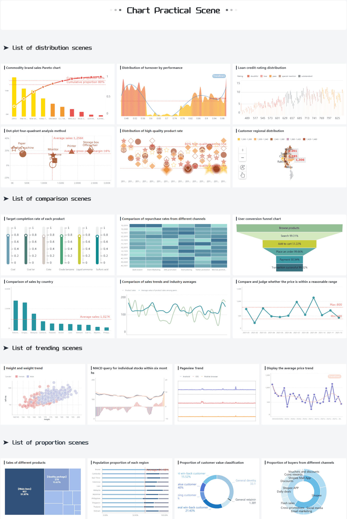
Selecting the most suitable chart type ensures that your data is conveyed clearly, making it easier for users to interpret key insights.
Customizing chart appearance
Customizing the appearance of your charts enhances both their visual appeal and their usability. Thoughtful adjustments can make complex data more accessible and engaging. Consider these best practices:
- Use contrasting colors to differentiate data points and ensure clarity.
- Add data labels to highlight specific values, making the chart easier to read and interpret.
- Incorporate a descriptive title that succinctly explains the purpose of the chart.
- Adjust axis scales to better fit your data range, avoiding distortion or misinterpretation of the information.
By customizing the appearance of your charts, you not only improve their readability but also create a more professional and impactful presentation of your data.
Adding Interactive Elements
Incorporating interactivity into an Excel Dashboard allows users to explore data dynamically, offering a more in-depth understanding of the information presented. Interactive features enable users to tailor their analysis, empowering them to uncover valuable insights from multiple perspectives.
Using slicers and filters
Slicers and filters are powerful tools that allow users to focus on specific data subsets with ease. These features enable dynamic exploration by:
- Filtering data by categories, time periods, or any relevant dimension, enabling more precise analysis.
- Highlighting key metrics for deeper, focused analysis, helping users zero in on critical data points.
- Toggling between different views to gain varied insights, allowing users to compare and contrast data from multiple angles.
These tools enhance the dashboard’s interactivity, making it more engaging, intuitive, and adaptable to the user’s needs.
Implementing drop-down menus
Drop-down menus provide an organized and user-friendly way to navigate complex datasets. By incorporating these menus, you can:
- Simplify large datasets by breaking them into manageable, easy-to-navigate parts, ensuring clarity and ease of use.
- Provide quick access to different data views, making it convenient for users to switch between various reports or analyses with a single click.
- Enhance the user experience by reducing visual clutter and creating a more streamlined interface.
By integrating drop-down menus into your dashboard, you not only enhance its functionality but also create a more efficient and user-centered experience, allowing for seamless interaction with the data.
Customizing Your Excel Dashboard
Applying Themes and Styles
Customizing your Excel dashboard with themes and styles enhances its visual appeal and readability. You can create a cohesive look that aligns with your brand or personal preferences.
Choosing color schemes
Selecting the right color scheme is crucial. Colors can influence how users perceive and interact with your dashboard. Consider these tips:
- Use contrasting colors: Ensure text and data stand out against the background.
- Limit color palette: Stick to a few complementary colors to avoid overwhelming users.
- Align with branding: Use colors that match your organization's brand for consistency.
A well-chosen color scheme makes your dashboard more engaging and easier to navigate.
Font and style consistency
Maintaining font and style consistency improves readability. It also creates a professional appearance. Follow these guidelines:
- Choose legible fonts: Opt for clear, easy-to-read fonts like Arial or Calibri.
- Keep font sizes uniform: Use consistent sizes for headings, subheadings, and body text.
- Apply uniform styles: Ensure charts, tables, and text boxes share similar styles.
Consistency in fonts and styles helps users focus on the data rather than the design.
Enhancing User Experience
Improving user experience ensures that your dashboard is not only functional but also enjoyable to use. You can achieve this by adding interactive elements and ensuring responsiveness.
Adding tooltips and annotations
Tooltips and annotations provide additional context without cluttering the dashboard. They offer insights that enhance understanding. Implement these features:
- Use tooltips for details: Display extra information when users hover over data points.
- Add annotations for clarity: Include notes or explanations for complex data sets.
These elements help users grasp the data's significance quickly and efficiently.
Ensuring dashboard responsiveness
A responsive dashboard adapts to different devices and screen sizes. This flexibility ensures accessibility for all users. Consider these strategies:
- Design for scalability: Ensure charts and tables resize appropriately on various screens.
- Test across devices: Check functionality on desktops, tablets, and smartphones.
- Optimize loading times: Streamline data and visuals to improve performance.
Responsive design guarantees that your dashboard remains effective and user-friendly, regardless of the device used.
Troubleshooting and Optimization of Excel Dashboard
Common Issues and Solutions
Excel dashboards can sometimes present challenges. Identifying and resolving these issues ensures your dashboard functions smoothly.
Data refresh problems
Data refresh issues often arise when your dashboard fails to update with the latest information. To address this:
- Check data connections: Ensure all data sources are correctly linked. Verify that connections remain active and accessible.
- Review refresh settings: Adjust settings to automatically refresh data at regular intervals. This keeps your dashboard current.
- Inspect formulas: Confirm that formulas reference the correct data ranges. Incorrect references can lead to outdated results.
By maintaining proper connections and settings, you ensure your dashboard reflects the most recent data.
Chart display errors
Chart display errors can disrupt the visual appeal and functionality of your dashboard. To fix these:
- Examine data ranges: Ensure charts reference the correct data. Incorrect ranges can cause charts to display inaccurately.
- Adjust chart settings: Modify settings like axis scales and labels. Proper adjustments enhance clarity and readability.
- Update Excel version: Use the latest version of Excel. Updates often resolve compatibility issues that affect chart displays.
Addressing these errors ensures your charts convey accurate and clear information.
Optimizing Performance
Optimizing your Excel dashboard enhances its efficiency and responsiveness. This ensures a smooth user experience.
Reducing file size
Large file sizes can slow down your dashboard. To reduce file size:
- Remove unnecessary data: Delete unused sheets and data ranges. This minimizes clutter and reduces file size.
- Compress images: Use Excel's compression tools to reduce image sizes. Smaller images improve loading times.
- Limit formatting: Avoid excessive use of styles and colors. Simplified formatting decreases file size.
These steps streamline your dashboard, making it faster and more efficient.
Improving calculation speed
Slow calculations can hinder your dashboard's performance. To improve speed:
- Use efficient formulas: Opt for simpler formulas that require less processing power. This speeds up calculations.
- Enable manual calculation: Switch to manual calculation mode. This allows you to control when Excel recalculates data.
- Optimize data structure: Organize data logically. Well-structured data enhances calculation efficiency.
By implementing these strategies, you boost your dashboard's performance and responsiveness.

You've now mastered the six steps to creating effective Excel dashboards. Remember, practice and experimentation are key to honing your skills. Try different chart types to find thebest way to communicate your data's story. As you refine your dashboard-building routine, consider exploring additional resources like FanRuan's FineBI. These tools offer advanced features for creating dynamic and interactive dashboards, enhancing your ability to make informed decisions. Embrace these resources to elevate your data visualization capabilities and drive better business outcomes.
Continue Reading About Dashboard
How to Quickly Build a Core App Dashboard


FAQ

The Author
Lewis
Senior Data Analyst at FanRuan
Related Articles

Portfolio Reporting for PMOs: 9 Executive Metrics Every Weekly Portfolio Dashboard Should Include
Weekly portfolio reporting should help executives answer three questions fast: Are we delivering the right initiatives, are we putting outcomes at risk, and what decisions need leadership this week? For PMOs, that means
Yida Yin
Jul 01, 2026

How to Build an Investment Portfolio Reporting Dashboard for Executives: KPIs, Benchmarks, and Drill-Down Views
Investment portfolio reporting for executives is not about showing every holding, transaction, and chart your investment team can produce. It is about giving CEOs, CFOs, CIOs, boards, and investment committees a fast, re
Yida YIn
Jun 25, 2026

12 KPI Reporting Examples for Executive Dashboards: What to Show in Weekly, Monthly, and Quarterly Reviews
Executive leaders do not need more data. They need decision ready $1 examples that match how often they review the business and what actions they are expected to take. A weekly $1 should surface fast moving risks and per
Yida YIn
Jun 25, 2026