An Excel report is a document created in Microsoft Excel to organize, analyze, and present data effectively. It helps you turn raw data into meaningful insights, making it easier to understand trends or patterns. Learning to create an Excel report is a valuable skill. It enhances your ability to manage data, whether for personal tasks or professional projects. To create a report, you need to prepare your data, use Excel tools like charts or PivotTables, and format it for clarity.
Understanding Excel Reports
What is an Excel report and its purpose?
An Excel report is a structured document created in Microsoft Excel to organize,analyze, and present data. It transforms raw information into meaningful insights, making it easier to interpret trends, patterns, or performance metrics. You can use Excel reports to summarize data, track progress, or make informed decisions.
The purpose of an Excel report is to simplify complex data and present it in a clear, actionable format. Whether you are managing personal finances or analyzing business performance, these reports help you focus on what matters most. They also allow you to share insights with others, ensuring everyone stays informed and aligned.
Common applications of Excel reports in business and personal use
Excel reports are versatile tools that cater to various needs. In business, they are widely used for:
Project tracking: Measure progress against deadlines and budgets.
In personal use, Excel reports can help you:
Budget household expenses: Organize income and spending.
Plan events: Track guest lists, costs, and schedules.
Monitor fitness goals: Record workouts and progress over time.
These applications highlight the flexibility of Excel reporting, making it a valuable skill for both professional and personal tasks.
Key elements of a basic Excel report
To create an effective Excel report, you need to focus on a few key elements. These elements ensure your report is clear, professional, and easy to understand.
Key Element
Description
Applying styles and themes
Use predefined templates to create organized reports.
Formatting data
Apply styles to individual cells or ranges, such as currency formatting.
Adjusting borders and colors
Use bold aesthetic choices to highlight key points.
Setting alignment and orientation
Reposition text or numbers within cells for better readability.
When you apply styles and themes, your report gains a polished and consistent look. Formatting data, such as applying currency symbols or percentages, ensures accuracy and clarity. Borders and colors help emphasize critical information, while alignment and orientation improve readability.
By focusing on these elements, you can create an Excel report that is both functional and visually appealing. These features not only enhance the presentation but also make it easier for others to interpret your data.
Preparing Data for Your Excel Report
Importing and organizing data in Excel
Importing data into Excel is the first step in creating a report. You can bring data from various sources, such as CSV files, databases, or even manual entries. To ensure your data is ready for analysis, follow these steps:
Open Excel and select the "Data" tab.
Choose the appropriate import option, such as "From Text/CSV" or "From Database."
Preview the imported data and adjust settings like delimiters or column formats.
Once your data is imported, organizing it becomes crucial. Proper structure helps you analyze and visualize information effectively. Use Excel's built-in tools to sort, filter, and group data. For example:
Sort data: Arrange rows alphabetically or numerically to identify trends.
Filter data: Display only relevant entries by applying filters.
Group data: Combine related rows for easier analysis.
Developing a coding scheme can also help categorize qualitative data. Define clear codes for themes or concepts, document them in a manual, and refine them regularly. These practices make your data manageable and ready for deeper analysis.
Cleaning and formatting data for better readability
Cleaning data ensures accuracy and eliminates errors. Start by identifying duplicates, missing values, or inconsistencies. Use Excel's "Remove Duplicates" feature to eliminate repeated entries. For missing values, either fill them with averages or leave them blank, depending on your analysis needs.
Formatting data improves readability and presentation. Apply styles like bold text or colors to highlight important information. Use currency symbols for financial data or percentages for ratios. Adjust column widths and align text for a polished look.
Tip: Use conditional formatting to automatically highlight cells based on specific criteria, such as values above a certain threshold.
These steps ensure your report is both accurate and visually appealing, making it easier for others to interpret your findings.
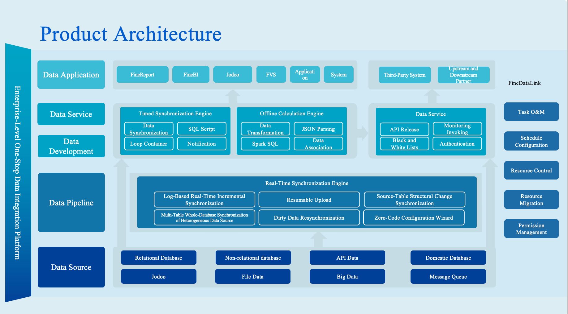
Using FineDataLink for seamless data integration
When working with data from multiple sources, integration can be challenging. FineDataLink simplifies this process bysynchronizing data across systems in real time. It supports over 100 common data sources, allowing you to connect databases, spreadsheets, and applications effortlessly.
FineDataLink’s ETL (Extract, Transform, Load) capabilities help preprocess data before importing it into Excel. You can clean, transform, and synchronize data without manual intervention. Its visual interface makes operations intuitive, even for beginners.
For example, if you need to integrate sales data from multiple departments, FineDataLink can consolidate it into a single dataset. This unified approach reduces errors and enhances the quality of your Excel report.
Note: FineDataLink’s API feature allows you to share data between systems quickly, making it ideal for collaborative projects.
By leveraging FineDataLink, you can streamline data preparation and focus on creating insightful reports.
How to Create a Excel Report Using PivotTables
Introduction to PivotTables and their benefits
PivotTables are one of Excel's most powerful tools for summarizing and analyzing large datasets. They allow you to organize data dynamically, making it easier to identify trends, patterns, and insights. Whether you're managing sales data, tracking inventory, or analyzing survey results, PivotTables simplify complex data into digestible summaries.
The benefits of using PivotTables include:
Efficiency: Quickly summarize thousands of rows of data without manual calculations.
Flexibility: Rearrange data fields to view information from different perspectives.
Interactivity: Drill down into specific details or filter data to focus on key metrics.
Visualization: Pair PivotTables with PivotCharts to create interactive visual reports.
For example, you can use a PivotTable to analyze sales performance by region, product category, or time period. This feature makes it an essential tool for anyone looking to create a report in Excel that is both insightful and professional.
Step-by-step guide to creating a PivotTable
Creating a PivotTable may seem intimidating at first, but the process is straightforward. Follow these steps to create a report in Excel using PivotTables:
Select your data range: Highlight the dataset you want to analyze. Ensure it has clear headers for each column.
Go to the Insert tab: Click on the Insert tab in the Excel ribbon.
Choose PivotTable: Select the PivotTable option. A dialog box will appear, asking where you want to place the table. Choose a new worksheet or an existing one.
Drag and drop fields: Use the PivotTable Field List to organize your data. Drag fields into the Rows, Columns, and Values areas. For example, place "Region" in Rows and "Sales" in Values to see sales totals by region.
Adjust Value Field Settings: Click on the dropdown in the Values area to customize calculations. You can sum, average, or count data based on your needs.
Tip: Use Excel's built-in templates to speed up the process if you're new to PivotTables.
This step-by-step approach ensures you can create a report in Excel that is both accurate and easy to interpret. PivotTables not only save time but also enhance the quality of your analysis.
Customizing PivotTables for enhanced insights
Customizing your PivotTable allows you to extract deeper insights and make your Excel report more impactful. Here are some ways to enhance your PivotTable:
Clean your source data: Remove duplicates and correct errors to ensure accurate results.
Refresh data regularly: Keep your PivotTable up-to-date by refreshing the data source whenever changes occur.
Add conditional formatting: Highlight key metrics, such as sales above a certain threshold, using color scales or data bars.
Incorporate sparklines: Add mini-charts within cells to visualize trends directly in your PivotTable.
Use calculated fields: Leverage Excel's formula library to create custom metrics, such as profit margins or growth rates.
For example, you can apply conditional formatting to highlight regions with the highest sales or use sparklines to show monthly trends. These customizations make your PivotTable not only functional but also visually appealing.
Feature
Description
Create PivotTables
Summarize large datasets and perform in-depth analysis.
1. Select the data range. 2. Insert a PivotTable. 3. Drag fields to Rows, Columns, and Values areas.
By customizing your PivotTable, you can transform raw data into actionable insights. This approach ensures your Excel reporting stands out and delivers maximum value.
Note: Document any changes you make to the PivotTable structure. This practice helps maintain consistency and ensures others can understand your adjustments.
Mastering PivotTables is a crucial step in learning how to create a report in Excel. With practice, you'll find that PivotTables not only simplify data analysis but also elevate the quality of your reports.
Visualizing Data in Your Excel Report
Why data visualization is essential in Excel reports
Data visualization plays a vital role in making your Excel reports more impactful. It transforms raw numbers into visual formats like charts and graphs, making complex data easier to understand. This approach helps you identify trends, patterns, and outliers quickly, which might otherwise go unnoticed in a table of numbers.
Well-designed visuals improve clarity and communication. For example, a line chart can show sales growth over time, while a pie chart can illustrate the percentage contribution of each product to total revenue. These visuals not only enhance your understanding but also make it easier to share insights with others.
Tip: Keep your charts simple and well-labeled to avoid confusion. Use annotations to highlight key data points and ensure your audience grasps the main message.
How to create charts and graphs in Excel
Creating charts and graphs in Excel is straightforward. Follow these steps to add visuals to your Excel report:
Select your data: Highlight the range of data you want to visualize. Ensure your data is well-organized with clear headers.
Go to the Insert tab: Click on the "Insert" tab in the Excel ribbon.
Choose a chart type: Select a chart from the options available, such as bar, line, or pie charts.
Customize your chart: Use the Chart Tools to adjust titles, labels, colors, and other elements for better clarity.
Excel offers a variety of chart types, each suited for specific purposes. For instance, a clustered bar graph works well for comparing sales performance across regions, while a pie chart is ideal for showing progress toward a goal. The table below highlights some best practices for choosing chart types:
Chart Type
Best Use Case
Clustered Bar Graph
Comparing sales by different agents across locations to understand performance.
Pie Chart
Visualizing progress toward a specific goal by showing values as percentages.
Box and Whisker
Depicting numerical data through statistical quartiles for better data analysis.
Note: Customizing your charts enhances their visual appeal and ensures they align with your audience's needs.
Choosing the right chart type for your data
Selecting the appropriate chart type is crucial for effective data visualization. The right chart ensures your data is presented clearly and accurately. Here’s a quick guide to help you choose:
Chart Type
Data Arrangement Requirements
Column, bar, line, area, etc.
In columns or rows.
Pie chart
In one column or row, and one column or row of labels.
Doughnut chart
In one or multiple columns or rows of data, and one column or row of labels.
XY (scatter) or bubble chart
In columns, with x values in the first column and y values in the next column.
Stock chart
In columns or rows, using opening, high, low, and closing values, plus labels in the right order.
For example, if you want to analyze the relationship between two variables, an XY scatter chart is ideal. On the other hand, a stock chart is perfect for financial data, such as tracking opening and closing prices.
Tip: Test your charts with others to ensure they are easy to interpret. This practice helps you refine your visuals for maximum clarity.
By choosing the right chart type and following best practices, you can create Excel reports that are both visually appealing and highly informative. These visuals not only enhance your report's quality but also make it easier for others to understand and act on the data.
Saving and Sharing Your Excel Report
Saving your report in Excel and other formats
Saving your Excel report properly ensures you can access and edit it later. Excel offers multiple formats for saving your work, each suited for different purposes. To save your report, click on the File tab and select Save As. Choose a location, name your file, and pick a format from the dropdown menu. The default format, .xlsx, is ideal for preserving formulas, charts, and formatting.
If you need to share your report with someone who doesn’t use Excel, consider saving it in other formats. For instance, the .csv format works well for sharing raw data without formatting. Alternatively, the .xls format ensures compatibility with older versions of Excel. Always double-check your saved file to ensure all data and formatting remain intact.
Tip: Keep a backup copy of your original file before converting it to another format. This practice prevents data loss and allows you to revisit the original version if needed.
Exporting your report as a PDF for easy sharing
Exporting your Excel report as a PDF makes it easier to share while maintaining its layout and formatting. PDFs are widely accessible and ensure that your report looks the same on any device. To export your report, go to the File tab, select Export, and choose Create PDF/XPS Document. Adjust the settings to include the entire workbook or specific sheets.
When preparing your report for PDF export, optimize its layout for readability. Use cell references instead of hard-coded values to maintain data accuracy. Double-check your formulas to ensure they reference the correct data. Incorporate headers and footers to add a professional touch, including details like the report title, creation date, or confidentiality notices.
Note: Resolve any formatting issues, such as overlapping text or misaligned columns, before finalizing the PDF. This step enhances the presentation and ensures your report communicates financial insights effectively.
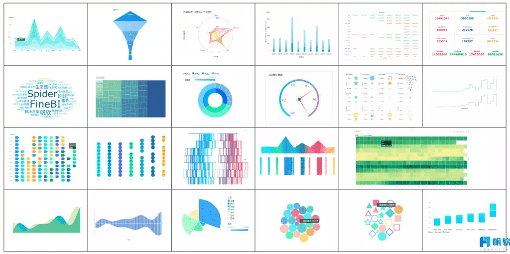
Sharing your report using FineReport and FineBI
FineReportandFineBI offer advanced options for sharing your Excel reports. These tools simplify the process of distributing reports while enhancing their functionality. FineReport allows you to generate a report with pixel-perfect formatting and schedule automated distribution. You can send reports via email or store them in shared directories for team access.
FineBI, on the other hand, focuses on self-service analytics. It enables you to share interactive dashboards and visualizations with your team. By integrating your Excel data into FineBI, you can create dynamic reports that update in real time. This feature ensures your team always has access to the latest insights.
Both tools support role-based permissions, ensuring that sensitive data remains secure. For example, you can restrict access to specific sections of a report based on user roles. This functionality makes FineReport and FineBI ideal for collaborative projects where data security is a priority.
Tip: Use FineReport’s scheduling feature to automate the delivery of recurring reports, such as monthly sales summaries. This approach saves time and ensures consistency.
By leveraging these tools, you can share your Excel reports efficiently while enhancing their impact. Whether you need static reports or interactive dashboards, FineReport and FineBI provide the flexibility to meet your needs.
Best Practices for Creating an Excel Report
Organizing data for clarity and accuracy
Organizing your data effectively is the foundation of a successful Excel report. Start by defining the purpose of your report. Knowing your audience and the insights they need will help you tailor the content appropriately. For example, a financial report for management might focus on budgets and variances, while a sales report could highlight performance by region or product.
Keep your data clean and structured. Use separate sheets for raw data, calculations, and the final report. This approach ensures clarity and prevents accidental changes to critical data. Descriptive headings guide readers through the report, while tables and PivotTables allow for dynamic sorting and filtering.
Incorporate Excel’s formulas and functions to automate calculations. This step not only saves time but also enhances accuracy. For instance, use the SUM function to calculate totals or IF statements to flag anomalies. Finally, include a summary section to emphasize key findings. A well-organized report ensures your audience can quickly grasp the insights you present.
Tip: Use charts and graphs to visualize data effectively. A thermometer chart, for example, can track performance against budgets, making it easier to identify progress.
Using consistent formatting and styles
Consistency in formatting and styles enhances the readability and professionalism of your Excel reports. Apply similar formats to cells with common purposes. For instance, use the same font and size for all headings and align titles uniformly across worksheets. This practice creates a cohesive look and helps readers navigate the report effortlessly.
Highlight key outputs and assumptions with distinct formatting. For example, use bold text or colored cells to draw attention to critical metrics like total revenue or profit margins. Conditional formatting can also help. It automatically highlights variances or outliers, making it easier for readers to focus on areas needing attention.
Transparency is another essential aspect of formatting. Ensure that key outputs are easily identifiable and assumptions are clearly labeled. This approach builds trust in your report and makes it easier for others to verify your findings. Consistent formatting not only improves the visual appeal of your report but also enhances its overall impact.
Leveraging tools like FineReport for advanced reporting
While Excel provides powerful tools for creating reports, leveraging advanced software like FineReport can take your reporting to the next level. FineReport simplifies the process of creating pixel-perfect reports with itsdrag-and-drop interface. It allows you to connect to multiple data sources, ensuring seamless integration and real-time updates.
FineReport’s automated scheduling feature saves time by delivering recurring reports, such as monthly sales summaries, directly to stakeholders. You can also use its advanced visualization options, including over 70 chart styles, to create stunning dashboards. These features make FineReport an excellent choice for businesses looking to enhance their Excel reporting capabilities.
For collaborative projects, FineReport offers robust permission controls. You can restrict access to sensitive data based on user roles, ensuring security and compliance. By combining Excel’s flexibility with FineReport’s advanced features, you can create reports that are both insightful and professional.
Note: FineReportintegrates seamlessly with Excel, allowing you to import and enhance your existing reports without starting from scratch.
Creating an excel report involves several key steps that transform raw data into actionable insights. Labeling columns, adjusting widths, and applying borders enhance clarity and visual appeal. Using formulas like SUM automates calculations, while charts help identify trends. The table below summarizes these steps and their benefits:
Key Steps
Benefits
Label each column with headers
Improves data organization and clarity
Adjust column widths
Ensures all data is visible
Apply borders and shading
Enhances visual appeal and navigation
Use bold fonts for headers
Increases readability and focus on key data
Utilize formulas (SUM, AVERAGE)
Automates calculations, improving efficiency
Visualize data
Helps identify patterns and trends for decision-making
Practice these techniques to master Excel’s features. Tools like FineReport and FineBI further enhance reporting by offering advanced visualization and automation options, making your reports more impactful.
Click the banner below to try FineReport and FineBI for free and empower your enterprise to transform data into productivity!
Access a wealth of case studies, industry insights, and solution guides to accelerate digital transformation.
FAQ
What is the easiest way to start creating an Excel report?
Begin by organizing your data in a structured format. Use clear headers for each column. Then, apply basic formatting like bold text for titles and borders for tables. This approach ensures your report looks professional and is easy to read.
How can I make my Excel report visually appealing?
Use charts and graphs to represent data visually. Apply consistent formatting, such as uniform fonts and colors. Highlight key metrics with conditional formatting. These steps improve readability and make your report more engaging.
What are PivotTables, and why should I use them?
PivotTables help you summarize and analyze large datasets quickly. They allow you to rearrange data fields dynamically, making it easier to identify trends and insights. This tool is essential for creating detailed and interactive reports.
How do I share my Excel report with others?
Save your report as a PDF for easy sharing. Alternatively, use tools like FineReport to schedule automated report distribution. These methods ensure your report reaches the intended audience in a professional format.
Can I integrate data from multiple sources into Excel?
Yes, you can use tools like FineDataLink to integrate data seamlessly. It supports real-time synchronization and preprocessing, making it easier to consolidate information from various systems into a single Excel report.