A training dashboard should do one thing exceptionally well: help leadership decide whether learning investments are improving workforce capability and business performance. If your dashboard only shows course completions, attendance, or satisfaction scores, it is reporting activity—not proving impact.
For L&D leaders, HR business partners, operations directors, and executives, the real challenge is not collecting training data. It is connecting learning activity to outcomes leadership actually cares about: productivity, quality, readiness, retention, compliance, and revenue contribution. A strong dashboard closes that gap.
 Click To Try The Dashboard
What a training dashboard should show leadership
Leadership does not need more learning data. Leadership needs answers to business questions.
A useful training dashboard should start by clarifying what leaders want to know across four areas:
- Participation: Who is taking the training, at what rate, and where are adoption gaps?
- Performance: Are learners completing programs, passing assessments, and achieving certifications?
- Capability growth: Are targeted skills improving across teams, roles, or business units?
- Business impact: Is the training linked to better operational, customer, compliance, or financial outcomes?
This distinction matters because many organizations confuse training reporting with learning impact measurement.
Reporting activity vs. proving learning impact
Reporting activity is straightforward. It tells you:
- how many people enrolled
- how many completed
- how many training hours were delivered
- average satisfaction or attendance
That information is useful, but it is not enough for executive decision-making.
Proving learning impact requires a higher standard. It means your training dashboard can show:
- whether training addressed a defined capability gap
- whether knowledge or behavior changed after training
- whether performance improved for the trained population
- whether those improvements align with business priorities
In other words, activity explains what happened in the learning program. Impact explains why it mattered to the business.
Identify the audiences for the dashboard
A single dashboard rarely serves every stakeholder equally well. The best approach is to design views for specific audiences.
Typical dashboard audiences include:
- Executives: Need a high-level summary of learning impact, strategic risks, and ROI signals
- L&D managers: Need program performance, completion bottlenecks, content effectiveness, and cohort trends
- HR partners: Need workforce capability insights, development coverage, internal mobility signals, and retention implications
- Line managers: Need team-level participation, overdue training, skill readiness, and action items
- Operations leaders: Need evidence that training is influencing quality, productivity, safety, or customer metrics
When you know the audience, you can reduce clutter and present only the metrics that support real decisions.
Set clear success criteria before building
A training dashboard becomes powerful when it supports decisions, not status updates. That requires explicit success criteria.
Before you choose charts or data fields, define:
- the business objective behind each program
- the target learner population
- the expected change in behavior or capability
- the business KPI the program is meant to influence
- the time frame for observing results
- the owner accountable for interpreting the data
For example, instead of saying, “We launched onboarding training,” define success as, “Reduce time to proficiency for new hires by 20% within 90 days of onboarding completion.”
That level of precision gives your training dashboard a clear job: measure progress against a business outcome.
How to build a training dashboard step by step
Building a credible dashboard is not a design exercise first. It is a measurement design exercise. Start with strategic alignment, then define metrics, then build the reporting layer.
Start with leadership goals and learning outcomes
Every training dashboard should begin with leadership priorities, not with whatever data is easiest to extract from the LMS.
Map each training initiative to:
- a business priority
- a workforce capability gap
- a target audience
- a measurable learning outcome
- an operational or business KPI
For example:
- Sales enablement training may map to win rate, average deal size, or ramp time
- Compliance training may map to audit performance, incident reduction, or policy adherence
- Customer service training may map to first-contact resolution, CSAT, or complaint reduction
- Leadership development may map to retention, promotion readiness, and team engagement
Once that mapping is complete, narrow your dashboard to a small set of high-value metrics leadership can scan quickly.
Key Metrics (KPIs) leadership should understand at a glance
- Participation rate: Percentage of target learners who started the program
- Completion rate: Percentage of enrolled learners who completed required training
- Assessment pass rate: Share of learners meeting the required knowledge threshold
- Certification status: Number or percentage of learners certified, expired, or pending
- Time to completion: Average time required to finish the program
- Skill progression: Measured change in proficiency before and after training
- Manager validation rate: Percentage of learners whose skill application was confirmed by managers
- Behavior adoption rate: Share of learners demonstrating the expected on-the-job behavior
- Time to proficiency: Speed at which learners reach expected performance levels
- Business outcome lift: Change in business KPI associated with trained groups over time
This is the foundation of a dashboard that can stand up in leadership reviews.
Choose the right metrics and data sources
A high-performing training dashboard combines learning data with workforce and business data. If you only pull from the LMS, your dashboard will stay trapped at the activity level.
You need a balanced measurement model that includes:
- Input data: planned hours, budget, audience size, assigned programs
- Engagement data: logins, attendance, participation, drop-off points
- Completion data: completion rates, overdue rates, time to finish
- Assessment data: scores, pass rates, reattempt rates, certification results
- Application data: survey results, manager observations, skill demonstrations, behavior checklists
- Business performance data: productivity, quality, sales, compliance, customer, retention, or readiness metrics
Common data sources for a training dashboard
Most organizations need to integrate data from several systems, such as:
- LMS: enrollments, completions, assessments, certifications, attendance
- HRIS: employee profiles, role, department, manager, tenure, location
- Survey tools: learner feedback, confidence shifts, self-assessed readiness
- Manager feedback systems: observed behavior changes, coaching notes, performance validation
- Operational systems: sales systems, quality tools, ticketing systems, production systems, CRM, ERP
- Talent systems: performance reviews, succession readiness, mobility, promotions, retention metrics
If these sources are not aligned, trust in the training dashboard will decline fast. Standardized definitions and consistent joins are essential.
Design for clarity, credibility, and action
A training dashboard should help leaders answer three questions in seconds:
- What changed?
- Why does it matter?
- What should we do next?
That means your design priorities should be clarity, credibility, and actionability.
Design principles that work in enterprise settings
- Use a simple layout: Put the most strategic KPIs at the top
- Define every metric consistently: Avoid ambiguity around completion, active learner, certified, or proficient
- Use clear time frames: Monthly, quarterly, YTD, and rolling 12-month views should be obvious
- Show trends, not snapshots only: Leadership needs movement over time
- Use comparisons: Compare cohorts, regions, roles, business units, or pre/post periods
- Enable drill-downs: Start with the executive view, then allow deeper analysis for L&D and managers
- Document data quality: Flag incomplete or delayed data
- Assign reporting ownership: Every dashboard metric should have a business owner and a data owner
A polished visual with weak governance is dangerous. It looks credible while creating confusion. A simpler dashboard with strong definitions and accountability wins every time.
Metrics that help prove learning impact
Not every metric belongs in an executive-facing training dashboard. To prove impact, focus on metrics that connect learner progress to workforce and business outcomes.
Core learning metrics to include
These are the essential building blocks. They tell you whether training reached the intended audience and whether learners progressed through the experience.
Core learning metrics:
- Enrollment: Number and percentage of eligible learners enrolled
- Completion: Number and percentage of learners who completed the program
- Attendance: Presence in instructor-led or virtual sessions
- Assessment scores: Average scores, pass rates, retake frequency, score distribution
- Certification status: Certified, recertified, expired, or in-progress learners
- Time to completion: How quickly learners complete required content
- Participation by segment: Training activity by role, team, location, tenure, or business unit
These metrics help identify reach, adoption, and execution consistency. They do not prove impact alone, but they are necessary inputs.
Business and performance indicators to connect
This is where the training dashboard becomes strategic. Link learning participation and performance to downstream outcomes leadership already tracks.
Business indicators commonly tied to learning impact:
- Productivity: Output per employee, cycle time, task completion speed
- Quality: Error rates, rework, defects, audit scores
- Sales: Conversion rate, quota attainment, pipeline progression, average deal value
- Compliance: Incident rates, policy adherence, audit findings, overdue mandatory training
- Customer outcomes: CSAT, NPS, first-contact resolution, complaint volume
- Retention: Turnover rate for trained vs. untrained populations
- Promotion readiness: Bench strength, internal mobility, succession coverage
- Time to proficiency: Speed at which new or reskilled employees perform at target levels
Best analytical views for proving learning impact
To make these indicators meaningful, include structured comparisons such as:
- Pre- and post-training analysis
- Trained vs. untrained cohort comparisons
- By-manager or by-team comparisons
- By-location or business unit benchmarks
- By-program portfolio performance views
- Trend analysis across multiple reporting periods
These views help leadership distinguish random movement from meaningful improvement.
Leading and lagging indicators
A mature training dashboard uses both leading and lagging indicators.
Leading indicators show early momentum. They help you predict whether training is on track to influence outcomes.
Examples include:
- enrollment rate
- attendance rate
- completion rate
- assessment pass rate
- learner confidence uplift
- manager validation of early behavior change
Lagging indicators confirm whether business results improved after training had time to take effect.
Examples include:
- productivity improvement
- fewer errors or incidents
- improved customer metrics
- reduced ramp time
- higher retention
- promotion readiness gains
The key is to interpret movement responsibly. If business outcomes improve after training, that is a strong signal—but not automatic proof of causation. Leadership will trust the dashboard more when you explicitly state:
- what changed
- what time period was analyzed
- what comparison group was used
- what other factors may have influenced results
This balanced interpretation builds credibility, especially in enterprise environments where multiple initiatives are running at once.
Training dashboard examples and practical templates
A good training dashboard structure depends on who uses it, how often it is reviewed, and how mature your data environment is.
Common dashboard layouts that work
The most effective training dashboard programs usually include multiple views, each designed for a different decision-maker.
1. Executive summary view
Best for senior leadership and HR executives.
Include:
- participation coverage
- completion status
- certification risk
- skill progression summary
- top business impact indicators
- major risks and recommendations
This view should be highly concise. Think scorecard plus trend highlights.
2. Operational L&D view
Best for L&D managers and program owners.
Include:
- program-by-program completion trends
- drop-off points
- assessment performance
- learner segment analysis
- instructor or content effectiveness
- upcoming compliance or delivery risks
This view supports optimization and intervention.
3. Team manager view
Best for people managers and department heads.
Include:
- team completion status
- overdue learners
- readiness gaps
- team vs. benchmark comparison
- recommended actions for coaching or follow-up
This makes the dashboard actionable beyond the learning function.
4. Common layout formats
Several structures consistently work well:
- Scorecard: Best for top-line KPIs and status checks
- Trend dashboard: Best for showing progress over time
- Funnel view: Best for enrollment-to-completion-to-application analysis
- Program portfolio view: Best for comparing multiple training initiatives side by side
Choose the format based on the decision the user needs to make—not on visual preference alone.
Tools and build options for different teams
Not every organization needs an advanced BI stack on day one. The right choice depends on skills, reporting frequency, and data complexity.
Spreadsheet-based dashboards
These are useful for:
- early pilots
- manual data validation
- proof-of-concept reporting
- small teams with limited system integration
They work well when data volume is manageable and the goal is to validate metric definitions before automation.
Limitations include:
- manual refresh effort
- version control issues
- weak governance
- limited drill-down and scalability
BI tools
BI platforms are the better fit when you need:
- automated refreshes
- interactive filtering
- role-based dashboard views
- cross-system data models
- stronger governance
- reusable templates and enterprise scalability
For most mid-sized and large organizations, this is where a training dashboard becomes sustainable and credible.
What to learn from sample dashboards
Studying sample dashboards is useful, but copying them rarely works.
Instead, review examples to learn:
- how KPIs are grouped
- how much information appears above the fold
- how trend lines are used
- how drill-down paths are structured
- how business outcomes are connected to learning metrics
- how commentary or annotations guide interpretation
The best templates are starting points, not final answers. Your training dashboard should reflect your own business goals, data maturity, governance model, and leadership expectations.
Common mistakes and how to avoid them
Many training dashboards fail for predictable reasons. The good news is that these mistakes are preventable.
1. Tracking too many metrics
A dashboard overloaded with metrics creates noise and weakens decision-making.
How to avoid it:
Limit executive views to the few KPIs tied directly to leadership decisions. Keep supporting detail in drill-down tabs.
2. Showing learning data without business context
Completion rates alone do not tell leadership whether training mattered.
How to avoid it:
Always pair learning data with a business baseline, comparison group, trend, or downstream performance metric.
3. Using unclear definitions
If “completion,” “active learner,” or “proficiency” mean different things to different teams, trust disappears.
How to avoid it:
Create a metric dictionary with standardized definitions, owners, and calculation rules.
4. Ignoring baselines and comparison periods
A single snapshot can be misleading and impossible to interpret.
How to avoid it:
Use pre/post comparisons, cohort analysis, and benchmark views wherever possible.
5. Launching without governance
A dashboard without refresh rules, ownership, or validation processes quickly becomes stale or disputed.
How to avoid it:
Define:
- data refresh frequency
- source system owners
- metric owners
- validation steps
- issue escalation process
Best practices for implementation
If you want a training dashboard that leadership actually trusts and uses, follow these practical steps:
-
Start with one priority use case.
Focus on one strategic program such as onboarding, compliance, sales enablement, or leadership development before scaling. -
Build a KPI map before building visuals.
Define business goals, learning outcomes, measures, data sources, and owners in one document. -
Validate definitions with stakeholders early.
Align L&D, HR, operations, and executives on what each KPI means before publishing anything. -
Pilot with a limited audience.
Test the dashboard with a small group of leaders and managers to refine usability, relevance, and trust. -
Review and iterate quarterly.
Business priorities change. Your training dashboard should evolve with them.
How to present the dashboard to leadership
Even the best training dashboard can fail if it is presented as a data dump. Leadership responds to a clear narrative tied to business decisions.
Turn dashboard data into a clear narrative
When presenting the dashboard, structure the discussion in this order:
- State the business goal
- Summarize what changed
- Explain why it matters
- Highlight risks and wins
- Recommend next actions
A practical example:
- Business goal: reduce new-hire ramp time in customer support
- What changed: completion rates rose to 92%, assessment scores improved 14%, and time to proficiency dropped by 18 days
- Why it matters: faster readiness improved service coverage and reduced escalations
- Risk: one region still shows lower manager validation rates
- Next action: reinforce manager coaching and localize support content
That is a leadership story. It uses dashboard data to support decisions.
Keep the dashboard useful over time
A training dashboard is not a one-time project. It is an operating tool.
To keep it relevant:
- review KPI relevance regularly
- retire metrics that no longer drive decisions
- update views as programs and business priorities evolve
- gather feedback from executives, managers, and L&D users
- improve annotations, filters, and drill-down logic over time
The highest-performing organizations treat dashboards as products: governed, iterated, and aligned to changing business needs.
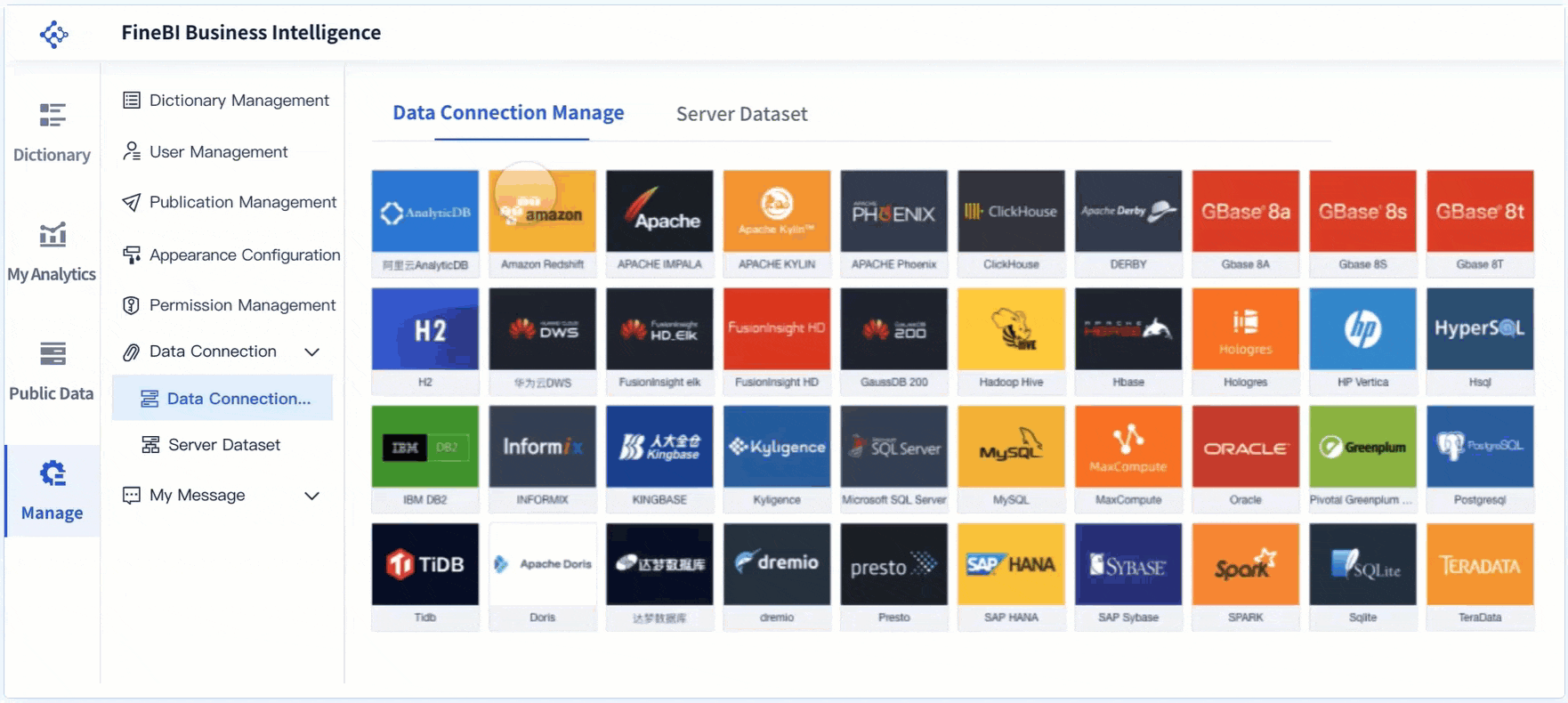
Build smarter with FineBI
Building a reliable training dashboard manually is possible—but it is often slow, fragmented, and difficult to scale. Data lives across LMS platforms, HRIS tools, survey systems, and operational databases. Definitions drift. Refresh cycles break. Stakeholders question the numbers.
That is why many teams move beyond manual reporting.
Building this manually is complex; use FineBI to utilize ready-made templates and automate this entire workflow. FineBI helps teams connect cross-system training data, standardize KPIs, create role-based dashboard views, and deliver interactive analysis without rebuilding reports every cycle.
With FineBI, you can:
- integrate LMS, HR, survey, and business data into one model
- use ready-made dashboard templates to accelerate deployment
- automate refreshes and reduce manual reporting effort
- enable drill-down analysis for executives, L&D, and managers
- improve governance with consistent definitions and reusable logic
- scale from pilot dashboards to enterprise-wide learning analytics
If leadership expects learning data that is credible, fast, and decision-ready, a modern BI approach is the practical next step. FineBI gives you the structure and automation to turn your training dashboard from a reporting asset into a business performance tool.
FAQs
A strong training dashboard should connect participation and completion data to capability growth, behavior change, and business KPIs. Leadership needs to see whether training improved outcomes like productivity, quality, compliance, retention, or revenue.
Basic reports show activity such as enrollments, completions, and satisfaction scores. A training dashboard built for leadership goes further by showing whether learning changed performance and supported business goals.
Executive views usually focus on participation rate, completion rate, assessment pass rate, skill progression, time to proficiency, and business outcome lift. The best KPI set depends on the program's stated goal and the business metric it is meant to influence.
Start by defining the business objective, target learner group, expected behavior change, and the KPI you want to improve before building the dashboard. Then compare post-training results over time to see whether trained groups show measurable improvement.
Training dashboards are most useful for executives, L&D leaders, HR partners, line managers, and operations leaders. Each audience should have a tailored view so they can quickly act on the metrics that matter to their decisions.


The Author
Yida YIn
FanRuan Industry Solutions Expert
Related Articles

Portfolio Reporting for PMOs: 9 Executive Metrics Every Weekly Portfolio Dashboard Should Include
Weekly portfolio reporting should help executives answer three questions fast: Are we delivering the right initiatives, are we putting outcomes at risk, and what decisions need leadership this week? For PMOs, that means
Yida Yin
Jul 01, 2026

How to Build an Investment Portfolio Reporting Dashboard for Executives: KPIs, Benchmarks, and Drill-Down Views
Investment portfolio reporting for executives is not about showing every holding, transaction, and chart your investment team can produce. It is about giving CEOs, CFOs, CIOs, boards, and investment committees a fast, re
Yida YIn
Jun 25, 2026

12 KPI Reporting Examples for Executive Dashboards: What to Show in Weekly, Monthly, and Quarterly Reviews
Executive leaders do not need more data. They need decision ready $1 examples that match how often they review the business and what actions they are expected to take. A weekly $1 should surface fast moving risks and per
Yida YIn
Jun 25, 2026