A user dashboard is often the first meaningful screen people see after signing in to a product. It shapes how quickly they can understand their account, complete tasks, monitor activity, and find the tools they need. Whether the product is a SaaS platform, a customer portal, a learning app, or an enterprise system, the quality of the dashboard directly affects usability and retention.
This article explains what a user dashboard is, the seven components that make it effective, where it is commonly used, and how to evaluate or design one that truly supports users.
What a User Dashboard Is and Why It Matters
A user dashboard is a centralized interface that brings together important information, actions, and tools in one place. In plain terms, it is the control center for a signed-in user. Instead of navigating through multiple pages to check progress, update settings, view notifications, or complete routine tasks, users can do so from a single screen.
A well-designed dashboard helps people:
- Access important information quickly
- Understand current status at a glance
- Take action without unnecessary steps
- Stay organized across features and workflows
- Reduce confusion when using a complex product
Not all dashboards serve the same audience. The term is broad, so it helps to distinguish between three common types:
- End-user dashboards: Designed for customers, employees, students, or members using a product or service. These focus on personal tasks, account details, recent activity, and self-service actions.
- Admin dashboards: Built for managers or system owners who oversee users, permissions, content, billing, or operations.
- Analyst dashboards: Created for people who need to interpret performance data, trends, and metrics in greater detail.
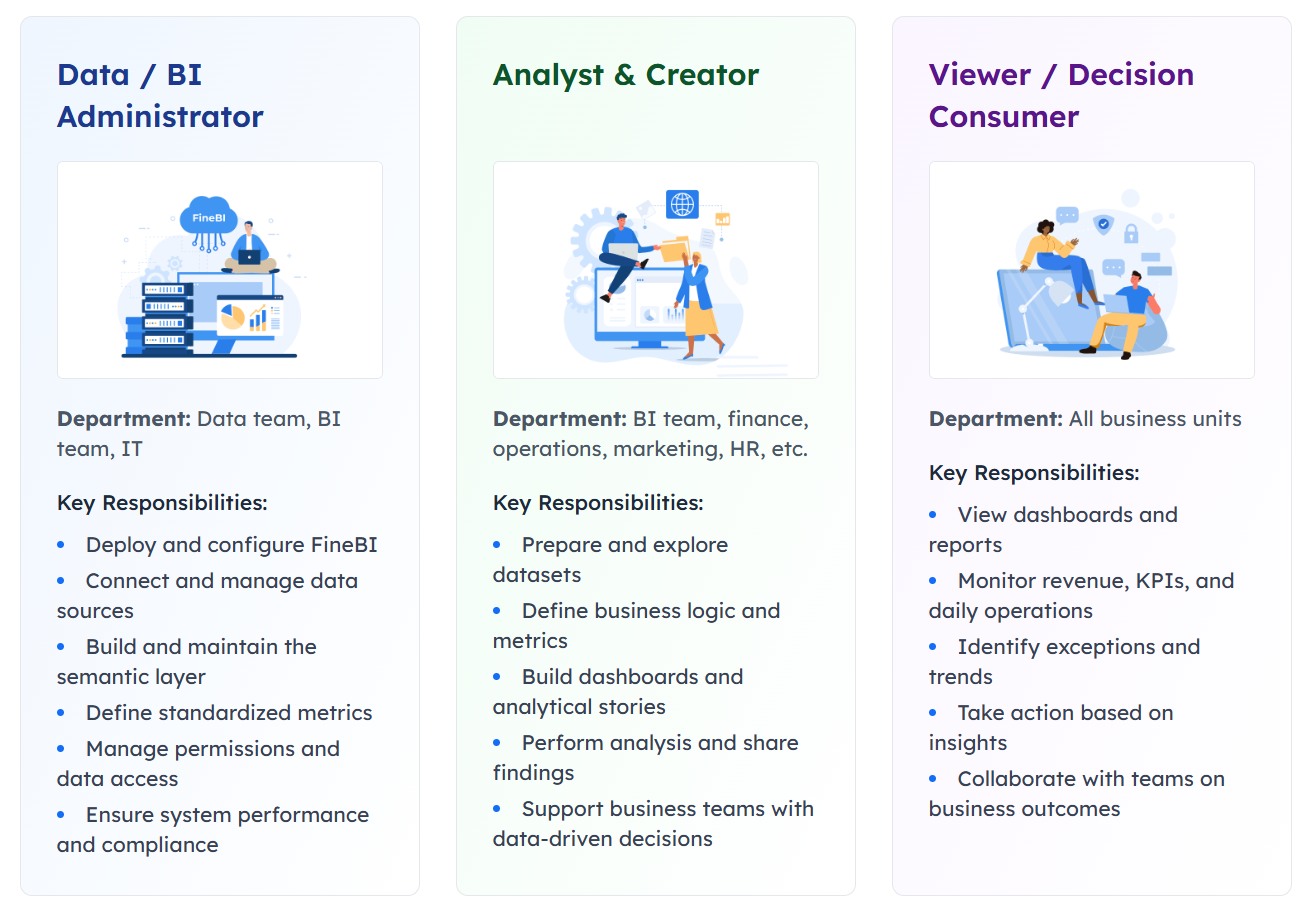 Different user roles
The main difference lies in purpose. A user dashboard is usually action-oriented and personalized. An admin dashboard is control-oriented. An analyst dashboard is insight-oriented.
This distinction matters because many teams mistakenly overload a user-facing dashboard with too much data. End users usually do not need a dense wall of charts. They need clarity, priority, and relevant next steps.
From a business perspective, dashboards matter because they improve:
- Usability: Users find what they need faster
- Productivity: Routine actions take fewer clicks
- Decision-making: Important signals are visible at the right time
- Engagement: Users return more often when value is obvious
- Support efficiency: Self-service options reduce manual assistance
In digital products where user experience influences adoption, the dashboard is not just a convenience feature. It is a strategic interface.
The 7 Core Components of an Effective User Dashboard
An effective user dashboard usually combines seven essential components. The exact mix depends on the product, but these building blocks appear across high-performing designs.
Navigation and information hierarchy
Users should immediately understand where they are, what matters most, and where to go next. This is the role of navigation and information hierarchy.
Common elements include:
- Top navigation bars
- Side menus
- Tabs
- Section headers
- Breadcrumbs
- Cards arranged by priority
Good hierarchy answers three questions quickly:
- What is this page for?
- What should I look at first?
- What can I do next?
A strong layout places the most valuable content in prominent positions, usually near the top or left side of the screen depending on reading patterns. Less important details are grouped into secondary sections. This prevents the dashboard from feeling crowded.
For example, an account portal might place subscription status, billing alerts, and support shortcuts at the top, while historical invoices and profile details appear lower down.
When hierarchy is weak, users waste time scanning the interface, second-guess labels, or ignore important tasks. That friction accumulates quickly.
Key metrics and status indicators
One of the main reasons dashboards exist is to provide instant context. Users should be able to understand their current position without reading long explanations.
Useful status elements include:
- Summary counts
- Progress bars
- Completion indicators
- Alerts and warnings
- Activity snapshots
- Upcoming deadlines
- Health or availability status
The goal is not to display as many numbers as possible. The goal is to show the right signals that support user decisions.
For instance:
- A learning platform may show course progress, pending assignments, and recent achievements
- A subscription service may show billing status, renewal date, and current plan usage
- A project tool may show assigned tasks, due items, and team updates
This is also where many organizations blend operational dashboards with light analytics. When deeper reporting is needed, a platform such as FineBI can support more advanced data analysis, interactive visual exploration, and cross-system reporting beyond the basic user dashboard layer. In practice, the user dashboard can surface essential summaries, while FineBI can power more detailed business views for managers and analysts.
Personalization and user controls
A user dashboard becomes far more effective when it adapts to the individual. Personalization ensures that users see content that matches their role, goals, and behavior.
Common personalization features include:
- Role-based modules
- Saved views
- Filters
- Display preferences
- Language or regional settings
- Shortcut customization
- Pinned items
- Recently used content
This component is especially important in products with diverse audiences. A new user may need onboarding prompts and setup guidance, while an experienced user may prefer direct access to workflows.
Personalization improves relevance in two ways:
- It removes unnecessary content
- It elevates useful content
For example, a customer success dashboard may prioritize onboarding steps for new accounts, while long-term customers see usage, support health, and renewal-related actions.
The best dashboards do not force everyone into the same layout. They balance consistency with user control.
Integrations, actions, and support elements
A dashboard should not function as a passive information panel. It should help users move from awareness to action.
This requires a combination of connected tools and workflow elements, such as:
- Quick action buttons
- App launchers
- Linked services
- Notifications
- Help center links
- Guided onboarding tips
- Support request entry points
- Contextual recommendations
For many products, integrations are central to the value of the dashboard. An identity platform may connect to enterprise applications. A sales platform may connect CRM, messaging, and reporting tools. A finance portal may connect payments, invoices, and support.
Support elements also deserve attention. If users encounter an issue, the dashboard should provide a clear path to help rather than forcing them to search elsewhere.
A practical dashboard often includes:
| Dashboard element | User benefit |
|---|---|
| Quick actions | Completes frequent tasks faster |
| Notifications | Draws attention to changes or risks |
| Integrations | Reduces switching between systems |
| Help links | Solves problems at the point of need |
| Onboarding prompts | Helps users reach first value sooner |
Together, these features turn a static interface into a usable work surface.
Common Use Cases of User Dashboard Across Products and Industries
The structure of a user dashboard varies by product category, but several use cases appear repeatedly across industries.
Account management and self-service portals
This is one of the most common dashboard applications. Users log in to manage their relationship with a service or organization.
Typical functions include:
- Updating profile details
- Managing billing and invoices
- Reviewing subscriptions
- Editing communication preferences
- Handling permissions
- Opening support requests
- Viewing order history or service status
Telecom providers, insurance companies, software vendors, healthcare portals, and membership organizations all rely on self-service dashboards to reduce operational burden and improve customer convenience.
A strong self-service dashboard does two things well:
- Makes common account tasks easy to find
- Shows status clearly enough that users do not need to contact support
Productivity, collaboration, and customer platforms
In work-oriented products, the dashboard acts as a productivity hub. It helps users understand priorities and move through tasks efficiently.
Common dashboard content in this category includes:
- Task lists
- Team messages
- Shared files
- Calendar events
- Project status
- Workspace shortcuts
- Recent documents
- Approval items
This use case is common in project management software, CRM systems, collaboration suites, internal work portals, and customer success platforms.
The dashboard becomes especially valuable when multiple workflows intersect. Instead of opening separate modules for tasks, conversations, and schedules, users get a coordinated view of current work.
Identity, access, and security experiences
Another major pattern is the identity or access dashboard. In these environments, the dashboard is the gateway to secure tools and applications.
Users may be able to:
- Launch approved applications
- Manage passwords
- Complete multifactor authentication steps
- Review security notifications
- Request application access
- Update account settings
These dashboards are common in enterprise IT and zero-trust environments, where users need secure but convenient access to many systems. A recognizable example is the app-launcher model used in identity platforms, where one dashboard becomes the front door to the digital workplace.
In this context, clarity is critical. Users must know which apps they can access, what requires approval, and what actions are security-sensitive.
Engagement, activity, and performance tracking
Many digital products use a dashboard to help users monitor progress over time. Here, the dashboard acts as a motivational and informational layer.
Examples include:
- Fitness apps showing goals and streaks
- Learning platforms tracking modules and completion
- Creator tools showing publishing activity
- SaaS products showing feature adoption and usage
- Employee platforms summarizing performance or milestones
The core design principle is visibility. When users can see progress, recent activity, and next milestones, they are more likely to stay engaged.
This category also benefits from thoughtful metrics design. A dashboard should highlight what users can influence, not overwhelm them with vanity numbers.
Real-World User Dashboard Examples and Design Inspiration
Studying real-world patterns is useful because many dashboard problems have already been solved in mature products. The most effective examples are not necessarily the most visually complex. They are the ones that make navigation, status, and action feel effortless.
Well-known dashboard patterns in major platforms
Several recognizable patterns appear across major products:
- Google-style account dashboards: These often emphasize account security, personal settings, device activity, and privacy controls in a modular card layout.
- Identity portals: These focus on secure app access, authentication steps, and account management, often with app tiles or launch cards.
- SaaS home screens: These combine product usage summaries, alerts, onboarding prompts, and shortcuts to high-frequency tasks.
These patterns succeed because they match user expectations. People sign in expecting answers to immediate questions such as:
- What changed?
- What needs attention?
- What can I access?
- What should I do next?
Major platforms typically resolve these questions through a mix of clear cards, concise labels, and action-led components.
Template libraries and visual inspiration sources
Before designing from scratch, it is helpful to review established component systems and template libraries. These resources can reveal practical approaches to layout, spacing, chart placement, cards, side navigation, and responsive behavior.
Useful inspiration often comes from:
- Dashboard template galleries
- UI component libraries
- Product design showcases
- Interface pattern collections
- App screen inspiration boards
When reviewing examples, focus on structure rather than decoration. A polished visual style is helpful, but the more important questions are:
- Is the hierarchy obvious?
- Are actions easy to spot?
- Is the layout adaptable to different user roles?
- Does the design scale as features grow?
The best inspiration does not simply provide aesthetics. It helps teams think through interaction design and content prioritization.
Project showcases and downloadable assets
For teams building quickly, project showcases and ready-made assets can reduce design time. These may include:
- Dashboard concept projects
- Downloadable UI kits
- Activity dashboard templates
- Vector illustrations
- Card and chart components
- Empty-state and onboarding assets
These resources are particularly useful during early prototyping. Teams can test structure and workflow before investing heavily in custom design.
However, templates should be treated as a starting point, not a final solution. A user dashboard works only when it reflects real user tasks and product context. Generic blocks copied without adaptation often lead to bloated interfaces.
Best Practices for Designing a Better User Dashboard
A dashboard should help users act with confidence, not force them to decode the interface. The following best practices improve both usability and long-term product value.
Keep the interface clear, relevant, and task-focused
The most common dashboard mistake is trying to show everything at once. More widgets do not create more value. In many cases, they create noise.
A better approach is to prioritize:
- Top user goals
- Frequent tasks
- Urgent status changes
- High-impact shortcuts
- Recent or context-sensitive information
To keep the interface focused:
- Use plain labels
- Limit the number of primary actions
- Group related content together
- Remove duplicate indicators
- Defer secondary details to drill-down pages
A good rule is simple: if an element does not help the user decide or act, it may not belong on the dashboard.
Design for accessibility, responsiveness, and performance
A user dashboard must work well across devices, screen sizes, and user abilities. This is not only an accessibility requirement but also a practical design standard.
Important considerations include:
- Strong color contrast
- Keyboard accessibility
- Clear heading structure
- Readable font sizes
- Touch-friendly controls
- Responsive card and grid behavior
- Fast loading of key modules
- Graceful handling of empty or error states
Users often revisit dashboards frequently, so performance matters. Slow-loading charts, unstable layouts, or excessive visual complexity reduce trust.
When dashboards include data-heavy components, organizations may benefit from separating the lightweight user-facing experience from more advanced analysis environments. For example, the core dashboard can stay fast and task-oriented, while FineBI can support deeper exploration, self-service analytics, and richer data visualization for users who need more than top-level summaries.
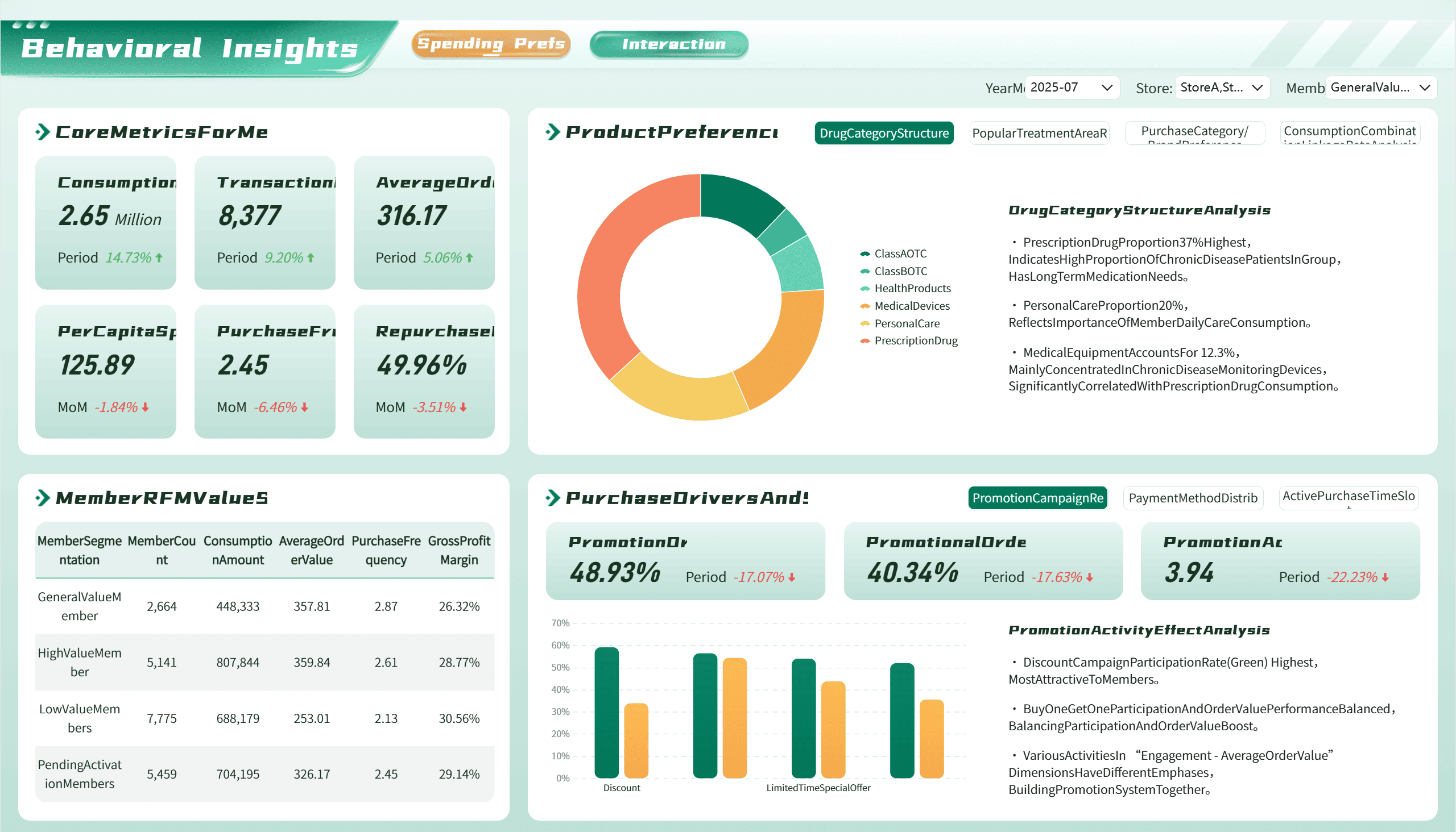 A Dashboard Demo created by FineBI
Measure success and improve over time
A dashboard should not remain static after launch. User behavior changes, product features evolve, and business priorities shift.
To improve over time, track signals such as:
- Click-through rates on key actions
- Completion rates for common tasks
- Search usage from within the product
- Scroll depth
- Support tickets tied to navigation issues
- Feature adoption patterns
- Qualitative user feedback
Usability testing is especially valuable. Watching users attempt real tasks often reveals hidden friction that metrics alone cannot show.
Dashboards improve when teams treat them as evolving products rather than fixed layouts.
How to Evaluate or Build the Right User Dashboard for Your Users
Choosing or designing the right dashboard starts with understanding the user, not with choosing visual components.
Begin with three foundational questions:
- Who is the user?
- What are they trying to accomplish?
- What do they need to know at a glance?
From there, evaluate the dashboard systematically.
Start with user goals, roles, and most common tasks
Different users need different dashboards. A new customer, an experienced subscriber, an IT employee, and a business analyst will not benefit from the same homepage.
Map out:
- Primary user roles
- Core tasks by role
- Frequency of those tasks
- Information needed before action
- Common pain points and blockers
This step prevents overdesign and helps define relevance.
Audit which components are essential versus optional
Once goals are clear, determine what truly belongs on the dashboard.
A practical audit can separate items into three groups:
| Priority level | What to include |
|---|---|
| Essential | Frequently used actions, critical status, urgent alerts |
| Useful | Secondary shortcuts, historical context, optional filters |
| Optional | Nice-to-have widgets, promotional modules, low-use content |
This prioritization keeps the interface lean and easier to maintain.
Compare examples and templates before creating a custom design
Many teams move too quickly into custom design. Reviewing examples first can reveal proven layouts, interaction patterns, and content groupings.
Compare:
- Major product dashboards in similar categories
- Template structures for navigation and cards
- Mobile and desktop behaviors
- Different methods of showing status and actions
If analytics depth is part of the roadmap, it is also worth deciding early whether the dashboard itself should include advanced reporting or whether that should be supported by a complementary BI layer such as FineBI. This helps maintain a clean user experience while still enabling sophisticated analysis where needed.
End with a simple checklist readers can use to assess any dashboard
Use this checklist to evaluate any user dashboard:
- Does the page clearly show the user’s most important information?
- Are the top tasks easy to find and complete?
- Is the navigation intuitive on first use?
- Are alerts and status indicators understandable at a glance?
- Does the dashboard adapt to role, context, or preferences?
- Are support and help options available when needed?
- Does the interface work well on mobile and desktop?
- Is the design accessible and easy to scan?
- Are unnecessary widgets or duplicate modules removed?
- Is there a plan to measure usage and improve the experience over time?
A strong user dashboard is not defined by visual complexity. It is defined by how effectively it helps people understand, decide, and act. When the right components, structure, and priorities come together, the dashboard becomes more than a homepage. It becomes the product experience users rely on every day.
FAQs
A user dashboard is a central screen that helps signed-in users view important information, track status, and complete common actions in one place. It is designed to make navigation faster and daily tasks easier.
A strong user dashboard usually includes clear navigation, key status indicators, personalized content, quick actions, notifications, recent activity, and helpful support or settings access. The exact mix depends on the product and user needs.
A user dashboard focuses on personal tasks, account details, and self-service actions for individual users. An admin dashboard is built for oversight, management, and control across users, systems, or operations.
Personalization makes the dashboard more relevant by showing content, shortcuts, and actions that match the user's role, preferences, and activity. This reduces clutter and helps people find what matters faster.
A user dashboard is best for quick status checks and routine actions inside the product experience. A reporting tool like FineBI is more suitable when users need deeper analysis, interactive exploration, or broader cross-system reporting.


The Author
Yida Yin
FanRuan Industry Solutions Expert
Related Articles

How to Build an Investment Portfolio Reporting Dashboard for Executives: KPIs, Benchmarks, and Drill-Down Views
Investment portfolio reporting for executives is not about showing every holding, transaction, and chart your investment team can produce. It is about giving CEOs, CFOs, CIOs, boards, and investment committees a fast, re
Yida YIn
Jun 25, 2026

12 KPI Reporting Examples for Executive Dashboards: What to Show in Weekly, Monthly, and Quarterly Reviews
Executive leaders do not need more data. They need decision ready $1 examples that match how often they review the business and what actions they are expected to take. A weekly $1 should surface fast moving risks and per
Yida YIn
Jun 25, 2026

How to Build a Digital Marketing Reports Dashboard: Executive Examples, KPIs, and Templates
A $1 is the control layer that helps executives and marketing leaders turn scattered channel data into fast, confident decisions. If you are a CEO, CMO, operations director, or marketing analytics lead, the real problem
Yida Yin
May 07, 2026