Reporting tools help you transform raw data into organized, easy-to-understand reports. These tools let you track business performance and spot trends faster. You can use reporting tools to make sense of numbers and present them in clear formats that support smart decision-making.
Here are 10 best reporting tools that help you to make smarter decisions:
Automated reporting tools offer real-time insights that boost the speed and accuracy of your decisions. You get consistent, up-to-date information, which means less guesswork and fewer mistakes. When you rely on automated reports, you turn reporting into a strategic advantage rather than a manual chore.
As you read, think about your own business needs and the challenges you face with reports. Consider how faster, more accurate data can help you grow and stay ahead.
Choosing the right reporting tools can transform how you manage data and make decisions. In 2025, you have more options than ever, each with unique strengths for building dashboards, automating reports, and tracking business performance. Let’s explore the top 10 reporting tools for business intelligence this year.
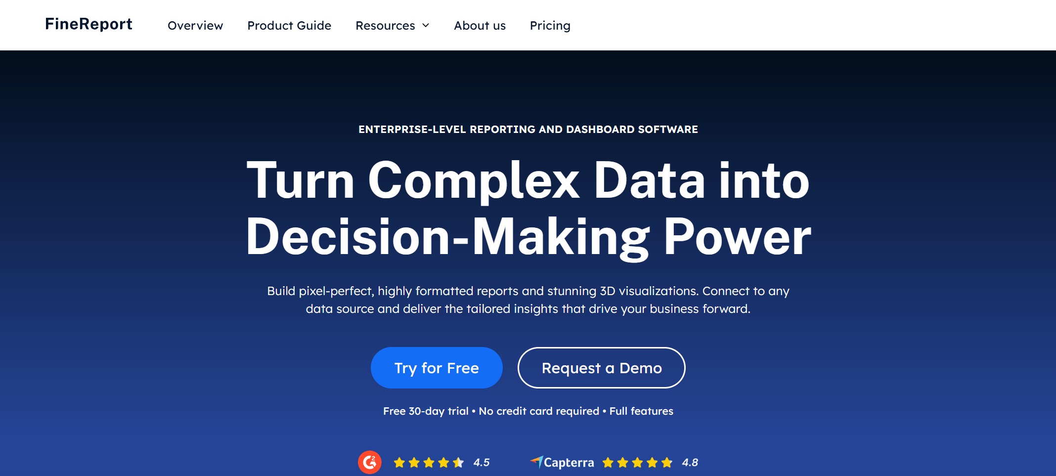
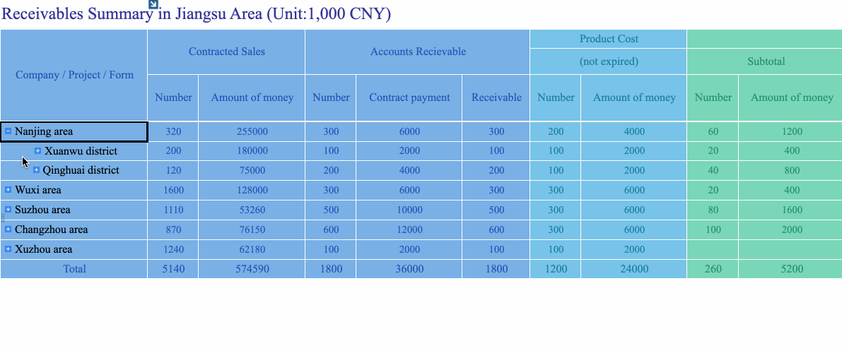
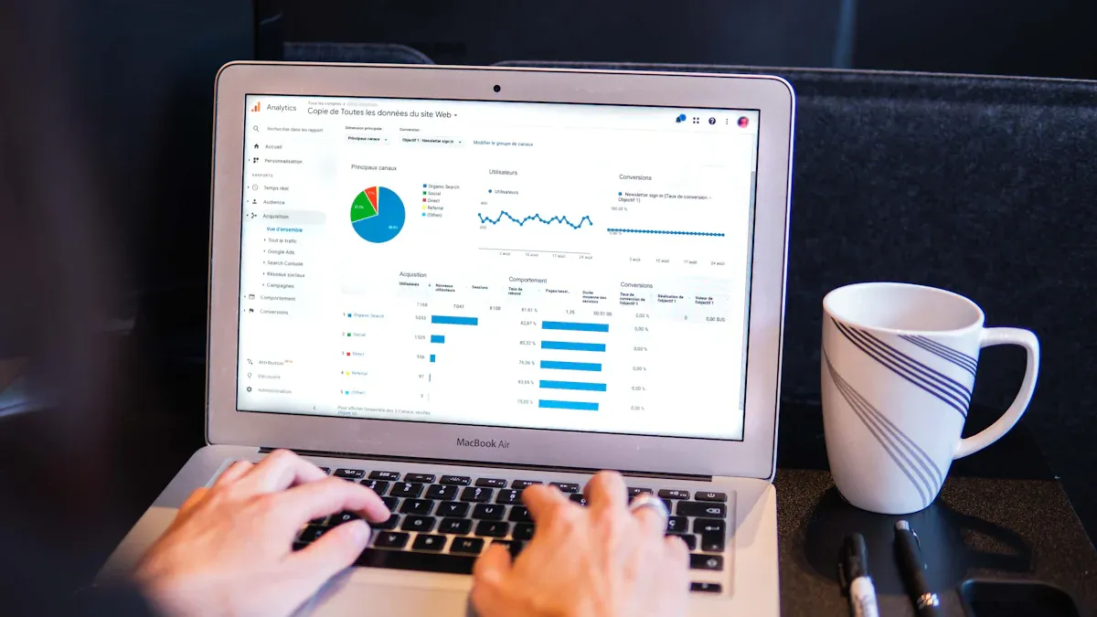
FineReport by FanRuan is a flexible reporting platform designed for enterprises that need automated reporting tools, customizable dashboards, and seamless data integration. You can create pixel-perfect reports, automate report generation, and manage data from multiple sources—all with an intuitive, Excel-like interface.
Key Features:
Pricing and Use Cases: FineReport offers flexible pricing tailored for large enterprises and government organizations. It supports advanced processes like funnel analysis and collaboration management. The software is especially popular in industries that require complex reporting and real-time data access.
Customer Story: King Yuan Electronics Group
King Yuan Electronics, a global leader in semiconductor testing, faced slow and limited reporting with their old tools. After switching to FineReport, they cut report development time from two weeks to just two hours. The user-friendly interface, support for multiple data sources, and automated reporting tools helped them boost efficiency and decision-making. Now, they use FineReport to manage everything from engineering yield reports to executive dashboards, showing how the right reporting tools can transform your business.
FineReport stands out for its ability to handle large datasets, automate reporting, and deliver real-time dashboards. If you want a reporting platform that adapts to your needs and scales with your business, FineReport is a smart choice.

Microsoft Power BI stands out as one of the most popular reporting tools for businesses of all sizes. You can connect to over 100 data sources, build dashboards, and automate reporting tasks. Power BI integrates seamlessly with Microsoft products, making it a natural fit if you already use Office 365 or Azure.
Key Features:
Pricing:
Pros and Cons:
| Advantages | Disadvantages |
|---|---|
| Easy to use and accessible | Advanced features require Pro or Premium plans |
| Strong Microsoft integrations | Can strain system resources |
| Helpful customer support | Desktop version only for Windows |
| Custom visuals and dashboards | Complex interface for new users |
| Effective collaboration | Complex licensing structure |
| Scalable for large datasets | Dataset size limits on free and paid plans |
Power BI gives you a powerful reporting platform with automated reporting tools and dashboards that help you track performance in real time. If you want a tool that grows with your business, Power BI is a solid choice.
Tableau is another leader in the reporting tools market, known for its exceptional data visualization and interactive dashboards. You can connect Tableau to almost any data source and create reports that are both beautiful and insightful.
Key Features:
Pricing:
| Product | Description | Cost |
|---|---|---|
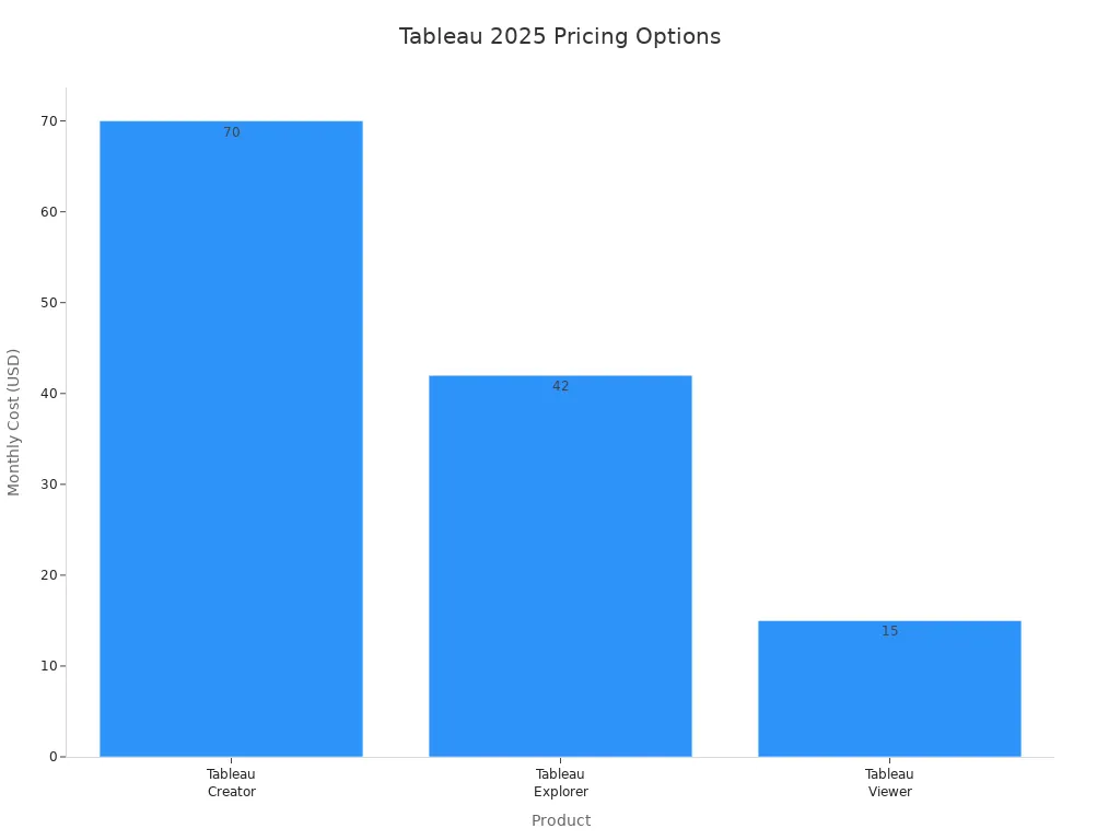
| Tableau Creator | Full analytics and visualization suite | $70 per user/month |
| Tableau Explorer | Advanced access for power users | $42 per user/month |
| Tableau Viewer | For viewing dashboards and reports | $15 per user/month |
| Tableau Server | Custom pricing for enterprise deployment | Custom pricing |
What Makes Tableau Stand Out?
| Feature | Tableau's Capability |
|---|---|
| Advanced Chart Creation | Deep customization for every visual element |
| Geospatial Analytics | Dynamic mapping and spatial calculations |
| Statistical Analysis | Built-in forecasting and statistical testing |
| Custom Calculations | Flexible formulas and complex data manipulations |
| Interactive Dashboards | Rich filtering and drill-down features |
Tableau’s reporting software lets you build customizable dashboards and visual dashboards that help you uncover trends quickly. If you value advanced data visualization and need a dashboard-based reporting tool, Tableau is a top pick.

Looker Studio, part of Google’s suite, is a cloud-based reporting tool that helps you create interactive dashboards and reports. You can blend data from multiple sources and share insights across your team.
Key Features:
| Feature | Looker Studio (Free) | Looker Studio Pro (Paid) |
|---|---|---|
| Pricing | Free | From $9/user/month |
| Data Connectors | 20 free connectors | Expanded options |
| Collaboration | Basic sharing | Real-time multi-user |
| Report Delivery | Manual sharing | Automated/scheduled |
| Security | Basic | Enterprise-grade |
| Automation | Manual refresh | Scheduled updates |
| Customization | Full templates | Advanced permissions |
| Mobile Access | View only | Enhanced integration |
Looker Studio supports unique charts, data blending, conditional formatting, and calculated fields. You can use it for everything from marketing campaign tracking to financial planning. The free version is great for individuals and small businesses, while Looker Studio Pro adds advanced collaboration and security for larger teams.
Looker Studio makes reporting simple and affordable, especially if you already use Google products. Its dashboards help you visualize data and make smarter decisions.
Qlik Sense is a flexible reporting tool that focuses on self-service analytics and real-time data exploration. You can build dashboards, automate reporting, and use AI-powered features for deeper analysis.
Key Features:
Pricing:
| Plan Type | Price | Users | Data Capacity | Best For |
|---|---|---|---|---|
| Qlik Sense Basic | Free | Limited functionality | Restricted | Getting started, basic exploration |
| Qlik Sense Business | $30/user per month | Small teams | 25 GB | Small teams, limited data needs |
| Qlik Sense Enterprise | Contact Qlik | Unlimited scaling | Starts at 50 GB | Large organizations, extensive data |
Pros and Cons:
| Pros | Cons |
|---|---|
| Affordable for small teams | Slows down with large datasets |
| Free 30-day trial | Costs add up for large teams |
| Improves data literacy | Some features require extra payment |
| Compatible with many devices | Custom formatting may be lost in Excel export |
| Easy collaboration and sharing | |
| Custom application development | |
| Fast search and responses | |
| Flexible security | |
| Cloud, on-premise, and hybrid options |
Qlik Sense gives you automated reporting tools and dashboards that help you explore data in real time. If you want a tool that supports both small teams and enterprise needs, Qlik Sense is worth considering.
Domo is a cloud-based reporting platform that focuses on automated reporting tools, collaboration, and real-time data sharing. You can connect data from multiple sources, build dashboards, and automate workflows.
Key Features:
Pricing:
Domo helps you improve data collection, enhance customer service, and boost productivity by streamlining information sharing. If you need a reporting tool that supports collaboration and real-time insights, Domo is a strong option.

Zoho Analytics is a popular choice for small and medium-sized businesses looking for affordable reporting tools and dashboards. You can connect to hundreds of data sources, build reports with a drag-and-drop interface, and automate reporting.
Key Features:
| Plan Type | Users Allowed | Data Rows Allowed | Price |
|---|---|---|---|
| BASIC | 2 | 0.5 Million | N/A |
| STANDARD | 5 | 1 Million | N/A |
| PREMIUM | 15 | 5 Million | N/A |
| ENTERPRISE | 50 | 50 Million | N/A |
| CUSTOM | Tailored | High scale needs | Get Quote |
| Feature | Description |
|---|---|
| Abundant Connectivity | 500+ native connectors, deep Zoho integration |
| Drag-and-Drop Interface | Build custom reports and dashboards easily |
| Customizable Dashboards | Transform metrics into actionable visuals, automate report generation |
| Interactive Filters | Drill down into dashboards for deeper insights |
| Collaboration and Sharing | Secure sharing with detailed access control |
Zoho Analytics makes it easy to create dashboards and automate reporting, even if you have no coding experience. If you want a reporting tool that grows with your business, Zoho Analytics is a great fit.

Klipfolio is a cloud-based reporting tool that specializes in real-time data visualization and customizable dashboards. You can connect to hundreds of services and APIs, build reports, and share insights with your team or clients.
Key Features:
| Pricing Edition | Monthly Price | Additional Notes |
|---|---|---|
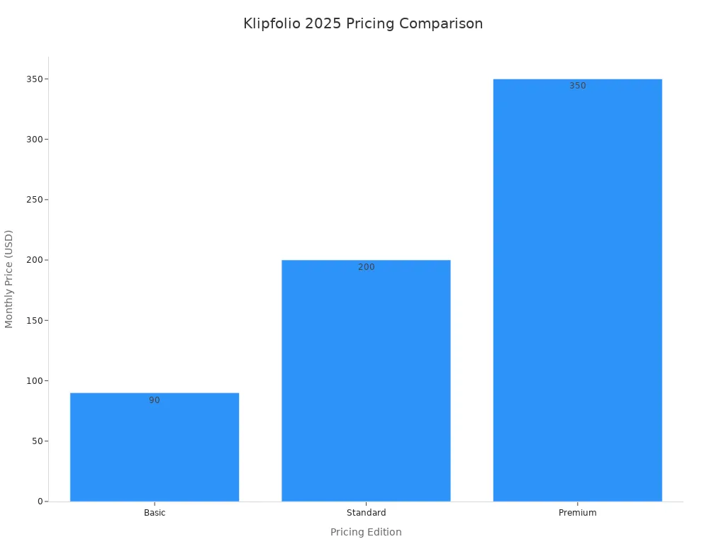
| Basic | $90 | Free trial, annual discount |
| Standard | $200 | Includes implementation options |
| Premium | $350 | Ongoing dedicated support |
Klipfolio’s automated reporting tools let you set flexible data refresh intervals, so your dashboards always show the latest information. If you need live dashboards and real-time data for fast decision-making, Klipfolio delivers.
Supermetrics is a reporting tool designed for marketing teams that need automated reporting tools and easy data integration. You can pull data from multiple marketing platforms and create reports in your favorite tools like Google Sheets or Excel.
Key Features:
| Plan | Price (Per Month, Annually) | Price (Monthly) | Key Features |
|---|---|---|---|
| Starter | From €29 | From €37 | 3 data sources, weekly refresh, SSO |
| Growth | From €159 | From €199 | 7 data sources, daily refresh, data transformations |
| Pro | From €399 | From €499 | 10 data sources, hourly refresh, advanced customization |
| Business | Custom pricing | Custom pricing | Unlimited sources, premium support, offline data import |
Supermetrics helps you automate reporting and track marketing performance across platforms. If you want to save time on manual data pulls and focus on analysis, Supermetrics is a smart choice.
monday work management is more than a project management tool—it’s also a powerful reporting tool for building dashboards and automating reporting. You can track projects, automate workflows, and create reports that keep your team on the same page.
Key Features:
| Plan | Price (per seat/month) | Key Features |
|---|---|---|
| Basic Plan | $10 | Unlimited free viewers, 1-week activity log, 5 GB storage, prioritized support |
| Standard Plan | $13 | Timeline/Gantt views, 6-month log, guest access, automation, dashboards (up to 5 boards) |
| Pro Plan | $20 | Private boards, 20 portfolios, workload management, advanced automation, unlimited forms |
| Enterprise Plan | Quotation | Enterprise automations, multi-level permissions, advanced analytics and reporting |
monday work management helps you reduce manual work and streamline communication. For example, Officeworks in Australia used monday to cut 10,000 emails and eliminate over 635 spreadsheets. If you want a reporting tool that brings together workflow automation and dashboards, monday work management is a great option.
Quick Comparison Table: Top Reporting Tools
| Tool | Pros | Cons |
|---|---|---|
| Microsoft Power BI | Integrates with Microsoft products, powerful data modeling, affordable | Steep learning curve for DAX, performance issues with large datasets |
| Tableau | Exceptional data visualization, connects to various data sources | More expensive, steep learning curve for non-technical users |
| Qlik Sense | Flexible data exploration, strong self-service capabilities | Less modern UI, requires specialized setup |
| Looker Studio | Cloud-native, strong embedded analytics | Requires familiarity with LookML, enterprise-focused pricing |
| FineReport | Automated reporting, multi-source integration, customizable dashboards | Tailored for large enterprises, custom pricing |
| Domo | Real-time collaboration, automated reporting | Pricing can be high for small businesses |
| Zoho Analytics | Affordable, easy to use, strong connectivity | Limited advanced analytics for large enterprises |
| Klipfolio | Real-time dashboards, flexible integrations | Higher price point for premium features |
| Supermetrics | Marketing data automation, easy integration | Limited users and data sources per plan |
| monday work management | Workflow automation, project tracking, dashboards | Advanced analytics require higher-tier plans |
With so many reporting tools available, you can find the right fit for your business needs. Whether you want automated reporting tools, customizable dashboards, or a reporting platform that scales, these top choices will help you get better insights and make smarter decisions.
When you hear about reporting tools, you might wonder what they actually do. Reporting tools are applications that help you generate different types of reports for your business. You use them to collect, prepare, and present data in a way that makes sense for your team. These tools bring together real-time and historical data, so you can see the full picture and make smarter decisions. With reporting tools, you don’t need to be a data expert to understand your business performance. The information comes to you in clear visuals and summaries.
You rely on reporting tools as a core part of business intelligence. They make sure your data is accessible, accurate, and ready for analysis. When you use automated reporting tools, you can measure, monitor, and display your data in a user-friendly way. This means everyone in your organization can understand what’s happening and act on it. You don’t need advanced data analytics skills to benefit from these tools. They empower you to see trends, spot issues, and respond quickly.
You gain a lot when you use reporting tools in your daily operations. Automated reporting tools save you time by cutting down on manual work. You can customize reports to focus on the key metrics that matter most to your business. With up-to-date information, you make decisions based on facts, not guesses. Many tools now use advanced data analytics and AI to help you forecast trends and spot new opportunities. Data visualization turns raw numbers into charts and graphs, making insights easier to understand and share.
Tip: When you use reporting tools, you unlock faster reporting, better accuracy, and more confidence in your decisions.

Automated reporting tools have become essential for modern business intelligence. You can use these solutions to streamline your data workflows, create interactive dashboards, and share actionable insights across your organization. Let’s break down the features that make these reporting tools so powerful.
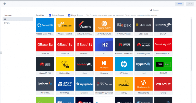
You want your reporting platform to connect with all your data sources. Automated reporting tools like FineReport let you blend information from databases, spreadsheets, and cloud services. You don’t need to move data manually. Instead, you get real-time access to historical and live data for better analysis. Here’s a quick look at the most important integration features:
| Feature | Description |
|---|---|
| Data Integration and Access | Connects multiple systems and retrieves historical data instantly. |
| Data Blending | Combines data from different sources for improved reports. |
| Real-time Data Accuracy | Delivers up-to-date information for smarter decisions. |
| Automated Tasks and Alerts | Sends notifications and manages tasks based on data events. |
| Customizable Dashboards | Lets you build dashboards tailored to your needs. |
| Data Security | Controls user permissions and protects sensitive information. |
FineReport stands out with multi-source integration, making it easy for you to unify data from various platforms.
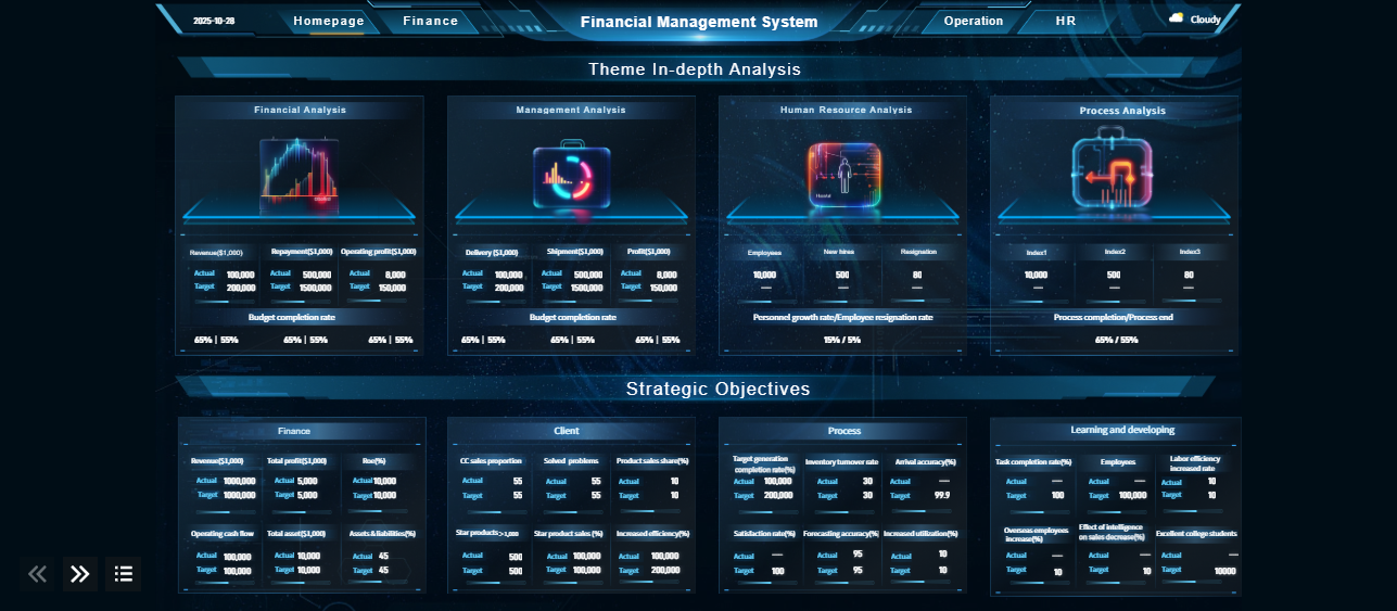
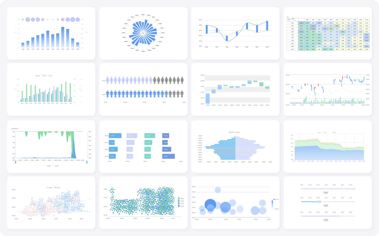
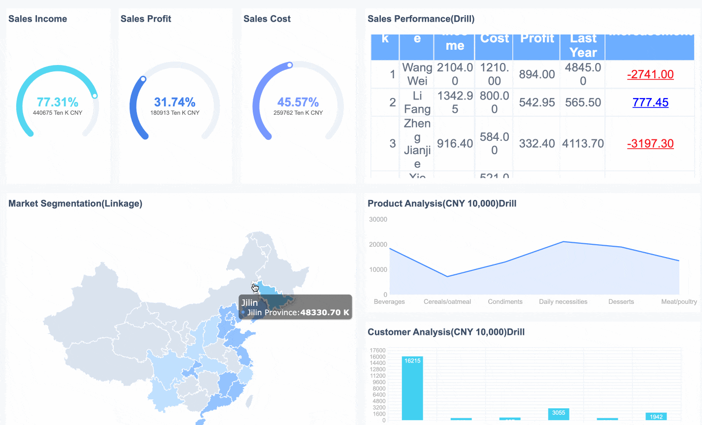
You need dashboards that turn numbers into clear visuals. Automated reporting tools offer interactive dashboards, 3D charts, and mobile-friendly layouts. FineReport’s reporting software gives you drag-and-drop design, animated dashboards, and responsive views for any device. Take a look at how advanced visualization features help you:
| Feature | Benefit |
|---|---|
| Visual Dashboards | Instantly transform raw data into easy-to-read visuals. |
| Real-time Analysis | See performance at a glance and act quickly. |
| AI Integration | Spot patterns and get recommendations for better insights. |
| Natural Language Queries | Ask questions in plain English and get answers fast. |
| Predictive Insights | Identify risks or opportunities before they happen. |
| Automated Narratives | Get summaries of dashboards for easy sharing. |
| Personalized Delivery | Make sure the right people see the right data. |
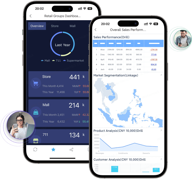
FineReport's 3D dashboards and mobile BI features help you visualize data wherever you are.
You want your team to work together and share reports easily. Automated reporting tools support secure sharing, scheduled delivery, and permission management. FineReport reporting software lets you automate report distribution, set up scheduled emails, and control who sees what. You can collaborate on dashboards and ensure everyone stays informed.
Tip: Use customizable dashboards to keep your team focused on the metrics that matter most.
Protecting your data is critical. Automated reporting tools include robust security controls, user permissions, and compliance features. FineReport reporting platform offers detailed permission management and secure data handling. You can trust that sensitive information stays safe while you share reports and dashboards across your organization.
Automated reporting tools give you the power to integrate data, visualize insights, collaborate with your team, and keep your information secure. With features like multi-source integration, interactive dashboards, and automated scheduling, you can unlock better insights and drive smarter decisions.
When you start looking for reporting tools, you need to think about your business goals and the types of reports you want to create. Do you need automated reporting tools for daily sales tracking or live dashboards for real-time insights? Make a list of your must-have features. Here’s a quick table to help you compare what matters most:
| Criteria | Description |
|---|---|
| Ease of Use | The tool should be simple for everyone to use. |
| Customization | You want to adjust reports to fit your business needs. |
| Integration | The tool must connect with your current systems and data sources. |
| Scalability | It should handle more data as your business grows. |
| Specific Features | Look for features that match your reporting requirements. |
Tip: Identify your reporting requirements based on your data needs and user purposes. Make sure the reporting platform you choose can grow with you.
You want reporting software that feels intuitive. If your team can pick it up quickly, you save time on training. FineReport stands out with its drag-and-drop designer and Excel-like interface. Automated reporting tools should let you build reports without needing advanced technical skills.
Your reporting tools must work with your existing systems. Automated reporting tools like FineReport connect to databases, spreadsheets, and cloud services. This integration gives you real-time data processing and helps you create comprehensive reports. You get a unified view of your business without manual data entry.
As your business expands, your reporting platform should keep up. Automated reporting tools need to handle increasing data volumes and more users. FineReport's scalable design means you can manage large datasets and add new features as your needs change. You won’t outgrow your solution.
Budget matters. Free tools may look attractive, but they often limit functionality. Paid options offer advanced data analytics, better support, and more robust features. Here’s a quick look at typical costs:
| Business Size | Initial Setup Cost | Ongoing Monthly Cost | Focus Areas |
|---|---|---|---|
| Small Businesses | $1,000 – $20,000 | $100 – $1,000 | Basic analytics dashboards |
| Medium Businesses | $10,000 – $100,000 | $1,000 – $5,000 | Departmental reporting, forecasting |
| Large Enterprises | $20,000 – $300,000 | $5,000 – $25,000 | AI, real-time analytics, data strategy |
Understanding your budget helps you choose a reporting tool that fits your needs without overspending. Automated reporting tools like FineReport offer flexible pricing and features that scale with your business.
When you compare reporting tools, you want to see how each one helps you work with data and create reports that matter. FineReport stands out with its Excel-like interface, making it easy for you to design reports without a steep learning curve. You can connect to multiple data sources, blend information, and build custom financial reports that look exactly how you want. FineReport also gives you advanced 3D visualizations and dynamic charts, so your dashboards are not just informative but also engaging.
Here’s a quick table to help you see how FineReport compares to other leading reporting tools:
| Feature | FineReport | Others (Power BI, Tableau, Qlik) |
|---|---|---|
| Interface | Excel-like, intuitive | Varies, often custom or web-based |
| Reporting | Pixel-perfect, custom financial | Standard, customizable |
| Integration | Advanced multi-source integration | Good, but may require add-ons |
| Visualization | 3D, dynamic charts | 2D, strong but less 3D focus |
| Deployment | Independent or integrated | Mostly cloud or hybrid |
| Analytics | Real-time, advanced analytics | Real-time, strong analytics |
You can see that FineReport brings a unique mix of flexibility and power, especially if you want pixel-perfect reports and advanced data visualization.
FineReport gives you more than just standard reporting software. You get a reporting platform that adapts to your needs, whether you want to build interactive dashboards or automate complex reports. The Excel-like interface means you can start quickly, even if you’re not a tech expert. You can connect to almost any data source, so you never feel limited by your current systems.
FineReport’s 3D dashboards help you visualize trends and spot patterns in real time. You can deploy it on its own or integrate it with your existing tools. This flexibility makes it a great choice for businesses that want better insights and a comprehensive business intelligence solution.
If you want reporting tools that combine ease of use, powerful integration, and advanced visualization, FineReport stands out as a top pick.
Choosing the right reporting tools helps you unlock better insights and actionable insights for your business. You can boost efficiency with dynamic reporting tools and customizable business analytics. FineReport gives you a reporting platform that supports real-time data and interactive dashboards. Try product demos or free trials to see which reporting software fits your needs. When you focus on comprehensive business intelligence, you make smarter decisions and improve marketing performance reporting.

What Is a Quarterly Report and Why Investors Should Care
How to Use Inventory Report for Better Business Decisions
How to Build a Service Report Template for Your Business
What Is a Research Report and Why Does It Matter

The Author
Lewis
Senior Data Analyst at FanRuan
Related Articles

10 Custom Reporting Dashboard Tools Compared: Features, Limits, and Best-Fit Use Cases
Compare 10 custom reporting dashboard tools on features, limits, and best-fit use cases.
Lewis Chou
May 03, 2026

10 Best Dashboard Reporting Tools for 2026 Compared: Power BI, Tableau, Looker Studio, and More
Dashboard reporting tools are software platforms that turn business data into interactive dashboards, scheduled reports, and decision ready insights.
Lewis Chou
Apr 27, 2026
How to create an HTML report from scratch in 2026
Build an html report from scratch in 2026 with easy steps, tools, and tips for customization, sharing, and making your data clear and interactive.
Lewis Chou
Mar 23, 2026


