A pm dashboard is not just a reporting screen. It is the operating view teams use to answer urgent delivery questions fast: Are we on schedule? Are we overspending? Where are the blockers? Who is overloaded? What needs leadership action today?
For project managers, operations leaders, PMOs, and executives, the business value is straightforward. A well-designed pm dashboard turns scattered project data into a single, at-a-glance decision system. Instead of chasing updates across spreadsheets, emails, ticketing tools, and finance reports, teams get one source of truth for project health, risk, cost, and capacity.
When delivery environments become more complex, guesswork becomes expensive. Delayed milestones, hidden budget drift, resource conflicts, and unresolved issues often stay invisible until they affect customers or margins. A strong dashboard makes those signals visible early enough to act.
 Click To Try The Dashboard
What a PM dashboard is and why teams rely on it
A pm dashboard is a visual workspace that consolidates the most important project data into one view. It typically brings together status, timelines, milestones, budget performance, resource allocation, risks, issues, and workload so teams can quickly understand project health without reading long status documents.
In simple terms, it turns raw project data into an at-a-glance picture of progress and problems.
That matters because most delivery teams do not suffer from a lack of data. They suffer from fragmented data. The dashboard solves that by organizing metrics into a format that supports real decisions, not just passive monitoring.
Who uses a PM dashboard
A project management dashboard serves multiple audiences, each with different needs:
- Project managers use it to monitor execution, track slippage, and escalate risks.
- Executives use it to review overall status, budget exposure, and major decision points.
- Operations teams use it to assess capacity, handoffs, and bottlenecks across workflows.
- Finance teams use it to compare actuals vs. forecasts and identify cost variance.
- Clients or external stakeholders use simplified views to track milestones, deliverables, and approvals.
- PMOs and portfolio leaders use roll-up views to compare projects and prioritize intervention.
Why teams depend on it
Teams rely on a pm dashboard because it reduces uncertainty. When project data is visible in one place, teams can:
- Spot delays before they become missed commitments
- See whether spending is aligned to progress
- Identify resource overload or underutilization
- Surface unresolved blockers and risks earlier
- Align internal teams and external stakeholders around the same facts
In practice, the dashboard becomes the fastest way to move from “What is happening?” to “What should we do next?”
The core metrics that belong on a project management dashboard
The best dashboards do not include every available chart. They focus on the metrics that directly support delivery, governance, and prioritization.
Key Metrics (KPIs)
Below are the core KPI categories every effective pm dashboard should consider:
- Planned vs. actual progress: Compares intended completion against real progress to show whether work is on track.
- Milestone completion rate: Measures how many planned milestones have been achieved on time.
- Schedule variance: Shows how far ahead or behind the project is against the baseline schedule.
- Budget consumed: Tracks how much of the approved budget has already been spent.
- Cost variance: Compares planned cost to actual cost to flag overruns or savings.
- Forecast at completion: Estimates total expected cost based on current performance.
- Resource utilization: Measures how much of team capacity is being used.
- Capacity vs. demand: Compares available effort to assigned work to reveal overload risk.
- Open risks by severity: Highlights unresolved risks and their potential impact.
- Open issues and blockers: Counts active delivery obstacles that require action.
- Defect or rework rate: Indicates quality issues that may slow delivery or increase cost.
- Portfolio health status: Rolls up project conditions across teams or business units.
- Dependency risk: Identifies tasks or projects likely to be delayed by external dependencies.
- Customer-impact signals: Tracks delays, defects, or missed approvals that may affect stakeholder confidence.
Schedule and milestone health
If the schedule is unclear, everything else becomes reactive. This section of a pm dashboard should show whether the plan is holding and where intervention is needed.
Track metrics such as:
- Planned vs. actual completion percentage
- Upcoming deadlines
- Milestones due in the next 7, 14, or 30 days
- Milestones completed on time
- Schedule slippage by project phase
- Tasks overdue by owner or team
This helps teams detect drift early. For example, a project may still be labeled “green,” but if milestone slippage is increasing week over week, leadership should already be asking what is at risk downstream.
Budget, cost, and resource use
Financial visibility is essential, especially in client delivery, capital projects, and enterprise transformation programs. A dashboard should not just show how much has been spent. It should show whether spending is justified by actual progress.
Important cost and resource metrics include:
- Budget spent to date
- Forecast vs. actual cost
- Burn rate
- Cost variance by workstream
- Approved vs. unapproved change impacts
- Utilization by role, team, or individual
- Capacity available in upcoming periods
This is where many dashboards fail. They show spend, but not context. A healthy dashboard connects budget performance with schedule performance and delivery output.
Risks, issues, and delivery quality
Many projects look healthy until delivery quality starts dropping or unresolved issues pile up. That is why risk and quality indicators should be treated as core operating signals, not secondary reporting data.
A practical pm dashboard should surface:
- Number of open issues
- Number of blocked tasks
- Risks by severity or probability
- Aging of unresolved issues
- Defect trends over time
- Rework volume
- Escalations requiring leadership attention
- Customer-impact indicators such as missed approvals or support complaints
If issues stay open too long or rework increases, the project may still appear busy while actually losing delivery efficiency.
Workload and portfolio visibility
For organizations running multiple initiatives, single-project visibility is not enough. Leaders need to compare health across teams and projects in real time.
This portfolio layer should include:
- Project status by team or department
- Priority ranking
- Cross-project dependencies
- Resource conflicts across programs
- Utilization trends across shared teams
- Portfolio health summary
- Projects requiring intervention this week
This view is especially important for PMOs and operations directors managing finite resources. Without it, teams optimize one project while unintentionally damaging another.

The most useful dashboard views for different decisions
Not every stakeholder should see the same dashboard. The most effective pm dashboard setups use role-based views so each audience gets the right level of detail.
Executive summary view
Executives need fast signal, not task-level noise. This dashboard view should present the few metrics that matter for governance, funding, and strategic intervention.
Include:
- Overall status by project
- Major risks and escalations
- Budget health
- Key milestone confidence
- Decisions waiting for leadership input
- Project or program trend direction
This view works best when it is concise. If leadership has to interpret ten charts to understand one risk, the dashboard is too dense.
Team delivery view
Project teams need a much more operational perspective. Their dashboard should help them run the week, not review the quarter.
A team delivery view usually focuses on:
- Task progress
- Workload balance
- Sprint, phase, or work package completion
- Near-term deadlines
- Blockers by owner
- Dependency status
- Upcoming handoffs
This view should help managers answer practical questions quickly: Who is overloaded? What is slipping this week? Which blocker is stalling multiple tasks?
Client or stakeholder view
External stakeholders do not need the full internal operating model. They need a clean, trustworthy summary that confirms progress and flags decisions or approvals clearly.
A client-facing dashboard should highlight:
- Timeline status
- Deliverables completed and upcoming
- Approval needs
- Key updates and milestones
- Change requests or scope impacts
- High-level risks, if relevant
The goal here is clarity and confidence. Keep noise low, definitions simple, and visuals easy to interpret.
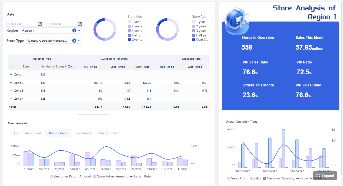
Multi-project or portfolio view
A portfolio dashboard is the right choice when leaders need to compare projects and allocate attention across a larger delivery environment.
This view should show:
- Status across multiple projects
- Trend patterns by team, region, or business unit
- Resource conflicts
- Budget pressure across the portfolio
- Shared dependency bottlenecks
- Projects most in need of intervention
For enterprise environments, this is often the most strategic dashboard because it shifts management from isolated reporting to coordinated portfolio control.
How to build a PM dashboard that people actually use
Most dashboards fail for one reason: they are built around available data instead of actual decisions. A good pm dashboard starts with the operational questions people need answered every day or every week.
1. Start with the decisions, not the widgets
Before selecting a single chart, define the decisions the dashboard must support.
Ask questions like:
- What should a project manager be able to decide from this view?
- What should an executive escalate based on this dashboard?
- What should operations change if capacity risk appears?
- What should finance challenge if spend and progress diverge?
This approach prevents dashboard bloat and keeps the design tied to action.
2. Use a small set of leading and lagging indicators
A balanced dashboard includes both:
- Leading indicators, such as blocked tasks, risk growth, capacity strain, and milestone confidence
- Lagging indicators, such as budget variance, missed deadlines, or defect counts
Leading metrics help teams intervene early. Lagging metrics help them measure outcomes. You need both.
As a rule, start with a tight metric set and expand only when a stakeholder can clearly explain the decision value of an added measure.
3. Define data sources, refresh rules, and ownership
Even a visually strong dashboard will lose trust if the numbers are inconsistent. Establish clear rules for:
- Source systems for schedule, cost, and workload data
- Refresh frequency
- Metric definitions
- Dashboard ownership
- Exception handling
- Governance for adding or changing KPIs
If one team defines “complete” differently from another, portfolio comparisons become misleading.
4. Design for clarity and drill-down
A dashboard should be readable in seconds. That means:
- Grouping metrics logically
- Using simple color coding carefully
- Avoiding decorative charts that do not support action
- Separating summary views from detail views
- Providing drill-down paths for root cause analysis
Good design is not about visual density. It is about making the next decision obvious.
5. Review usage and iterate like an operating tool
Treat the dashboard like a living management system, not a one-time reporting project.
A seasoned consultant would recommend a regular review cycle:
- Identify which metrics are used in meetings and decisions
- Remove charts no one references
- Add metrics only when they support a known decision gap
- Revalidate definitions as processes change
- Update layouts when teams, portfolios, or reporting cadences evolve
Adoption grows when users see the dashboard helping them act faster, not just report upward.
Common mistakes to avoid and how to improve over time
Even experienced teams build dashboards that look polished but fail in real use. The most common issues are not technical. They are design and governance problems.
Signs your dashboard is not helping decisions
Your pm dashboard is likely underperforming if you see these warning signs:
- Too many widgets competing for attention
- Unclear definitions for status or KPIs
- Data that updates too slowly to support action
- Metrics that inform but do not trigger decisions
- No distinction between executive and team views
- Heavy manual preparation before each reporting cycle
- Stakeholders still asking for separate spreadsheets or slide decks
A dashboard should reduce reporting friction. If it creates more explanation work, it needs redesign.
How to review and refine the dashboard
Continuous improvement is what separates a dashboard people tolerate from one they depend on.
Use this review method:
- Gather user feedback regularly: Ask which visuals people trust, ignore, or misinterpret.
- Retire low-value metrics: If a chart never changes a decision, remove it.
- Adjust by project maturity: Early-stage projects need risk and planning focus; later-stage projects may need burn, quality, and delivery confidence.
- Benchmark for inspiration, not imitation: Examples from other teams are useful, but the final layout should reflect your workflow, governance model, and stakeholder needs.
- Test in real meetings: The best validation is whether the dashboard improves the speed and quality of project reviews.
Over time, the strongest dashboards become embedded in operating cadence. Teams check them daily. Leaders use them in weekly reviews. Stakeholders trust them as the default view of reality.
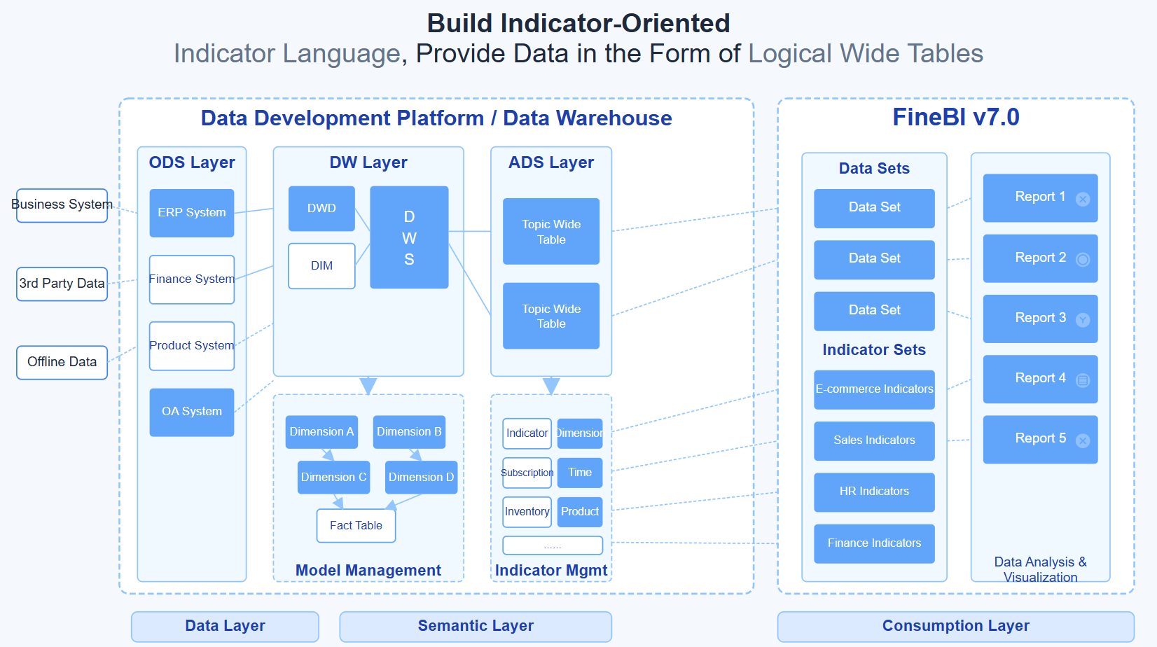
From dashboard methodology to execution at scale
The framework is clear: define the decisions, select the right KPIs, tailor the views by audience, and govern the data carefully. But building this manually is complex.
In most enterprises, project data lives across planning tools, spreadsheets, time systems, finance platforms, and collaboration apps. Standardizing metrics, maintaining refresh logic, designing role-based views, and keeping everything consistent over time demands significant effort.
That is where FineBI becomes the practical enabler.
Instead of assembling a pm dashboard from scratch, teams can use FineBI to utilize ready-made templates and automate this entire workflow. This makes it easier to:
- Consolidate project, budget, and resource data from multiple systems
- Build executive, delivery, client, and portfolio views faster
- Standardize KPI definitions across teams
- Enable drill-down analysis without creating separate reports
- Refresh dashboards automatically for real-time visibility
- Scale reporting without multiplying spreadsheet work
For organizations that want better delivery control without building a custom reporting stack from the ground up, FineBI helps turn dashboard strategy into a repeatable operating model.
A practical pm dashboard should do more than display data. It should help people make better decisions, earlier. If you want that outcome consistently across projects and portfolios, automation, templates, and governed self-service analytics are no longer optional. They are the fastest path to dashboards that teams actually use.
FAQs
A PM dashboard gives teams a single view of project status, timelines, budget, risks, and workload so they can make faster decisions. Its main purpose is to show what is happening now and where action is needed next.
The most useful metrics usually include planned versus actual progress, milestone status, schedule variance, budget consumed, cost variance, resource utilization, and open risks or blockers. The right mix depends on the audience and the decisions they need to make.
Project managers, PMOs, executives, operations teams, and finance stakeholders all use PM dashboards for different reasons. Some need detailed execution data, while others need a high-level summary of health, cost, and risk.
A status report is usually a periodic summary, while a PM dashboard is designed for ongoing visibility and faster decision-making. Dashboards are more useful when teams need real-time or near-real-time insight across multiple project signals.
Start by defining the audience and the decisions the dashboard should support, then include only the metrics that help answer those questions. A strong dashboard stays simple, connects schedule, cost, resource, and risk data, and highlights exceptions early.


The Author
Yida YIn
FanRuan Industry Solutions Expert
Related Articles

Portfolio Reporting for PMOs: 9 Executive Metrics Every Weekly Portfolio Dashboard Should Include
Weekly portfolio reporting should help executives answer three questions fast: Are we delivering the right initiatives, are we putting outcomes at risk, and what decisions need leadership this week? For PMOs, that means
Yida Yin
Jul 01, 2026

How to Build an Investment Portfolio Reporting Dashboard for Executives: KPIs, Benchmarks, and Drill-Down Views
Investment portfolio reporting for executives is not about showing every holding, transaction, and chart your investment team can produce. It is about giving CEOs, CFOs, CIOs, boards, and investment committees a fast, re
Yida YIn
Jun 25, 2026

12 KPI Reporting Examples for Executive Dashboards: What to Show in Weekly, Monthly, and Quarterly Reviews
Executive leaders do not need more data. They need decision ready $1 examples that match how often they review the business and what actions they are expected to take. A weekly $1 should surface fast moving risks and per
Yida YIn
Jun 25, 2026