Choosing the right financial dashboard template is not a design decision. It is a reporting strategy decision that directly affects how fast executives can detect risk, approve action, and steer the business.
If you are a CFO, finance manager, FP&A leader, or operations director, the problem is familiar: finance teams often build reports that are technically accurate but operationally ineffective for executives. They include too much detail, too many charts, and not enough context. As a result, leadership meetings turn into interpretation sessions instead of decision sessions.
The right financial dashboard template should compress financial complexity into a clear executive view. It should highlight what changed, why it changed, and what decision is needed next.
 Click To Try The Dashboard
What a financial dashboard template should do for executive reporting
Executive reporting is fundamentally different from day-to-day financial analysis. A dashboard built for controllers or analysts often fails when presented to the C-suite because it emphasizes transaction-level detail instead of strategic clarity.
An executive-ready financial dashboard template should help leaders absorb the state of the business in minutes, not force them to navigate dozens of filters and tabs.
Clarify the difference between operational dashboards and executive-level reporting views
Operational dashboards are built for monitoring activity. They support users who need to track workflows, investigate anomalies, and manage detailed processes. These dashboards often include granular dimensions, transaction lists, and drill-heavy exploration.
Executive dashboards serve a different purpose. They are designed to support strategic judgment. That means they should:
- Surface business performance at a high level
- Show trends over time
- Highlight variance against plan, forecast, or prior period
- Make risk and opportunity visible quickly
- Support concise, board-ready storytelling
A CEO does not need the same view as an AP manager. An executive reporting dashboard should reduce clutter and elevate the few financial signals that truly influence decisions.
Focus on fast decision-making, trend visibility, and board-ready storytelling
A strong financial dashboard template for executive use should answer three questions immediately:
- Where do we stand now?
- What changed versus plan or prior period?
- What action should we consider next?
That requires a dashboard structure built around summary metrics, movement over time, and explanatory context. Executives rarely want isolated numbers. They want narrative-supported insight.
For example, a decline in margin is useful only when paired with context such as rising input costs, pricing pressure, or mix shift. A dashboard that presents the number without the story creates more questions than answers.
Identify the metrics, visuals, and context executives actually need
An effective executive dashboard should not attempt to represent every available finance metric. It should prioritize indicators tied to enterprise performance, capital allocation, and operational resilience.
Key Metrics (KPIs)
- Revenue: Tracks top-line performance and growth trajectory.
- Cash Flow: Shows liquidity strength and ability to fund operations.
- Gross Margin: Indicates pricing power and cost efficiency.
- EBITDA or Operating Profit: Measures operating performance before financing and non-operating factors.
- Net Profit Margin: Shows bottom-line efficiency.
- Budget Variance: Compares actual results against approved targets.
- Forecast Accuracy: Evaluates planning quality and confidence in forward views.
- Working Capital: Reflects short-term financial health and efficiency.
- Accounts Receivable Days: Measures cash collection speed.
- Accounts Payable Days: Indicates payment timing and supplier cash strategy.
- Current Ratio or Liquidity Ratio: Assesses short-term solvency.
- Burn Rate or Cash Runway: Critical for high-growth or cash-sensitive businesses.
The visuals should match the executive use case. In practice, that often means:
- Summary cards for headline metrics
- Trend lines for period-over-period movement
- Variance indicators for actual vs budget or forecast
- Waterfall or bridge visuals for explaining movement
- Select drill-down paths for focused investigation, not open-ended exploration
Define your executive audience, goals, and reporting cadence
Many reporting failures happen before the dashboard is even built. Teams pick a template based on appearance rather than intended audience, decision objective, and review rhythm.
A template that works for a monthly CFO review may fail for a quarterly board pack. Start with the audience and reporting purpose, then choose the structure.
Match the dashboard to who will use it
Different executive audiences consume financial information differently. Your financial dashboard template should reflect that reality.
CEOs
CEOs typically want a concise enterprise-level view. They care about:
- Revenue growth
- Profitability trends
- Cash position
- Business unit performance
- Strategic risks and exceptions
They usually need a summary-first dashboard with minimal accounting detail.
CFOs
CFOs require more financial depth. They need visibility into:
- Cash flow dynamics
- Variance to budget
- Forecast reliability
- Working capital efficiency
- Cost control and margin drivers
A CFO dashboard can support light drill-down, but it still needs to remain decision-oriented.
Finance leaders and FP&A teams
These users often sit between operational detail and executive presentation. They need dashboards that allow them to:
- Validate numbers before review meetings
- Understand drivers behind changes
- Prepare commentary and recommendations
For this group, the template should combine summary performance with selected diagnostic views.
Department heads
Business leaders outside finance typically need a filtered view tied to accountability. They care about:
- Budget consumption
- Department spend vs target
- Headcount cost trends
- Revenue or margin contribution where relevant
Their dashboards should simplify finance metrics into operational implications.
You should also define the primary use case before choosing a dashboard structure:
- Strategic review: Focus on trends, risk, and scenario implications
- Budget tracking: Emphasize actual vs budget and spending control
- Performance oversight: Balance financial outcomes with driver metrics
- Board reporting: Prioritize concise storytelling, consistency, and trust
Set the reporting frequency before choosing a format
Reporting cadence should shape dashboard design. This is often overlooked.
A weekly executive dashboard needs compact indicators, exception flags, and near-real-time visibility. A monthly finance review dashboard can include more context, commentary, and reconciliation logic. A quarterly board dashboard should be polished, stable, and highly curated.
Consider the following reporting cycles:
- Weekly: Best for fast-moving organizations that need current performance visibility
- Monthly: Ideal for formal financial review and accountability rhythms
- Quarterly: Better for strategic evaluation and board-level reporting
- Board-meeting cadence: Requires presentation-grade layout and narrative support
You also need to decide whether the dashboard is meant for:
- Snapshot reporting: A fixed view of performance at a point in time
- Real-time visibility: A live dashboard with automated refresh and dynamic movement
If executives are consuming both, your template should support a stable summary page for presentations and a live version for ongoing monitoring.
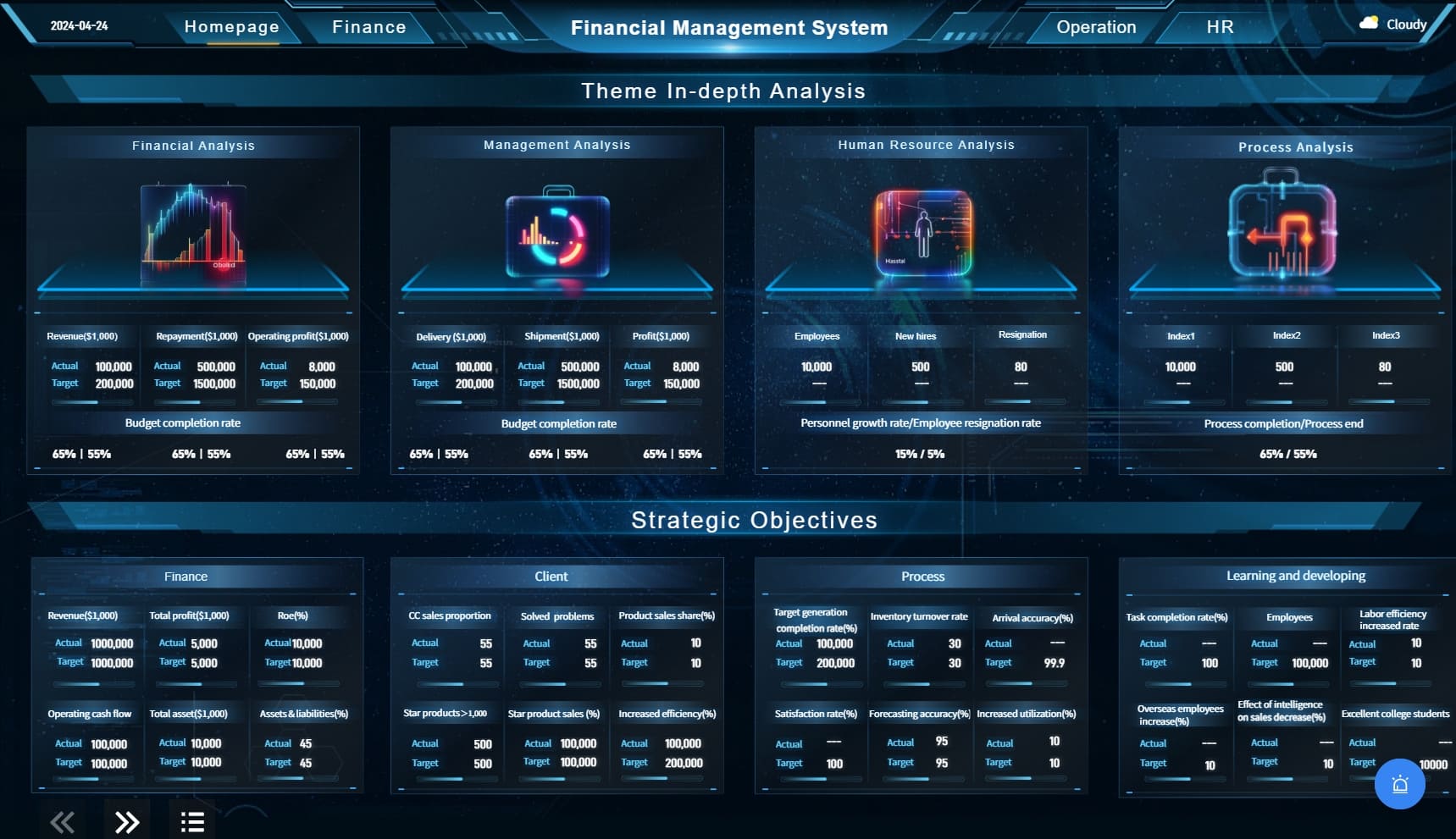
Evaluate the right layout, KPIs, and visual structure
Once audience and cadence are clear, the next step is evaluating the dashboard itself. The best financial dashboard template is not the one with the most charts. It is the one that creates the shortest path from data to executive understanding.
Choose KPIs that support executive decisions
Start by selecting only the KPIs that influence executive action. If a metric does not change a leadership decision, it probably does not belong on the main page.
For most executive finance dashboards, the core KPI set includes:
- Revenue
- Cash flow
- Profitability
- Forecast accuracy
- Budget variance
- Working capital
Depending on the business model, you may also include:
- Recurring revenue
- Customer acquisition efficiency
- Cost-to-serve
- Debt coverage
- Capital expenditure vs plan
- Inventory-related cash exposure
The key is discipline. Resist the urge to overload the template with analyst-level detail. Highly granular measures belong in supporting tabs or role-specific views, not in the executive summary.
A useful rule: the first screen should contain only the metrics leadership expects to discuss in the first five minutes of a review meeting.
Look for a clear visual hierarchy
Good executive dashboards are intentionally structured. They guide the eye from top-level outcomes to underlying trends and then to selective detail.
A strong layout usually includes:
- Top row: Summary KPI cards
- Middle section: Trend and variance visuals
- Lower section: Drivers, exceptions, or filtered breakdowns
- Optional side or footer area: Commentary and action notes
This hierarchy helps executives read the dashboard in a natural sequence.
Key design elements to evaluate in any financial dashboard template:
- Summary cards: Should make current status obvious at a glance
- Trend lines: Should reveal direction, not just static values
- Variance indicators: Should show actual vs budget, forecast, or prior period clearly
- Color use: Should highlight material changes, not decorate the page
- Drill-down paths: Should be limited, purposeful, and intuitive
If an executive cannot understand the main message in under two minutes, the layout is too complex.
Check whether the template supports narrative context
Numbers alone rarely satisfy executive needs. Leaders want to know what caused the movement, what risk it creates, and what actions are recommended.
That is why the best executive financial dashboard template leaves room for narrative context.
Look for space to include:
- Commentary on major variances
- Assumptions behind forecast changes
- Notes on one-off events or accounting effects
- Risk indicators and implications
- Recommended next steps
This narrative layer is what transforms a dashboard from a reporting artifact into a decision-support tool.
A board-ready dashboard should not only answer “what happened?” It should also support “why did it happen?” and “what do we do next?”
Compare tools, examples, and customization options
After clarifying reporting needs and evaluating design logic, you need to choose the delivery environment. Templates can look impressive in static mockups but fail in production if they do not align with your systems, governance model, and stakeholder workflow.
Review template examples before making a choice
Before selecting any financial dashboard template, compare multiple examples across different reporting styles.
Assess how each example handles:
- Trend presentation
- Variance communication
- Forecast comparisons
- Density of information
- Commentary and explanatory notes
- Executive readability
Free templates can be useful starting points, especially for ideation. But many are too generic for executive finance reporting. They may showcase visual style without reflecting real financial governance needs.
When reviewing examples, ask practical questions:
- Does this template show the metrics my executives actually care about?
- Can key issues be understood without a walkthrough from finance?
- Is the layout credible enough for board-level use?
- Will this structure still work as reporting needs become more complex?
A visually attractive dashboard that undermines trust is worse than a plain one that is clear and consistent.
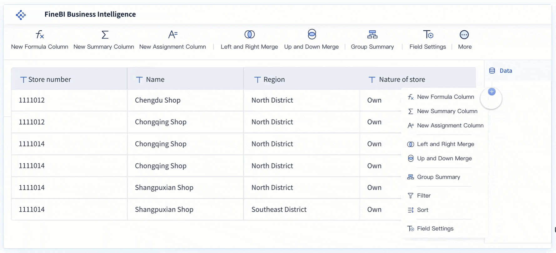
Consider your reporting platform and data model
A dashboard template is only as effective as the environment supporting it.
You may be choosing among:
- Spreadsheets for lightweight or static reporting
- BI tools for scalable and interactive reporting
- A Power BI Report for organizations standardized on Microsoft analytics
- Enterprise analytics platforms connected to ERP, accounting, and planning systems
The right option depends on your data maturity and reporting complexity.
Evaluate whether the template can connect cleanly to:
- ERP systems
- General ledger and accounting platforms
- Planning and budgeting tools
- Revenue systems
- Payroll and HR cost data
- Operational systems that drive financial outcomes
If the dashboard requires excessive manual extraction or manipulation, the template may create hidden process risk. Executive reporting demands consistency, data freshness, and confidence in the numbers.
Also review the underlying data model:
- Are KPI definitions standardized?
- Can time periods be aligned consistently?
- Are actuals, budgets, and forecasts mapped correctly?
- Can the model handle multiple entities, currencies, or departments?
- Will governance remain manageable as usage grows?
Balance design quality with usability
Executive reporting should look polished, but appearance must never outrank clarity.
Many finance teams over-index on visual inspiration from gallery sites or design communities. The result is often dashboards that look modern but obscure the message.
A high-quality financial dashboard template should balance three things:
- Credibility: The presentation must feel reliable and board-ready
- Clarity: The structure must make insight obvious
- Usability: The dashboard must remain practical for recurring reporting
When evaluating design quality, check for:
- Clean spacing and alignment
- Consistent labeling
- Controlled use of color
- Minimal visual noise
- Strong readability in presentation mode and on screen
- Scalability as additional metrics or segments are added
The best finance dashboards are usually not flashy. They are disciplined, stable, and easy to trust.
Test the template for accuracy, adoption, and executive readiness
A template should never be selected based on aesthetics alone. It must prove that it can survive real reporting conditions: messy source data, executive scrutiny, and recurring usage.
This is where many teams uncover hidden weaknesses.
Validate the numbers and definitions
Before rollout, validate every KPI and comparison rule in the dashboard.
At minimum, standardize:
- KPI formulas
- Date logic
- Fiscal calendar handling
- Source system hierarchy
- Actual vs budget mapping
- Forecast version control
- Currency conversion logic where needed
Then test for consistency across views:
- Do totals reconcile?
- Do filters behave correctly?
- Are period comparisons stable?
- Are executive summary numbers aligned with detailed supporting views?
Even a well-designed financial dashboard template will fail if different stakeholders interpret the numbers differently. In executive reporting, trust is everything.
Pilot the dashboard with stakeholders
A pilot phase helps you see whether the dashboard works under realistic conditions.
Run a review with a small group that includes:
- One or two executive consumers
- CFO or finance leadership
- FP&A or reporting owners
- Data or BI support where applicable
During the pilot, observe how stakeholders interact with the dashboard. Do not just ask whether they like it. Ask what they can conclude from it.
Useful pilot questions include:
- What is the first insight you see?
- Which metric feels unclear or unnecessary?
- Where do you still need explanation from finance?
- What question would you ask immediately in a review meeting?
- What action would this dashboard help you make faster?
The answers will reveal whether the template truly supports executive understanding or simply displays financial data.
Use a final selection checklist
Before making your final decision, use a structured checklist. This avoids choosing a template based on style preference or internal bias.
Final Selection Checklist
- Does the template match the target executive audience?
- Does it support the intended reporting purpose?
- Is it aligned to the right reporting cadence?
- Are the KPIs decision-relevant and limited to essentials?
- Is the visual hierarchy clear and fast to read?
- Is there room for commentary and narrative context?
- Can it connect reliably to source systems?
- Are KPI definitions and filters consistent?
- Can it scale with new entities, departments, or reporting needs?
- Is the dashboard suitable for both quick review and confident decision-making?
If the answer to several of these questions is no, keep evaluating. A weak template creates recurring reporting friction that only grows over time.
Build a more scalable executive reporting workflow with FineBI
At this point, the real issue becomes clear: selecting the right financial dashboard template is only one part of the job. The harder challenge is maintaining it across changing KPIs, multiple data sources, reporting cycles, and executive expectations.
Building this manually is complex; use FineBI to utilize ready-made templates and automate this entire workflow.
FineBI helps finance and business teams move beyond static reporting by combining executive-ready dashboard design with scalable BI capabilities. Instead of stitching together spreadsheets, presentation decks, and disconnected charts, teams can build a consistent reporting layer that is easier to maintain and far more credible in leadership reviews.
With FineBI, you can:
- Start faster with ready-made financial dashboard templates
- Standardize executive KPIs across teams and reporting periods
- Connect to ERP, accounting, and planning data sources more efficiently
- Automate refresh cycles for weekly, monthly, or quarterly reporting
- Deliver dashboards that support both high-level review and controlled drill-down
- Add context, commentary, and structured storytelling to executive views
For enterprise teams, this matters because executive reporting is not a one-time dashboard project. It is an ongoing operational capability. FineBI makes that capability more repeatable, scalable, and trustworthy.
If your current process depends on manual consolidation, version confusion, or presentation rework every reporting cycle, the better move is not to keep redesigning reports. It is to adopt a platform that turns executive reporting into a governed, automated workflow.
Choose a financial dashboard template that fits your audience and decisions. Then use FineBI to make that template sustainable in the real world.
FAQs
It should include headline KPIs such as revenue, cash flow, margin, profit, and variance to budget or forecast, along with clear trend views and concise context. The goal is to show what changed, why it changed, and what decision may be needed next.
An executive dashboard is built for fast strategic review, not detailed process monitoring. It emphasizes summary metrics, trends, and risks, while operational dashboards focus more on transactions, workflows, and deep investigation.
The most important KPIs usually include cash flow, working capital, gross margin, EBITDA or operating profit, budget variance, and forecast accuracy. The right mix depends on the business model, reporting goals, and audience.
Choose a template that is summary-first, easy to scan, and focused on strategic performance rather than accounting detail. It should support board-ready storytelling with trends, variance explanations, and visible risks or opportunities.
Summary cards, line charts, variance indicators, and waterfall charts are usually the most effective because they make performance movement easy to understand. The best executive dashboards avoid clutter and use only a few visuals that directly support decisions.


The Author
Yida YIn
FanRuan Industry Solutions Expert
Related Articles

Portfolio Reporting for PMOs: 9 Executive Metrics Every Weekly Portfolio Dashboard Should Include
Weekly portfolio reporting should help executives answer three questions fast: Are we delivering the right initiatives, are we putting outcomes at risk, and what decisions need leadership this week? For PMOs, that means
Yida Yin
Jul 01, 2026

How to Build an Investment Portfolio Reporting Dashboard for Executives: KPIs, Benchmarks, and Drill-Down Views
Investment portfolio reporting for executives is not about showing every holding, transaction, and chart your investment team can produce. It is about giving CEOs, CFOs, CIOs, boards, and investment committees a fast, re
Yida YIn
Jun 25, 2026

12 KPI Reporting Examples for Executive Dashboards: What to Show in Weekly, Monthly, and Quarterly Reviews
Executive leaders do not need more data. They need decision ready $1 examples that match how often they review the business and what actions they are expected to take. A weekly $1 should surface fast moving risks and per
Yida YIn
Jun 25, 2026