

Sales graphs transform raw sales data into clear visual formats, making complex metrics easy to grasp. You can quickly spot patterns and trends, which helps in making informed decisions. Visual data representation is crucial in business because it saves time and enhances understanding. Instead of sifting through endless reports, you see the big picture at a glance. Sales graphs play a vital role in strategic planning by improving communication and motivating your team. They make data more accessible, allowing you to adjust strategies swiftly and effectively.
Understanding the Sales Graph
Definition of the Sales Graph
A Sales Graph is a visual tool that represents sales data in an easy-to-understand format. You can think of it as a snapshot of your sales performance over time. By using a Sales Graph, you can quickly identify trends and patterns in your sales activity. This makes it easier to make informed decisions about your business.
Key Characteristics
Sales Graphs have several key characteristics that make them valuable:
-
Clarity: They present complex data in a simple, visual format.
-
Trend Identification: You can spot trends, such as seasonal swings or growth patterns, at a glance.
-
Comparative Analysis: They allow you to compare different sets of sales data easily.
Types of Sales Graphs
There are various Types of Sales Graphs, each serving a unique purpose:
-
Line Graphs: Ideal for showing trends over time. You can use them to track sales growth year-over-year.
-
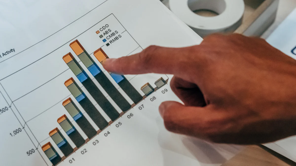
Bar Graphs: Useful for comparing sales figures across different categories or time periods.
Historical Context of the Sales Graph
Understanding the history of Sales Graphs helps you appreciate their evolution and significance in today's business world.
Evolution of Sales Graphs
Sales Graphs have come a long way. Initially, businesses relied on basic charts to represent sales data. Over time, these graphs evolved to include more sophisticated features, allowing for detailed analysis and comparison. This evolution has made Sales Graphs an essential tool for businesses looking to understand their sales performance better.
Technological Advancements
Technological advancements have significantly impacted the development of Sales Graphs. Modern software tools now offer advanced features like real-time data updates and interactive elements. These innovations make it easier for you to visualize and analyze sales data, leading to more informed decision-making.
Components of a Sales Graph
Understanding the components of a Sales Graph can help you make the most of this powerful tool. Let's break down the essential parts that make up a Sales Graph.
Axes and Labels of a Sales Graph
The axes and labels form the backbone of any Sales Graph. They provide the framework for displaying your data clearly.
X-Axis: Time Period
The X-axis typically represents time. You might use it to show days, months, or even years. This axis helps you track how sales change over time. For instance, you can see if sales peak during certain seasons or if there's a steady growth trend. By focusing on the time period, you can plan better and anticipate future sales patterns.
Y-Axis: Sales Metrics
The Y-axis displays sales metrics. These could include revenue, units sold, or profit margins. By plotting these metrics, you can easily compare different time periods. For example, you might notice that actual profit differs from predicted profit. This insight can help you understand why targets aren't being met and adjust your strategies accordingly.
Data Points and Trends of a Sales Graph
Data points and trends are where the magic happens. They reveal the story behind your Sales Graph.
Identifying Patterns
Data points on a Sales Graph allow you to identify patterns. You might see that certain products consistently perform well. This information is crucial for managing inventory effectively. By recognizing these patterns, you can ensure that popular items are always in stock, maximizing your sales potential.
Analyzing Peaks and Troughs
Analyzing peaks and troughs in your Sales Graph can provide valuable insights. Peaks might indicate successful marketing campaigns or seasonal demand. Troughs, on the other hand, could highlight areas for improvement. By understanding these fluctuations, you can make informed decisions to boost your sales performance.
Importance of a Sales Graph
Understanding the importance of a Sales Graph can transform how you approach business decisions. Let's explore how it aids in strategic decision-making and performance analysis.
Strategic Decision-Making
Sales Graphs play a crucial role in shaping your business strategies. Sales Graphs play a crucial role They provide a clear picture of your sales landscape, helping you make informed choices.
Forecasting Sales
You can use Sales Graphs to predict future sales trends. By analyzing past data, you identify patterns that indicate potential growth or decline. This foresight allows you to prepare for upcoming demands, ensuring you meet customer needs efficiently.
Identifying Market Trends
Spotting market trends becomes easier with Sales Graphs. They highlight shifts in consumer behavior and preferences. You can adjust your marketing strategies to align with these trends, keeping your business competitive.
Performance Analysis
Evaluating your business performance is essential for growth. Sales Graphs offer a straightforward way to measure success and pinpoint areas needing improvement.
Measuring Success
Sales Graphs provide a visual representation of your achievements. You can track progress against targets and celebrate milestones. This clarity boosts team morale and keeps everyone focused on common goals.
Identifying Areas for Improvement
Recognizing where you can improve is vital for continuous growth. Sales Graphs reveal underperforming areas, allowing you to address issues promptly. By focusing on these areas, you enhance overall efficiency and drive better results.
Case Studies: Explore 60 Case Studies Exploring Sales Strategy Across Various Industries to gain insights into effective sales strategies. These studies offer valuable lessons that can be applied to your own business context.
Benefits of Using a Sales Graph
Enhanced Data Visualization
Sales graphs transform complex data into simple visuals. You can see patterns and trends without getting lost in numbers. This clarity helps you understand your sales data better.
Simplifying Complex Data
Graphs break down complicated data into easy-to-read visuals. You don't need to sift through endless spreadsheets. Instead, you get a clear picture of your sales performance at a glance. This simplicity saves time and reduces errors.
Improving Communication
Visuals make it easier to share information with your team. Everyone can see the same data and understand it quickly. This shared understanding improves teamwork and decision-making. You can discuss strategies and make plans with confidence.
Increased Efficiency
Sales graphs boost efficiency by making data interpretation faster. You can make decisions quickly and accurately. This speed gives you an edge in the competitive business world.
Quick Data Interpretation
Graphs allow you to interpret data swiftly. You can spot trends and anomalies without delay. This quick insight helps you respond to changes in the market promptly. You stay ahead of the competition by acting fast.
Facilitating Quick Decisions
With clear visuals, you can make decisions on the fly. You don't have to wait for lengthy reports. Instead, you have the information you need right in front of you. This agility helps you seize opportunities and address challenges effectively.
Best Practices for Creating a Sales Graph
Creating an effective sales graph involves choosing the right type and ensuring data accuracy. Let's dive into these best practices.
Choosing the Right Type of Graph
Selecting the appropriate graph type is crucial for clear data visualization. Different graphs serve different purposes, so understanding their strengths can enhance your insights.
Line Graphs
Line graphs are perfect for showing trends over time. They help you track changes in sales, revealing patterns like seasonal fluctuations or growth trends. By using line graphs, you can easily spot upward or downward movements in your sales data.
Bar Graphs
Bar graphs excel at comparing sales figures across categories or time periods. They simplify complex datasets, making it easier to detect trends and make informed decisions. Bar graphs provide a straightforward way to visualize performance, especially when dealing with large datasets.
Ensuring Data Accuracy
Accurate data is the backbone of any reliable sales graph. Without it, your insights might lead you astray. Here’s how to maintain precision.
Regular Updates
Keep your data current by updating it regularly. This practice ensures that your sales graph reflects the latest information, allowing you to make timely decisions. Regular updates help you stay on top of market changes and customer behavior.
Cross-Verification
Cross-verify your data to ensure its accuracy. Double-check figures and sources to avoid errors. This step is vital for maintaining trust in your data visualization. Accurate graphs lead to better decision-making and improved business strategies.
Key Insight: Data visualization tools offer improved understanding of data, faster decision-making, and better communication. By choosing the right graph and ensuring data accuracy, you enhance the effectiveness of your sales strategy.
Tools for Creating a Sales Graph
Creating a sales graph becomes a breeze when you have the right tools at your disposal. Let's explore some popular software options and online platforms that can help you visualize your sales data effectively.
Software Options
Excel
Excel is a versatile tool that many businesses rely on for creating sales graphs. You can manually input your data and use Excel's built-in chart features to generate various types of graphs. Whether you're looking to create a simple line graph or a more complex bar graph, Excel offers the flexibility you need. Its user-friendly interface makes it easy for you to customize your graphs, ensuring they meet your specific requirements.
FineBI
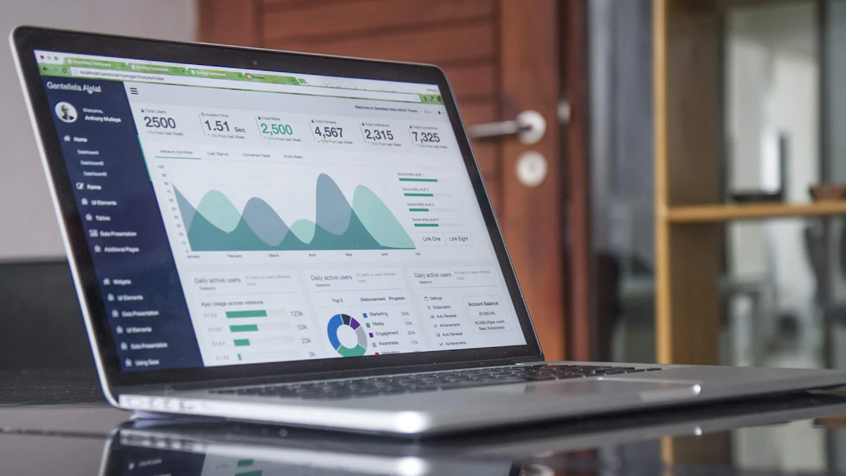
FineBI takes data visualization to the next level. It's not just about creating pretty charts; it's about turning raw data into actionable insights. With FineBI, you can focus on the right metrics and unlock the full potential of your sales team. The software allows you to build interactive dashboards that make complex data simple to understand. By using FineBI, you can make faster decisions, improve forecasting, and boost team performance.
Online Platforms
Google Charts
Google Charts offers a powerful way to create interactive charts. You can easily integrate these charts into your website or presentations. The platform provides a variety of chart types, allowing you to choose the one that best represents your sales data. With Google Charts, you can hover over data points to get additional information, making your graphs more engaging and informative.
Power BI
Power BI is another excellent tool for creating sales graphs. It allows you to connect to various data sources and transform your data into stunning visuals. Power BI's interactive features enable you to explore your data in depth, helping you uncover trends and patterns that might not be immediately apparent. By using Power BI, you can enhance your data storytelling and make more informed business decisions.
Key Insight: Choosing the right tool for creating sales graphs can significantly impact your ability to visualize and interpret your data. Whether you prefer the simplicity of Excel or the advanced features of FineBI and Power BI, having the right tool can make all the difference in your sales strategy.
Future of a Sales Graph
Emerging Trends of a Sales Graph
AI and Machine Learning
AI and machine learning are transforming sales graphs. These technologies help you analyze vast amounts of data quickly. They identify patterns and trends that might be hard to spot manually. By using AI, you can predict future sales more accurately. This insight allows you to make smarter decisions and stay ahead of the competition.
Some experts say, "A data-driven sales strategy will enable your company to make better decisions and become more profitable in the long run."
Real-Time Data Analysis
Real-time data analysis is becoming essential. You can see sales data as it happens, allowing you to respond immediately. This capability helps you adjust strategies on the fly. You can seize opportunities or address issues without delay. Real-time insights keep your business agile and competitive.
Innovations in Data Visualization
Interactive Graphs
Interactive graphs are changing how you view sales data. You can engage with the data by clicking or hovering over elements. This interaction makes complex information easier to understand. You can explore different scenarios and gain deeper insights. Interactive graphs turn data analysis into an engaging experience.
Augmented Reality Applications
Augmented reality (AR) is the next frontier in data visualization. Imagine viewing sales graphs in a 3D space. AR allows you to interact with data in new ways. You can visualize trends and patterns more vividly. This technology makes data analysis more intuitive and exciting. AR applications could revolutionize how you approach sales strategies.
By embracing these emerging trends and innovations, you can enhance your sales strategy and drive success. The future of sales graphs promises to be dynamic and full of possibilities.
Sales graphs are crucial for understanding your sales data. They transform raw numbers into clear visuals, making it easier for you to spot trends and patterns. By implementing sales graphs in your business strategy, you can make informed decisions quickly and boost team performance. As sales graphs continue to evolve with technological advancements, they will play an even more significant role in shaping successful business strategies. Embrace these tools to stay ahead in the competitive market and enhance your sales approach effectively.
FAQ
A sales graph is a visual representation of your sales data. It helps you see patterns and trends quickly, making it easier to understand your sales performance over time.
Sales graphs simplify complex data, allowing you to spot trends and make informed decisions. They enhance your sales strategy by providing clear insights into customer behavior and market trends.
You can choose from various types of sales graphs, such as line graphs, bar graphs, and pie charts. Each type serves a different purpose, like tracking trends over time or comparing sales across categories.
Use tools like Excel, FineBI, or Google Charts to create a sales graph. Input your data, select the graph type that suits your needs, and customize it to highlight key insights.
Regular updates are crucial. Keep your sales graph current by updating it with the latest data. This practice ensures you have accurate insights for decision-making.
Absolutely! Sales graphs provide a clear picture of your sales landscape. By understanding patterns and trends, you can refine your sales strategy and address any blockers causing friction.
Sales graphs make your presentations more engaging. They help your audience grasp complex data quickly, improving communication and making your points more persuasive.
Ensure data accuracy and choose the right graph type. Avoid cluttering your graph with too much information. Keep it simple and focused on the key insights you want to convey.

Continue Reading About Sales Graph
Unveiling the Top 20 Business Reporting Tools of 2025
Discover the top 39 business reporting tools of 2025 to drive growth and innovation. Explore cutting-edge solutions for data-driven decisions.
Lewis
Jun 09, 2024
50+ Must-Have Business Tools for Small Businesses to Succeed in 2025
Discover 50+ essential business tools for small businesses in 2025. Boost productivity, streamline operations, and achieve success with the right tools.
Lewis
Mar 13, 2025
Augmented Analytics: Unlock the Core Concepts & Benefits!
Discover augmented analytics—where AI and ML automate data prep and insights, revolutionizing decision-making for smarter, faster business strategies!
Lewis
Mar 04, 2025
Which Data Analysis Projects Work Best for Beginners?
Ready to shine in 2025? Discover easy data analysis projects to boost your portfolio, learn data cleaning, visualization, and tackle real-world challenges!
Lewis
Mar 10, 2025
Business Data Analyst vs Business Analyst Key Differences Explained
Compare business data analyst vs business analyst roles, focusing on key differences, responsibilities, skills, and career paths to guide your career choice.
Lewis
Mar 11, 2025
Covers Dashboard: Find Your Perfect Match
Choose the perfect covers dashboard to protect and style your car, enhancing its interior and resale value with the right material and fit.
Lewis
Nov 05, 2024

