

Have you ever wondered how to visualize data that changes in sudden jumps rather than smooth transitions? A Step Graph might be just what you need. This unique graph type represents data as a series of steps, making it perfect for displaying irregular, persistent values. By using a Step Graph, you can highlight specific data points without overwhelming your audience. Understanding this graph can enhance your ability to interpret trends over time, offering a fresh perspective on data analysis. Dive into the world of Step Graphs and discover their importance in simplifying complex information.
Understanding the Step Graph

Definition of Step Graphs
Step Graphs are a fascinating way to visualize data. Imagine a staircase where each step represents a constant value over a specific interval. This is what a Step Graph looks like. It’s a type of piecewise function, meaning it consists of different segments, each with its own rule.
Basic Characteristics
A Step Graph has some unique features. Each segment of the graph maintains a constant value, creating a series of horizontal lines. These lines form the "steps" you see. The graph jumps from one level to another without any gradual transition. This discontinuous nature makes it perfect for representing data that changes abruptly.
How They Differ from Other Graphs
Unlike line graphs, which show smooth transitions, Step Graphs highlight sudden changes. They don’t connect data points with sloping lines. Instead, they use horizontal lines to emphasize stability within intervals. This makes them ideal for situations where data remains constant for a period before jumping to a new value.
Piecewise Nature of Step Graphs
Step Graphs are a classic example of piecewise functions. These functions apply different rules to different parts of their domain.
Explanation of Piecewise Functions
A piecewise function breaks down into several parts, each defined by its own equation. In a Step Graph, each "step" corresponds to a piece of the function. For example, utility billing often uses step functions. You pay a fixed rate for a certain amount of usage, and then the rate changes at predefined intervals.
Examples of Piecewise Data Representation
Consider mobile phone billing. You might pay a flat rate for the first 100 minutes, then a different rate for the next 100. A Step Graph perfectly illustrates this scenario. Each step represents a different billing rate, making it easy to see how costs change as usage increases.
Step Graphs offer a clear and concise way to represent data that doesn’t change smoothly. By understanding their structure and purpose, you can better interpret data that involves sudden shifts.
How A Step Graph Functions
Visual Representation
Steps and Intervals
When you look at a Step Graph, you'll notice it resembles a staircase. Each "step" represents a constant value over a specific interval. This design makes it easy to see where changes occur. Unlike line charts, which show gradual trends, Step Graphs highlight the exact moment data shifts. This feature is perfect for data that changes at irregular intervals and stays constant between those changes.
Reading a Step Graph
Reading a Step Graph might seem tricky at first, but it's straightforward once you get the hang of it. Focus on the horizontal lines. Each line represents a stable value. The vertical jumps show where the data changes. By following these steps, you can quickly grasp how values shift over time.
Mathematical Foundation
Calculating Steps
To calculate steps in a Step Graph, you need to understand the intervals. Each step corresponds to a specific range of input values. You determine the height of each step by the value it represents. This calculation helps you visualize how data behaves within each segment.
Interpreting Data Points
Interpreting data points on a Step Graph involves looking at where each step begins and ends. These points mark the boundaries of each interval. By analyzing these points, you can understand the precise moments when data changes. This clarity makes Step Graphs invaluable for tracking sudden shifts in information.
By mastering these aspects of Step Graphs, you can enhance your data analysis skills. You'll find them especially useful for visualizing data that doesn't follow a smooth path.
Applications of A Step Graph
Step Graphs are not just theoretical concepts; they have practical applications across various fields. Let's explore how you can use them in mathematics and data visualization.
Use in Mathematics
Solving Mathematical Problems
In mathematics, Step Graphs serve as powerful tools for solving problems involving piecewise functions. You can use them to represent situations where a function changes its rule based on the input value. For instance, when calculating taxes, different rates apply to different income brackets. A Step Graph can visually depict these changes, making it easier for you to understand and solve such problems.
Educational Tools
Step Graphs also play a significant role in education. They help students grasp the concept of piecewise functions and discontinuous data. By visualizing these graphs, you can better understand how different rules apply to different intervals. Teachers often use Step Graphs to illustrate real-world scenarios, like utility billing or tiered pricing models, making abstract mathematical concepts more tangible.
Data Visualization
Business and Economics
In the business world, Step Graphs are invaluable for visualizing data that changes at irregular intervals. They allow you to see how sales, costs, or other metrics shift over time. For example, a company might use a Step Graph to show how product prices change during a promotional period. This clear representation helps you make informed decisions by highlighting when and where changes occur, similar to sales dashboards.
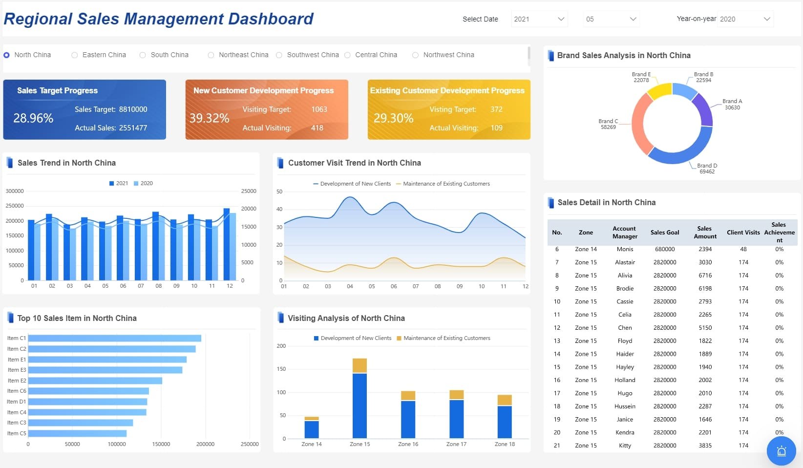
Sales dashboard created by FineBI
Scientific Research
Step Graphs also find applications in scientific research. Researchers use them to display data that remains constant for a period before suddenly changing. For instance, in environmental studies, a Step Graph might show temperature changes over time, with each step representing a stable period followed by a sudden shift. This visualization helps you identify patterns and anomalies in the data, aiding in the analysis and interpretation of complex information.
By incorporating Step Graphs into your toolkit, you can enhance your ability to analyze and present data effectively. Whether you're solving mathematical problems or visualizing trends in business and science, Step Graphs offer a clear and concise way to represent data that doesn't change smoothly.
Importance of A Step Graph
Advantages in Data Analysis
Clarity and Precision
When you use a Step Graph, you gain clarity and precision in your data analysis. This graph type allows you to see exactly where changes occur, without the noise of gradual transitions. Each step clearly marks a shift in data, making it easier for you to pinpoint specific moments of change. This precision helps you avoid misinterpretations and ensures that your audience understands the data accurately.
Simplifying Complex Data
Step Graphs excel at simplifying complex data. They break down intricate information into manageable segments, each represented by a distinct step. This approach makes it easier for you to digest and analyze data that might otherwise seem overwhelming. By focusing on individual steps, you can better understand how different variables interact and influence each other over time.
Real-World Examples
Case Studies
In real-world scenarios, Step Graphs have proven their worth time and again. Consider a case study in the energy sector, where companies use Step Graphs to illustrate electricity usage patterns. Each step represents a different rate based on consumption levels. This visual representation helps both the company and its customers understand how usage impacts costs, leading to more informed decisions about energy consumption.
Industry Applications
Step Graphs find applications across various industries. In finance, they help you track stock prices that remain stable for periods before jumping to new levels. In healthcare, Step Graphs can show patient data, like blood pressure readings, that stay constant before changing due to treatment. These graphs provide a clear picture of how data behaves, enabling you to make data-driven decisions with confidence.
Nick Desbarats once said, "So, if you haven’t been using step charts, there’s a good chance that you’ve been misrepresenting at least some of your data to your audience." He suggests incorporating Step Graphs into your data visualization toolkit to ensure accurate representation of irregular, persistent values.
By embracing Step Graphs, you enhance your ability to analyze and present data effectively. Whether you're dealing with complex datasets or seeking clarity in your analysis, Step Graphs offer a powerful solution that simplifies the process and improves understanding.
Challenges and Limitations of A Step Graph
When using a Step Graph, you might encounter some challenges and limitations. Understanding these can help you make better decisions about when and how to use this type of graph.
Potential Misinterpretations
Common Mistakes
You might find that interpreting a Step Graph can lead to mistakes if you're not careful. One common error is assuming that the data changes gradually between steps. Remember, a Step Graph shows sudden jumps, not smooth transitions. Misreading these jumps can lead to incorrect conclusions about the data's behavior.
Avoiding Errors
To avoid errors, focus on the horizontal lines. These lines represent constant values over specific intervals. Pay attention to where the steps change. This will help you accurately interpret the data. Practice reading different Step Graphs to become more familiar with their unique structure.
Limitations in Use
When Not to Use Step Graphs
Step Graphs aren't always the best choice. If your data changes gradually or continuously, a line chart could provide a clearer picture. Line charts excel at showing trends and gradual changes, while Step Graphs highlight steadiness and abrupt shifts.
Alternative Graphical Methods
Consider other graphical methods when a Step Graph doesn't fit your needs. Line charts, bar graphs, or scatter plots might offer better insights depending on your data. Each type of graph has its strengths, so choose the one that best represents your information.
By understanding these challenges and limitations, you can use Step Graphs more effectively. They are powerful tools for visualizing data with sudden changes, but knowing when to use them is key to accurate data representation.
Enhancing Understanding of A Step Graph
Educational Resources
To truly grasp the concept of Step Graphs, you can explore a variety of educational resources. These resources will provide you with the foundational knowledge and practical insights needed to master this unique graph type.
Books and Articles
Books and articles offer a wealth of information on Step Graphs. They delve into the theory behind these graphs and provide examples of their application. Look for books that focus on data visualization or mathematical functions. Articles in educational journals or online platforms can also offer valuable insights. They often include case studies and real-world examples that illustrate how Step Graphs are used in different fields.
Online Courses
Online courses are an excellent way to learn about Step Graphs at your own pace. Many platforms offer courses that cover data visualization techniques, including Step Graphs. These courses often include video tutorials, quizzes, and interactive exercises. By enrolling in an online course, you can gain a deeper understanding of how to create and interpret Step Graphs effectively.
Practical Exercises
Hands-on practice is crucial for mastering Step Graphs. By engaging in practical exercises, you can apply what you've learned and develop your skills further.
Creating Your Own Step Graphs
Creating your own Step Graphs is a great way to reinforce your understanding. Start by identifying a dataset that changes at irregular intervals. Use graphing software or tools like Excel to plot the data. Focus on translating the data into a series of steps, ensuring each step accurately represents a constant value over a specific interval. This exercise will help you become familiar with the process of graphing step functions.
Analyzing Sample Data
Analyzing sample data with Step Graphs can enhance your analytical skills. Find datasets that are commonly represented using Step Graphs, such as utility billing rates or tax brackets. Plot these datasets and examine the resulting graphs. Pay attention to how the steps highlight changes in the data. This practice will improve your ability to interpret Step Graphs and draw meaningful conclusions from them.
By utilizing these educational resources and engaging in practical exercises, you can deepen your understanding of Step Graphs. Whether you're reading books, taking online courses, or creating your own graphs, each step you take will bring you closer to mastering this valuable data visualization tool.
Future of A Step Graph
As you look to the future, Step Graphs promise exciting developments. Technological advancements and emerging trends are shaping how you will use these graphs in data visualization.
Technological Advancements
Software Tools
New software tools are making it easier for you to create and interpret Step Graphs. These tools offer user-friendly interfaces that simplify the process of plotting data. You can now generate Step Graphs with just a few clicks, thanks to advancements in graphing software. This ease of use allows you to focus more on analyzing data rather than struggling with complex graph creation.
Moreover, some tools incorporate advanced features like real-time data updates. Imagine being able to see your Step Graph adjust instantly as new data comes in. This capability enhances your ability to make timely decisions based on the most current information.
Innovations in Data Visualization
Innovations in data visualization are also transforming how you use Step Graphs. Augmented design structure matrix visualizations, for instance, are enhancing the way you analyze software systems. These visualizations provide a clearer picture of complex data structures, making it easier for you to identify patterns and trends.
Additionally, visualization tools are becoming more interactive. You can now manipulate Step Graphs to explore different scenarios and outcomes. This interactivity helps you gain deeper insights into your data, allowing for more informed decision-making.
Emerging Trends
Integration with AI
Artificial Intelligence (AI) is playing a significant role in the evolution of Step Graphs. By integrating AI, you can automate the analysis of Step Graphs, saving you time and effort. AI algorithms can quickly identify trends and anomalies in your data, providing you with valuable insights that might otherwise go unnoticed.
Furthermore, AI can help you predict future data trends. By analyzing historical data, AI can generate Step Graphs that forecast potential changes. This predictive capability empowers you to make proactive decisions, staying ahead of the curve in your field.
New Applications
Step Graphs are finding new applications across various industries. In healthcare, for example, visualization tools are being used to track patient data, such as blood pressure readings, over time. Each step in the graph represents a stable period, helping you identify when significant changes occur.
In the realm of patent analysis, Step Graphs are being utilized to visualize trends in patent applications. For instance, a tool for visualizing USPTO cancer-related patent information can help you spot emerging trends in cancer treatment innovations. This application highlights the versatility of Step Graphs in presenting complex data in an accessible format.
As you embrace these technological advancements and emerging trends, Step Graphs will continue to be a valuable tool in your data visualization arsenal. They offer clarity and precision, helping you make sense of complex information and make informed decisions.
To wrap things up, you've explored the fascinating world of Step Graphs. These graphs are perfect for visualizing data that changes at irregular intervals, like price shifts or tax rate adjustments. By using Step Graphs, you can clearly see where data remains constant and where it jumps, making complex information easier to digest. Their significance spans various fields, from business to science, offering clarity and precision in data analysis. So, why not dive deeper? Experiment with creating your own Step Graphs and discover new ways to present your data effectively.
FAQ
A Step Graph looks like a staircase, where each step represents a constant value over a specific interval. It’s perfect for data that changes suddenly rather than gradually.
Line charts focus on trends and smooth transitions. Step Graphs, however, highlight the exact moment of change, showing data that remains constant between shifts.
Use a Step Graph when you need to display data that changes at irregular intervals. It provides clarity by showing precise changes without the noise of gradual transitions.
Initially, creating Step Graphs might seem complex. Once you learn the process, they become a valuable tool for various applications. You can even reuse templates for different datasets.
Absolutely! They’re used in business to track sales changes, in science for environmental data, and even in finance for stock price analysis.
A common mistake is assuming gradual changes between steps. Remember, Step Graphs show sudden jumps. Focus on the horizontal lines to understand constant values.
Ensure your graphing software is updated. Sometimes, rebooting your device or re-logging into your application can resolve display issues.

Continue Reading About Step Graph
Covers Dashboard: Find Your Perfect Match
Choose the perfect covers dashboard to protect and style your car, enhancing its interior and resale value with the right material and fit.
Lewis
Nov 05, 2024
Dynamic Dashboard: A Game Changer for Data Analysis
Dynamic dashboard revolutionize data analysis with real-time insights, customization, and improved decision-making. Explore their impact and future trends.
Lewis
Oct 11, 2024
How to Select the Best Data Visualization Consulting Service
Select top data visualization consulting services to transform data into insights, enhancing decision-making and driving business success.
Lewis
Nov 29, 2024

