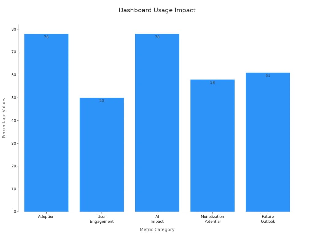
Imagine starting your day with a single screen that shows every critical metric you need. That’s the power of a dashboard—a visual tool that consolidates your most important data, letting you make data-driven decisions quickly. The importance of a dashboard grows as organizations handle more complex data. In fact, 78% of SaaS companies now embed dashboards, and 50% of users interact with them daily, underscoring their essential role:
| Metric Category | Statistic / Insight | Impact / Interpretation |
|---|---|---|
| Adoption | 78% of SaaS companies embed dashboards | Dashboards are widely adopted and considered a standard feature in SaaS products. |
| User Engagement | 50% of users interact with dashboards daily | High daily usage indicates dashboards are actively used in business workflows. |
Dashboards simplify complex data, enabling you to focus on what matters and improve the quality of your decisions.
When you search for "what is a dashboard," you find a consistent answer across industry standards and leading business intelligence resources. A dashboard is a visual interface that brings together key performance indicators, metrics, and data points from multiple sources. You see these insights displayed in charts, graphs, and tables, making it easy to track progress and spot trends. The main goal is to help you monitor, analyze, and act on information quickly.
A data dashboard acts as your command center. It transforms raw data into clear visuals, so you can understand complex information at a glance. Industry standards define dashboards by their ability to display and track key performance indicators. These tools let you compare results, monitor real-time changes, and align your actions with business goals. For example, a quantitative metrics dashboard will show you KPIs in real time, helping you measure performance and make informed decisions.
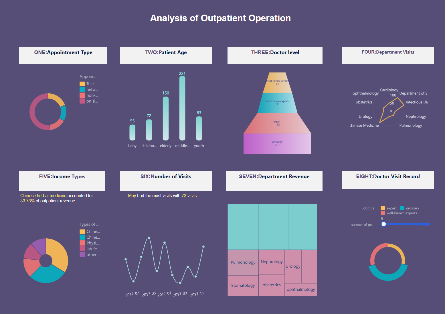
You find dashboards in every industry. Healthcare providers use dashboards to consolidate patient data, leading to a 20% improvement in patient management efficiency. Manufacturing companies rely on dashboards to unify production and supply chain data, which can improve response times to disruptions by 30%. These dashboard examples show how consolidating key metrics leads to better outcomes. Here is a healthcare dashboard created by FineBI.
The purpose of a dashboard is to give you a single, unified view of your most important data. You no longer need to sift through spreadsheets or multiple reports. Instead, you get instant access to the information that matters most. This at-a-glance approach supports faster, more confident decision-making.
A dashboard helps you:
You see the value of dashboards in real-world scenarios. Retailers use dashboards to identify top sales performers. SaaS companies adjust marketing strategies based on conversion rates shown in their dashboards. Manufacturers align sales forecasts with production schedules, all from a single data dashboard. These types of dashboards improve efficiency, enable rapid responses, and support cross-department collaboration.
Modern dashboard solutions like FanRuan and FineBI take these benefits further. FineBI, for example, offers self-service analytics, real-time data integration, and interactive visualizations. You can connect to dozens of data sources, build custom dashboards, and share insights securely. These features make it easier for you to turn data into action, no matter your industry.
The market for dashboard software continues to grow. In 2023, the dashboard market reached $3.6 billion and is projected to surpass $9 billion by 2031. This growth reflects the rising demand for real-time data access, cloud-based solutions, and user-friendly interfaces. Organizations across finance, healthcare, retail, and manufacturing now rely on dashboards to drive digital transformation.
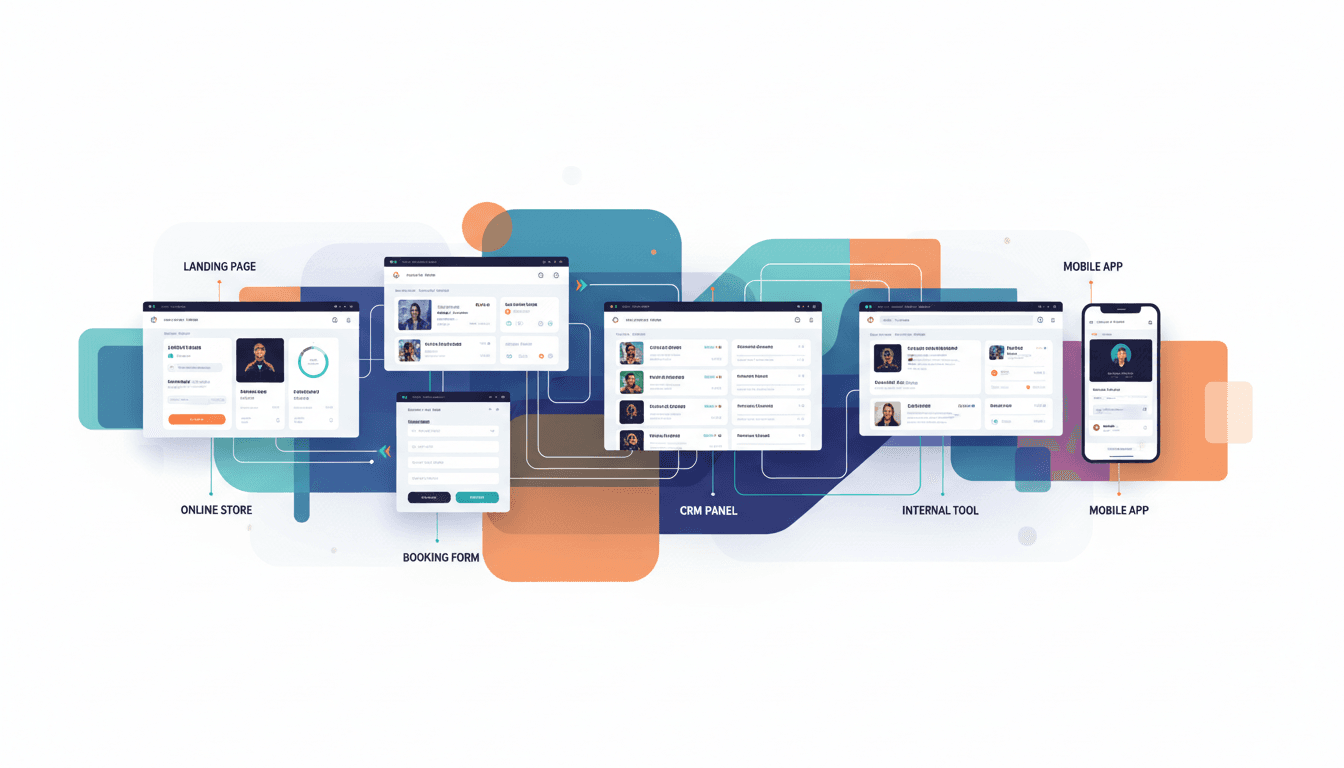
When you use a dashboard, you gain a powerful tool for consolidating, visualizing, and acting on your data. Whether you need to monitor sales, track equipment performance, or manage patient care, dashboards help you stay informed and agile. As you explore different types of dashboards, you will find solutions tailored to every business need.
A good dashboard transforms how you interact with your data. You gain essential insights at a glance, streamline your workflow, and empower your team to make smarter, faster decisions. Let’s explore the core dashboard benefits and see how solutions like FineBI by FanRuan help you unlock the full value of your data dashboard.
You need information that keeps pace with your business. A real-time dashboard delivers up-to-the-minute data, so you can respond to changes as they happen. This immediacy sets dashboards apart from traditional reporting methods, which often rely on static, outdated information.
| Aspect | Dashboards (Real-time Insights) | Traditional Reports (Data Management) |
|---|---|---|
| Data Timeliness | Real-time updates enabling immediate insights | Static, periodic updates with delay |
| Interactivity | High interactivity and customization | Low interactivity, fixed format |
| Visualization | Rich visual elements like charts, graphs, KPIs | Mostly text-heavy with limited visuals |
| Accessibility | Accessible on multiple devices anytime | Distributed as static documents (PDF, print) |
| Detail Level | Summary-level insights for quick decisions | Detailed, narrative analysis for in-depth review |
| Usage | Supports quick decision-making and monitoring | Used for formal documentation and strategic planning |
| Software Integration | High integration with tools like FineBI | Low, often manual data integration |
You see the difference immediately. Dashboards provide real-time data integration, allowing you to monitor sales, inventory, or customer feedback as events unfold. For example, a retail dashboard can update store-level data every hour, letting you adjust promotions or restock shelves before issues arise. FineBI’s high-performance engine ensures minimal data latency, so you always work with the freshest information. You can benchmark your update frequency against industry standards, giving you a competitive edge.
These features make the benefits of dashboard reporting clear: you react faster, prioritize resources better, and make data-driven decisions with confidence.
A dashboard is more than a collection of numbers. It is a powerful data visualization tool that turns complex information into clear, actionable graphics. You process visuals much faster than text, which means you spot trends, outliers, and opportunities almost instantly.

| Source / Organization | Numerical Evidence / Result | Impact on Decision-Making Speed or Efficiency |
|---|---|---|
| Aberdeen Group (2013 study) | Managers using data visualization tools are 28% more likely to gather information promptly | Indicates faster information gathering leading to quicker decisions |
| JPMorgan Chase | 10% improvement in decision-making speed after introducing shared dashboards | Demonstrates measurable speed increase in decision-making |
| Lenovo | 95% efficiency boost by deploying Tableau dashboards | Significant operational efficiency gain supporting faster decisions |
| Brain Processing Speed | Visuals processed 60,000 times faster than text | Cognitive basis for faster decision-making with visual tools |
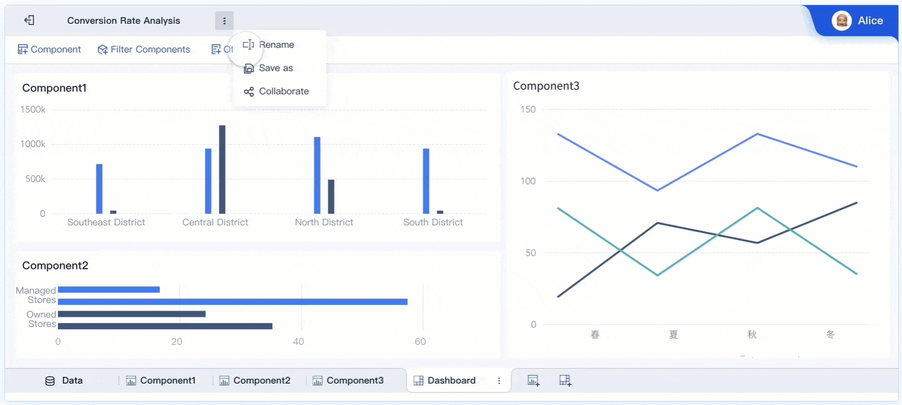
You benefit from these advantages every day. FineBI's drag-and-drop interface lets you build custom dashboards with over 60 chart types, including bar charts, line graphs, and geographic maps. You can compare multiple time frames, explore variable combinations, and drill down into details—all in one place. This flexibility supports the benefits of dashboard reporting by making your analysis more interactive and accessible.

FineBI’s data visualization capabilities help you:
You move from raw data to actionable insights in seconds, not hours. This speed and clarity drive better business outcomes.
A dashboard does more than inform—it connects your team. When everyone sees the same data, you foster transparency, accountability, and alignment across departments. Dashboards serve as a centralized information hub, eliminating the need to search through emails or multiple reports.
| Collaborative Performance Indicator | Description | Impact on Team Communication and Collaboration |
|---|---|---|
| Centralized Information Hub | Dashboards consolidate all project data in one place, eliminating the need to search multiple sources. | Saves time, keeps teams focused and aligned by providing easy access to updates. |
| Increased Transparency | Team tasks, progress, and goals are visible to everyone. | Builds trust and accountability, fostering a collaborative environment. |
| Fewer Meetings, More Productivity | Automated updates and clear visuals reduce the need for frequent meetings. | Minimizes interruptions, allowing teams to concentrate on tasks. |
| Easily Track Goals and Milestones | Visual tracking of goals and milestones at a glance. | Enhances clarity and motivation, keeping everyone aligned. |
| Spot and Resolve Bottlenecks Fast | Early visibility of bottlenecks enables prompt action. | Prevents delays, maintaining smooth project flow. |
| Enhanced Accountability | Display of tasks and progress encourages ownership. | Motivates team members to meet deadlines and be responsible. |
| Boost Cross-Department Collaboration | Improves communication and insight sharing across departments. | Increases transparency and collaboration beyond individual teams. |
FineBI enhances collaboration with features like role-based access control and secure sharing. You can assign permissions by department or role, ensuring sensitive data stays protected while teams access the information they need. Automated alerts and personalized dashboards keep everyone updated on progress and milestones. You spend less time in meetings and more time acting on insights.
Dashboards also encourage diverse input. Team members with different skills and perspectives can contribute to the analysis, clarify misunderstandings, and align on goals. This collective awareness leads to better decisions and higher productivity.
Tip: Use FineBI’s collaborative features to create shared dashboards for cross-functional teams. You will see improved communication, faster problem-solving, and a stronger sense of ownership.
A good dashboard turns complex data into clear, actionable insights. You need more than just numbers on a screen. Data visualization helps you see patterns, trends, and outliers at a glance, making your information easier to understand and act on. When you use dashboards, you transform raw data into visualizations like charts, graphs, and maps. These visual components simplify your workflow and support faster, smarter decisions.
You benefit from a wide range of visual components in modern dashboards. FineBI, for example, offers a drag-and-drop interface that lets you build custom data visualizations without any coding. You can choose from over 60 chart types, including bar charts, line graphs, heatmaps, and customer journey maps. These tools help you track key performance indicators such as customer satisfaction, Net Promoter Score, and churn rate. By using these visual elements, you turn complex datasets into insights you can act on immediately.
You see the impact of these components in your daily work. They help you focus on what matters most and avoid information overload.
Interactive features take your dashboard experience to the next level. You can filter data, drill down into details, and explore different scenarios with just a few clicks. Studies show that interactive annotations and storytelling in dashboards improve comprehension, memorability, and reduce cognitive load. When you interact with your data, you become an active participant rather than a passive viewer. This engagement leads to deeper understanding and better decisions.
User engagement statistics reveal that managers using interactive dashboards are 28% more likely to find timely information. Features like drill-downs and real-time manipulation increase daily active users by 25%. You also see a 40% boost in motivation when dashboards include interactive elements such as gamification or community challenges. These features encourage you to explore, personalize, and share insights with your team.
FineBI ensures your dashboards work seamlessly on any device. Mobile responsiveness means you can access key metrics on your phone or tablet, wherever you are. Responsive design adapts layouts to different screen sizes, prioritizes important elements, and supports touch interactions. Companies that implement responsive dashboards see a 66% increase in user adoption and higher engagement across teams.
Tip: Limit dashboard elements to the most important metrics and use simple visualizations for mobile devices. This approach keeps your dashboard clear, focused, and easy to use on any screen.
You rely on dashboards to turn raw data into actionable insights. In business intelligence, dashboards help you monitor key performance indicators (KPIs) that align with your company’s goals. You can track sales, marketing, and financial metrics in real time. This approach allows you to spot trends, identify issues, and make informed decisions quickly.
| Industry | Practical Application of Dashboards in BI | Example / Case Study |
|---|---|---|
| Retail | Monitor eCommerce data, customer satisfaction, and supply chain metrics in real time. | Retailers track spending patterns and delivery times for insights. |
| Healthcare | Track patient outcomes and operational efficiency with real-time dashboards. | NHS Trust uses dashboards for patient reporting. |
| Manufacturing | Monitor production lines and equipment performance to improve efficiency. | DENSO consolidates product info for better insights. |
FineBI by FanRuan empowers you to build dashboards tailored to your department’s needs. You can set up role-specific KPIs, ensuring each team focuses on what matters most. Notable clients like A.O. Smith and Red Bull use dashboards to unify their business intelligence efforts and drive better results.
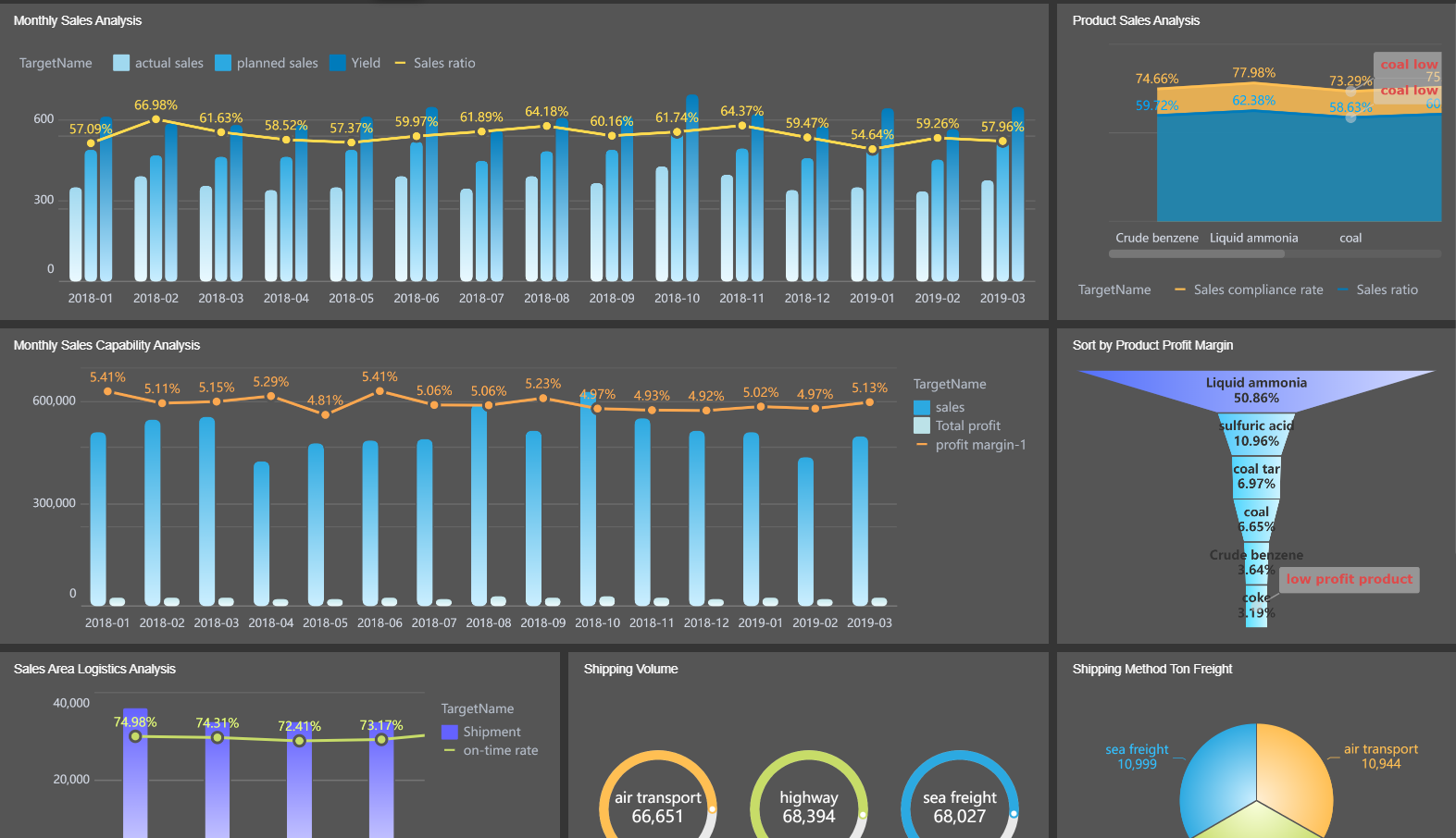
Dashboards play a vital role in manufacturing quality control. You can visualize production metrics and spot quality issues before they escalate. FineBI enables you to track KPIs such as defect density, first pass yield, and return rates. This visibility helps you maintain high standards and reduce waste.
| KPI | Description |
|---|---|
| Defect Density | Measures the number of defects relative to product size. |
| First Pass Yield | Percentage of products passing quality standards without rework. |
| Return Rate | Rate of product returns due to defects. |
| Customer Complaints | Tracks complaints received from end users. |
You also monitor equipment effectiveness and downtime. FineBI dashboards let you analyze root causes and optimize processes. Companies like Danfoss and Omron Automation use these tools to improve quality and boost efficiency.
You use dashboards to manage sales performance and streamline operations. Real-time data helps you track quota attainment, pipeline health, and deal velocity. FineBI provides dashboards that highlight conversion rates and compensation progress, making it easier to coach teams and allocate resources.
Manufacturers leverage dashboards to coordinate sales and operations, ensuring alignment between production and market demand. Notable clients like Hongkong Land and Leysen have seen improved collaboration and faster decision-making with FineBI.
Tip: Use dashboards to bring together your sales, operations, and quality data. This unified view helps you respond quickly to market changes and stay ahead of the competition.
You often hear about dashboards and reports in business intelligence, but they serve different purposes. Dashboards give you real-time, interactive access to your data. Reports provide static snapshots, usually at set intervals. The table below highlights the main differences:
| Aspect | Static Reports | Flexible Dashboards |
|---|---|---|
| Delivery Frequency | Fixed daily snapshots | Real-time or on-demand interactive access |
| Interactivity | None (static data) | Dynamic filtering, drill-down capabilities |
| Metrics Included | Basic performance metrics | Deeper insights, trends, and performance analytics |
| Data Presentation | Simple visuals | Progressive, layered insights |
| User Control | None | Dropdowns and controls for custom views |
| Decision Support Enhancement | Limited to snapshots | Enables faster, tailored decision-making |
| Use Case Focus | General overview | Persona-specific, actionable analytics |
Dashboards let you filter, drill down, and interact with your data. You can see trends and answer questions quickly. Reports, on the other hand, show you a fixed view of your data at a certain point in time. This makes dashboards more flexible and useful for ongoing monitoring.
You should use a dashboard when you need real-time visibility and ongoing performance monitoring. Dashboards reduce the time you spend on reporting and make it easier to spot trends. For example, marketing agencies use dashboards to manage multiple clients and show proof of ROI. Ecommerce teams track sales and link marketing activity to revenue. Social media managers monitor engagement across platforms, while email marketers optimize campaigns by tracking open and click rates.
FineBI supports both dashboards and reports. You can build interactive dashboards for daily monitoring and generate detailed reports for in-depth analysis. If you want to know how to create a dashboard, FineBI offers a drag-and-drop interface that makes the process simple for any user. This flexibility ensures you always have the right tool for your business intelligence needs.
Tip: Use dashboards for quick insights and reports for deep dives. FineBI helps you balance both, so your team stays informed and agile.
You have seen how dashboards transform data into actionable insights across industries. Consider these key benefits:
Modern solutions like FanRuan and FineBI help you achieve these results. Many organizations report a 70% reduction in report customization time and a 40% decrease in IT dependency. Explore FineBI to empower your team and accelerate smarter decision-making.
Click the banner below to experience FineBI for free and empower your enterprise to convert data into productivity!

작성자
Seongbin
FanRuan에서 재직하는 고급 데이터 분석가
관련 기사

ERP 프로그램 도입 후에도 엑셀을 못 버리는 이유 7가지와 해결 방법
$1를 도입하면 많은 문제가 한 번에 정리될 것처럼 기대하는 경우가 많습니다. 하지만 현실은 다릅니다. $1을 도입한 뒤에도 여전히 엑셀 파일이 업무의 중심에 남아 있는 회사 가 적지 않습니다. 월말 보고는 엑셀, $1 보정도 엑셀, 부서 간 전달 자료도 엑셀이라면 “도대체 $1를 왜 도입했지?”라는 질문이 자연스럽게 나옵니다. 그렇다고 이것을 단순히 $1 실패라고 보기는 어렵습니다. 실제로
Seongbin
2026년 6월 04일
노코드란 무엇인가? 로우코드와 차이까지 10분 만에 이해하는 입문 가이드
요즘 노코드 라는 말을 한 번쯤은 들어보셨을 겁니다. 예전에는 웹사이트나 앱을 만들려면 개발자가 직접 코드를 작성해야 한다는 인식이 강했지만, 이제는 꼭 그렇지만은 않습니다. 드래그 앤 드롭, 템플릿, 자동화 규칙 설정만으로도 생각보다 많은 것을 만들 수 있게 되었기 때문입니다. 특히 1인 창업가, 마케터, 기획자, 운영 담당자처럼 빠르게 시도하고 바로 결과를 확인해야 하는 사람들 에게 노코
Seongbin
2026년 5월 17일
데이터 카탈로그란 무엇인가? 메타데이터·데이터 사전·거버넌스 차이까지 10분 완전 정리
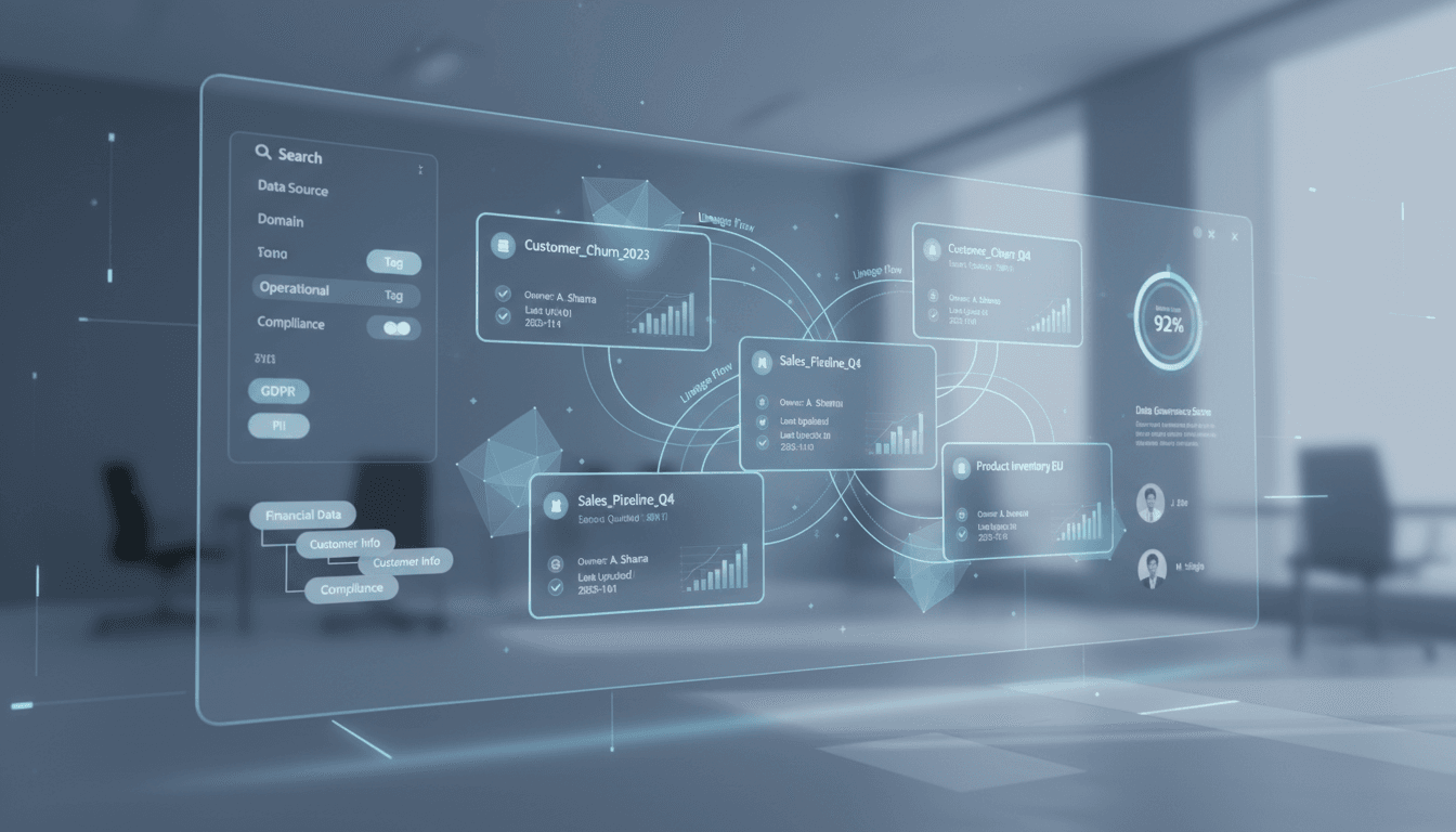
데이터가 많은 조직일수록 공통으로 겪는 문제가 있습니다. 데이터는 넘치는데, 정작 필요한 데이터를 빨리 찾기 어렵다 는 점입니다. 비슷한 데이터를 여러 팀이 중복으로 만들고, 같은 지표를 두고도 부서마다 정의가 다르며, 믿고 써도 되는 데이터인지 판단하기도 쉽지 않습니다. 이럴 때 핵심 역할을 하는 것이 바로 데이터 카탈로그 입니다. 데이터 카탈로그는 단순히 데이터 목록을 나열하는 도구가 아
Seongbin
2026년 5월 17일


