A strip chart gives you a clear way to see individual numbers along a single category. You plot each value as a dot, so you can spot every point in your data set. Unlike other charts, a strip chart places one variable on a category axis and one on a number axis. Dots may stack up if values repeat, forming a visible strip. This direct view helps you notice patterns or outliers quickly. When you build a basic strip chart, you get a simple tool that highlights each data point and makes trends easy to spot.
You use a strip chart to display individual data points along a single axis. This chart type helps you see every value in your dataset without any overlap or confusion. Each point appears as a dot, and you can quickly spot patterns, clusters, or outliers. When you work with a basic strip chart, you focus on one category and one numerical value. This approach makes it easy to compare numbers and notice trends.
Strip charts stand out because they do not hide any data. You see each measurement clearly. If you have a small dataset, a strip chart gives you a clean and simple view. You avoid the clutter that sometimes appears in scatter plots or histograms. Many scientists and analysts use strip charts when they want to highlight every single result.
You might use a strip chart in science labs, business reports, or quality control. For example, you can track machine performance or student test scores. The chart helps you make decisions based on real, visible data points.
A strip chart offers several features that make it a powerful tool for visualization. You can use these features to get more precise and meaningful insights from your data.
Tip: Strip charts work best when you want to see every data point without losing detail.
Here are some of the main features you will find in a strip chart:
| Numerical Feature / Component | Description and Benefit |
|---|---|
| Display of Individual Data Points | Shows all data points clearly without clutter. Great for small datasets and avoids congestion. |
| Multiple Coordinate Axes | Lets you use up to four axes, each with its own labels and titles. This helps you position numbers precisely. |
| Crosshairs | Adds perpendicular lines to help you read exact values on the chart. |
| Customizable Data Elements | Lets you change symbols, colors, and layers for each point. This makes it easy to compare different groups. |
| Grid Lines | Extends ticks across the chart so you can estimate and compare numbers more easily. |
| Legend | Shows names and symbols for each group, making it easier to interpret categories. |
| Marker | Allows you to highlight or annotate specific points or areas. |
| Pen | Controls how data points look, supporting different styles for complex data. |
You can use these features to make your visualization more effective. For example, you can highlight outliers with markers or use different colors for each group. If you use a chart recorder, you can capture real-time data and display it on a strip chart for instant analysis.
Strip charts give you a clear advantage when you need to see every value. You avoid the confusion that sometimes comes with other chart types. You also gain tools to customize and annotate your data, making your analysis more accurate and insightful.
When you look at a strip chart, you see a simple but powerful tool for data visualization. The basic components of strip chart design help you record and display information over time. You can break down these components into four main parts:
These components work together to turn raw signals into a clear visual record. You can spot trends, sudden changes, or unusual points right away.
Note: The main components have changed over time. Modern digital strip charts use screens and software instead of paper and pens, but the core idea stays the same.
You can use strip charts in many ways, from old-school labs to high-tech factories. The operation starts with a sensor that detects a variable, such as temperature or voltage. The sensor sends a signal to the recorder. The drive mechanism moves the paper or updates the screen. The pen or digital marker moves to show the value of the signal. You get a real-time visual record of your data.
Here is a step-by-step look at how strip charts work:
You can use strip charts in many fields. In medicine, doctors use them to monitor heartbeats. In factories, engineers track machine performance. Scientists use them to record experiments. You can even use them to monitor air or water quality.
You might wonder how strip charts have changed. Traditional mechanical strip charts use pens and paper. Modern digital strip charts use screens and software. Here is a table that shows the main differences:
| Feature | Traditional Mechanical Methods | Modern Digital Techniques (Paperless Recorders) |
|---|---|---|
| Recording Medium | Physical pens mark on paper strips or circular charts | Digital display on integrated screens |
| Data Storage | Permanent physical paper charts | Digital files stored locally on removable media |
| Data Manipulation | Fixed physical charts, no zoom or review capabilities | Zoomable, reviewable, and easily shareable digital data |
| Operational Components | Mechanical and electro-mechanical parts (servo motors, servo potentiometers, stepper motors) | Electronic components with no mechanical parts |
| Archiving | Physical charts can be torn off and archived | Digital data can be stored, retrieved, and downloaded easily |
| Display Quality | Physical ink on paper, limited by pen and paper quality | High resolution, color quality approaching modern PC displays |
| Application Suitability | Continuous process recording, laboratory and process measurement | Conservation of paper, easy data retrieval, and sharing |
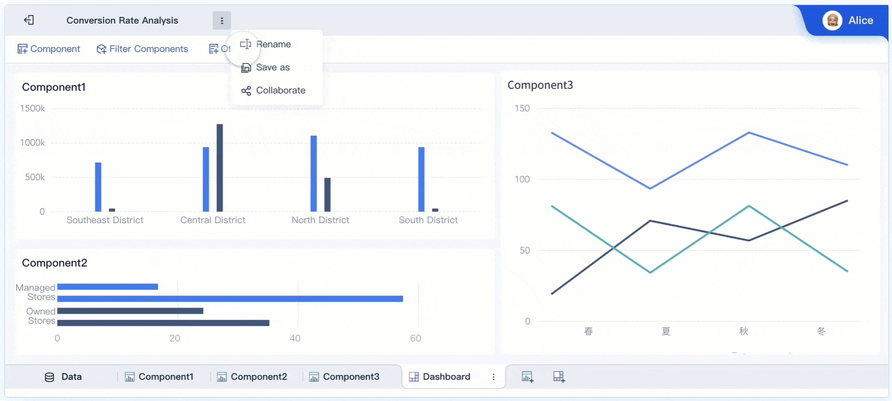
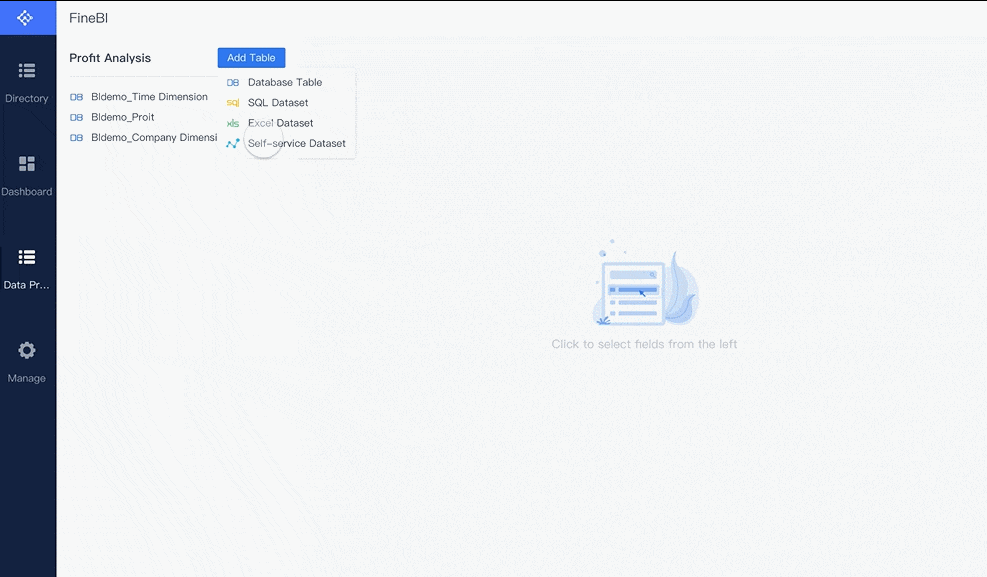
Modern data visualization platforms, such as FanRuan and FineBI, take strip charts to the next level. You can connect to many data sources, visualize real-time data, and share results instantly. FineBI lets you drag and drop data, apply filters, and build interactive dashboards. You do not need to worry about paper or manual archiving. You can zoom in, review past data, and collaborate with your team.

You want your strip chart to be accurate and efficient. Performance statistics help you understand how well your chart records and displays data. Here is a table that shows some key metrics:
| Metric / Class | Description | Values / Percentages |
|---|---|---|
| Qualitative Error Classes | Classification of deviations in curve detection: - Class 0: No or negligible deviation (<0.2 mm) - Class 1: Minor deviation (0.2–0.5 mm) - Class 2: Major deviation (0.5–10 mm) - Class 3: Severe deviation (>10 mm, requiring manual correction) | Class 0: 75.9% of charts correctly processed Class 1: 10.3% Class 2: 5.2% Class 3: 8.6% |
| Quantitative Metrics | Mean Absolute Error (MAE) and Relative Mean Absolute Error (RMAE) at various time resolutions, indicating accuracy of precipitation intensity extraction: - Day resolution: MAE ~0.38 mm, RMAE ~0.0321 - Hour resolution: MAE ~0.14 mm, RMAE ~0.0960 - Half-hour resolution: MAE ~0.11 mm, RMAE ~0.138 - 5-minute resolution: MAE ~0.056 mm, RMAE ~0.396 | Demonstrates high accuracy at daily and hourly scales, with increasing error at finer resolutions due to data acquisition differences |
| Computational Efficiency | Processing time for 58 images: 5 minutes 6 seconds (~5.28 seconds per image) on a dual-core 1.7 GHz CPU | Indicates practical feasibility of automatic digitization |
You can see that strip charts perform best at daily and hourly scales. Errors increase when you try to record data at very short intervals.
Modern strip charts let you see data as it happens. For example, you can use software like LabVIEW to create a strip chart that updates in real time. The program adds new data points and refreshes the display. You can monitor industrial processes or medical signals without delay. FineBI also supports real-time data visualization. You can connect to sensors, stream data, and watch trends unfold on your dashboard.

Tip: Real-time visualization helps you catch problems early and make quick decisions.
Strip charts remain a key tool in data visualization. You can use them to track changes, spot outliers, and share insights. Whether you use traditional paper or modern digital tools like FineBI, you get a clear view of your data.
When you want to create a strip chart, you have many tools to choose from. Some tools work best for quick, simple charts. Others give you advanced features for deeper analysis and sharing. Here are some of the most popular options:
FineBI stands out as a modern business intelligence platform. You can connect to many data sources, drag and drop your data, and build interactive strip charts in minutes. FineBI lets you filter, zoom, and highlight data points. You can also share your charts with your team or publish them on dashboards. FineBI supports real-time data updates, so you always see the latest information.

Tip: FineBI is a great choice if you want self-service analytics and easy integration with other business systems.
Excel gives you a familiar way to plot strip charts. You can use scatter plots to mimic a strip chart. Excel works well for small datasets and quick reports. You can customize colors and add labels, but you may find it harder to handle large or complex data.
If you know some coding, Python offers powerful libraries like matplotlib and seaborn. You can write a few lines of code to create detailed strip charts. These tools let you control every part of your chart, from colors to labels. Python works best for users who want flexibility and automation.
You can pick the tool that fits your skills and needs. If you want a fast, interactive, and user-friendly experience, FineBI gives you everything you need for modern strip chart creation.
You can create strip chart visualizations quickly by following a few simple steps. Many digital tools make this process easy, especially if you use a platform like FineBI from FanRuan. Here is a step-by-step guide to help you get started:
Tip: FineBI’s drag-and-drop interface means you do not need coding skills to create strip chart dashboards.
When you read strip charts, look for patterns, clusters, and outliers. Each dot represents a single data point. If you see dots stacking up, you know that value appears often. Spread-out dots show a wide range of results. You can spot trends by comparing the position and grouping of dots across categories.
Modern digital tools, like FineBI, help you zoom in and filter your data. This makes it easier to focus on specific groups or time periods. In business, you might use strip charts to track sales performance, monitor equipment efficiency, or analyze quality control results. Accurate interpretation is important. Recent studies show that advanced models, such as deep learning, can interpret strip charts with over 90% accuracy in scientific and industrial settings. This high reliability means you can trust your insights when you use digital strip charts for decision-making.
FineBI from FanRuan gives you the power to create strip chart dashboards and interpret them with confidence. You can turn raw data into clear, actionable insights for your business.
You can use strip charts in many real-world situations. One of the most popular strip chart examples comes from the airquality dataset in r programming. This dataset tracks air quality in New York, including ozone readings. When you plot these values, you see how ozone levels change over time. You can use a jitter plot to make the points easier to see, especially when many values overlap.
Many scientists and analysts use strip charts to study air quality. You might want to compare ozone readings across different months. You can also use strip charts to check for outliers or sudden changes in the data. In business, you can track machine performance or product quality. Teachers use strip charts to show student test scores. Medical professionals use them to monitor patient data.
If you want to create effective strip charts, you can use r programming or modern BI tools. FineBI makes it easy to connect your data and build interactive visuals. You can also use a jitter plot to improve clarity when points stack up.
Tip: Try using a jitter plot when your data points overlap. This helps you see every value clearly.
You get many benefits of using strip chart visualizations. Strip charts show every data point, so you never miss important details. They work well for small datasets and help you spot outliers quickly. You can use them to compare groups or track changes over time. Effective strip charts make it easy to see patterns and trends.
However, strip charts have some limitations. If you have a large dataset, the chart can look crowded. Too many overlapping points make it hard to read, even with a jitter plot. Strip charts also work best with one category and one number. They do not show relationships between multiple variables.
Here is a quick table to help you remember:
| Pros | Cons |
|---|---|
| Shows all data points | Can get crowded with large datasets |
| Easy to spot outliers | Limited to one category and one value |
| Simple to create | Hard to show complex relationships |
You can create effective strip charts by choosing the right dataset and using tools like r programming or FineBI. When you work with airquality data, you see how strip charts help you understand ozone readings and other air quality measures.
You can turn your data into clear visuals with FineBI’s interactive dashboard. This tool lets you see every data point from your strip chart in real time. You drag and drop your data fields onto the dashboard. You watch as each value appears as a dot or line. You can zoom in, filter, and highlight important points with just a few clicks.
Interactive dashboards help you spot trends and outliers quickly. In healthcare, studies show that dashboards can improve the tracking of clinical quality indicators. For example, odds ratios for better testing and documentation range from 1.10 to 2.08 when using interactive dashboards. These results suggest that dashboards can help you make better decisions by showing you the right information at the right time.
Tip: Use dashboard filters to focus on specific time periods or groups. This makes it easier to find patterns in your strip chart data.
You can also share your dashboard with your team. Everyone sees the same up-to-date information. This supports teamwork and faster problem-solving.
FineBI gives you the power to explore your data on your own. You do not need to wait for IT or data experts. You connect your data sources, choose what you want to see, and build your own reports. The drag-and-drop interface makes this process simple.
You can create custom strip charts, compare different groups, and adjust your visuals as needed. FineBI supports real-time updates, so your charts always show the latest data. You can also set up alerts to notify you when values go above or below certain limits.
Self-service analytics helps you answer questions fast. You test ideas, check results, and share insights—all without writing code. This approach makes data analysis easy for everyone in your organization.
Note: FineBI’s self-service tools help you turn raw data into clear, actionable insights. You gain more control over your business decisions.
You have seen how strip charts help you visualize every data point, making it easy to spot trends and outliers. When you use airquality data, you can track ozone levels and see changes over time. Strip charts work well for small datasets, especially when you want to highlight the benefits of using strip chart visuals in your reports. With modern BI tools like FineBI from FanRuan, you gain powerful features for real-time monitoring and analysis.
Try using strip charts in your next project. You will find that they make your airquality analysis more accurate and your decisions more informed.
Click the banner below to experience FineBI for free and empower your enterprise to convert data into productivity!


작성자
Seongbin
FanRuan에서 재직하는 고급 데이터 분석가
관련 기사

워드클라우드 사이트 비교 2026: 한글 지원·디자인·저장 기능까지 한눈에
$1는 텍스트에서 자주 등장하는 단어를 크게 보여 주는 $1 방식입니다. $1, 발표 자료, 수업 활동, SNS 콘텐츠까지 활용 범위가 넓어지면서 어떤 $1 사이트 를 선택해야 하는지 고민하는 분도 많아졌습니다. 특히 2026년 기준으로는 단순히 “예쁘게 보이는가”보다 한글 처리 품질, 저장 형식, 재편집 편의성 이 훨씬 중요해졌습니다. 영문 중심 서비스는 많지만, 실제 국내 사용자 입장에서
Seongbin
2026년 4월 15일
volcano plot 실전 제작 가이드: Excel·R·Python·웹툴 비교로 최적 도구 찾기
차등 발현 분석 결과를 빠르게 훑어보고, 중요한 후보 유전자를 직관적으로 찾고 싶다면 volcano plot 은 거의 가장 먼저 떠올려야 할 $1 방법입니다. 특히 RNA Seq, 마이크로어레이, 단백질체, 대사체처럼 비교 대상이 많고 변수 수가 큰 데이터에서는 변화의 크기와 통계적 유의성을 동시에 보여준다는 점에서 매우 강력합니다. 이 글에서는 volcano plot의 개념, 읽는 법, 해
Seongbin
2026년 4월 14일
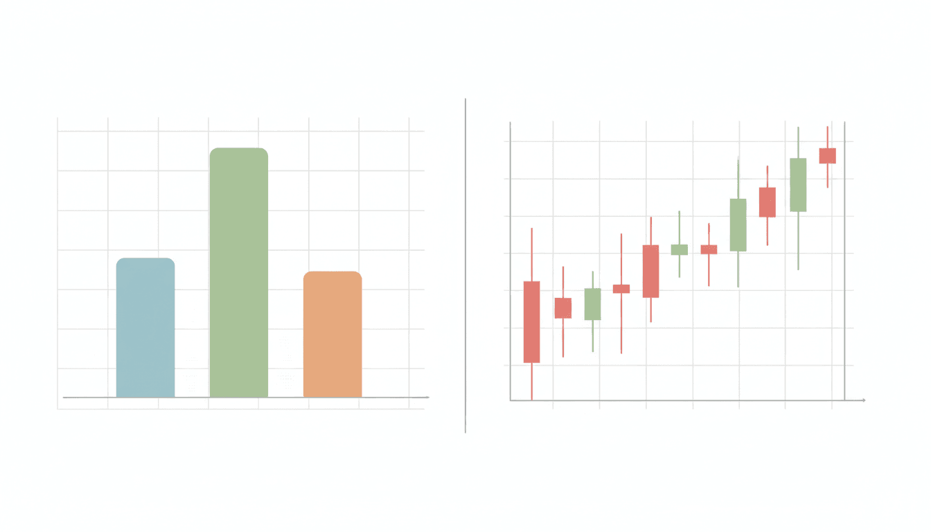
바차트란 무엇인가? 막대그래프와 주식 바차트 차이까지 10분 만에 이해하기
‘ 바차트 ’라는 말을 들으면 많은 사람이 먼저 $1 를 떠올립니다. 실제로 $1에서는 바차트가 곧 $1를 뜻하는 경우가 많습니다. 하지만 주식이나 금융 시장에서는 같은 단어가 전혀 다른 방식의 가격 차트 를 의미하기도 합니다. 바로 하나의 선과 짧은 눈금으로 시가, 고가, 저가, 종가 를 표시하는 금융용 바차트입니다. 초보자가 가장 많이 헷갈리는 지점도 여기입니다. “바차트 = $1 아닌가
Seongbin
2026년 4월 14일


