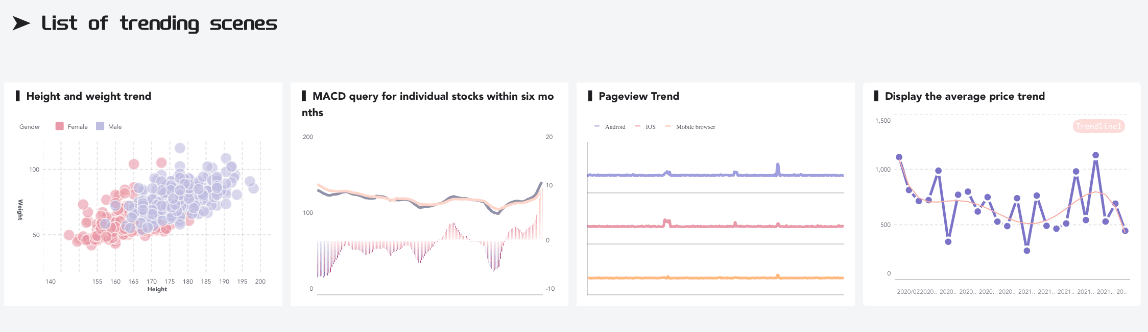
Mastering advanced Excel techniques enhances your data analysis, enabling you to turn complex datasets into clear, insightful visualizations. Tools like combo charts and sparklines improve decision-making and communication. Exploring platforms like FineBI and FineVis can further refine your skills. Unlike Excel, FineBI offers more dynamic features, such as real-time data updates and interactive dashboards, providing a deeper, more flexible analysis experience. Integrating Excel with these platforms allows you to stay ahead in the competitive world of data-driven decision-making, enhancing both your analytical abilities and professional growth.
Excel Data Visualization with Combo Charts
Combo charts in Excel are an effective way to visualize multiple data series using different chart types within a single chart, making complex information easier to understand. Mastering this technique enhances your Excel data visualization skills and improves presentations. While Excel offers an accessible platform for creating combo charts, FineBI takes data visualization to the next level with advanced features such as dynamic data exploration and real-time integration. FineBI’s interactive dashboards and deeper analytical capabilities make it ideal for complex enterprise environments, where real-time data analysis and advanced insights are critical for decision-making.
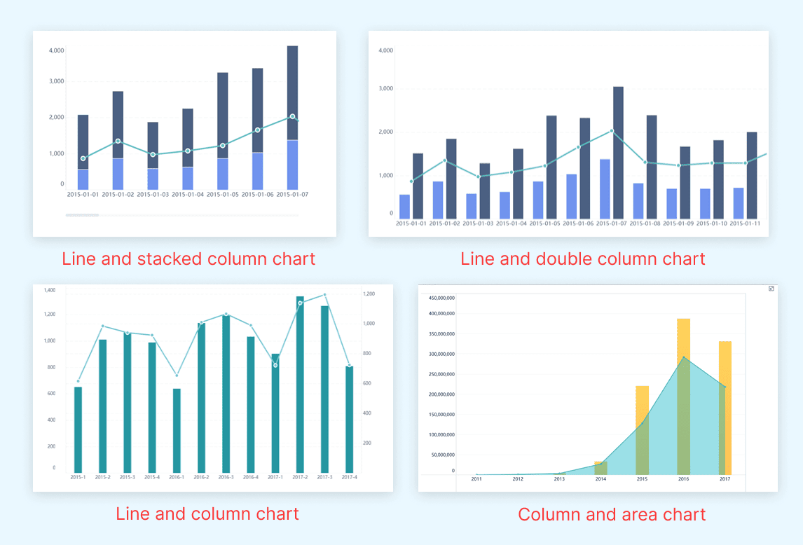
Multiple chart types are displayed on a chart component
Step-by-Step Guide to Combining Different Chart Types in Excel
Select Your Data: Begin by selecting the data range you want to visualize. Ensure that your data includes at least two sets of data series, as combo charts require multiple series to display different chart types.
Insert a Combo Chart: Navigate to the "Insert" tab in Excel. Click on "Combo Chart" and choose the type of combo chart you wish to create. Excel offers several options, such as combining column and line charts.
Customize Chart Types: Once the chart appears, you can customize each data series. Click on the chart, then select "Change Chart Type" from the Chart Tools menu. Assign different chart types to each data series to best represent your data.
Adjust Axes: Ensure that your chart's axes accurately reflect the data. You may need to add a secondary axis for one of the data series to improve clarity.
Finalize Your Chart: Add titles, labels, and any other necessary elements to complete your chart. This step ensures that your audience can easily interpret the data.
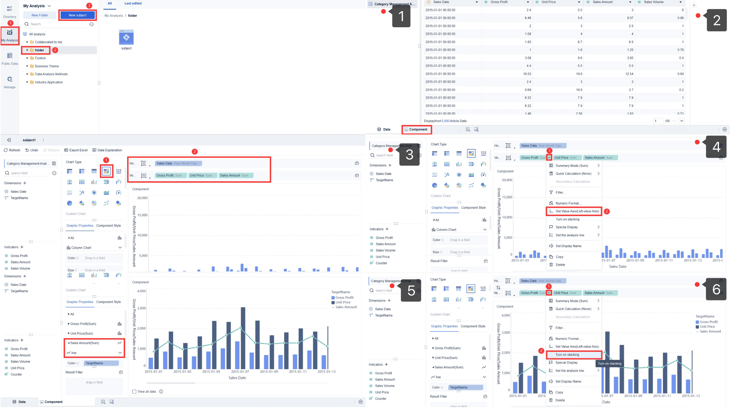
Step-by-Step Guide to Combining Different Chart Types on FineBI
Preparing Data for the Combo Chart: Log in, navigate to "My Analysis", upload your data file via "Local Excel", and confirm the upload.
Creating a Component for the Combo Chart: Access "Component", choose "Custom Chart", set axes with your data dimensions and values, and adjust settings like axis range and colors.
Creating Dual Column Charts and Line Chart: Convert "Sales Amount" into a line chart format through the "Graphic Properties" menu to differentiate it visually.
Creating Stacked Bar and Line Chart: Enable stacking for "Gross Profit" and "Unit Price" and maintain "Sales Amount" as a line chart for clear, layered data representation.
While Excel provides basic combo chart capabilities, FineBI excels with advanced visualization options and enhanced functionality. FineBI's intuitive interface and dynamic customization features allow for easier and more efficient data manipulation. This makes FineBI particularly suited for sophisticated data analysis in fast-paced business environments, offering superior tools to depict trends and insights effectively, thereby enhancing data storytelling.
Examples of when to use combo charts
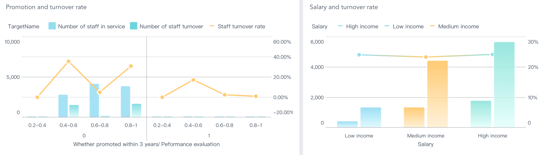
Comparing Actuals vs. Targets: Employ a combo chart to visually compare actual sales figures with target goals. In this setup, actuals could be represented using a column chart, and targets with a line chart. This visual distinction clarifies how closely targets are being met, and when combined with tools like Excel, it's straightforward for initial setup. However, for more dynamic visualization and advanced customization, such as real-time data updates or interactive elements, FineBI provides a robust alternative that can enhance the analytical impact of such comparisons.
Displaying Different Metrics: To concurrently display different business metrics, such as revenue alongside profit margins, a combo chart serves as an effective tool. It allows these differing data sets to be understood in relation to each other on the same axis. While Excel can handle basic implementations, FineBI excels in presenting complex datasets and allows for enhanced interaction and deeper analysis, making it ideal for more detailed business intelligence tasks.
Customizing Combo Charts
Adjusting chart elements for clarity
To enhance the clarity of your combo charts, focus on adjusting key elements:
Legend and Labels: Optimize legends and labels to be clear and concise, helping viewers understand the data effortlessly. Excel is suitable for simple modifications, while FineBI allows for more sophisticated customization, vital for complex datasets.
Color Schemes: Use contrasting colors to differentiate data series easily. Excel offers a standard range of colors, but FineBI provides a more extensive palette and deeper customization options to improve chart readability.
Gridlines and Axes: Streamline gridlines and axes to keep the chart uncluttered yet informative. Excel has basic adjustments, but FineBI offers precise control, enhancing both the chart's appearance and its analytical utility.
Tips for effective data representation
Highlight Key Data Points: Utilize markers or annotations to emphasize important trends. Excel allows for simple annotations, while FineBI provides interactive features that dynamically highlight critical insights.
Maintain Consistency: Ensure uniformity in chart styles across projects. Excel is useful for basic consistency, but FineBI offers advanced templating for a professional look, even with complex datasets.
Test Readability: Share drafts with colleagues to ensure your charts communicate effectively. While both Excel and FineBI support feedback processes, FineBI’s collaborative features can enhance real-time adjustments and streamline peer review.
Mastering combo charts in Excel boosts your data visualization skills, allowing for clear, engaging presentations of complex data. This not only enhances your analysis but also your ability to communicate insights effectively. Furthmore, compared to Excel, FineBI offers more dynamic visualizations and advanced analytics, making it ideal for environments requiring real-time data integration and deeper insight extraction, thus empowering users to manage complex datasets efficiently.
Advanced Excel Data Visualization Techniques: Sparklines
Introduction to Sparklines
Understanding the purpose of sparklines
Sparklines, a concept introduced by data visualization expert Edward Tufte, are compact, word-sized charts embedded within a single cell in Excel. Described as "intense, simple, word-sized graphics," sparklines offer a succinct visualization of trends and patterns directly within data tables. This integration provides a streamlined view of data fluctuations, facilitating quick identification of trends, patterns, and outliers without occupying significant space.
While Excel allows for seamless embedding of sparklines into spreadsheets, enhancing data analysis within familiar tables, FineBI takes visualization a step further. It offers more comprehensive tools that handle complex data sets and dynamic visualizations across entire dashboards, not just within a cell. This capability enables deeper analytical insights and more interactive data exploration compared to the static nature of Excel's sparklines.
Line Sparklines: Ideal for showing trends over time. They help you visualize data points connected by lines, making it easy to spot upward or downward trends.
Column Sparklines: Useful for comparing individual values. These sparklines display data as vertical bars, allowing you to see variations in data points.
Win/Loss Sparklines: Perfect for binary data. They show positive and negative values, helping you quickly identify wins and losses.
FineBI enhances data visualization with its own powerful mini-chart capabilities, extending beyond Excel’s standard sparklines to provide a dynamic and interactive analysis tool:
Trend Sparklines: Similar to Excel's Line Sparklines, FineBI's Trend Sparklines effectively showcase data trends over time, connecting points with smooth lines to highlight fluctuations.
Bar Sparklines: These are akin to Excel's Column Sparklines but offer enhanced functionality in FineBI. They display data as horizontal or vertical bars, making it straightforward to compare individual values across different categories.
Difference Sparklines: Offering a unique approach compared to Excel's Win/Loss Sparklines, FineBI’s Difference Sparklines illustrate deviations between two points, making it easy to visualize gains and losses or before-and-after scenarios.
FineBI's mini-charts are integrated within dashboards, allowing for interactive data exploration that goes beyond the static presentations in Excel, thereby enabling more complex analyses and richer visual storytelling.
Implementing Sparklines
Step-by-Step Guide to Adding Sparklines in Excel
Select Your Data: Choose the range of data you want to visualize with sparklines. Ensure that your data is organized in rows or columns.
Insert Sparklines: Go to the "Insert" tab in Excel. Click on "Sparklines" and select the type you want to use: Line, Column, or Win/Loss.
Choose Location: Specify the cell or range where you want the sparklines to appear. Excel will insert the sparklines into these cells.
Customize Sparklines: Use the "Design" tab to customize your sparklines. You can change colors, add markers, and adjust axis settings to enhance clarity.
Finalize Your Sparklines: Review your sparklines to ensure they accurately represent your data. Make any necessary adjustments to improve readability.
Step-by-Step Guide to Adding Sparklines in FineBI
Open Your Report and Select a Cell: Open the report or dashboard, then select the cell or column where you want to add the sparkline.
Insert Sparkline: Right-click the selected cell and choose "Insert" > "Sparkline" to open the configuration options.
Choose Sparkline Type and Data Range: Select the sparkline type (Line, Column, or Win/Loss) and specify the data range for the sparkline.
Customize Appearance: Adjust colors, styles, and other visual settings to match your preferences.
Apply and Save: Click "OK" to apply the sparkline and save your changes to the report.
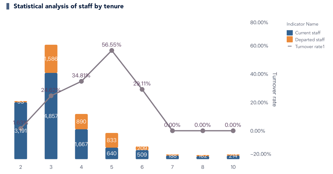
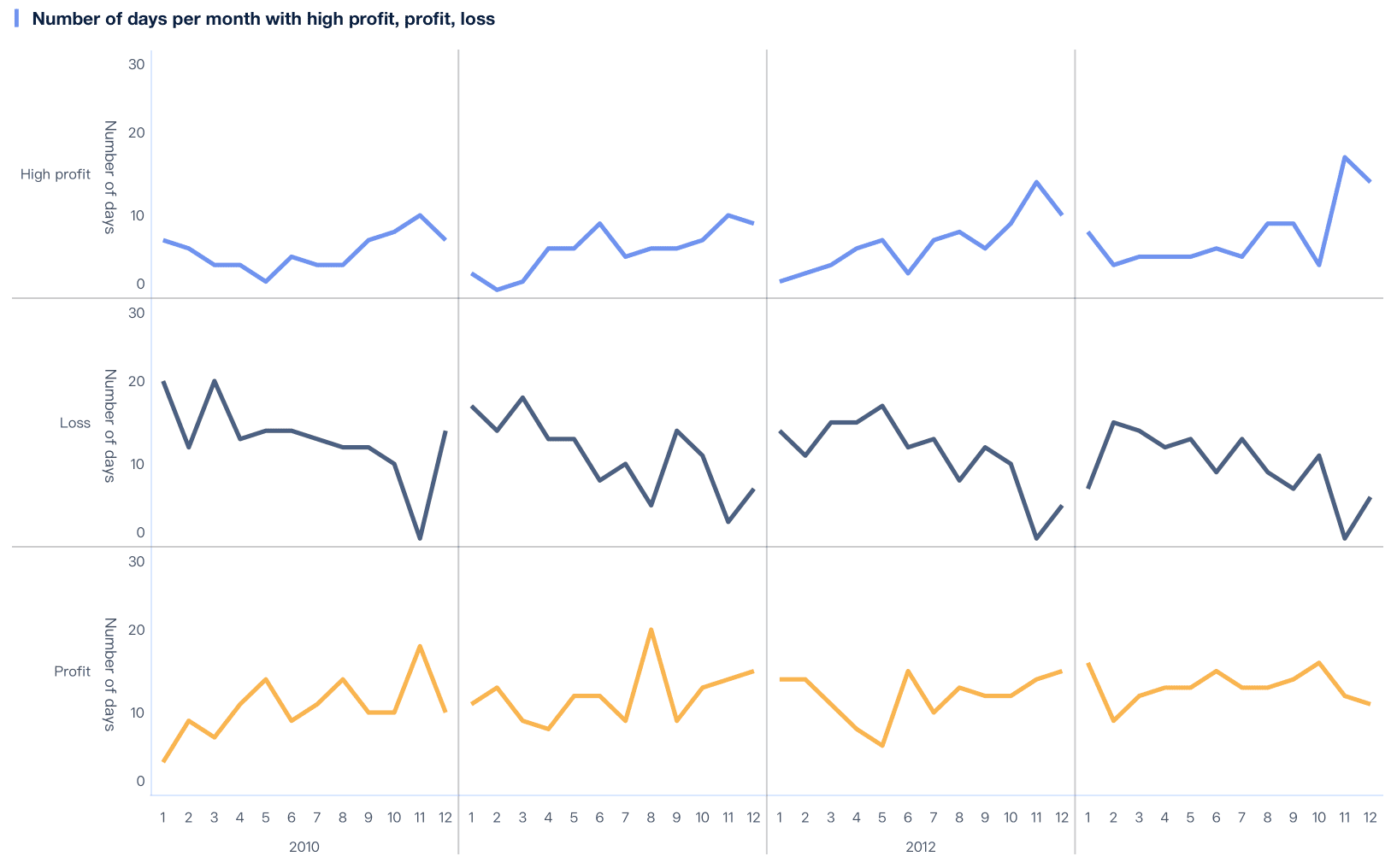
Monthly Profit Days Statistics Dashboard Created By FineBI
Practical examples of sparklines in data analysis
Sales Trends: Use line sparklines to track monthly sales figures. This visualization helps you quickly identify seasonal trends and sales peaks.
Performance Metrics: Implement column sparklines to compare performance metrics across different departments. This approach allows you to see which departments are excelling or lagging.
Financial Gains and Losses: Apply win/loss sparklines to financial data. This method highlights periods of profit and loss, aiding in financial analysis.
Mastering sparklines can significantly enhance your data visualization skills, whether in Excel or FineBI. These compact, powerful graphics provide a clear, concise way to represent data trends. In Excel, sparklines are typically used within individual cells to display trends in a limited space.
However, FineBI takes it a step further by integrating sparklines into dynamic dashboards, allowing for more interactive and comprehensive analysis. This flexibility not only improves your data insights but also makes your reports more engaging and visually appealing, offering a superior user experience compared to Excel's static approach.
Advanced Excel Data Visualization Techniques: Conditional Formatting
Conditional formatting in Excel allows users to highlight important data based on specific criteria, helping to visualize patterns and trends quickly. It’s ideal for identifying outliers and simplifying data interpretation. While Excel offers powerful static formatting within cells, FineBI enhances this with dynamic, interactive dashboards that update in real-time. FineBI provides more flexibility in visualizing data with advanced features like color gradients and icon sets, allowing for richer, more engaging reports. By mastering conditional formatting, users can improve data analysis in Excel, while FineBI offers a more scalable and interactive approach to data visualization.
Using formulas in conditional formatting allows for dynamic data visualizations that respond to the changing context of your data. In Excel, you can set up custom rules to highlight cells that exceed specific thresholds or to differentiate positive and negative values with color changes. This flexibility helps make data insights clearer and more actionable. In contrast, FineBI takes this a step further by offering real-time, interactive dashboards, where formatting rules can adapt automatically as the data updates. This enhances data analysis by providing a more seamless and engaging experience for users, particularly in large, complex datasets.
Examples of complex conditional formatting scenarios
Highlighting Top Performers: In Excel, use conditional formatting to mark the top 10% of sales. FineBI automates this with real-time updates in interactive dashboards.
Visualizing Trends: Excel color scales show trends, like temperature changes. FineBI offers dynamic, interactive visualizations with filters to explore trends in more detail.
Flagging Anomalies: In Excel, set rules to highlight outliers. FineBI enhances this with automatic alerts, allowing faster detection of data issues.
Benefits of Conditional Formatting
Enhancing data interpretation with visual cues
Conditional formatting improves data interpretation by offering visual cues that highlight key information. In Excel, you can use colors, symbols, and data bars to emphasize patterns and trends, making complex data more accessible. FineBI takes this further by integrating dynamic, interactive visualizations within dashboards, allowing users to explore and filter data in real-time. While Excel provides static formatting for quick analysis, FineBI enhances decision-making with its responsive and customizable visualizations, enabling more in-depth insights and faster action.
To maintain readability while using conditional formatting, consider the following tips:
Limit Color Usage: Use a simple, limited color palette to avoid overwhelming the viewer. In Excel, this ensures clear distinctions between data points. In FineBI, more sophisticated color schemes can be applied to dynamic visualizations without losing clarity.
Simplify Rules: Keep your formatting rules straightforward. In Excel, overly complex rules can obscure the message, while FineBI allows for more advanced, context-sensitive formatting with interactive features that support deeper data exploration.
Test Visibility: Ensure your formatting works across devices and screens. While Excel offers standard views, FineBI’s responsive dashboards allow users to check formatting across multiple devices, ensuring data remains clear and impactful wherever it’s viewed.
By incorporating advanced Excel techniques like conditional formatting, you can create more engaging and insightful data visualizations. This approach enhances your ability to analyze data and effectively communicate key trends. In Excel, formatting rules offer flexibility for quick visual cues, while FineBI provides even more dynamic and interactive visualizations, making it easier to analyze and share complex data across multiple platforms and devices.
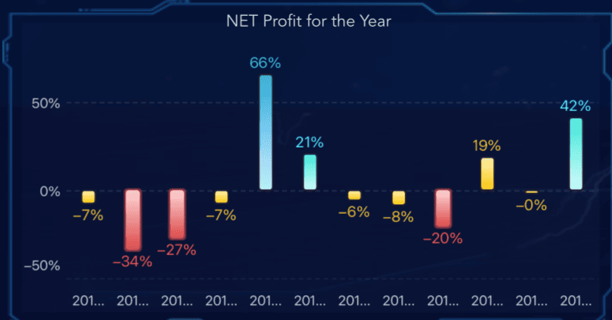
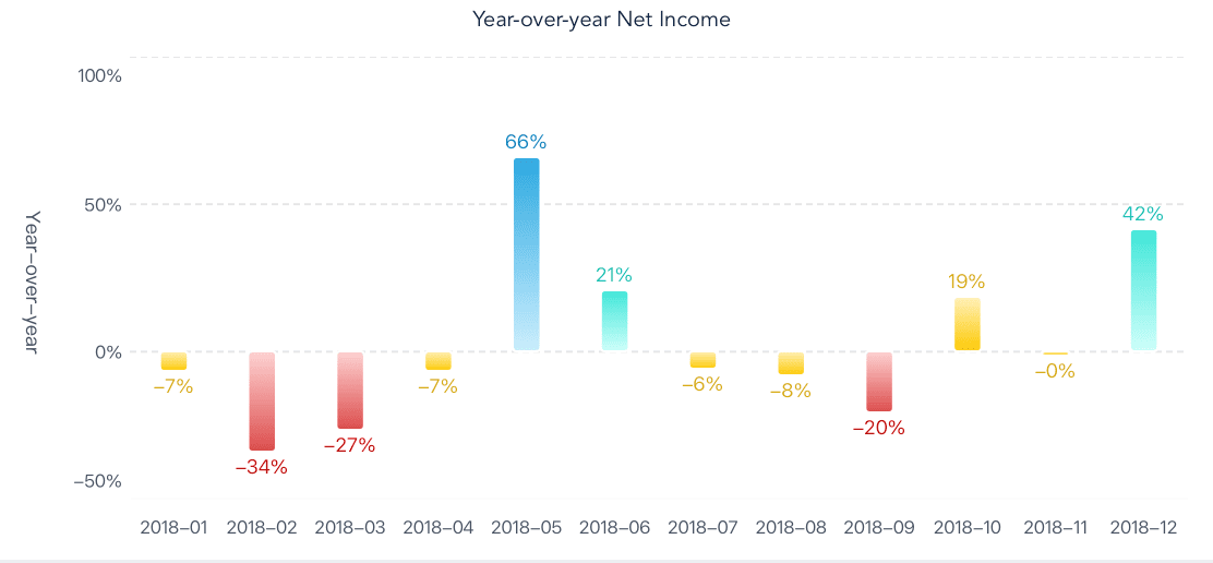
Advanced Excel Data Visualization with Waterfall Charts
Waterfall charts are ideal for visualizing the cumulative impact of sequential positive and negative values, commonly used in financial analysis to track changes from a starting to an ending value. In Excel, waterfall charts offer a straightforward way to illustrate this, while FineBI enhances the experience with interactive features and real-time data integration, making it easier to analyze and present complex data in a dynamic and engaging format.
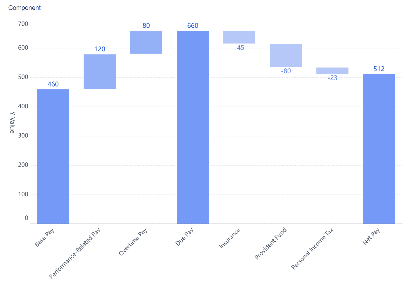
A waterfall chart consists of several key components that help you understand the flow of data:
Starting Value: This is the initial point from which changes begin. It sets the baseline for the chart.
Positive and Negative Changes: These bars represent increases or decreases in value. Positive changes are typically shown in green, while negative changes appear in red.
Ending Value: This is the final result after all changes have been applied. It shows the cumulative effect of the sequential values.
Waterfall charts effectively illustrate how individual components contribute to the total, making them ideal for analyzing profit and loss, inventory changes, or sales performance.
Common use cases for waterfall charts
Waterfall charts find application in various scenarios:
Profit-Loss Analysis: Track how revenue, expenses, and taxes contribute to net profit over time. In Excel, this can be done manually, but FineBI offers dynamic features for real-time data analysis and easier updates.
Inventory Analysis: Visualize inventory changes, including stock additions and reductions, to understand inventory movement more clearly. FineBI’s interactive interface makes it easier to drill into specific periods or categories.
Employee Changes: Monitor team size fluctuations, visualizing hires and departures over time, with the ability to filter by department or role in FineBI for deeper insights.
These charts provide a clear picture of how different elements affect the overall outcome, making them valuable tools for advanced data visualization.
Creating Waterfall Charts
Step-by-step guide to building a waterfall chart in Excel
Select Your Data: Choose the dataset you want to visualize. Ensure it includes a starting value, positive and negative changes, and an ending value.
Insert a Waterfall Chart: Go to the "Insert" tab in Excel. Click on "Waterfall Chart" to create a basic chart layout.
Customize the Chart: Use the "Chart Tools" menu to adjust the appearance. You can change colors, add labels, and modify the axis to enhance clarity.
Highlight Key Changes: Emphasize significant changes by adjusting the color or size of the bars. This helps draw attention to critical data points.
Finalize Your Chart: Add titles and legends to ensure your audience understands the data. Review the chart for accuracy and readability.
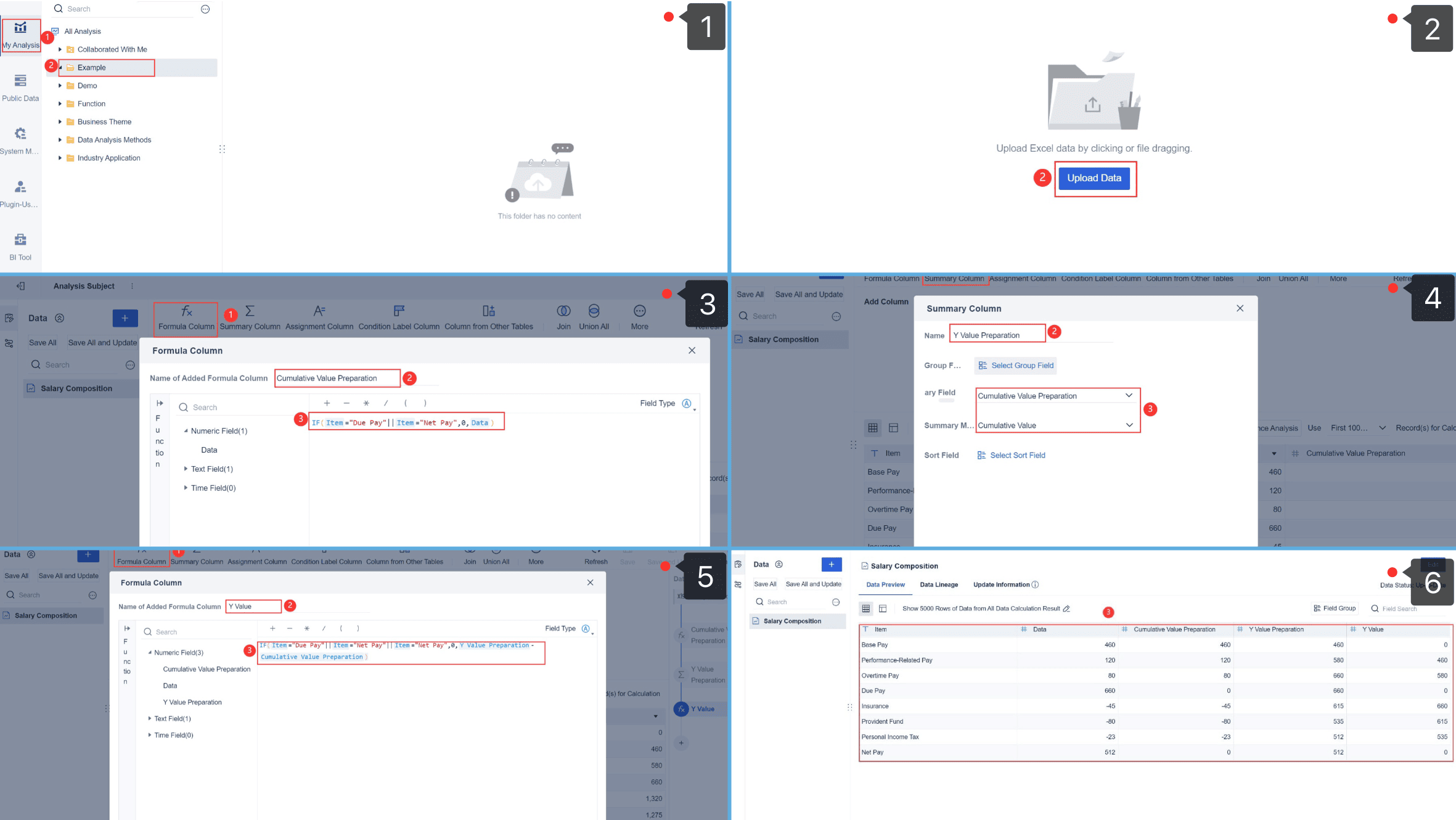
Step-by-step guide to building a waterfall chart in FineBI
Create a Waterfall Chart: Start by selecting the data you want to visualize. In FineBI, you can create a waterfall chart by choosing the "Waterfall" chart type from the visualization options.
Choose Your Data: Select the dimensions (like time or categories) and measures (like profit, loss, etc.) you want to display in the chart. This is how you define the starting and ending points of your waterfall.
Customize the Chart: FineBI allows you to adjust the appearance of the chart, such as changing colors for positive or negative values, adding labels, and formatting the axis for better clarity.
Add Filters: You can add filters to focus on specific time periods, categories, or data points. This helps you analyze specific trends in more detail.
Display and Analyze: Once the chart is set up, FineBI will show the cumulative effect of each value, making it easy to track how each step contributes to the total change.
Customization options for better insights
To gain deeper insights from your waterfall charts, consider these customization options:
Color Coding: Use distinct colors for different types of changes. This makes it easier to differentiate between positive and negative impacts.
Data Labels: Add labels to each bar to display exact values. This provides precise information at a glance.
Annotations: Include notes or comments to explain significant changes. This adds context and aids in data interpretation.
By incorporating these elements, you can create more informative and visually appealing waterfall charts. These advanced data visualization techniques not only improve your data analysis but also enhance your ability to communicate insights effectively.
Pivot Charts with Slicers in Excel Data Visualization
Pivot charts, paired with slicers, offer a dynamic approach to data visualization, turning static data into interactive insights. While Excel provides basic pivot charts, FineBI enhances this by offering more flexible filtering and visualization options, making it easier to explore data from multiple perspectives. Mastering pivot charts and slicers in FineBI enables more efficient and effective data analysis, helping you uncover trends and patterns with greater ease and precision.
Sales Director Real-time Dashboard Created By FineBI
Pivot charts provide a visual representation of data summarized in pivot tables, offering an intuitive way to spot trends and patterns. When combined with slicers, you can interactively filter data, enhancing the exploration of insights.
Enhanced Data Exploration: In both Excel and FineBI, slicers allow you to quickly modify the data displayed, making it easier to uncover hidden insights. FineBI, however, offers more advanced filtering and visualization features for a deeper analysis.
Improved Decision-Making: The dynamic nature of pivot charts helps make better-informed decisions by enabling a multi-perspective view of the data. FineBI’s flexibility in adjusting and presenting these visualizations further aids strategic planning.
Efficient Communication: Interactive charts, especially in FineBI, foster more engaging presentations, as stakeholders can explore and filter data independently, leading to richer, data-driven discussions. FineBI's interactive dashboard offers a seamless experience compared to Excel's more basic slicer functionality.
Regional Store Analysis Dashboard Created By FineBI
Overview of slicer functionality
Slicers serve as visual filters for pivot charts, providing an intuitive way to interact with data. Here’s how they enhance your data analysis:
User-Friendly Interface: Slicers in both Excel and FineBI offer easy, button-based filtering. Unlike Excel, FineBI provides more advanced visual customization, allowing you to integrate slicers seamlessly into interactive dashboards.
Multiple Selections: Slicers allow you to filter by multiple criteria, giving you a detailed view of combined data. FineBI takes this a step further by enabling multi-dimensional slicing, improving data exploration across various categories.
Clear Visuals: Slicers make it easy to track which filters are applied, ensuring you can adjust them as needed. FineBI’s real-time filtering and dynamic updates make it even more efficient, providing a clearer view of data trends compared to Excel’s static filtering.
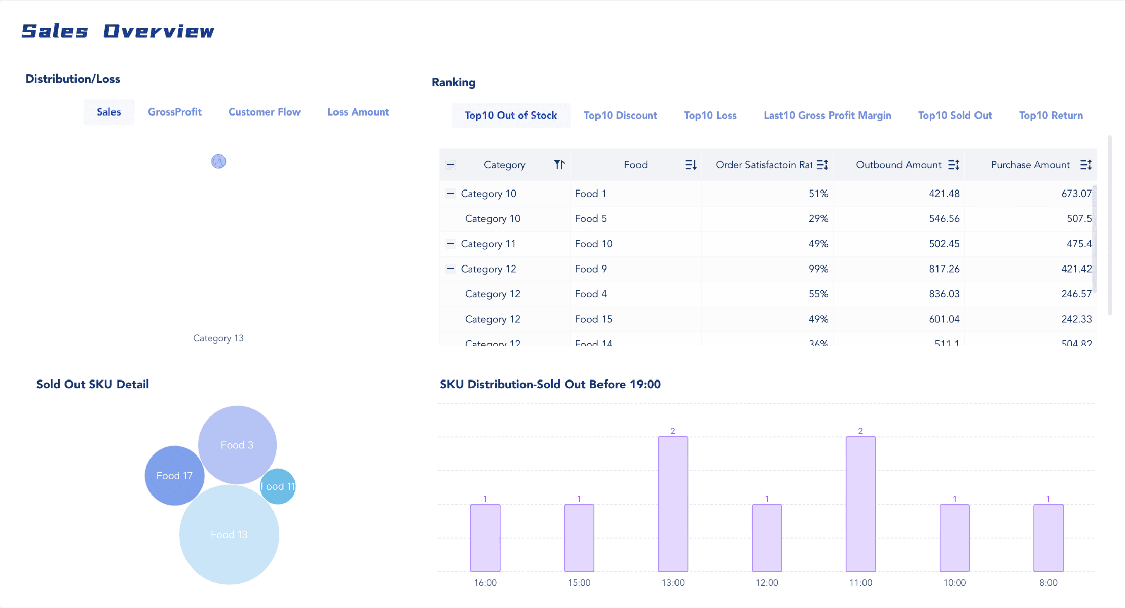
Sales Overview Dashboard Created By FineBI
Building Pivot Charts with Slicers
Step-by-step instructions for creating pivot charts in Excel
Prepare Your Data: Organize your data in a table format. Ensure that it includes all the necessary fields for analysis.
Create a Pivot Table: Go to the "Insert" tab and select "PivotTable." Choose the data range and the location for the pivot table.
Insert a Pivot Chart: With the pivot table selected, navigate to the "Insert" tab again. Click on "PivotChart" and choose the desired chart type.
Add Slicers: Select the pivot chart, then go to the "Analyze" tab. Click on "Insert Slicer" and choose the fields you want to use as filters.
Customize Your Chart: Adjust the chart elements, such as titles and labels, to enhance clarity. Use the slicers to filter data and observe changes in real-time.
Step-by-step instructions for creating pivot charts in FineBI
Select Data: Log in to FineBI and choose the dataset you want to work with.
Create Pivot Table: Start a new report and drag the relevant fields into the pivot table layout (rows, columns, values).
Convert to Pivot Chart: Click the Chart option to visualize the pivot table as a chart.
Customize & Filter: Adjust chart settings (type, colors) and add slicers for interactive filtering.
Save & Share: Save your report and export or share it as needed.
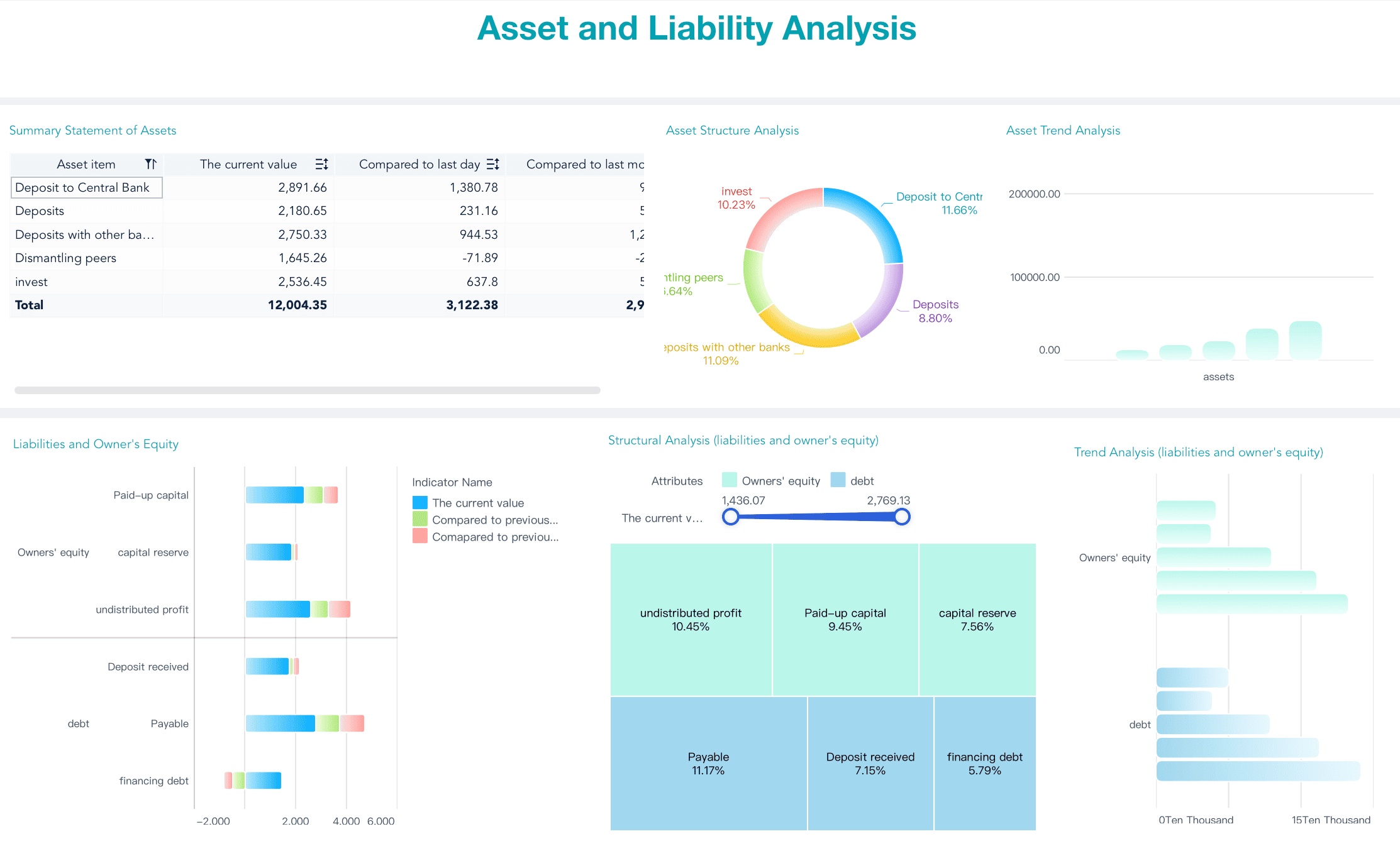
Asset Liability Analysis Dashboard Created By FineBI
Examples of interactive data exploration
Sales Analysis: Use pivot charts and slicers to analyze sales data by region and product. FineBI allows you to quickly switch between regions, enabling you to compare performance across different categories, offering a more interactive approach compared to Excel’s static pivot tables.
Financial Reporting: Create dynamic financial reports that stakeholders can interact with. With FineBI, slicers let users filter data by time periods or departments, providing a customized view of financial metrics, enhancing the flexibility compared to Excel’s standard reporting.
Customer Insights: Explore customer data by demographics or purchase history. Slicers in FineBI allow easy segmentation of data, uncovering valuable insights into customer behavior in a more user-friendly and efficient manner compared to Excel's manual data manipulation.
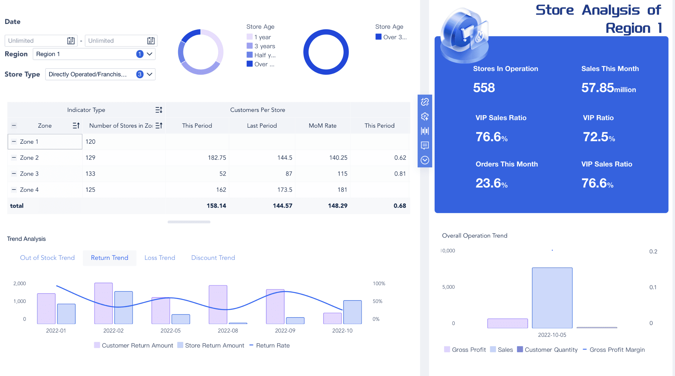
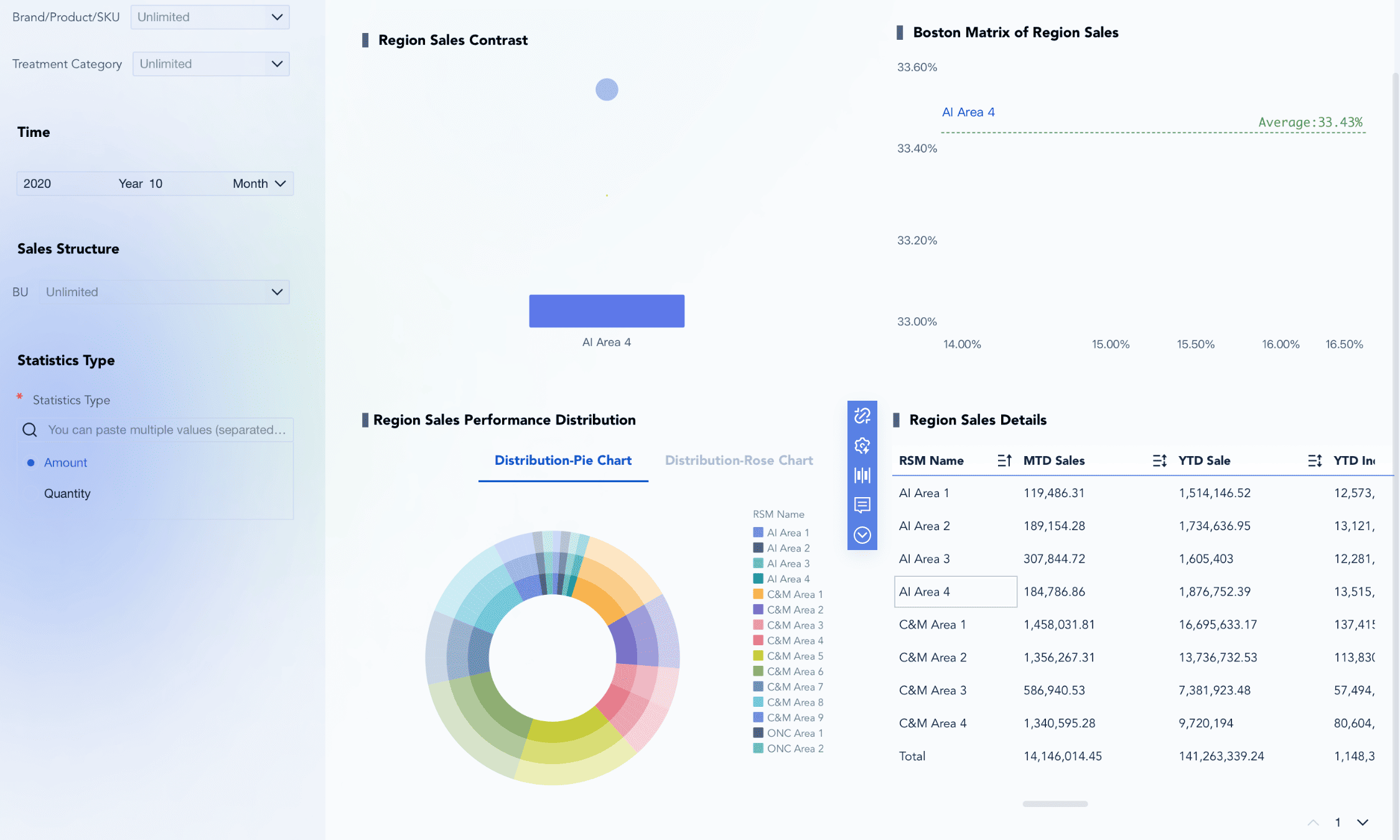
Region Sales Performance Analysis Dashboard Created By FineBI
By integrating pivot charts with slicers, you can elevate your data visualization techniques. FineBI’s interactive features offer a more streamlined and dynamic approach for analyzing and communicating data effectively, giving you an edge over Excel’s more traditional, less interactive process.
Advanced Excel Data Visualization Techniques: Treemap and Sunburst Charts
Exploring Treemap Charts
Understanding the structure of treemap charts
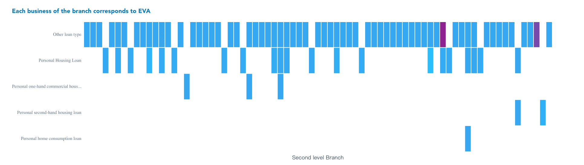
Treemap charts provide a powerful way to visualize hierarchical data using nested rectangles, where the size of each rectangle represents a specific value. This layout allows you to easily compare categories and subcategories at a glance. FineBI’s treemaps offer greater interactivity and customization compared to Excel’s more basic charting options. FineBI enables deeper insights through dynamic visualizations, while Excel’s static treemaps may lack the flexibility and detailed interactivity.
Key Insight: Treemaps excel in visualizing large datasets with multiple categories and subcategories, providing a clear overview of hierarchical data.
Treemap charts are effective for visualizing hierarchical data across various applications:
Market Share Analysis: Visualize the market share of companies in an industry, with the size of each rectangle representing the company’s share. FineBI allows for more interactive treemaps, enabling dynamic exploration of data compared to Excel’s static version.
Budget Allocation: Display how a budget is allocated across departments or projects, easily identifying areas with the most funding. FineBI’s treemaps offer better customization, making it easier to adjust visualizations to your needs.
Website Traffic: Analyze website traffic by showing the number of visits to different pages, helping to highlight the most popular sections. FineBI’s ability to filter and interact with these visualizations provides deeper insights than Excel’s basic approach.
By using treemaps in FineBI, you can create more interactive and insightful data visualizations, improving data communication and decision-making.
Sunburst Charts
Explanation of sunburst chart design
Sunburst charts provide another way to visualize hierarchical data. They display data as concentric rings, with each ring representing a level in the hierarchy. The innermost circle represents the root category, while outer circles show subcategories. This design allows you to see the entire hierarchy in one view, making it easy to understand the structure of your data.
Scientific Insight: Sunburst charts display hierarchical data as concentric rings, offering a comprehensive view of data relationships.
Practical applications of sunburst charts
Sunburst charts are versatile and can be used in various scenarios:
Organizational Structure: Visualize an organization’s hierarchy, from top-level executives to individual employees. FineBI’s sunburst charts allow for interactive exploration of this hierarchy, making it easier to drill down into specific departments, unlike Excel's more static visualizations.
File System Analysis: Display the structure of a file system with folders and subfolders. FineBI enhances this by enabling dynamic filtering and zooming, offering more flexibility than Excel’s static charts.
Product Categories: Analyze product categories and subcategories within a retail business. FineBI’s sunburst chart offers advanced features like color coding and interactivity, making it more effective for identifying key sales contributors compared to Excel.
By using sunburst charts, you can gain deeper insights into hierarchical relationships and present complex data in a more interactive, visually appealing way, improving communication and decision-making.
FanRuan's FineBI and FineVis for Advanced Data Visualization
Leveraging FineBI for Enhanced Data Analysis
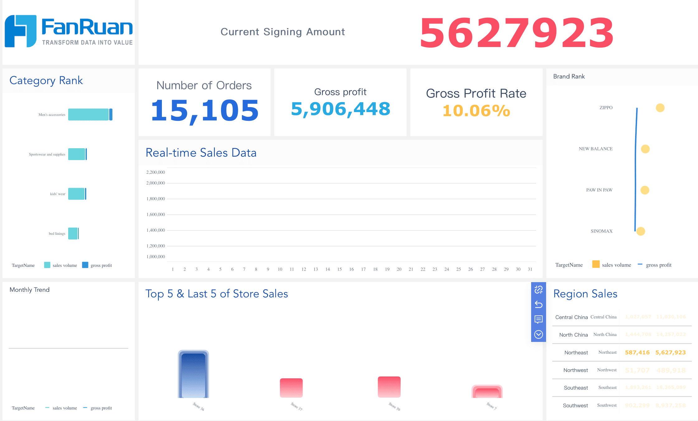
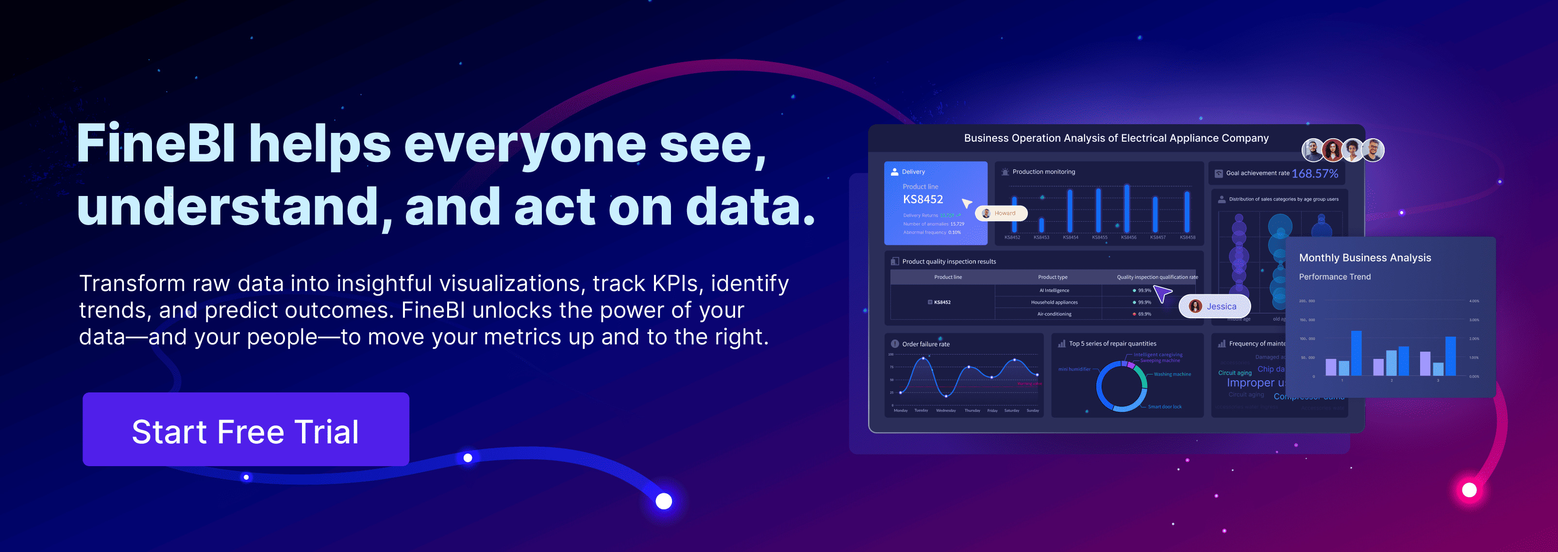
FineBI offers a robust platform for advanced data visualization. You can transform raw data into insightful visualizations with ease. This tool empowers you to track KPIs, identify trends, and predict future outcomes. FineBI's high-performance computing engine processes massive datasets efficiently. It supports over 10,000 users for online viewing, making it ideal for enterprise-level applications.
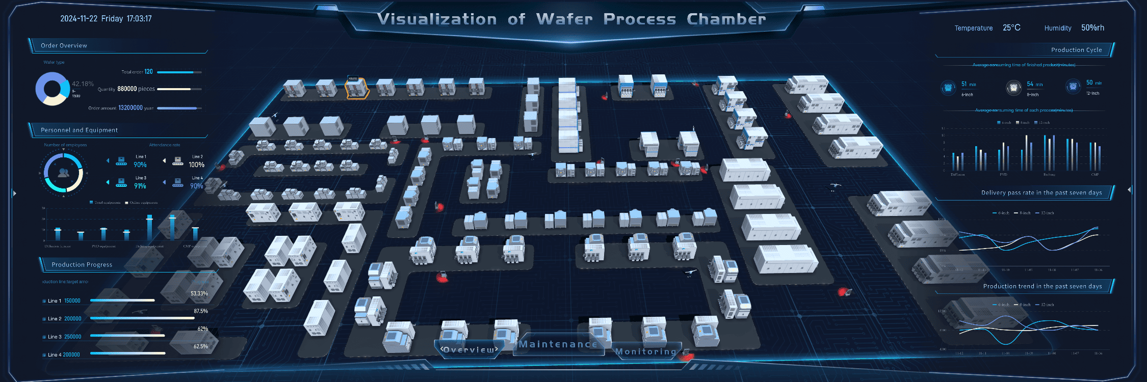
Visualization of Water Process Chamber Dashboard Created By FineVis
Features of FineBI that support advanced data visualization
Data Connection: FineBI connects to various data sources, including big data platforms and Excel datasets. This feature ensures seamless data integration across your organization.
Visual Analysis: With drag-and-drop functionality, you can perform OLAP multidimensional analysis effortlessly. FineBI offers over 60 chart types, enhancing your ability to visualize complex data.
Augmented Analytics: FineBI provides interactive data interpretation. It generates automatic analysis for selected data, helping you uncover insights quickly.
Key Insight: FineBI's features streamline data analysis, boosting efficiency by over 50%.
How FineBI integrates with Excel for improved insights
FineBI integrates seamlessly with Excel, enhancing your data visualization capabilities. You can import Excel datasets into FineBI for more comprehensive analysis. This integration allows you to leverage FineBI's advanced features, such as real-time analysis and role-based access control. By combining Excel with FineBI, you gain deeper insights and improve decision-making.
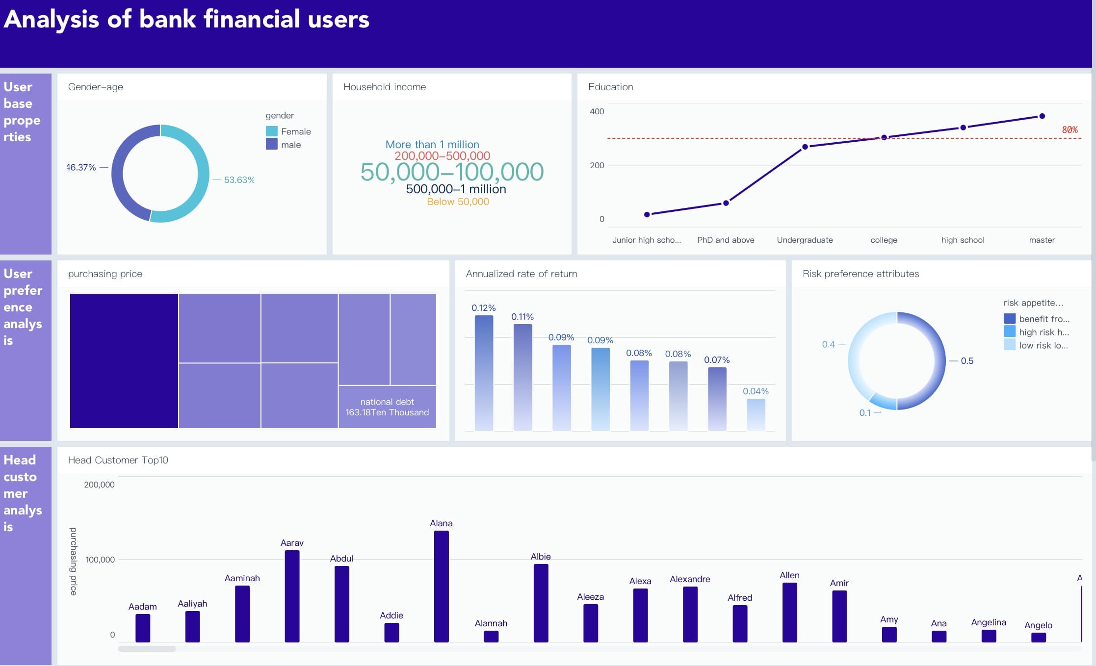
Analysis of bank financial users Dashboard Created By FineBI
Utilizing FineVis for Interactive Data Storytelling
FineVis takes data visualization to the next level. It offers a dynamic platform for creating interactive charts and dashboards. You can unlock insights and visualize success with FineVis's powerful tools. This platform caters to users of all technical levels, providing a zero-code, drag-and-drop interface.
Key features of FineVis for dynamic visualizations
Dynamic 3D Visualizations: FineVis supports over 60 chart types, including 3D visualizations. You can create engaging and informative visual stories with ease.
Customizable Dashboards: FineVis allows you to design dashboards that suit your needs. Its adaptive design ensures compatibility across various devices, from smartphones to large screens.
Real-Time Analytics: FineVis provides real-time data insights, enabling you to make informed decisions quickly.
Scientific Insight: FineVis's real-time analytics enhance your ability to respond to changing business conditions promptly.
FanRuan University Data Visualization Dashboard Created By FineVis
FineVis offers tailored solutions for various industries. You can optimize data insights and drive business growth with its industry-specific tools. FineVis serves sectors such as manufacturing, healthcare, logistics, and smart cities. These solutions enhance efficiency and performance, making FineVis a versatile choice for businesses.
By leveraging FineBI and FineVis, you can elevate your data visualization techniques. These tools empower you to create interactive and insightful visualizations, enhancing your ability to analyze and communicate data effectively.
FanRuan Business Park Dashboard Created By FineVis
Mastering advanced Excel data visualization techniques transforms your data analysis skills. By using tools like combo charts, sparklines, and conditional formatting, you can create compelling visual stories that enhance communication. These skills not only improve your ability to analyze data but also open doors to professional growth. Microsoft Excel remains a powerful tool for data analysis, with features like power pivot enhancing its capabilities. FineBI and FineVis further support your efforts by providing advanced visualization options. Practice these techniques to elevate your data analysis and stay competitive in the data-driven world.
Click the banner below to experience FineBI for free and empower your enterprise to convert data into productivity!
Product Trial
FineReport
Pixel-perfect reports · Interactive dashboards · Easy data entry · Digital twins
Access a wealth of case studies, industry insights, and solution guides to accelerate digital transformation.
FAQ
What types of charts can I create in Excel?
Excel offers a variety of chart types, including bar, line, pie, and scatter plots. You can also create more advanced visualizations like combo charts, sparklines, and waterfall charts. These options allow you to present data in a way that best suits your analysis needs.
How can I enhance Excel's data visualization capabilities?
While Excel provides robust tools, you can enhance its capabilities with third-party apps like ChartExpo. These apps offer additional chart types and customization options, making your visualizations more dynamic and tailored to specific needs, such as survey results.
Can I use Excel for survey data visualization?
Yes, you can visualize survey data in Excel. Although Excel lacks survey-oriented charts, you can use its existing chart types creatively. For more specialized needs, consider integrating third-party tools that offer survey-specific visualizations.
How do I choose the right chart type for my data?
Selecting the right chart type depends on the data you have and the story you want to tell. For trends over time, line charts work well. Use bar charts for comparisons and pie charts for proportions. Understanding your data's nature helps in choosing the most effective visualization.