What are the benefits of data visualization? You might wonder why it's such a big deal. Well, data visualization transforms complex data into visuals that your brain can easily understand. Imagine trying to make sense of endless rows of numbers. Sounds daunting, right? But with charts and graphs, you can quickly spot trends and patterns. This makes data not just accessible but actionable. In today's data-driven world, tools like FineReport, FineBI, and FineVis empower you to harness these insights effectively. They help you make informed decisions, driving growth and innovation.
When faced with large volumes of data, it can quickly become overwhelming. The sheer amount of numbers and details may make it hard to extract meaningful insights. However, data visualization provides a solution by breaking down complex data into easy-to-understand visuals. With tools like bar charts, line graphs, and pie charts, you can quickly identify trends, patterns, and anomalies. Imagine looking at a sales report that spans months of data. A simple bar chart can instantly highlight peak performance periods, while a line graph shows the sales growth over time. Platforms like FineReport and FineBI take this further, offering interactive and customizable options that allow users to explore data in depth, turning raw numbers into actionable insights.
For those who are not data experts, data visualization is especially powerful. It simplifies data interpretation, making complex concepts more accessible. You don’t need to be a data scientist to understand a well-designed chart. A pie chart, for example, can quickly show you how a budget is allocated across various departments, while a line graph might highlight seasonal trends in customer demand. With FineVis, users can easily create visually appealing data dashboards and reports that bring data to life, helping decision-makers from all backgrounds understand the story behind the numbers without getting lost in the details.
Data visualization excels at making complex relationships clear and understandable. When you visualize connections and dependencies within your data, you reveal insights that might be difficult to grasp from raw numbers alone. For example, network diagrams or flowcharts can effectively illustrate how various elements within a system interact. Whether it’s understanding how customer interactions drive sales or mapping the connections between different components in a supply chain, these visuals help you comprehend intricate networks at a glance. Platforms like FineBI allow users to create interactive diagrams that provide a deeper understanding of these relationships, empowering teams to make data-driven decisions.
Visual aids enhance comprehension by presenting data in an easily digestible format. Studies show that humans process visual information much faster than text alone. In fact, research suggests that data visualization can boost comprehension by up to 400%. For instance, a scatter plot may instantly reveal correlations between two variables, while a heat map can highlight areas of high performance or concern. With FineVis, users can quickly design custom visualizations that transform complex datasets into engaging visuals, making it easier for stakeholders to grasp key insights.
By simplifying complex information, data visualization unlocks the potential for better understanding and more informed decision-making. Whether you're analyzing sales trends or exploring scientific findings, tools like FineReport, FineBI, and FineVis allow you to turn raw data into actionable insights, facilitating quicker and more confident decisions.
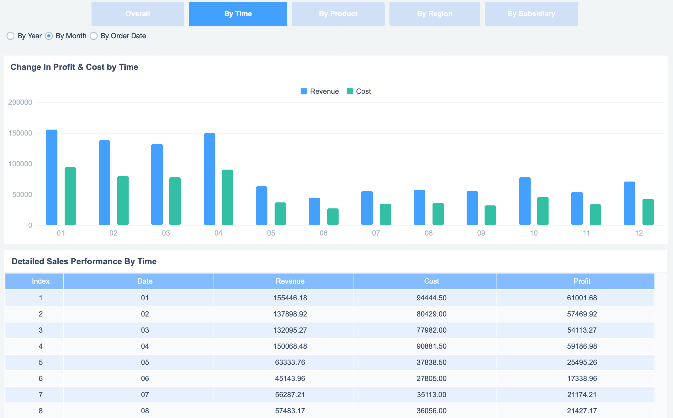
When examining data over time, spotting trends can often feel like searching for a needle in a haystack. Line graphs, however, simplify this process by clearly illustrating changes. For instance, tracking sales over a year, a line graph helps you immediately see whether sales are trending upward, downward, or remaining stable. You can quickly identify significant spikes or declines, making it easier to understand patterns in your data. Tools like FineBI allow users to create interactive line graphs that not only highlight trends but also allow for detailed drill-downs, enabling deeper insights into specific time periods or factors.
Visual tools like line graphs are also incredibly helpful for identifying seasonal patterns or cyclical trends. For example, you might notice that sales consistently rise during the holiday season and dip during the summer months. These insights are invaluable for planning. With visualizations in FineReport, you can adjust strategies, prepare for high-demand periods, and optimize your approach during slower times. By visualizing data over time, you uncover critical trends that allow for better decision-making, ensuring your strategies are always data-driven and well-informed.
Data visualization is particularly effective when it comes to discovering correlations between variables, and scatter plots are one of the best tools for this purpose. For example, you may want to explore whether there's a relationship between advertising spend and sales revenue. By plotting the data on a scatter plot, you can easily see if increased spending correlates with higher sales. This visual approach allows you to spot trends that might otherwise go unnoticed in raw data. Platforms like FineBI take this a step further by offering interactive scatter plots that allow users to zoom in on specific data points and filter variables, helping to uncover deeper insights.
These visual tools make complex data more accessible and turn it into actionable insights. When correlations are clearly displayed, you can quickly make informed decisions based on real patterns, rather than assumptions. For instance, if a clear positive correlation is seen between ad spend and sales, you might decide to increase the budget for advertising in future campaigns. FineVis enhances this process by offering advanced data visualization options that help you see and analyze relationships between data points in real time, driving smarter, data-driven decisions.
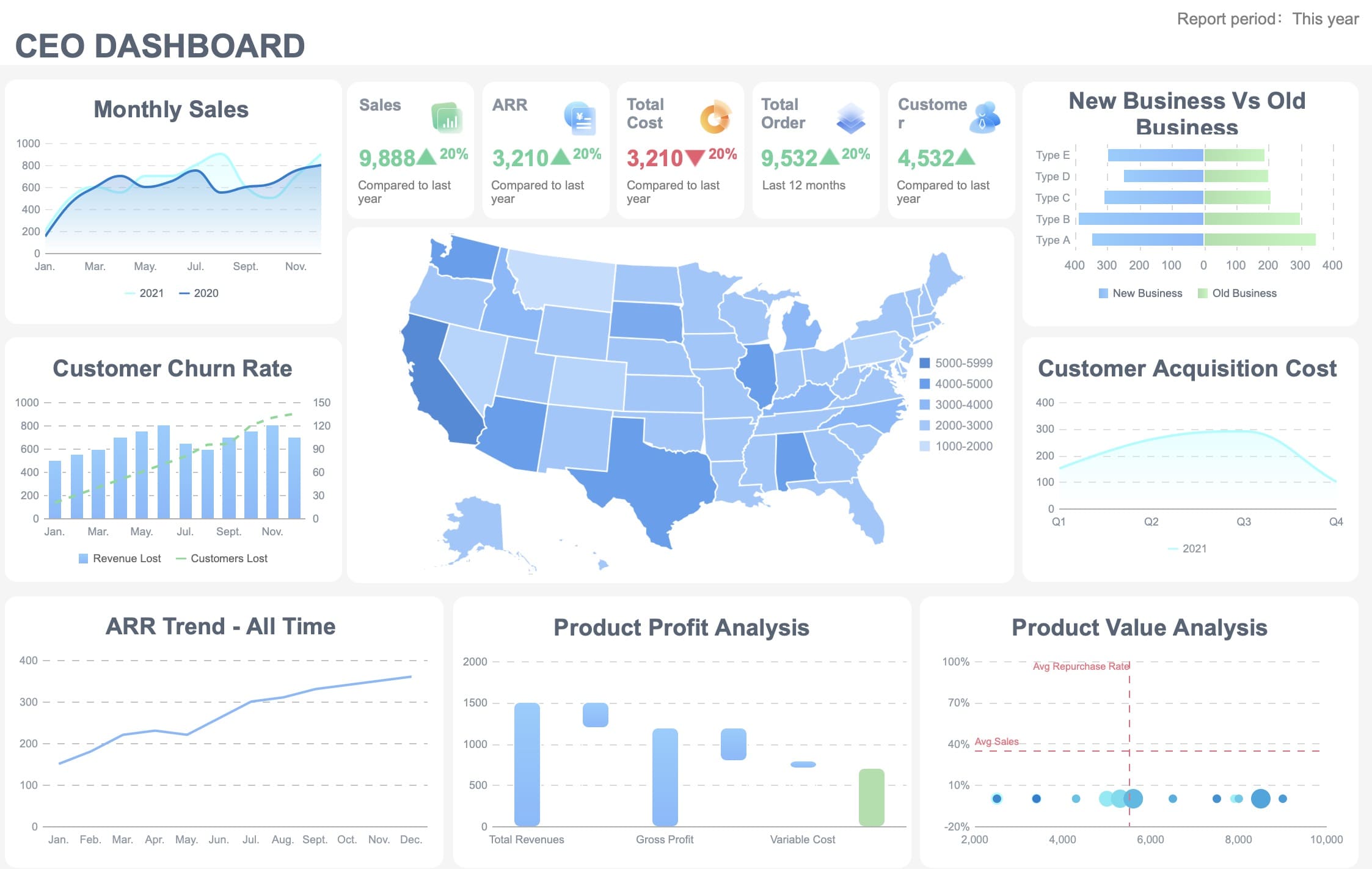
When it comes to making strategic decisions, data visualization plays a crucial role in providing clear, actionable insights. Imagine you’re reviewing a sales performance report, but instead of going through hundreds of rows of data, you are presented with a dynamic dashboard full of colorful charts and graphs. These visuals highlight key trends, such as rising sales or declining customer engagement, making it much easier to identify important patterns at a glance. Platforms like FineBI help enhance this experience with interactive visualizations, allowing decision-makers to drill deeper into data points in real-time, uncovering trends that might otherwise go unnoticed.
The real advantage of data visualization is its ability to simplify complex data. Instead of sifting through lengthy spreadsheets or reports, you can access a clear, visual summary of the information. This allows you to focus on what's most important—such as sales performance across regions or customer satisfaction scores—without getting bogged down in irrelevant details. FineReport further supports this process by offering powerful reporting capabilities that help you present data in a visually appealing and easy-to-understand format.
"Data-driven decisions: By visualizing data, decision-makers can see the patterns, trends, and insights clearly, which aids in making informed, data-driven decisions."
With easy-to-read visuals, you can act quickly and confidently. The clarity provided by effective data visualization means you don’t have to waste time interpreting raw data. Whether you’re adjusting marketing strategies or reallocating resources, you’re making decisions backed by solid, easily digestible insights. FineVis complements this by providing real-time data exploration, enabling you to adapt to changing conditions swiftly and ensure that every decision is data-driven and well-informed.

Data can often feel overwhelming, especially when it's presented in large volumes. However, by utilizing effective data visualization techniques, this challenge can be easily overcome. Visual formats such as bar charts, line graphs, and heat maps allow us to see patterns and trends more clearly, reducing the mental load of interpreting raw data. Your brain processes visual information much faster than text, which means that a well-designed chart or graph can quickly convey the key points. FineReport, for instance, excels in transforming large datasets into visually intuitive reports, making it easier for users to absorb complex information at a glance.
Moreover, data visualization streamlines the analysis process by highlighting key insights without the distraction of irrelevant details. When you use interactive dashboards, like those offered by FineBI, you can quickly filter and drill down into specific data points, enabling you to focus on what matters most. By presenting data in a more digestible format, you save valuable time and make your decision-making process much more efficient.
"Improves Understanding – The visual representations of business data make it easier for the human brain to comprehend and process large amounts of data."
Ultimately, the use of data visualization tools enhances decision-making by providing clear, actionable insights. FineVis, with its advanced visual analytics capabilities, allows you to interact with real-time data, uncovering trends and correlations instantly. This ensures that you can make data-driven decisions swiftly and confidently, improving overall business performance.
Grabbing your audience's attention is key to delivering a successful presentation, and visually appealing graphics can make all the difference. Imagine a presentation with vibrant charts, infographics, and color-coded data—these visuals not only captivate the eye but also enhance the message you're conveying. By using graphics effectively, you engage both the emotional and analytical sides of the brain, helping your audience connect with the material on a deeper level. FineReport excels in this area, offering users the ability to design pixel-perfect, visually engaging reports that instantly capture attention while providing clear, insightful data.
Interactive visuals take audience engagement to a whole new level. Instead of passively viewing a static chart, interactive dashboards allow users to click, explore, and filter data based on their interests. For example, in FineBI, users can interact with real-time analytics and drill down into data to uncover hidden trends and insights. This interactivity invites stakeholders to participate, creating a more dynamic and personalized experience that fosters deeper understanding.
Ultimately, these visual tools not only engage but also help make complex data more relatable. FineVis, with its advanced interactive features, transforms data analysis into a collaborative experience. By providing real-time exploration and a hands-on approach, it ensures that your audience can fully grasp the insights you are presenting, leading to better retention and a more effective decision-making process.
Enhancing storytelling through data visualization is a powerful tool for improving presentations. Complex information can overwhelm an audience, but when presented visually, it becomes a story that's easier to follow and understand. For example, a sales performance report with colorful charts showing year-over-year growth immediately communicates the message without overwhelming your audience with raw numbers. Using tools like FineReport, which allows you to craft visually appealing and detailed reports, helps transform data into a compelling narrative that speaks to both logic and emotion, making your message clearer and more persuasive.
Data visualization also fosters greater engagement and discussion. When information is presented visually, it’s easier for your audience to grasp the key takeaways quickly. This opens the door for more in-depth discussions and feedback. Interactive features in platforms like FineBI enable users to dive deeper into the data, encouraging participants to ask questions and share insights, which enriches the analysis. This interaction creates a collaborative environment where everyone feels involved, ultimately enhancing the quality of the conversation.
"Data visualization transforms numbers into actionable insights, increasing audience engagement with interactive visualization techniques." - Noble Desktop
Incorporating effective data visualization strategies can lead to more impactful communication and improved audience engagement. Visuals capture attention and provide clarity, making it easier to convey your message and invite dialogue. With tools like FineVis, you can create dynamic, real-time visualizations that not only present your data effectively but also allow your audience to interact with it. This ensures that your message resonates and that everyone is on the same page, helping to build trust and credibility within your organization.
Designing data visuals for diverse audiences is key to ensuring your message is accessible. People process information in different ways—some prefer charts, while others might engage more with infographics or diagrams. By using a mix of visual formats, you can cater to varied preferences. For example, combining bar charts for trend analysis and infographics for key insights ensures your data speaks to a wide range of people. FineReport’s flexible design capabilities allow you to create customized reports in multiple formats, making the information easier to grasp for everyone.
Accessibility is equally important when presenting data. Users with disabilities may face challenges with traditional data formats, like text-heavy reports or spreadsheets. Interactive visualizations can make a big difference, inviting users to actively engage with the data. FineBI provides an intuitive platform for creating accessible visualizations, offering customizable features such as zoom and color adjustments, ensuring that all users can interact with the data.
By prioritizing both accessibility and engagement, you expand your audience and foster inclusivity. Adding features like alt text or audio descriptions alongside visuals can make the data more accessible to people with visual impairments. FineVis enhances this experience by enabling real-time, interactive visualizations, ensuring that your data reaches a wider audience and fosters deeper understanding.
Data visualization plays a crucial role in bridging the gap between experts and non-experts. Complex, technical data often requires simplification to make it understandable for a wider audience. Visual tools such as bar charts, pie charts, and line graphs can transform intricate datasets into clear, easy-to-digest visuals. For instance, FineReport enables the creation of user-friendly, professional reports that make technical data accessible to all, without requiring specialized knowledge. These visuals allow everyone—whether a data scientist or a business executive—to understand key insights and make informed decisions.
Another key benefit of data visualization is promoting inclusivity in data interpretation. When data is presented visually, it encourages participation from all stakeholders. For example, stakeholders from different departments or backgrounds can provide diverse insights based on the same data. FineBI enhances this collaborative process by allowing users to interact with visualizations, explore different data views, and extract their own insights. This active engagement fosters a more inclusive environment where everyone feels empowered to contribute, regardless of their technical expertise.
Ultimately, this collaborative approach enriches the analysis process, leading to more comprehensive insights. By making data accessible and engaging, FineVis helps teams work together more effectively, ensuring that diverse perspectives drive better decisions and outcomes.
Data visualization enables interactive exploration, allowing users to engage with data in ways static reports can't. Imagine clicking on a bar chart to reveal deeper insights or applying filters to zoom in on specific metrics. This interactive capability transforms you from a passive viewer into an active explorer. Tools like FineVis facilitate this by offering real-time, clickable visualizations, making it easy to uncover hidden trends or anomalies that might not be immediately obvious in a static report.
By actively interacting with the data, you begin asking more targeted questions. For example, why did sales increase dramatically in March? What factors influenced customer satisfaction during certain periods? These questions push you to dig deeper, leading to a more thorough analysis. FineBI’s self-service analytics platform helps you to investigate these patterns in-depth without relying on IT specialists, giving you the tools to answer these questions independently and effectively.
Ultimately, this interactive approach leads to more informed decision-making. By uncovering the underlying trends through exploration, you’re empowered to make data-driven decisions with greater confidence. FineReport supports this process by providing clear, actionable insights within well-designed, interactive reports that cater to both detailed exploration and executive overviews.
Data visualization doesn't just help you understand the present; it inspires new ideas for the future. When you see data in a visual format, your brain makes connections that might not be obvious in raw numbers. This can spark creativity and innovation. For instance, John Snow used data visualization during the 1855 cholera epidemic in London. By mapping cholera deaths, he identified a contaminated water pump as the source, leading to its removal and ending the epidemic. This innovative use of data visualization saved lives and changed public health practices.
Visualizing data supports creative problem-solving. When you face a challenge, data insights can guide you toward solutions. You might notice a correlation between two variables that suggests a new approach. Or, you might identify an untapped market segment by analyzing customer demographics. By fostering innovation, data visualization helps you stay ahead of the competition and adapt to changing circumstances.
"Data visualization has been used to make critical judgments countless times, from restoring health to capturing enemy territory."
Incorporating these strategies into your data analysis process can lead to groundbreaking discoveries. By promoting exploration and fostering innovation, data visualization empowers you to unlock the full potential of your data.
While data visualization can make data more accessible, it also requires careful handling to avoid misinterpretation. Choosing the right type of chart or graph is critical for conveying accurate insights. For example, using a pie chart to show changes over time can be misleading. A line graph would better illustrate trends, providing a clearer representation of data fluctuations. FineReport, with its wide range of customizable charts, allows you to select the most appropriate visual for any data set, ensuring clarity and accuracy.
Understanding how to read and interpret visualizations is equally important. You must grasp what each element of the visualization represents to draw accurate conclusions. For instance, failing to recognize that correlation does not imply causation can lead to poor decisions. FineBI helps mitigate this risk by offering detailed tooltips and legends, which enhance understanding and guide users through the data, preventing misinterpretations.
Educating yourself and your team on the proper interpretation of visuals ensures better decision-making. By learning to read visuals with care, you can avoid common pitfalls and make more informed, data-driven choices. FineVis further supports this by creating interactive, intuitive visualizations that help users explore data in a way that promotes deeper understanding and avoids errors in analysis.
"Logical reasoning is crucial to avoid misleading or confusing the audience in data visualization projects."
When creating data visualizations, finding the right balance between simplicity and detail is essential. You need to present enough context to convey the key message without overwhelming your audience. For instance, a well-designed dashboard in FineVis allows you to highlight critical metrics, such as sales trends or customer satisfaction, while avoiding clutter. By focusing on only the most relevant data points, you ensure that the audience stays engaged without feeling overwhelmed.
Achieving clarity while dealing with complex data can be challenging, but breaking it down into smaller, more digestible chunks helps. FineBI’s intuitive platform enables you to drill down into detailed data while presenting an overview that's easy to follow. This approach allows decision-makers to quickly grasp the essence of the data and identify patterns without getting bogged down in minutiae.
"Addressing these challenges ensures accurate analysis and informed decision-making in data interpretation."
By prioritizing simplicity and clarity, you can create visualizations that not only communicate your message effectively but also build trust with your audience. FineReport excels at generating comprehensive, user-friendly reports that are both visually appealing and rich in data, making it easier for stakeholders to interpret the findings and make informed decisions.
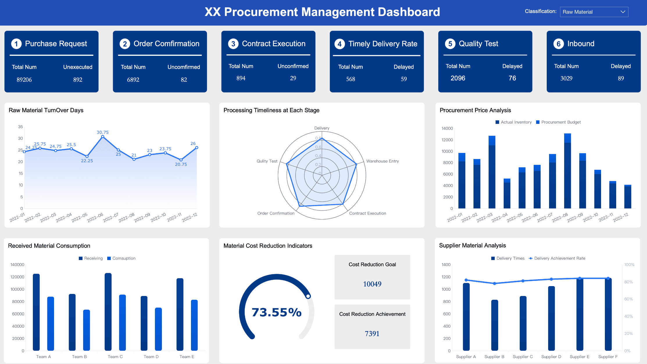
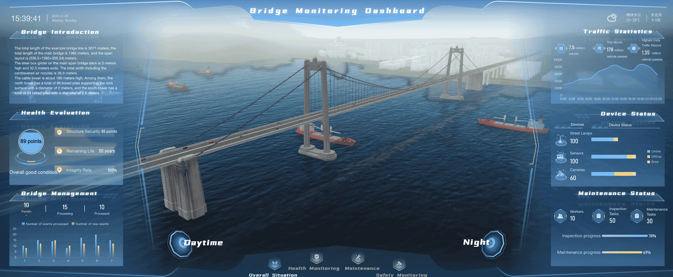
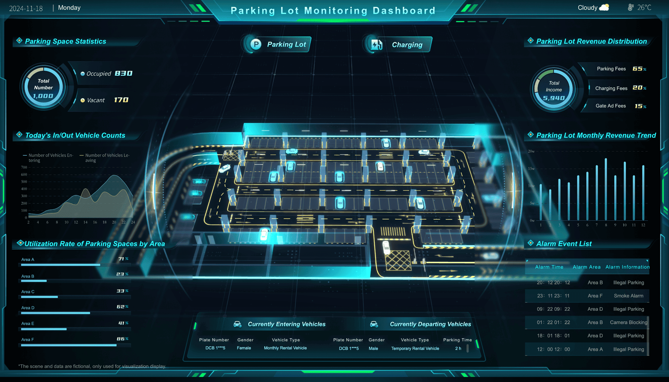
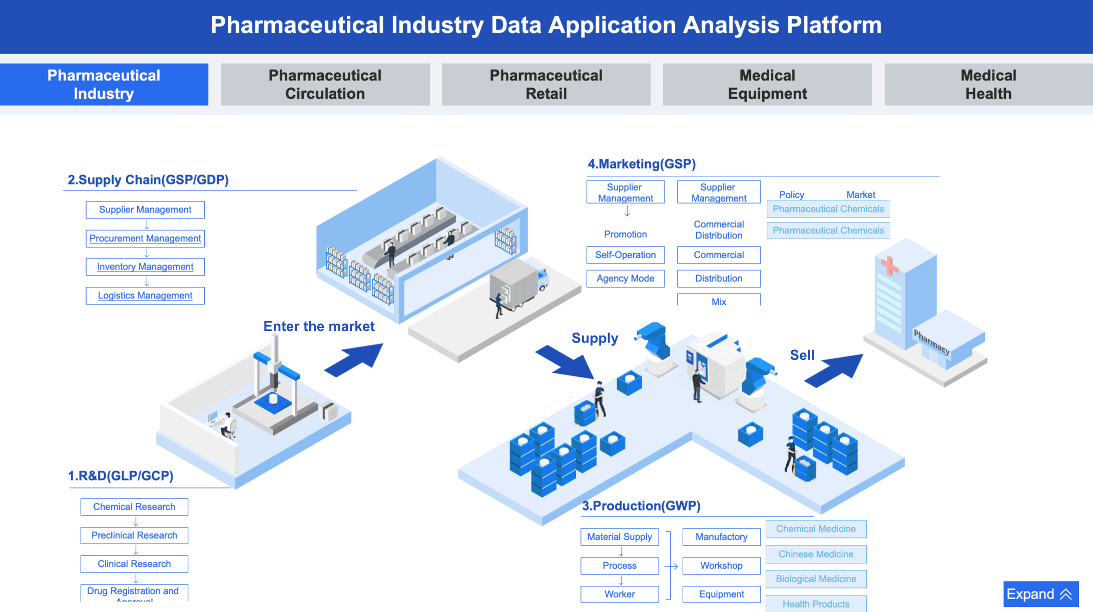
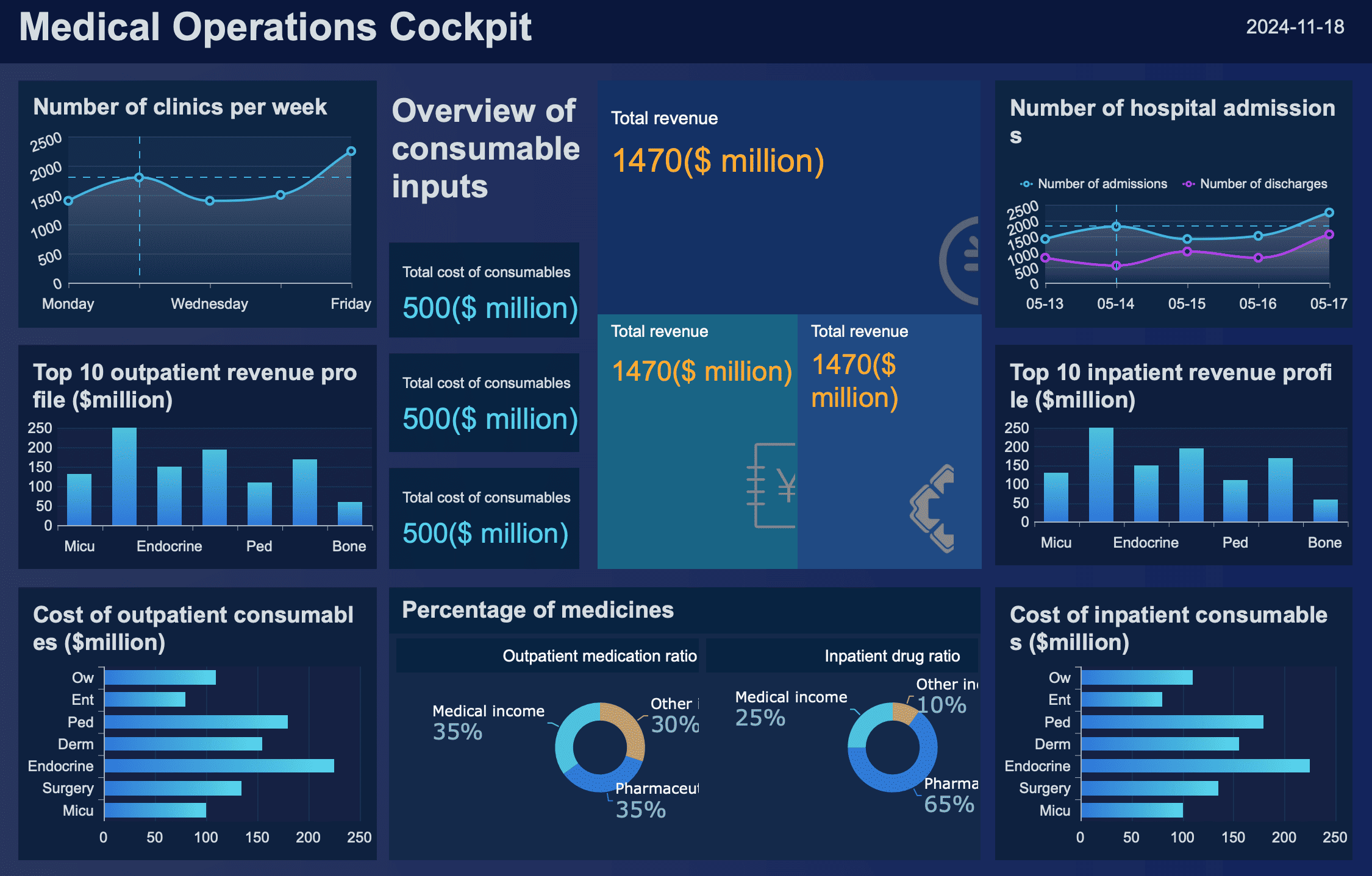
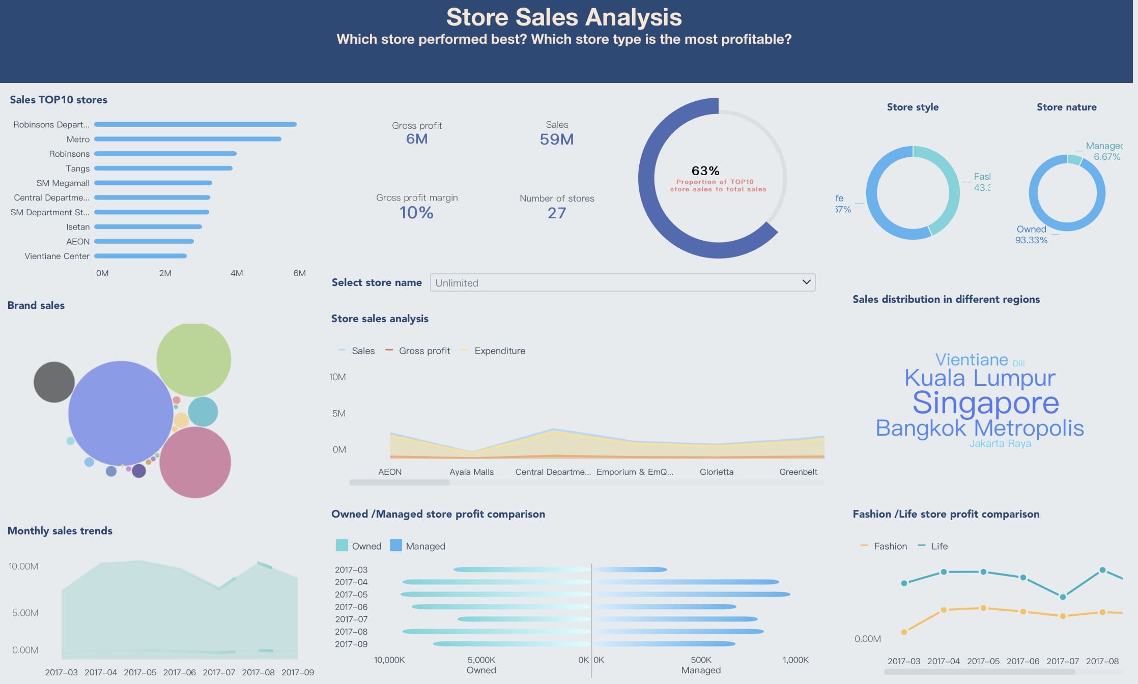
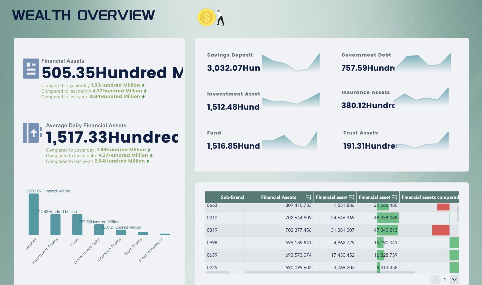
When you need to create reports that are both precise and visually appealing, FineReport is your go-to tool. With its powerful report designer, you can create pixel-perfect documents that capture every detail with clarity. Whether you are preparing financial reports or performance summaries, FineReport ensures that every piece of data is accurately presented. For instance, a manager might need a quarterly sales report with precise visualizations and clear breakdowns. FineReport makes this task effortless by allowing you to design reports that are easy to read and visually striking.
The platform’s flexibility stands out with its drag-and-drop functionality. You can seamlessly integrate tables, charts, and graphics into your reports, making it simple to build a cohesive layout that enhances understanding. This feature is especially useful when creating complex reports where the ability to manipulate data and design elements is crucial. The result is a polished, professional-looking document that communicates information effectively and enhances decision-making.
Moreover, FineBI and FineVis provide additional power for interactive data exploration and analytics, allowing you to connect your reports to real-time data. These tools enable you to not only create reports but also generate insights that drive business decisions, offering a comprehensive solution for data presentation.
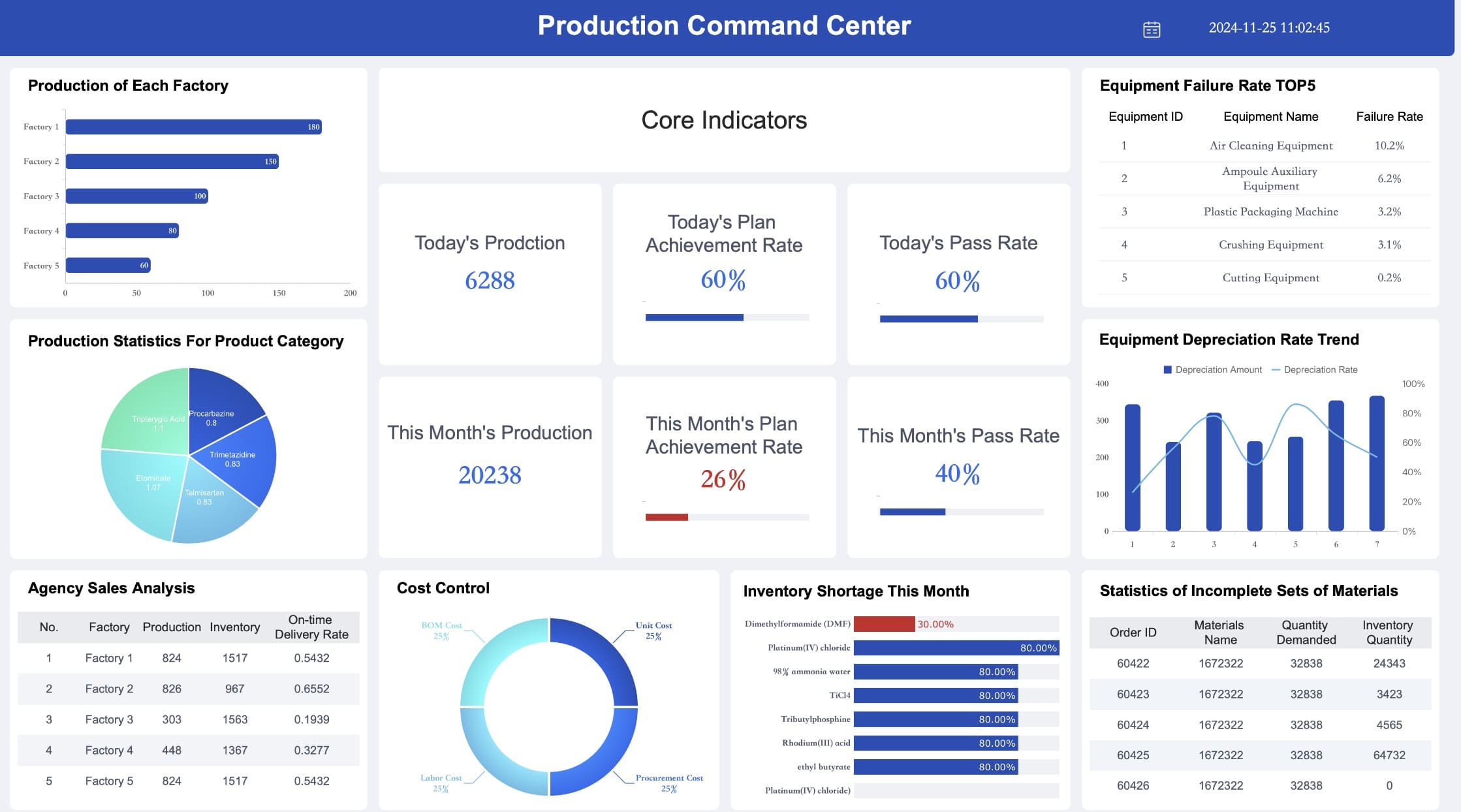
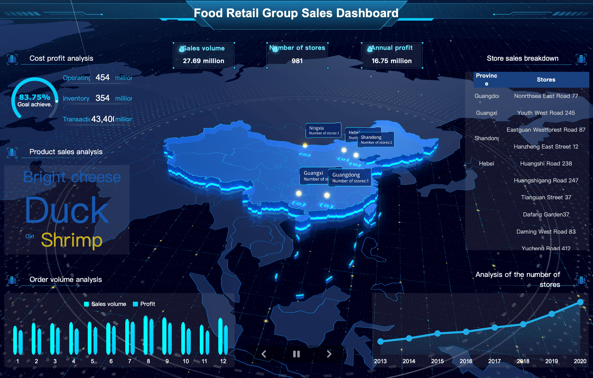
FineBI empowers you to take full control of your data analysis. With its intuitive self-service platform, you no longer need to rely on IT specialists to extract valuable insights. Whether you’re a business analyst or a department head, FineBI allows you to explore and analyze data independently, enabling you to make timely, data-driven decisions. For example, a sales manager can instantly pull reports from multiple data sources, perform complex analyses, and identify trends, all within minutes.
The platform’s flexibility allows you to connect to various databases, visualize data, and run sophisticated analyses without needing technical expertise. Imagine combining sales data with marketing metrics to see how different campaigns impact performance. FineBI simplifies this process with its easy-to-use interface and robust analytics tools. This accessibility not only accelerates decision-making but also empowers users across departments to uncover insights that drive business growth.
Moreover, with FineReport and FineVis, you can create detailed, visually appealing reports and interactive dashboards. These tools complement FineBI, providing a comprehensive solution for analyzing, visualizing, and sharing data insights in a way that’s accessible to all users.
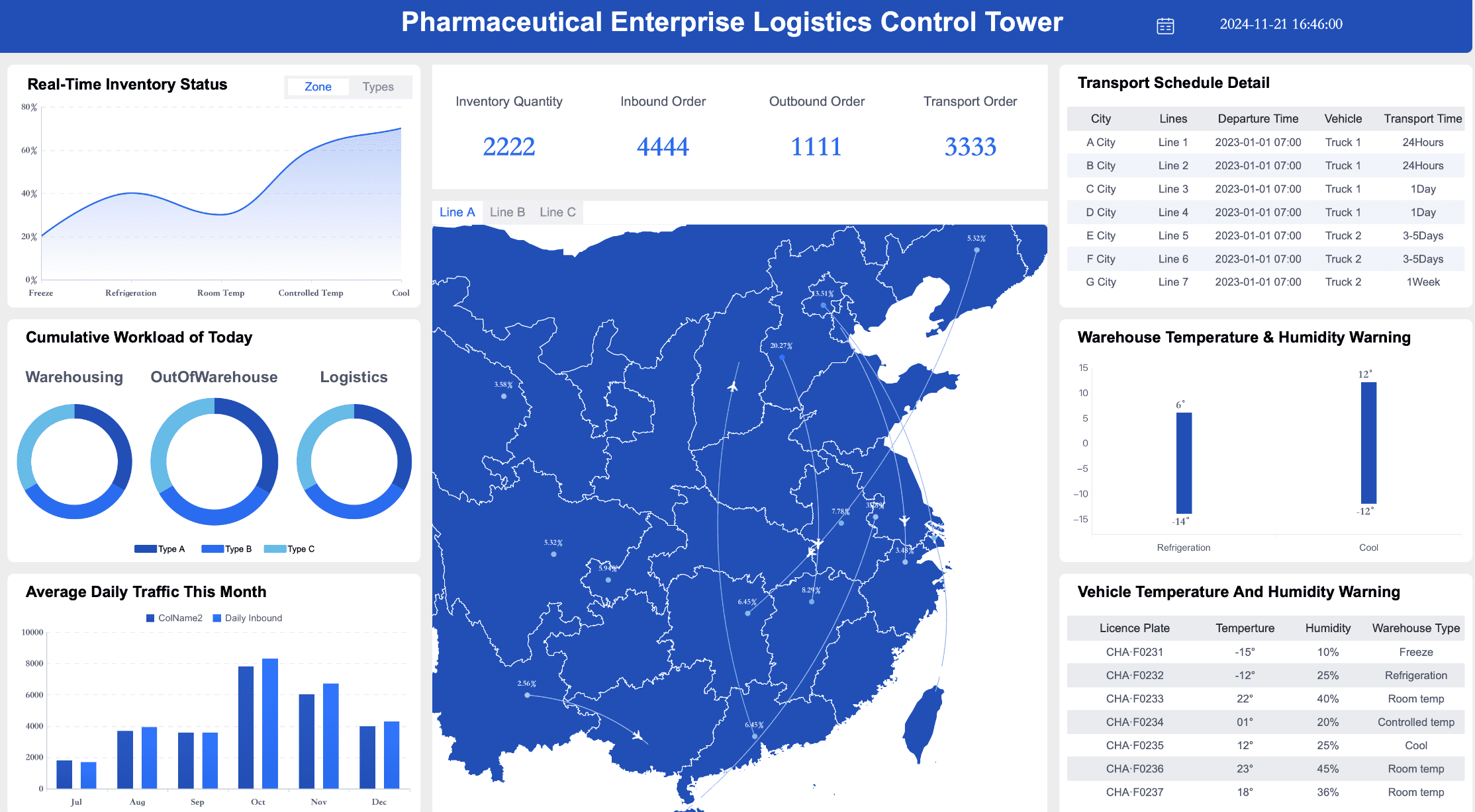
With FineVis, you can dive into the world of dynamic visualizations. This tool is designed to unlock the power of interactive charts and real-time analytics. Imagine being able to visualize your data in 3D or create dashboards that update in real-time. FineVis makes this a reality. Its zero-code, drag-and-drop interface means you can create complex visualizations without any coding skills. This accessibility ensures that everyone in your organization can benefit from powerful data insights. By using FineVis, you can transform static data into engaging stories that inspire action and drive business growth.
Data visualization offers numerous benefits that transform how you interact with data. It simplifies complex information, reveals patterns, and enhances decision-making. By using data visualization effectively, you can make informed choices and communicate insights clearly. Explore various tools and techniques to unlock the full potential of your data. Start by experimenting with different visualization methods in your work. This approach will help you gain deeper insights and drive innovation.
Click the banner below to experience FineBI for free and empower your enterprise to convert data into productivity!

The Author
Lewis
Senior Data Analyst at FanRuan
Related Articles

12 Best Data Visualization Tools for 2026: Features, Pricing, Pros and Cons
$1 are software platforms that turn raw data into charts, dashboards, maps, and interactive visual stories for analysis and decision making. 12 best data visualization tools for 2026 at a glance
Lewis Chou
Apr 23, 2026

Top 8 Data Visualization softwares You Should Try in 2025
Compare the top 8 data visualization software for 2025, including FineReport, Tableau, Power BI, and more to find the best fit for your business needs.
Lewis
Dec 19, 2025
10 Must-Have Data Visualization Tools for Modern Businesses
Compare the top 10 data visualization tools for 2025 to boost business insights, streamline analytics, and empower smarter decision-making.
Lewis
Dec 17, 2025


