You want a delivery dashboard that helps you decide quickly. Good dashboard design starts with knowing what users need. It also starts with knowing what your business wants. With FineReport, you can build dashboards for any device. You can use data from many places. The dashboards show information in clear ways.
| Feature | FanRuan FineReport | Other Tools |
|---|---|---|
| User-friendly interface | Yes | Changes |
| Pixel-perfect reports | Yes | Changes |
| Data integration | Yes | Not much |
| Zero code dashboard | Yes | Not there |

First, you need to know who uses the dashboard. Each person has a different job. They need different information. Managers look for big patterns. Drivers check their routes and times. Customer service teams want order status and delivery problems. When you know user roles, you make sure the dashboard helps with daily work.
You must find out what each user wants from the dashboard. There are many ways to do this:
These steps help you build a dashboard that solves real problems and makes work easier.
You need to pick key metrics to see how well your dashboard works. Use numbers and opinions to check how it performs. The table below shows common ways to track success:
| Metric Type | Examples |
|---|---|
| Qualitative | Customer satisfaction surveys, delivery driver feedback |
| Quantitative | On-time delivery rates, delivery times |
When you know customer KPIs and meet them, you make customers happier. You also make your dashboard more useful.
You must pick the best dashboard for your delivery work. Operational dashboards show what is happening right now. You can see orders, inventory, and routes as they change. Analytical dashboards help you look at data over time. You can check how things went before and plan for the future.
| Feature | Operational Dashboard | Analytical Dashboard |
|---|---|---|
| Purpose | Real-time monitoring of logistics operations | In-depth analysis of logistics data |
| Data Handling | Focuses on current data and KPIs | Utilizes historical data for trend analysis |
| User Interaction | Designed for quick decision-making | Supports detailed exploration and insights |
| Examples of Use Cases | Inventory tracking, order fulfillment | Performance analysis, forecasting |
FineReport connects to many kinds of data sources. You can get information from databases, spreadsheets, and other systems. Drag-and-drop tools let you build dashboards without writing code. The FineVis plugin gives you cool charts and 3D visuals. You can see dashboards on computers, tablets, or phones. This helps you bring all your data together and understand everything.
In manufacturing, you can link order data from ERP and production data from MES. In logistics, you can mix shipment tracking with warehouse inventory. FineReport makes it simple to combine all your data.
Your dashboard should match your delivery goals. Here are some common goals in logistics:
Your dashboard needs to show numbers that help you reach these goals. You can check progress and find problems fast. This keeps your delivery running well and helps your business succeed.
You should pay attention to the most important kpis when making your delivery dashboard. Actionable metrics help you make choices fast. They show what is happening now and what you need to do next. Many top companies use dashboards to see kpis from inventory, logistics, and supplier performance all in one place. This helps you see your whole supply chain.
Here are some key metrics you should watch:
Dashboards with real-time data and alerts let you see updates right away. You can find problems and fix them quickly.
If you have too much information, your dashboard gets hard to use. You should put related information together. Take out data you do not need. Use simple visuals so the screen does not look crowded. Pre-calculate summaries to make things easy to see. Always start with a clear goal for your dashboard. This keeps the design simple and easy to use.
Cognitive Load Theory says that simple layouts and modular designs help people understand information better. When you keep things clear, everyone can use the dashboard more easily.
You should connect your kpis to what users want to do. For example, if your goal is fast delivery and easy returns, you can track these indicators:
| Goal | Leading Indicators | Lagging Indicators |
|---|---|---|
| Fast delivery and return | Number of successful deliveries | Customer satisfaction level |
| Time taken for delivery | Return rate |
When you match key metrics to user goals, you make sure your dashboard helps real business needs. This is one of the best ways to design a dashboard.
When you design a delivery dashboard, you want everyone to use it easily. You need to follow important dashboard ui design rules. Your dashboard should be clear and simple. It should help people make choices fast. FanRuan’s FineReport gives you tools to do this. You can use drag-and-drop and responsive design. Let’s see some good ways to make a dashboard that people like.
You should help users see the most important things first. Good dashboard design uses visual hierarchy. Here are some ways to set up your layout:
FineReport’s drag-and-drop tools make this easy. If you know Excel, you can build dashboards without trouble. You can move charts, tables, and widgets where you want. This helps you make a dashboard that fits your work.
Keep your dashboard simple. The best dashboards are clear and easy to use. You want users to find answers fast. Here are some tips to make your dashboard better:
Cognitive psychology gives more ways to help users. Break information into small parts. This makes it easier to understand. Grouping information and making clear paths help users move around. Fitts’s Law says big buttons and KPIs are easier to click. Hick’s Law says fewer choices make things less confusing. Gestalt principles say to group related items together.
Color and contrast are important in dashboard design. You want your dashboard to look nice and be easy to read. Here are some ways to use color and contrast:
When you use these dashboard design rules, your dashboard is better for everyone. You help users focus on what matters. They can make choices faster and have a better time. FanRuan’s FineReport lets you use these rules easily. You can build dashboards for any device and any user.
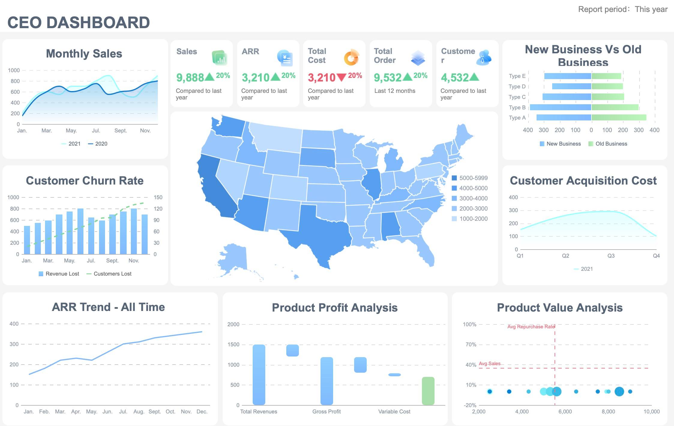
You want your dashboard to show delivery performance in simple ways. Picking the right chart helps you spot patterns fast. Bar and column charts help you compare values between groups. For example, you can see delivery times for different routes. Line and area charts show changes over time. You can track delivery speed each week. Bullet charts show if you meet your goals.
| Chart Type | Purpose |
|---|---|
| Bar Chart | Compare values within and between groups |
| Column Chart | Compare values within and between groups |
| Bullet Chart | Display performance against goals |
| Line Chart | Show change over time |
| Area Chart | Show change over time |
You can turn numbers into stories that everyone understands. Start with a clear goal for your dashboard. Know who will use it and what they need. Build a simple story that shows what is happening. Use visuals to highlight important data. Edit your dashboard so it does not have too much information. These steps make your data visualization more helpful. You help people see trends and take action.
You need real-time data to make quick decisions. Instant data refresh keeps your dashboard updated. Multi-source integration brings all your data together. Role-based access controls keep your data safe. Each team sees what matters most.
When you use these design strategies, your dashboard becomes a strong tool. You can see what matters, understand the story behind the numbers, and act quickly.
You need to find out what users think about your dashboard. Start by watching how people use it. Use tools like heatmaps and session recordings. These tools show where users click and what they miss. Add feedback widgets so users can share their thoughts while using the dashboard. After a session, ask users to fill out a short survey. The survey asks what was easy or hard. You can also test for screen reader compatibility. Check keyboard navigation and color contrast. This makes sure everyone can use the dashboard.
| Testing Method | Description |
|---|---|
| Screen Reader Compatibility | Checks if visually impaired users can use the dashboard |
| Keyboard Navigation | Ensures all features work without a mouse |
| Color and Contrast Testing | Makes sure text is easy to read for everyone |
| Heatmap Analysis | Shows which parts users focus on or ignore |
| Session Recordings | Reveals where users get stuck or confused |
| Post-Session Surveys | Collects feedback on what works and what does not |
| Feedback Widgets | Lets users share ideas during real use |
| Usage Analytics | Tracks clicks and actions to spot problems |
| Moderated Testing | Guides users through tasks for live feedback |
| Unmoderated Testing | Lets users try tasks on their own and records their actions |
You should always try to make your dashboard better. Start by writing down all feedback and ideas from users. Assign team members to handle changes and set deadlines. Use this record as a roadmap to track progress. Spot issues that come up often. Build a flexible process so you can test new features and fix problems quickly. Try pilot deployments to catch issues early. Automate testing to keep quality high. Work together as a team to solve bottlenecks and make approvals faster.
You want to know if your dashboard helps your business. Track key metrics to see how well it works. Use these common measures:
| Metric | Description | Impact on Operations |
|---|---|---|
| On-time delivery performance | Percent of deliveries made on time | Improves customer trust and satisfaction |
| Order cycle time | Time from order to delivery | Reduces delays and boosts efficiency |
| Supplier performance metrics | Checks how reliable and high-quality suppliers are | Strengthens supply chain management |
You can also watch delivery time, operational efficiency, and customer satisfaction. These numbers show if your dashboard supports your goals and follows best practices. Review them often to keep improving.
You can build a good delivery dashboard by following easy steps. First, learn who will use the dashboard. Pick the right dashboard design for your users. Use simple layouts so people find things quickly. Organize information in a way that makes sense. Focus on metrics that help you take action. Check your dashboard often to make it better. FanRuan and FineReport let you connect lots of data sources. You can use your dashboard for any size business.
| Key Step | Description |
|---|---|
| Know Your Audience | Make user personas and learn what they need |
| Choose Dashboard Type | Pick a dashboard that fits user and business goals |
| Apply UI Principles | Help users with clear visual order |
| Keep it Simple | Remove clutter and show only important metrics |
| Integrate Data | Use tools to connect data easily |


The Author
Lewis Chou
Senior Data Analyst at FanRuan
Related Articles
Executive Summary Dashboard for Enterprise Leaders: 9 Steps to Design KPIs, Layout, and Governance
Learn 9 steps to design an executive summary dashboard for enterprise leaders. Define KPIs, layout, and governance for better strategic decision-making.
Lewis Chou
May 04, 2026

Executive Dashboard Template: What Enterprise Leaders Should Include Before They Build
Learn what to include in an executive dashboard template for better decision-making. Focus on KPIs, risk signals, and strategic alignment for leadership teams.
Lewis Chou
May 04, 2026

How to Build a Teams Call Queue Dashboard: Turn Raw Queue Data Into Actionable Insights
Learn how to transform raw Teams call queue data into a dashboard for real-time monitoring, trend analysis, and proactive service level management.
Lewis Chou
May 04, 2026


