Dashboard
EMR Dashboard Guide: 12 Metrics to Track for Faster Clinical and Operational Decisions
Lewis Chou
May 05, 2026
An EMR dashboard is not just a reporting screen. It is a decision system that helps clinical leaders, practice managers, and operations teams see what needs attention now: where patient flow is slowing, which tasks are overdue, what revenue is getting stuck, and which quality measures are drifting off target.
For most healthcare organizations, the pain is familiar. Teams are working inside the EMR all day, yet critical signals remain buried across appointment schedules, charting workflows, task queues, billing modules, and patient communication tools. By the time someone identifies a delay, the operational cost is already real: longer waits, incomplete documentation, missed follow-up, denied claims, and avoidable staff overload.
A well-built EMR dashboard solves that problem by turning raw records into a small set of high-value signals that support faster action.
All dashboards in this article are created by FineBI
What an EMR dashboard helps teams see at a glance
An effective emr dashboard gives decision-makers a real-time or near-real-time view of performance across care delivery, operations, and revenue workflows. Instead of forcing users to pull multiple reports, it consolidates the metrics that directly influence daily decisions.
At a glance, teams should be able to answer questions like:
- Are providers fully booked or carrying unused capacity?
- Where are patients waiting too long?
- Which charts are still open after visits?
- Are lab results sitting unreviewed?
- Are claims moving quickly from encounter to payment?
- Which departments or roles are overloaded right now?
That is the business value. Better visibility drives faster intervention, and faster intervention improves patient experience, staff efficiency, compliance, and financial performance.
A strong dashboard also changes the nature of EMR data. Raw records are detailed but fragmented. A dashboard organizes those data points into trends, thresholds, and exceptions. That makes it easier to move from observation to action.
For example, a scheduler does not need a list of every appointment record. They need to see unused slots, no-show patterns, and provider utilization by day and hour. A clinical manager does not need every note timestamp. They need to know chart closure time, overdue documentation volume, and which providers or teams need support.
The difference between a general reporting view and a decision-focused performance view is simple:
- General reporting view: Tells you what happened.
- Decision-focused performance view: Tells you what needs action, where, and by whom.
Key Metrics (KPIs) an EMR dashboard should surface
Below are the core KPI categories most organizations should define before building an EMR dashboard:
- Volume metrics: Measure demand, such as appointments booked, visits completed, and portal activity.
- Utilization metrics: Show how effectively provider time, rooms, and scheduling capacity are being used.
- Throughput metrics: Track how quickly patients and tasks move through workflows.
- Quality metrics: Evaluate clinical performance, preventive care adherence, and care gap closure.
- Responsiveness metrics: Measure turnaround time for documentation, refills, messages, orders, and referrals.
- Revenue cycle metrics: Show where charges, claims, and payments are delayed or denied.
- Exception metrics: Highlight outliers, overdue items, rework, and unresolved tasks.
- Adoption metrics: Indicate whether staff and patients are using digital tools in the intended way.
The 12 metrics to track in an EMR dashboard
The best emr dashboard does not try to display everything. It prioritizes the metrics that influence daily clinical and operational decisions. The 12 metrics below give most practices a practical, high-impact foundation.
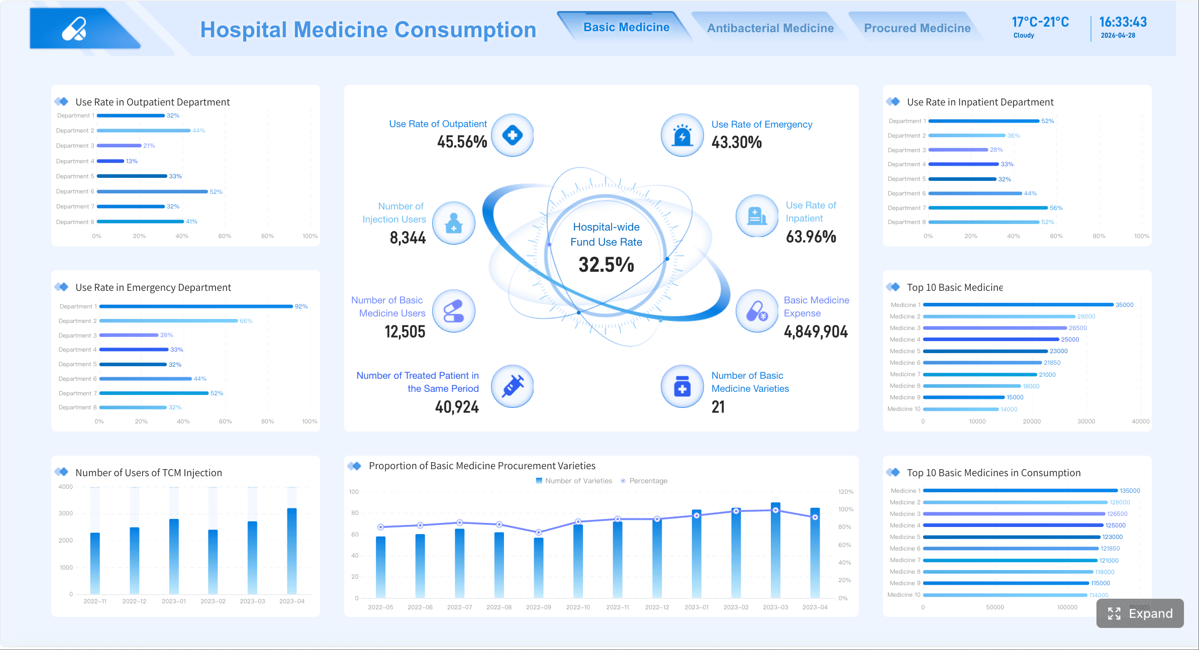
1. Appointment volume and scheduling utilization
Appointment volume shows demand. Scheduling utilization shows how effectively capacity is being used. Together, they reveal whether your practice has access constraints, underused provider time, or unstable booking patterns.
Track this by day, week, provider, specialty, and location. Look for open slots that consistently go unused, time windows with elevated no-show risk, and schedules that rely too heavily on overbooking.
Key indicators include:
- Total appointments booked
- Visits completed
- Provider schedule fill rate
- Available slot utilization
- Same-day appointment usage
- Overbooked slot count
 Outpatient Monitoring Dashboard created with FineBI
This metric is especially useful for access management, staffing, and template redesign.
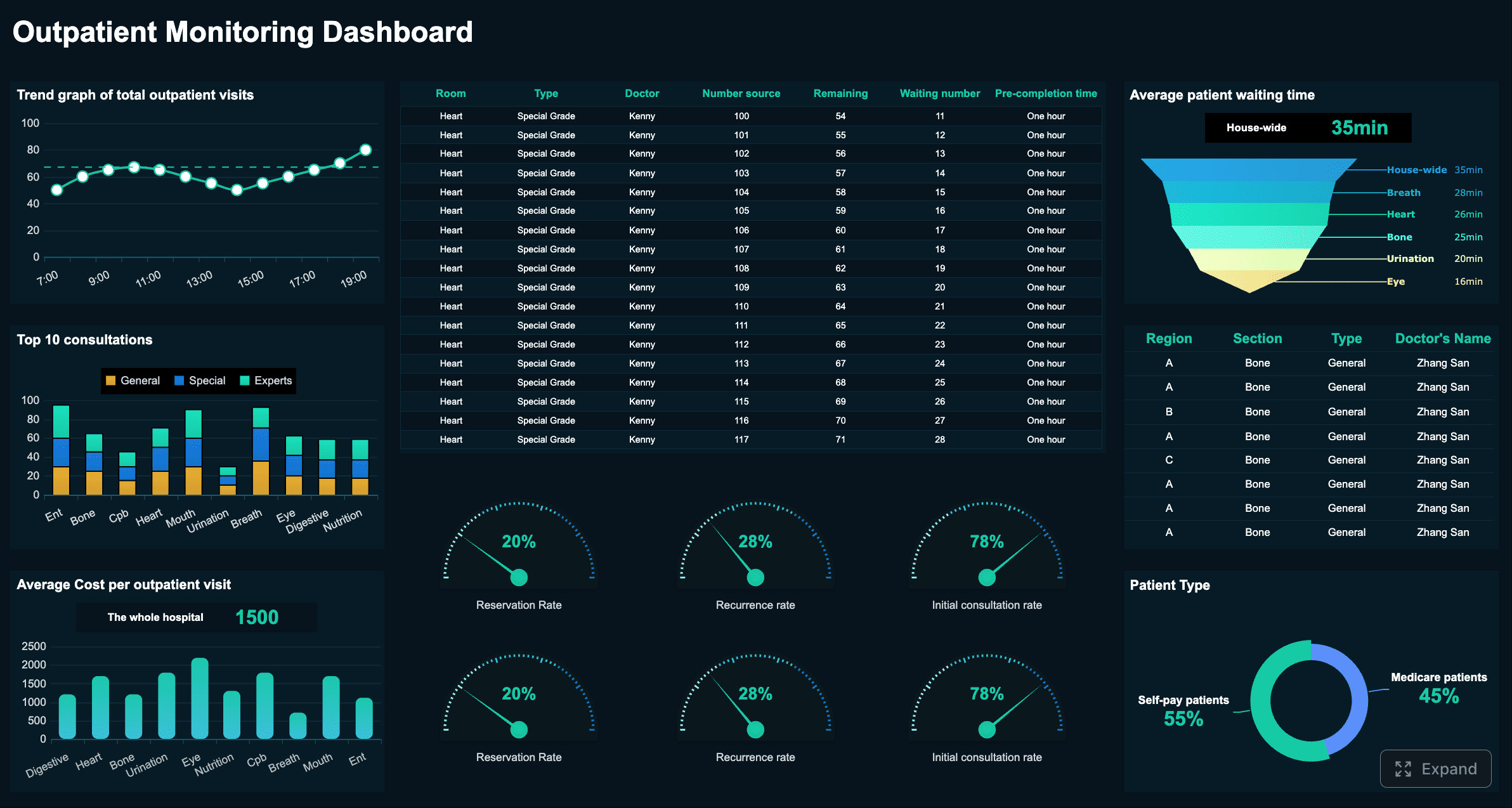
2. Patient wait time and throughput
Patient wait time is one of the clearest signals of operational friction. It affects patient satisfaction, clinic efficiency, and provider productivity.
A useful dashboard should break wait time into stages, not just one total number:
- Check-in to rooming
- Rooming to clinician
- Clinician to checkout
- Total visit cycle time
This lets managers see exactly where the bottleneck exists. Maybe front desk throughput is fine, but room turnover is slow. Maybe rooming happens quickly, but providers are routinely delayed by documentation spillover from earlier visits.
 Hospital 360° Operations Dashboard created with FineBI
The goal is not simply to reduce averages. It is to identify variability, peak periods, and recurring failure points that disrupt care flow.
3. No-show and cancellation rates
No-shows and cancellations directly affect access, revenue, provider utilization, and continuity of care. A dashboard should segment these rates by:
- Visit type
- Provider
- Location
- Day of week
- Time of day
- New vs. returning patient
- Reminder method
This level of detail helps teams move beyond generic assumptions. A spike in no-shows may be tied to one provider schedule, one specialty, or one appointment type. It may also reveal that reminder workflows are working for some patient groups but not others.
Operationally, this metric supports changes in reminder timing, waitlist activation, scheduling policy, and overbooking strategy.
4. Documentation completion time
Documentation lag creates downstream problems fast. Open charts delay coding, slow billing, weaken handoffs, and increase compliance risk.
An emr dashboard should show:
- Average chart closure time after visit
- Percentage of notes closed within target SLA
- Overdue note count
- Aging of incomplete documentation
- Provider or department variation
This metric helps leaders distinguish between isolated delays and structural workflow issues. If one department consistently closes notes later than others, the solution may involve template optimization, staffing support, or schedule redesign rather than simple performance pressure.
5. Clinical quality measure performance
Clinical quality measures connect the EMR dashboard to patient outcomes and payer incentives. These metrics vary by organization, but common categories include:
- Preventive screenings
- Immunization completion
- Chronic disease follow-up
- Medication adherence indicators
- Care gap closure rates
The dashboard should focus on the measures that matter most operationally and financially. If teams are flooded with too many quality indicators, attention gets diluted. Instead, surface the measures tied to your current contracts, care priorities, and population health goals.
Make performance visible at both summary and drill-down levels. Leaders need trend lines and benchmark views. Care teams need patient-level follow-up lists tied to the same metrics.
6. Medication refill and prescription turnaround
Refill delays create patient dissatisfaction, staff burden, and potential clinical risk. They also consume significant inbox time for nurses, medical assistants, and providers.
Track:
- Pending refill request volume
- Average turnaround time
- Percentage completed within target
- Exception or escalation rate
- Provider and team-level workload
This metric is valuable because it sits at the intersection of responsiveness and labor efficiency. If refill turnaround is slipping, the issue may be staffing, workflow design, protocol clarity, or message routing inside the EMR.
A dashboard makes that visible before the backlog becomes unmanageable.
7. Lab and imaging order follow-up
Outstanding orders and unreviewed results are high-risk areas. A robust dashboard should help teams see whether orders are placed, completed, resulted, reviewed, and acted on in time.
Core measures include:
- Open lab or imaging orders
- Result turnaround time
- Unreviewed result count
- Aging of pending follow-up
- Abnormal result follow-up completion
This is one of the most important safety-oriented components of an emr dashboard. It helps reduce the chance of missed follow-up, delayed outreach, or results sitting unattended in queues.
8. Referral completion rate
A referral is only valuable if it moves through the care journey successfully. Many organizations track referral placement but lack visibility into whether the patient actually schedules and completes the visit.
Your dashboard should measure:
- Referrals placed
- Referrals scheduled
- Referrals completed
- Referral leakage rate
- Time from referral to appointment
- Specialty or destination performance
This helps identify friction points such as poor handoff processes, network leakage, patient communication breakdowns, or insufficient referral coordination.
For multisite practices and health systems, referral completion is also a strong indicator of care continuity and downstream revenue capture.
9. Claims lag and charge capture
Clinical performance and financial performance are tightly connected. If encounter documentation, coding, or claim submission stalls, cash flow slows.
Track these timing metrics carefully:
- Encounter to coding time
- Coding to claim submission time
- Claim submission to payment posting time
- Missing charge rate
- Unbilled encounter count
This metric is especially important for practice administrators and revenue cycle leaders because it reveals whether revenue delays are caused upstream in clinical workflows or downstream in billing operations.
A good dashboard does not only show lag. It shows where lag starts.
10. Denial rate and rework volume
Denials generate avoidable cost, consume staff time, and often signal process inconsistency. Your dashboard should break denials down by:
- Reason code
- Payer
- Provider
- Location
- Specialty
- Procedure or service category
Also track rework volume, because denial rate alone does not show the labor burden created after the denial occurs.
The most actionable measures include:
- Initial denial rate
- Preventable denial rate
- Rework case volume
- Appeal success rate
- Top denial reasons by financial impact
11. Patient portal engagement
Portal adoption influences access, communication efficiency, administrative workload, and patient convenience. It can reduce manual calls and paperwork when managed well.
Track portal metrics such as:
- Login rate
- Message volume
- Response time
- Online payment usage
- Digital form completion
- Appointment self-scheduling usage
This data helps practices understand whether digital engagement is actually reducing workload or just shifting it. For example, rising portal messages with slow response times may indicate a staffing or triage issue rather than a success story.
For leaders, portal engagement is also a useful proxy for digital maturity and patient service accessibility.
12. Staff productivity and task backlog
Most EMR environments generate a constant flow of work: inbox messages, refill requests, chart tasks, order follow-up, claims edits, and patient communications. Without visibility, bottlenecks grow silently.
A strong dashboard should show:
- Inbox volume by role
- Unresolved task count
- Task aging
- Work distribution across teams
- SLA compliance
- Backlog trend over time
This metric matters because overloaded teams make slower decisions. When work is unevenly distributed, patient service declines and burnout risk rises. A dashboard gives managers the information needed to rebalance work before delays spread across clinical and administrative operations.
How to choose the right metrics for your practice
Not every organization needs the same dashboard. The right emr dashboard aligns metrics to actual decisions, not generic reporting habits.
Match metrics to your top decisions
Start with the decisions your teams make most often.
- Executives need summary indicators tied to access, quality, finance, and trend direction.
- Operational managers need workflow metrics they can act on daily.
- Frontline teams need patient-level or queue-level visibility tied to immediate tasks.
A useful rule: if a metric does not lead to a clear action, it probably does not belong on the main dashboard.
Choose metrics that answer questions like:
- Where do we intervene today?
- Which queue, provider, or department needs attention?
- What threshold requires escalation?
- What workflow should change if this trend continues?
Use reliable EMR data sources
Dashboards fail when users do not trust the numbers. That usually happens because field definitions are inconsistent, refresh timing is unclear, or calculations change over time.
To keep data trustworthy:
- Confirm exact field definitions for each metric
- Document data owners
- Standardize numerator and denominator logic
- Define refresh frequency by use case
- Reconcile dashboard values against source reports regularly
If one clinic defines “visit completed” differently from another, cross-site benchmarking becomes unreliable. Standardization is not optional.
Avoid dashboard overload
Many dashboards underperform because they try to show too much at once. Users do not need every metric on the landing page. They need a compact summary of what matters most, with the ability to drill down when necessary.
Best practice:
- Limit the top-level view to core operational signals
- Group metrics by workflow area
- Use drill-downs for detail
- Separate strategic, operational, and frontline views
Simplicity increases adoption. Clutter kills it.
How to design dashboards that teams actually use
A technically correct dashboard can still fail if it is slow, confusing, or irrelevant to the people expected to use it.
Build for speed and clarity
Healthcare teams do not have time to interpret vague visuals. The dashboard should be understood in seconds.
Use:
- Clear metric labels
- Target thresholds
- Trend arrows or status indicators
- Exception highlighting
- Consistent color logic
- Minimal chart clutter
The most effective dashboards emphasize outliers and changes that require attention. Users should instantly recognize what is on track, what is slipping, and what needs intervention now.
Segment views by role
Different roles need different views from the same data.
- Clinicians need patient care signals, overdue follow-up, and documentation priorities.
- Managers need throughput, backlog, staffing load, and process variation.
- Leaders need summary performance, trend direction, and risk concentration.
Do not force everyone into one universal dashboard. Relevance drives adoption.
A role-based design also reduces noise. Users see only the metrics they can influence, which increases accountability and speed.
Review performance in near real time when needed
Not every metric requires constant refresh. But some absolutely do.
Use higher refresh frequency for:
- Scheduling activity
- Wait time and throughput
- Inbox queues
- Refill requests
- Task backlogs
- Operational bottlenecks
Use daily, weekly, or monthly refresh cycles for:
- Strategic quality trends
- Long-term financial performance
- Retrospective benchmarking
This balance improves usability and infrastructure efficiency while preserving decision value.
Common mistakes to avoid when building an EMR dashboard
Even well-funded dashboard projects can underdeliver if the design ignores operational reality. The most common mistakes include:
-
Tracking too many vanity metrics without clear action paths
If nobody knows what to do when a metric changes, it should not occupy prime dashboard space. -
Mixing inconsistent definitions across departments or locations
A metric that means different things to different teams creates confusion, not alignment. -
Ignoring staff adoption, training, and workflow fit
Dashboards must fit how teams already work. If users need extra effort to interpret or access them, adoption drops fast. -
Failing to validate dashboard outputs against source records and reports
One trust-breaking discrepancy can cause teams to abandon the dashboard entirely. -
Designing for reporting instead of intervention
The goal is not to admire trends. The goal is to trigger faster decisions.
Turning dashboard insights into faster clinical and operational decisions
A dashboard creates value only when it changes behavior. To move from visibility to action, organizations should define a clear operating model around each core metric.
1. Set thresholds and escalation rules
Each metric should have:
- A target range
- A warning threshold
- A critical threshold
- A documented escalation path
For example, if chart closure exceeds a defined time limit or if unreviewed lab results exceed a safe threshold, the responsible team should know exactly what happens next.
2. Assign clear ownership
Every metric needs an owner. Not just someone who watches it, but someone who is responsible for responding when performance changes.
Examples:
- Scheduling manager owns no-show trends
- Clinical operations lead owns throughput bottlenecks
- HIM or provider lead owns documentation timeliness
- Revenue cycle manager owns claims lag and denial trends
Ownership turns a dashboard from passive reporting into active management.
3. Establish review cadences
Different metrics need different review rhythms:
- Daily: wait times, backlog, refill turnaround, provider capacity
- Weekly: documentation lag, referral completion, result review
- Monthly: quality performance, denial trends, portal adoption, strategic productivity
Cadence matters because delayed review weakens the value of visibility.
4. Refine the dashboard continuously
Practice goals, workflows, and patient needs change. Your dashboard should evolve with them.
Use monthly reviews to ask:
- Which metrics led to action?
- Which metrics were ignored?
- Which definitions need adjustment?
- Which drill-downs are missing?
- What new bottleneck has emerged?
The best emr dashboard is not static. It matures with the organization.
Build the workflow faster with FineBI
Building this manually is complex; use FineBI to utilize ready-made templates and automate this entire workflow.
For healthcare organizations, the challenge is rarely a lack of data. The challenge is turning fragmented EMR, operational, and revenue signals into role-based dashboards that teams trust and use. That means connecting multiple data sources, standardizing KPI definitions, building drill-down logic, setting refresh schedules, and delivering views that match how leaders, managers, and frontline staff actually work.
FineBI helps simplify that process.
With FineBI, teams can:
- Build emr dashboard views faster using ready-made dashboard templates
- Connect and unify clinical, operational, and financial data sources
- Create role-based dashboards for executives, managers, and frontline users
- Automate recurring reporting and refresh workflows
- Enable self-service analysis without forcing every request through IT
- Drill from high-level KPI cards into detailed records and exception lists
That matters because speed to insight is now a competitive advantage. Practices and health systems cannot afford to wait on manual spreadsheet workflows or disconnected reports when care delivery, staffing pressure, and revenue performance are all moving in real time.
If your goal is faster clinical and operational decisions, the path is clear: define the right metrics, design for action, and avoid building the entire reporting stack from scratch. FineBI gives you a more scalable way to operationalize the dashboard strategy and turn EMR data into decisions teams can act on every day.
FAQs
A useful EMR dashboard should combine clinical, operational, and revenue metrics in one view. Common examples include appointment volume, scheduling utilization, patient wait time, no-show rate, documentation lag, claims lag, and task backlog.
It helps teams spot bottlenecks by showing delays across check-in, rooming, clinician time, and checkout. With that visibility, managers can act faster to reduce wait times and smooth throughput.
The highest-value metrics are usually appointment utilization, patient wait time, no-shows and cancellations, chart closure time, overdue tasks, revenue cycle delays, and quality measure trends. The right mix depends on your workflow and decision needs.
For operational use, real-time or near-real-time updates are best because teams need to respond during the day. Some quality and financial metrics can also be reviewed daily or weekly depending on the process.
A standard report mainly summarizes what already happened, while an EMR dashboard highlights what needs attention now. Dashboards are built to support faster action with trends, thresholds, and exceptions.


The Author
Lewis Chou
Senior Data Analyst at FanRuan
Related Articles

How to Build an Investment Portfolio Reporting Dashboard for Executives: KPIs, Benchmarks, and Drill-Down Views
Investment portfolio reporting for executives is not about showing every holding, transaction, and chart your investment team can produce. It is about giving CEOs, CFOs, CIOs, boards, and investment committees a fast, re
Yida YIn
Jun 25, 2026

12 KPI Reporting Examples for Executive Dashboards: What to Show in Weekly, Monthly, and Quarterly Reviews
Executive leaders do not need more data. They need decision ready $1 examples that match how often they review the business and what actions they are expected to take. A weekly $1 should surface fast moving risks and per
Yida YIn
Jun 25, 2026

How to Build a Digital Marketing Reports Dashboard: Executive Examples, KPIs, and Templates
A $1 is the control layer that helps executives and marketing leaders turn scattered channel data into fast, confident decisions. If you are a CEO, CMO, operations director, or marketing analytics lead, the real problem
Yida Yin
May 07, 2026