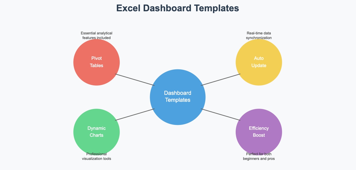
Excel dashboards are game-changers when it comes to visualizing and analyzing data. They let you turn raw numbers into clear, actionable insights. But creating one from scratch can feel overwhelming, right? That’s where templates come in. They simplify the process and save you tons of time.
Templates often include essential features like pivot tables and dynamic charts. These prebuilt elements make it easier to design professional dashboards quickly. Plus, many templates update automatically, so your data stays current without extra effort. Whether you’re a beginner or a pro, excel dashboard templates can boost your efficiency and help you focus on what matters most—your data.
What is an Excel Dashboard Template?
Definition and Purpose
An Excel dashboard template is a pre-designed file that helps you visualize and analyze data more effectively. Unlike a standard Excel file, which mainly stores and calculates data, a dashboard focuses on presenting key metrics visually. It uses elements like charts, tables, and gauges to make large volumes of data easier to interpret.
Think of it as a high-level summary of your data. It brings together important information in one place, so you can interact with it and uncover insights. Whether you're tracking sales, monitoring performance, or analyzing trends, a dashboard helps you make smarter decisions faster.
Benefits of Dashboards
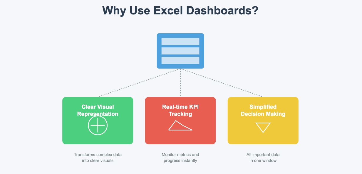
Why should you use Excel dashboards? They offer several advantages that make your work easier:
- They provide a clear visual representation of your data.
- You can track key performance indicators (KPIs) and monitor progress in real time.
- Dashboards simplify decision-making by showing the most important data in one window.
Excel dashboards also stand out because of their familiarity, flexibility, and cost-efficiency. Most people already know how to use Excel, so there's no steep learning curve. Plus, Excel offers a wide range of tools for customizing dashboards to fit your needs. Since it's part of the Microsoft Office suite, you likely already have access to it without extra costs.
| Benefit | Description |
|---|---|
| Familiarity | Excel is widely used and familiar to many users, making it easy to adopt. |
| Flexibility | You can customize dashboards with Excel's powerful tools and functions. |
| Cost-Efficiency | No need for additional software—Excel is already part of most workplaces. |
Common Use Cases
Excel dashboard templates are incredibly versatile. Here are some common ways you can use them:
- Company KPI Dashboard: Track high-level metrics like new customers or Monthly Recurring Revenue (MRR).
- Sales Dashboard: Monitor sales performance, including new orders, invoice payments, and sales activity.
These templates are perfect for businesses, but they also work well for personal projects. Whether you're managing a budget or analyzing survey results, dashboards help you stay organized and focused.
How to Build Professional Excel Dashboard Templates
Preparing Your Data
Before you dive into creating an excel dashboard, you need to get your data ready. Think of this step as laying the foundation for your dashboard. Clean and organize your data to avoid errors later. Here’s a step-by-step guide to help you:
- Insert a new worksheet at the start of your workbook and name it "Dashboard."
- Rename the worksheet with your raw data to "Data."
- Format your raw data as an Excel table. This makes it easier to manage and update.
- Ensure each piece of information has its own cell. Organize your data into rows and columns.
- Check for typos, remove duplicates, and keep a backup of the original dataset.
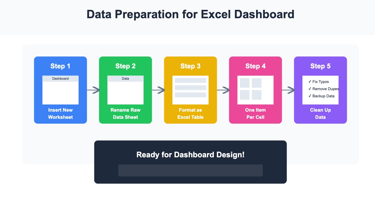
Once your data is clean, you’re ready to move on to the fun part—designing your dashboard!
Planning the Layout
A well-planned layout makes your dashboard easy to read and navigate. Start by defining the purpose of your dashboard. What story do you want your data to tell? Once you know that, prioritize the most important information and place it prominently.
Here are some tips to plan your layout effectively:
- Avoid clutter. Don’t cram everything onto one page.
- Use a balanced design. Combine large elements like charts with smaller ones like KPIs.
- Create focal points. Highlight key metrics to draw attention.
- Think about your audience. Make sure the dashboard is intuitive and easy to use.
For example, if you’re building a sales dashboard, place sales trends and revenue charts at the top. Supporting details like customer demographics can go below.
Adding Visualizations
Visualizations are the heart of any interactive excel dashboard. They turn raw numbers into insights you can act on. Excel offers a wide range of charts and graphs to choose from. Some popular options include:
- Column and bar charts for comparisons.
- Line charts for trends over time.
- Pie and doughnut charts for proportions.
- Treemap and sunburst charts for hierarchical data.

To add a visualization, select your cleaned dataset, go to the "Insert" tab, and pick a chart from Excel’s gallery. Experiment with different types to find the one that best represents your data. Remember, the goal is to make your dashboard both informative and visually appealing.
By following these steps, you’ll be well on your way to creating an excel dashboard that’s professional, interactive, and easy to use.
Creating an Interactive Dashboard
Making your dashboard interactive transforms it from a static report into a dynamic tool. An interactive dashboard in Excel allows you to explore data, filter results, and uncover insights with just a few clicks. Here’s how you can create an interactive dashboard step by step:
- Start with PivotTables: Organize your data using PivotTables. They’re the backbone of any interactive dashboard in Excel.
- Add Slicers: Go to the "Insert" tab, select "Slicer," and choose fields like region or product. Place these slicers on your dashboard sheet. They act as filters, letting you focus on specific data.
- Use Dropdown Lists: Add dropdown menus to let users select options like time periods or categories. Use Excel’s "Data Validation" feature to create these lists.
- Incorporate Scroll Bars and Checkboxes: These tools make your dashboard even more interactive. For example, scroll bars can adjust chart ranges, while checkboxes can toggle data series on or off.
- Visualize with Charts: Add bar, column, pie, or line charts to display your data. These visuals make your dashboard engaging and easy to understand.
Interactive dashboards aren’t just functional—they’re fun to use. They let you explore your data in real time and make informed decisions faster.
Pro Tip: Keep your interactive elements simple and intuitive. Too many filters or options can overwhelm users.
Customizing the Dashboard
Once you’ve built your interactive dashboard, it’s time to make it your own. Customization ensures your dashboard fits your needs and looks professional. Here are some ways to customize your dashboard:
| Customization Option | Description |
|---|---|
| Chart Types | Choose from bar, line, pie, or combo charts to match your data. |
| Interactive Filters (Slicers) | Use slicers to filter data dynamically and focus on what matters most. |
| Formatting Tips | Stick to consistent colors, align elements neatly, and use clear labels for better readability. |
| Dashboard Templates | Use pre-designed templates for specific purposes like sales or project management. |
To customize your dashboard, start by selecting the right chart types. For example, use line charts for trends and pie charts for proportions. Next, format your dashboard with consistent colors and fonts. This makes it visually appealing and easier to read.
Don’t forget to align your elements. A clean layout improves usability. Finally, if you’re short on time, use a template. Excel dashboard templates are pre-designed and save you the hassle of starting from scratch.
Note: Always test your dashboard after customizing it. Make sure it’s easy to use and displays accurate data.
By following these steps, you’ll not only create an interactive dashboard in Excel but also customize it to suit your unique needs.
Ready-to-Use Excel Dashboard Templates Explained
Benefits of Templates
Using ready-to-use Excel dashboard templates can save you time and effort. These templates come pre-designed with all the essential elements, so you don’t have to start from scratch. They’re perfect for visualizing data quickly and effectively.
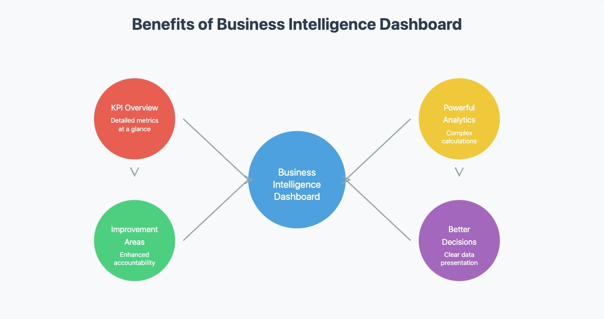
Here’s why you should consider using them:
- They give you a detailed overview of Key Performance Indicators (KPIs) at a glance.
- You can identify areas for improvement across departments, enhancing accountability.
- They support complex calculations and offer powerful analytical capabilities.
- They help businesses make better decisions by presenting data clearly.
Templates are especially useful if you’re new to dashboards or need a quick solution. They simplify the process and let you focus on analyzing your data instead of designing layouts.
Where to Find Templates
Finding high-quality Excel dashboard templates is easier than you think. Many websites offer free options that cater to different needs. For example, you can download templates for financial analysis, marketing performance, or project management.
Here are some reliable sources:
- Microsoft’s official website provides free Excel dashboard templates.
- Template.net and Smartsheet offer a variety of options, including sales and financial dashboards.
- Excel Campus has templates compatible with earlier versions of Excel.
You’ll also find popular dashboard templates like Sales Dashboards and Financial Dashboards. These templates are designed to help you create professional dashboards quickly and efficiently.
How to Use Templates Effectively
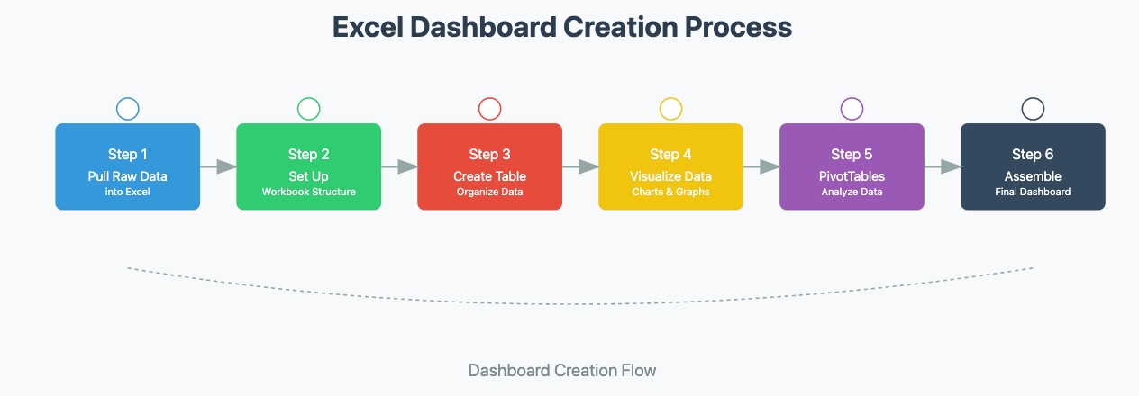
Using a pre-designed template is straightforward if you follow a few simple steps. Here’s a quick guide to get you started:
- Pull your raw data into Excel.
- Set up a structure for your workbook.
- Create a table to organize your data.
- Visualize your data using charts or graphs.
- Use PivotTables to summarize and analyze your data.
- Assemble your dashboard by combining all the elements.
By following this tutorial, you can turn any template into a functional and visually appealing dashboard. Remember to customize it to fit your specific needs. This ensures your dashboard not only looks great but also delivers the insights you’re looking for.
Pro Tip: Always test your dashboard after setting it up. Make sure it displays accurate data and is easy to navigate.
Best Practices for Excel Dashboard Templates
Focus on Clarity
Clarity is the backbone of any effective dashboard. If your audience can’t quickly grasp the insights, the dashboard loses its purpose. So, how do you ensure clarity? Start by understanding your audience. Think about how they’ll use the dashboard and what data matters most to them.
Next, choose visuals that match your data. For example, use bar charts for comparisons or line charts for trends. Avoid unnecessary elements that clutter the dashboard. Every chart, table, or label should serve a purpose. Adding context is another key step. Include descriptive labels or brief notes to explain what the numbers mean.
Organizing your dashboard is equally important. Group related visuals together to create logical associations. Use consistent fonts and colors to maintain a clean, professional look. Contrast can also help. Highlight key metrics with bold colors or larger fonts to draw attention.
Finally, avoid overwhelming users with too much information. If you need to include more details, link to another dashboard or worksheet. This keeps the main dashboard focused and easy to navigate.
Test for Usability
Once your dashboard is ready, test it thoroughly. Usability testing ensures that your audience can interact with the dashboard without confusion. Start by asking yourself a few questions. Is the data accurate? Are the visuals easy to interpret? Can users find the information they need quickly?
You can also share the dashboard with a small group of users for feedback. Watch how they interact with it. If they struggle to find key metrics or understand the visuals, make adjustments. Small tweaks, like renaming labels or simplifying charts, can make a big difference.
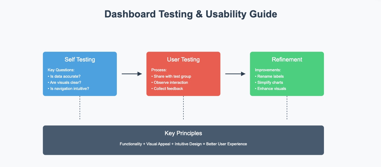
Remember, usability isn’t just about functionality. It’s also about the experience. A dashboard that’s intuitive and visually appealing will always leave a better impression.
Keep Dashboards Updated
An outdated dashboard is as good as no dashboard. To keep your dashboard relevant, update it regularly with the latest data. Using Excel tables can simplify this process. When you add new data to a table, Excel automatically adjusts linked charts and PivotTables.
For dashboards with Pivot Charts, use the "Refresh All" option to update everything in one go. This ensures your visuals reflect the most recent data. Setting up automated data imports can also save time, especially for dashboards that rely on external sources.
By keeping your dashboard updated, you ensure it remains a reliable tool for decision-making. Regular updates also help you spot trends and changes in real time, giving you a competitive edge.
Scaling Beyond Basic Dashboards
When organizations grow beyond Excel's capabilities, enterprise reporting tools like FineReport offer advanced solutions. A financial services company's transition illustrates this evolution:
Before:
- Manual data consolidation from multiple sources.
- Limited to basic visualizations.
- Security concerns with sensitive financial data.
- Time-consuming report distribution process.
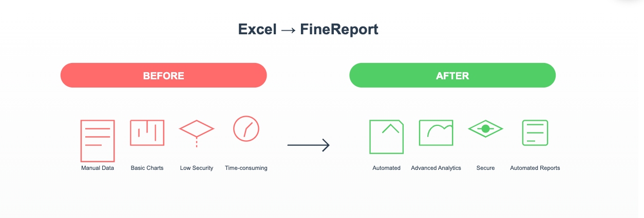
After implementing an enterprise reporting solution:
- Automated data integration from multiple systems.
- Advanced visualization options with drill-down capabilities.
- Granular access control and audit trails.
- Scheduled report generation and distribution.
This transformation demonstrates how organizations can scale their reporting infrastructure while maintaining data accuracy and security.
Beyond Excel Dashboard Templates: Modern Alternatives
Drawbacks of Excel Dashboards
Excel dashboards are great for small-scale projects, but they do have their limits. If you’ve ever tried working with massive datasets, you’ve probably noticed Excel struggles to keep up. It’s not built to handle large amounts of data efficiently. Unstructured data? That’s another challenge. Excel isn’t designed to process it easily, which can slow you down.
Real-time updates are another weak spot. While you can refresh data manually, Excel doesn’t offer seamless, automatic updates like some modern tools. Collaboration can also be tricky. Sharing an Excel dashboard often means emailing files back and forth, which can lead to version control issues.
Customization is another area where Excel falls short. Sure, you can tweak charts and layouts, but it doesn’t offer the advanced visual options that specialized tools provide. If you need highly polished, interactive visuals, Excel might not be your best bet.

Real-World Challenges with Excel Dashboards
A manufacturing company's experience highlights the limitations of Excel dashboards in enterprise scenarios. With daily production data exceeding 500,000 records across multiple workshops, their Excel-based monitoring system faced significant challenges:
- Data processing often took hours, causing delays in decision-making
- Multiple workshops needed real-time production status updates
- File sharing and version control became increasingly complex
- Data security concerns arose with sensitive production metrics
- System performance degraded significantly with large datasets
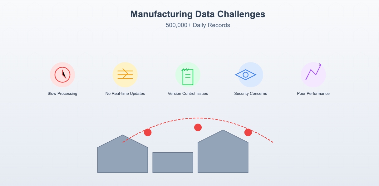
After implementing FineReport as an alternative solution, they experienced substantial improvements:
- Data processing time reduced from hours to minutes
- Real-time cross-department data sharing became possible
- Established a comprehensive data permission system
- Automated reporting reduced manual work by 75%
- Enhanced data visualization capabilities with interactive dashboards
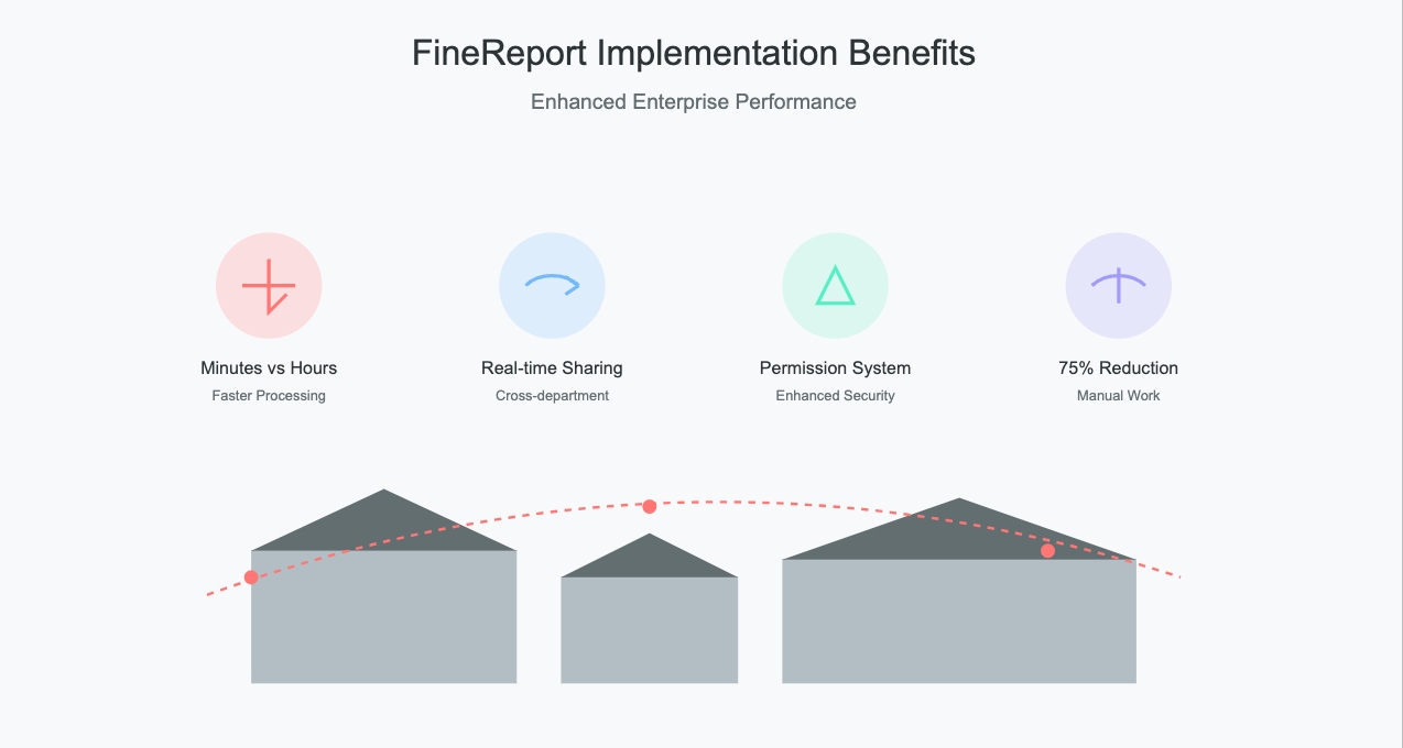
This case study demonstrates how enterprise-level reporting tools like FineReport can address the scalability and performance limitations of Excel dashboards in large-scale industrial applications.
Enterprise-Level Dashboard Requirements
As your organization expands, the demands for more sophisticated data analysis grow. You might find Excel dashboards falling short in scenarios such as:
- Processing daily data volumes exceeding one million rows.
- Requiring multiple departments to access and edit dashboards simultaneously.
- Needing dashboards to display and update data in real time.
- Having strict controls for data security and access permissions.
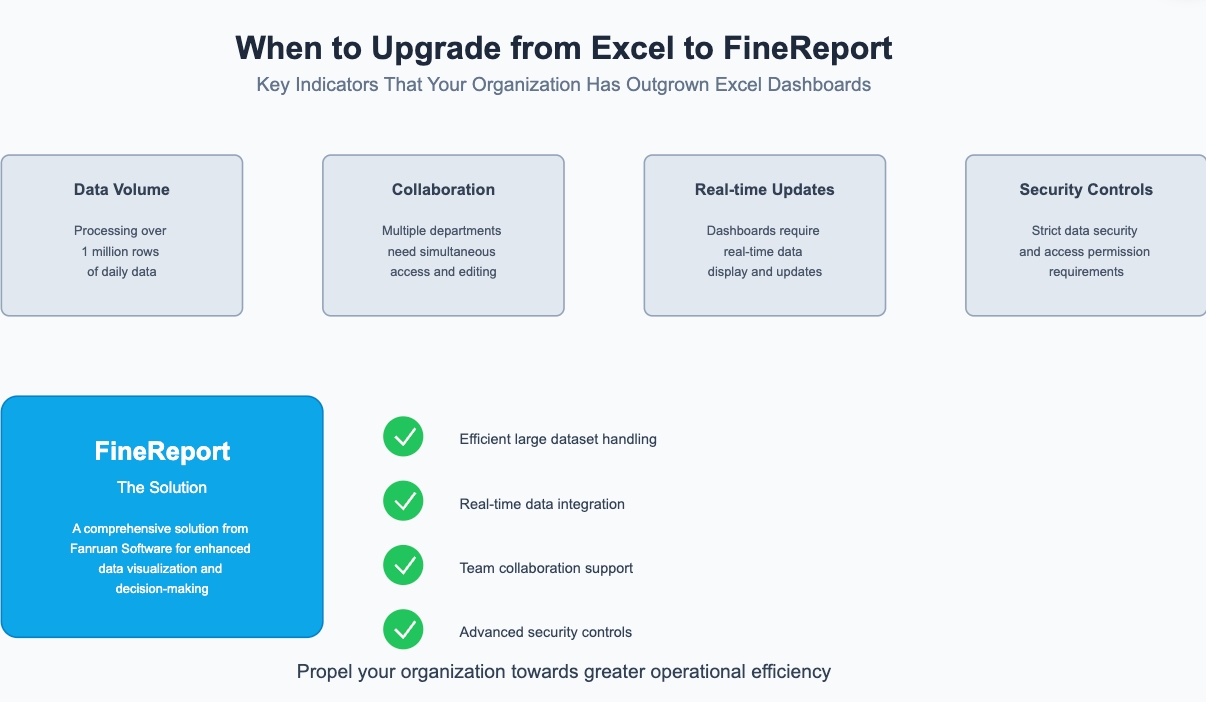
For these complex needs, consider exploring FineReport, a solution from Fanruan Software. FineReport excels in handling large datasets efficiently, supports real-time data integration, and offers features that enable collaborative work across teams. Additionally, it ensures high levels of data security. Whether you're familiar with FineReport or encountering it for the first time, its capabilities make it an ideal choice for enhancing your data visualization and decision-making infrastructure, propelling your organization towards greater operational efficiency.
Professional Dashboard Solutions Comparison
As enterprises evolve, the complexity of their data analytics needs grows, prompting the search for robust dashboard solutions beyond traditional tools like Excel. The market offers several advanced alternatives, each with its unique strengths and applications:
Mainstream BI Tools:
Tableau:
- Advantages: Renowned for its advanced visualization capabilities, Tableau supports a diverse array of data sources and offers powerful analytics.
- Disadvantages: Its premium pricing and complex features necessitate a significant investment in training.
- Case Study: A leading marketing agency utilizes Tableau to integrate data from various digital campaigns, enabling dynamic reporting and insights that drive client strategy adjustments.
Power BI:
- Advantages: Excelling in integration with Microsoft products, Power BI facilitates seamless connectivity with Excel and Azure for enhanced analytics.
- Disadvantages: Its more sophisticated functionalities are locked behind a subscription, and the customization options are not as extensive as some competitors.
- Case Study: A multinational corporation leverages Power BI to monitor real-time performance data across its global operations, improving response times and operational efficiency.
FineReport Solution:
FineReport distinguishes itself as a specialized, enterprise-level reporting tool designed to meet the nuanced demands of modern businesses:
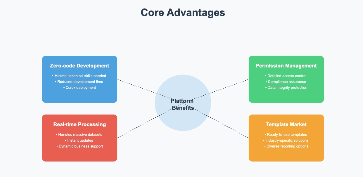
Core Advantages:
- Zero-code Development: Enables users with minimal technical skills to create and deploy reports, significantly reducing development time.
- Real-time Processing of Massive Data: Capable of handling vast datasets with instant updates, ideal for dynamic business environments.
- Robust Permission Management System: Offers detailed control over data access, ensuring compliance and data integrity.
- Rich Template Market Resources: Provides a variety of ready-to-use templates that cater to different industries and reporting needs.
Applicable Scenarios:
- Large Enterprises: Supports complex, multi-departmental data analysis workflows.
- Financial Institutions: Manages sensitive financial data with stringent security requirements.
- Manufacturing Industry: Handles large-scale production data to optimize operational efficiency.
- Retail Industry: Tracks sales and inventory in real-time to adjust marketing strategies swiftly.
- Case Study: A prominent financial institution adopted FineReport to overhaul its data systems, integrating various internal and regulatory reporting processes into a unified framework. This integration has enabled quicker decision-making and enhanced compliance with international standards.
Choosing the right dashboard solution depends on your specific business requirements, data complexity, and operational scale. While Tableau and Power BI are powerful, FineReport is particularly suited for enterprises that require robust, efficient, and secure data management systems. Its user-friendly platform, combined with strong backend capabilities, makes it a top choice for organizations aiming to enhance their data-driven decision-making processes.
Making the Right Choice for Your Business
Assessing Your Needs
When selecting a dashboard solution for your business, it's essential to consider several critical factors that align with your operational requirements and strategic goals. Here’s what to keep in mind:
Data Scale
- Daily Data Volume: Evaluate the volume of data your business processes on a daily basis.
- Data Growth Trends: Consider how quickly your data is growing and the scalability needs this may entail.
- Real-Time Requirements: Assess the need for real-time data processing and updates, which are crucial for timely decision-making.
Usage Scenarios
- Department Collaboration: Determine if there is a need for multiple departments to collaborate on the same platform, which can streamline operations and enhance productivity.
- Mobile Access: Consider the necessity for mobile access to dashboards to ensure stakeholders can make informed decisions on-the-go.
- Data Security: Evaluate the importance of data security within your organization, particularly if handling sensitive or proprietary information.
Cost-Effectiveness
- Initial Investment: Reflect on the upfront costs associated with deploying a new dashboard solution.
- Maintenance Costs: Factor in the long-term maintenance expenses, including updates and potential system expansions.
- Training Costs: Consider the training required for your team to effectively use the new system.
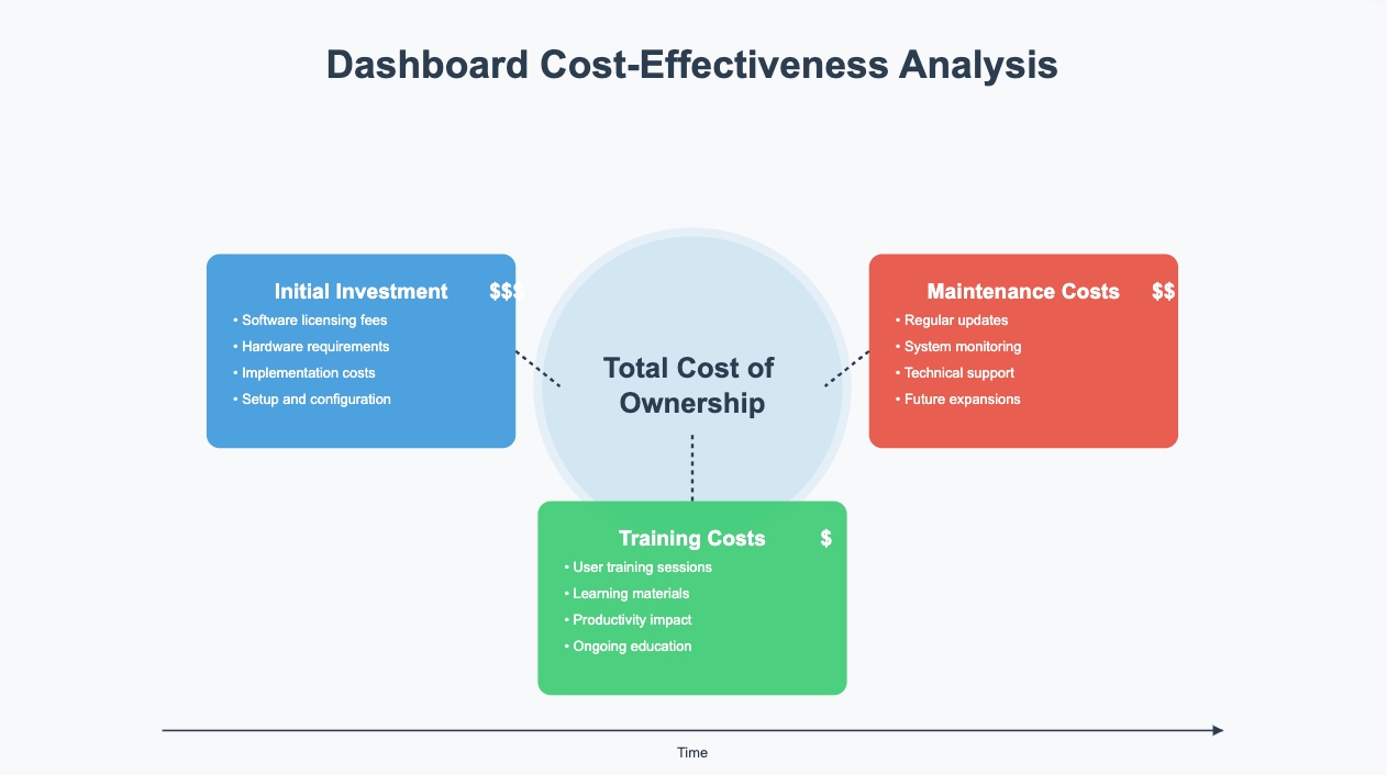
By carefully evaluating these aspects, you can make a more informed decision on which dashboard solution, like FineReport, aligns best with your business needs. FineReport specifically offers advanced capabilities tailored to handle large-scale data, collaborative scenarios, and stringent security requirements, all while maintaining a cost-effective profile for growing companies.
Key Takeaways
- Excel dashboard templates provide a quick and efficient foundation for creating professional data visualizations with minimal setup time.
- Choose visuals that best represent your key metrics, focusing on clarity and maintaining a clean, organized layout for maximum impact.
- While Excel dashboards work well for most scenarios, consider tools like Power BI for handling larger datasets or when real-time updates are needed.
Click the banner below to experience FineReport for free and empower your enterprise to convert data into productivity!

Continue Reading About Dashboard
How to Quickly Build a Core App Dashboard
Store Performance Dashboard: Your Retail Command Center
Dynamic Dashboard: A Game Changer for Data Analysis
Master the Square Dashboard in Easy Steps
How to Design a Client Dashboard That Delivers Results
Draft Dashboard Review - Is It the Ultimate DFS Tool?
Mastering the Twitch Dashboard for Streamer Success
Using the Blooket Dashboard to Boost Student Engagement
Mastering the Unity Cloud Dashboard for Effective Use
How to Access the Clover Dashboard Easily
How to Access the Chrysler Employee Portal Easily
Covers Dashboard: Find Your Perfect Match


FAQ

The Author
Lewis
Senior Data Analyst at FanRuan
Related Articles

How to Build an Investment Portfolio Reporting Dashboard for Executives: KPIs, Benchmarks, and Drill-Down Views
Investment portfolio reporting for executives is not about showing every holding, transaction, and chart your investment team can produce. It is about giving CEOs, CFOs, CIOs, boards, and investment committees a fast, re
Yida YIn
Jun 25, 2026

12 KPI Reporting Examples for Executive Dashboards: What to Show in Weekly, Monthly, and Quarterly Reviews
Executive leaders do not need more data. They need decision ready $1 examples that match how often they review the business and what actions they are expected to take. A weekly $1 should surface fast moving risks and per
Yida YIn
Jun 25, 2026

How to Build a Digital Marketing Reports Dashboard: Executive Examples, KPIs, and Templates
A $1 is the control layer that helps executives and marketing leaders turn scattered channel data into fast, confident decisions. If you are a CEO, CMO, operations director, or marketing analytics lead, the real problem
Yida Yin
May 07, 2026