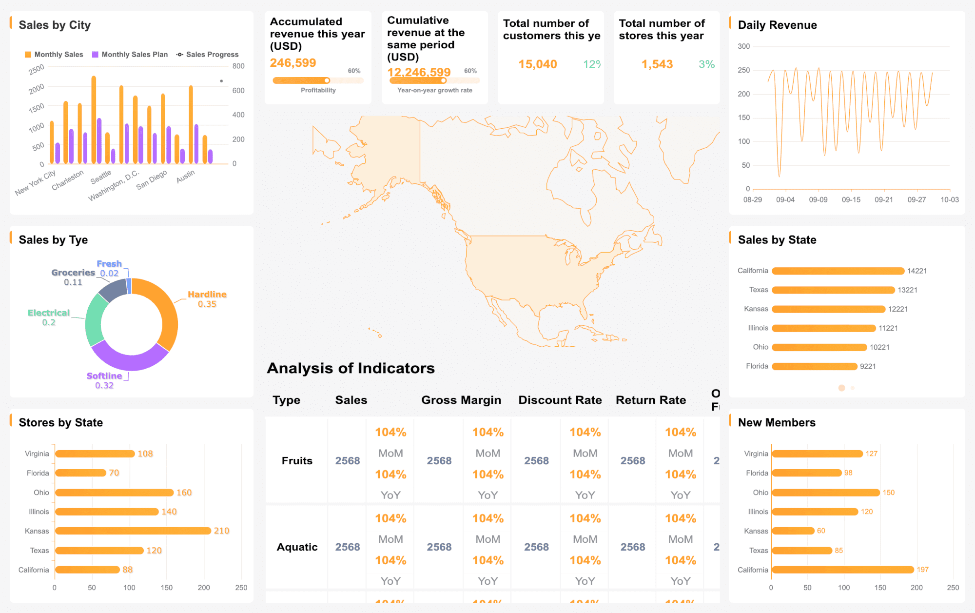
A dashboard gives you a real-time visual summary of important information, helping you track and understand data quickly. The dashboard meaning can shift depending on your industry, but its main purpose always remains: to make complex data easy to see and act on. Many organizations rely on dashboards to monitor performance and support decision-making.
87% of companies have increased the number of employees using analytics and business intelligence tools.
The adoption rate of business intelligence tools, including dashboards, stands at 26%.
Dashboards differ from traditional reports in several ways:
Feature
Dashboard
Report
Design
Interactive and visually engaging
Static and often text-heavy
Purpose
Quick analysis and real-time decision-making
In-depth analysis and historical data review
User Engagement
Higher due to interactivity and updates
Lower, often reviewed offline
Data Presentation
Real-time or near real-time data
Data as of a specific point in time
Accessibility
Easier for a wider range of users
May require more expertise to interpret
You will find dashboards essential for making data-driven choices in any professional setting.
Dashboard Meaning
Core definition
When you ask, "what is a dashboard," you are seeking a clear explanation of a tool that brings together important information in one place. A dashboard is a visual interface that displays key data points, metrics, and trends. You can use a dashboard to see performance at a glance, spot issues early, and make informed decisions. In business intelligence, a dashboard acts as a data visualization tool. It helps you manage information and supports decision-making by showing graphs, charts, and summaries of critical business data.
You will find that a dashboard simplifies complex data. It turns raw numbers into visuals that you can understand quickly. This makes it easier for you to track progress, compare results, and respond to changes. When you use a dashboard, you do not need to search through long reports or spreadsheets. Instead, you get a clear, real-time overview of what matters most.
Key features
A dashboard offers several features that make it a powerful tool for data analysis and monitoring. You can see these features in most modern dashboard platforms:
Feature
Description
Integrations
Connects with various data sources for comprehensive data visualization.
UI Interactivity
Lets you interact with charts and tables for deeper insights, such as drilldown and drill-through.
Data Filter Capabilities
Allows you to filter data based on specific criteria for focused analysis.
User Roles
Provides different access levels, such as admin, editor, or viewer, to control who sees what data.
Advanced Graph Customization
Offers options to customize charts, including conditional formatting and secondary axes.
Predictive Analytics
Uses historical data to forecast future outcomes and trends.
Tabs
Enables you to organize and track multiple metrics across different tabs within the same dashboard.
You will notice that dashboards are interactive and flexible. You can filter data, drill down into details, and customize how information appears. These features help you explore data from different angles and make better decisions.
Types of dashboards
You will encounter several types of dashboards, each designed for a specific purpose. Understanding the types of dashboards helps you choose the right one for your needs.
Type of Dashboard
Definition and Purpose
Key Features
Use Cases
Operational Dashboard
Monitors and manages daily activities with real-time data.
Real-time monitoring, detailed metrics, alerts
Customer support, manufacturing, logistics
Analytical Dashboard
Supports deep data analysis and exploration.
Advanced visualizations, historical data analysis
Marketing, sales, finance
Strategic Dashboard
Gives a top-level view of performance against long-term goals.
High-level metrics, goal tracking, trend analysis
Executive management, board meetings
Financial Dashboard
Shows financial performance metrics like revenue, expenses, and cash flow.
You can use an operational dashboard to track real-time events and respond quickly. An analytical dashboard helps you dig into data and find patterns or trends. A strategic dashboard lets you see how your organization is performing against its goals. A financial dashboard focuses on money-related data, helping you manage budgets and cash flow.
After you understand what is a dashboard and the types of dashboards available, you can look for platforms that make dashboard creation easy. FineBI is one example of a modern dashboard platform. It supports self-service analysis, seamless integration with many data sources, and a user-friendly drag-and-drop interface. With FineBI, you can build dashboards that fit your business needs without needing advanced technical skills.
A dashboard is different from a report. While a report often presents static, detailed information, a dashboard gives you a dynamic, interactive view of your data. You can use a dashboard for quick analysis and real-time decision-making, while reports are better for in-depth reviews and historical analysis.
You will see that the dashboard meaning changes depending on your field. Each industry uses dashboards to solve unique problems and highlight specific data. A dashboard always brings together important information, but the type of data and the way you use it can look very different from one industry to another. Understanding how dashboards work in your industry helps you get the most value from your analytics.
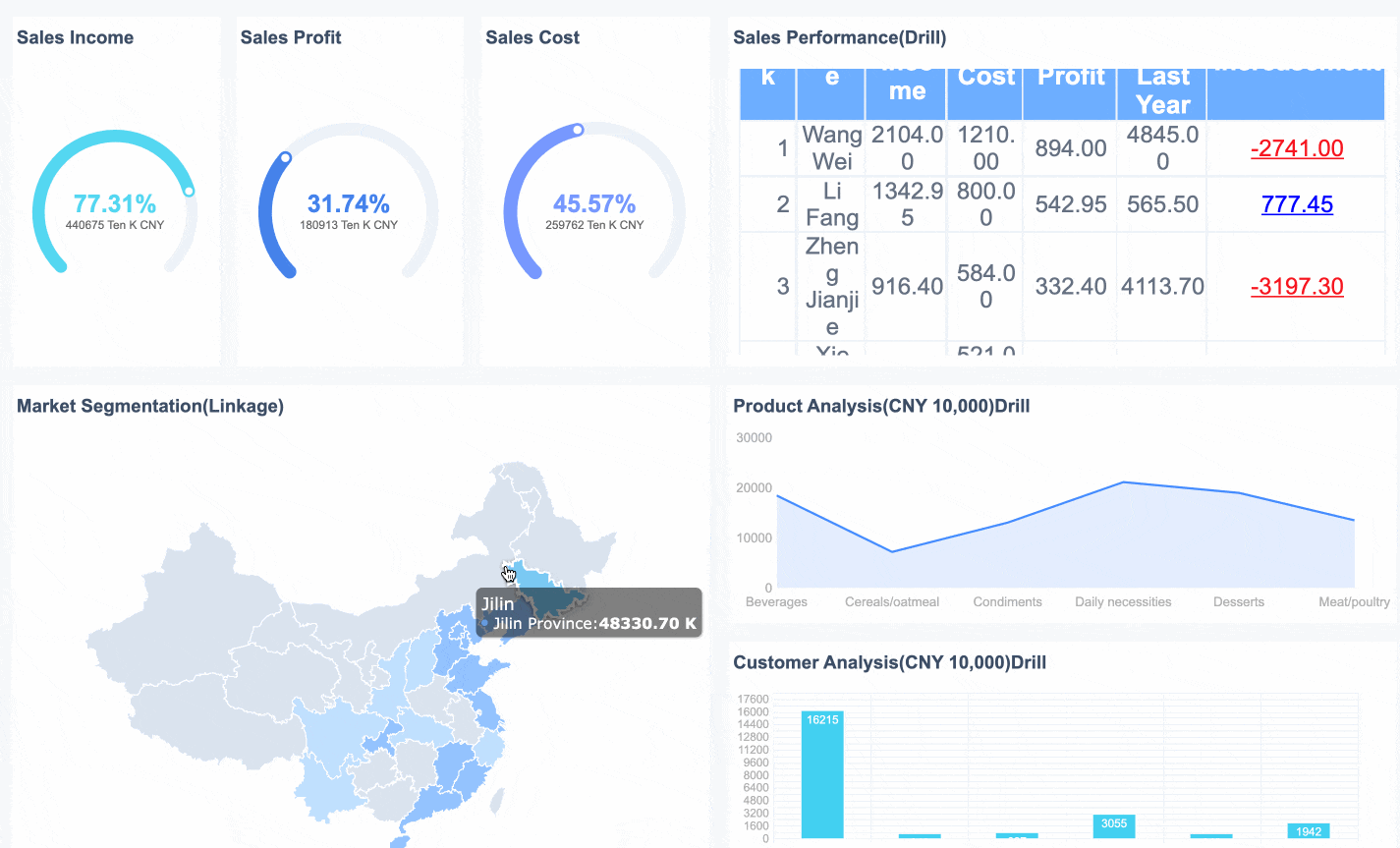
Business and analytics
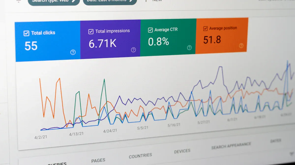
In business and analytics, the dashboard meaning centers on giving you a clear, real-time view of your organization’s performance. You use dashboards to track key performance indicators (KPIs), monitor trends, and make fast decisions. A dashboard in this context often displays sales numbers, marketing campaign results, or customer satisfaction scores. You can spot problems early and act before they grow.
Benefit of Dashboards
Description
Real-time insights
Dashboards provide immediate access to data, allowing for timely decision-making.
Automation of data analysis
They reduce the time spent on data preparation, enabling teams to focus on analysis instead.
Enhanced communication
Dashboards facilitate better sharing of information, improving collaboration in decision-making.
Focus on KPIs
They help organizations track important metrics that drive performance and strategy.
Identification of issues
Dashboards allow for early detection of problems and opportunities for growth.
Support for fact-based culture
They promote data-driven decision-making across the organization.
Reduction in debate time
Dashboards streamline discussions by providing clear data, allowing for quicker decisions.
You will find that dashboards in analytics help you identify problems before they escalate and spot new opportunities. You can quickly test ideas with real data and foster a fact-based culture. Teams spend less time debating and more time acting.
FineBI plays a key role in this area. You can use FineBIto build self-service dashboards that give you real-time analytics and insights. FineBI lets you connect to many data sources, drag and drop charts, and share dashboards with your team. This makes it easier for everyone to see the same data and collaborate on decisions. With FineBI, you improve decision-making, monitor performance in real time, and increase visibility across your business.
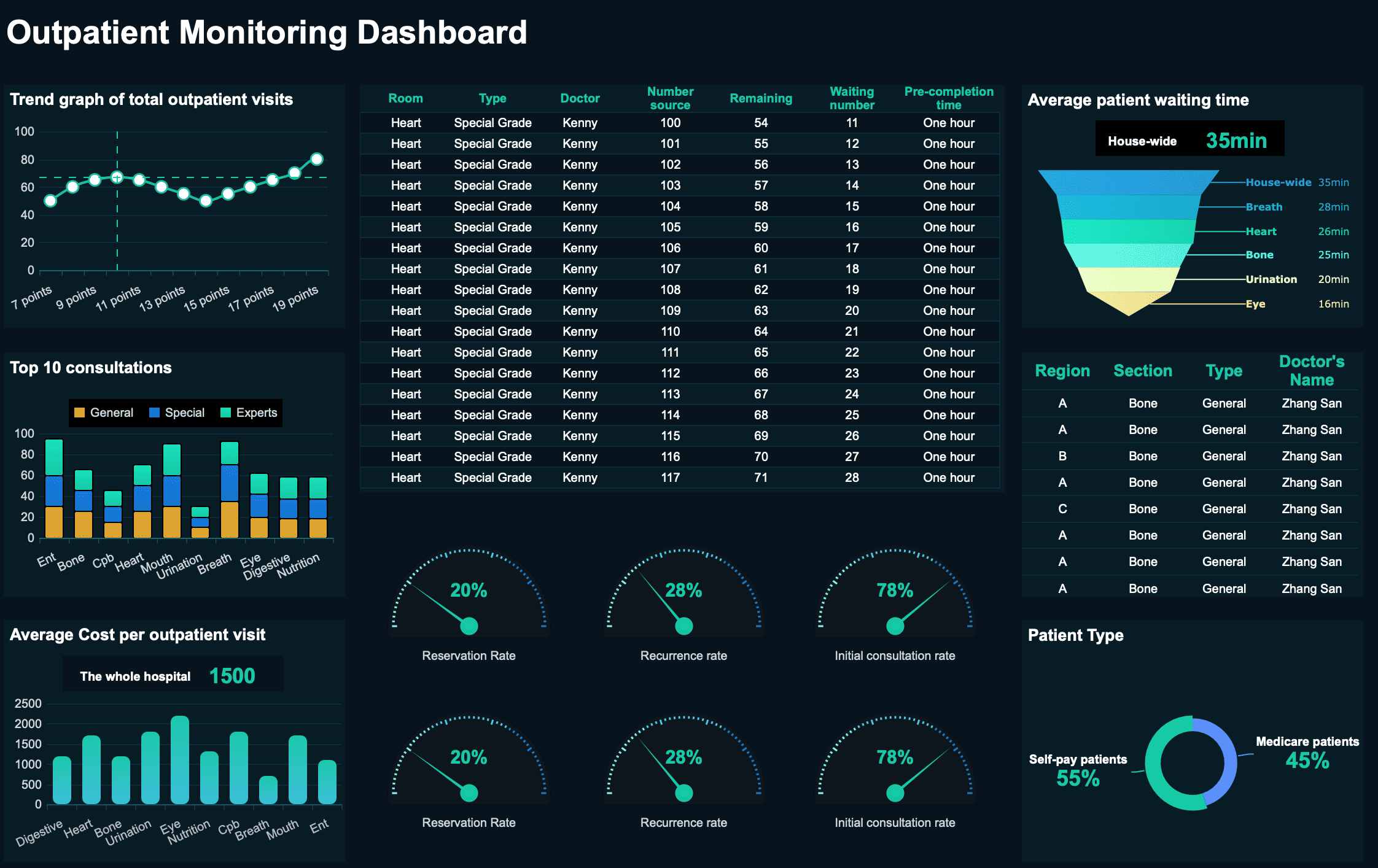
In healthcare, the dashboard meaning focuses on improving patient care and operational efficiency. You use dashboards to track clinical outcomes, monitor hospital resources, and manage finances. A dashboard can show you infection rates, patient wait times, or the status of medical equipment.
Dashboard Type
Primary Uses
Clinical
Offers a comprehensive view of treatment outcomes, infection monitoring, and patient data.
Operational
Tracks hospital efficiency, resource utilization, and wait times.
Financial
Provides insights into the financial health of organizations, monitoring costs and revenue cycles.
Dashboards help you see trends in patient care and spot areas that need attention. For example, after implementing dashboards, hospitals have seen improvements in key outcomes:
Outcome
Before Implementation
After Implementation
NEWS2 recording
64%
83%
Referral completion (n)
170
6800
Assessment completion (n)
23
540
You can use dashboards to make faster decisions, improve patient safety, and manage resources more effectively.
In education, the dashboard meaning is about tracking student performance and school operations. You use dashboards to see academic achievement, attendance, and engagement. A dashboard can help you identify students who need extra support or spot trends in test scores.
Dashboards aggregate educational metrics to track academic achievement, attendance, and engagement.
They provide real-time analytics and predictive risk indicators to identify at-risk students.
Visual elements like charts and graphs make it easier for teachers and administrators to interpret data and take action.
You can use dashboards to improve teaching strategies, allocate resources, and ensure students stay on track.
IT and software
In IT and software, the dashboard meaning relates to project management and system monitoring. You use dashboards to track project progress, manage resources, and monitor system health. A dashboard can show you which tasks are on schedule, which systems need attention, and where risks might appear.
Dashboards provide real-time insights, improving visibility and helping you make proactive decisions.
You can track key metrics, manage resources, and identify issues early.
Clear task assignments and timelines support accountability and smooth workflows.
Proactive risk management tools let you spot risks sooner and prevent bigger problems.
You benefit from improved visibility into project progress, better alignment across teams, and faster decision-making. Dashboards also help you track costs and schedules, making sure projects stay on target.
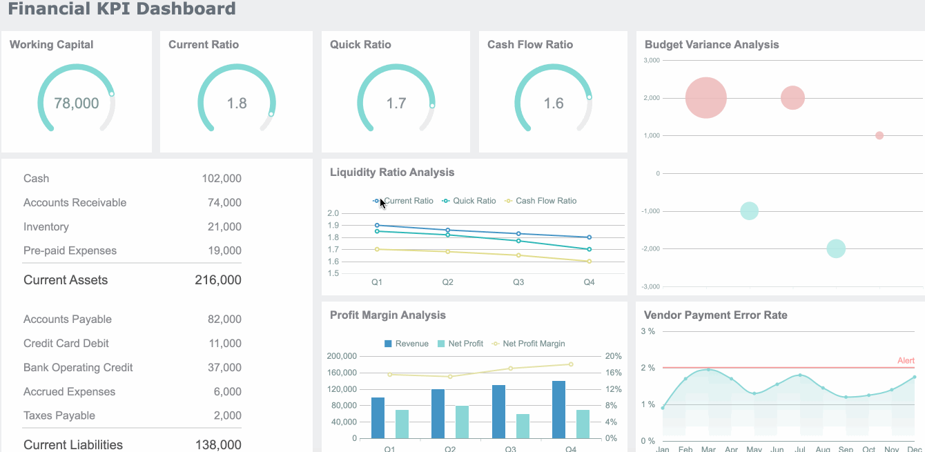
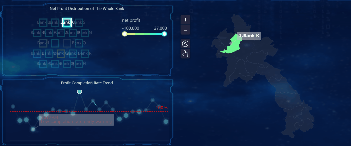
Finance
In finance, the dashboard meaning centers on risk management, compliance, and performance tracking. You use dashboards to monitor financial KPIs, detect anomalies, and ensure regulatory compliance. A dashboard can display revenue, expenses, cash flow, and risk alerts.
Dashboards provide real-time monitoring of compliance and risk.
They help you identify risks through automated reporting and advanced analytics.
Integration of AI models enhances compliance workflows and transparency.
You get a centralized view of data from multiple sources, with immediate alerts for proactive risk management.
Benefit Description
Quantitative Impact
Cost reductions through enhanced visibility
Up to 15% within the first year
Reduction in budget variance
20%
Improvement in key performance indicators (KPIs)
Aim for 10% improvement within the first year
You can use dashboards to identify profitable segments, allocate resources strategically, and make data-driven pricing decisions.
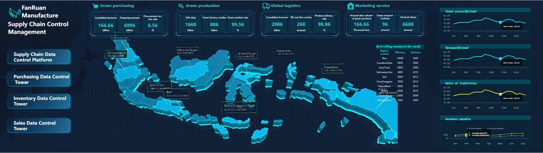
In supply chain and logistics, the dashboard meaning is about improving operational efficiency and visibility. You use dashboards to integrate data from shipping, inventory, and procurement. A real-time dashboard gives you a holistic view of your supply chain, helping you make better decisions.
Dashboards provide real-time insights into logistics operations.
You can monitor shipping performance, costs, and efficiency.
Dashboards help you track on-time shipments, freight capacity, and delayed shipments.
You can optimize routes, reduce fuel consumption, and improve inventory management.
For example, Kintetsu World Express used dashboards to integrate customer and logistics data. Their real-time dashboards improved information management and operational efficiency. Sales teams gained access to comprehensive customer data, which led to better decision-making and streamlined operations.
In manufacturing, the dashboard meaning focuses on quality control and process optimization. You use dashboards to monitor production efficiency, track defects, and manage equipment health. A dashboard can display metrics like overall equipment effectiveness (OEE), defect rates, and machine utilization.
Metric/KPI
Purpose
Overall Equipment Effectiveness (OEE)
Measures production efficiency by evaluating availability, performance, and quality.
Number of Units Produced per Hour
Indicates output levels and helps identify bottlenecks.
Downtime Metrics
Highlights disruptions and maintenance needs by tracking stoppages.
Defective Rate
Measures product quality by tracking the percentage of faulty units.
Machine Utilization
Assesses how effectively equipment is being used to optimize resources.
Defects per Million Opportunities (DPMO)
Measures overall defect rates and identifies trends in production quality.
Customer Complaint Rate
Provides insights into product issues reported by end users.
Quality Achievement Rate (%)
Tracks the percentage of products meeting quality standards, ensuring compliance.
You can use dashboards to see total production, current defect rates, and cycle times. Visual tools help you analyze trends and costs, and identify defects by category. Predictive maintenance dashboards can cut downtime by up to 50% and reduce maintenance costs by up to 40%. AI-powered dashboards improve defect detection and help you coordinate repairs, leading to higher quality and efficiency.
FineReport offers a quality control solution for manufacturing. You can use dashboards to monitor qualification rates, defect rates, and scrap rates. These dashboards help you identify root causes of defects and optimize production processes. By using dashboards, you maintain high quality standards and reduce costs.
In every industry, the dashboard meaning adapts to your needs. You use dashboards to turn complex data into clear, actionable insights. This helps you make better decisions, improve performance, and achieve your goals.
Dashboard Meaning: Components
A dashboard brings together the most important information you need to monitor and manage your business. When you look at the core components of a modern dashboard, you see how each part works together to turn raw data into clear, actionable insights. The dashboard gives you a single place to view key metrics, track progress, and make decisions based on real-time information.
Visual elements
Visual elements form the foundation of every dashboard. You use charts, tables, and graphs to turn complex data into visuals you can understand at a glance. The most effective dashboards position the most important metrics at the top or in larger fonts. You often see color and size contrast to highlight essential information. Logical arrangement puts primary metrics front and center. Common visual tools include:
Bar charts and column charts for comparing quantities across categories
Line charts for showing trends over time
Pie charts for displaying proportions and percentages
Heatmaps for identifying patterns in large data sets
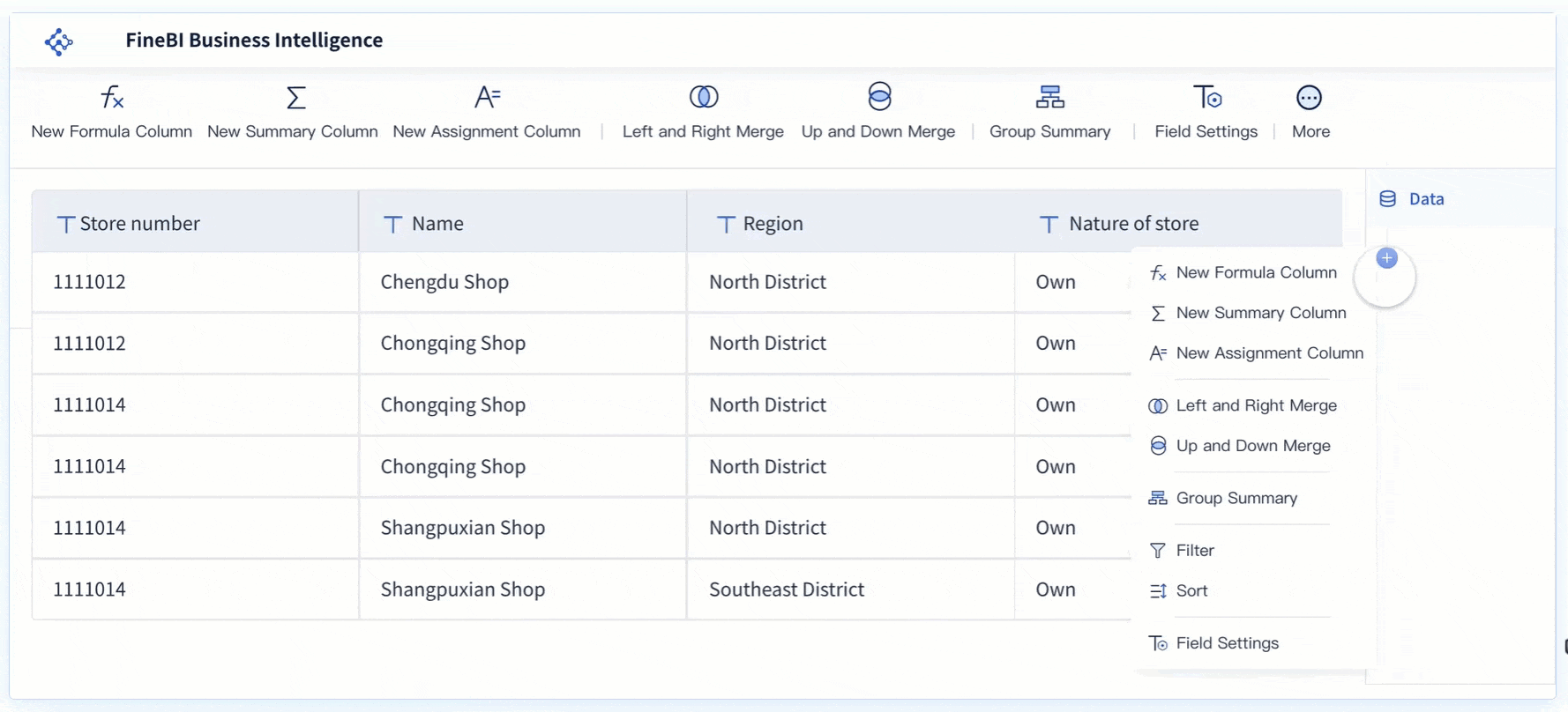
Consistent color coding and layout templates help you quickly interpret the dashboard. FineBI'sdrag-and-drop interface lets you build these visual elements easily, making it simple to customize your dashboard for any need.
Metrics and KPIs are the heart of any dashboard. You track sales, production output, customer engagement, or financial performance depending on your goals. The core components of a modern dashboard always include a focused set of metrics that matter most to your business. For example, a sales dashboard might show total revenue, conversion rates, and average deal size. A manufacturing dashboard could display overall equipment effectiveness, defect rates, and machine downtime. Real-time dashboards update these metrics instantly, giving you live visibility into your operations. Tracking the right metrics helps you measure progress, uncover opportunities, and improve accountability.
Dashboard Type
Key Metrics Tracked
Sales Dashboard
Total sales revenue, Conversion rates, Average deal size, Client engagement, Sales cycle length
Manufacturing Dashboard
Overall Equipment Effectiveness, Production output, Defect rates, Machine downtime
Financial Dashboard
Profit margins, Cash flow projections, Operational expenses, Budget variance, ROI
Interactivity
Interactivity sets a modern dashboard apart from static reports. You can filter data, drill down into specific metrics, and explore trends in real-time. Filters let you narrow your view to a specific time period or business unit. Drill-down options allow you to click on a metric and see more detail. Tooltips provide extra context when you hover over a data point. Customization is a key feature—each user can select the data and visualizations that fit their needs. FineBIsupports real-time filtering and dynamic exploration, making it easy for you to adapt the dashboard as your business changes. The core components of a modern dashboard must include these interactive features to help you make smarter, faster decisions.
When you compare a dashboard to a report, you see that each serves a unique purpose in how you view and use data. A dashboard gives you a real-time, interactive overview of your most important data. You can filter, explore, and adjust the dashboard to see the latest information as it happens. This means you always have access to up-to-date data, which helps you respond quickly to changes.
A report, on the other hand, presents data as it was at a specific point in time. Reports are usually static and do not allow you to interact with the data or make real-time changes. You use reports to review historical data, analyze trends, and share detailed findings with others.
Here is a quick comparison:
Feature
Dashboard
Report
Interactivity
Filter and modify data instantly
Static, no real-time modifications
Data Refresh
Real-time updates possible
Manual or scheduled refresh
Data Presentation
Up-to-the-minute data
Data as of a specific moment
A dashboard allows you to apply filters and drill down into specific data points. Reports give you a fixed view of data, which is useful for audits or compliance.
When to use each
You should use a dashboard when you need real-time insights and want to monitor data as it changes. Dashboards work best for continuous progress tracking, proactive issue detection, and real-time collaboration. For example, you can use a dashboard to watch sales numbers, track website traffic, or monitor production lines as events unfold.
Reports are better when you need to analyze historical data or share detailed findings. You might use a report for executive summaries, client updates, or interdepartmental communication. Reports help you review past performance and make long-term plans.
Use a dashboard for:
Real-time monitoring of key metrics
Quick decision-making based on current data
Interactive exploration of trends and patterns
Use a report for:
Detailed analysis of historical data
Sharing official results with stakeholders
Documenting compliance or audit information
FineBIsupports both dashboards and reports. You can create interactive dashboards for real-time data analysis and also generate detailed reports for deeper reviews. FineBI emphasizes self-service and agility, so you can build the dashboard or report you need without waiting for IT support. This flexibility helps you stay informed and make better decisions with your data.
You have seen how the dashboard meaning shifts across industries, but its core value stays the same. Dashboards help you make data-driven decisions by consolidating data from different sources and providing real-time, actionable insights. You can use dashboards to improve efficiency, support strategic planning, and optimize resources.
Dashboards operate in business, healthcare, and public health, helping you monitor trends and act quickly.
To get started, hold regular meetings, enhance communication, and automate updates for your dashboards. Explore solutions like FineBIto unlock the full potential of your data.
Access a wealth of case studies, industry insights, and solution guides to accelerate digital transformation.
FAQ
What is the modern dashboard meaning in today's digital age?
The modern dashboard meaning has evolved beyond simple data display - it now represents an interactive, intelligent interface that transforms complex data into actionable insights, enabling real-time decision-making across all organizational levels.
What is the main purpose of a dashboard?
A dashboard helps you track, analyze, and visualize data in one place. It simplifies complex information, making it easier for you to monitor performance, identify trends, and make informed decisions quickly.
How do dashboards improve decision-making?
Dashboards present real-time data in a clear, visual format. This allows you to spot trends, address issues, and focus on key metrics. With these insights, you can make smarter, faster decisions that align with your goals.
Can dashboards be customized for specific needs?
Yes! You can tailor dashboards to fit your unique requirements. Whether you’re in healthcare, marketing, or finance, a custom dashboard ensures you see the most relevant data for your industry or role.
What are the common types of dashboards?
Dashboards come in three main types: operational, analytical, and strategic. Operational dashboards focus on daily tasks, analytical ones analyze trends, and strategic dashboards help you track long-term goals.
Are dashboards suitable for small businesses?
Absolutely! Dashboards work for businesses of all sizes. They help small businesses monitor key metrics like sales, expenses, and customer behavior, giving you the insights needed to grow and succeed.