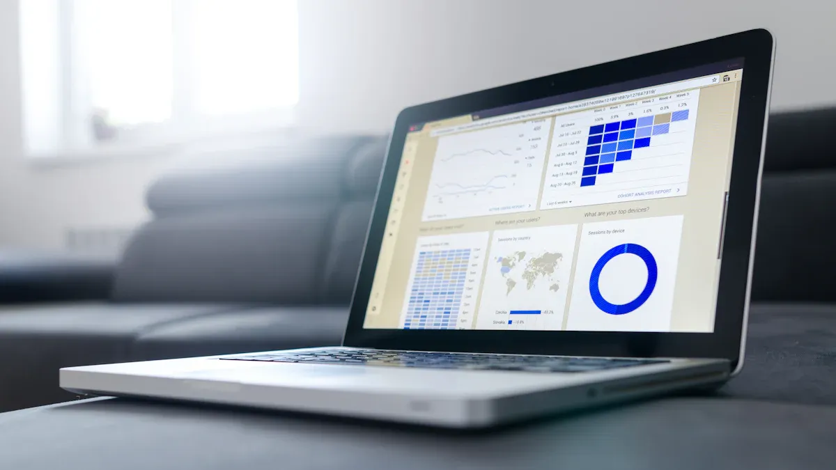
A reporting dashboard gives you a clear, visual summary of your most important business data. You see key metrics and trends at a glance, so you can make decisions faster. When you use a reporting dashboard, you access live data that updates in real time. Around 60% of companies that meet most of their goals rely on live dashboards to share reports with their teams.
- You track performance instantly and respond quickly to any changes.
- You cut down on waiting for middle management reports, which speeds up your decision-making.
| Impact of Dashboards on Business Efficiency | Description |
|---|---|
| Real-time KPI Tracking | Increases transparency and control over processes, enabling quick responses to changes. |
| Data-led Decision Making | Helps identify growth opportunities and improve customer service through better data understanding. |
| Real-time Performance Tracking | Enables immediate reactions to performance issues, such as ineffective ad campaigns or high churn rates. |
A reporting dashboard puts the right information in your hands, so you stay in control and act with confidence.
Reporting Dashboard Basics
What Is a Reporting Dashboard
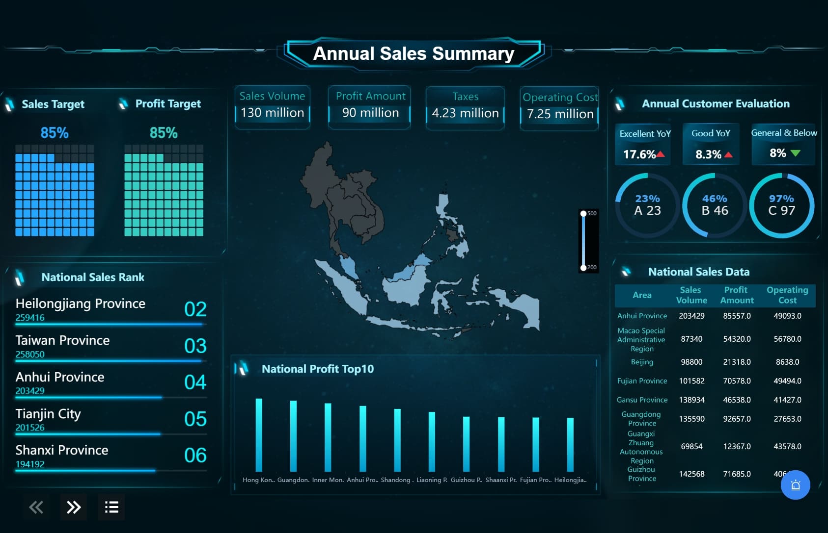
A reporting dashboard is a visual tool that helps you track key performance indicators (KPIs) and business metrics in one place. You see charts, graphs, and tables that make complex data easy to understand. Most dashboards include interactive charts, widgets, filters, and drill-down capabilities. These features let you focus on the data that matters most and explore details when you need deeper insights.
| Key Component | Description |
|---|---|
| Data visualization | Charts and graphs present data clearly for quick understanding. |
| Interactive charts | You can click or hover to see more information. |
| Widgets | Pre-made modules help you build dashboards faster. |
| Filters | Remove unnecessary data to focus on what matters. |
| Metrics | Show progress and outputs using clear measurements. |
| KPIs | Track the effectiveness of business units and processes. |
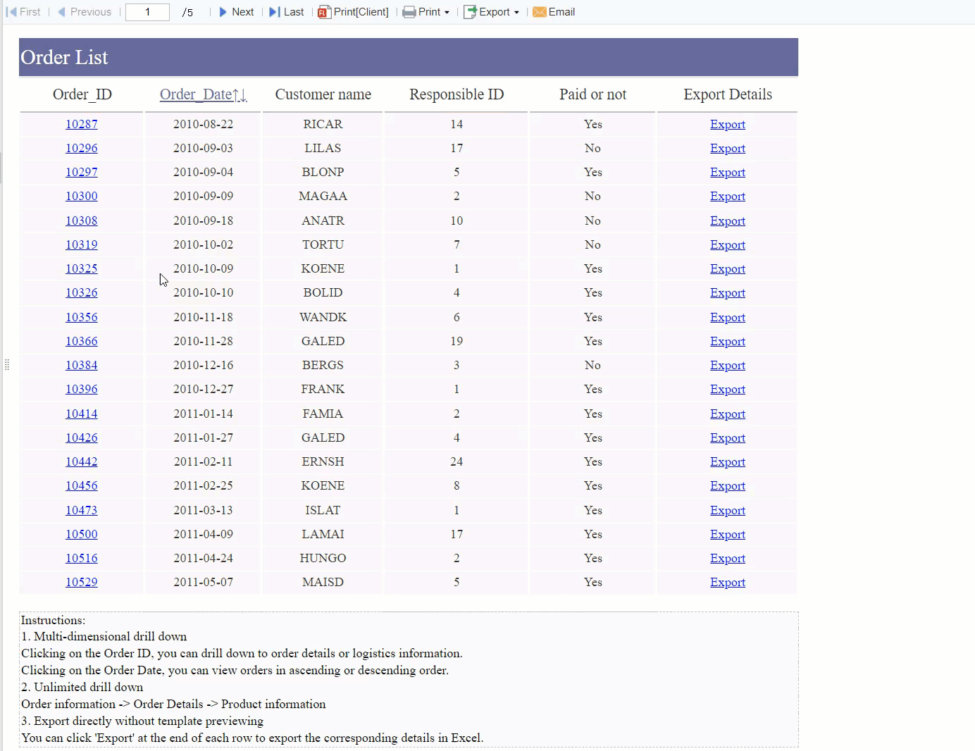
| Drill-down | Access detailed data behind summary results. |
| Data Integration | Combine data from different sources for a complete view. |
A reporting dashboard gives you a real-time overview of your business. You monitor KPIs such as sales, customer satisfaction, and production costs. You see trends and patterns that help you make better decisions. When you use a dashboard, you avoid manual reporting and reduce errors. You get a single source of truth for your business data.
How Dashboard Reporting Works
Dashboard reporting follows a clear process. You start by integrating data from multiple sources. You choose the right visualizations, such as charts or graphs, to display your KPIs. You set up real-time updates so your dashboard always shows the latest information. You add customizable widgets to tailor the dashboard to your needs.
- Integrate data sources for accuracy and accessibility.
- Select visualizations that make your data easy to read.
- Define KPIs to track your business goals.
- Enable real-time updates for dynamic information.
- Use customizable widgets for personalized views.
| Step | Description |
|---|---|
| Data Integration | Connect different databases and files to your dashboard. |
| Data Visualization | Present data using charts, tables, and graphs. |
| KPIs | Include key performance indicators to measure success. |
| Real-time Updates | Link dashboards to live data for instant changes. |
| Customizable Widgets | Adjust dashboard views to fit your needs. |
You interact with your reporting dashboard to monitor changes as they happen. You filter data, drill down into details, and compare metrics across time periods. You use the dashboard to spot issues early and respond quickly.
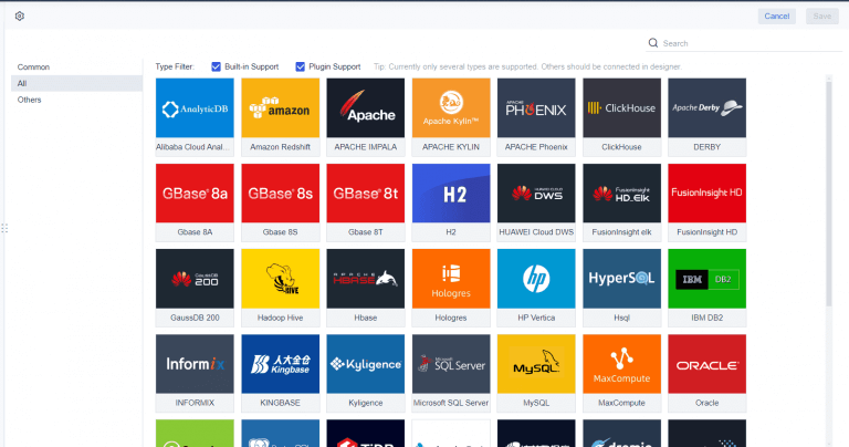
FineReport makes dashboard reporting simple and powerful. You connect data from over 500 sources using built-in connectors. You design dashboards with drag-and-drop tools, choosing from more than 100 chart types, including 3D visualizations. FineReport supports real-time monitoring with timed refresh and data monitoring features. You link dashboard components for dynamic updates and drill-down analysis. You access dashboards on any device, so you stay informed wherever you are.
A reporting dashboard, especially with tools like FineReport, transforms how you manage data. You gain control, speed, and clarity in your decision-making process.
Reporting Dashboard Features
Data Integration
A reporting dashboard brings all your business data together in one place. You can connect to mainstream databases, use FineDataLink for flexible ETL and ELT development, and improve data quality through seamless integration. This unified approach ensures you always work with accurate and up-to-date information.
| Data Source Type | Description |
|---|---|
| Mainstream Databases | Connect to various popular databases for reporting |
| FineDataLink | Enables flexible ETL and ELT data development |
| Enhanced Data Quality | Improves data quality through integration |
FineReport makes data integration simple. You use built-in connectors to link over 500 data sources. This means your reporting dashboard always reflects the latest business data. You avoid manual data entry and reduce errors, giving you a reliable foundation for dashboard reporting.
Visualizations
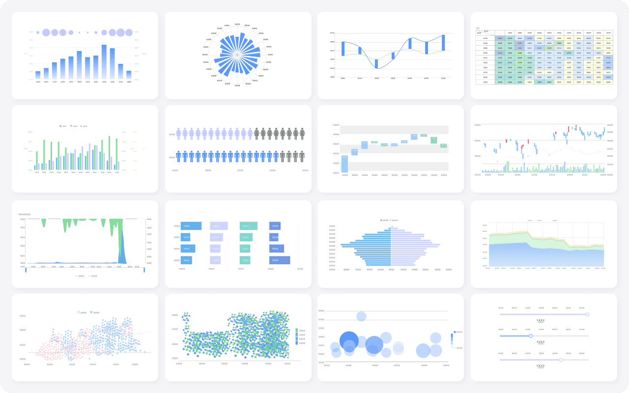
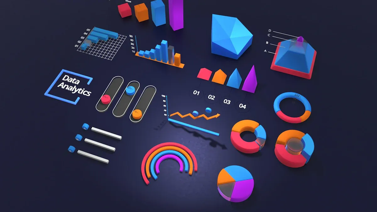
A reporting dashboard uses data visualization to turn raw numbers into clear insights. You choose from a wide range of data visualization tools to display your KPIs and trends. The most popular techniques include:
- Bar charts for comparing categories
- Bullet charts to show progress against goals
- Line graphs for tracking changes over time
- Histograms and box plots for analyzing data distribution
- Maps for location-based data
- Pie charts for adding detail
FineReport offers over 100 chart types, including advanced 2D and 3D options. You can create business data visualization that fits your needs, whether you view it on a desktop or mobile device. The drag-and-drop interface lets you build dashboards quickly, making data visualization accessible to everyone.
Interactivity
A reporting dashboard becomes much more powerful when you add interactivity.
Interactivity transforms a static dashboard into a powerful tool for exploration, personalization, and decision-making in real time.
With an interactive dashboard, you customize your view, explore different perspectives, and gain real-time insights. You filter data, drill down into details, and compare metrics across time periods. This hands-on approach helps you respond quickly to changes in your business environment.
- Real-Time Analysis: Access to updated data allows you to react quickly to opportunities or threats, optimizing proactive decision-making.
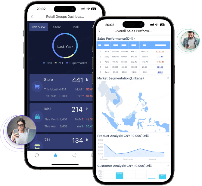
FineReport supports interactive dashboards with features like real-time data refresh, mobile dashboards, and a decision-making platform. You stay connected to your business data wherever you are, making dashboard reporting a key part of your daily workflow.
Types of Reporting Dashboard
When you explore the types of reporting dashboards, you discover three main categories: operational, analytical, and strategic. Each dashboard serves a unique purpose and supports different business needs. FineReport helps you build all these dashboards, including mobile and 3D versions, so you can monitor, analyze, and plan with confidence.
Operational Dashboards
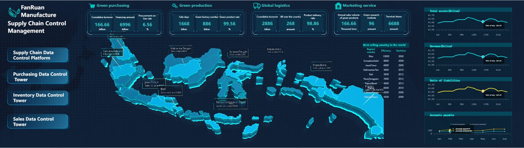
Operational dashboards give you instant access to key metrics that drive your daily business activities. You use these dashboards to track production output, inventory levels, and sales performance. In manufacturing and retail, operational dashboards let you respond quickly to issues and optimize workflows.
- You see real-time data, which improves efficiency and decision-making.
- You monitor operations and spot problems before they escalate.
- You use dashboards as training tools for new staff, providing a clear view of processes.
- You enhance safety by reducing the need for frequent on-site inspections.
FineReport supports operational dashboard reporting with mobile dashboards and 3D dashboards. You can view live data on any device, making it easy to stay informed wherever you work.
Analytical Dashboards
Analytical dashboards help you investigate data trends and answer complex business questions. You use these dashboards to conduct root cause analysis, segment data by different factors, and discover hidden insights. Analytical dashboard reporting is essential for financial analysis, marketing, and customer behavior studies.
- You explore data to find patterns and trends.
- You compare metrics across time periods and entities.
- You analyze the composition of sales or expenses using visual tools.
- You predict future outcomes by studying development trends.
FineReport makes analytical dashboard reporting simple. You can perform summary data analysis, trend analysis, and composition analysis using interactive charts. In finance, you track annual operating income, net profit, and other key indicators to guide your decisions.
Strategic Dashboards
Strategic dashboards support long-term planning and executive decision-making. You use these dashboards to monitor progress toward business objectives and visualize trends that shape your strategy. Strategic dashboards provide a high-level overview for senior leaders.
| Function | Description |
|---|---|
| High-level overview | Snapshot of performance against business objectives. |
| Tracking progress | Monitor advancement toward long-term goals. |
| Visualizing trends | Identify patterns for future strategies. |
| Benchmarking | Compare current performance to past trends. |
| Insight delivery | Ensure decision-makers get fast, actionable information. |
You rely on strategic dashboards to assess risks, uncover opportunities, and allocate resources efficiently. FineReport enables you to create executive dashboards that aggregate performance data across all departments. You can access these dashboards on mobile devices or large screens, ensuring leaders always have the insights they need.
FineReport supports all types of reporting dashboards for industries like manufacturing, finance, and retail. You can customize dashboards to fit your business needs, whether you want to monitor operations, analyze data, or plan strategy.
Reporting Dashboard Benefits
Better Decisions
Dashboard reporting gives you the power to make better decisions every day. When you use a dashboard report, you see actionable insights at a glance. You no longer wait for manual reporting or sift through spreadsheets. You access visual information based on real-time data, which decreases resolution time for issues like overspending or bottlenecks.
| Improvement Type | Description |
|---|---|
| Decision Speed | The time required to make data-informed decisions has decreased. |
| Decision Quality | Outcomes have improved since the implementation of dashboards. |
| ROI Metrics | Efficiency, quality, and cost have improved for dashboards focused on specific processes. |
You optimize marketing plans and drive growth by acting on the latest data. FineReport enhances decision-making speed by offering real-time data access, allowing you to respond swiftly to business changes. The platform integrates multiple data sources and presents them through user-friendly visualizations, streamlining your decision-making process.
Dynamic reporting allows you to access data quickly and easily, enabling informed decisions on the fly. By providing 24/7 access to the most up-to-date information, such reports allow you to interact with data and analyze it from various perspectives, significantly improving decision-making.
Real-Time Insights
Dashboard reporting delivers real-time insights that transform your business performance. You see up-to-date metrics, which help you respond faster to customer needs and market changes. Teams using dashboard reports experience higher engagement and more effective targeting.
| Metric | Real-Time Companies | Slower Companies |
|---|---|---|
| Revenue Growth | 62% higher | - |
| Profit Margins | 97% higher | - |
| Operational Efficiency | 22% better | - |
| Innovation | 20% better | - |
A report by McKinsey reveals that organizations employing real-time analytics can achieve up to 23 times higher customer acquisition rates and are 6 times more likely to retain customers. FineReport utilizes intelligent background monitoring to track data changes and updates the mobile interface in real time. You receive timely actionable insights on any device, ensuring you never miss critical information.
Collaboration
Dashboard reporting improves collaboration across your organization. You share dashboard reports with team members, which ensures everyone works with the same actionable insights. Real-time updates keep your team aligned and reduce communication delays.
- Enhanced decision making: Collective insights improve decision quality.
- Increased efficiency: You reduce communication delays among stakeholders.
- Improved data governance: Secure sharing maximizes data utility.
- Real-time update and interaction: You access the latest data instantly.
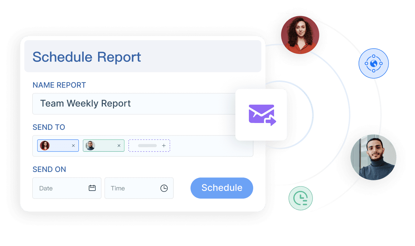
FineReport supports collaboration with automated scheduling and permission control. You create templates and share them with relevant users for data input, simplifying teamwork and data management. The system allows you to assign permissions, so each user accesses only the data they need. This secure approach fosters better cross-functional collaboration and ensures data integrity.
Create a Reporting Dashboard
Steps to Build
Building a reporting dashboard involves several clear steps. You start by clarifying your requirements and designing the architecture. You need to consider what information your users need and how they will interact with the dashboard. The process typically follows a three-tier structure:
- Clarify user requirements and design the architecture.
- Implement a three-tier system: data layer, application layer, and presentation layer.
- Use the presentation layer to display reports and dashboards, ensuring compatibility across devices with HTML5.
- Design, generate, and manage reports in the application layer using user-friendly tools.
- Establish a data layer that supports various data sources and integration.
This approach helps you organize your data, streamline reporting, and ensure your dashboard works smoothly across different platforms.
Best Practices
When designing a reporting dashboard, you should follow best practices to maximize its effectiveness. Start by knowing your audience and tailoring the dashboard to their needs. Define clear objectives so the dashboard displays only necessary information. Choose the right visualizations to make data easy to interpret.
| Best Practice | Description |
|---|---|
| Perform Regular Monitoring and Updates | Check and update KPIs regularly to keep them relevant. |
| Set Realistic, Focused Targets | Define specific KPIs that align with business objectives. |
| Maintain Data Integrity and Controls | Restrict changes to authorized personnel and follow a set schedule for updates. |
Layout plays a key role in user engagement. A well-structured dashboard allows users to scan for information quickly. Consistent use of fonts, colors, and formatting builds trust. Interactive elements, such as filters and drill-down options, help users explore data and gain deeper understanding.
Tip: Tailor visualizations to meet the needs of different stakeholders. Integrate interactive elements to allow users to explore data further.
FineReport Example
FineReport makes dashboard creation simple and efficient. You use a unified design interface that reduces operation costs. You can adjust row height and column width to match your preferred layout. The platform supports template locking and backup, so you avoid development issues. Super admins can unlock templates, and users can back up their work while editing.
| Feature | Description |
|---|---|
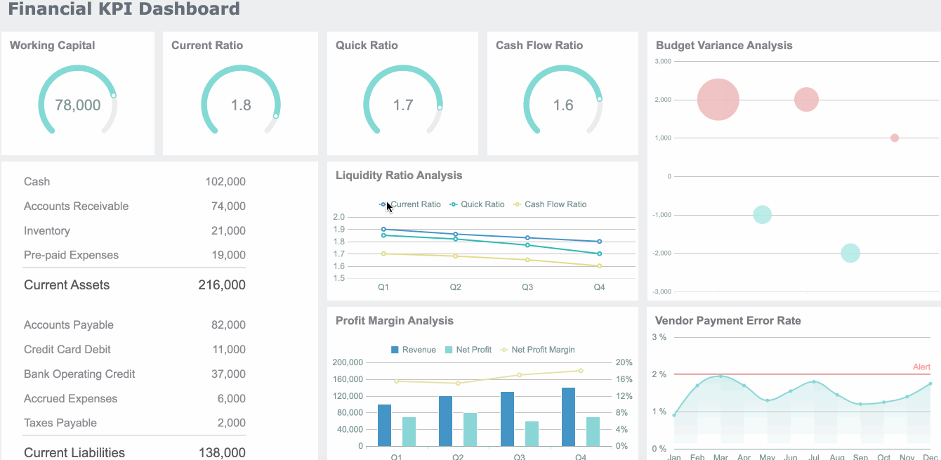
| Real-Time Data Visualization | Monitor sales metrics and performance indicators dynamically. |
| Comprehensive Analysis | Explore sales data for trends and improvement areas. |
| Seamless Integration | Integrate easily with existing systems for a smooth workflow. |
| Predictive Insights | Access advanced analytics for forecasting and identifying growth. |
| Customization Options | Adjust zoom, set cell borders, and manage templates for personalized dashboards. |
FineReport supports deployment across devices, ensuring your dashboard remains accessible and interactive. You benefit from a streamlined workflow, robust customization, and secure management features.
You now understand how a reporting dashboard works and why it matters for your organization. When you apply best practices, you improve user satisfaction, build trust in your data, and encourage leadership involvement. Consider these actionable steps:
| Step | Benefit |
|---|---|
| Group related KPIs | Gain clearer insights |
| Automate data collection | Reduce manual updates |
| Maintain consistent design | Enhance readability |
You maximize ROI by using real-time dashboards and automated reporting. FineReport helps you create interactive dashboards that drive better decisions and measurable results.
Continue Reading About Reporting Dashboard
What is a Dashboard and How Does It Work
Store Performance Dashboard: Your Retail Command Center
How to Craft an Effective Analytics Dashboard
What is a Digital Dashboard and How Does It Work
What is a KPI Dashboard and Why Your Business Needs One


FAQ

The Author
Lewis
Senior Data Analyst at FanRuan
Related Articles

How to Build an Investment Portfolio Reporting Dashboard for Executives: KPIs, Benchmarks, and Drill-Down Views
Investment portfolio reporting for executives is not about showing every holding, transaction, and chart your investment team can produce. It is about giving CEOs, CFOs, CIOs, boards, and investment committees a fast, re
Yida YIn
Jun 25, 2026

12 KPI Reporting Examples for Executive Dashboards: What to Show in Weekly, Monthly, and Quarterly Reviews
Executive leaders do not need more data. They need decision ready $1 examples that match how often they review the business and what actions they are expected to take. A weekly $1 should surface fast moving risks and per
Yida YIn
Jun 25, 2026

How to Build a Digital Marketing Reports Dashboard: Executive Examples, KPIs, and Templates
A $1 is the control layer that helps executives and marketing leaders turn scattered channel data into fast, confident decisions. If you are a CEO, CMO, operations director, or marketing analytics lead, the real problem
Yida Yin
May 07, 2026