A pareto chart gives users a simple way to see which problems matter most. This chart uses bars and a line to show which issues or causes have the biggest impact. The pareto principle, also known as the 80/20 rule, suggests that about 80% of problems come from just 20% of causes. By focusing on these top causes, businesses can solve most of their issues quickly. Many teams use the pareto chart to organize problems by size or cost, making it easier to decide where to act first. FanRuan and FineBI help organizations create pareto charts and make better data-driven decisions.
A pareto chart is a special type of vertical bar chart that helps people find the most important factors in a set of data. It combines bars and a line to show both the size of each category and their total impact. The chart uses several key parts to make data easy to understand:
This structure allows teams to spot the "vital few" problems that cause most of the issues. By focusing on these, organizations can improve processes and solve problems more efficiently.
The pareto principle, also called the 80/20 rule or the law of the vital few, comes from the work of Vilfredo Pareto. He noticed that 80% of Italy’s land belonged to 20% of the people. Later, Joseph M. Juran applied this idea to business and quality control. He found that 80% of problems often come from just 20% of causes. This principle helps people focus on the most important issues instead of spreading their efforts too thin.
The pareto principle appears in many real-world situations:
This principle guides companies to use their resources wisely and make the biggest improvements with the least effort.
A pareto chart helps teams find the most significant problems in a process or system. To use this quality management tool effectively, teams follow a series of steps to identify the critical few issues that cause most of the trouble. The process includes:
Tip: By following these steps, teams can separate the vital few and trivial many. This approach ensures that resources target the areas with the greatest potential for improvement.
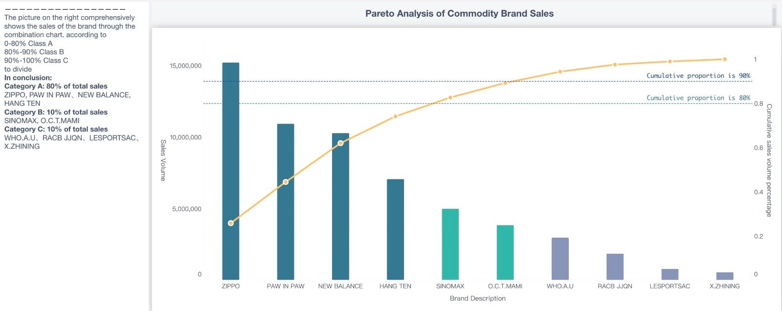
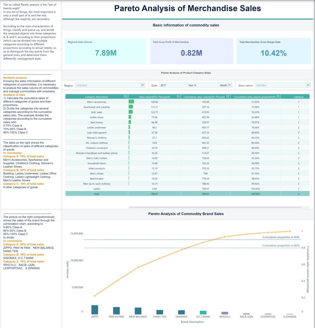
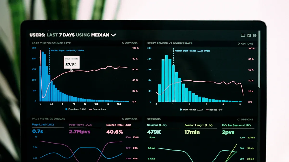
Once the pareto chart is complete, teams can interpret the results to guide their actions. The bars show which categories have the highest impact, while the cumulative line reveals how quickly the categories add up to most of the problem. A steep cumulative line means that a few categories cause most of the issues. These categories are the critical few.
For example, if a company tracks the frequency of defects in a product, the pareto diagram will show which defect types occur most often. The cumulative line helps managers see how addressing just a few defect types can solve most of the quality issues. This visual analysis makes it easier to evaluate quality issues and communicate priorities to the team.
Pareto charts also work well for analyzing customer complaints or help desk service complaints. By focusing on the categories that make up about 80% of the total, organizations can make the biggest improvements with the least effort.
Teams begin by collecting data relevant to the problem they want to solve. FineBI supports connections to many data sources, such as databases, spreadsheets, and APIs. Users select the necessary fields and remove any that do not relate to the analysis. For example, a manufacturing team might collect data on product defects by type and frequency. FineBI allows users to group and summarize this information, making it easier to prepare for visualization. The platform also provides tools to clean and organize the data, ensuring accuracy before moving to the next step.
For more specific details about creating a pareto chart, refer to the help document.
FineBI makes it simple to build a Pareto chart through its drag-and-drop interface. The process involves several steps:
FineBI also allows users to process cumulative proportions directly in the data set, offering flexibility in how they approach the analysis.
After building the chart, users can explore the results using FineBI’s interactive dashboards. The platform enables dynamic analysis, letting users filter data, adjust time frames, and focus on specific categories. Real-time data analysis ensures that teams always work with the latest information. FineBI’s visualization options help users spot trends and communicate findings clearly. Manufacturing teams benefit from these features by quickly identifying key issues and prioritizing improvements. Business users can independently create and share insights, supporting faster and more informed decision-making.
Tip: FineBI’s self-service analytics and real-time capabilities empower teams to act on data without waiting for IT support.
To unlock more functions of FineBI, refer to the product guide.
Pareto analysis gives organizations a clear way to focus on what matters most. When teams use this method, they can quickly spot the few causes that create most of the problems. This focus leads to faster and more effective problem-solving. Many companies have seen real improvements after using this approach:
Pareto analysis also helps businesses use their people, time, and money more wisely. By concentrating on the vital few causes, teams avoid wasting effort on less important issues. For example, companies like Microsoft fixed the 20% of bugs that caused 80% of errors, leading to big gains in performance. Visualization tools make it easy to see these priorities and take action.
Tip: Focusing on the most important problems first can lead to faster results and better use of resources.
FanRuan empowers organizations to use Pareto analysis for ongoing improvement. FineBI, the self-service analytics platform from FanRuan, helps teams connect to many data sources and build clear visualizations. Users can create interactive dashboards that highlight the most important issues, making it easy to track progress and share insights.
FineBI supports real-time data updates, so teams always work with the latest information. Business users can explore data on their own, without waiting for IT help. This independence speeds up decision-making and helps teams respond quickly to new challenges. With FanRuan and FineBI, organizations can keep improving by always focusing on the issues that matter most.
How DuPont Analysis Helps You Understand Your Business
How to Do Retention Analysis for Business Success

The Author
Lewis
Senior Data Analyst at FanRuan
Related Articles
What is Ecommerce Analytics and Why Does It Matter
Ecommerce analytics helps online stores track data, optimize sales, and enhance customer experience for better growth and profitability.
Lewis
Jan 04, 2026
What is Ad-Hoc Analysis and Why is it Important
Ad-hoc analysis lets you answer unique business questions instantly, offering flexible, real-time insights that drive smarter, faster decisions.
Lewis
Sep 16, 2025

What Is a Data Model and Why Does It Matter
A data model defines how data is structured and connected, making information easier to manage, analyze, and use for smarter business decisions.
Lewis
Aug 04, 2025


