An interactive dashboard gives you the power to explore and analyze data visually, making complex information easy to understand and act on. Unlike traditional dashboards, interactive dashboards let you filter, drill down, and customize views in real time. This difference matters because 75% of organizations now use interactive dashboards for business intelligence, showing the importance of dashboards in decision-making. FineBI stands out as a leading solution, offering dynamic and user-friendly dashboards that help you unlock deeper insights from your data.
An interactive dashboard is a digital interface that presents data in a dynamic and user-friendly way. You can explore and manipulate the data to derive insights. This type of dashboard goes beyond static reporting. It allows you to interact with charts, tables, and metrics directly on the screen. You can filter information, drill down into details, and adjust views instantly.
A business intelligence dashboard serves as a visualization and analysis tool. It consolidates key performance indicators (KPIs) and other critical business metrics onto a single screen. You see all your important data in one place. This makes it easier to monitor trends and spot issues quickly.
Tip: When you use an interactive dashboard, you gain control over how you view and analyze your data. You do not need to wait for IT or data specialists to generate reports.
The core purpose of an interactive dashboard is to help you make better decisions using data. You can access information instantly and respond to changes in your business environment. Interactive dashboards are designed to achieve several objectives in data-driven organizations:
Interactive dashboards empower you to act on data in real time. You can share insights with your team and work together to solve problems. The interactive features make it easy to customize views and focus on what matters most.
A well-designed interactive dashboard transforms raw data into actionable insights. You track KPIs, monitor performance, and uncover hidden patterns. You do not just see numbers; you understand the story behind the data.
When you compare an interactive dashboard to a traditional dashboard, you notice several important differences. An interactive dashboard gives you the ability to manipulate data in real time. You can filter, drill down, and adjust parameters to see different scenarios. Traditional dashboards, also known as static or reporting dashboards, only show pre-defined views. You cannot interact with the data or change how it is displayed.
Here are some key differences:
Note: Interactive dashboards transform static datasets into dynamic visualizations. This interactivity leads to a more engaging and personalized experience.
You can see the comparison in the table below:
| Feature | Interactive Dashboard | Static/Traditional Dashboard |
|---|---|---|
| User Interaction | Dynamic interaction with data | No interaction possible |
| Data Exploration | Explore and manipulate information | Limited to pre-defined views |
| Insight Depth | Deeper, personalized insights | Surface-level insights only |
| Real-Time Updates | Yes | No |
You gain several advantages when you use an interactive dashboard. Real-time data access enables you to make quick decisions based on the most current information. You can explore data from different angles, identify trends, and perform scenario analysis. This leads to more strategic, data-driven decisions.
Interactive dashboards also improve user engagement. You control how you view and analyze information, which helps you stay focused and interested. Interactive visualizations let you explore and manipulate data, making your experience more meaningful.
FineBI enables you to move beyond static reporting dashboards. With FineBI, you can build your own dashboards, explore data interactively, and communicate insights effectively. You do not need to rely on IT for every report. FineBI’s self-service analytics and wide range of visualization options empower you to uncover deeper insights and make better decisions.

Real-time data visualization stands at the heart of every interactive dashboard. You see up-to-the-minute information as soon as it becomes available. This feature transforms how you monitor business performance and respond to changes. When you use real-time data visualization, you no longer wait for manual updates or static reports. Instead, you gain instant access to the latest data, which supports faster and more informed decisions.
Here is how real-time data visualization impacts business outcomes:
| Benefit | Description |
|---|---|
| Enhanced decision-making | Enables quicker, data-driven decisions by providing up-to-the-minute information. |
| Streamlined data analysis | Saves time and resources by eliminating the need for manual data compilation and review. |
| Improved performance monitoring | Facilitates continuous monitoring of operational processes, allowing for immediate adjustments. |
| Proactive problem-solving | Helps in identifying issues in real-time, allowing for prompt intervention before problems escalate. |
| Better customer experience | Supports real-time tracking of customer behavior, enabling personalized responses and services. |
FineBI’s interactive dashboard delivers real-time data visualization through seamless integration with multiple data sources. You can connect to databases, cloud platforms, and APIs. This ensures your dashboard always reflects the most current data. FineBI's high-performance engine processes large datasets quickly, so you never miss critical updates.
User interaction defines the difference between a static report and an interactive dashboard. You can filter, drill down, and explore data visualizations directly. This hands-on approach lets you uncover insights that static dashboards often hide. Leading platforms, including FineBI, support a wide range of user interactions.
| User Interaction Type | Description |
|---|---|
| Personalization and context | Dashboards adapt based on your data, goals, and context, moving away from a one-size-fits-all approach. |
| Actionable analytics | You interact with data by clicking, drilling down, and triggering actions, integrating insights into daily tasks. |
| Deep interactivity | Beyond simple filtering, you engage deeply with the data presented. |
| App/workflow integration | Dashboards integrate into workflows, allowing for actions and triggers directly from the dashboard. |
| Customization and branding | You can customize the dashboard's appearance and functionality to fit your needs. |
| User-level personalization | Each user can have a tailored experience based on specific requirements. |
| Fast, scalable deployment | Dashboards deploy quickly and scale to meet user demands. |
| Living, in-app data experiences | You explore and act on data rather than just viewing static reports. |
| Integration with core workflows | Dashboards embed in user journeys, enhancing onboarding, adoption, and upsell processes. |
FineBI's interactive dashboard offers a drag-and-drop interface that makes user interaction simple. You can build dashboards without coding. You select data fields, arrange visualizations, and apply filters with just a few clicks. This approach democratizes data analytics, making it accessible to everyone in your organization.
Customization is a key feature of any interactive dashboard. You can tailor the dashboard to show only the data that matters to you. This reduces distractions and helps you focus on your main responsibilities. Customization also improves efficiency because you can access frequently used features quickly.
| Benefit | Description |
|---|---|
| Reduced Cognitive Load | Customized dashboards display only relevant data, helping you focus on your key responsibilities. |
| Enhanced Efficiency | You can quickly access frequently used features, minimizing time spent on administrative tasks. |
| Improved Decision Making | Critical metrics are easily accessible, enabling faster and more informed scheduling decisions. |
| Higher Adoption Rates | Software that adapts to user needs sees increased voluntary usage and fewer workarounds. |
| Decreased Training Requirements | Intuitive interfaces reduce the learning curve, leading to less need for extensive training. |
FineBI’s interactive dashboard supports extensive customization. You can choose from over 60 chart types and 70 styles. You adjust layouts, colors, and data visualizations to match your workflow. FineBI also supports mobile compatibility, so you can access your dashboard on any device.
Collaboration transforms how teams use an interactive dashboard. Modern dashboards include features such as real-time data sharing, annotation tools, and user-friendly customization options. These features help you communicate insights and solve problems together. For example, annotation tools let you add notes or tag colleagues, making it easier to discuss findings and take action.
FineBI’s interactive dashboard enables secure sharing and team collaboration. You can publish dashboards with role-based permissions. This ensures that each team member sees the right data. You can also track user activity and audit changes, which supports data governance and compliance. FineBI's collaborative features help your team work together, share insights, and drive innovation.
Tip: When you use an interactive dashboard with collaboration features, you create a culture of data-driven decision-making across your organization.
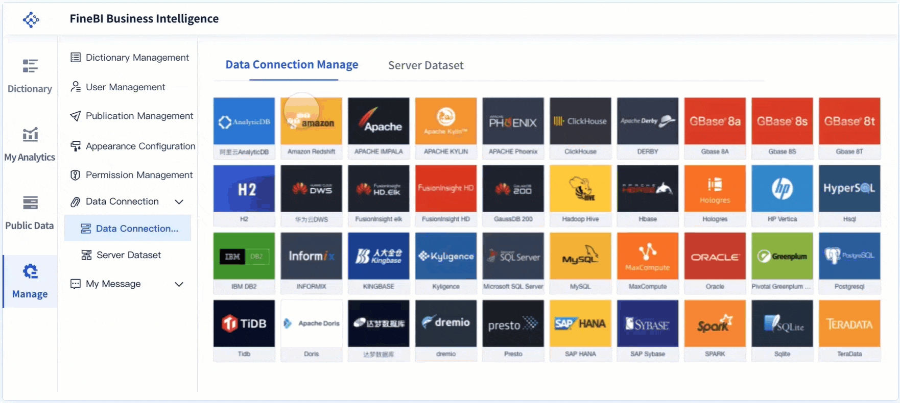
You start building an interactive dashboard by connecting to your data sources. FineBI makes this step easy by supporting over 60 connectors, including databases, cloud warehouses, and APIs. You can bring together data from different systems, creating a unified view for your analytics. This advanced data integration helps you see the full picture and eliminates data silos.
| Functionality | Benefit |
|---|---|
| Advanced data integration | Consolidates disparate data sources for a unified view. |
| Automated data aggregation | Saves time and reduces manual errors in data processing. |
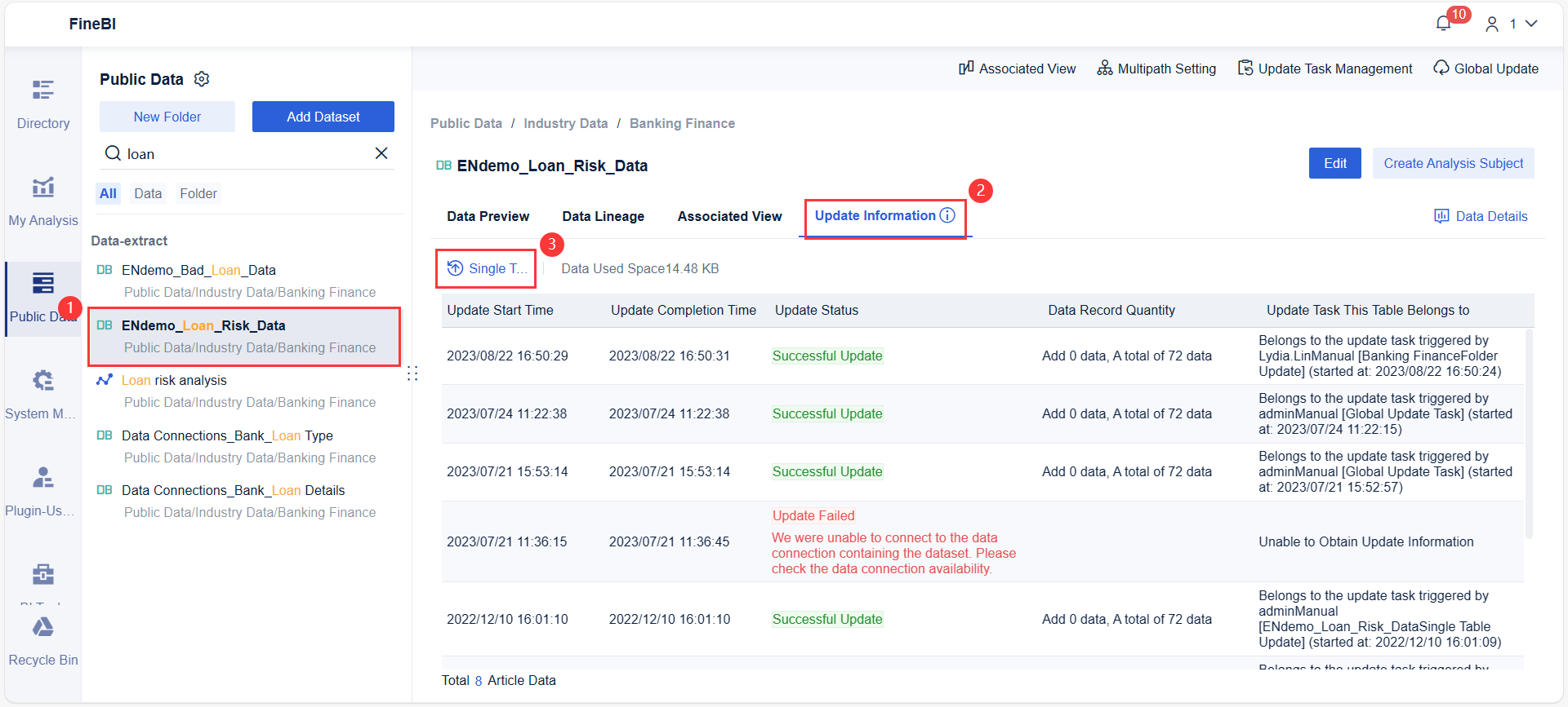
You do not need to worry about manual updates. FineBI schedules incremental updates, so your dashboard always displays real-time results. This ensures you work with the most current information for your data analytics needs.
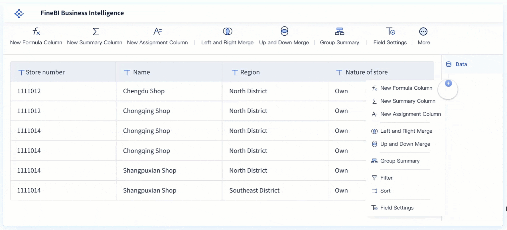
After connecting your data, you move to data processing. FineBI lets you clean, join, and transform your data without coding. You can create custom datasets, add calculated fields, and filter out unnecessary records. This step prepares your data for analysis and ensures accuracy.
FineBI’s automated data aggregation and processing features save you time and reduce errors. You can preview your changes instantly, making it easy to refine your data before moving to the next stage. Real-time analytics capabilities allow you to analyze large volumes of data efficiently.
Once your data is ready, you create data visualizations. FineBI offers a drag-and-drop interface for building interactive dashboards. You can choose from over 60 chart types and customize layouts to match your workflow. These visualizations help you turn complex data into clear, actionable insights.
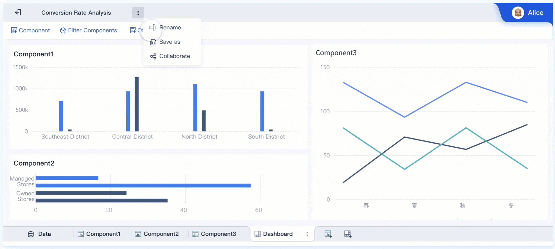
The dashboard below, for example, showcases a drill-down feature, which enables users to explore intricate layers of data detail within a single visualization. This feature facilitates a deeper understanding of trends and the discovery of actionable insights.
FineBI supports secure sharing and publishing. You can set permissions, track user activity, and ensure only authorized users access sensitive data. The workflow for publishing a dashboard is simple: select your analysis, set publication options, and wait for admin approval. This process keeps your analytics secure and accessible to your team.
If you want to understand how dashboards work from start to finish, remember these steps: connect your data, process it, build interactive visualizations, and publish securely. FineBI's workflow ensures you get real-time results and actionable insights every time.
You can use an interactive dashboard in business intelligence to turn raw data into actionable insights. Many organizations rely on interactive business intelligence dashboards to improve decision-making and boost efficiency. For example:
FineBI supports these business intelligence goals by offering features that help you manage, model, and visualize data. The table below shows how FineBI’s interactive dashboard features contribute to better decision-making:
| Feature | Contribution to Decision-Making |
|---|---|
| Data Management | You can classify data for easier access and understanding. |
| Data Modeling | You build relationships in data warehouses for deeper insights. |
| Data Visualization | You identify data issues quickly through visual analysis. |
| Collaboration Functionalities | You share and collaborate on datasets and dashboards with your team. |
You gain the ability to explore data, share findings, and make informed choices. Interactive dashboards help you spot trends, monitor KPIs, and align your team around shared goals.
In manufacturing, an interactive dashboard helps you monitor product quality and reduce defects. Real-time data visualization transforms numbers into insights that drive improvements in product quality. Every member of your production team stays informed and can contribute to product excellence.
The table below highlights how interactive dashboards support manufacturing quality control:
| Feature | Benefit |
|---|---|
| Real-time data visualization | You see insights that help improve product quality. |
| Empowerment of team | Every team member can act to ensure product excellence. |
You can monitor and analyze defect rates and performance metrics in one view. Built-in filtering lets you manipulate data easily to gain different insights. Automated alerts notify you of potential issues, such as supply shortages or machinery malfunctions. This allows you to act quickly and prevent defects before they impact production.
Interactive dashboards also serve other industries. In healthcare, you track patient outcomes and resource usage. In retail, you monitor sales trends and inventory levels. In finance, you analyze risk and compliance metrics. No matter your field, an interactive dashboard gives you the tools to make smarter, faster decisions.
You can build an interactive dashboard by following a clear process. Start by defining the purpose of your dashboard. Decide what questions you want to answer and which metrics matter most. Next, choose the right tool for your needs. FineBI is a strong choice because it supports self-service dashboard creation and real-time data visualization.
Apply key UI and UX principles to make your dashboard easy to use. Focus on clarity and simplicity. Add interactive features such as filters and drill-downs. These features help you explore data from different angles. Prioritize data accuracy and quality. Clean your data and check for errors before you create a dashboard. Test your dashboard with real users and make improvements based on feedback.
Here is a step-by-step guide:
Tip: When you use FineBI, you can create a dashboard by selecting the Dashboard tab, choosing 'New Dashboard', and picking a data table. You can add components and share dashboards with others or create public links for easy access.
Selecting the right tool for interactive dashboard development is important. You should focus on usability, data quality, and system capabilities. Look for a tool that offers a user-friendly interface and strong interactive features. Make sure the tool supports up-to-date and accurate data. Evaluate system performance and customer support.
Consider these criteria:
You should also think about cost and long-term value. Assess the dashboard’s performance and read user reviews to understand customer support.
FineBI stands out for self-service dashboard creation. You do not need coding skills to build interactive dashboards. FineBI supports role-based access control, data masking, and real-time monitoring. These features help you keep your dashboard secure and compliant with regulations like GDPR and HIPAA.
Note: Always define clear objectives and understand your audience. Use responsive design and intuitive navigation for accessibility. Implement role-based access control to protect sensitive data.
You gain many benefits when you use an interactive dashboard. You improve decision-making and efficiency by exploring data in real time. The dashboard lets you analyze trends, share insights, and act quickly.
| Benefit | Description |
|---|---|
| Improved Operational Intelligence | You see key metrics instantly, which helps you make better choices. |
| Increased Efficiency | You drill down into data and respond without delay. |
| Enhanced User Engagement | Interactive features keep you involved and focused. |
You can expect future dashboards to use AI, offer better user experiences, and support mobile devices. Try FineBI to build your own interactive dashboard and unlock the full power of your data.
What is a Dashboard and How Does It Work
Store Performance Dashboard: Your Retail Command Center
How to Craft an Effective Analytics Dashboard
What is a Digital Dashboard and How Does It Work
What is a KPI Dashboard and Why Your Business Needs One


The Author
Lewis
Senior Data Analyst at FanRuan
Related Articles
Payment Analytics Dashboard: 12 KPIs Every Operations Leader Should Track to Cut Revenue Leakage
Losing revenue to declines? Discover 12 essential KPIs to track in your payment analytics dashboard to stop leakage and manage disputes.
Lewis Chou
May 05, 2026

SOC Dashboard Explained: 12 Essential KPIs, Views, and Workflows Security Teams Use
Learn about SOC dashboards, the 12 essential KPIs for security teams, and how they centralize alerts and workflows for faster threat detection and response.
Lewis Chou
May 05, 2026

EMR Dashboard Guide: 12 Metrics to Track for Faster Clinical and Operational Decisions
Learn the 12 essential EMR dashboard metrics to track for faster clinical and operational decisions, improving patient flow and revenue cycle management.
Lewis Chou
May 05, 2026


