Most dashboards show you what happened. The best ones tell you what to do next. If your marketing dashboard doesn’t map to your funnel, you’re just visualizing confusion at scale.
The Real Problem with Marketing Dashboards Isn’t the Data.
It’s the Default Thinking. You’ve seen it: dozens of marketing dashboards packed with charts, metrics, heatmaps, and filters. CTR here, ROI there, CAC down below. And yet none of them answered a single strategic question. That’s because most dashboards are built backwards: from data sources → KPIs → chart types → eventually slapped into a UI. But marketers don’t think that way. Marketers think in goals, funnels, and actions.That’s why your dashboard should too.
A Dashboard Should Work Like a Funnel, Not a Report
Most marketing dashboards today are designed like static reports: they present data in isolation, layer on visuals, and often overwhelm the viewer with disconnected KPIs. But marketing doesn’t operate in fragments, it operates in flows. And the dashboard should reflect that.
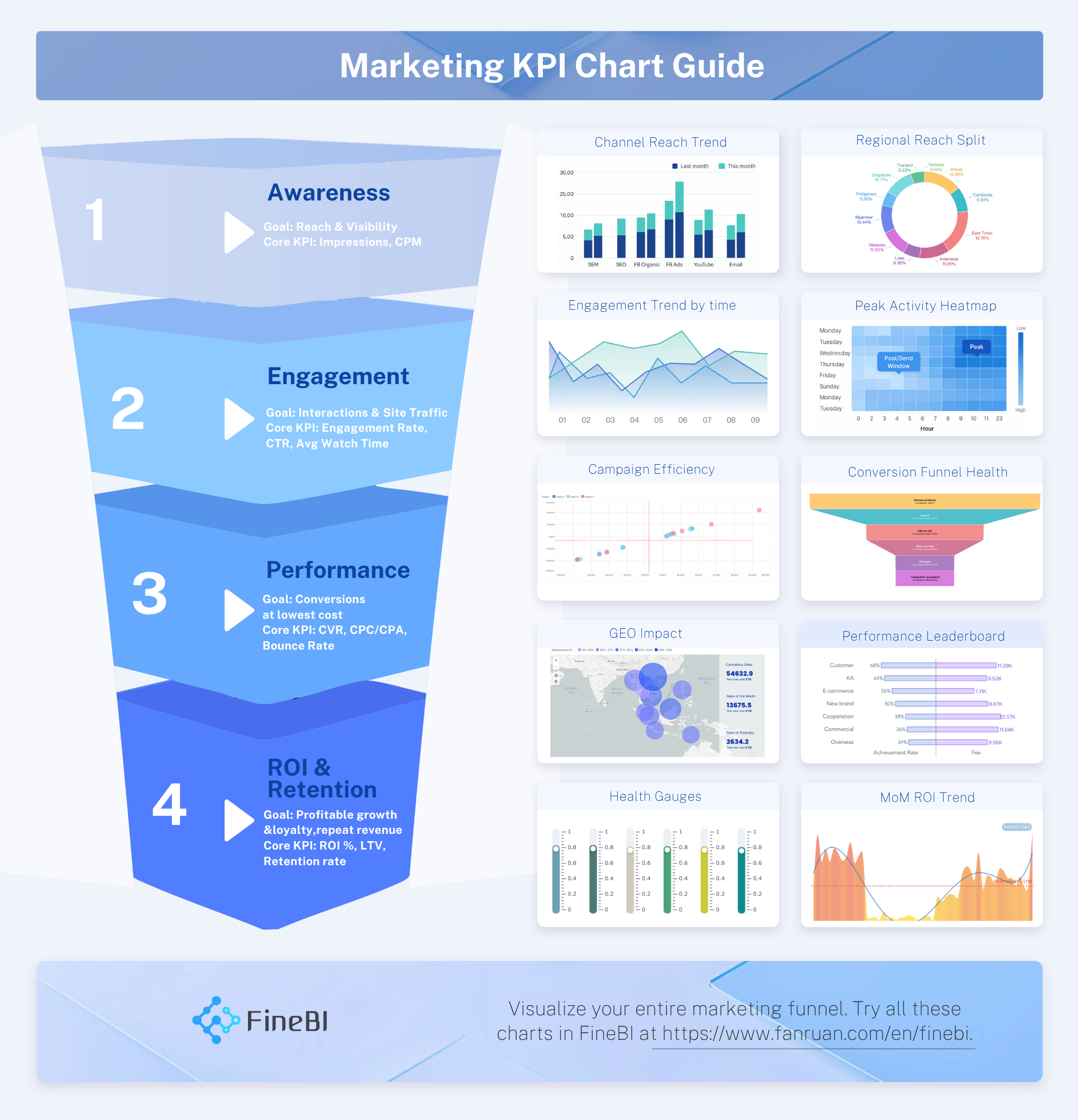
A truly effective marketing dashboard is structured according to the conversion funnel, not data sources, not team silos. Each stage of the funnel corresponds to a specific set of decisions:
Awareness: Where is attention growing? What’s the cost of that attention?
Engagement: Who is interacting, when, and with what content?
Performance: Which campaigns are converting most efficiently?
ROI & Retention: Is the business growing profitably over time?
Every chart in the dashboard should tie to a stage in this journey. Every metric should answer a real marketing question. Every visualization should make the next move obvious: scale, pause, shift, or fix.
Dashboards that mix funnel stages, showing impressions, CTR, and ROI on the same screen, create noise, not insight. Dashboards that show KPIs without context, like a CTR of 2.1% with no target line, require guesswork, not decisions. And dashboards that bury core signals under filters and widgets risk becoming internal reporting graveyards. Instead, a well-structured dashboard guides the marketer like a funnel itself:
From reach → to interaction → to conversion → to long-term value.
This is the philosophy embedded in marketing analytics approach. By aligning dashboard logic with marketing logic, teams move faster, think clearer, and act with confidence.
Chart Choice Isn’t Aesthetic. It’s Strategic.
Three Don’ts That Kill Decision-Making
Why Self-Service BI Tools Fall Short Without Structure
Bottom Line: Don’t Visualize the Chaos. Funnel It.


FAQ

The Author
RuanRuan
Data Analyst at FanRuan
Related Articles

What Recruiters Look for in a Data Analysis Portfolio: 10 Criteria to Score Yours Fast
A $1 is not judged like a school assignment. It is judged like a hiring shortcut. Recruiters, hiring managers, and analytics leads use it to answer one question fast: Can this person solve business problems with data in
Lewis Chou
May 29, 2026

What Is Data Analytics Consulting? Beginner’s Guide to Services, Deliverables, and Business Value
$1 helps organizations turn raw data into decisions they can trust. For many business leaders, the challenge is not a lack of data. It is a lack of clarity. Reports conflict, teams track different KPIs, dashboards are un
Lewis Chou
Jun 03, 2026

Data Analyst Job Description [+2026 Guide]: Compare Responsibilities, Skills, and Salary by Industry
A strong $1 does more than list tasks. It defines how a company turns raw data into business decisions, which teams the analyst supports, and what measurable outcomes the role is expected to influence. For employers, tha
Lewis Chou
Jun 02, 2026