You rely on dashboards to turn raw data into clear, actionable insights. Good dashboard design helps you spot trends, track KPIs, and make fast decisions. When you use dashboards with real-time data, you can quickly identify problems and respond before they grow.
FanRuan and FineBI lead the way in user-friendly dashboard design. Their platforms let you create dashboards that are both powerful and easy to use. You can connect data from many sources, visualize it in real time, and share dashboards across your organization.
Effective data visualization is the heart of every successful dashboard. When you follow strong design principles, you help users understand information faster and make better choices. Research shows that well-structured dashboards can reduce the time it takes to find information by up to 76%. Companies using real-time visualization often see lower operating costs and faster decision-making.
You should use color to highlight important data points and avoid distractions. Storytelling with data helps users see patterns and trends, making dashboards more engaging. In healthcare, dashboards improve patient care by making it easier to spot issues. In logistics, visualization supports real-time tracking and risk management. E-commerce teams use dashboards to analyze customer behavior and manage inventory.
When you design dashboards with clarity, consistency, and a focus on the user, you create tools that drive results. FineBI makes it simple to build dashboards that follow these principles, so your teams can act on insights with confidence.
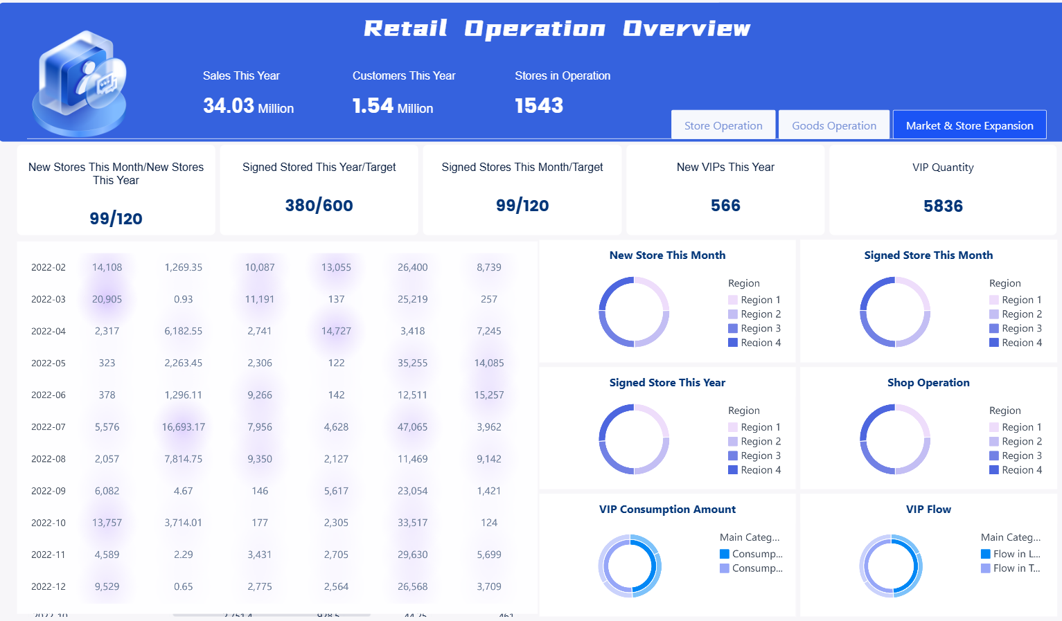
You need to track sales, customer engagement, and marketing effectiveness in retail. Retail operation dashboard templates help you monitor store performance in real time. These dashboards connect to your POS, CRM, and ERP systems, giving you a centralized view of all your key performance indicators.
Purpose:
You use these templates to analyze sales trends, customer loyalty, and campaign results. They help you spot issues quickly and adjust your strategy.
Ideal Use Cases:
Key Features:
Example KPIs:
Companies using retail dashboards have seen customer satisfaction scores rise by up to 20% and conversion rates increase by 25%. These improvements drive higher sales and repeat business.
FineBI lets you build executive dashboards that combine all these metrics. You can customize layouts, set up real-time alerts, and share dashboards with your team. FanRuan’s solutions ensure your data stays accurate and actionable.
Manufacturing dashboards give you a real-time view of production, quality, and efficiency. You use these templates to monitor every step of your process, from raw materials to finished goods.
Purpose:
You want to reduce waste, improve quality, and maximize output. Manufacturing dashboard templates help you track KPIs and spot bottlenecks.
Ideal Use Cases:
Key Features:
Example KPIs:
| KPI Name | Description |
|---|---|
| Overall Equipment Effectiveness (OEE) | Measures machine productivity |
| Capacity Utilization | Percentage of capacity used |
| Throughput | Units produced per hour |
| Defect Density | Defects per product |
| First Pass Yield (FPY) | Products passing quality checks first time |
| Downtime | Percentage of time machines are not running |
Analytical dashboards in manufacturing double your chances of hitting improvement goals. Regular tracking of KPIs leads to higher profit margins and better resource management.
FineBI supports data integration from MES, ERP, and IoT devices. You can create executive dashboards that visualize trends, compare shifts, and drill down to operator performance. FanRuan’s platform helps you optimize every part of your operation.
Sales dashboard templates help you track pipeline health, team performance, and revenue growth. You use these dashboards to set clear goals and motivate your sales team.
Purpose:
You want to see which products sell best, which reps need coaching, and how close you are to your targets.
Ideal Use Cases:
Key Features:
Example KPIs:
Using dedicated sales dashboards improves team performance, speeds up reporting, and makes it easier to spot trends. Walmart uses executive dashboards to manage millions of transactions, turning raw data into actionable insights.
FineBI’s drag-and-drop interface lets you build analytical dashboards that track every sales metric. You can filter, visualize, and share insights instantly. FanRuan’s solutions make sales reporting fast and accurate.
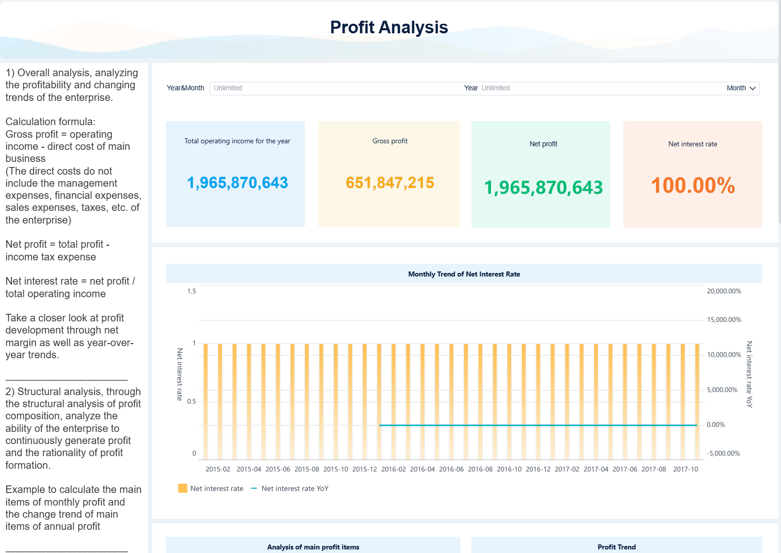
Finance dashboard templates give you a clear view of your company’s financial health. You use these dashboards to monitor revenue, expenses, and cash flow.
Purpose:
You want to make informed decisions, manage risk, and ensure compliance. Finance dashboards help you track key performance indicators and spot issues early.
Ideal Use Cases:
Key Features:
Example KPIs:
Finance dashboards consolidate complex data, making it easy to spot trends and risks. Centralized access to KPIs supports better fiscal management and faster decision-making.
FineBI connects to your accounting systems and bank feeds. You can create executive dashboards that update automatically and share them securely. FanRuan’s platform ensures your financial reporting is always up to date.
Operations dashboard templates help you monitor productivity, quality, and efficiency across your business. You use these dashboards to keep projects on track and improve processes.
Purpose:
You want to identify bottlenecks, reduce costs, and deliver better results. Operations dashboards give you real-time visibility into every part of your workflow.
Ideal Use Cases:
Key Features:
Example KPIs:
| Metric Category | Example KPIs |
|---|---|
| Productivity | Employee and team productivity |
| Cost Efficiency | Cost per unit, cost efficiency |
| Quality | Defect rate, quality rates |
| Time Management | Delivery times, cycle time |
| Equipment | OEE, equipment downtime |
| Customer Metrics | Customer satisfaction |
Operations dashboards improve project visibility and resource use. Real-world dashboard examples show better timeline control and smarter decision-making.
FineBI lets you build analytical dashboards that track every operational metric. You can automate reporting and share insights with your team. FanRuan’s solutions help you drive continuous improvement.
Banking finance dashboard templates help you manage risk, compliance, and financial performance. You use these dashboards to make faster, more informed decisions.
Purpose:
You want to track loans, deposits, and regulatory compliance. Banking dashboards aggregate complex data and highlight trends.
Ideal Use Cases:
Key Features:
Example KPIs:
Dashboards in banking improve decision accuracy by up to 20% and reduce operational losses by 25%. Automated alerts and real-time data help you spot risks early.
FineBI enables you to create executive dashboards that integrate with core banking systems. You can automate reporting and ensure compliance. FanRuan’s platform supports secure, scalable analytics for financial institutions.
HR dashboard templates help you manage employee performance, engagement, and retention. You use these dashboards to monitor workforce trends and make data-driven HR decisions.
Purpose:
You want to optimize productivity, reduce turnover, and support employee development. HR dashboards provide real-time insights into your workforce.
Ideal Use Cases:
Key Features:
Example KPIs:
HR dashboards offer interactive, real-time data that supports proactive decision-making. Compared to standard reporting, dashboards provide faster, more actionable insights for workforce planning.
FineBI lets you build executive dashboards tailored to HR needs. You can track KPIs, automate reporting, and share insights securely. FanRuan’s solutions help you create a data-driven HR strategy.
Education and training dashboard templates help you track learning outcomes and program effectiveness. You use these dashboards to monitor student progress and optimize training investments.
Purpose:
You want to improve learning results and make training more effective. Education dashboards provide real-time data on participation, assessment, and engagement.
Ideal Use Cases:
Key Features:
Example KPIs:
About 25% of studies show that learning analytics dashboards improve student outcomes. Automated reporting saves time and supports continuous improvement.
FineBI enables you to create analytical dashboards that integrate with LMS and HR systems. You can automate data collection and visualize trends. FanRuan’s platform supports personalized learning and strategic planning.
Transportation logistics dashboard templates help you optimize routes, reduce costs, and improve delivery performance. You use these dashboards to manage shipments and resources efficiently.
Purpose:
You want to track shipments, monitor fleet performance, and ensure on-time delivery. Logistics dashboards provide real-time visibility into your supply chain.
Ideal Use Cases:
Key Features:
Example KPIs:
Companies using logistics dashboards have reduced fuel costs by 20% and improved order fulfillment speed by 30%. Real-time data and analytics drive better resource use and customer satisfaction.
FineBI lets you build executive dashboards that connect to TMS, WMS, and GPS systems. You can automate reporting and optimize every step of your logistics process. FanRuan’s solutions support scalable, integrated supply chain analytics.
Medical dashboard templates help you streamline patient care and resource management. You use these dashboards to monitor appointments, staff, and clinical outcomes.
Purpose:
You want to improve patient flow, reduce wait times, and optimize resource allocation. Medical dashboards centralize all your key metrics in one place.
Ideal Use Cases:
Key Features:
Example KPIs:
Medical dashboards reduce manual reporting and improve care coordination. Hospitals using these templates see faster decision-making and higher patient satisfaction.
FineBI enables you to create executive dashboards that integrate clinical, operational, and financial data. You can automate reporting and customize dashboards for any department. FanRuan’s platform supports secure, scalable healthcare analytics.
You should always start dashboard design by understanding your audience and their data needs. Different users need different information. For example, a sales manager wants to see pipeline stages, while a marketing analyst focuses on campaign performance. One-size-fits-all dashboards rarely work. Customization ensures each user gets the right insights.
Tip: Identify who will use the dashboard, what decisions they need to make, and how often they will access it.
Follow these best practices for dashboard design:
FineBI makes dashboard customization simple and powerful. You can use its drag-and-drop interface to build executive dashboards without technical skills. FineBI supports many visualization types, including bar charts, pie charts, and heatmaps. This flexibility helps you explore data in new ways.
A healthcare provider using FineBI reduced report customization time by 70%. You can monitor key metrics in real time and respond quickly to changes. FineBI’s interactive features, like drill-down and filtering, let you dig deeper into your data. Customizable dashboard templates and scalable design mean your dashboards can grow with your business.
Note: FineBI’s self-service analytics lets everyone in your company analyze data, not just IT teams. This democratizes insights and speeds up decision-making.
You get the most value from dashboards when you tailor them to specific audiences. Start by defining user personas and their goals. Set SMART goals for your executive dashboard to keep metrics focused and actionable. Select 3-5 KPIs that drive impact and avoid clutter.
Structure your dashboard so users see the most important KPIs first. Use comparative and trend-based views, like month-over-month growth, to give context. Add interactivity so users can filter data or drill down for details. Link data to recommended actions to highlight actionable insights.
Real-world examples, like Amazon Seller Central, show that user-centric dashboard design improves efficiency and decision-making. Customized dashboards reduce cognitive load and help users act on insights faster.
You should always align metrics with business strategy. This approach leads to more effective reporting and better business outcomes.
You gain a competitive edge when you use proven dashboard templates to visualize your data. Dashboards help you track KPIs, monitor trends, and make informed decisions at every level. You can see real-time data from sources like finance, marketing, and operations. Dashboards organize key metrics for executives and teams, making insights clear and actionable. FineBI from FanRuan lets you customize dashboards for your unique needs. Start using these templates to unlock the full value of your data and drive business growth.
Click the banner below to experience FineBI for free and empower your enterprise to convert data into productivity!

작성자
Seongbin
FanRuan에서 재직하는 고급 데이터 분석가
관련 기사
ERP 대시보드에서 꼭 봐야 할 KPI 12가지: 재무·구매·재고·영업 한눈에 이해하기
기업이 데이터를 많이 가지고 있다고 해서 의사결정이 빨라지는 것은 아닙니다. 중요한 것은 지금 당장 판단과 행동으로 이어질 수 있는 핵심 지표를 $1 $1에서 어떻게 보여 주느냐 입니다. 특히 재무, 구매, $1, 영업 데이터가 각각 따로 흩어져 있으면 문제를 발견하더라도 원인을 정확히 짚기 어렵습니다. 이 글에서는 $1 $1 에서 반드시 확인해야 할 $1 12가지를 재무·구매·$1·영업 관
Seongbin
2026년 4월 19일
CRM 대시보드란? 초보자가 꼭 알아야 할 핵심 지표와 구성 요소 7가지
고객 정보가 쌓일수록 중요한 것은 단순한 데이터 보관이 아니라, 지금 어떤 고객이 들어오고 있고, 영업은 어디까지 진행됐으며, 어떤 고객이 이탈할 가능성이 있는지 한눈에 파악하는 것 입니다. 이때 가장 강력한 도구가 바로 crm $1 입니다. 초보자에게 crm $1는 다소 복잡해 보일 수 있습니다. 하지만 핵심만 이해하면 생각보다 어렵지 않습니다. 잘 설계된 crm $1는 숫자를 보여주는 화
Seongbin
2026년 4월 16일
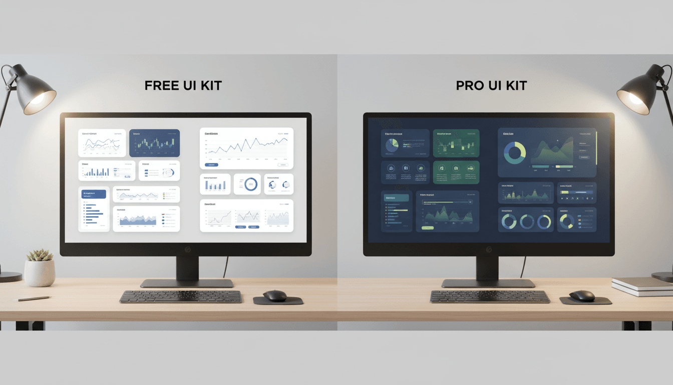
무료 vs 유료 Dashboard UI Kit 비교: 초기 비용보다 중요한 dashboard ui 평가 기준 7가지
$1 ui를 고를 때 많은 팀이 가장 먼저 보는 것은 가격입니다. 하지만 실제 프로젝트에서는 무료인지 유료인지보다, 그 $1 ui가 우리 서비스에 얼마나 잘 맞고 오래 버틸 수 있는지 가 더 중요합니다. 처음엔 무료 템플릿으로 빠르게 시작하는 것이 합리적으로 보여도, 커스터마이징과 개발 반영, 운영 중 수정 비용까지 합치면 오히려 더 비싸질 수 있습니다. 반대로 유료 $1 ui kit도 무조
Seongbin
2026년 4월 15일


