You know that making smart decisions is the key to marketing success. A marketing dashboard gives you real-time insights that help you track marketing metrics and key performance indicators. With the best marketing dashboard, you can see the results of your digital marketing dashboard and online marketing dashboard efforts. These marketing dashboard examples offer inspiration for building a marketing performance dashboard or a digital marketing report dashboard. You can use a marketing reporting dashboard, a marketing campaign spotlight dashboard, or even a power bi cmo dashboard to monitor your marketing kpi dashboard and performance metrics. Marketing analytics dashboards, dashboard templates, and a performance dashboard help you measure paid media dashboard results, facebook ads overview dashboard, linkedin ads overview dashboard, and marketing and advertising effectiveness dashboard. Explore a sales and marketing analysis dashboard or an executive power bi dashboard to unlock new ideas for your campaigns.
You need to track your social media campaigns to understand what works best. A social media performance dashboard gives you a clear view of your results across platforms. You can see which posts drive the most engagement and which channels bring the highest return. Top-performing companies use several types of marketing dashboards to monitor their efforts. These include:
A social media performance dashboard helps you measure key performance indicators like reach, impressions, clicks, and conversions. You can use dashboard templates to create custom views for your team. With real-time analytics, you can adjust your strategy quickly. Many businesses use platforms like Power BI and Tableau for their marketing dashboard needs. Power BI offers strong integration with Microsoft products and works well for companies of all sizes. Tableau is known for its powerful data visualization and user-friendly interface, making it a favorite for marketing teams.
A marketing dashboard example for social media might include a table like this:
| Feature | Benefit |
|---|---|
| Powerful Analytics Tools | Gain insights into audience demographics, behaviors, and engagement for informed decisions. |
| Campaign Tracking and ROI Analysis | Adapt strategies to improve effectiveness in a dynamic social media environment. |
| Customizable Reporting | Provides a clear picture of social media performance through tailored reports. |
| Real-Time Analytics Dashboard | Offers a complete understanding of audience and performance metrics. |
| Automated Insights | Delivers recommendations to stay competitive in the market. |
| Performance Optimization | Helps in maximizing social media impact through data-driven strategies. |
You can use these features to maximize your campaign results. A marketing reporting dashboard lets you share insights with your team and stakeholders. This approach helps you stay ahead in a fast-changing digital world.
Instagram is a key channel for many brands. An Instagram engagement dashboard helps you track how your content performs. You can measure likes, comments, reach, and saves. These metrics show you what your audience enjoys most. Analytics tracking is crucial for understanding performance metrics. This helps you optimize your social media strategies.
You should also monitor:
Major brands use Instagram engagement dashboards to improve their content strategy. Automation tools help you keep your messaging consistent across different markets. These tools let you post at the best times, which increases your visibility. Streamlined content creation processes allow you to focus on quality and planning instead of last-minute posts.
A marketing dashboard example for Instagram might show trends in engagement over time. You can use this data to plan future campaigns. A marketing kpi dashboard helps you set clear goals and measure your progress. You can also compare your results to industry benchmarks.
Paid social campaigns require careful tracking. A paid social ROI dashboard shows you how your ads perform on platforms like Facebook and Instagram. You can see which ads drive the most conversions and which audiences respond best. This type of marketing dashboard example helps you allocate your budget more effectively.
You should track:
A facebook ads overview dashboard gives you a detailed look at your ad performance. You can use this information to optimize your campaigns and improve your ROI. An executive power bi dashboard can help you present these results to leadership in a clear and visual way.
You can use a performance dashboard to monitor your paid social efforts in real time. This lets you make quick decisions and adjust your strategy as needed. Many companies use online marketing dashboard tools to track their campaigns across multiple channels. These marketing dashboard examples provide the inspiration you need to build your own dashboards and drive better results.
Tip: Use dashboard templates to save time and ensure consistency across your reports.
A marketing dashboard helps you turn data into action. You can track key performance indicators, share insights, and improve your marketing strategy with the right tools.
You want to know how your email campaigns perform. A campaign performance overview gives you a clear picture of your results. You can track open rates, click-through rates, bounce rates, and conversions. These metrics help you understand what works and what needs improvement. A marketing dashboard lets you see all your key performance indicators in one place. You can compare different campaigns and spot trends over time.
Many marketers use dashboard templates to save time. These templates help you organize your data and present it in a way that is easy to understand. You can use a marketing reporting dashboard to share results with your team. This makes it easier to plan your next steps. A digital marketing dashboard can also show how your email campaigns fit into your overall strategy.
Tip: Review your campaign data every week. This helps you make quick changes and improve your results.
You need to track how your email list grows. A subscriber growth dashboard shows you new sign-ups, unsubscribes, and total subscribers. You can see which campaigns bring in the most new contacts. This helps you focus on the strategies that work best.
Companies that use strong data visualization in their dashboards often see better results. A study from MIT found that top companies in data visualization achieve higher profit margins, faster revenue growth, and better customer experience. When you use best practices for visualizing subscriber growth, you can make smarter decisions and improve your email marketing performance.
A marketing kpi dashboard can help you set goals for your list growth. You can use an online marketing dashboard to track your progress in real time. A marketing performance dashboard gives you the tools to measure success and adjust your strategy. These marketing dashboard examples show how you can use data to drive better results.
A performance dashboard helps you stay focused on your goals and keeps your team informed.
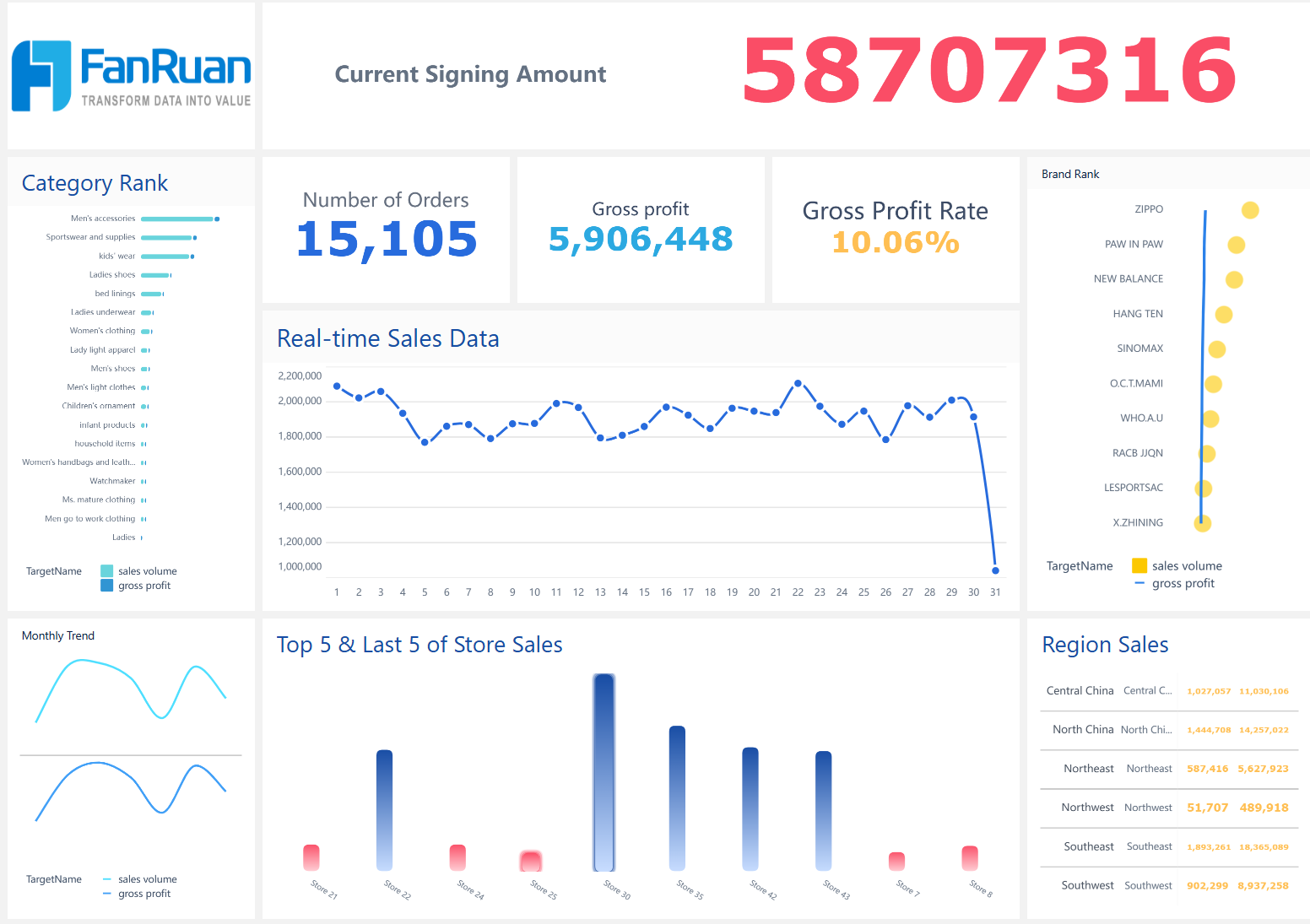
You need to understand how your online store performs at every stage. A sales and conversion dashboard gives you a clear view of your store’s health. You can track key performance indicators that show how well your marketing efforts turn visitors into buyers. Many marketing dashboard examples use tables to display important metrics. Here is a sample table you might see in a digital marketing dashboard:
| Metric | Description |
|---|---|
| Conversion rate | The percentage of visitors who make a purchase. Improving site design can increase this rate. |
| Customer acquisition cost | The total marketing spend divided by new customers acquired. Lowering CAC improves profitability. |
| Average order value | The average amount spent per purchase. Offering bundles can boost AOV. |
| Customer lifetime value | The total revenue a customer generates over time. Loyalty programs help maximize CLV. |
A marketing performance dashboard helps you spot trends and make quick decisions. You can use dashboard templates to save time and keep your reports consistent. Many businesses use an online marketing dashboard to compare sales channels and campaigns.
Tip: Review your dashboard daily to catch sudden changes in sales or conversion rates.
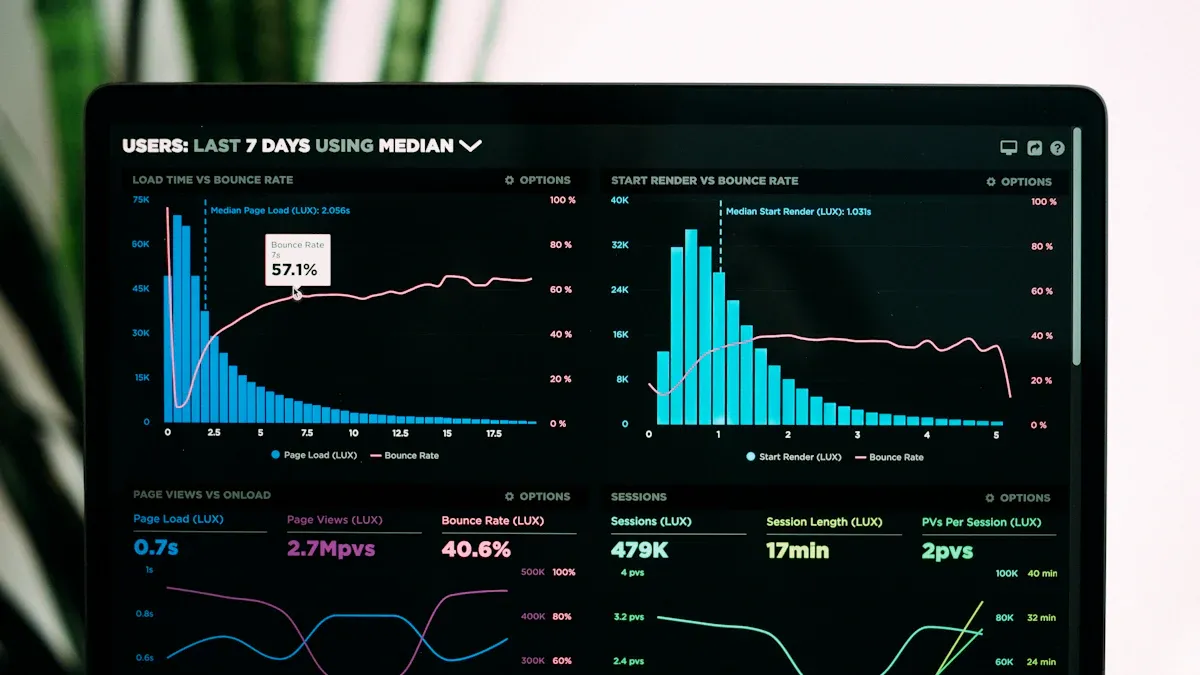
You want to know how customers move through your store. A customer journey dashboard tracks each step, from first visit to final purchase. This type of marketing dashboard shows where customers drop off and where they convert. You can use this data to improve your website and boost sales.
Many companies have seen big results by using marketing kpi dashboard tools. For example, a Dubai-based e-commerce brand increased conversions by 43% in just 90 days. They used CRM automation, such as cart-abandonment emails and targeted re-engagement campaigns, to guide customers back to their site.
You can use these examples to inspire your own dashboards. A performance dashboard helps you track progress and share insights with your team. When you use the right marketing dashboard, you make smarter decisions and grow your business.
You want to understand how your blog performs. A blog traffic dashboard gives you a clear view of your content’s reach and impact. You can track important metrics that show how readers interact with your posts. Using dashboard templates helps you organize this data for easy review.
Here is a table of key metrics you should include in your blog traffic dashboard:
| Metric Type | Description |
|---|---|
| Daily/weekly/monthly traffic | Overview of traffic over time |
| Channel analysis | Breakdown of traffic sources |
| Page performance | Detailed metrics on page efficiency |
| Real user journey tracking | Insights into user navigation |
| Device breakdowns | Traffic segmented by device type |
| Geographic analysis | Traffic distribution by location |
| New vs. returning visitor analysis | Understanding visitor behavior |
| UX Friction Index | Measure of user experience friction |
Tracking these metrics helps you spot trends and identify which content attracts the most visitors. You can use a performance dashboard to compare results over different periods. This approach lets you make quick changes to your content strategy. Many marketing dashboard examples use these metrics to guide decisions and improve results.
Tip: Review your dashboard regularly to catch sudden changes in traffic or user behavior.
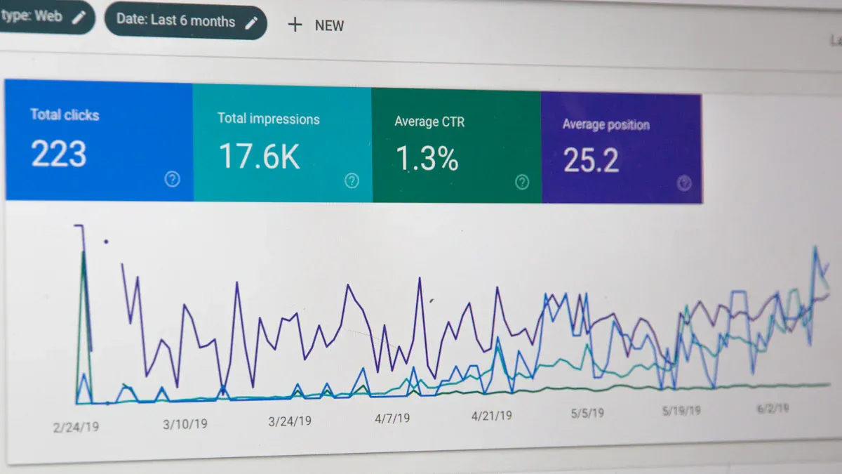
You need to know how your website ranks in search engines. An SEO analytics dashboard helps you monitor your progress and find areas to improve. This type of digital marketing dashboard lets you see which keywords drive the most traffic and which pages perform best. You can also track backlinks, page speed, and technical SEO issues.
SEO analytics dashboards give you the tools to make informed decisions. You can identify what works and adjust your strategy to boost organic search performance. Teams use these dashboards to optimize content and improve rankings. With an online marketing dashboard, you can track changes in real time and respond quickly to new trends.
Many companies use examples from top-performing brands to build their own dashboards. These dashboards help you focus on the most important metrics and avoid information overload. When you use a marketing dashboard, you turn data into action and drive better results for your business.
When you build a marketing dashboard, you want a tool that helps you make smart decisions quickly. Power BI and FineBI are two popular choices for marketing teams. Each platform offers strong features, but they serve different needs.
Power BI marketing dashboard gives you deep integration with Microsoft products. You can connect data from Excel, SharePoint, and other Microsoft tools. Many companies use Power BI marketing dashboard to create interactive reports and visualizations. You get access to dashboard templates that make setup easy. Power BI works well for teams that already use Microsoft software.
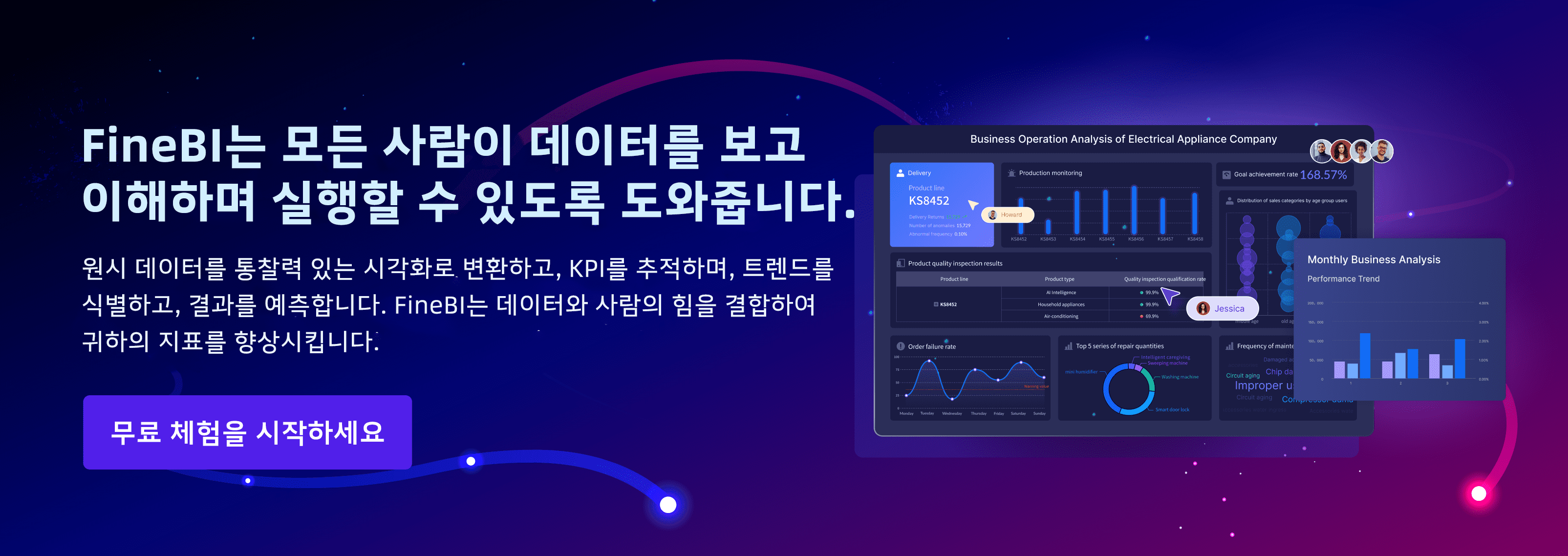
FineBI stands out with its self-service analytics. You can explore data without waiting for IT support. FineBI offers real-time insights, so you see changes as they happen. The platform connects to many data sources, including big data platforms and cloud services. You can use FineBI to combine data from sales, social media, and e-commerce channels. This helps you create marketing dashboard examples that show a complete view of your campaigns.
FineBI’s advanced data integration lets you track customer journeys across multiple touchpoints. You can set up alerts for key metrics and share dashboards with your team. The platform supports collaboration, so you work together to solve problems. FineBI makes it easy to customize dashboard templates for your business needs.
Note: FineBI helps you spot trends and respond to market changes faster than traditional tools.
You can use FineBI to build dashboards for many marketing scenarios. Here are some examples:
The table below shows how FineBI supports marketing teams:
| Feature | Benefit |
|---|---|
| Self-service analytics | Explore data independently |
| Real-time insights | Make decisions with up-to-date metrics |
| Data integration | Combine data from many sources |
| Collaboration tools | Share dashboards and work as a team |
| Custom templates | Build dashboards for any marketing goal |
You can use these marketing dashboard examples to inspire your next campaign and improve results.
You want a marketing dashboard that helps you make smart decisions fast. FanRuan’s FineBI gives you self-service BI tools that let you explore and visualize your data right away. You do not need to wait for IT support. You can connect to many data sources and see real-time updates. This means you always have the latest insights for your campaigns. FineBI empowers you to act quickly and stay ahead of changes in the market.
To get started, follow these steps:
FineBI’s features make it easy to build dashboards that fit your needs. You can customize your views, set up alerts, and work together with your team. You get a complete picture of your marketing performance in one place.
You need to track the right metrics to measure your campaign’s success. The best marketing dashboard examples include these important metrics:
| Metric | Description |
|---|---|
| Return on Ad Spend (ROAS) | Tracks the profitability of ad campaigns. |
| Conversion Rate | Measures the effectiveness of driving user actions. |
| Click-through Rate (CTR) | Indicates how engaging ads or content are. |
| Revenue and AOV | Important for eCommerce dashboards to track sales. |
| Source/Medium Breakdown | Identifies which channels are most effective. |
| Customer Journey Metrics | Includes funnel steps, bounce rate, and time to conversion. |
You can also track:
Tracking these metrics helps you align your dashboards with your campaign goals and KPIs. You can use dashboard templates to save time and keep your reports consistent. When you follow these best practices, you make sure your dashboards support your marketing strategy.
Tip: Review your dashboards often. This helps you spot trends and make quick changes to improve your results.
You can boost your campaign results by learning from marketing dashboard examples. These examples help you see what works and inspire new ideas for your strategy. Try exploring solutions like Fanruan’s FineBI to build a marketing dashboard that gives you real-time insights. You should review your current tools and consider testing FineBI for your analytics needs. Actionable insights lead to better decisions and ongoing improvement in marketing.

작성자
Seongbin
FanRuan에서 재직하는 고급 데이터 분석가
관련 기사

ERP 대시보드에서 꼭 봐야 할 KPI 12가지: 재무·구매·재고·영업 한눈에 이해하기
기업이 데이터를 많이 가지고 있다고 해서 의사결정이 빨라지는 것은 아닙니다. 중요한 것은 지금 당장 판단과 행동으로 이어질 수 있는 핵심 지표를 $1 $1에서 어떻게 보여 주느냐 입니다. 특히 재무, 구매, $1, 영업 데이터가 각각 따로 흩어져 있으면 문제를 발견하더라도 원인을 정확히 짚기 어렵습니다. 이 글에서는 $1 $1 에서 반드시 확인해야 할 $1 12가지를 재무·구매·$1·영업 관
Seongbin
2026년 4월 19일

CRM 대시보드란? 초보자가 꼭 알아야 할 핵심 지표와 구성 요소 7가지
고객 정보가 쌓일수록 중요한 것은 단순한 데이터 보관이 아니라, 지금 어떤 고객이 들어오고 있고, 영업은 어디까지 진행됐으며, 어떤 고객이 이탈할 가능성이 있는지 한눈에 파악하는 것 입니다. 이때 가장 강력한 도구가 바로 crm $1 입니다. 초보자에게 crm $1는 다소 복잡해 보일 수 있습니다. 하지만 핵심만 이해하면 생각보다 어렵지 않습니다. 잘 설계된 crm $1는 숫자를 보여주는 화
Seongbin
2026년 4월 16일
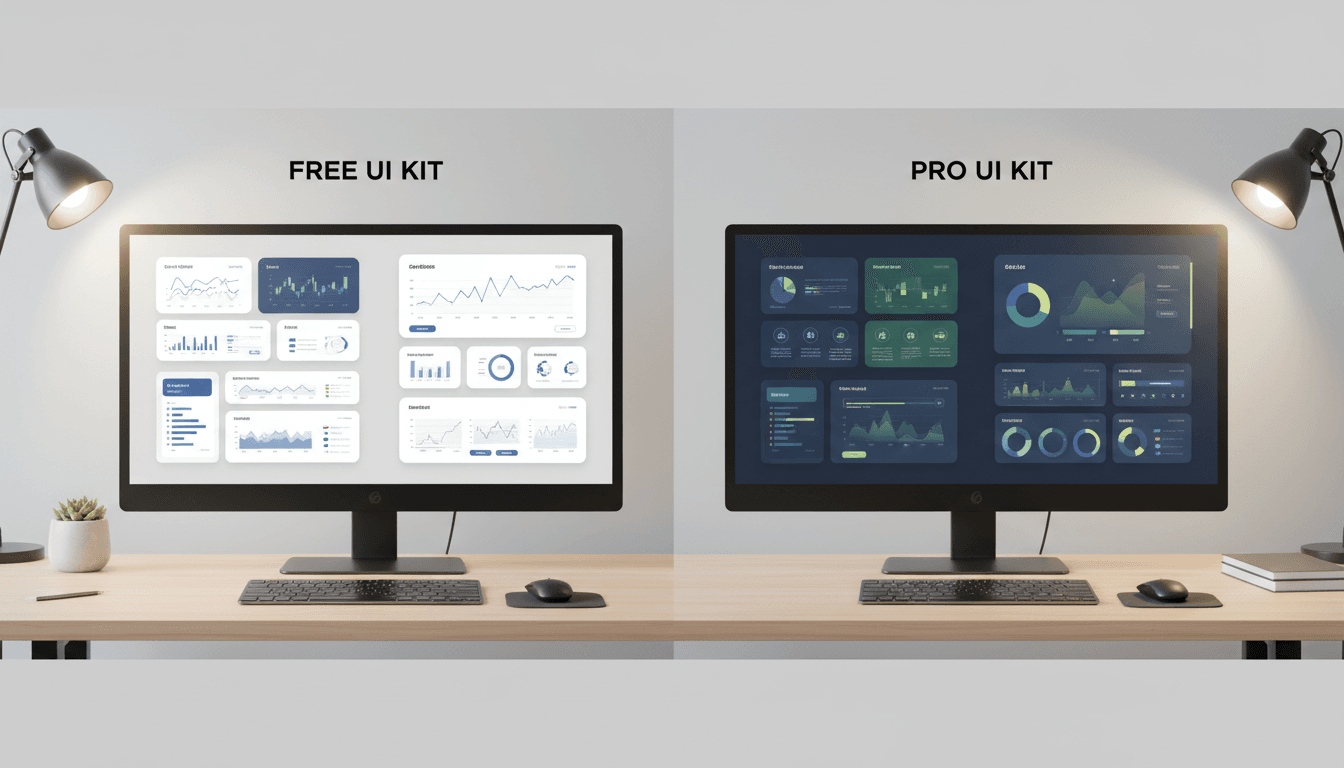
무료 vs 유료 Dashboard UI Kit 비교: 초기 비용보다 중요한 dashboard ui 평가 기준 7가지
$1 ui를 고를 때 많은 팀이 가장 먼저 보는 것은 가격입니다. 하지만 실제 프로젝트에서는 무료인지 유료인지보다, 그 $1 ui가 우리 서비스에 얼마나 잘 맞고 오래 버틸 수 있는지 가 더 중요합니다. 처음엔 무료 템플릿으로 빠르게 시작하는 것이 합리적으로 보여도, 커스터마이징과 개발 반영, 운영 중 수정 비용까지 합치면 오히려 더 비싸질 수 있습니다. 반대로 유료 $1 ui kit도 무조
Seongbin
2026년 4월 15일


