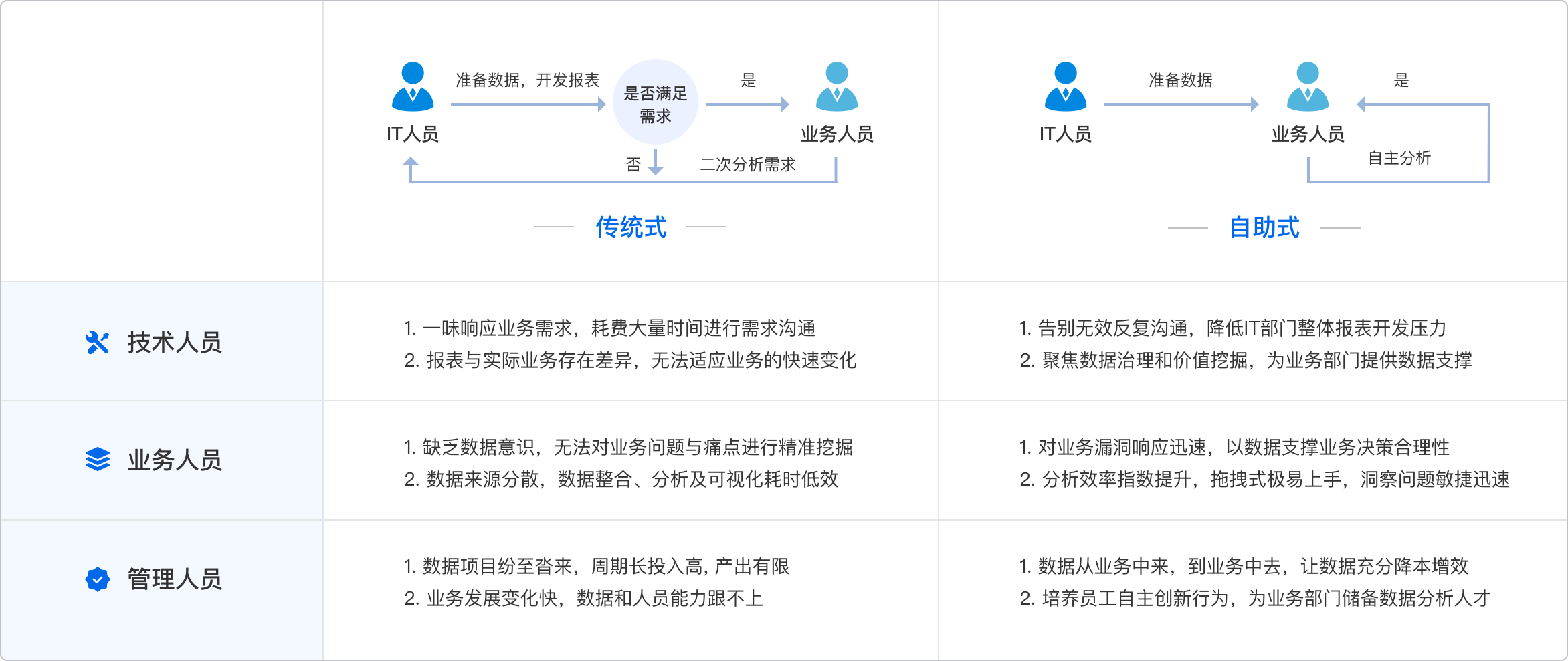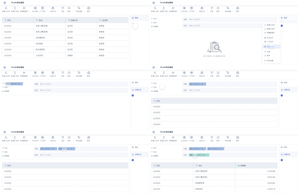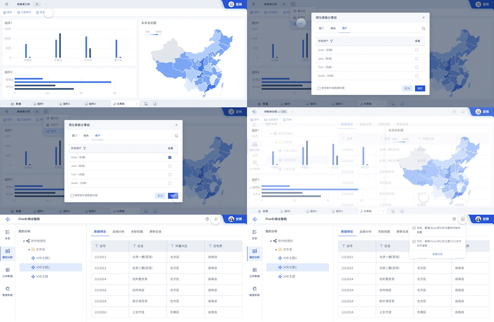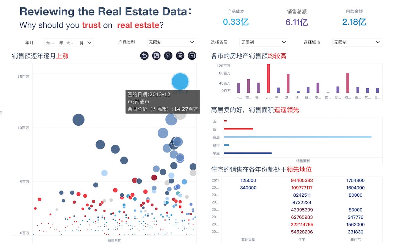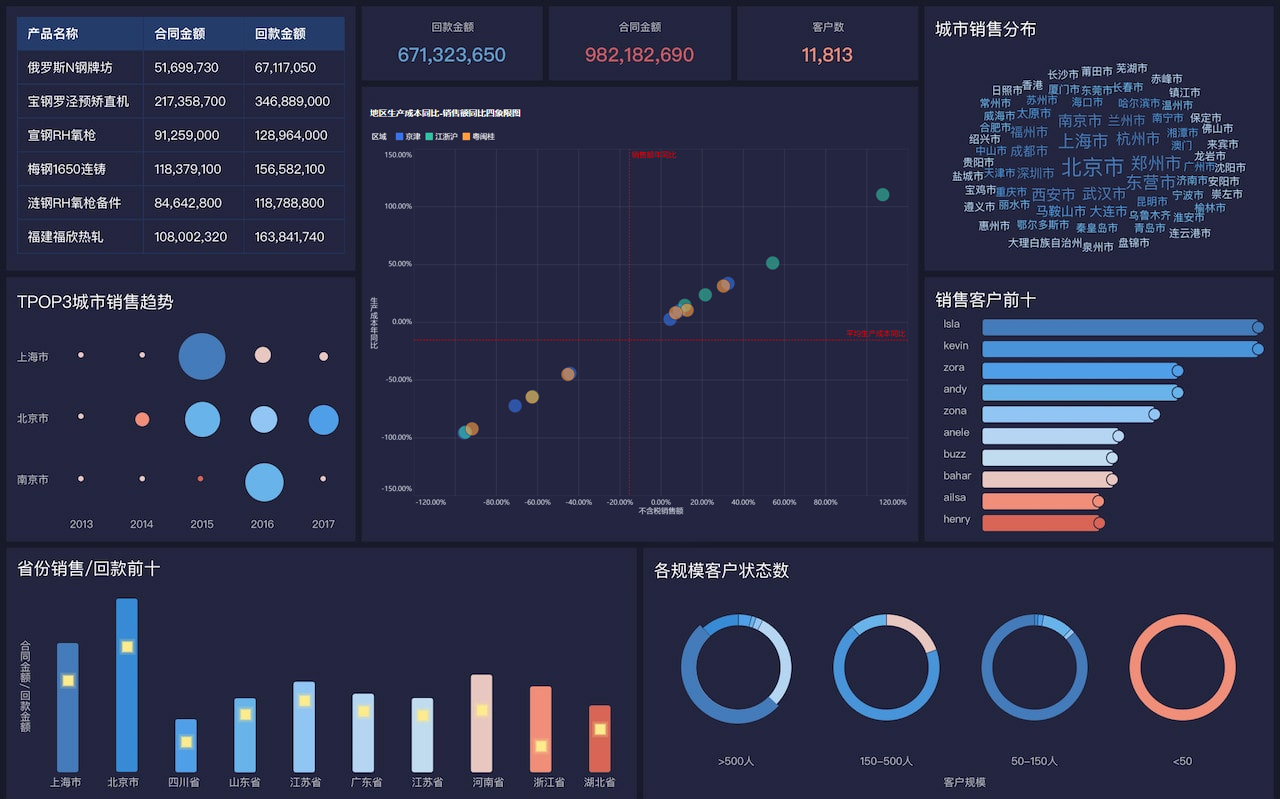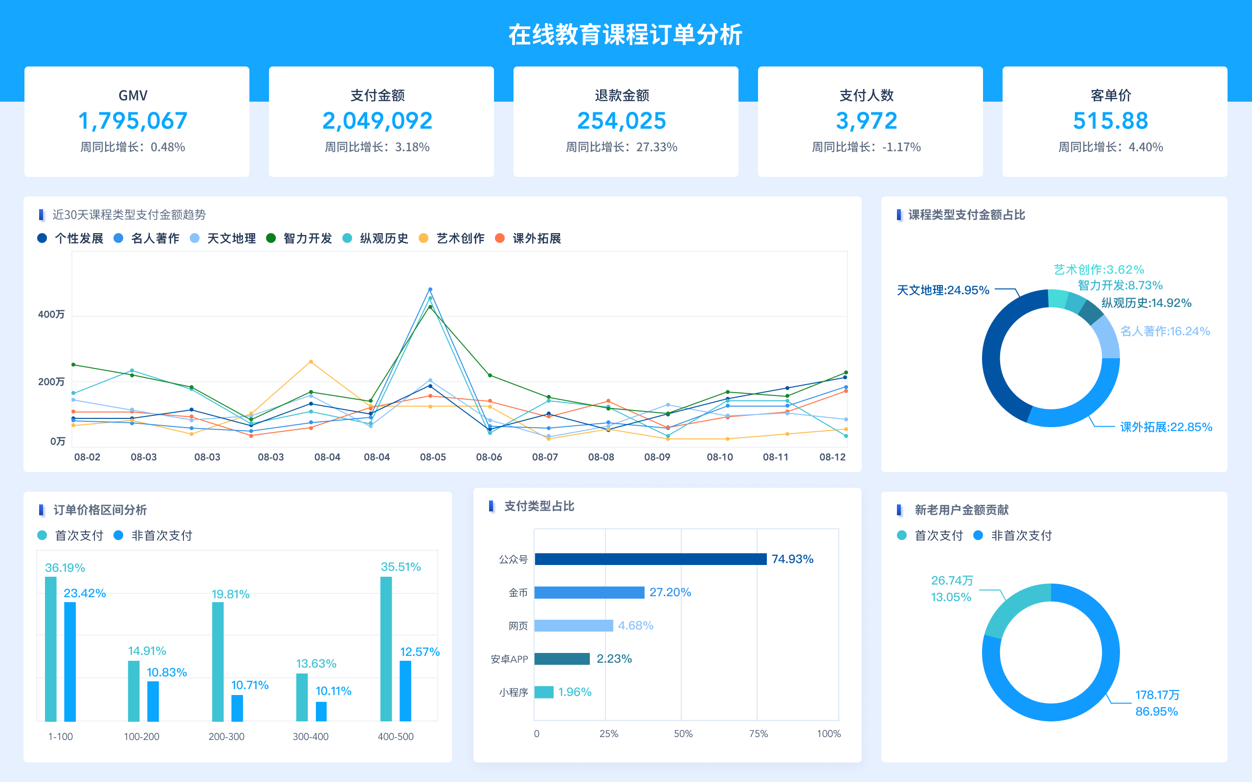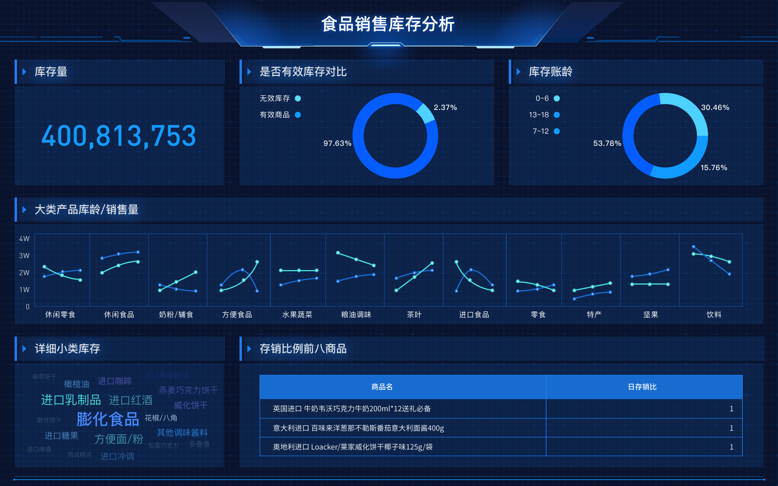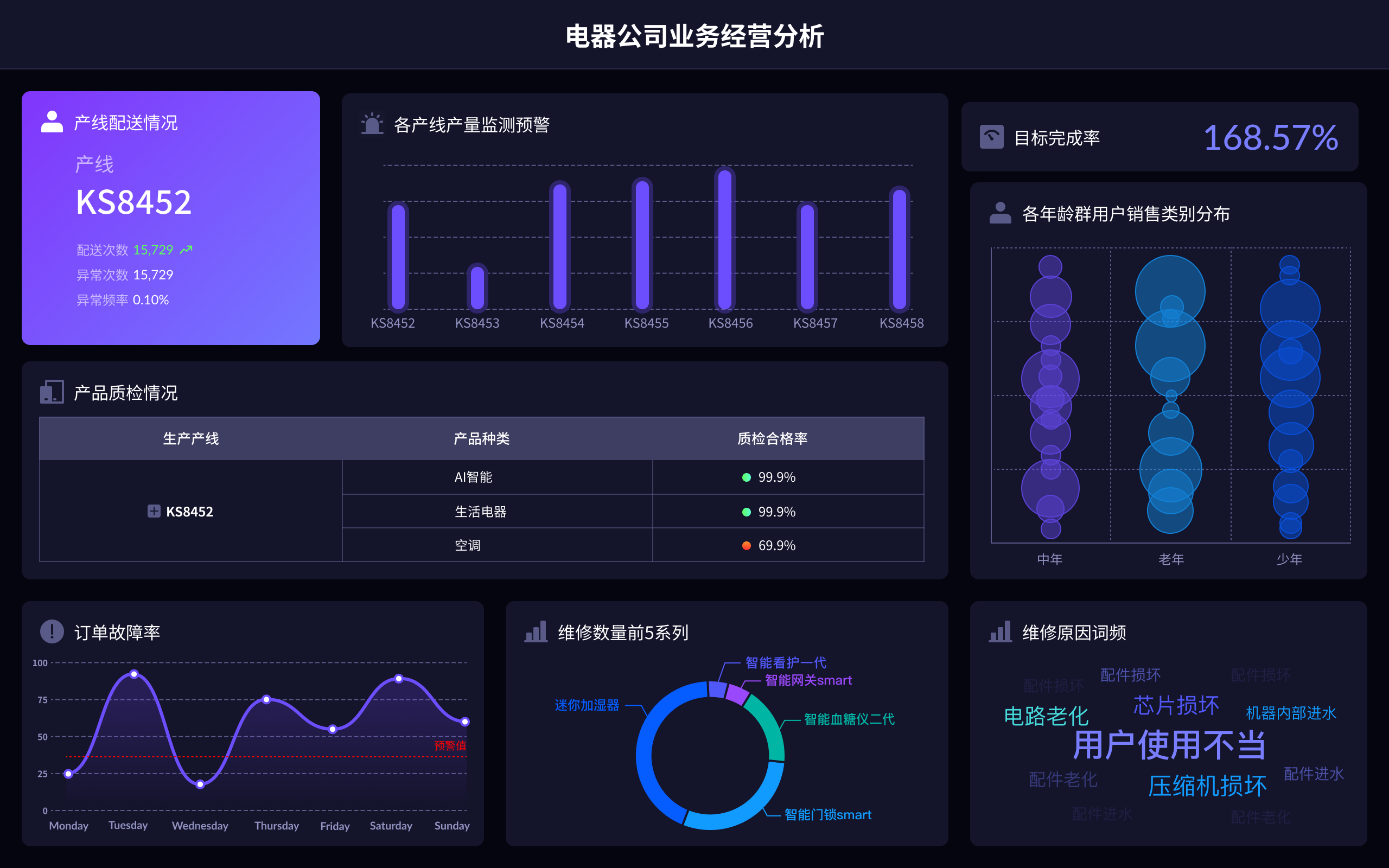
图文报表工具的英文使用方法包括:选择合适的工具、导入数据源、设计报表布局、添加图表和图像、调整格式和样式、预览和导出报表。在这些步骤中,选择合适的工具至关重要,因为不同工具提供的功能和使用体验各不相同。以FineReport为例,它是一款强大的报表工具,支持多种数据源接入,能够灵活设计报表布局,并提供丰富的图表类型和格式选项。通过FineReport,用户可以轻松创建专业的图文报表,满足多样化的业务需求。
一、选择合适的工具
选择合适的图文报表工具是创建高质量报表的第一步。市面上有许多报表工具可供选择,其中FineReport和FineVis是帆软旗下的两款优秀产品。FineReport专注于传统报表设计,提供丰富的数据处理和展示功能,非常适合企业级应用。而FineVis则专注于数据可视化,提供直观的图表和仪表盘设计功能,更加适合需要快速展示数据的场景。这两款工具都拥有强大的功能和灵活的设计选项,用户可以根据具体需求选择合适的工具。
二、导入数据源
在选择好工具后,下一步是导入数据源。FineReport和FineVis都支持多种数据源类型,包括数据库、Excel、CSV等。用户可以通过简单的配置连接到数据源,并选择需要展示的数据表或视图。在导入数据源时,需要注意数据的完整性和准确性,确保报表能够准确反映业务情况。此外,还可以通过数据预处理功能,对数据进行清洗和转换,以便更好地展示。
三、设计报表布局
设计报表布局是图文报表制作的重要环节。FineReport和FineVis都提供了灵活的布局设计功能,用户可以通过拖拽组件、自定义样式等方式,快速设计出符合需求的报表布局。在设计布局时,需要考虑报表的结构和逻辑,确保数据展示清晰、易于理解。同时,还可以通过添加分组、分页等功能,提高报表的可读性和用户体验。
四、添加图表和图像
图表和图像是图文报表的核心元素,能够直观展示数据趋势和关系。FineReport和FineVis都提供了丰富的图表类型,包括柱状图、折线图、饼图、仪表盘等,用户可以根据数据特点选择合适的图表类型。此外,还可以通过添加图片、图标等元素,增强报表的视觉效果。在添加图表和图像时,需要注意图表的配色、标签和注释,确保数据展示准确、清晰。
五、调整格式和样式
调整格式和样式是提升报表专业度的重要步骤。FineReport和FineVis都提供了丰富的格式和样式调整选项,用户可以通过修改字体、颜色、边框等方式,优化报表的视觉效果。在调整格式和样式时,需要考虑整体的协调性和一致性,确保报表美观、易读。此外,还可以通过设置条件格式、高亮显示等功能,突出重点数据,提升报表的实用性。
六、预览和导出报表
在完成报表设计后,用户需要对报表进行预览和导出。FineReport和FineVis都提供了预览功能,用户可以在导出前查看报表效果,确保没有错误和遗漏。预览过程中,可以对报表进行微调,优化展示效果。导出功能支持多种格式,包括PDF、Excel、图片等,用户可以根据需要选择合适的导出格式,方便报表的分享和存档。
七、FineReport和FineVis的优势
FineReport和FineVis作为帆软旗下的两款报表工具,各自有着独特的优势。FineReport在数据处理和报表设计方面具有强大的功能,适合复杂业务报表的设计和展示。它支持多种数据源接入,提供丰富的数据处理和分析功能,能够满足企业级报表需求。FineVis则注重数据可视化,提供直观的图表和仪表盘设计功能,适合快速展示数据和趋势分析。两者结合使用,可以充分发挥各自优势,实现数据的全面展示和分析。
八、应用场景
图文报表工具在各行各业都有广泛应用。在金融行业,图文报表可以用于展示财务数据、风险分析等,帮助决策者快速了解公司财务状况。在制造业,图文报表可以用于生产数据监控、质量管理等,提高生产效率和质量控制。在零售业,图文报表可以用于销售数据分析、库存管理等,帮助企业优化销售策略和库存管理。无论哪个行业,图文报表工具都可以帮助企业更好地管理和展示数据,提升工作效率和决策质量。
九、使用技巧
在使用图文报表工具时,有一些实用的技巧可以提升报表制作效率和效果。首先,合理选择图表类型,根据数据特点选择合适的图表,确保数据展示直观、准确。其次,注意报表的布局和结构,通过分组、分页等方式提高报表的可读性。再次,充分利用条件格式、高亮显示等功能,突出重点数据,提升报表的实用性。此外,可以通过学习和借鉴优秀报表案例,不断提升自己的报表设计能力。
十、学习资源
为了更好地掌握图文报表工具的使用方法,用户可以利用各种学习资源进行学习和提升。FineReport和FineVis的官方网站(FineReport官网: https://s.fanruan.com/ryhzq ,FineVis官网: https://s.fanruan.com/7z296 )提供了丰富的教程、文档和案例,用户可以通过这些资源快速入门。此外,用户还可以参加相关培训课程、加入用户社区,与其他用户交流经验和心得,不断提升自己的技能和水平。
通过以上方法和技巧,用户可以充分发挥图文报表工具的优势,制作出高质量的图文报表,满足各种业务需求。无论是FineReport还是FineVis,都可以帮助用户实现数据的全面展示和分析,提升工作效率和决策质量。
相关问答FAQs:
1. How to Create Visual Reports Using Graphical Reporting Tools?
Graphical reporting tools are essential for creating visual reports that present data in a clear and easy-to-understand format. To use these tools effectively, you can follow these steps:
-
Select the Right Tool: There are various graphical reporting tools available, such as Tableau, Power BI, and Google Data Studio. Choose the tool that best suits your data visualization needs.
-
Import Data: Most graphical reporting tools allow you to import data from different sources like Excel, CSV files, databases, or cloud services. Upload your data into the tool to get started.
-
Create Visualizations: Once the data is imported, you can start creating visualizations such as bar charts, pie charts, line graphs, heat maps, and more. Customize the visualizations based on your data and the story you want to tell.
-
Add Filters and Interactivity: To make your reports more dynamic, add filters and interactivity options. This allows users to explore the data further and gain insights by interacting with the visualizations.
-
Design Layout: Arrange the visualizations on the report canvas in a logical and visually appealing manner. Consider the flow of information and make sure the report is easy to navigate.
-
Apply Formatting: Customize the colors, fonts, labels, and other design elements to enhance the visual appeal of the report. Consistent formatting helps in creating a professional-looking report.
-
Share and Collaborate: Once the report is ready, you can share it with stakeholders by exporting it as a PDF, image, or interactive dashboard. Some tools also allow for real-time collaboration, where multiple users can work on the report simultaneously.
-
Iterate and Improve: Review the feedback on your visual reports and continuously iterate to improve the clarity and effectiveness of the visualizations. Experiment with different chart types and layouts to find the best way to present your data.
By following these steps, you can effectively use graphical reporting tools to create visually engaging reports that convey insights and drive informed decision-making.
2. How Can I Utilize Image-Based Reporting Tools for Data Visualization?
Image-based reporting tools offer a unique way to present data through pictures, icons, and graphics. Here are some tips on how to effectively utilize these tools for data visualization:
-
Choose Relevant Images: Select images that are relevant to the data you are presenting. Use icons, symbols, and illustrations that help convey the message and make the data more engaging.
-
Create Infographics: Infographics are a popular form of image-based reporting that combines text, images, and data visualizations to tell a story. Use infographic templates or design tools to create visually appealing infographics that communicate complex information in a simple way.
-
Use Heatmaps and Geographic Visualizations: Heatmaps and geographic visualizations are powerful tools for showing spatial data and patterns. Use these visualizations to display data on maps, highlight trends, and uncover insights based on location.
-
Incorporate Data Icons and Symbols: Data icons and symbols can help in quickly communicating key data points or trends. Use icons like arrows, checkmarks, dollar signs, and other symbols to emphasize important information in your reports.
-
Design Engaging Dashboards: Image-based reporting tools allow you to create interactive dashboards with clickable icons, buttons, and images. Design engaging dashboards that enable users to explore the data visually and interact with different elements.
-
Optimize for Mobile Viewing: With the increasing use of mobile devices, ensure that your image-based reports are optimized for mobile viewing. Use responsive design techniques to make sure the reports look good on various screen sizes.
-
Tell a Story with Images: Instead of overwhelming the audience with data, use images to tell a story and guide the viewers through the information. Combine images with text and visuals to create a narrative that is easy to follow and understand.
By leveraging image-based reporting tools effectively, you can create visually appealing reports that capture the audience's attention and make data more accessible and engaging.
3. What Are the Benefits of Using Graphical Reports in Data Analysis and Decision-Making?
Graphical reports play a crucial role in data analysis and decision-making by presenting information in a visual format that is easy to interpret and analyze. Here are some key benefits of using graphical reports:
-
Improved Data Understanding: Visual reports help in presenting complex data in a simplified and intuitive manner. Charts, graphs, and diagrams make it easier to understand trends, patterns, and relationships within the data.
-
Quick Insights: Graphical reports enable users to quickly grasp key insights and trends without having to sift through rows of numbers or text. Visualizations highlight the most important information, allowing decision-makers to make informed choices efficiently.
-
Enhanced Communication: Visual reports are more engaging and memorable than text-based reports. By using charts, graphs, and images, you can effectively communicate data findings to stakeholders and team members, fostering better understanding and collaboration.
-
Identifying Patterns and Anomalies: Graphical reports make it easier to identify patterns, outliers, and anomalies in the data. By visualizing data in different ways, you can uncover hidden insights that may not be apparent in raw data tables.
-
Facilitates Decision-Making: Visual reports provide decision-makers with a clear overview of the data, enabling them to make informed decisions quickly. By presenting data visually, graphical reports empower users to take action based on data-driven insights.
-
Data Exploration and Discovery: Interactive graphical reports allow users to explore the data dynamically by filtering, drilling down, and interacting with visualizations. This promotes data discovery and facilitates a deeper understanding of the information presented.
-
Track Progress and Performance: Graphical reports are effective for tracking progress, performance metrics, and key performance indicators (KPIs). By visualizing trends over time, stakeholders can monitor performance and identify areas for improvement.
-
Enhanced Presentations: When presenting findings or reports to an audience, graphical reports are more visually appealing and engaging than text-heavy presentations. Visualizations help in capturing the audience's attention and conveying information effectively.
By leveraging the benefits of graphical reports in data analysis and decision-making, organizations can streamline processes, improve communication, and drive better outcomes based on data-driven insights.
本文内容通过AI工具匹配关键字智能整合而成,仅供参考,帆软不对内容的真实、准确或完整作任何形式的承诺。具体产品功能请以帆软官方帮助文档为准,或联系您的对接销售进行咨询。如有其他问题,您可以通过联系blog@fanruan.com进行反馈,帆软收到您的反馈后将及时答复和处理。


