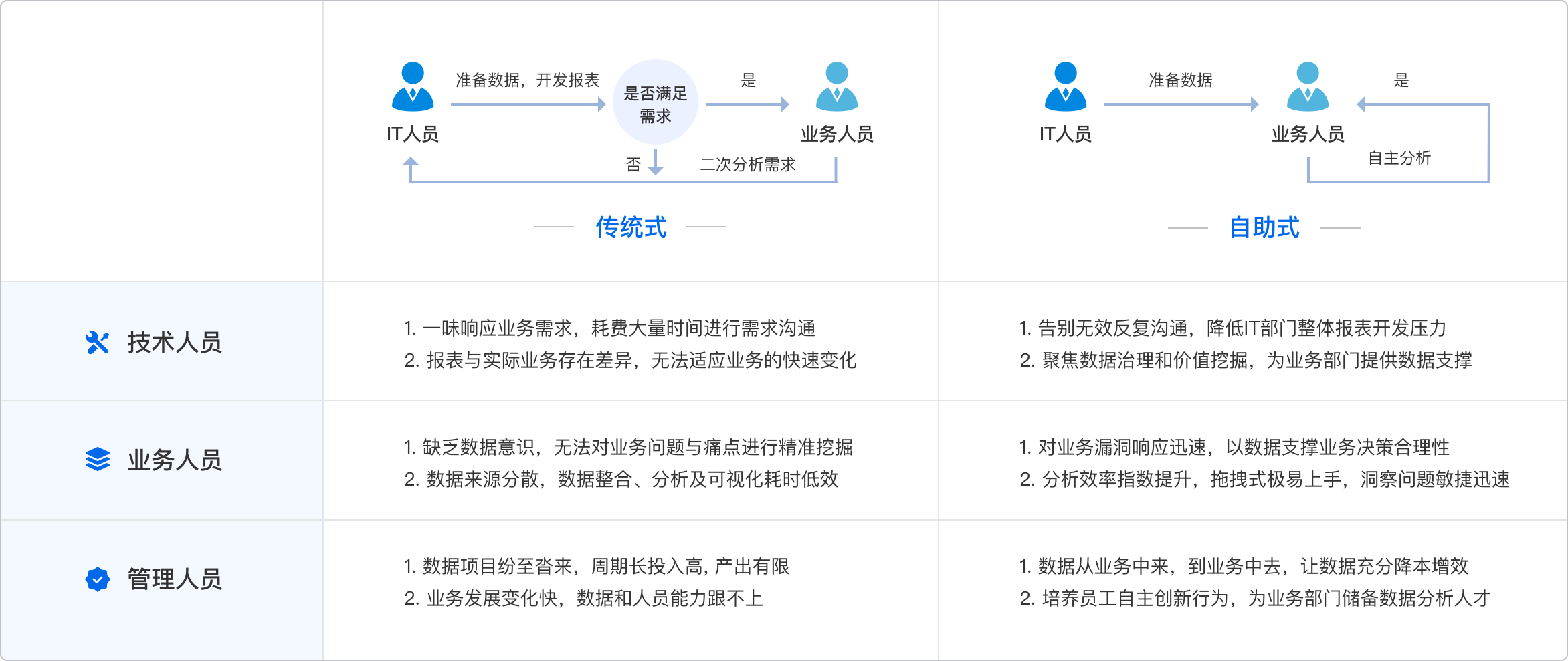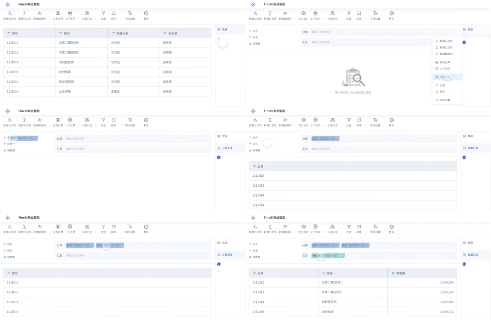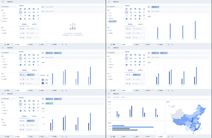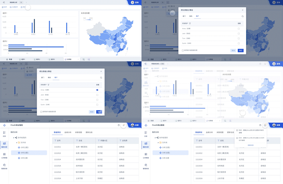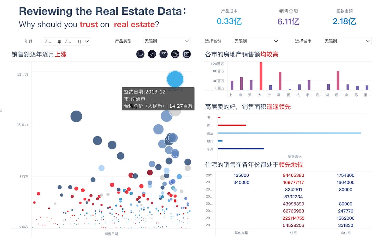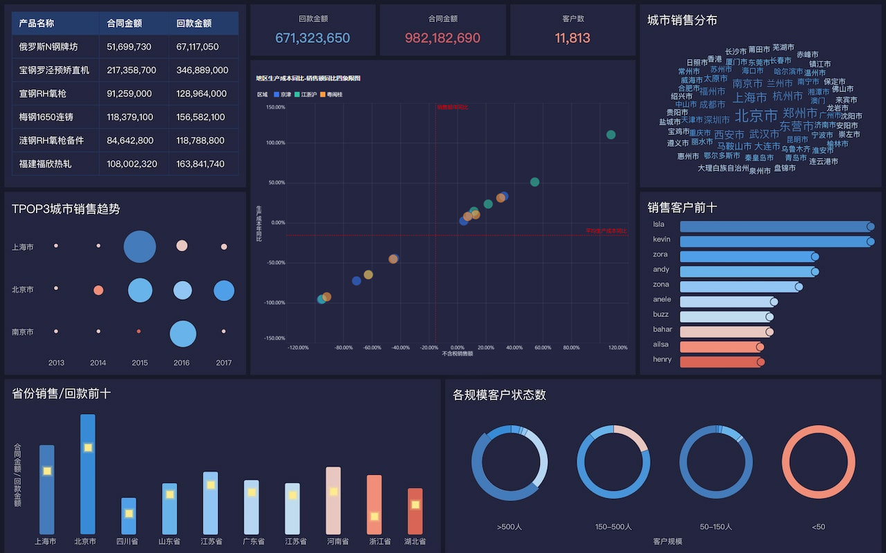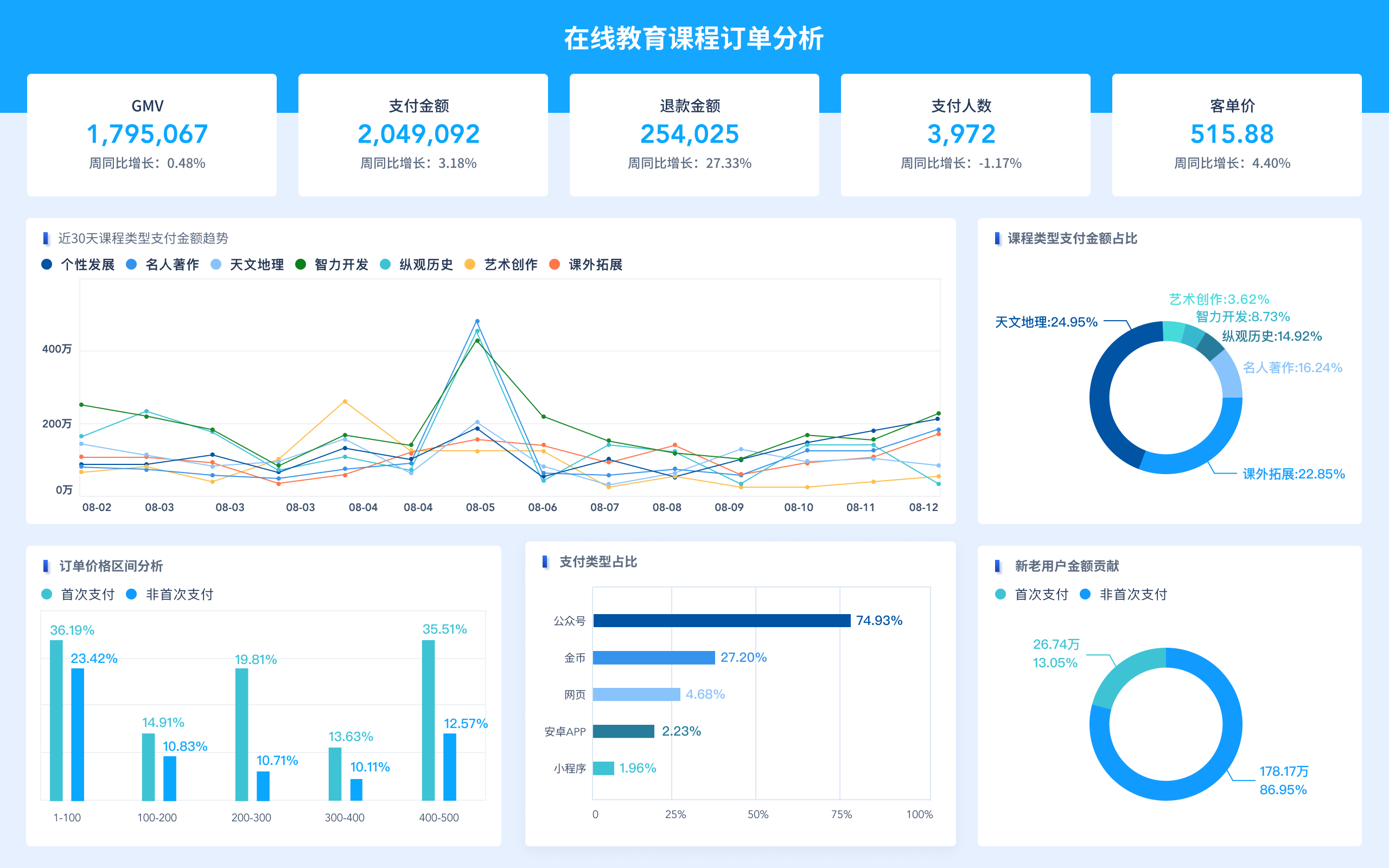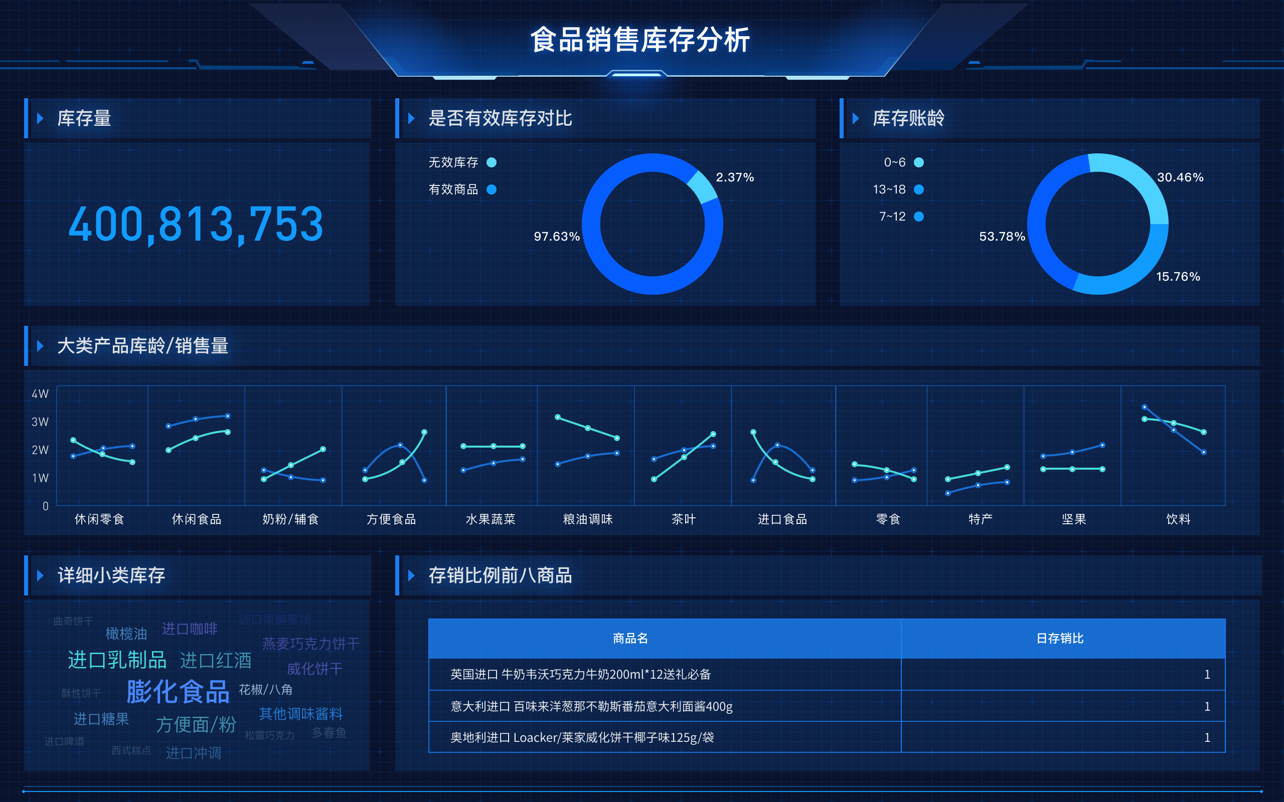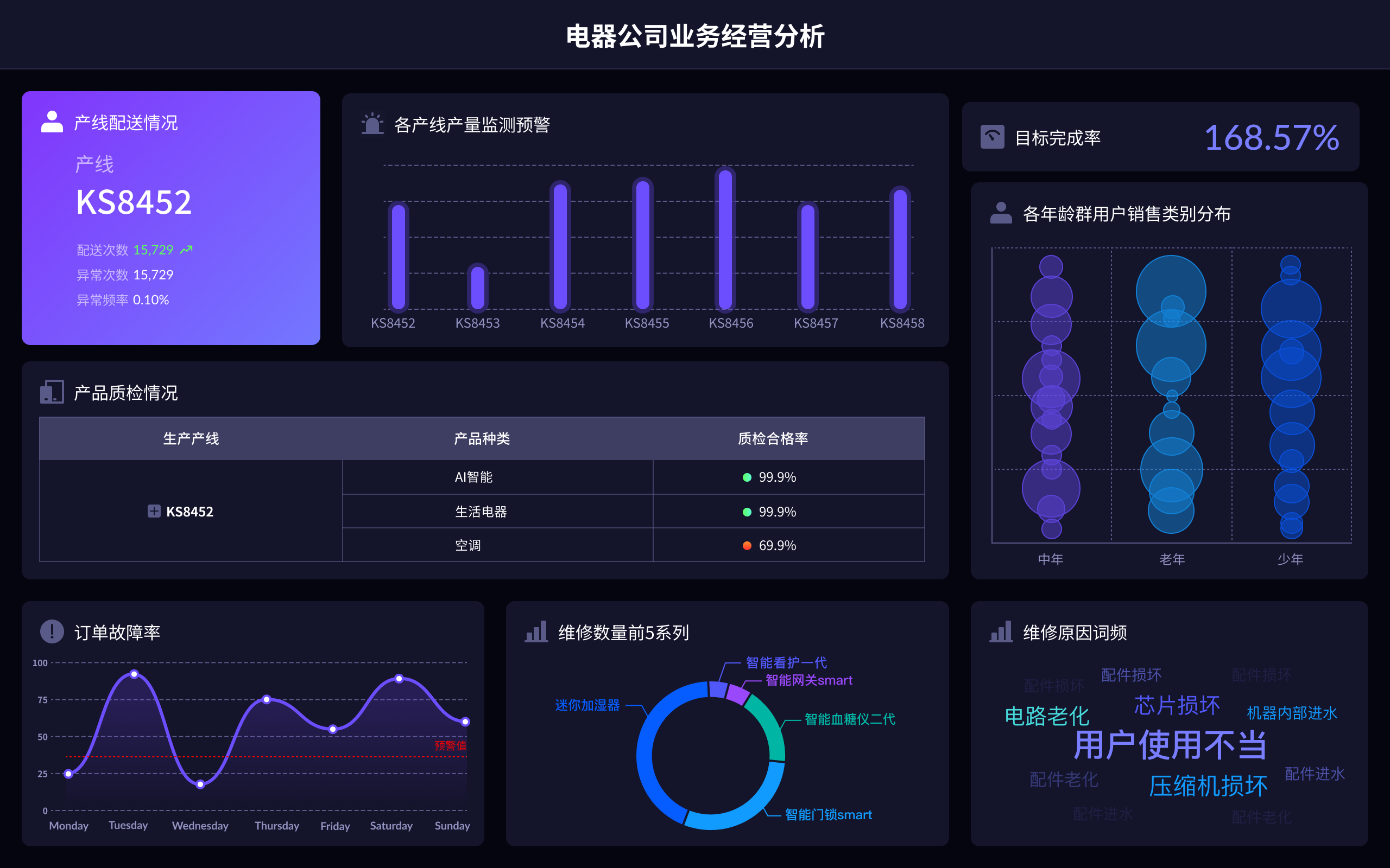
The basic features of data visualization include clarity, accuracy, efficiency, interactivity, and aesthetics. Clarity ensures that the data is easily understood by the audience. Accuracy guarantees that the data is represented correctly without distortion. Efficiency focuses on quickly conveying the necessary information. Interactivity allows users to engage with the data, often through tools like dashboards and filters. Aesthetics make the visualization visually appealing, which can enhance user engagement. For instance, clarity is crucial because it ensures that the audience can grasp the insights being presented without confusion. Clear visualizations use straightforward charts and avoid unnecessary complexity, making it easier for users to interpret the data accurately and make informed decisions.
I. CLARITY
Clarity in data visualization is about making the visual representation of data easy to understand for the viewer. This involves selecting the right type of chart or graph for the data being presented. For example, bar charts are excellent for comparing quantities, while line graphs are ideal for showing trends over time. Ensuring clarity also means avoiding clutter and unnecessary details that could distract from the main message. The use of labels, legends, and annotations can help provide context and make the data more understandable. Clarity is crucial because it directly impacts the effectiveness of the data communication.
II. ACCURACY
Accuracy in data visualization is about correctly representing the data without any form of distortion. This involves using proper scales, ensuring that the visual elements proportionally represent the data values, and avoiding misleading visualizations. For instance, a truncated y-axis can exaggerate differences between data points, leading to incorrect interpretations. Ensuring accuracy also means verifying the data sources and methods used to gather and present the data. Accurate data visualizations build trust with the audience and ensure that the insights drawn are reliable.
III. EFFICIENCY
Efficiency in data visualization refers to the ability to quickly convey the intended message to the audience. This involves designing visualizations that are not only clear and accurate but also concise. Efficient visualizations use the minimum amount of space and elements necessary to convey the information. This can be achieved by focusing on the most important data points and using visual techniques such as color coding and highlighting to draw attention to key areas. Efficiency is important because it helps the audience grasp the insights quickly, which is particularly valuable in fast-paced decision-making environments.
IV. INTERACTIVITY
Interactivity in data visualization allows users to engage with the data in a meaningful way. This can include features like zooming, filtering, and hovering over data points to reveal more information. Interactive visualizations are often implemented through dashboards that allow users to explore the data from different angles and drill down into specific details. Interactivity enhances the user experience by making the data exploration process more dynamic and personalized. Tools like FineBI, FineReport, and FineVis are excellent for creating interactive data visualizations that enable users to interact with the data in real-time.
V. AESTHETICS
Aesthetics in data visualization is about making the visualization visually appealing. This includes the use of color schemes, typography, and layout design. An aesthetically pleasing visualization can capture the audience’s attention and make the data more engaging. However, aesthetics should not come at the cost of clarity and accuracy. The design should enhance the data’s readability and not distract from the information being presented. Good aesthetics can improve user engagement and make the data more memorable.
VI. TOOLS FOR DATA VISUALIZATION
There are several tools available for creating effective data visualizations. FineBI, FineReport, and FineVis are powerful tools that offer a range of features for building interactive and aesthetically pleasing visualizations. FineBI is known for its robust data analysis capabilities and interactive dashboards. FineReport excels in creating detailed reports with a high level of customization. FineVis focuses on advanced visualization techniques and is ideal for creating complex visualizations. These tools provide the necessary functionalities to ensure clarity, accuracy, efficiency, interactivity, and aesthetics in data visualization.
FineBI官网: https://s.fanruan.com/f459r
FineReport官网: https://s.fanruan.com/ryhzq
FineVis官网: https://s.fanruan.com/7z296
VII. APPLICATIONS IN BUSINESS
Data visualization plays a crucial role in various business applications. In marketing, it is used to analyze customer behavior, track campaign performance, and segment audiences. In finance, visualizations help in monitoring financial metrics, forecasting trends, and managing risks. Operations teams use data visualization to optimize supply chains, track production metrics, and improve process efficiencies. The ability to quickly interpret data through visualizations can significantly enhance decision-making processes across different business functions.
VIII. EDUCATION AND TRAINING
The principles of data visualization are not just limited to business but extend to education and training as well. Educational institutions use data visualization to track student performance, identify trends in academic achievement, and allocate resources effectively. Training programs often include modules on data visualization to equip professionals with the skills needed to analyze and present data effectively. Understanding and applying data visualization techniques is becoming increasingly important in various fields, making it a valuable skill set to develop.
IX. FUTURE TRENDS IN DATA VISUALIZATION
The field of data visualization is continually evolving, with several trends shaping its future. Augmented reality (AR) and virtual reality (VR) are being explored for creating immersive data visualization experiences. The integration of artificial intelligence (AI) is enabling more sophisticated data analysis and visualization techniques. Real-time data visualization is becoming more prevalent, driven by the increasing availability of big data and the need for immediate insights. These trends are pushing the boundaries of what is possible with data visualization, making it an exciting area to watch.
In conclusion, the basic features of data visualization—clarity, accuracy, efficiency, interactivity, and aesthetics—are essential for effectively communicating data insights. Tools like FineBI, FineReport, and FineVis provide the functionalities needed to create powerful visualizations that enhance decision-making processes. As the field continues to evolve, staying updated with the latest trends and tools will be crucial for leveraging the full potential of data visualization.
相关问答FAQs:
What are the fundamental characteristics of data visualization?
Data visualization has several key features that make it an essential tool for understanding and interpreting data. Some of the basic characteristics of data visualization include:
1. Visual Representation: Data visualization involves representing data in visual formats such as charts, graphs, maps, and dashboards. Visual elements make it easier for users to grasp complex patterns and relationships within the data.
2. Simplification: One of the primary goals of data visualization is to simplify complex datasets and make them more accessible to a wider audience. By presenting information visually, data visualization helps in highlighting key insights and trends.
3. Interactivity: Many modern data visualization tools offer interactive features that allow users to explore data in more depth. Interactivity enables users to drill down into specific data points, filter information, and gain a more comprehensive understanding of the dataset.
4. Contextualization: Data visualization provides context to the data by placing it within a broader framework. By incorporating additional information, such as annotations, labels, and legends, data visualization helps in interpreting the data more effectively.
5. Scalability: Data visualization should be scalable to accommodate datasets of varying sizes. Whether visualizing a small dataset or big data, the visualization should be able to handle the volume of information without sacrificing performance or clarity.
6. Customization: Effective data visualization allows for customization to suit the specific needs of users. This includes the ability to choose different types of visualizations, colors, styles, and layouts to convey information in the most impactful way.
7. Real-time Updates: In some applications, data visualization needs to provide real-time updates as new data becomes available. This feature is crucial in dynamic environments where decisions need to be made quickly based on the most current information.
8. Accessibility: Data visualization should be accessible to a diverse audience, including individuals with disabilities. Ensuring that visualizations are compliant with accessibility standards makes the information available to a broader range of users.
By incorporating these fundamental characteristics into data visualization practices, organizations and individuals can effectively communicate insights, identify trends, and make informed decisions based on data-driven analysis.
本文内容通过AI工具匹配关键字智能整合而成,仅供参考,帆软不对内容的真实、准确或完整作任何形式的承诺。具体产品功能请以帆软官方帮助文档为准,或联系您的对接销售进行咨询。如有其他问题,您可以通过联系blog@fanruan.com进行反馈,帆软收到您的反馈后将及时答复和处理。


