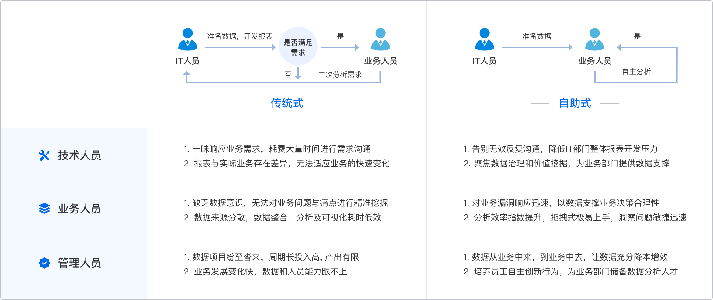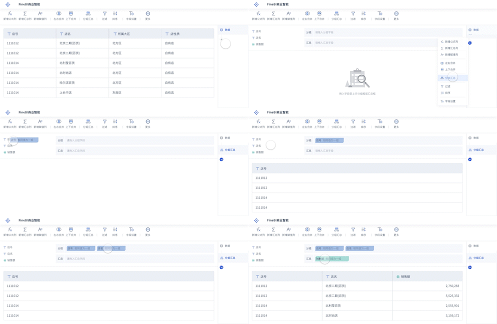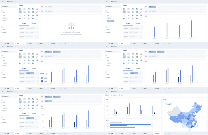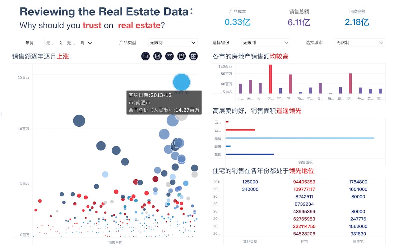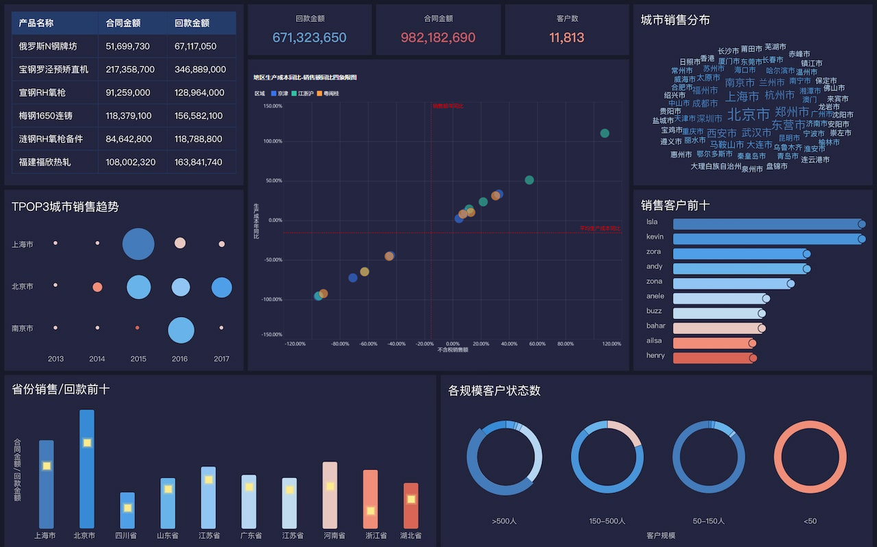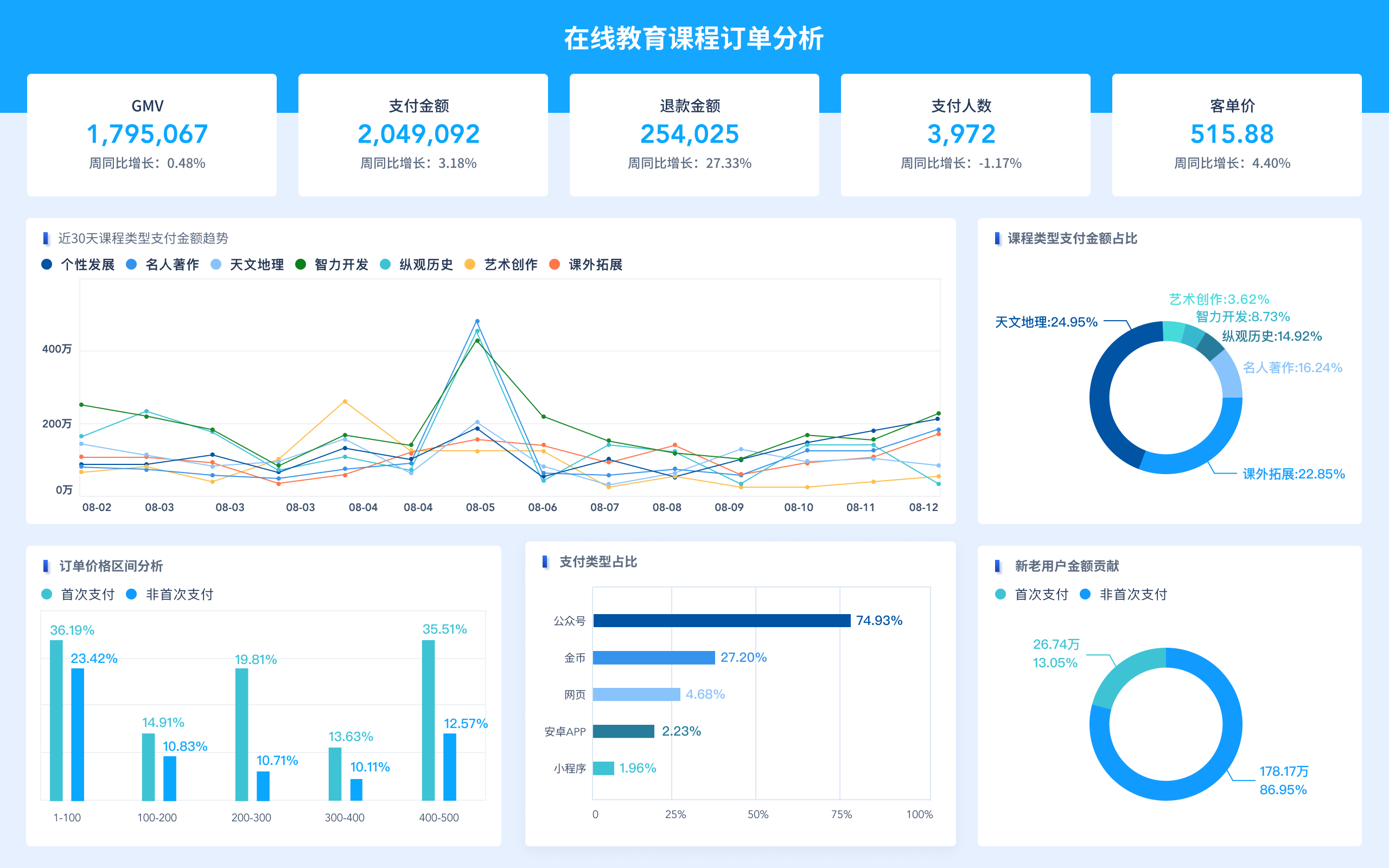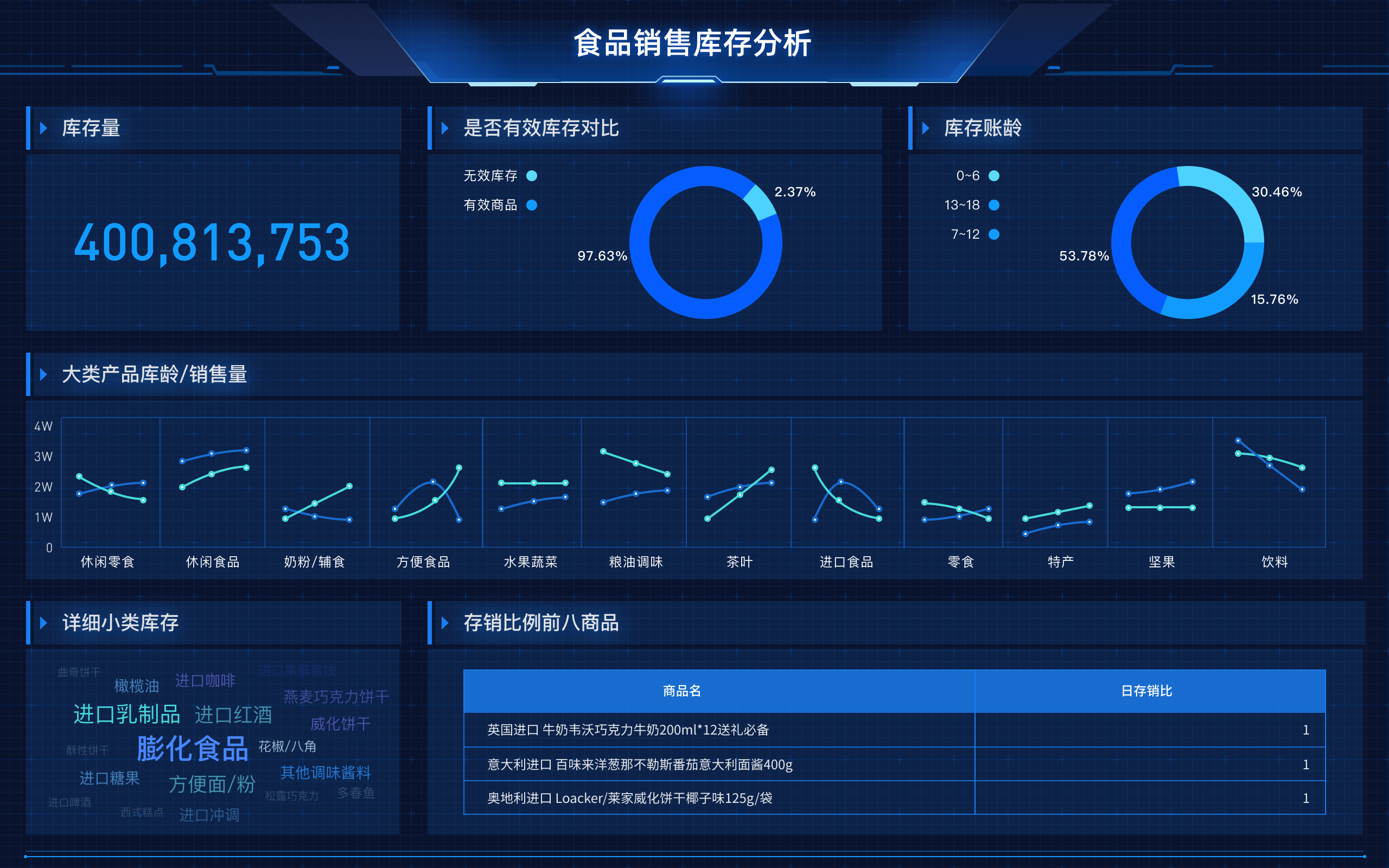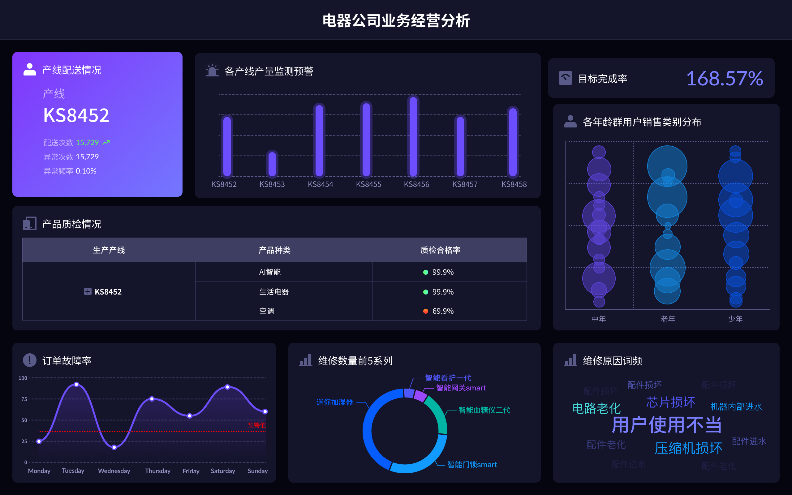
Data visualization design is the English term for 数据可视化设计. It encompasses creating visual representations of data to make the information easily understandable. Key aspects include choosing the right visualization types, ensuring clarity, using appropriate color schemes. Choosing the right visualization types is critical because it impacts how effectively the data communicates the intended message. For example, line charts are suitable for showing trends over time, while pie charts are best for displaying proportions. Ensuring clarity involves avoiding clutter and making sure the visualization is easy to read. Using appropriate color schemes helps in distinguishing different data points and making the visualization aesthetically pleasing.
I、CHOOSING THE RIGHT VISUALIZATION TYPES
Choosing the correct visualization type is paramount in data visualization design. Different types of data visualizations serve different purposes and can dramatically impact the user's ability to interpret the data correctly. For example, bar charts are highly effective for comparing different categories, whereas line charts excel at displaying trends over time. Scatter plots are ideal for identifying relationships between two variables, and heat maps can effectively show variations in data across a geographic area or a large matrix. Understanding the data's nature and the message you want to convey will guide you in selecting the most appropriate visualization type. Tools such as FineReport, FineBI, and FineVis offer a variety of visualization options that can be tailored to specific needs. FineReport, for instance, provides comprehensive charting capabilities, while FineBI excels in offering interactive dashboards. FineVis, on the other hand, focuses on creating visually stunning and highly interactive visualizations.
II、ENSURING CLARITY
Clarity in data visualization design is crucial for effective communication. Avoiding clutter is one of the primary ways to ensure clarity. This means removing any unnecessary elements that do not add value to the visualization. For instance, too many grid lines, overly complex legends, or excessive use of colors can distract the viewer and obscure the main message. Consistent labeling is another essential factor; labels should be clear, concise, and placed in a way that they do not overlap or create confusion. Fine-tuning the scale of your axes can also make a significant difference in how easily the data can be interpreted. Tools like FineReport and FineBI offer features to help you maintain clarity. FineReport, for example, allows for the customization of axis scales and labels, while FineBI provides options for interactive filtering to reduce clutter dynamically.
III、USING APPROPRIATE COLOR SCHEMES
Color plays a significant role in data visualization design. The right color scheme can make a visualization more intuitive and engaging. Color contrast is essential for distinguishing different data points or categories. High contrast colors can help highlight critical areas, while softer hues can be used for less important data. Color consistency helps maintain a uniform look and feel across multiple visualizations, making it easier for viewers to understand the data. Avoiding color overload is also crucial; using too many colors can make the visualization confusing and hard to read. Tools like FineVis specialize in advanced color management, providing pre-set color themes that can be easily applied to maintain consistency. FineBI and FineReport also offer extensive color customization options, allowing you to match your visualizations with your brand's color scheme or specific project requirements.
IV、INTERACTIVITY AND USER ENGAGEMENT
Interactivity is a powerful feature in data visualization that can significantly enhance user engagement. Interactive elements like hover effects, clickable regions, and drill-down capabilities allow users to explore the data in more depth. Hover effects can provide additional information without cluttering the main visualization, while clickable regions can link to more detailed reports or related visualizations. Drill-down capabilities enable users to navigate through different levels of data granularity, offering a more comprehensive understanding of the data. FineBI excels in providing interactive dashboards that allow users to filter and manipulate data in real-time. FineReport also supports interactive features like drill-downs and hyperlinks, enhancing the overall user experience. FineVis takes interactivity to the next level with its highly customizable and visually appealing interactive features.
V、DATA ACCURACY AND INTEGRITY
Ensuring the accuracy and integrity of data is fundamental in data visualization design. Data validation processes should be in place to check for errors and inconsistencies before visualizing the data. Real-time data updating ensures that the visualization reflects the most current information, which is particularly important for dashboards and live reports. Data integration from multiple sources should be handled carefully to avoid discrepancies. FineReport offers robust data validation and integration features, ensuring that your visualizations are based on accurate and up-to-date data. FineBI provides real-time data updating capabilities, making it ideal for dynamic dashboards. FineVis also supports data integration from various sources, allowing for comprehensive and accurate visualizations.
VI、ACCESSIBILITY AND USER-FRIENDLINESS
Accessibility and user-friendliness are crucial aspects of data visualization design. Visualizations should be designed to be accessible to a wide range of users, including those with disabilities. Text alternatives for visual elements, keyboard navigation, and screen reader compatibility are essential features to consider. Simplifying navigation and providing intuitive user interfaces can significantly enhance the user experience. FineReport, FineBI, and FineVis all offer features to improve accessibility and user-friendliness. FineReport provides options for adding text descriptions to visual elements, while FineBI supports keyboard navigation and screen reader compatibility. FineVis focuses on creating intuitive and easy-to-navigate visualizations, ensuring a positive user experience for all.
VII、SCALABILITY AND PERFORMANCE
Scalability and performance are essential considerations in data visualization design, especially when dealing with large datasets. Efficient data processing and rendering techniques are necessary to ensure that visualizations load quickly and perform well. Optimizing data queries and using appropriate data storage solutions can help achieve this. Load balancing and distributed computing can also be employed for handling large-scale data visualizations. FineBI is designed for scalability, offering features like data caching and optimized queries to handle large datasets efficiently. FineReport supports distributed computing, allowing for faster data processing and rendering. FineVis provides advanced rendering techniques to ensure smooth performance even with complex and large-scale visualizations.
VIII、CUSTOMIZATION AND FLEXIBILITY
Customization and flexibility are vital for creating tailored data visualizations that meet specific requirements. Customizable templates, flexible layout options, and extensive styling capabilities allow for creating unique and personalized visualizations. API integrations and scripting capabilities offer additional flexibility for advanced users. FineReport provides extensive customization options, including customizable templates and flexible layout settings. FineBI offers API integrations and scripting capabilities, allowing for highly customized and interactive dashboards. FineVis excels in styling capabilities, offering a wide range of customization options to create visually stunning and unique visualizations.
IX、COLLABORATION AND SHARING
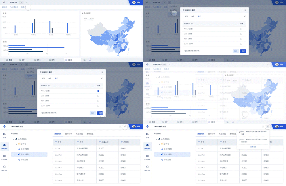
Collaboration and sharing are essential features in data visualization design, enabling teams to work together and share insights effectively. Real-time collaboration, version control, and sharing options are crucial for effective teamwork. Commenting and annotation features allow team members to provide feedback and discuss insights directly within the visualization. Exporting options for different formats, such as PDF, Excel, and image files, enable sharing visualizations with a broader audience. FineReport offers robust collaboration features, including real-time collaboration and version control. FineBI supports commenting and annotation, making it easy for teams to collaborate and share insights. FineVis provides extensive sharing options, including exporting to various formats and embedding visualizations in web pages or applications.
X、SECURITY AND PRIVACY
Security and privacy are critical considerations in data visualization design, especially when dealing with sensitive or confidential data. Data encryption, access control, and user authentication are essential features to ensure the security of your visualizations. Compliance with data protection regulations and regular security audits are also crucial to maintaining data privacy. FineReport offers robust security features, including data encryption and access control. FineBI supports user authentication and compliance with data protection regulations. FineVis provides regular security updates and audits to ensure the highest level of data security and privacy.
FineBI官网: https://s.fanruan.com/f459r
FineReport官网: https://s.fanruan.com/ryhzq
FineVis官网: https://s.fanruan.com/7z296
相关问答FAQs:
1. What is data visualization design?
Data visualization design is the practice of presenting data in a graphical or visual format, such as charts, graphs, and maps, to help people understand the significance of the data. It involves choosing the most effective way to represent the data visually to communicate information clearly and efficiently.
2. Why is data visualization design important?
Data visualization design is important because it allows us to quickly interpret and understand large amounts of complex data. By presenting data visually, patterns, trends, and correlations that may not be apparent in raw data can be easily identified. This helps in making informed decisions, identifying opportunities, and communicating insights effectively.
3. What are some key principles of data visualization design?
Some key principles of data visualization design include:
- Simplicity: Keep visualizations simple and focused on the key message to avoid overwhelming the audience.
- Clarity: Ensure that the data is presented clearly and accurately, with labels and legends to provide context.
- Consistency: Use consistent colors, fonts, and design elements throughout the visualizations for a cohesive look.
- Interactivity: Incorporate interactive elements to allow users to explore the data and gain deeper insights.
- Storytelling: Use data visualization to tell a story, guiding the audience through the data to communicate a narrative effectively.
本文内容通过AI工具匹配关键字智能整合而成,仅供参考,帆软不对内容的真实、准确或完整作任何形式的承诺。具体产品功能请以帆软官方帮助文档为准,或联系您的对接销售进行咨询。如有其他问题,您可以通过联系blog@fanruan.com进行反馈,帆软收到您的反馈后将及时答复和处理。


