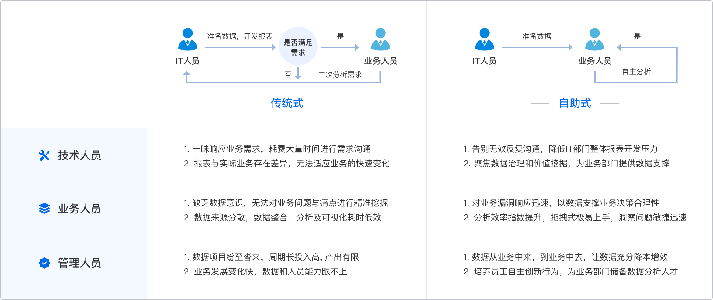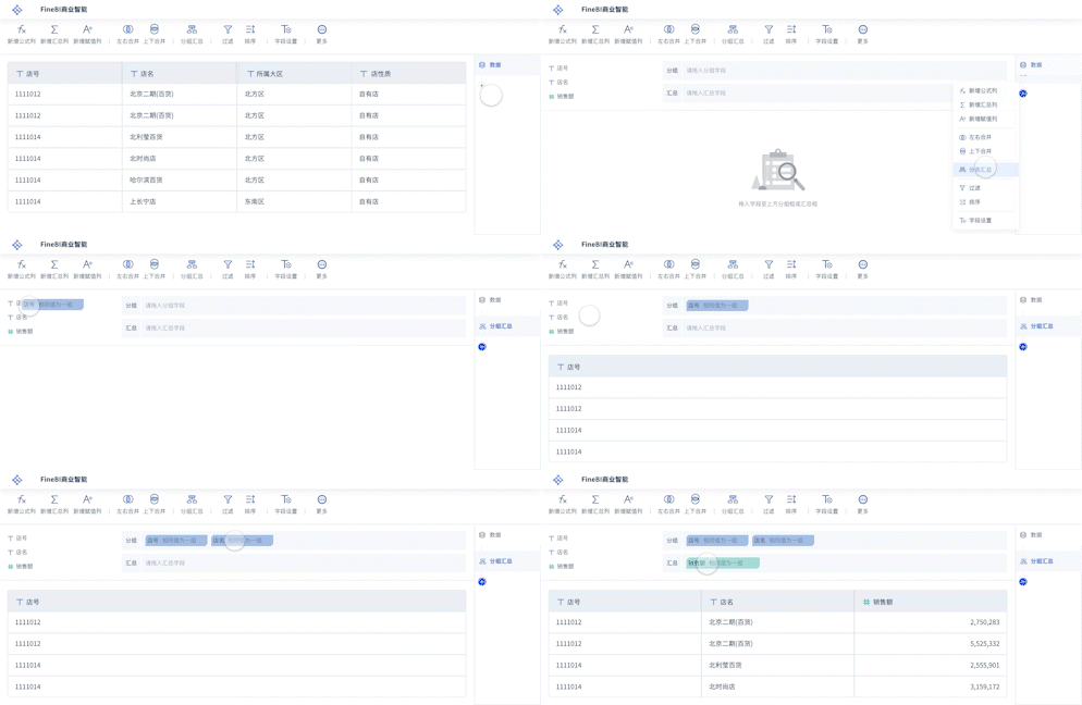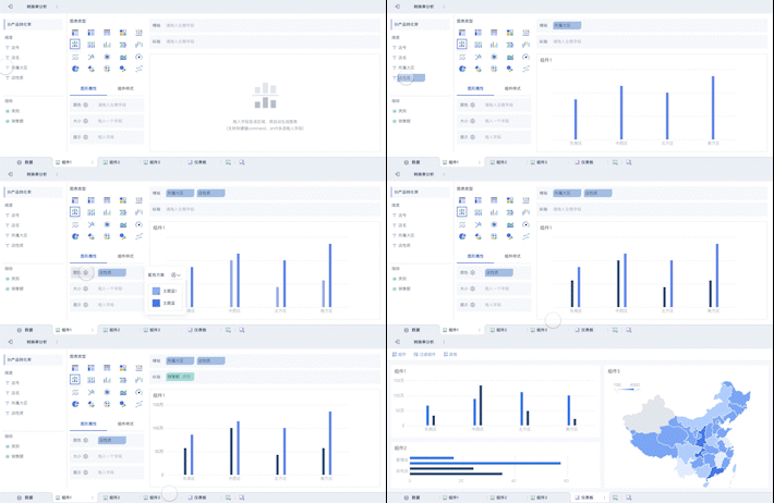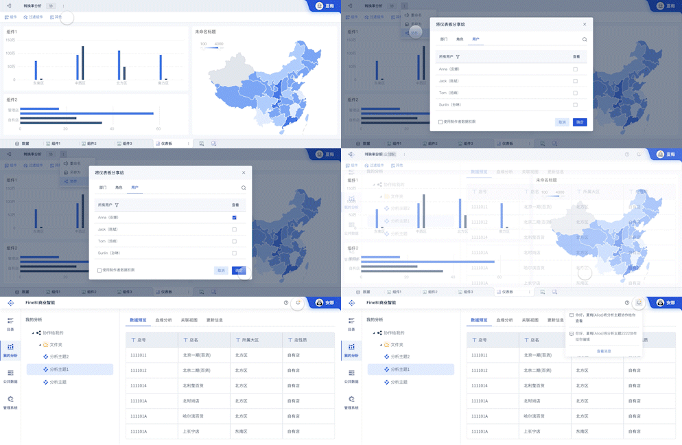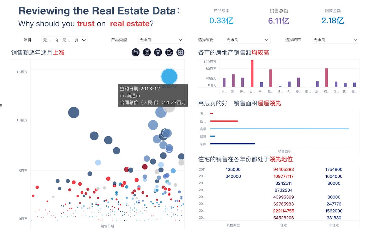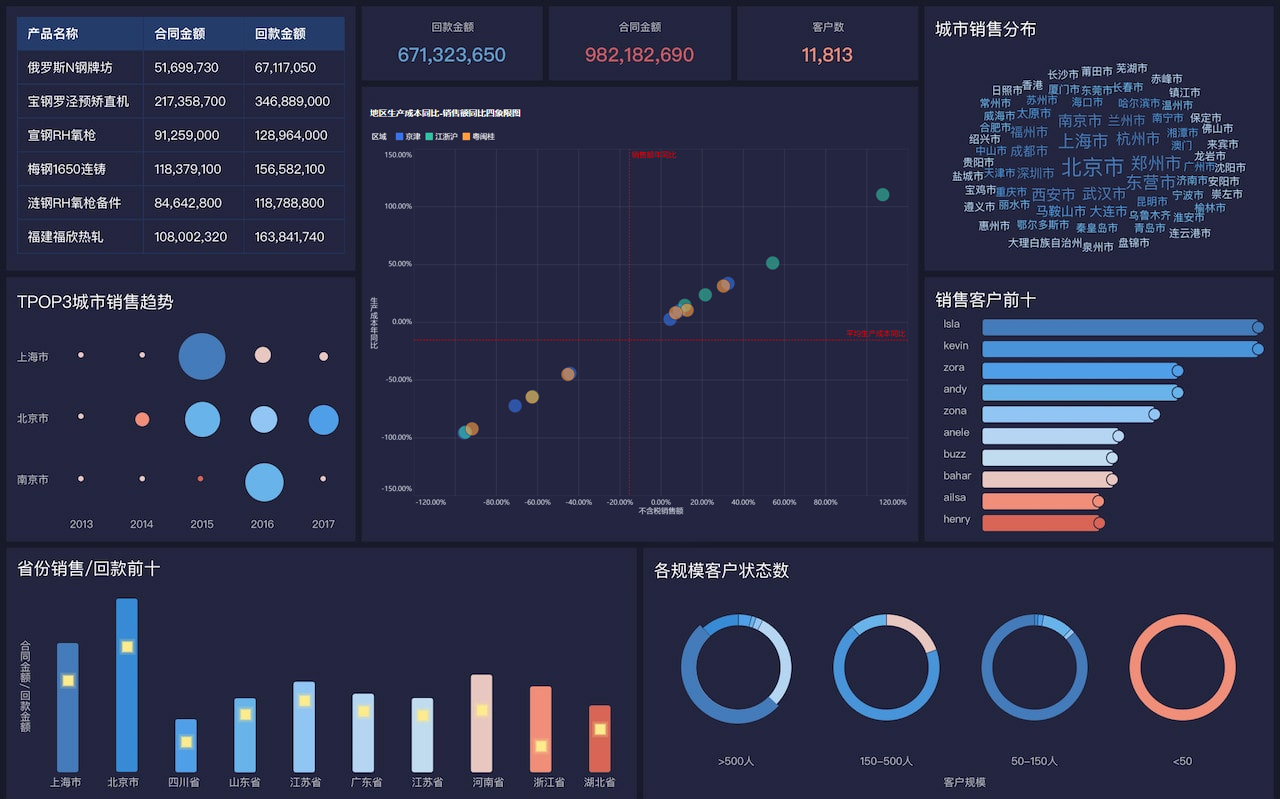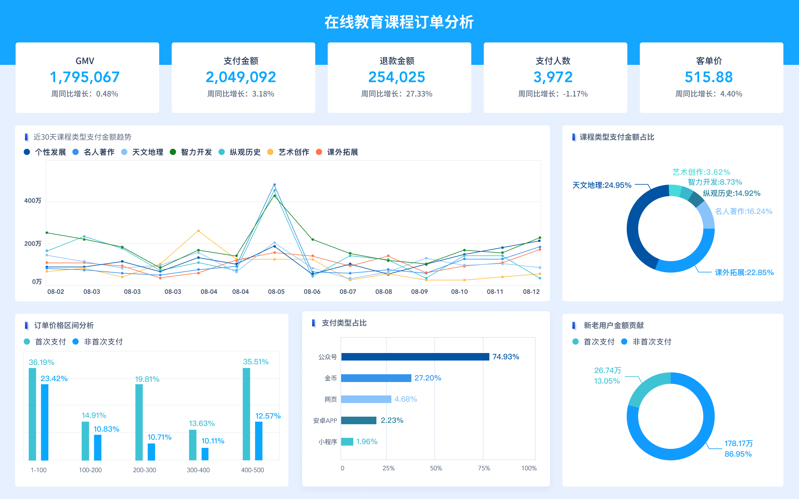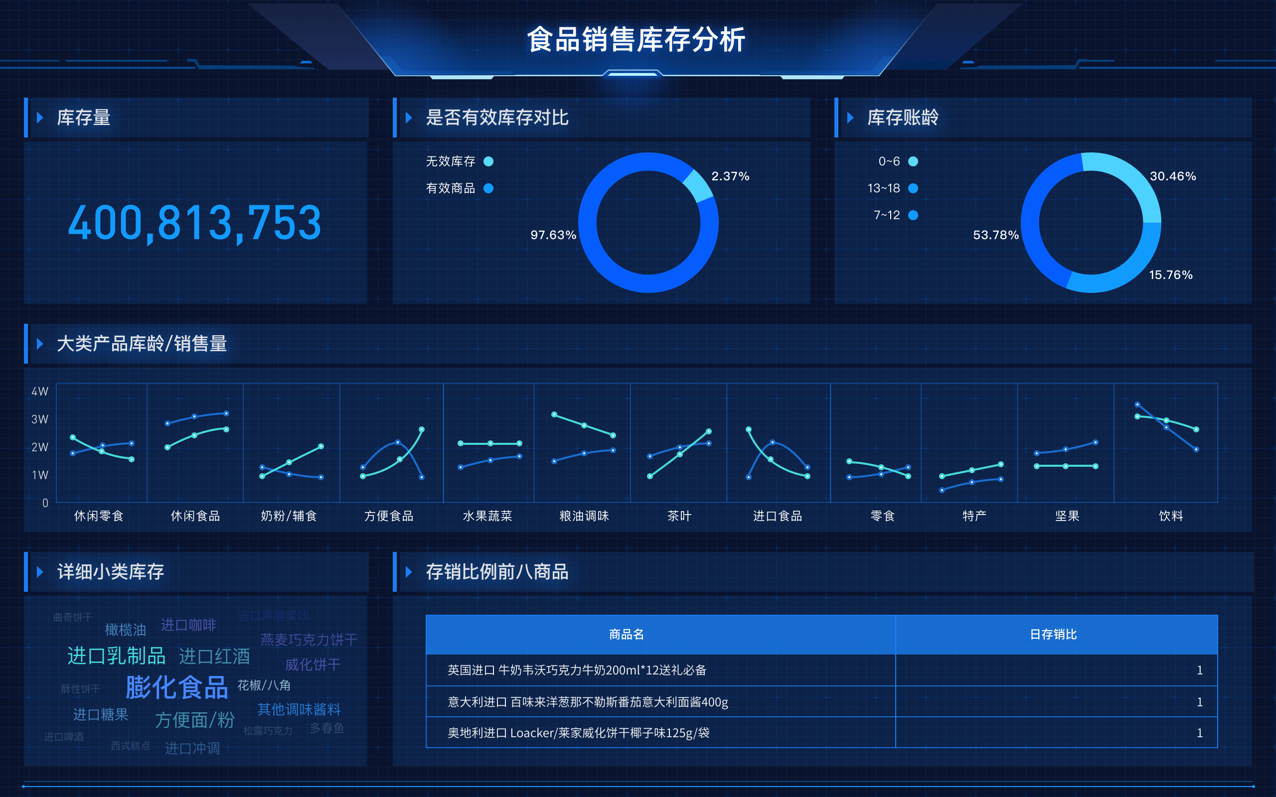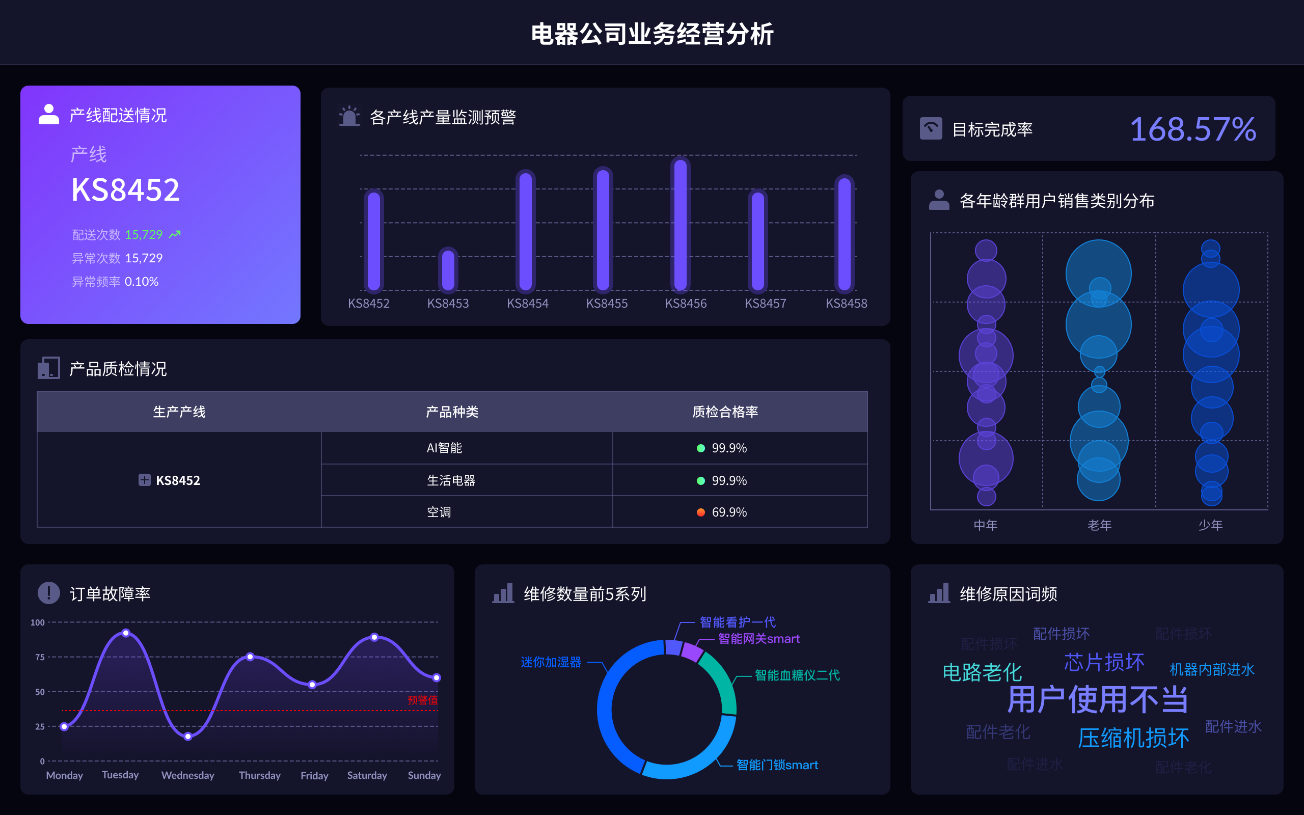
The principles of data visualization involve several key concepts, including clarity, accuracy, efficiency, and aesthetics. These principles ensure that data is presented in a way that is easy to understand, accurately represents the information, and is visually appealing. Clarity involves making the data understandable at a glance, accuracy ensures the data is represented truthfully, efficiency means the data can be quickly interpreted, and aesthetics make the visualization engaging and pleasing to look at. For instance, clarity can be achieved by choosing appropriate chart types for the data, such as bar charts for comparisons or line charts for trends, which makes it easier for viewers to grasp the information quickly.
I. CLARITY
To achieve clarity in data visualization, it is crucial to select the correct type of chart or graph for the data being represented. This means understanding the nature of the data and the message you want to convey. For example, bar charts are ideal for comparing discrete categories, while line charts effectively show trends over time. Using clear labels, appropriate scales, and avoiding clutter also contribute to clarity. FineBI, FineReport, and FineVis are excellent tools that provide a wide range of visualization options to ensure clarity in data presentation. Their user-friendly interfaces and extensive chart libraries make it easy to choose the right visualization for your data.
II. ACCURACY
Accuracy is paramount in data visualization because misleading representations can lead to incorrect conclusions. This involves ensuring that the visual proportions accurately reflect the numerical data, avoiding distortions that can mislead the viewer. For example, starting the Y-axis at zero can prevent exaggerating differences between data points. FineBI, FineReport, and FineVis emphasize accuracy through their robust data processing capabilities and precise charting tools. These platforms allow users to meticulously configure their visualizations to ensure that the data is depicted truthfully and accurately.
III. EFFICIENCY
Efficiency in data visualization means that the viewer can quickly interpret and understand the data without unnecessary effort. This can be achieved by using intuitive designs, minimizing distractions, and highlighting key information. Dashboards and interactive elements can greatly enhance efficiency by allowing users to explore the data dynamically. FineBI, FineReport, and FineVis excel in providing efficient data visualization solutions. They offer interactive dashboards and various filtering options, enabling users to drill down into the data and uncover insights rapidly.
IV. AESTHETICS
Aesthetics play a crucial role in engaging the audience and making the data visualization appealing. This involves using colors, fonts, and layouts that are visually pleasing and enhance the overall readability of the data. Good aesthetics can also help in emphasizing important data points and trends. FineBI, FineReport, and FineVis provide extensive customization options, allowing users to tailor the visual appearance of their charts and dashboards. These tools offer a variety of themes, color palettes, and design elements to create visually stunning and effective data visualizations.
V. FINEBI, FINEREPORT, AND FINEVIS
FineBI, FineReport, and FineVis are comprehensive data visualization tools developed by FanRuan. Each of these tools excels in different aspects of data visualization and reporting, making them suitable for various business needs. FineBI focuses on business intelligence and interactive dashboards, FineReport specializes in sophisticated report creation and distribution, and FineVis offers advanced data visualization capabilities. By integrating these tools into your data analysis workflow, you can leverage their strengths to create clear, accurate, efficient, and aesthetically pleasing visualizations.
FineBI官网: https://s.fanruan.com/f459r
FineReport官网: https://s.fanruan.com/ryhzq
FineVis官网: https://s.fanruan.com/7z296
VI. APPLICATIONS IN BUSINESS
In the business world, data visualization plays a pivotal role in decision-making processes. Companies use data visualization to monitor key performance indicators (KPIs), track sales trends, analyze customer behavior, and much more. By transforming raw data into visual insights, businesses can identify patterns, correlations, and anomalies that would be difficult to discern from spreadsheets alone. FineBI, FineReport, and FineVis provide powerful tools to create these visualizations, enabling businesses to make data-driven decisions with confidence.
VII. ENHANCING DATA STORYTELLING
Data storytelling is an emerging field that combines data visualization with narrative techniques to convey complex information compellingly. Effective data storytelling involves not just presenting data but also contextualizing it within a narrative that highlights its significance. FineBI, FineReport, and FineVis support data storytelling by offering features such as interactive dashboards, drill-down capabilities, and customizable reports. These tools allow users to craft narratives that guide the audience through the data, making the insights more relatable and impactful.
VIII. FUTURE TRENDS IN DATA VISUALIZATION
The future of data visualization is likely to be shaped by advancements in technology and increasing demands for real-time data insights. Emerging trends include the use of artificial intelligence (AI) to automate data analysis, augmented reality (AR) to create immersive visualizations, and enhanced interactivity to allow users to engage with data more dynamically. FineBI, FineReport, and FineVis are at the forefront of these trends, continually evolving to incorporate new technologies and meet the growing needs of data professionals.
IX. BEST PRACTICES FOR DATA VISUALIZATION
To create effective data visualizations, it is important to follow best practices such as understanding the audience, choosing the right type of visualization, keeping it simple, and focusing on key insights. FineBI, FineReport, and FineVis provide a wealth of resources and templates to help users adhere to these best practices. Additionally, these tools offer training and support to ensure that users can maximize the potential of their data visualizations.
X. CONCLUSION
Data visualization is a powerful tool for making sense of complex data and communicating insights effectively. By adhering to the principles of clarity, accuracy, efficiency, and aesthetics, and leveraging advanced tools like FineBI, FineReport, and FineVis, users can create compelling visualizations that drive informed decision-making. As technology continues to evolve, the capabilities of data visualization tools will expand, offering even more opportunities to unlock the value of data.
FineBI官网: https://s.fanruan.com/f459r
FineReport官网: https://s.fanruan.com/ryhzq
FineVis官网: https://s.fanruan.com/7z296
相关问答FAQs:
What is the principle of data visualization?
Data visualization is based on the principle of representing complex data in a visual format that is easy to understand and interpret. It involves the use of visual elements like charts, graphs, and maps to present data patterns, trends, and correlations. The principle behind data visualization is to make large and complex datasets more accessible, understandable, and actionable for decision-making purposes.
How does data visualization work?
Data visualization works by transforming raw data into visual representations, such as bar charts, pie charts, scatter plots, and heat maps. This process involves mapping different data attributes (e.g., numerical values, categories, geospatial coordinates) to visual properties (e.g., length, color, position) in order to effectively communicate insights and patterns within the data. By leveraging visual cues and graphical elements, data visualization helps users perceive and comprehend information more quickly and intuitively than they could from raw data alone.
What are the benefits of data visualization?
Data visualization offers several benefits, including the ability to identify trends, outliers, and patterns within data; communicate complex concepts and insights more effectively; discover relationships and correlations that may not be apparent in raw data; and make data-driven decisions with greater confidence. Additionally, data visualization can enhance storytelling and presentations, as well as facilitate collaboration and knowledge sharing among stakeholders. Overall, the principle of data visualization is grounded in the idea that visual representations can significantly enhance our understanding of data and support informed decision-making.
本文内容通过AI工具匹配关键字智能整合而成,仅供参考,帆软不对内容的真实、准确或完整作任何形式的承诺。具体产品功能请以帆软官方帮助文档为准,或联系您的对接销售进行咨询。如有其他问题,您可以通过联系blog@fanruan.com进行反馈,帆软收到您的反馈后将及时答复和处理。


