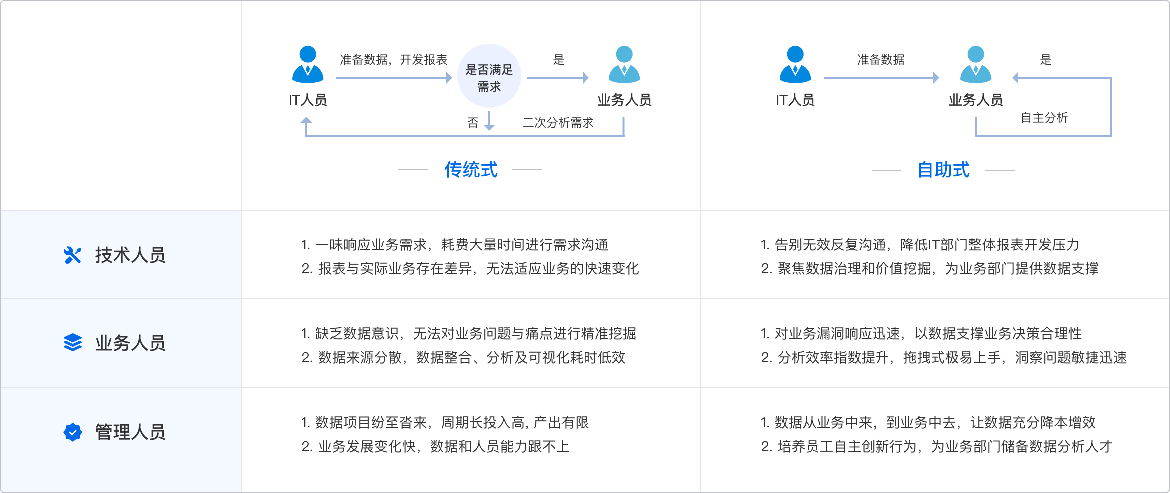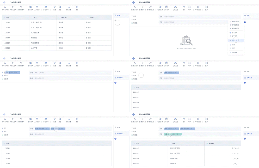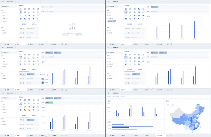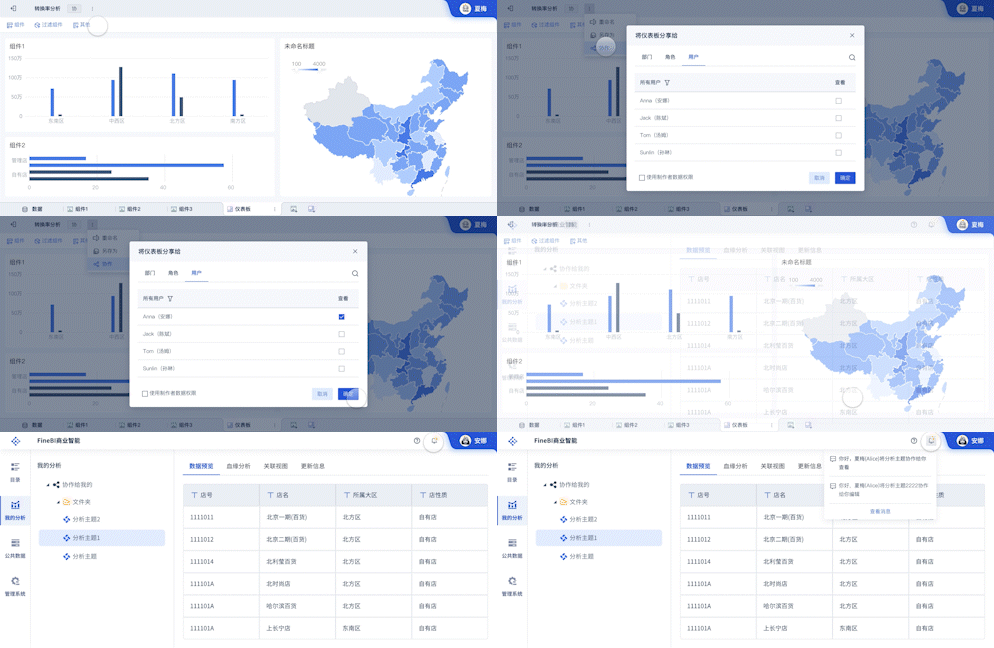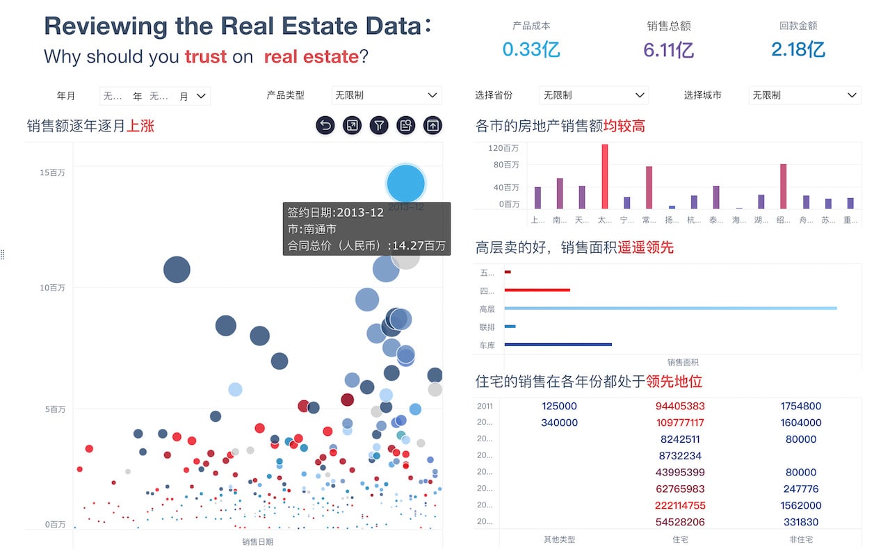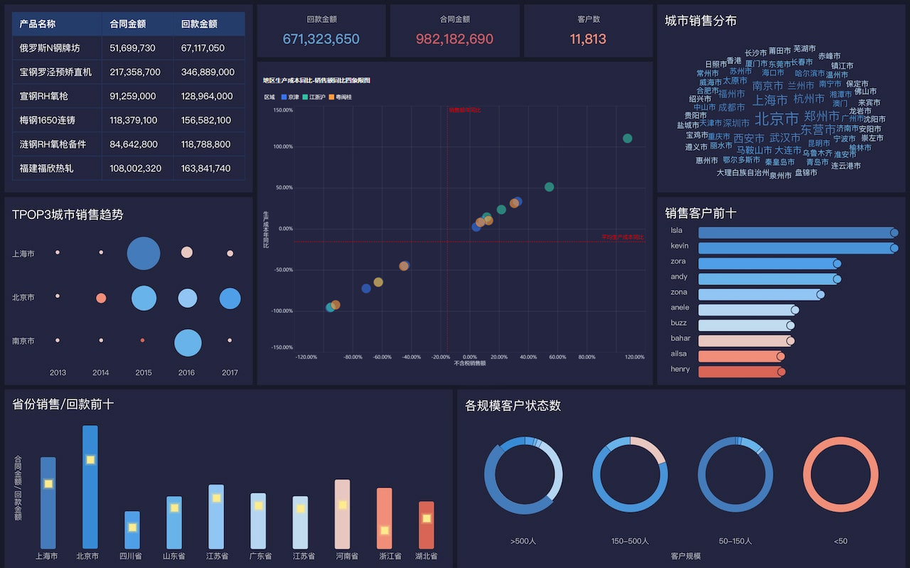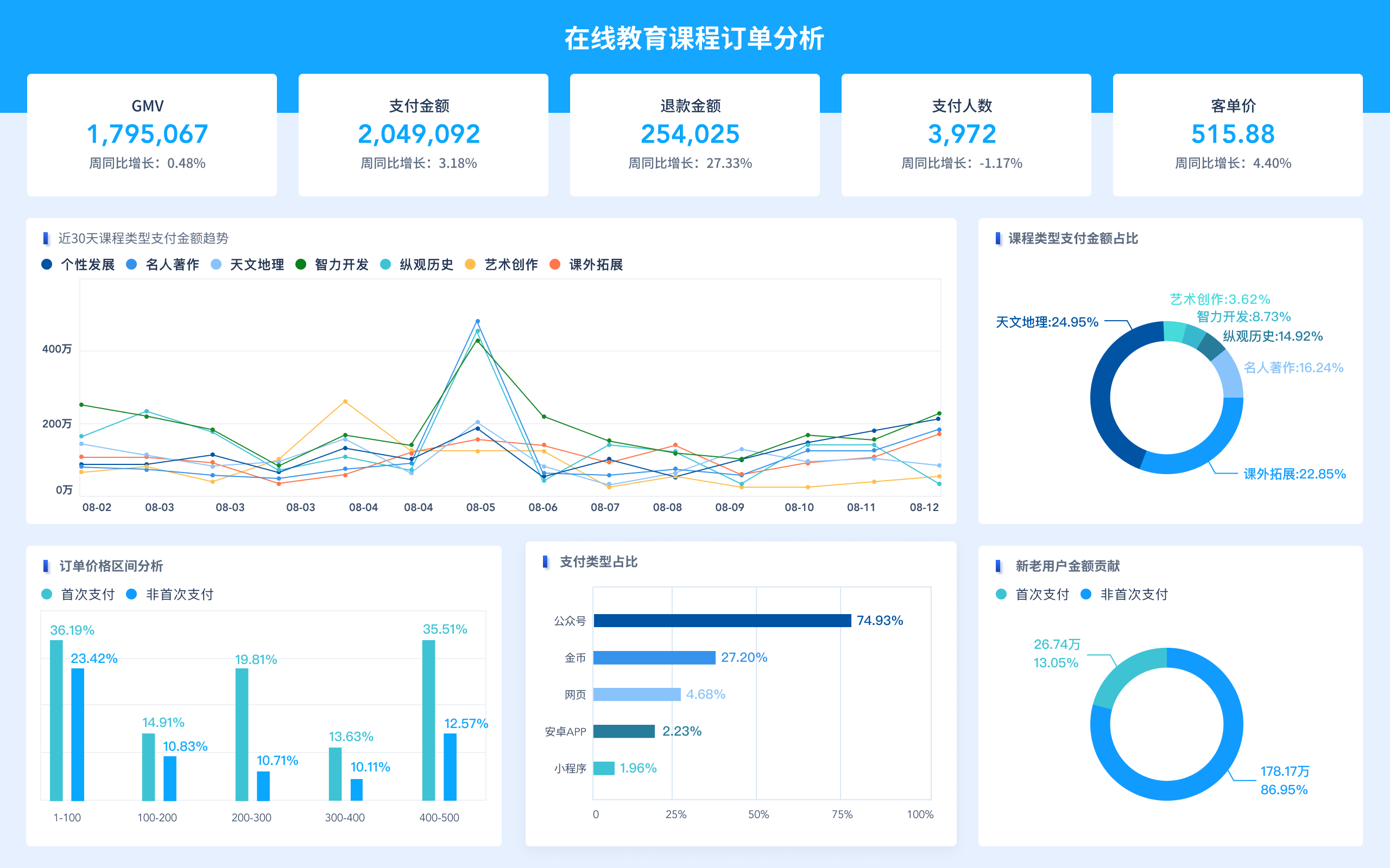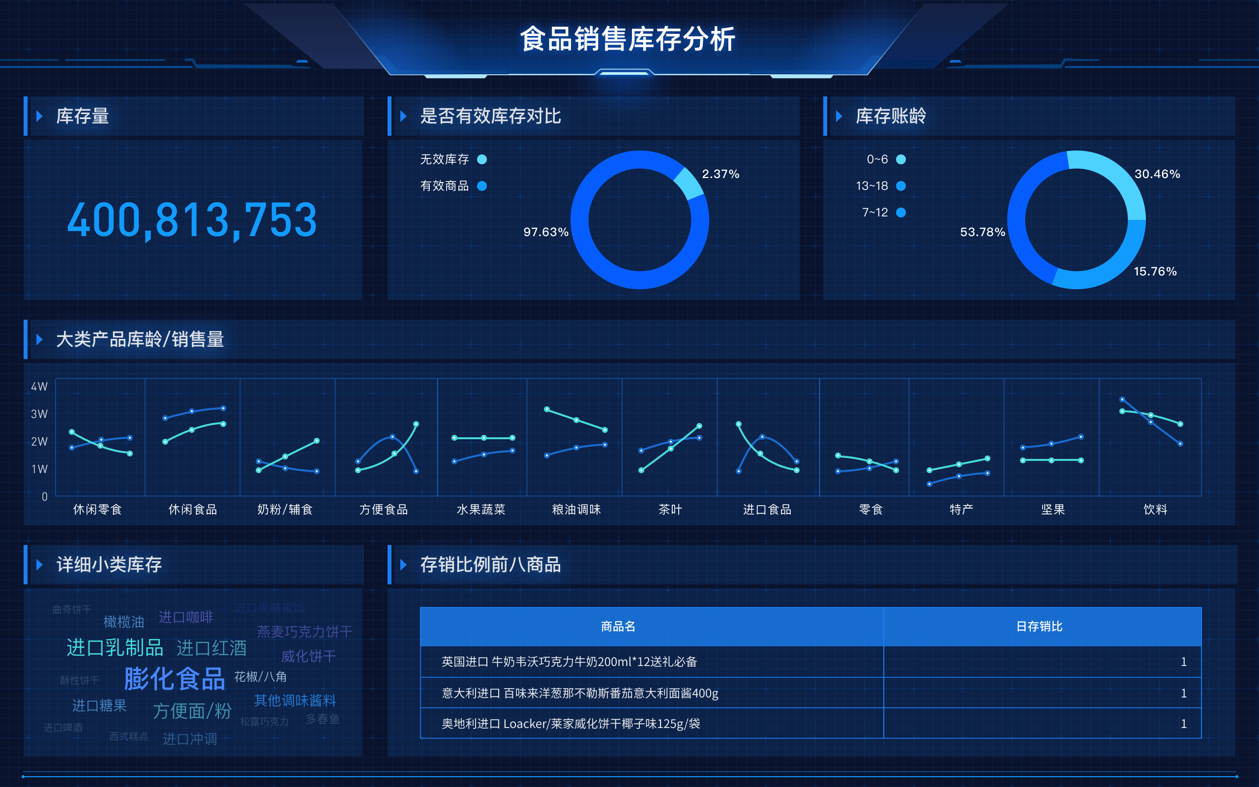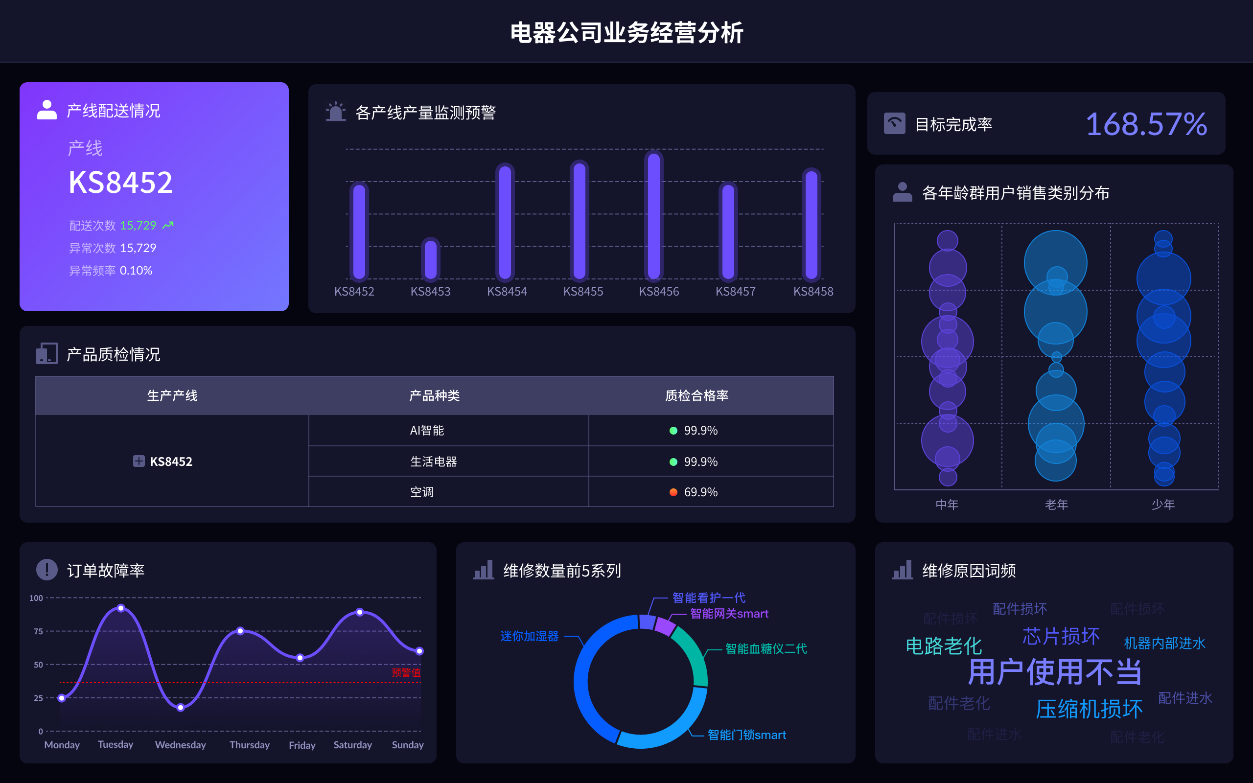
实际应用中,可以使用帆软旗下的多款产品进行多参数时间数据的可视化,例如FineBI、FineReport和FineVis。这些工具提供了强大的数据处理和可视化功能,可以轻松创建各种类型的图表,并进行深入的数据分析和展示。
FineBI是一款专业的商业智能分析工具,支持多维数据分析和多种可视化图表,适合进行复杂的多参数数据分析和展示。官网地址:FineBI官网
FineReport是一款高效的报表工具,支持多种图表类型和复杂的报表设计,适用于企业日常报表和数据分析的需求。官网地址:FineReport官网
FineVis是一款数据可视化工具,专注于简单易用的数据展示和交互,适合快速创建各种可视化图表,并与团队共享数据洞见。官网地址:FineVis官网
这些工具不仅提供了丰富的可视化选项,还支持与数据库、Excel等多种数据源的集成,使得数据的处理和展示更加便捷高效。通过使用这些工具,可以快速构建高质量的多参数时间数据可视化,帮助企业和个人更好地理解和利用数据。
相关问答FAQs:
FAQs about Multi-Parameter Time Series Data Visualization
1. What is multi-parameter time series data visualization and why is it important?
Multi-parameter time series data visualization involves displaying multiple variables or parameters over time within a single chart or set of charts. This technique is crucial because it allows for a comprehensive analysis of how different factors evolve and interact over time. For instance, in a financial context, you might visualize stock prices, trading volumes, and market indices on the same timeline. By doing so, you can uncover patterns, correlations, and trends that might not be apparent when examining each parameter in isolation. This holistic view is essential for making informed decisions and drawing actionable insights from complex datasets.
2. What are some effective methods for visualizing multi-parameter time series data?
Several methods can effectively visualize multi-parameter time series data:
- Line Charts with Multiple Lines: This is one of the simplest and most common methods. By plotting each parameter as a separate line on the same graph, you can easily compare how each parameter changes over time.
- Stacked Area Charts: These charts display the cumulative totals of various parameters over time. Each parameter is represented as a section of the stacked areas, which helps in understanding the contribution of each parameter to the total over time.
- Heatmaps: Heatmaps provide a visual representation of data where colors represent the magnitude of values. This method is particularly useful when dealing with large datasets, as it can highlight variations and trends across different parameters.
- Bubble Charts: These can be used to represent three or more parameters. For example, the x-axis and y-axis can represent two parameters, while the size and color of the bubbles can represent additional parameters.
- Interactive Dashboards: Advanced visualization tools, such as Tableau or Power BI, allow for the creation of interactive dashboards. Users can filter, zoom, and drill down into specific parameters, offering a dynamic way to explore and analyze time series data.
3. What are some best practices for creating effective multi-parameter time series visualizations?
When creating multi-parameter time series visualizations, consider the following best practices:
- Choose the Right Type of Chart: Select a chart type that best represents the relationships between parameters. For example, line charts are great for trends, while heatmaps are better for density and variation.
- Maintain Clarity and Readability: Ensure that your visualizations are clear and not overcrowded. Use different colors or styles for each parameter to avoid confusion. Avoid excessive detail that may overwhelm the viewer.
- Include Legends and Annotations: Clearly label each parameter and provide a legend for reference. Annotations can help highlight key points or anomalies in the data, making it easier for viewers to understand the context.
- Optimize for Interactivity: If using interactive tools, design your dashboards to be intuitive and user-friendly. Allow users to easily switch between different parameters or time ranges.
- Test Across Different Devices: Ensure that your visualizations are accessible and functional across various devices and screen sizes. This is especially important for interactive dashboards.
- Regularly Update Data: For real-time or regularly updated data, ensure that your visualizations reflect the most current information to provide accurate insights.
By adhering to these practices, you can create effective and insightful multi-parameter time series visualizations that enhance data analysis and decision-making processes.
本文内容通过AI工具匹配关键字智能整合而成,仅供参考,帆软不对内容的真实、准确或完整作任何形式的承诺。具体产品功能请以帆软官方帮助文档为准,或联系您的对接销售进行咨询。如有其他问题,您可以通过联系blog@fanruan.com进行反馈,帆软收到您的反馈后将及时答复和处理。


