Big Data Visualization is the English term for 大数据可视化.
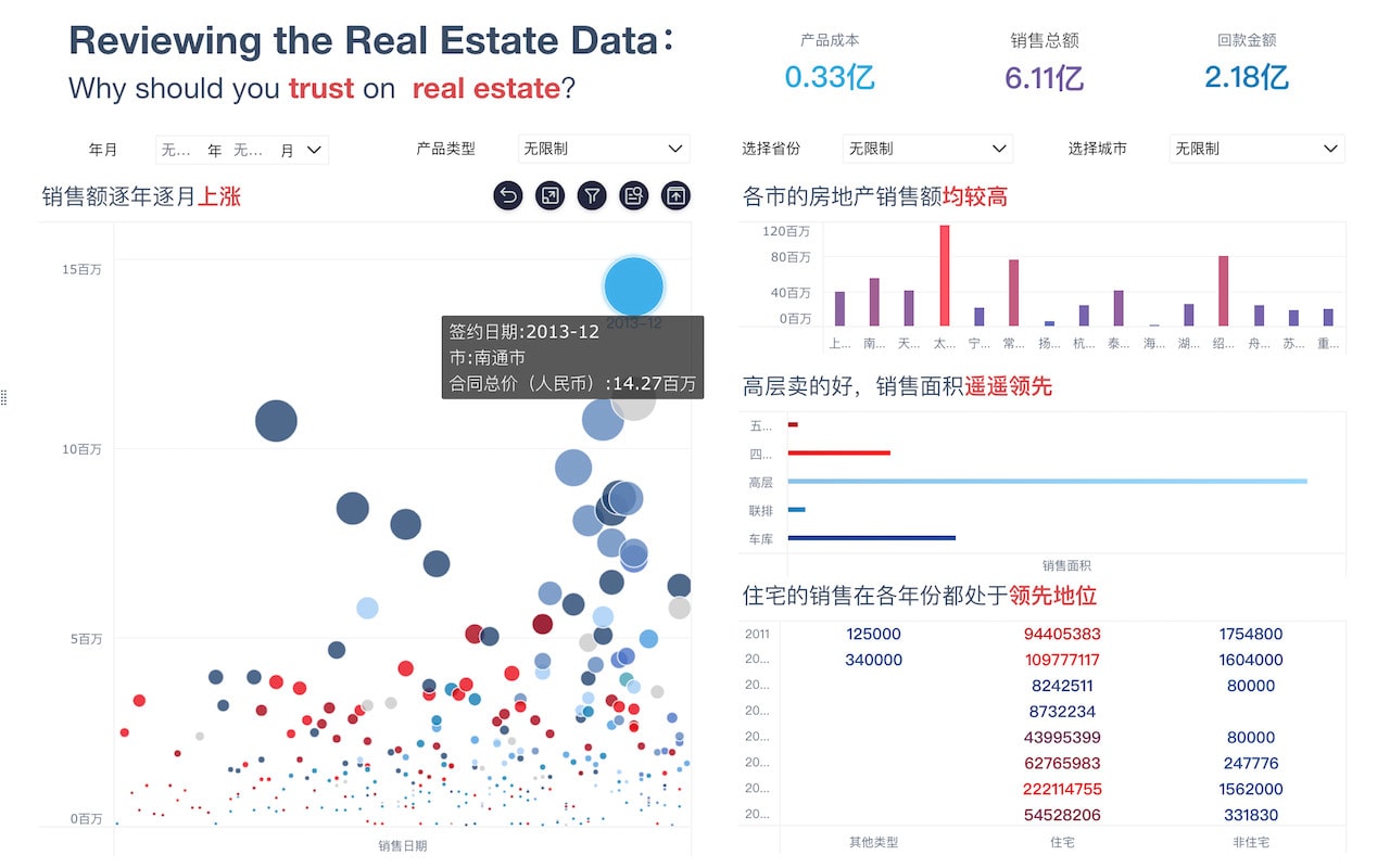
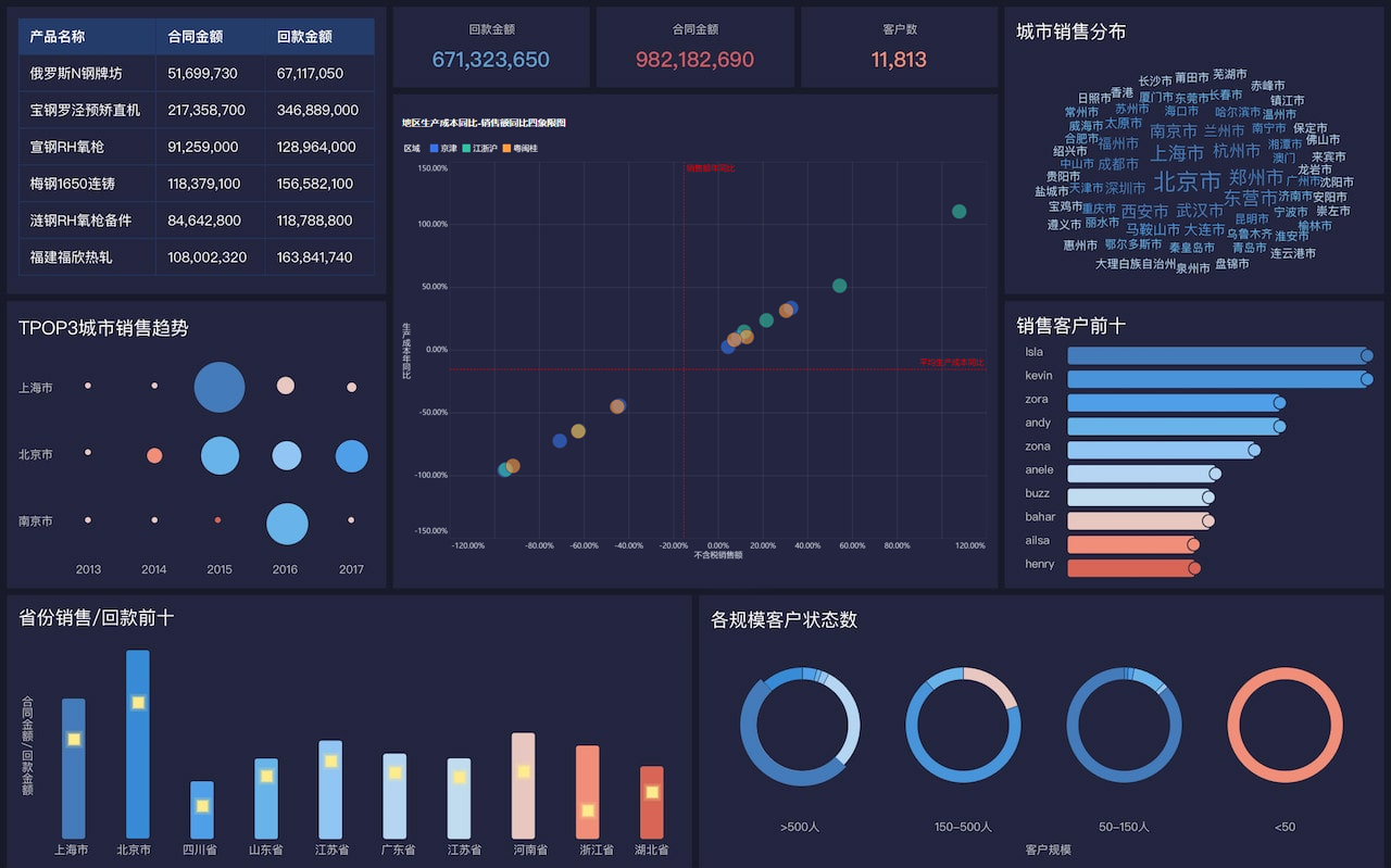
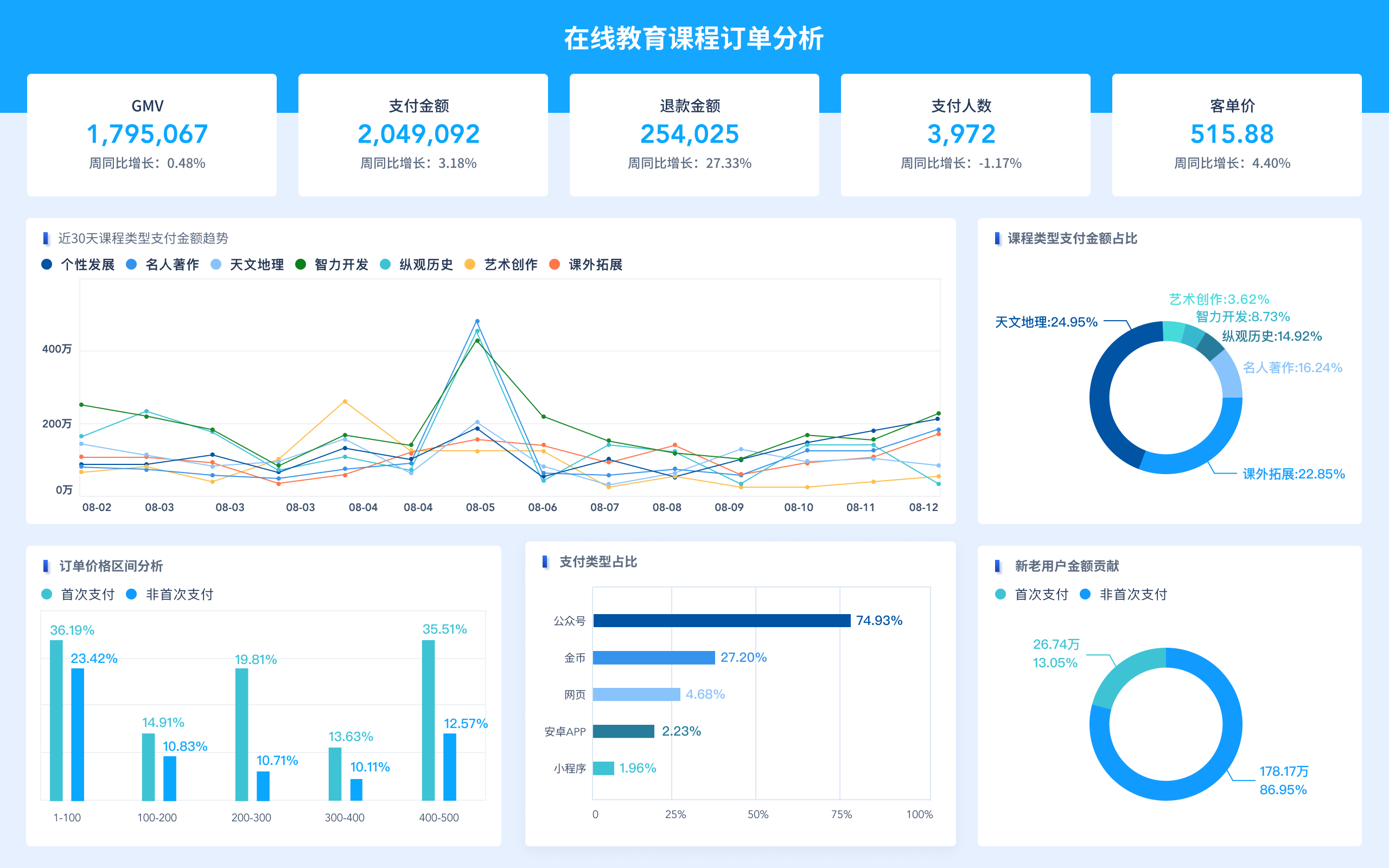
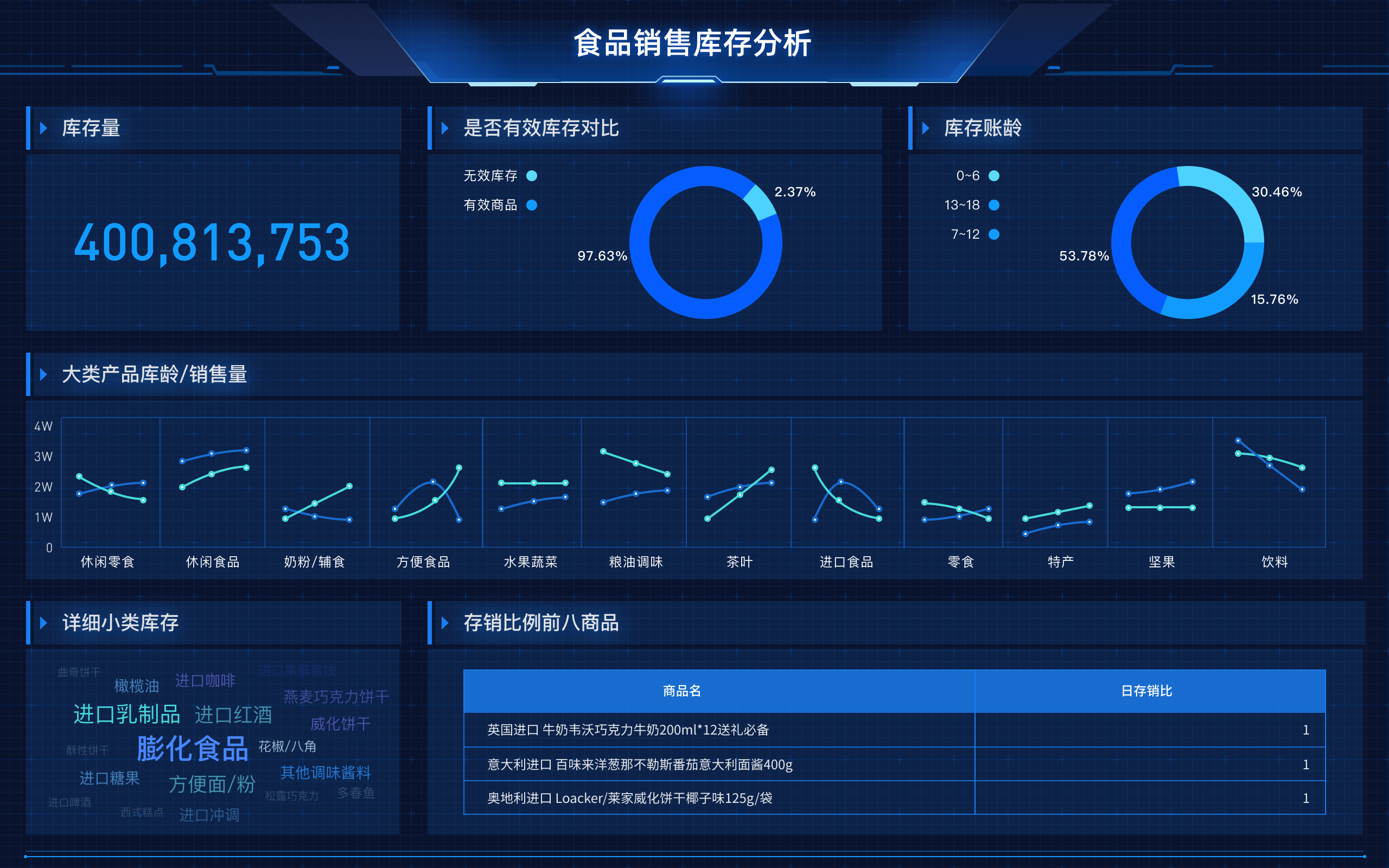
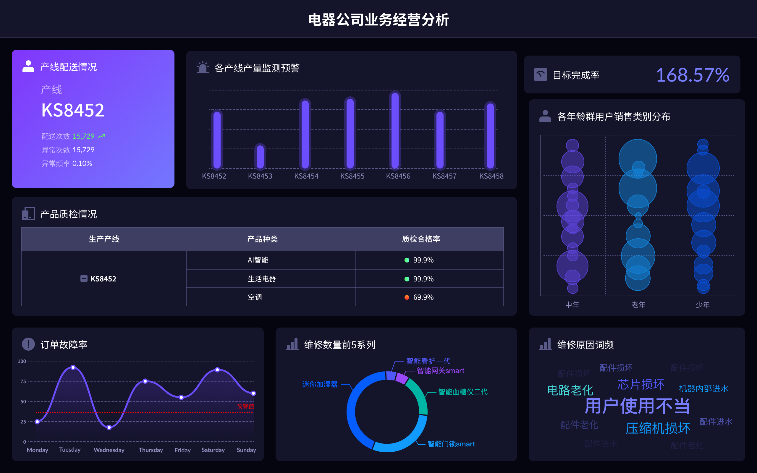
Big data visualization involves representing complex and vast data sets in graphical formats to help interpret and understand trends, patterns, and insights more efficiently. By using visual tools and techniques, it becomes easier to grasp the significance of data, which might otherwise be challenging to analyze in raw format. This process leverages various visualization methods such as bar charts, line graphs, scatter plots, heat maps, and more, to simplify the interpretation of data.
I. DEFINITION AND IMPORTANCE OF BIG DATA VISUALIZATION
Big data visualization refers to the techniques used to convert large volumes of data into visual representations. The importance of big data visualization lies in its ability to make complex data more accessible, understandable, and usable. Through visualization, data scientists and analysts can identify patterns, correlations, and outliers that might not be immediately apparent through traditional data analysis methods.
The benefits include:
- Enhanced data comprehension
- Improved decision-making processes
- Identification of trends and patterns
- Faster data analysis
For example, a heat map can highlight areas of high activity or concentration within a dataset, making it easier to pinpoint regions of interest or concern without sifting through numerical data.
II. TYPES OF BIG DATA VISUALIZATION TOOLS AND TECHNIQUES
Big data visualization employs various tools and techniques, each suited to different types of data and analysis needs. These include:
- Bar Charts and Histograms: Useful for comparing different groups or tracking changes over time.
- Line Graphs: Ideal for illustrating trends or changes in data points over periods.
- Scatter Plots: Effective for showing the relationship between two variables.
- Heat Maps: Used to represent data density or activity intensity.
- Pie Charts: Helpful in displaying proportions within a whole.
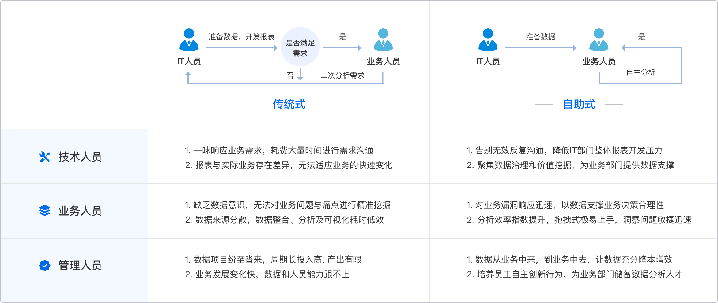
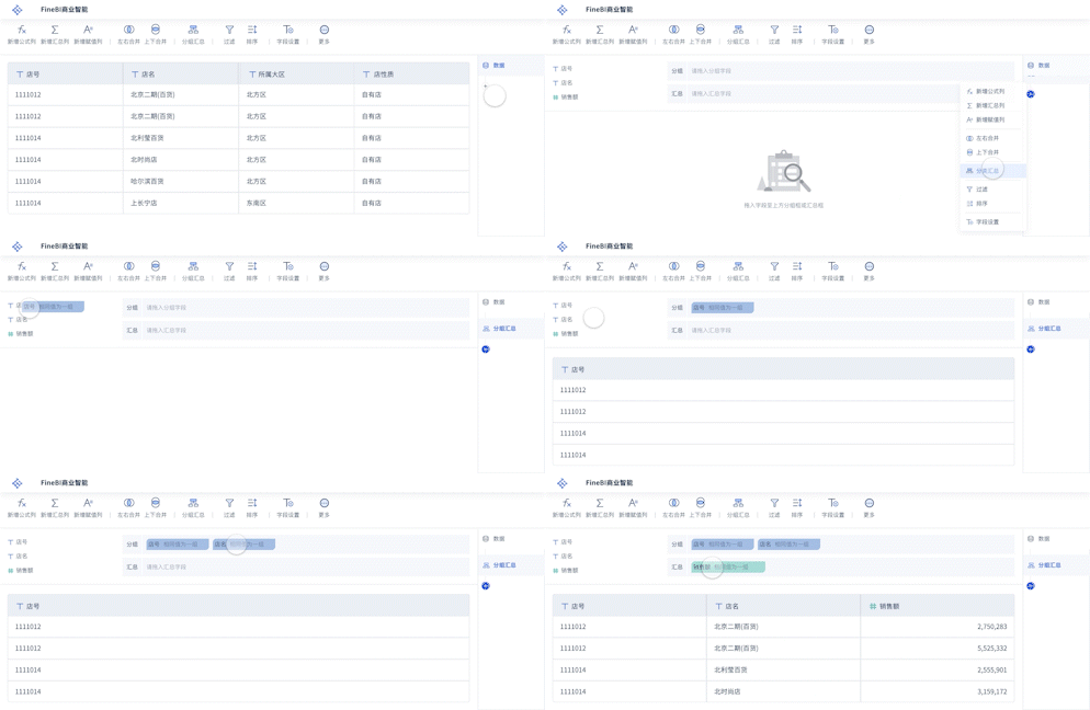
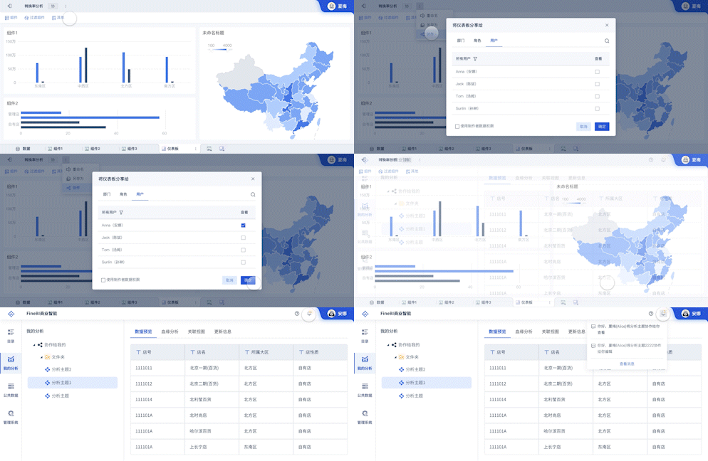
FineBI is a business intelligence tool designed to assist with big data visualization. It provides comprehensive data analysis capabilities and intuitive visual dashboards. For more information, visit the FineBI official website.
III. APPLICATIONS OF BIG DATA VISUALIZATION IN DIFFERENT INDUSTRIES
Big data visualization has applications across numerous industries:
- Healthcare: Visualizing patient data to track health trends, predict outbreaks, and manage resources.
- Finance: Analyzing financial trends, risks, and market movements.
- Retail: Understanding consumer behavior, sales patterns, and inventory management.
- Manufacturing: Monitoring production processes, equipment performance, and supply chain logistics.
For instance, in healthcare, visualizing patient data can reveal patterns in disease spread, helping to allocate medical resources more effectively and anticipate future healthcare needs.
IV. TOOLS FOR BIG DATA VISUALIZATION
Several tools are specifically designed for big data visualization, each offering unique features and capabilities:
- FineReport: Provides robust reporting and dashboard functionalities, supporting large-scale data visualization. For more details, check out the FineReport official website.
- Tableau: Known for its interactive data visualization capabilities and ease of use.
- D3.js: A JavaScript library for producing dynamic, interactive data visualizations in web browsers.
- QlikView: Offers guided analytics and dashboards for business intelligence needs.
These tools help users create interactive and shareable dashboards that can update in real-time, allowing for dynamic data analysis.
V. BEST PRACTICES FOR EFFECTIVE BIG DATA VISUALIZATION
To ensure effective big data visualization, consider the following best practices:
- Choose the Right Visualization Type: Match the visualization method to the type of data and the insights you want to uncover.
- Simplify the Design: Avoid clutter and focus on the most important data points to ensure clarity.
- Use Color Wisely: Utilize colors to highlight key areas without overwhelming the viewer.
- Incorporate Interactivity: Enable users to interact with the data for deeper exploration.
- Provide Context: Add labels, legends, and notes to help interpret the visuals.
For example, using an interactive dashboard, users can filter data by specific criteria, such as date ranges or demographic groups, to uncover more detailed insights.
VI. CHALLENGES IN BIG DATA VISUALIZATION
Big data visualization also faces several challenges:
- Handling Large Data Volumes: Visualizing extensive datasets without performance degradation.
- Data Quality: Ensuring data accuracy and consistency to avoid misleading visuals.
- Scalability: Creating visualizations that can scale with growing data sizes.
- Security and Privacy: Protecting sensitive data while still providing meaningful insights.
Addressing these challenges requires advanced tools and techniques, as well as a robust understanding of data management principles.
VII. THE FUTURE OF BIG DATA VISUALIZATION
The future of big data visualization looks promising, with ongoing advancements in technology and methodologies:
- Artificial Intelligence and Machine Learning: Enhancing visualization capabilities through automated insights and predictions.
- Virtual and Augmented Reality: Offering immersive visualization experiences.
- Real-time Data Processing: Enabling immediate visualization of live data streams.
- Enhanced User Interfaces: Making tools more intuitive and user-friendly.
As these technologies evolve, the potential for big data visualization to transform industries and drive innovation will continue to grow.
In conclusion, big data visualization is a crucial aspect of modern data analysis, offering significant benefits across various sectors. By leveraging the right tools and techniques, organizations can unlock the full potential of their data, making more informed decisions and gaining a competitive edge. For powerful big data visualization solutions, explore FineBI, FineReport, and FineVis through their respective official websites: FineBI, FineReport, and FineVis.
相关问答FAQs:
FAQ 1: What is the English term for 大数据可视化?
The English term for 大数据可视化 is "Big Data Visualization." This phrase refers to the process of representing large and complex data sets visually, making it easier to interpret and analyze vast amounts of information. Big Data Visualization employs various graphical tools such as charts, graphs, and maps to present data in a way that highlights patterns, trends, and outliers, aiding in more informed decision-making.
FAQ 2: Why is Big Data Visualization important in data analysis?
Big Data Visualization plays a crucial role in data analysis by transforming raw data into interactive and intuitive visual formats. This transformation helps in uncovering insights that might be difficult to detect through numerical analysis alone. Visual representations such as dashboards and interactive charts allow users to quickly grasp complex information, identify trends, and make data-driven decisions with greater accuracy. This is especially valuable in sectors like finance, healthcare, and marketing, where understanding large data volumes swiftly can significantly impact business outcomes.
FAQ 3: What tools are commonly used for Big Data Visualization?
Several tools are widely used for Big Data Visualization, each offering unique features to handle large data sets. Prominent examples include Tableau, which provides robust interactive visualizations and dashboards; Power BI by Microsoft, known for its seamless integration with other Microsoft products and user-friendly interface; and QlikView, which offers associative data modeling to explore data from various angles. Additionally, open-source tools like D3.js and Apache Superset provide flexible and customizable options for creating complex visual representations of big data. These tools enable users to tailor their visualizations to specific needs, enhancing their ability to interpret and act on data insights effectively.
本文内容通过AI工具匹配关键字智能整合而成,仅供参考,帆软不对内容的真实、准确或完整作任何形式的承诺。具体产品功能请以帆软官方帮助文档为准,或联系您的对接销售进行咨询。如有其他问题,您可以通过联系blog@fanruan.com进行反馈,帆软收到您的反馈后将及时答复和处理。


