Big Data Visualization: Unpacking its Core Components
Big data visualization involves converting complex, large-scale data into visual formats that are easier to understand, interpret, and analyze. The core components of big data visualization include data extraction, data transformation, and data representation, with a particular emphasis on scalability, interactivity, and real-time processing. Data extraction focuses on gathering relevant information from vast datasets. Data transformation involves cleaning and structuring this data, making it suitable for visualization. Finally, data representation is the process of using visual tools and techniques, such as graphs, charts, and maps, to present data insights clearly and effectively. Interactivity is a critical aspect as it allows users to explore data dynamically, adjusting views and perspectives to uncover deeper insights.
I. DATA EXTRACTION
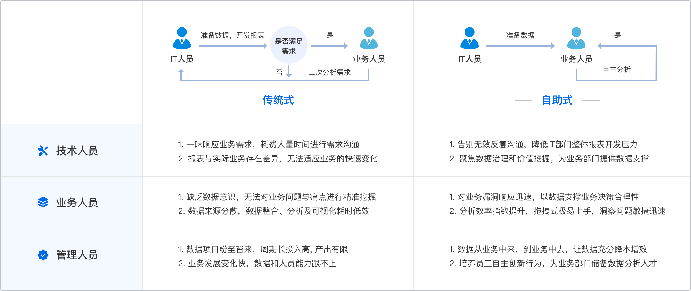
In the context of big data visualization, data extraction is the initial phase where relevant data is pulled from various sources. This can include databases, APIs, log files, and data streams. The extraction process must be efficient and scalable, as big data environments often involve vast amounts of data. Techniques like ETL (Extract, Transform, Load) pipelines are commonly used, where data is first extracted, then transformed into a usable format, and finally loaded into a data warehouse or visualization tool.
II. DATA TRANSFORMATION
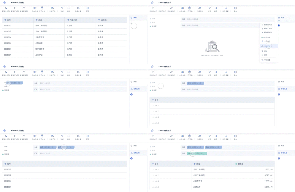
Data transformation is crucial in preparing raw data for visualization. This step involves cleaning the data to remove any inconsistencies, duplicates, or irrelevant information that could distort the visualization results. It also includes structuring data, which might involve converting data types, normalizing values, and creating metadata. Data aggregation is a key part of this process, where data is summarized or grouped to simplify analysis and improve performance in visualization tools.
III. DATA REPRESENTATION
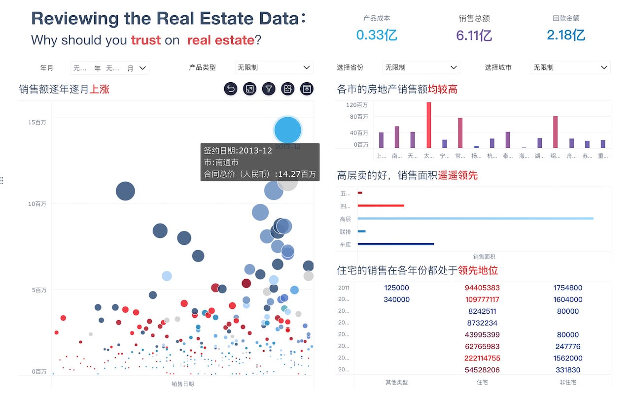
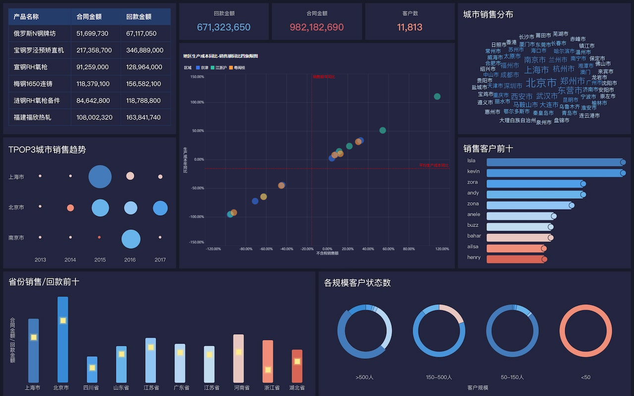
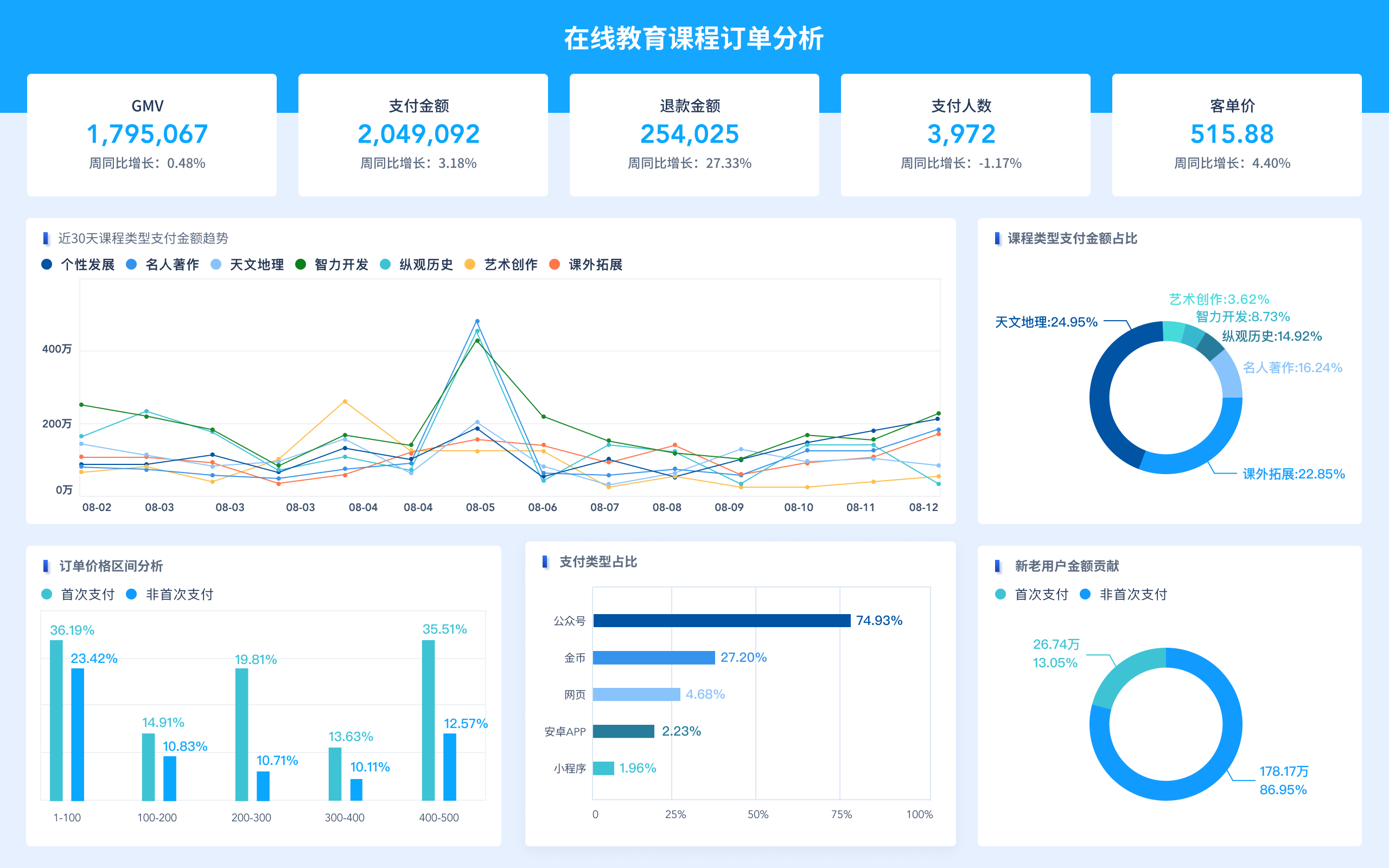
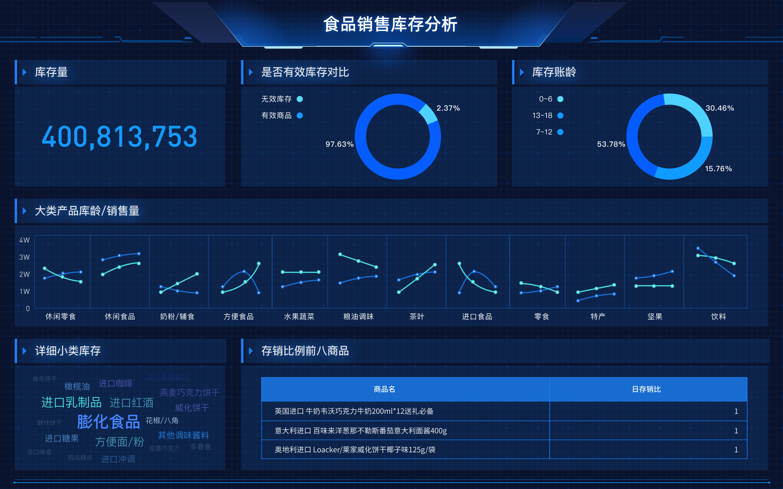
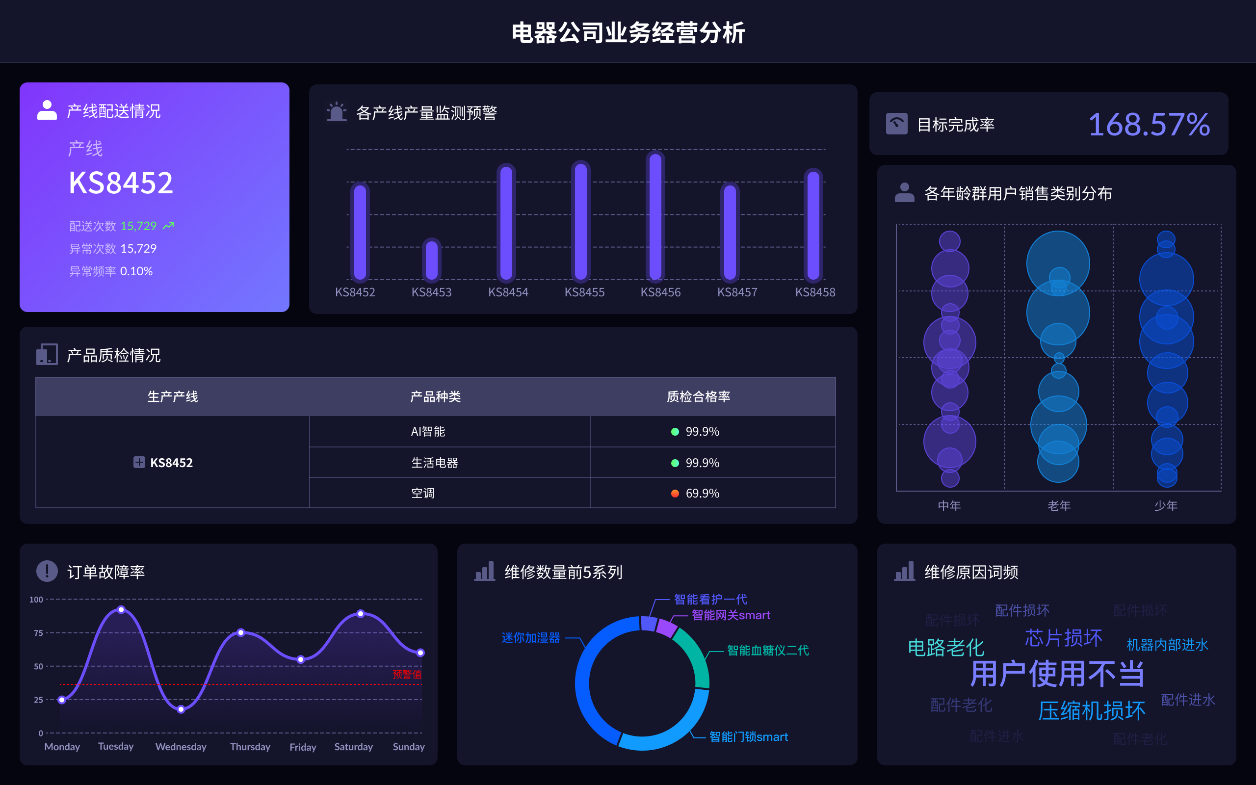
Data representation refers to the visual techniques used to present data insights. Common visualization types include bar charts, line graphs, scatter plots, heat maps, and geographic maps. The choice of representation depends on the nature of the data and the insights one wishes to convey. For instance, time series data is often best represented with line graphs, while categorical data might be more effectively displayed using bar charts. Advanced visualizations might include interactive dashboards, which allow users to drill down into the data for more detailed analysis.
IV. INTERACTIVITY AND USER EXPERIENCE
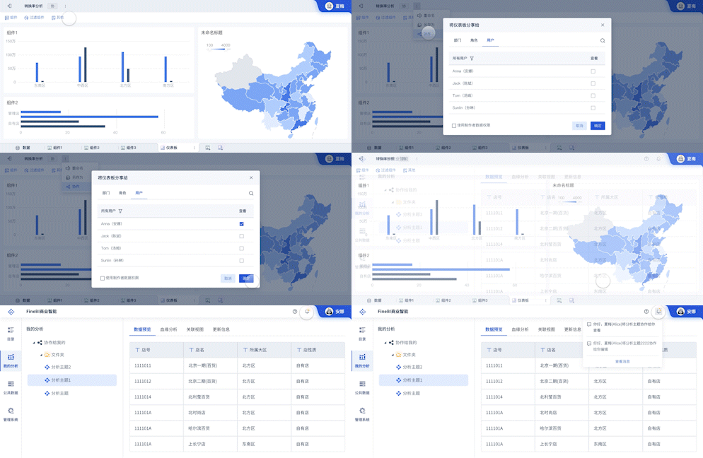
Interactivity is a hallmark of effective big data visualization. It allows users to engage with the data by filtering, zooming, and manipulating the visual elements. This dynamic interaction helps in uncovering trends, patterns, and anomalies that static visuals might not reveal. Tools like FineBI, FineReport, and FineVis provide powerful interactive features that support data exploration and decision-making. These tools offer capabilities such as real-time data updates, customizable dashboards, and intuitive user interfaces, enhancing the overall user experience.
V. REAL-TIME PROCESSING AND SCALABILITY
In big data visualization, real-time processing is critical for applications that require up-to-the-minute data analysis, such as in financial trading or social media monitoring. Real-time data pipelines and visualization tools enable organizations to respond quickly to changes and trends. Scalability is equally important, as visualization solutions must handle increasing data volumes and complexity without compromising performance. This requires robust infrastructure, including scalable storage, powerful processing capabilities, and efficient data management practices.
VI. THE FUTURE OF BIG DATA VISUALIZATION
The future of big data visualization is poised for significant advancements with the integration of technologies like artificial intelligence (AI) and machine learning (ML). These technologies can automate data analysis, provide predictive insights, and enhance visualization by highlighting critical trends and anomalies. Additionally, the rise of augmented reality (AR) and virtual reality (VR) promises to bring immersive data visualization experiences, allowing users to interact with data in more intuitive and impactful ways. The continuous evolution of tools and techniques in big data visualization will further empower organizations to leverage their data for strategic advantage.
For more information on advanced data visualization tools, you can explore the following resources:
- FineBI: https://s.fanruan.com/f459r
- FineReport: https://s.fanruan.com/ryhzq
- FineVis: https://s.fanruan.com/7z296
相关问答FAQs:
大数据可视化的内涵可以从多个方面进行探讨,下面是一些详细的阐述。
-
大数据可视化的定义是什么?
大数据可视化是将复杂的数据集转化为易于理解的视觉图形的过程。通过图表、图形和其他视觉工具,能够帮助用户快速识别数据中的趋势、模式和异常情况。可视化不仅仅是数据的呈现,更是数据分析的一个重要环节,它使得大量且复杂的信息变得更易于理解和分析。有效的可视化可以提高决策效率,帮助企业和组织从数据中提取有价值的洞察。
-
大数据可视化的目的是什么?
大数据可视化的主要目的是使数据更加直观和易于理解。通过将数据以图形方式展示,用户可以更快地抓住信息的核心,识别重要趋势和关系。这种方式能够帮助分析师、决策者和普通用户更好地理解数据背后的故事。此外,可视化还能够增强数据的共享性,使得不同背景的人都能够参与到数据驱动的决策中。通过可视化,复杂的分析结果被简化为图表和图形,促进了跨部门和团队之间的沟通。
-
大数据可视化的技术和工具有哪些?
现代大数据可视化使用了多种技术和工具。常见的可视化工具包括Tableau、Power BI、D3.js、Plotly等。这些工具能够处理大规模的数据集,并提供多种图形和图表选项,帮助用户根据具体需求选择合适的可视化形式。此外,数据可视化的技术也在不断发展,如机器学习和人工智能的应用,使得可视化能够自动识别数据中的关键点,并实时更新。这些技术和工具的结合,为用户提供了更加强大的数据分析能力。
通过这些角度,可以更全面地理解大数据可视化的内涵,以及其在现代数据分析中的重要性。
本文内容通过AI工具匹配关键字智能整合而成,仅供参考,帆软不对内容的真实、准确或完整作任何形式的承诺。具体产品功能请以帆软官方帮助文档为准,或联系您的对接销售进行咨询。如有其他问题,您可以通过联系blog@fanruan.com进行反馈,帆软收到您的反馈后将及时答复和处理。


