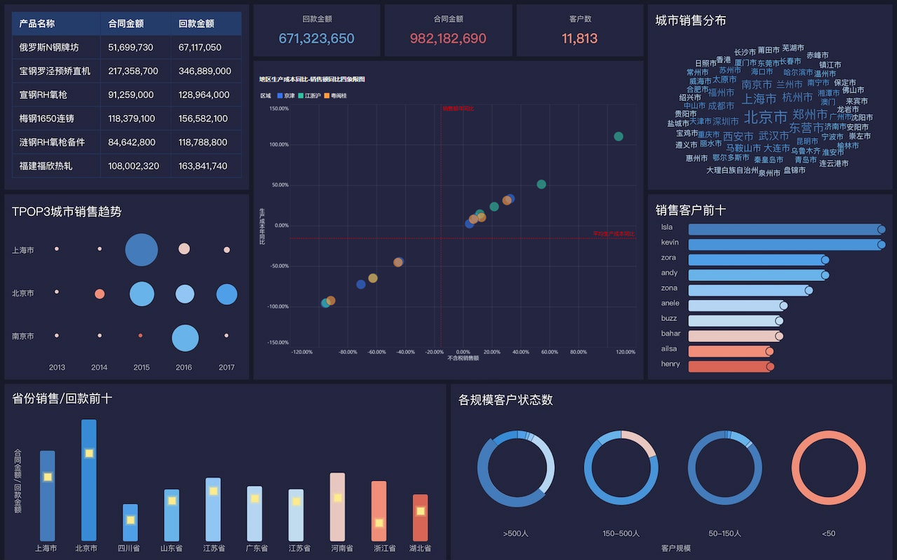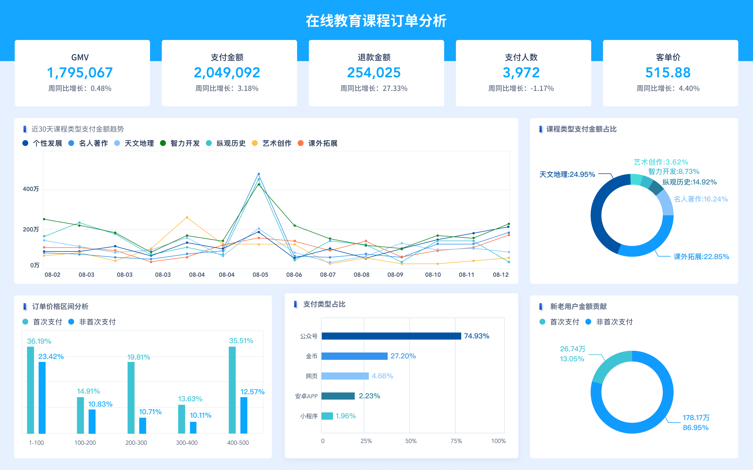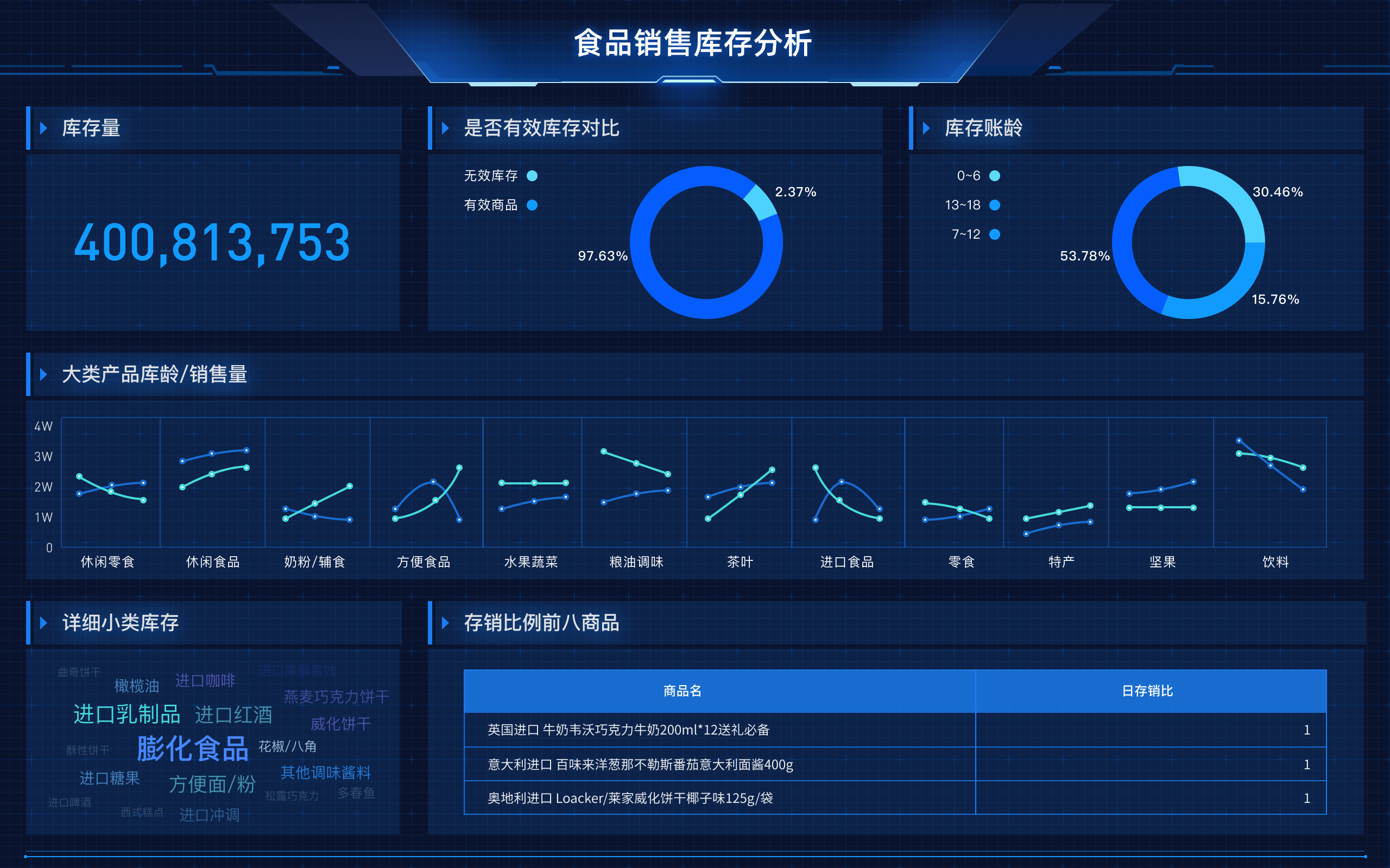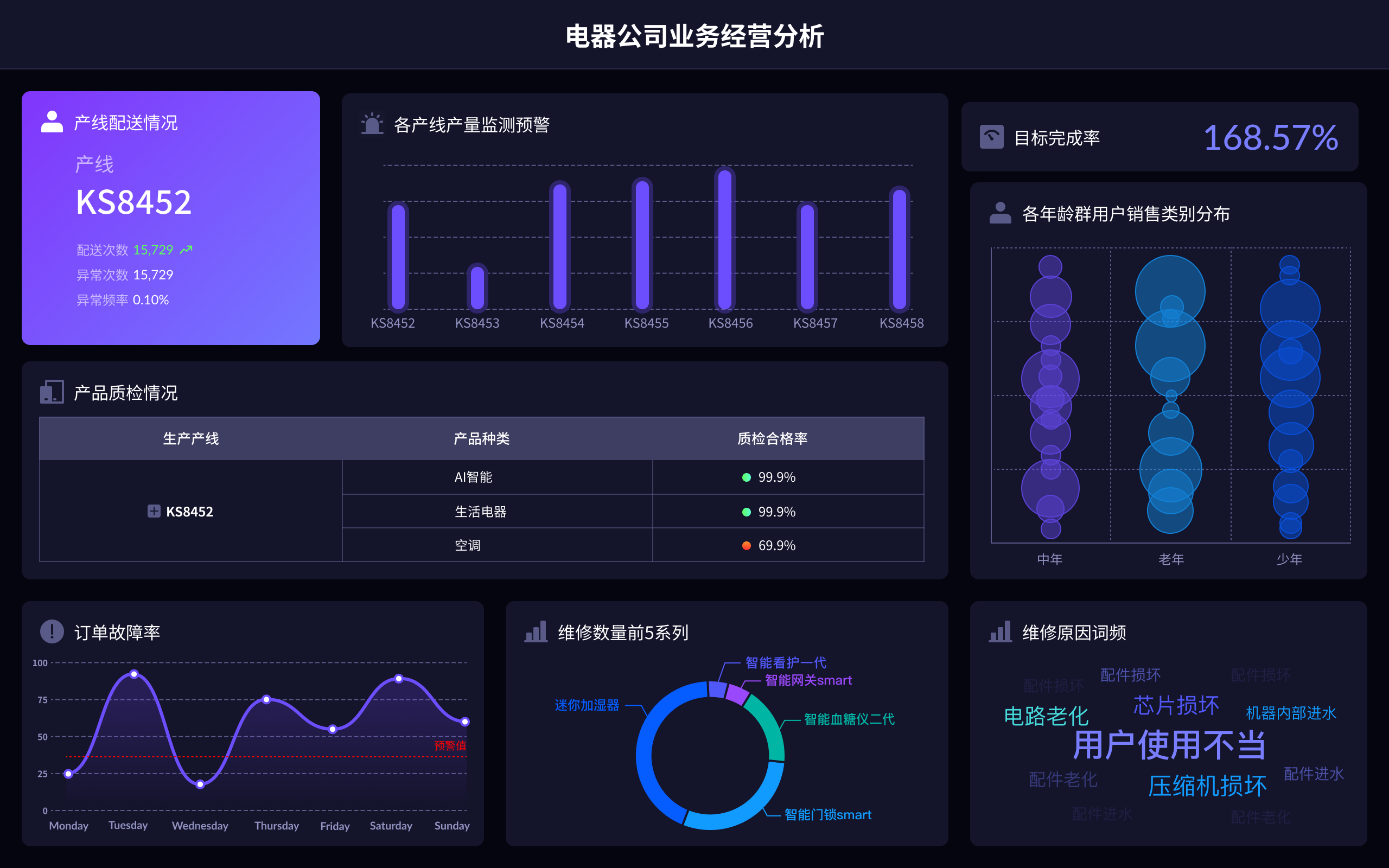
The essence of big data visualization involves transforming complex data sets into visual formats, facilitating data analysis, interpretation, and decision-making. This includes making data more accessible, revealing patterns and trends, enhancing understanding, and driving actionable insights. For instance, making data accessible means converting raw data into interactive visualizations that non-technical stakeholders can easily interpret and understand.
I. ACCESSIBILITY OF DATA
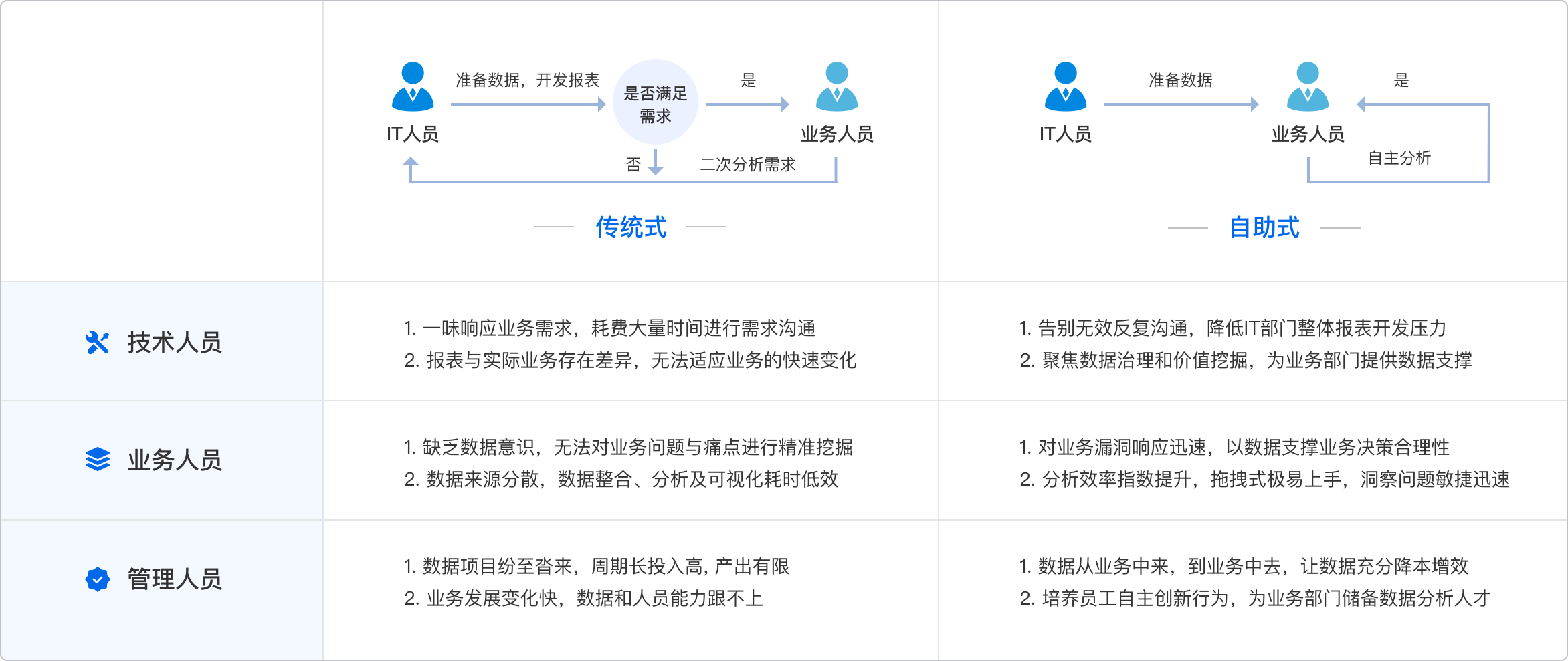
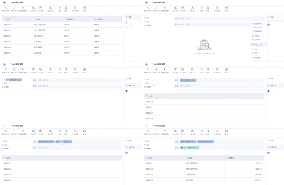
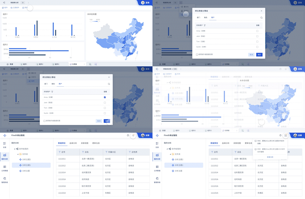
Big data visualization makes data accessible by converting vast amounts of complex, raw data into interactive and comprehensible visual formats. This transformation involves using tools and technologies that can handle large data sets, such as FineBI, FineReport, and FineVis. These tools help in breaking down barriers that traditionally prevent stakeholders from understanding and utilizing data effectively. By creating dashboards, charts, and graphs, these tools enable users to interact with data in a user-friendly manner, thus democratizing data access across the organization.
II. REVEALING PATTERNS AND TRENDS
Another critical aspect is the ability to reveal patterns and trends that are not immediately apparent in raw data. Big data visualization uses advanced analytics and machine learning algorithms to identify these patterns, providing a deeper understanding of the data. For example, time-series analysis can uncover trends over specific periods, while heat maps can show concentrations of activity. By visualizing these patterns, organizations can gain insights into customer behavior, market trends, and operational inefficiencies.
III. ENHANCING UNDERSTANDING
Big data visualization enhances understanding by presenting data in a visual context, such as through graphs or infographics. This method leverages human visual processing capabilities, allowing for quicker comprehension and better retention of information. For instance, a complex data table might be difficult to interpret, but a well-designed line graph can immediately convey trends and correlations. Enhanced understanding leads to more informed decision-making, as stakeholders can quickly grasp essential insights.
IV. DRIVING ACTIONABLE INSIGHTS
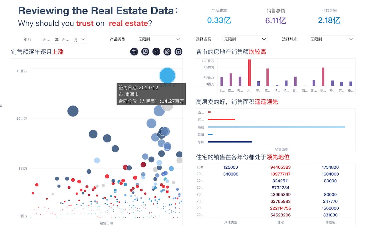
Driving actionable insights is perhaps the most significant value of big data visualization. By converting data into visual formats, organizations can identify key insights that lead to strategic decisions and actions. For instance, by visualizing sales data, a company can quickly identify which products are performing well and which are not, allowing for timely adjustments in marketing strategies. Additionally, predictive analytics can forecast future trends, helping businesses to plan and allocate resources more effectively.
V. TOOLS AND TECHNOLOGIES
Several tools and technologies facilitate big data visualization. FineBI, FineReport, and FineVis are prominent examples from FanRuan. FineBI specializes in business intelligence and analytics, providing interactive dashboards and reports that support decision-making. FineReport focuses on reporting and can handle complex data visualization needs with its robust reporting capabilities. FineVis, on the other hand, is tailored for sophisticated visualizations and data storytelling. These tools integrate with various data sources and offer features like drag-and-drop interfaces, real-time data processing, and customizable visualizations.
FineBI官网: https://s.fanruan.com/f459r
FineReport官网: https://s.fanruan.com/ryhzq
FineVis官网: https://s.fanruan.com/7z296
VI. APPLICATIONS IN DIFFERENT INDUSTRIES
Big data visualization finds applications across various industries. In healthcare, it can track patient records and treatment outcomes, leading to better patient care and resource management. In finance, visualizations can identify fraud patterns, assess risk, and manage portfolios. Retailers use it to understand consumer behavior, optimize inventory, and personalize marketing efforts. In manufacturing, it helps in monitoring production processes, predicting equipment failures, and improving supply chain efficiency. Each industry benefits from tailored visualizations that address specific challenges and opportunities.
VII. CHALLENGES AND CONSIDERATIONS
While big data visualization offers numerous benefits, it also presents challenges. Data quality is paramount; poor data quality can lead to misleading visualizations and incorrect conclusions. Ensuring data integrity and accuracy is crucial. Scalability is another concern, as tools must handle growing data volumes without compromising performance. Additionally, there is a need for skilled personnel who can create effective visualizations and interpret the results accurately. Organizations must invest in training and development to build these competencies.
VIII. FUTURE TRENDS
The future of big data visualization will likely see advancements in AI and machine learning, further enhancing the ability to process and visualize large data sets. Predictive and prescriptive analytics will become more integrated, offering deeper insights and more proactive decision-making capabilities. Virtual and augmented reality could also play a role, providing immersive and interactive visualization experiences. Additionally, there will be a focus on improving user interfaces and experience, making data visualization tools even more accessible and intuitive for a broader range of users.
IX. BEST PRACTICES
Adopting best practices in big data visualization is essential for maximizing its benefits. This includes focusing on clarity and simplicity in visual design, using the right type of visualization for the data and the audience, and maintaining consistency in visual elements. It is also important to provide context and narrative, helping users understand the significance of the data. Regularly updating visualizations to reflect the latest data ensures relevance and accuracy. Engaging with stakeholders to understand their needs and incorporating feedback can lead to more effective and impactful visualizations.
X. CONCLUSION
In conclusion, the essence of big data visualization lies in making data accessible, revealing patterns and trends, enhancing understanding, and driving actionable insights. By leveraging advanced tools like FineBI, FineReport, and FineVis, organizations can transform raw data into powerful visual stories that inform and inspire. As technology continues to evolve, the potential for big data visualization to revolutionize how we interact with data will only grow, opening up new opportunities for innovation and efficiency across all sectors.
相关问答FAQs:
FAQs on the Essence of Big Data Visualization
1. What is the essence of big data visualization?
Big data visualization refers to the representation of complex data sets in a visual format, such as graphs, charts, or maps, to facilitate understanding and insight. Its essence lies in its ability to transform raw, vast quantities of data into intuitive and interactive visuals. This transformation is crucial because it allows users to identify patterns, trends, and outliers that might be difficult to discern from raw data alone. By leveraging various visualization techniques, big data visualization simplifies the interpretation of data, making it more accessible and actionable. This is particularly valuable in decision-making processes across various domains, including business intelligence, healthcare, and scientific research.
2. How does big data visualization enhance decision-making processes?
Big data visualization significantly enhances decision-making by presenting data in a format that is easier to analyze and interpret. Through interactive dashboards and visualizations, decision-makers can quickly grasp complex data trends and relationships. For example, a well-designed visualization can highlight correlations between different variables or track changes over time, enabling users to make more informed decisions. Additionally, visualizations can facilitate predictive analytics by illustrating potential future trends based on historical data. This approach not only speeds up the decision-making process but also improves accuracy by providing a clear and comprehensive view of the data.
3. What are some common types of visualizations used in big data?
In big data visualization, a variety of visualization types are employed to represent different aspects of the data. Common types include:
- Bar Charts and Histograms: These are used to display and compare quantities across different categories or to show the distribution of data points.
- Line Charts: Ideal for illustrating trends over time, line charts help in understanding how variables change and interact with each other.
- Heat Maps: These visualize data density and patterns through color gradients, making them useful for identifying areas of high or low activity.
- Pie Charts: Although less commonly used for complex data sets, pie charts can effectively show proportions and percentages within a dataset.
- Scatter Plots: Useful for identifying correlations and outliers, scatter plots display data points on a two-dimensional plane.
Each type of visualization serves a specific purpose and is chosen based on the nature of the data and the insights needed.
本文内容通过AI工具匹配关键字智能整合而成,仅供参考,帆软不对内容的真实、准确或完整作任何形式的承诺。具体产品功能请以帆软官方帮助文档为准,或联系您的对接销售进行咨询。如有其他问题,您可以通过联系blog@fanruan.com进行反馈,帆软收到您的反馈后将及时答复和处理。


