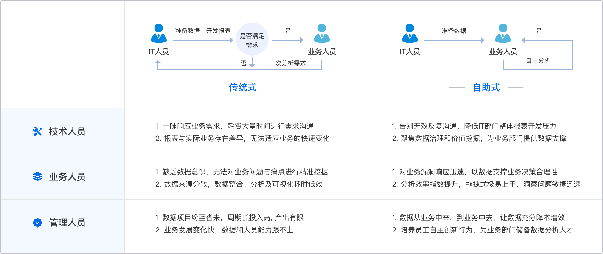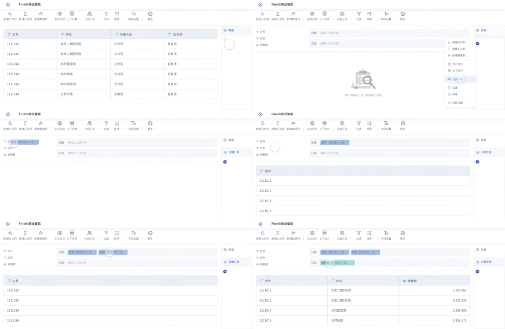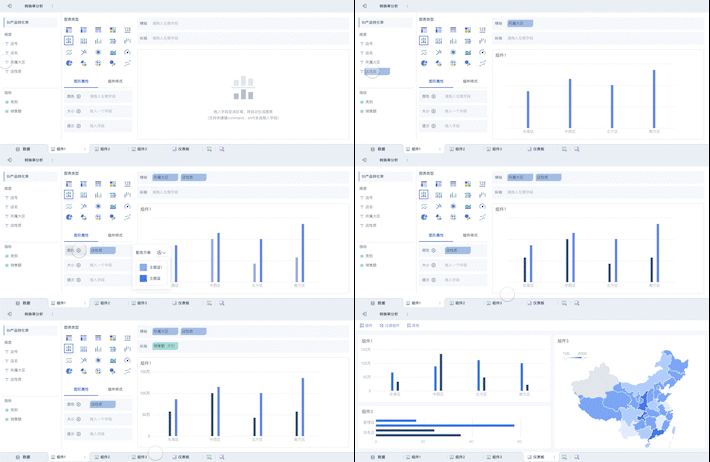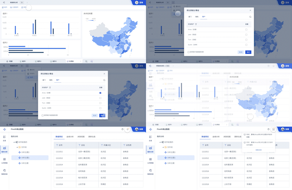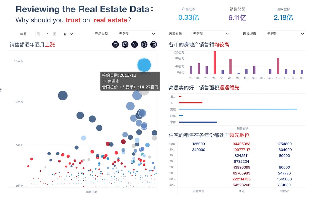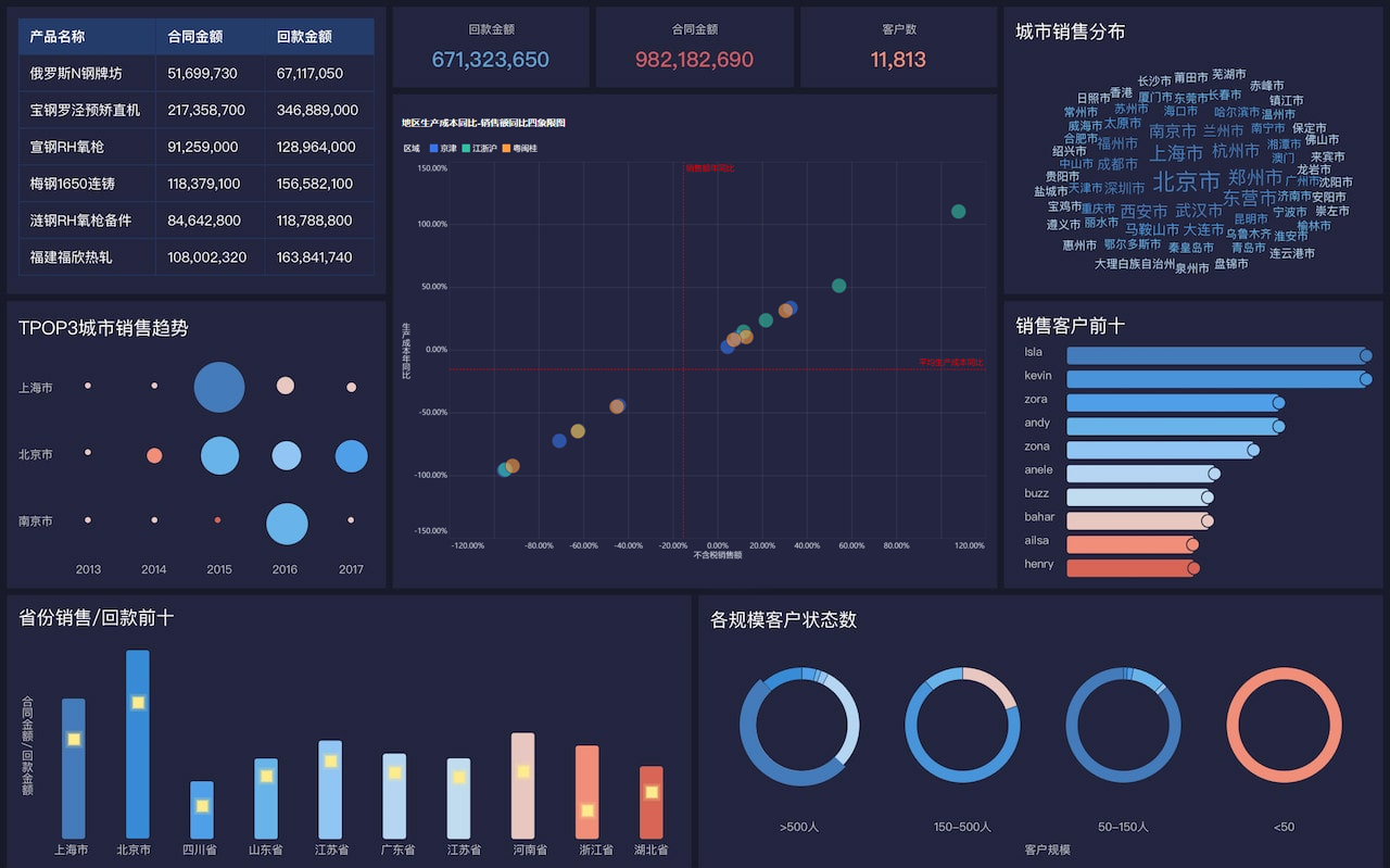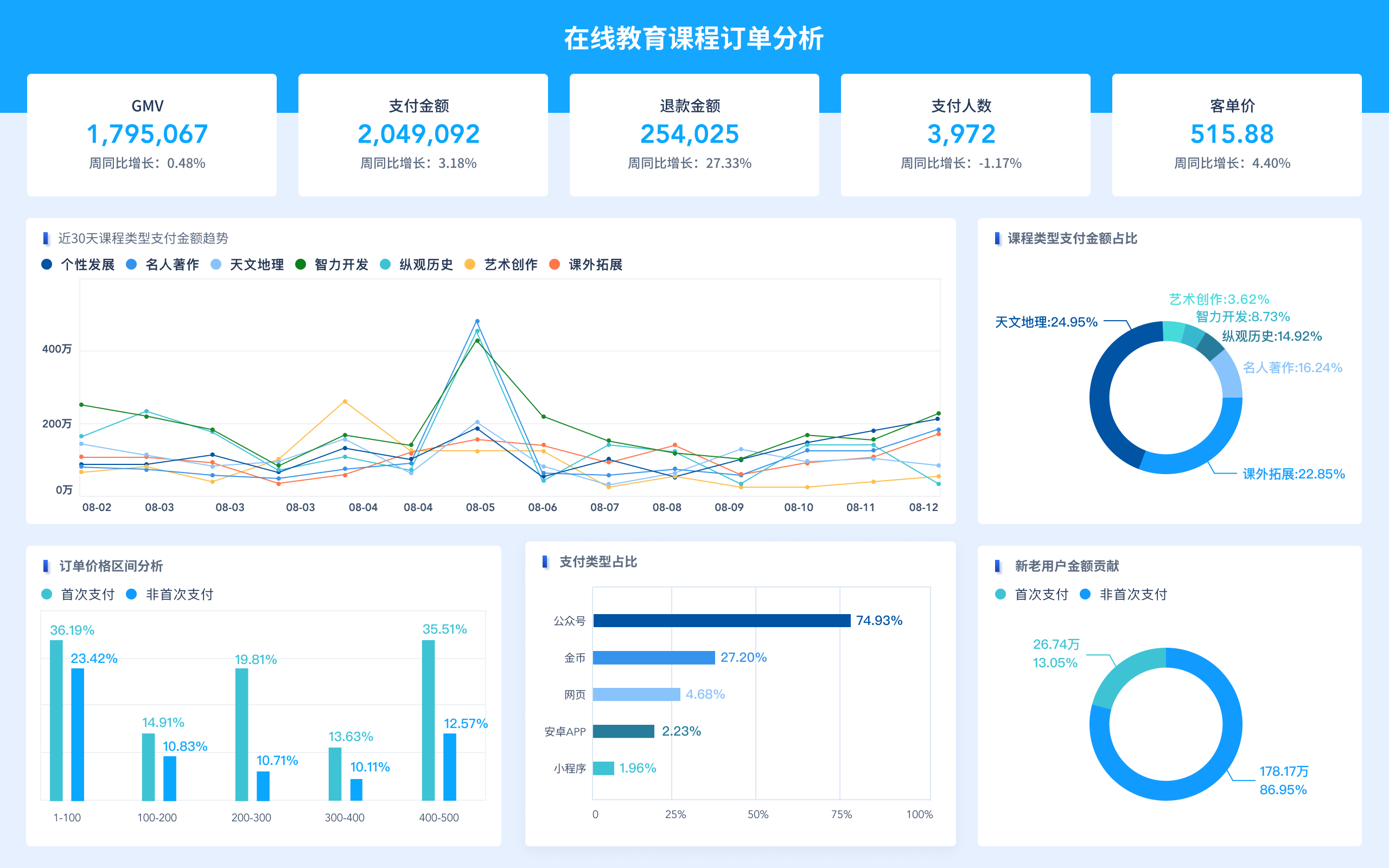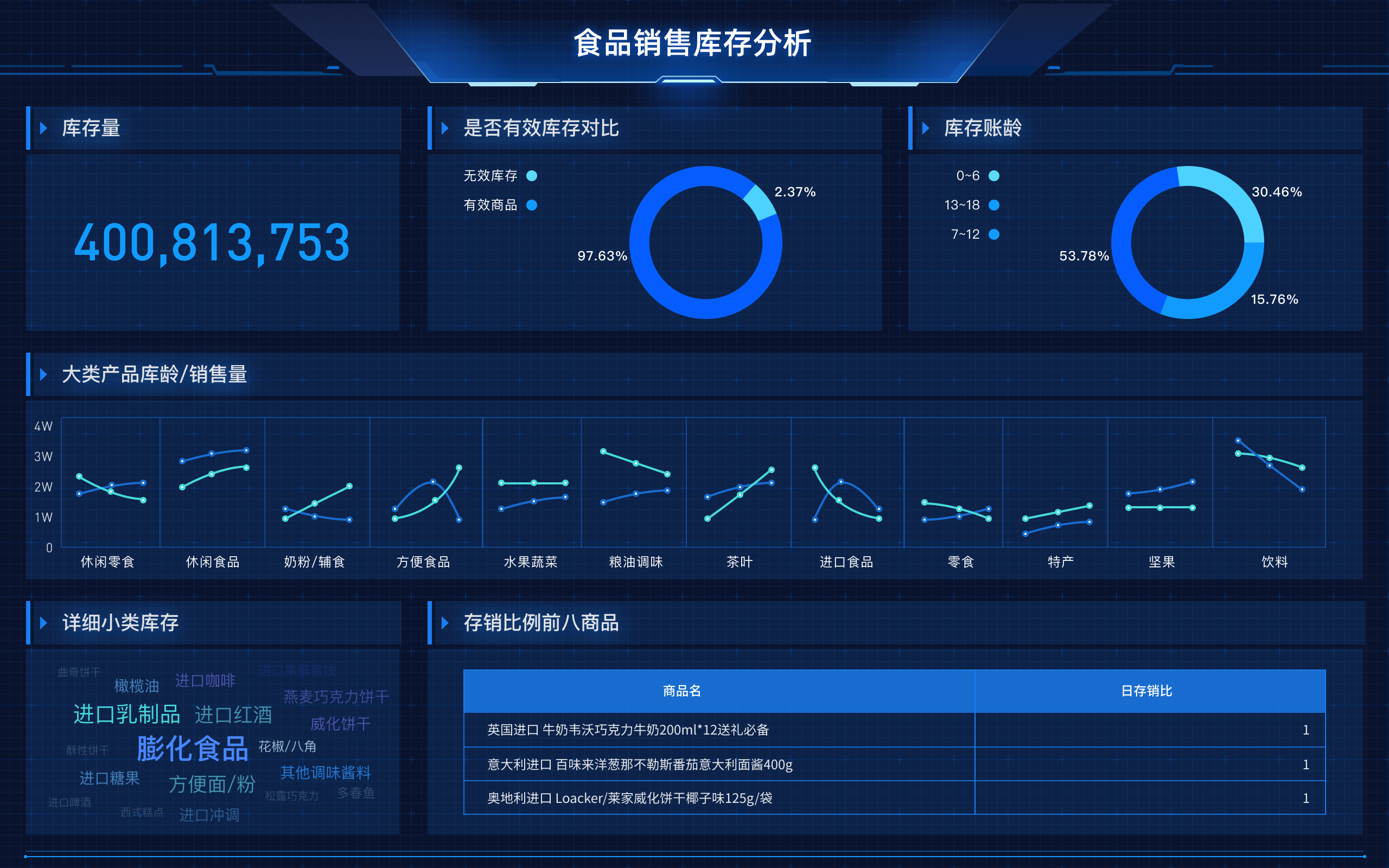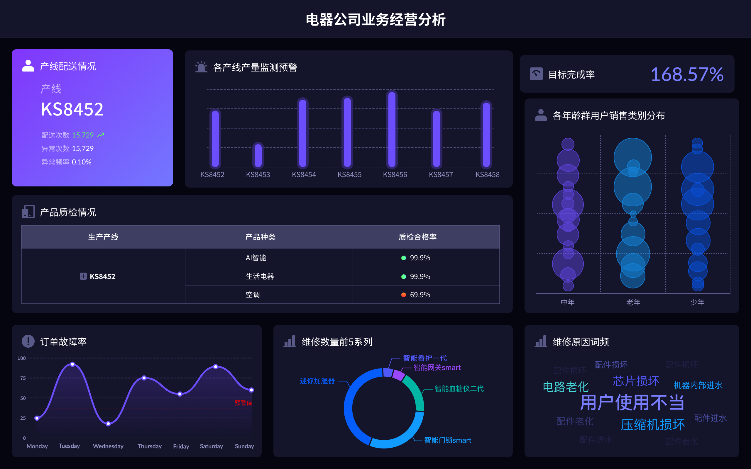
The term "动态可视化数据" in English is "dynamic data visualization."
相关问答FAQs:
Frequently Asked Questions About Dynamic Data Visualization
- What is dynamic data visualization in English?
Dynamic data visualization refers to the use of interactive and real-time graphical representations to display data. Unlike static charts or graphs, dynamic visualizations are designed to update automatically as new data becomes available, providing a more engaging and informative user experience. This approach allows users to explore data through interactive elements like sliders, filters, and clickable areas, enhancing their ability to analyze trends and patterns. Dynamic data visualization is commonly used in fields such as business intelligence, data analysis, and scientific research to convey complex information in a more accessible and understandable way.
- How does dynamic data visualization enhance data analysis?
Dynamic data visualization enhances data analysis by providing real-time feedback and interactive features that allow users to manipulate and explore data in various ways. This type of visualization can handle large datasets and complex variables, offering visual cues that help identify trends, outliers, and correlations more effectively. For instance, dynamic dashboards enable users to drill down into specific data points, apply filters, and view different perspectives of the data without needing to generate new static reports. This interactivity not only makes the data more comprehensible but also facilitates faster and more informed decision-making.
- What are some common tools and technologies used for creating dynamic data visualizations?
Several tools and technologies are commonly used for creating dynamic data visualizations, each offering unique features and capabilities. Popular options include:
- Tableau: Known for its user-friendly interface and powerful data integration capabilities, Tableau allows users to create interactive dashboards and visualizations with ease.
- Power BI: Microsoft's Power BI provides robust features for building dynamic reports and dashboards, including real-time data updates and integration with various data sources.
- D3.js: A JavaScript library that offers extensive customization options for creating interactive and animated visualizations directly on web pages.
- Plotly: An open-source library that supports a wide range of chart types and interactive features, suitable for both web and offline visualizations.
- Google Data Studio: A tool that enables users to build interactive reports and dashboards using data from various Google services and other sources.
These tools facilitate the creation of dynamic visualizations that are not only visually appealing but also highly functional, enabling users to interact with data in meaningful ways.
本文内容通过AI工具匹配关键字智能整合而成,仅供参考,帆软不对内容的真实、准确或完整作任何形式的承诺。具体产品功能请以帆软官方帮助文档为准,或联系您的对接销售进行咨询。如有其他问题,您可以通过联系blog@fanruan.com进行反馈,帆软收到您的反馈后将及时答复和处理。


