Executives do not need another email report full of opens, clicks, and subject-line winners. They need email marketing dashboard examples that answer harder business questions: Which programs are creating pipeline? Which campaigns are influencing revenue? Where is conversion slowing down? And which teams are accountable for fixing it?
That is the difference between tactical campaign reporting and an executive KPI view. A campaign report helps a channel manager optimize sends. An executive dashboard helps leadership decide where to invest, what to cut, and how email contributes to growth.
When designed correctly, an email dashboard becomes a decision system. It connects email performance to:
- Pipeline creation
- Opportunity progression
- Deal influence
- Closed-won revenue
- Marketing efficiency
- Forecast confidence
For CMOs, revenue leaders, marketing operations teams, and business unit heads, a useful dashboard must do four things well:
- Speed: surface the signal in seconds, not after a 20-tab report review
- Clarity: show business outcomes before channel detail
- Trend visibility: reveal whether performance is improving, flattening, or declining
- Accountability: tie each KPI to an owner, process, and corrective action
 Click To Try The Dashboard
What executives need from email marketing dashboard examples
Executive dashboards should be built for leadership decisions, not channel diagnostics alone. That means the layout, KPI selection, and drill-down logic must reflect commercial outcomes.
Define the difference between campaign reporting and executive KPI views
Most email teams already have campaign reporting. It typically includes:
- Send volume
- Delivery rate
- Open rate
- Click-through rate
- Unsubscribe rate
- A/B test performance
Useful? Yes. Sufficient for executives? No.
An executive KPI dashboard reframes email as a revenue engine. Instead of stopping at engagement, it extends into funnel performance and commercial impact. It shows whether email is helping generate qualified demand, accelerate movement through the pipeline, and convert into revenue.
A practical distinction:
- Campaign reporting asks: How did this email perform?
- Executive KPI views ask: What business result did this email program produce?
Clarify how dashboards connect email performance to pipeline creation, deal influence, and revenue
To make email performance credible in the boardroom, the dashboard must connect data across systems:
- Marketing automation platform for sends, deliveries, clicks, nurture participation
- CRM for leads, MQLs, SQLs, opportunities, stages, and revenue
- Web analytics for post-click behavior and conversions
- Attribution model for sourced, influenced, first-touch, and multi-touch logic
This is where many dashboards fail. They show email engagement in one system and pipeline in another, leaving leadership to guess the relationship. Strong executive dashboards remove that gap and visualize email’s role across the full buying journey.
Set the criteria for a useful leadership dashboard: speed, clarity, trend visibility, and accountability
A leadership dashboard should meet a simple standard: a senior stakeholder should be able to open it and answer the following in under two minutes:
- Are we on pace for pipeline and revenue goals?
- Which email programs are contributing most?
- Where are conversion rates improving or declining?
- Which segments or regions are outperforming?
- What action should we take this week or this month?
If the dashboard cannot answer those questions quickly, it is likely too tactical, too crowded, or too disconnected from revenue operations.
The core KPIs every executive email marketing dashboard should include
The best email marketing dashboard examples do not overload leadership with every available metric. They prioritize a disciplined KPI stack that connects leading indicators to lagging outcomes.
Key Metrics (KPIs)
- Sourced pipeline: Total pipeline created directly from email-originated leads or opportunities.
- Influenced pipeline: Pipeline where email engagement materially contributed, even if email was not the original source.
- Won revenue: Closed-won revenue attributed to email under the agreed attribution model.
- Average deal size: Average value of deals touched or sourced by email programs.
- Sales cycle impact: Change in time-to-close for prospects influenced by email journeys.
- Lead-to-MQL rate: Percentage of email-driven leads that meet marketing qualification criteria.
- MQL-to-SQL rate: Percentage of marketing-qualified leads that become sales-accepted or sales-qualified.
- Opportunity conversion rate: Percentage of email-engaged leads or accounts that become pipeline opportunities.
- Meeting-booked rate: Share of recipients or engaged prospects that result in booked meetings.
- Send volume: Number of emails sent, used for context and scale normalization.
- Deliverability rate: Percentage of sent emails that successfully reach inboxes or are accepted by receiving servers.
- Open rate context: Open rate used cautiously as directional context, not as a standalone success metric.
- Click-through rate (CTR): Percentage of delivered emails generating at least one click.
- Unsubscribe rate: Percentage of recipients opting out after a send or journey.
- Cost per opportunity: Total email program cost divided by opportunities generated.
- Month-over-month trend: Performance change across periods to identify momentum.
- Target attainment: Current performance versus pipeline or revenue goal.
- Cohort comparison: Performance comparison across acquisition month, segment, or nurture entry group.
- Channel benchmark comparison: Email performance compared with other demand channels or internal targets.
The core KPIs every executive email marketing dashboard should include
Revenue and pipeline metrics
These are the numbers leadership cares about first. They anchor email in financial outcomes rather than engagement trivia.
Sourced pipeline shows the direct commercial output generated by email-led efforts. This is essential for understanding whether nurture tracks, promotions, newsletters, and outbound email programs are actually creating new selling opportunities.
Influenced pipeline captures email’s assisting role. In B2B environments with long buying cycles, email rarely acts alone. It often nurtures stakeholders, supports product education, and re-engages dormant accounts before pipeline appears in CRM.
Won revenue is the clearest proof of impact. When shown alongside sourced and influenced pipeline, it helps executives understand both direct contribution and broader deal support.
Average deal size helps leadership evaluate quality, not just volume. A campaign that generates fewer but larger opportunities may be more valuable than one that floods the funnel with low-value leads.
Sales cycle impact reveals whether email accelerates buying. If nurtured prospects close faster, email is doing more than creating interest; it is reducing friction in the revenue process.
Funnel and conversion metrics
Executive teams need to see where conversion improves or breaks down after engagement begins.
Core conversion KPIs include:
- Lead-to-MQL
- MQL-to-SQL
- Opportunity conversion
- Meeting-booked rate from email-driven journeys
These metrics matter because they expose operational bottlenecks. For example:
- High clicks but weak lead-to-MQL may signal poor audience quality or weak landing page alignment.
- Strong MQL creation but low MQL-to-SQL may indicate handoff problems or weak qualification criteria.
- Healthy SQL volume but weak opportunity conversion may suggest messaging misalignment or sales follow-up gaps.
Funnel metrics turn the dashboard into a performance management tool, not just a reporting surface.
Efficiency and engagement metrics
Engagement metrics still matter, but only when framed in context.
Send volume provides scale. A revenue increase from email means more when leaders can see whether it came from better efficiency, more volume, or both.
Deliverability is a foundational health indicator. If inbox placement deteriorates, everything downstream suffers. This is especially important for large databases, global programs, and high-frequency nurture streams.
Open rate context should be treated carefully due to privacy-driven inflation and tracking inconsistencies. It is useful directionally, especially when reviewed with click and conversion data, but it should not dominate executive reporting.
Click-through rate remains a stronger indicator of content relevance and offer strength.
Unsubscribe rate helps leadership monitor fatigue, targeting quality, and list risk.
Cost per opportunity is one of the most executive-friendly efficiency metrics because it links channel spend to actual pipeline output.
Forecasting and benchmarking metrics
Executive visibility is incomplete without pacing and comparison.
Include these on every leadership-ready dashboard:
- Month-over-month trends
- Target attainment
- Cohort comparisons
- Channel benchmarks
Trend data shows momentum. Target attainment shows whether the team is on plan. Cohort analysis helps explain why newer leads or nurture entrants convert differently. Benchmarks help leadership assess whether email is underperforming or outperforming other channels and historical standards.
12 executive dashboard views that tie campaigns to business outcomes
Below are 12 practical email marketing dashboard examples built for executive visibility and business action.
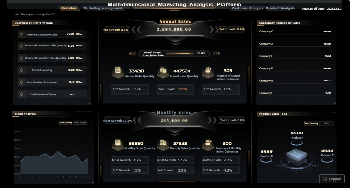
1. Executive summary dashboard
This is the one-screen view leadership opens first. It should summarize email’s contribution to revenue and pipeline without requiring drill-down.
Include:
- Sourced pipeline
- Influenced pipeline
- Won revenue
- Cost per opportunity
- Goal attainment
- 3- to 6-month trend lines
- Top-performing programs
The value of this dashboard is speed. It gives a quick answer to whether email is helping hit quarterly targets and whether performance is improving or slipping.
2. Campaign-to-pipeline dashboard
This view connects specific email campaigns or campaign families to qualified pipeline creation.
Show:
- Campaign name
- Audience segment
- Sends and clicks
- MQLs generated
- Opportunities created
- Pipeline value
- Pipeline velocity trend
This helps executives and demand generation leaders understand which campaigns are driving actual sales momentum rather than superficial engagement.
3. Revenue attribution dashboard
Email rarely deserves all the credit, but leadership needs a clean view of how attribution is being applied.
This dashboard should compare:
- Sourced revenue
- Influenced revenue
- First-touch revenue
- Multi-touch revenue
The key here is definition clarity. Executives do not need attribution theory lectures. They need consistent logic and an apples-to-apples comparison of how email contributes under each model.
4. Funnel conversion dashboard
This is one of the most important executive views because it links channel activity to pipeline stages.
A strong funnel maps:
- Sent
- Delivered
- Clicked
- Converted to lead
- Became MQL
- Became SQL
- Created opportunity
- Closed won
This dashboard quickly exposes drop-off points. It is especially effective in executive reviews because it turns disconnected metrics into a single commercial story.
5. Segment performance dashboard
Not all audiences respond equally, and executives need to know where email produces the highest return.
Break performance out by:
- Audience type
- Industry
- Account tier
- Lifecycle stage
- Geography
- Customer vs. prospect segment
This view supports budget shifts, territory planning, and segmentation strategy. It is one of the clearest ways to identify where email deserves more investment.
6. Lifecycle and nurture dashboard
Automated programs are often underreported despite being major revenue contributors. This dashboard tracks nurture effectiveness by lifecycle stage.
Include:
- Entry volume by workflow
- Stage progression rate
- Time to conversion
- Opportunity creation
- Pipeline contribution
- Revenue influenced by nurture path
This helps executives understand whether lifecycle marketing is simply sending messages or actually moving buyers forward.
7. Account-based email dashboard
For B2B teams running ABM motions, the reporting unit should often be the account, not the individual recipient.
This dashboard should measure:
- Engagement across target accounts
- Buying group interaction
- Account progression by stage
- Meetings created
- Pipeline movement
- Revenue from target-account email programs
Executives appreciate this view because it aligns marketing performance with strategic account priorities.
8. Sales alignment dashboard
One of the biggest executive concerns is whether marketing-generated activity leads to timely sales action.
Show:
- Lead handoff speed
- Sales follow-up rate
- Meeting creation after email engagement
- Opportunity acceptance rate
- Response time by team or region
This dashboard is highly effective in joint sales-marketing reviews because it makes process accountability visible.
9. Deliverability and list health dashboard
No executive wants to discover too late that performance dropped because the database deteriorated or inbox placement collapsed.
This dashboard should track:
- Bounce rate trends
- Spam complaint rate
- Suppression list growth
- Inactive subscriber growth
- List decay rate
- Domain-level deliverability patterns
It is not the flashiest dashboard, but it is critical for protecting future pipeline production.
10. Content and CTA performance dashboard
Executives do not need deep creative analytics, but they do need to know which messages and offers produce business outcomes.
Compare:
- Subject line themes
- Content formats
- CTA types
- Offers
- Landing pages
- Asset themes
- Downstream pipeline and revenue impact
The point is not creative vanity. The point is commercial learning: which content patterns drive conversion and which do not.
11. Regional or business-unit comparison dashboard
Large organizations need normalized reporting across regions, teams, or product lines.
This dashboard helps compare:
- Pipeline per 1,000 sends
- Revenue per campaign
- Conversion rates by region
- Cost per opportunity
- Goal attainment by business unit
Normalization matters. Raw totals can mislead leadership when one region has a larger database or more campaign volume than another.
12. Forecast and pacing dashboard
This is the executive control tower. It shows whether email performance is on track to support quarterly pipeline and revenue commitments.
Include:
- Quarterly pipeline target
- Current actuals
- Gap to target
- Pace required
- Forecast based on current conversion rates
- Scenario ranges based on campaign pipeline in-flight
This view is especially valuable for monthly business reviews and quarter-end planning because it turns historical reporting into forward-looking management.
How to build an email dashboard executives will actually use
A dashboard becomes valuable when it improves decisions. The following practices are what experienced consultants use to keep executive reporting trusted and adopted.
Start with business questions, not channel metrics
Do not begin with a list of available email metrics. Start with leadership decisions.
Ask questions like:
- Should we shift budget to nurture or one-off campaigns?
- Which segments should get more coverage next quarter?
- Where is funnel leakage occurring after email engagement?
- Is email helping create efficient pipeline compared with paid media or events?
Once the decisions are clear, choose the metrics that support them. This prevents dashboards from becoming cluttered with numbers that do not drive action.
Align data sources and attribution rules
Before building visuals, standardize the data model. This is non-negotiable.
At minimum, align:
- CRM stage definitions
- MQL and SQL rules
- Opportunity creation logic
- Revenue attribution windows
- Campaign naming conventions
- Identity resolution across systems
If these rules are unstable, the dashboard will lose credibility fast. Executives can tolerate bad news; they do not tolerate inconsistent numbers.
Keep the layout decision-friendly
A clean layout usually performs better than a visually dense one. Good executive dashboards follow a simple hierarchy:
- Top summary KPIs
- Trends over time
- Contribution or comparison views
- Drill-down for diagnosis
Use limited chart types, consistent colors, clear labels, and minimal clutter. Every element should support a leadership question.
Review and refine on a reporting cadence
Dashboards should mirror operating rhythm.
A practical structure:
- Weekly: pace, anomalies, handoff speed, campaign momentum
- Monthly: pipeline contribution, segment performance, funnel conversion
- Quarterly: revenue impact, forecast accuracy, budget allocation, benchmark analysis
Dashboards that are not reviewed in live business conversations usually decay into reporting furniture.
Best practices for implementation
Here are four concrete steps to build executive-grade reporting:
-
Define the revenue story first.
Decide exactly how email contributes to pipeline and revenue in your organization. Lock sourced, influenced, and attribution definitions before dashboard design. -
Map every KPI to a system owner.
Each metric should have a clear owner across marketing ops, sales ops, demand gen, or BI. This reduces disputes and speeds issue resolution. -
Build one summary layer and one diagnostic layer.
Executives need fast answers. Operators need detail. Separate these views rather than forcing one dashboard to serve everyone poorly. -
Audit data quality monthly.
Review CRM latency, campaign tagging, duplicate records, broken UTM conventions, and missing opportunity links. Dashboard trust depends on data discipline.
Common mistakes that make email dashboards less credible
Even well-intentioned teams undermine dashboard trust by overreporting the wrong things or hiding methodological weaknesses.
The most common mistakes include:
-
Overemphasizing opens and clicks without pipeline context
This creates the illusion of performance without demonstrating business value. -
Mixing sourced and influenced revenue without clear definitions
When attribution categories blur, executive confidence drops immediately. -
Hiding data quality issues, attribution gaps, or lagging CRM updates
Transparency builds trust. Silent data issues do the opposite. -
Showing too many tactical charts instead of a concise executive narrative
Leadership does not need fifteen widgets. They need a coherent answer to whether email is driving growth efficiently.
A good rule: if a chart does not support a strategic decision, it probably does not belong in the executive version of the dashboard.
Final checklist for choosing the right dashboard template or reporting format
Before rolling out a dashboard or selecting from available email marketing dashboard examples, use this checklist to evaluate fit.
- Confirm each KPI has an owner, definition, source, and reporting cadence
- Make sure every view answers a leadership question tied to growth or efficiency
- Validate that benchmarks, targets, and historical trends are visible at a glance
- Choose a template that can scale from executive summary to channel-level diagnosis
Also ask three practical questions:
- Can the dashboard support both weekly operating reviews and quarterly business reviews?
- Can leadership drill from summary performance into segment or campaign diagnosis?
- Can the reporting logic scale as the company adds regions, business units, or new attribution requirements?
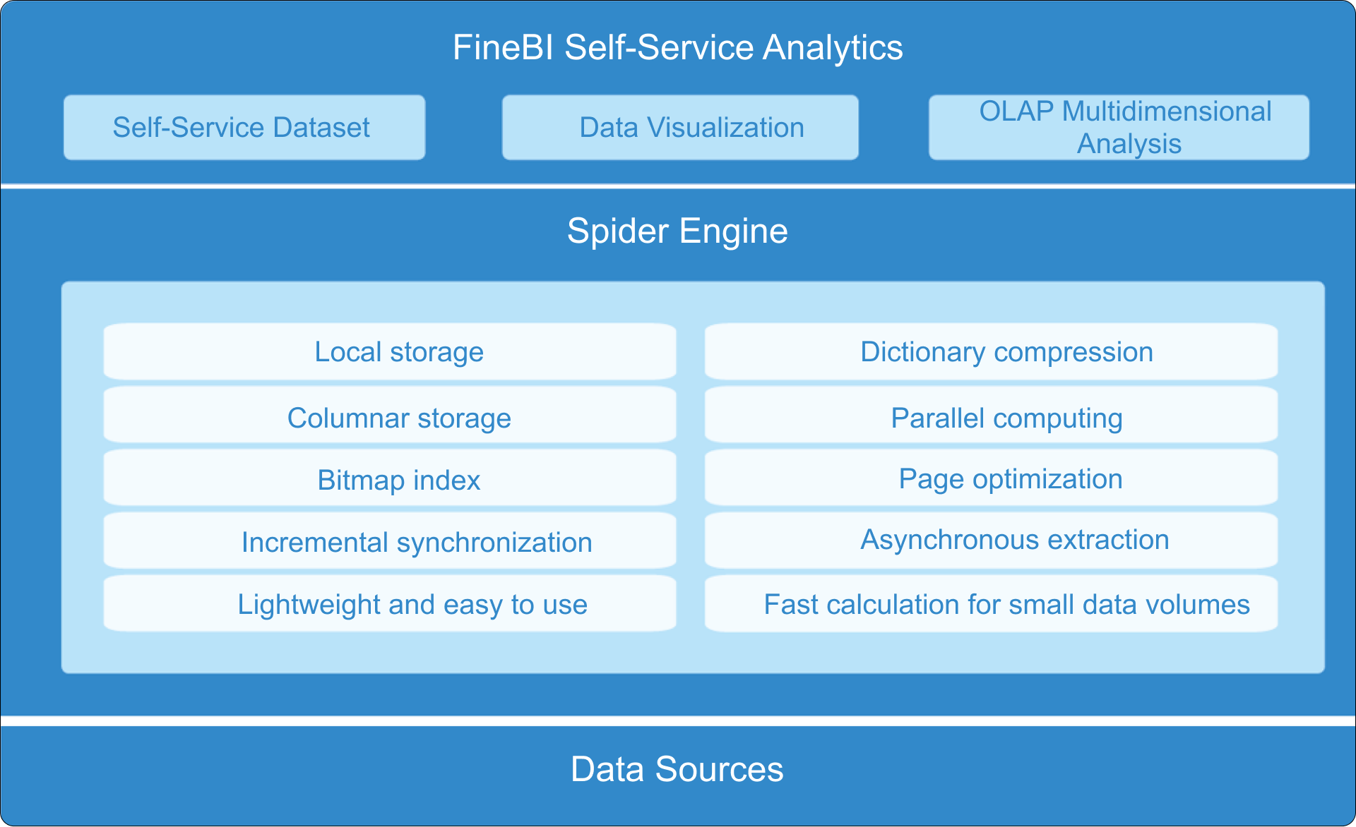
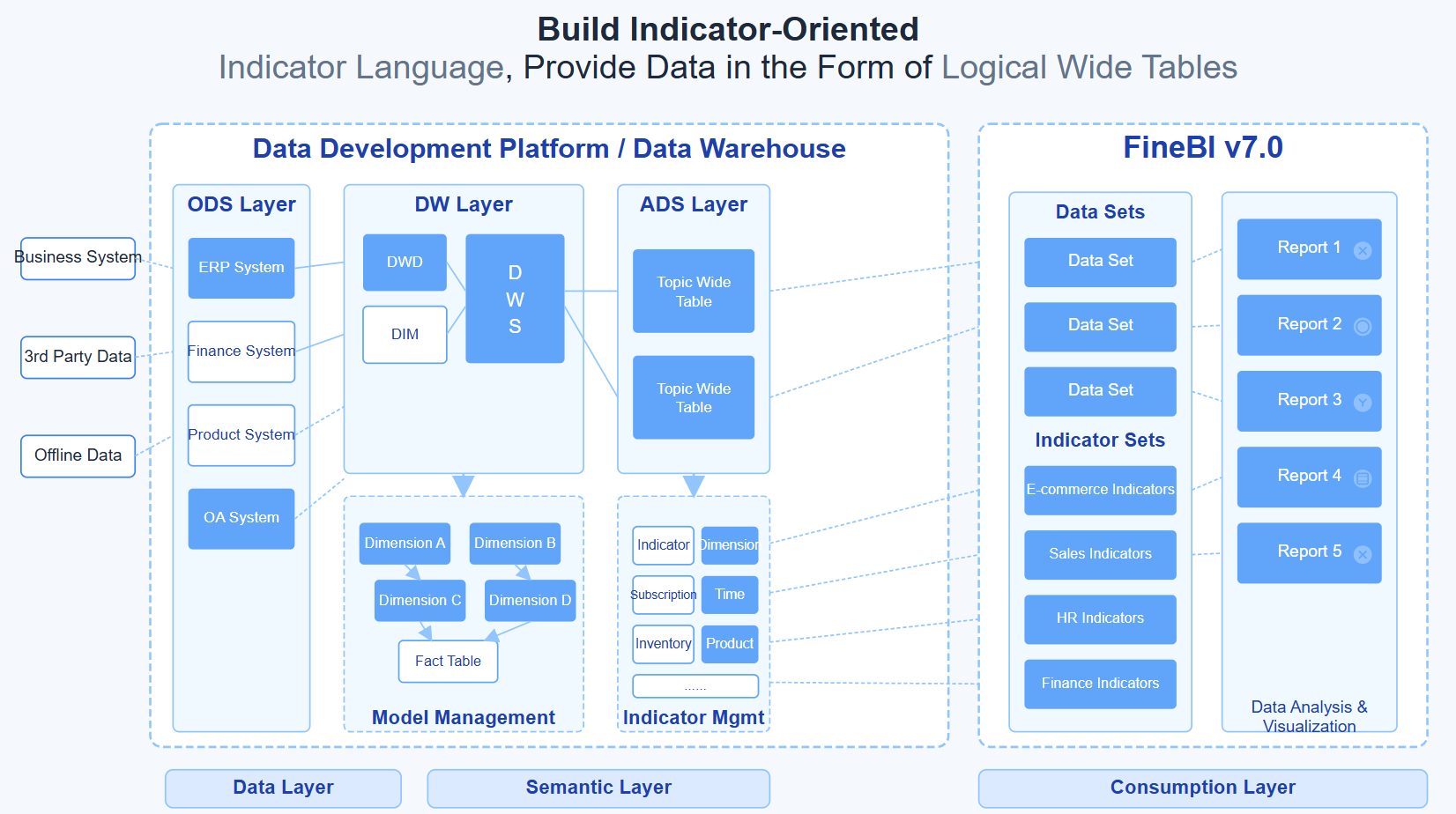
Build faster with FineBI instead of stitching this together manually
Building this manually is complex. You need data integration across email platforms, CRM, web analytics, and revenue systems. You need trusted KPI definitions, executive-ready visual design, automated refreshes, and drill-down paths that do not break under scale.
This is where FineBI becomes the practical solution.
Instead of building fragile reports from scratch, use FineBI to utilize ready-made templates and automate this entire workflow. FineBI helps teams centralize email, funnel, pipeline, and revenue data into decision-ready dashboards that executives can actually use. With flexible visualizations, governed metrics, and scalable self-service analysis, it allows marketing ops, BI teams, and revenue leaders to move from manual reporting to repeatable executive insight.
If your goal is to turn email from a tactical channel report into a boardroom-ready performance system, FineBI gives you a faster and more reliable way to do it.
FAQs
It should prioritize business outcomes such as sourced pipeline, influenced pipeline, won revenue, conversion rates, target attainment, and month-over-month trends. Engagement metrics like opens and clicks can still appear, but only as supporting context.
You need to combine data from your email platform, CRM, web analytics, and an agreed attribution model. That connection lets leaders see how email contributes from first engagement through opportunities and closed-won revenue.
The most important KPIs are sourced pipeline, influenced pipeline, won revenue, opportunity conversion rate, meeting-booked rate, cost per opportunity, and sales cycle impact. These metrics help executives evaluate growth contribution instead of just campaign activity.
Opens and clicks show engagement, but they do not explain whether email is creating pipeline or accelerating deals. Executives need metrics tied to commercial results so they can make budget, prioritization, and accountability decisions.
Most executive dashboards should refresh at least daily, with some teams using near real-time updates for high-volume programs. The key is giving leadership timely trend visibility without forcing them to wait for manual reporting cycles.


The Author
Yida YIn
FanRuan Industry Solutions Expert
Related Articles

Portfolio Reporting for PMOs: 9 Executive Metrics Every Weekly Portfolio Dashboard Should Include
Weekly portfolio reporting should help executives answer three questions fast: Are we delivering the right initiatives, are we putting outcomes at risk, and what decisions need leadership this week? For PMOs, that means
Yida Yin
Jul 01, 2026

How to Build an Investment Portfolio Reporting Dashboard for Executives: KPIs, Benchmarks, and Drill-Down Views
Investment portfolio reporting for executives is not about showing every holding, transaction, and chart your investment team can produce. It is about giving CEOs, CFOs, CIOs, boards, and investment committees a fast, re
Yida YIn
Jun 25, 2026

12 KPI Reporting Examples for Executive Dashboards: What to Show in Weekly, Monthly, and Quarterly Reviews
Executive leaders do not need more data. They need decision ready $1 examples that match how often they review the business and what actions they are expected to take. A weekly $1 should surface fast moving risks and per
Yida YIn
Jun 25, 2026