A clustered bar chart is a type of bar chart that compares data across multiple categories and subgroups. It organizes data into clusters, making it easier for you to explore relationships between subcategories. This chart type works well when you need to analyze proportions or compare values, such as income levels across departments in Malaysia.
Clustered bar chart enhances data visualizationby offering detailed insights. For instance, they allow you to compare values within a main category while showcasing differences among subcategories. This makes them ideal for presenting complex comparisons in a clear and structured format. Whether you’re analyzing survey results or tracking team performance in Malaysia, these charts provide clarity and precision. You can even create them using tools like Excel for added convenience.
What Is a Clustered Bar Chart?
Definition and Key Features of a Clustered Bar Chart
A clustered bar chart is a type of bar chart that groups data into clusters to compare values across multiple categories and subcategories. Each cluster represents a main category, while the bars within it show the subcategories. This layout makes it easy for you to analyze relationships and differences between groups. For example, you can use it to compare sales performance across regions and product types.
One key feature of a clustered bar chart is its horizontal orientation. This format allows you to display longer category names without cluttering the chart. Another feature is its ability to handle multiple data series, making it ideal for side-by-side comparisons. You can also customize the chart by adjusting colors, labels, and axis settings to enhance clarity.
Differences Between Clustered Bar Chart and Clustered Column Chart
Although clustered bar charts and clustered column charts look similar, they differ in orientation. A clustered bar chart displays data horizontally, while a clustered column chart presents it vertically. This distinction affects how you interpret the data. Horizontal bars are better for comparing categories with long labels, while vertical columns work well for showing trends over time.
Another difference lies in their visual impact. Clustered bar charts emphasize category comparisons, making them suitable for analyzing static data. On the other hand, clustered column charts highlight changes or patterns, which is useful for time-series data. Choosing the right chart depends on your data and the story you want to tell.
Benefits of Using Clustered Bar Chart for Data Analysis
Clustered bar chart offers several advantages for data analysis in Malaysia:
They simplify comparisons by grouping related data, helping you identify differences across categories and subcategories.
These charts are effective for tracking progress or variations, such as team performance across locations in Malaysia.
They enhance presentations by providing a clear and visually appealing way to display relationships in your data.
For example, if you use Excel to create a clustered bar chart, you can easily compare sales figures across departments and products in Malaysia. This clarity makes it easier for your audience to grasp key insights.
Tip: Use clustered bar charts when you need to compare multiple categories side by side. Avoid using them for datasets with too many groups, as this can make the chart look crowded.
How to Create a Clustered Bar Chart with FineBI
Step 1: Organize Your Data for a Clustered Bar Chart
To begin, you need to prepare your data in a structured format. FineBI works best when your data is organized into rows and columns. Each row should represent a unique category, while each column should contain the values for different subcategories. For example, if you want to compare sales across regions and product types, list the regions in rows and the product types in columns.
Ensure your data is clean and free of errors. Remove duplicates and fill in any missing values. This step is crucial because accurate data leads to reliable visualizations. If you’re using Excel, you can easily format your data by creating a table with headers for each column. This makes it easier to import the data into FineBI later.
Tip: Use descriptive labels for your categories and subcategories. Clear labels improve the readability of your clustered bar chart and help your audience understand the data quickly.
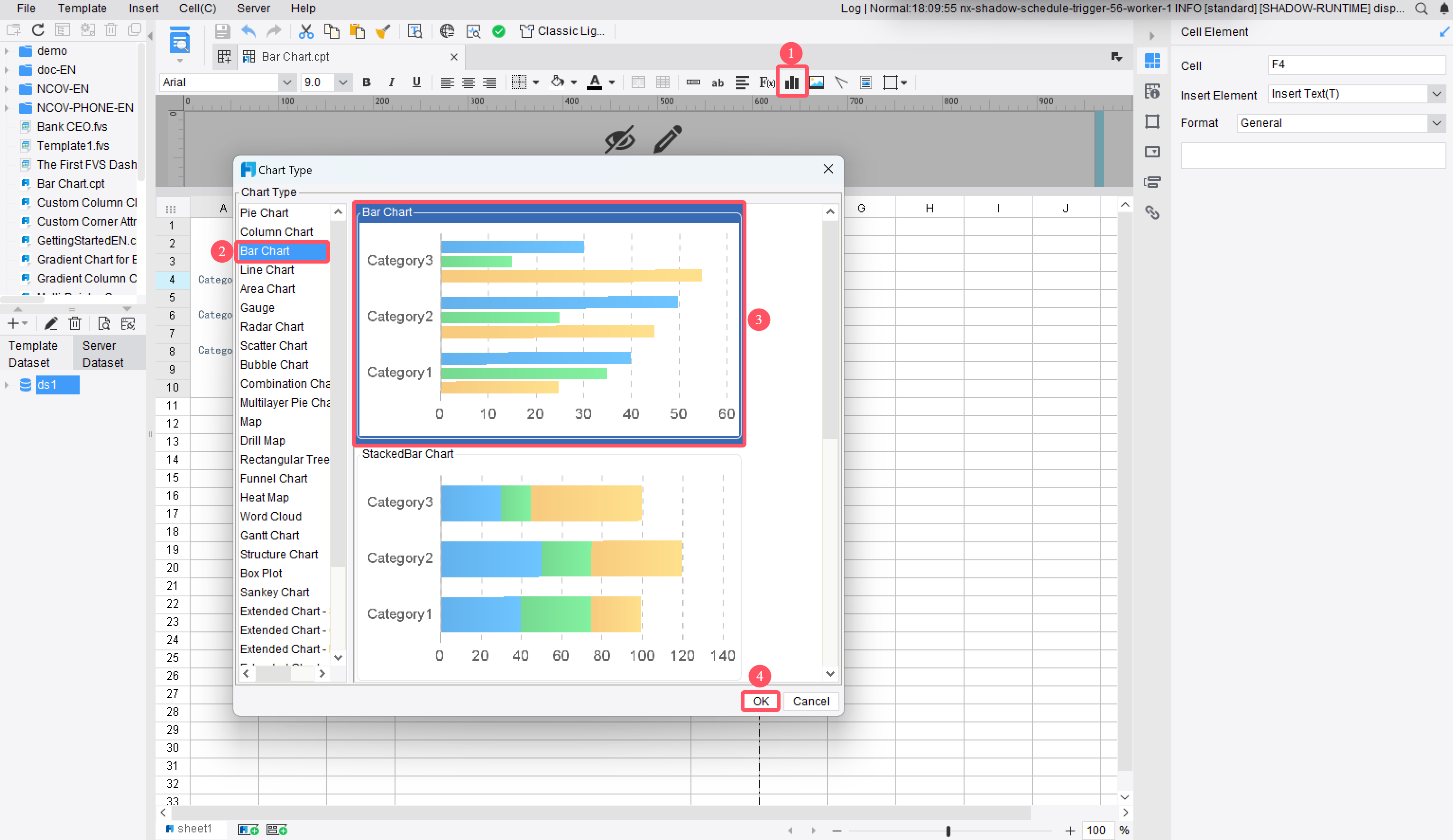
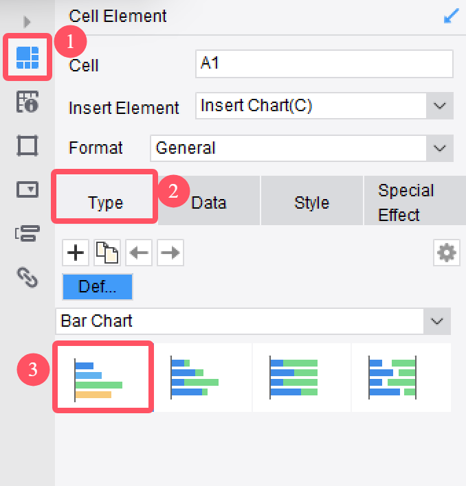
Step 2: Select Data and Insert a Clustered Bar Chart
Once your data is ready, open FineBI and connect to your data source. FineBI supports various data formats, including Excel files, relational databases, and big data platforms. Select the dataset you want to visualize and navigate to the chart creation interface.
To create a clustered bar chart, choose the standard column chart option. FineBI allows you to transform this into a bar chart by swapping the horizontal and vertical axes. This flexibility lets you adapt the chart to your specific needs. After selecting the chart type, drag and drop your data fields into the appropriate axes. Assign the main categories to the horizontal axis and the subcategories to the vertical axis.
Note: If you’re wondering how to create a clustered column chart, the process is similar. Instead of swapping the axes, keep the default vertical orientation to display your data as a clustered column chart.
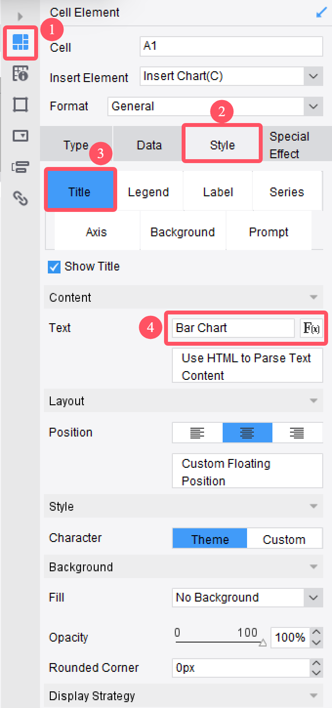
Step 3: Customize the Chart Layout and Style
Customizing your clustered bar chart enhances its visual appeal and clarity. FineBI offers a range of options to help you tailor the chart to your preferences. Start by adjusting the colors of the bars to differentiate between subcategories. Use contrasting colors to make the chart visually engaging.
Next, add labels to the axes and bars. Labels provide context and make it easier for viewers in Malaysia to interpret the data. You can also include a title that summarizes the chart’s purpose. For example, “Sales Performance Across Regions and Products” gives your audience an immediate understanding of the chart’s focus.
FineBI’s Component Style settings allow you to modify the width of the bars and adjust the spacing between clusters. These features ensure your chart remains uncluttered and easy to read. If you’re using Excel for data preparation, you can import the formatted data directly into FineBI for seamless customization.
Tip: Customize your clustered column chart in a similar way. Add titles, labels, and legends to improve clarity and make your data stand out.
Step 4: Save and Share Your Clustered Bar Chart
Once you have customized your clustered bar chart in FineBI, the next step is to save and share it effectively. This ensures that your work is accessible and can be used for presentations, reports, or collaborative discussions.
Saving Your Clustered Bar Chart
Save Your Work in FineBI After finalizing your bar chart, click on the "Save" button in the toolbar. Choose a folder or directory within FineBI to store your chart. Use a descriptive name for easy identification later. For example, if your chart compares sales across regions, name it something like "Regional Sales Comparison."
Export Your Chart FineBI allows you to export your clustered bar chart in multiple formats. You can save it as an image (PNG or JPEG), a PDF, or even an Excel file. To do this, select the "Export" option and choose your preferred format. Exporting to Excel is particularly useful if you want to share the underlying data along with the visualization.
Backup Your Chart To avoid losing your work, create a backup. Save a copy of your chart on your local drive or cloud storage. This step ensures that you can access your chart even if there are technical issues with the platform.
Tip: Always double-check your chart before saving or exporting. Ensure that labels, colors, and titles are accurate and aligned with your data's purpose.
Sharing Your Clustered Bar Chart
Share Directly from FineBI FineBI offers built-in sharing options. You can share your chart with team members in Malaysia by assigning permissions. Navigate to the sharing settings, select the users or groups, and set their access levels. For instance, you can allow some users to view the chart while granting others editing rights.
Embed in Presentations or Reports If you are preparing a presentation, embed your clustered bar chart into PowerPoint or Word documents. Export the chart as an image or PDF and insert it into your slides or reports. This method is ideal for showcasing your analysis during meetings or conferences.
Publish to a Dashboard FineBI enables you to publish your chart to a dashboard. This feature is perfect for collaborative environments where multiple users need to access and interact with the data. Add your chart to a shared dashboard and customize its layout for better visibility.
Email or Share via Link For quick sharing, use FineBI's email or link-sharing options. Generate a shareable link and send it to your colleagues. This method is convenient for remote teams or stakeholders in Malaysia who need instant access to your bar chart.
Note: When sharing your chart, ensure that the recipients have the necessary permissions to view or edit it. This prevents unauthorized access and maintains data security.
Saving and sharing your clustered bar chart ensures that your insights reach the right audience. It also allows you to collaborate effectively, whether you are working on a team project or presenting findings to stakeholders in Malaysia. By exporting your chart to Excel or embedding it in reports, you enhance its usability and impact.
Callout: A well-saved and shared chart can transform raw data into actionable insights, making it a valuable tool for decision-making.
How to Create a Clustered Bar Chart with FineReport
Data Preparation
To start, organize your data in a structured format. FineReportworks best when your data is arranged in rows and columns. Each row should represent a category, while each column should contain values for subcategories. For example, if you want to compare sales across regions and product types, list the regions in rows and the product types in columns.
You can use Excel to prepare your data. Ensure that your dataset is clean and free of errors. Remove duplicates and fill in missing values. Use clear headers for each column to make the data easy to understand. This step ensures that your clustered bar chart will display accurate and meaningful insights.
Tip: Use descriptive labels for your categories and subcategories. This makes your chart easier to interpret.
Chart Insertion
Once your data is ready, open FineReport and connect it to your data source. FineReport supports various data formats, including Excel files and relational databases. After importing your data, navigate to the chart creation interface.
Select the clustered column chart option. FineReport allows you to transform this into a bar chart by swapping the horizontal and vertical axes. Drag and drop your data fields into the appropriate axes. Assign the main categories to the horizontal axis and the subcategories to the vertical axis. This setup ensures that your clustered bar chart will display the data correctly.
Note: If you want to create a clustered column chart instead, keep the default vertical orientation.
Chart Design
Customizing your chart enhances its clarity and visual appeal. FineReport offers various options to help you design your clustered bar chart. Start by adjusting the colors of the bars to differentiate between subcategories. Use contrasting colors to make the chart visually engaging.
Add labels to the axes and bars. Labels provide context and make it easier for viewers in Malaysia to understand the data. Include a title that summarizes the chart’s purpose, such as "Sales Performance by Region and Product Type."
FineReport also allows you to adjust the width of the bars and the spacing between clusters. These features help you create a clean and professional-looking chart. If you prepared your data in Excel, you can import it directly into FineReport for seamless customization.
Callout: A well-designed clustered bar chart can transform raw data into actionable insights, making it a valuable tool for presentations and reports.
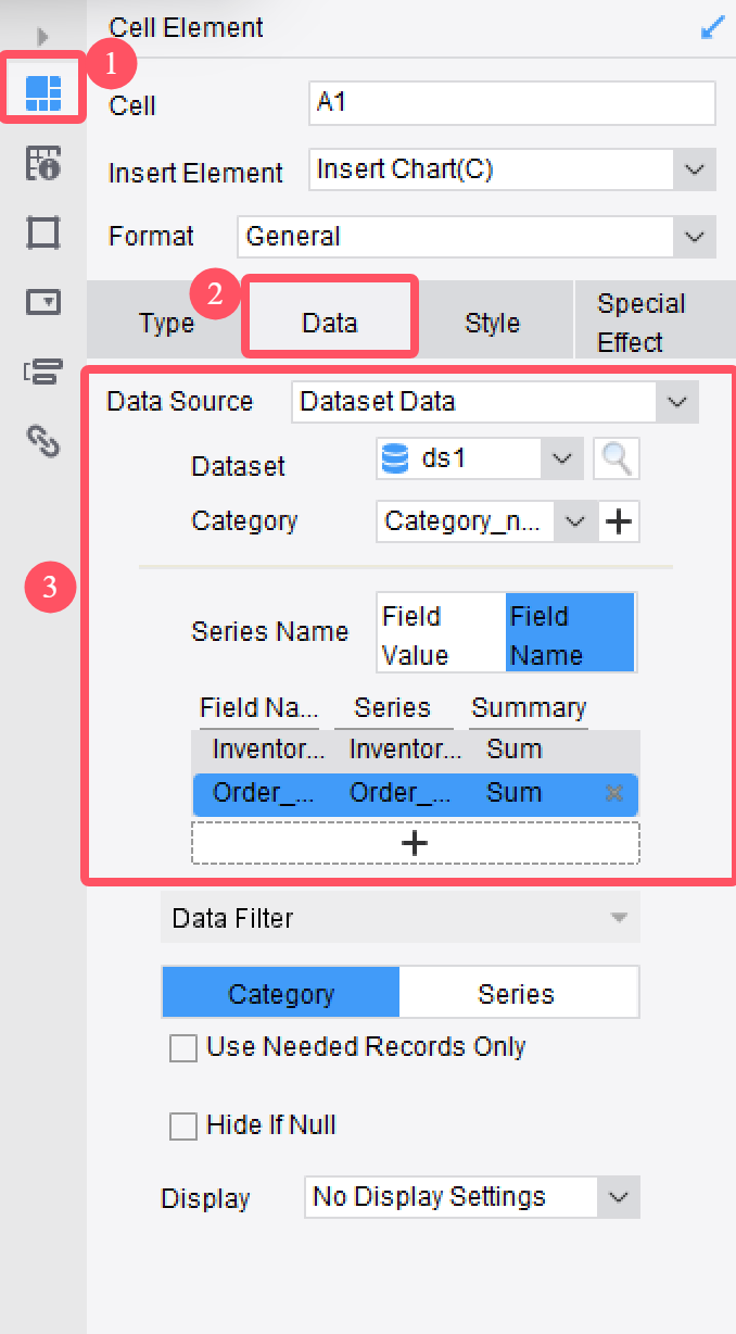
Data Binding
Data binding is a crucial step in creating a clustered bar chart with FineReport. It connects your data source to the chart, ensuring accurate and dynamic visualizations. To begin, open the chart editor in FineReport and select your clustered bar chart. You will see options to bind data fields to specific chart components.
Assign Data Fields Drag and drop your data fields into the designated areas. Place the main categories in the horizontal axis and the subcategories in the vertical axis. For example, if you are comparing sales across regions and product types, bind the regions to the horizontal axis and the product types to the vertical axis.
Set Metrics Choose the metric or value you want to display. This could be sales figures, percentages, or any other numerical data. Drag the metric field into the value area of the chart editor. FineReport automatically calculates and displays the values for each cluster.
Preview Your Chart After binding the data, click the preview button to check your chart. Ensure that the clusters and bars align with your data. If something looks off, revisit the data binding settings and make adjustments.
Tip: Use clear and descriptive field names in your dataset. This makes the binding process easier and ensures your chart is easy to interpret.
Style Setting
Style settings allow you to customize the appearance of your clustered bar chart. FineReport provides a range of options to enhance the visual appeal and clarity of your chart.
Adjust Bar Width and Spacing Modify the width of the bars to make them more prominent. Increase or decrease the spacing between clusters to avoid overcrowding. These adjustments improve readability and ensure your chart looks professional.
Choose Colors Select contrasting colors for the bars to differentiate subcategories. Use a consistent color scheme that aligns with your presentation or report theme. This helps your audience quickly identify patterns and comparisons.
Add Labels and Titles Include labels for the axes and bars to provide context. Add a title that summarizes the chart’s purpose. For example, "Quarterly Sales Performance by Region" gives viewers in Malaysia an immediate understanding of the data.
Apply Interactive Features FineReport supports interactive features like tooltips and drill-downs. Enable these options to allow viewers in Malaysia to explore the data in greater detail. Tooltips display additional information when users hover over a bar, while drill-downs let them navigate deeper into specific clusters.
FanRuan has established a localized team in Malaysia to provide comprehensive project implementation and technical support services. This local presence ensures faster response times, better alignment with regional business needs, and smoother deployment of products like FineReport and FineBI. Clients in Malaysia benefit from personalized assistance throughout the project lifecycle, from initial setup to post-deployment optimization.
Callout: A well-styled chart not only looks appealing but also communicates your insights effectively. Spend time refining the style settings to make your clustered bar chart impactful.
The Difference Between FineBI and FineReport in Designing a Clustered Bar Chart
FineBI and FineReport both excel at creating clustered bar charts, but they cater to different user needs. Understanding their differences helps you choose the right tool for your specific requirements.
1. User Focus and Accessibility
FineBI is designed for business users and analysts who need self-service analytics. Its intuitive drag-and-drop interface allows you to create clustered bar charts without technical expertise. You can explore data independently and customize charts quickly.
FineReport, on the other hand, targets IT professionals and report developers. It offers advanced features for creating highly formatted, pixel-perfect clustered bar charts. If you need precise control over layout and design, FineReport is the better choice.
Tip: Use FineBI for quick, interactive visualizations. Choose FineReport for detailed, enterprise-level reporting.
2. Data Integration and Processing
FineBI simplifies data integration by connecting to multiple sources, including relational databases and big data platforms. It supports real-time data updates, making it ideal for dynamic analysis.
FineReport focuses on structured reporting. It excels at handling complex datasets and generating automated reports. You can integrate data from various sources and apply advanced formatting options.
FineBI emphasizes collaboration. You can share dashboards and charts with your team in Malaysia, enabling real-time interaction. Its Component Style settings let you adjust bar widths, colors, and spacing effortlessly.
FineReport provides more granular customization. You can fine-tune every aspect of your clustered bar chart, from axis labels to interactive features like drill-downs.
Feature
FineBI
FineReport
Target Audience
Business users, analysts
IT professionals, report developers
Ease of Use
Drag-and-drop simplicity
Advanced, detailed customization
Data Integration
Real-time updates, multiple sources
Structured reporting, complex datasets
Callout: FineBI and FineReportcomplement each other. Use them together to balance self-service analytics and detailed reporting.
By understanding these differences, you can select the tool that aligns with your goals. FineBI empowers you to explore data independently, while FineReport ensures precision and professionalism in reporting.
Customizing and Formatting Your Clustered Bar Chart
Adding Titles, Labels, and Legends for Clarity
Titles, labels, and legends make your clustered bar chart easier to understand. Adding these elements ensures that your audience can quickly grasp the purpose of the chart and interpret the data accurately.
Start by adding a chart title that summarizes the main idea of your visualization. For example, "Quarterly Sales Performance by Region" gives viewers in Malaysia an immediate understanding of what the chart represents. Place the title at the top of the chart for maximum visibility.
Next, label the axes clearly. Use descriptive names for both the horizontal and vertical axes. For instance, if your chart compares sales across regions, label the horizontal axis as "Regions" and the vertical axis as "Sales Figures." Clear labels reduce confusion and improve readability.
Finally, add a legend to explain the colors or patterns used in the chart. If your clustered bar chart includes multiple subcategories, the legend helps viewers in Malaysia identify which bar corresponds to each subgroup. Place the legend in a visible area, such as the top-right corner or below the chart.
Tip: Avoid overcrowding the chart with excessive text. Keep titles, labels, and legends concise to maintain a clean and professional look.
Adjusting Colors, Styles, and Axis Settings
Colors, styles, and axis settings play a crucial role in enhancing the visual appeal of your clustered bar chart. Thoughtful adjustments can make your chart more engaging and easier to interpret.
Choose colors wisely to differentiate between groups. Use distinct colors for each subcategory to avoid confusion. High-contrast colors work best for professional presentations, while softer tones suit casual settings. Avoid using similar shades, as they can make it difficult to distinguish between bars.
Adjust the width of the bars to match the size of your dataset. For large datasets, thicker bars improve clarity. For smaller datasets, thinner bars reduce clutter. Moderate widths strike a balance between readability and aesthetics.
Modify the axis settings to ensure accurate representation of your data. Always start the y-axis at zero to prevent exaggeration of differences between values. If your chart includes long category names, rotate the labels or use abbreviations to avoid overlapping text.
Design Technique
Benefit
Choose Colors Wisely
Distinct colors help differentiate between groups, enhancing visual appeal.
Label Clearly
Clear labels reduce clutter and improve readability.
Use Design Techniques
Sparing use of gridlines and markers guides the viewer's eye effectively.
Avoid Overcrowding
Limiting categories maintains clarity and prevents confusion.
Ensure Accurate Scales
Starting the y-axis at zero prevents exaggeration of differences.
Use High Contrast Colors
Avoiding similar colors prevents viewer in Malaysia confusion.
Callout: Small adjustments to colors, bar widths, and axis settings can transform a basic chart into a polished and impactful visualization.
Enhancing Visual Appeal with FineBI’s Component Style Settings
FineBI’s Component Style settings offer powerful tools to refine the appearance of your clustered bar chart. These features allow you to create a visually stunning chart in Malaysia that communicates your insights effectively.
Begin by adjusting the spacing between clusters. Increasing the gap width prevents overcrowding and makes the chart easier to read. For presentations, moderate spacing ensures a professional look.
Use FineBI’s options to customize the display effects of the bars. You can change the thickness of the bars to suit your dataset. Thicker bars work well for large datasets, while thinner bars are ideal for smaller ones.
Experiment with the color palette to match your chart with your presentation theme. FineBI lets you apply contrasting colors to highlight differences between subcategories. This feature enhances the chart’s visual appeal and helps viewers in Malaysia identify patterns quickly.
Add interactive features like tooltips to provide additional context. Tooltips display detailed information when viewers in Malaysia hover over a bar. This feature is especially useful for charts with complex data.
Tip: Use FineBI’s customization tools to create a chart that is both visually appealing and easy to understand. A well-designed chart captures attention and conveys insights effectively.
When and Why to Use a Clustered Bar Chart
Comparing Data Across Multiple Categories and Groups
A clustered bar chart is an excellent tool for comparing data across multiple categories and groups. It allows you to visualize relationships and differences side by side, making it easier to identify trends and outliers. For example, you can use it to compare quarterly sales figures across different product lines or analyze market share data across various regions.
This type of bar chart is scalable, meaning it works well with both small and large datasets. Whether you are presenting financial data to compare revenues across departments or analyzing survey results, the chart adapts to your needs. Its horizontal layout also makes it ideal for categories with long names, ensuring clarity in your data comparison.
Feature
Description
Clear Comparative Visualization
Enables side-by-side comparison of multiple data sets, facilitating the identification of trends, patterns, and outliers.
Scalability
Suitable for various data sizes and complexities, making them adaptable for different analytical needs.
Real-world Applicability
Commonly used in professional settings for presenting comparative data, such as market shares or sales figures.
Tip: Use a clustered bar chart when you need to compare multiple data series side by side. This approach ensures your audience can quickly grasp the differences between categories and subcategories.
Identifying Patterns and Trends in Data
Clustered bar charts help you uncover patterns and trends in your data. By displaying multiple data series together, they highlight relationships that might otherwise go unnoticed. For instance, you can use them to track changes in sales performance across regions or identify which product categories perform best in specific markets.
Different types of bar charts serve unique purposes. Grouped bar charts, for example, show multiple data series side by side, making them ideal for comparing sales by category and channel. Horizontal bar charts work well for datasets with long category names, while stacked bar charts are better for visualizing total values across categories.
Chart Type
Description
Use Case
Stacked
Displays multiple data series stacked on top of each other.
Comparing total sales across categories.
Grouped
Shows multiple data series side by side for each category.
Comparing sales by category and channel.
Horizontal
Displays bars horizontally, useful for long category names.
Comparing sales across various categories.
Callout: Choose the right type of bar chart based on your data and the insights you want to convey. This ensures your analysis remains clear and impactful.
Practical Use Cases for Clustered Bar Charts in FineReport
FineReport makes it easy to create clustered bar charts for various business scenarios. You can use these charts to compare sales performance across regions, track employee productivity across departments, or analyze customer satisfaction scores across different service categories.
For example, a retail company might use FineReport to compare quarterly sales figures for different product lines. By organizing the data into rows and columns, you can create a clustered bar chart that highlights which products perform best in each region. Similarly, a marketing team in Malaysia can use the chart to analyze campaign performance across multiple channels, identifying which strategies yield the highest ROI.
FineReport’s customization options enhance the usability of your charts. You can adjust bar widths, apply contrasting colors, and add interactive features like tooltips. These features ensure your clustered bar chart not only looks professional but also communicates your insights effectively.
Tip: Use FineReport’s advanced features to create clustered bar charts that are both visually appealing and data-rich. This approach helps you present your findings with clarity and precision.
Advantages of Using Clustered Bar Chart in FineBI and FineReport
Clear Comparison of Data Across Groups
A clustered bar chart makes it easy to compare data across multiple groups. You can see differences and similarities side by side, which helps you identify trends quickly. For example, if you are analyzing sales data, you can use a clustered column chart to compare product performance across regions. FineBI and FineReport allow you to create these charts with precision, ensuring your data is clear and accurate.
FineBI’s drag-and-drop interface simplifies the process. You can select your data fields and instantly generate a bar chart. FineReport, on the other hand, offers advanced formatting options. You can customize every detail, from axis labels to bar spacing, to make your chart more professional. Both tools ensure your comparisons are easy to understand and visually appealing.
Tip: Use a clustered column chart when you need to compare multiple categories side by side. This approach highlights differences effectively.
Flexibility in Customization and Presentation
FineBI and FineReport give you the flexibility to customize your charts. You can adjust colors, bar widths, and spacing to match your presentation style. FineBI’s Component Style settings let you modify the chart’s appearance with just a few clicks. This feature is perfect for creating visually engaging charts that capture your audience’s attention.
FineReport takes customization further. It allows you to add interactive features like tooltips and drill-downs. These features make your clustered bar chart more dynamic and informative. You can also export your chart to Excel for easy sharing. This flexibility ensures your chart fits seamlessly into your reports or presentations.
Callout: A well-customized bar chart not only looks great but also communicates your insights effectively.
Limitations to Consider When Using Clustered Bar Charts
While clustered bar charts are powerful, they have some limitations. They may not work well for datasets with too many groups or categories. Overcrowding can make the chart hard to read. If your data includes long category names, a horizontal bar chart might be a better choice.
Another limitation is their focus on static comparisons. Clustered column charts are less effective for showing trends over time. For trend analysis, consider using a line chart instead. FineBI and FineReport provide various chart types, so you can choose the one that best fits your data.
Note: Always match your chart type to your data and the story you want to tell. This ensures your analysis remains clear and impactful.
Creating a clustered bar chart becomes simple when you follow the right steps. Start by organizing your data, then use tools like FineBI or FineReportto design and customize your chart. Adjust colors, labels, and spacing to make your bar chart clear and visually appealing.
Choosing the right chart type is essential for effective data visualization. A clustered bar chart works best for comparing multiple categories side by side. Tools like FineBIand FineReport simplify this process, offering features that enhance your analysis. Whether you prepare your data in excel or another format, these tools help you create professional charts effortlessly.
Callout: Explore FineBI and FineReport today to transform your data into actionable insights with stunning clustered bar charts.
Click the banner below to try FineReport and FineBI for free and empower your enterprise to transform data into productivity!
Access a wealth of case studies, industry insights, and solution guides to accelerate digital transformation.
FAQ
What is the best use case for a clustered bar chart?
A clustered bar chart works best for comparing data across multiple categories and subcategories. For example, you can use it to analyze sales performance by region and product type or compare survey results across different demographic groups.
Can I create a clustered bar chart without technical skills?
Yes, you can! Tools like FineBI and FineReport offer user-friendly interfaces. You can drag and drop data fields to create a chart. These tools simplify the process, making it accessible even if you lack technical expertise.
How do I choose between a clustered bar chart and a clustered column chart?
Choose a clustered bar chart for horizontal comparisons, especially when category names are long. Opt for a clustered column chart to highlight trends or patterns over time. The orientation of the chart determines its effectiveness for your data.
What data formats do FineBI and FineReport support?
Both tools support a wide range of data formats, including Excel files, relational databases, and big data platforms. This flexibility allows you to connect and visualize data from various sources seamlessly.
How can I make my clustered bar chart visually appealing?
Customize colors, bar widths, and spacing. Add clear labels, titles, and legends. Use contrasting colors to differentiate subcategories. FineBI’s Component Style settings and FineReport’s advanced formatting options help you create professional and engaging charts.