A component bar chart is a powerful tool in data visualization. It helps you break down and compare categorical data within a single chart in Malaysia. This chart type simplifies the interpretation of complex datasets by stacking data segments into one bar, each representing a unique category. You can quickly grasp proportions and relationships among components, enhancing clarity in your analysis. Bar charts like these are invaluable for improving your data analysis skills. By visualizing data composition, you can uncover patterns, make informed decisions, and communicate insights more effectively in Malaysia.
What Is a Component Bar Chart?
Definition and Key Characteristics
A component bar chart is a type of bar chart that visually represents data by dividing each bar into segments. Each segment corresponds to a specific category or component, making it easier for you to understand how individual parts contribute to the whole. This chart type is particularly effective for comparing data composition across categories or time periods.
Historically, bar charts have played a significant role in data visualization. For example, the earliest known bar chart, created in the 14th century, depicted fluctuating wheat prices using a horizontal layout. Later, in the late 18th century, William Playfair refined the bar chart, establishing it as a cornerstone of modern data visualization.
Year/Period
Event/Contribution
Description
14th Century
Earliest Use
The first known bar chart depicted fluctuating wheat prices over time.
Late 18th Century
William Playfair
Refined the bar chart, contributing significantly to data visualization.
Modern component bar charts have several defining features. They can accommodate large datasets, making them ideal for nominal and small ordinal data. Their multivariate representation allows you to analyze multiple data series simultaneously. Additionally, they are easy to create and interpret, even for audiences in Malaysia with limited statistical knowledge.
Characteristic/Feature
Description
Accommodate Large Data Sets
Handles large datasets effectively, simplifying interpretation.
How Component Bar Chart Differ from Other Bar Charts
Component bar charts stand out from other bar chart types due to their ability to display part-to-whole relationships within a single bar. Unlike traditional bar charts, which focus on comparing individual categories, component bar charts emphasize the composition of each category. This makes them particularly useful for analyzing data with multiple variables.
For example, stacked bar charts, a common type of component bar chart, show how a larger category divides into smaller subcategories. Segmented bar charts split the bar into multiple sections, allowing you to analyze different segments across the same axis. Clustered charts, on the other hand, group bars into clusters for a dimension, providing clarity on data across categories.
Bar Chart Type
Description
Stacked Bar Graphs
Show how a larger category divides into smaller subcategories.
Segmented Bar Charts
Split the bar into multiple segments for detailed analysis.
Clustered Charts
Group bars into clusters for a dimension, clarifying data across categories.
Dual Axis Clustered Bar Charts
Compare two measures with one dimension, combining dual-axis and clusters.
Dual Axis and Stacked Charts
Combine dual-axis and stacked charts for multi-dimensional analysis.
While other bar chart types may excel in specific scenarios, component bar charts provide a unique advantage when you need to visualize data composition. They allow you to see both the overall trend and the contribution of individual components in Malaysia, making them a versatile tool in data analysis.
Benefits of Using Component Bar Chart in Data Visualization
Component bar charts offer several benefits that make them indispensable indata visualization. First, they summarize complex datasets visually, enhancing your ability to comprehend insights. By breaking down data into components, these charts allow you to identify patterns and relationships quickly. This capability is especially valuable when analyzing multivariate data.
Experts can use patterns in bar charts to generate accurate analyses of data.
Bar charts allow for a comparable time frame in generating correct interpretations as line graphs.
There is no significant advantage for experts when using line graphs over bar charts.
While it does seem that experts are able to use the patterns in line graphs to more rapidly identify interactions, there is no overall benefit for experts of using line graphs over bar charts.
Another advantage of component bar charts is their accessibility. They are easy to create and understand, making them suitable for audiences in Malaysia with varying levels of expertise. Whether you are presenting data to a team of analysts or a group of stakeholders, component bar charts ensure that your message is clear and impactful.
Finally, component bar charts encourage data-driven discussions. A well-crafted chart communicates key points effectively, sparking meaningful conversations around the data. This makes them a powerful tool for decision-making in business, education, and research in Malaysia.
Types of Component Bar Chart
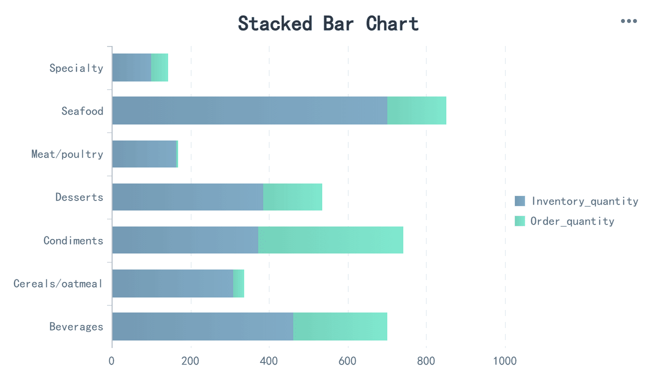
Stacked Bar Chart
A stacked bar chart is a versatile tool that helps you visualize how individual components contribute to a total. Each bar is divided into segments, with each segment representing a specific category. This makes it easy to compare the composition of data across multiple categories. For example, you can use a stacked bar chart to analyze sales data by product category and region, showing how each region contributes to the overall sales of a product.
This chart type is particularly effective when you want to highlight part-to-whole relationships. By stacking the segments, you can quickly identify which categories dominate and which ones have smaller contributions. However, stacked bar charts work best when the number of categories is limited, as too many segments can make the chart harder to interpret.
Chart Type
Description
Bar Chart
Suitable for comparing data across different categories, with each bar representing a category.
Histogram
Useful for showing the distribution of a continuous variable, grouping data into ranges.
Pareto Chart
Highlights significant factors by arranging categories in descending order based on frequency.
100% Stacked Bar Chart
A 100% stacked bar chart takes the concept of a stacked bar chart further by normalizing the data. Each bar represents 100% of the total, with segments showing the proportional contribution of each category. This makes it ideal for comparing relative percentages rather than absolute values. For instance, you can use a 100% stacked bar chart to compare customer satisfaction levels across different products.
This chart type excels in scenarios where you need to compare proportions, such as the percentage of survey respondents who strongly agree, agree, or disagree with a statement. It allows you to see how these proportions vary across categories. However, it may not be as effective for comparing individual segment values due to the mental math required to interpret the data.
Effective for comparing Strongly Disagree percentages.
Useful for comparing the combination of Strong Disagree and Disagree percentages.
Works well for comparing Strongly Agree percentages.
Suitable for comparing the combination of Agree and Strongly Agree percentages.
Grouped Component Bar Chart
A grouped bar chart, also known as a clustered bar chart, organizes data into groups for easy comparison. Each group contains multiple bars, with each bar representing a different category. This layout allows you to compare data across categories and subcategories simultaneously. For example, you can use a grouped bar chart to analyze monthly sales data for different products, with each group representing a month and each bar within the group representing a product.
This chart type is highly effective for presentations where clarity and detail are essential. Metrics such as engagement, understanding, and feedback validate its usage in data presentations. For instance:
Metric Type
Description
Engagement Metrics
Measures time spent on the page, clicks, and interaction rates to assess attention capture.
Understanding Metrics
Utilizes quizzes or follow-up questions to evaluate viewer comprehension of key insights.
Feedback Metrics
Collects direct viewer feedback through surveys or comments for improvement insights.
Grouped bar charts provide a clear and organized way to present complex data, making them a valuable tool for business, education, and research in Malaysia.
Applications of Component Bar Chart in Data Visualization
Comparing Data Composition Across Categories
Component bar charts excel at helping you compare data composition across categories. They allow you to break down complex datasets into smaller, manageable parts, making it easier to understand how individual components contribute to the whole. For example, stacked bar charts are ideal for visualizing how different parts make up a total. You can use them to analyze demographic studies, financial reports, or product sales performance.
Use Case
Description
Comparing components within a whole
Stacked bar graphs are ideal for visualizing how different parts contribute to a total.
Demographic studies
Useful for analyzing population segments and their proportions.
Financial reports
Effective in displaying revenue breakdowns by category.
Product sales analysis
Helps in tracking sales performance across various regions.
These charts also help you understand relative proportions. For instance, you can visualize the composition of a company’s revenue by product category or compare population segments in demographic studies. By presenting data in a clear and organized manner, component bar charts enable quick comparison and analysis, making them a valuable tool for decision-making in Malaysia.
Tracking Changes Over Time
Bar charts are particularly effective for tracking trends and changes over time. They allow you to visualize time-series data by highlighting specific intervals, such as months or years. This makes it easier to compare values across categories during the same period. For example, you can use a component bar chart to analyze monthly sales data for different products or track annual revenue growth across regions in Malaysia.
When visualizing trends, component bar charts provide clarity and precision. They help you identify patterns, such as seasonal fluctuations or long-term growth trajectories. By focusing on specific time intervals, these charts simplify the process of tracking trends, enabling you to make informed decisions based on historical data.
Use Cases in Business, Education, and Research
Component bar charts have diverse applications across industries. In business Malaysia, they help you analyze sales performance, track revenue composition, and monitor customer satisfaction levels. For instance, a retail company in Malaysia can use grouped bar charts to compare monthly sales data across different product categories. This insight allows the company in Malaysia to identify high-performing products and optimize its inventory strategy.
In education Malaysia, component bar charts assist in visualizing student performance across subjects or tracking attendance trends over semesters. Teachers can use these charts to identify areas where students excel or struggle, enabling targeted interventions to improve learning outcomes.
In research Malaysia, component bar charts simplify the analysis of complex datasets. Researchers can use stacked bar charts to compare survey responses across demographic groups or track changes in experimental results over time. These visualizations enhance the clarity of findings, making it easier to communicate insights to stakeholders in Malaysia.
By leveraging component bar charts, you can uncover patterns, track trends, and compare categories effectively. Their versatility makes them indispensable for data analysis in various fields in Malaysia.
Creating and Customizing A Component Bar Chart with FanRuan Tools
Using FineReport for Stacked Bar Charts
FineReport simplifies the process of creating a stacked bar chart, making it an excellent choice among tools for creating bar charts. You can use its drag-and-drop interface to design visually appealing charts that highlight part-to-whole relationships. FineReport allows you to bind data directly from multiple sources, ensuring seamless integration. This feature is particularly useful when comparing categories or visualizing trends over time.
To create a stacked bar chart, start by preparing your dataset. FineReport enables you to execute SQL queries to extract the required data. Once the data is ready, you can insert the chart into your report by selecting the stacked bar chart option. FineReport also offers customization options, such as adjusting colors, labels, and styles, to match your specific reporting needs. These features make it a powerful tool for data visualization and tracking trends effectively in Malaysia.
Leveraging FineBI for Interactive Data Visualization
FineBI takes data visualizationto the next level with its interactive capabilities. It excels in handling large datasets, providing dynamic visual representations, and supporting real-time analytics. These features make FineBI ideal for visualizing trends and conducting in-depth data analysis in Malaysia.
Feature
Description
Large Dataset Handling
FineBI tools excel in managing extensive datasets efficiently.
They provide dynamic visual representations that enhance data analysis.
Real-time Analytics
The tools support real-time data processing, crucial for timely decision-making.
With FineBI, you can create interactive bar charts that allow users to explore data by drilling down into specific categories. This functionality helps you uncover insights that static charts might miss. FineBI’s user-friendly interface ensures that even non-technical users in Malaysia can create and customize charts effortlessly. By leveraging its real-time analytics, you can make data-driven decisions faster and more accurately.
Real-Time Analysis
The Difference of FineReport and FineBI In Creating A Component Bar Chart
FineReport and FineBI serve different purposes when it comes to creating component bar charts. FineReport focuses on generating highly formatted, pixel-perfect reports. It is ideal for scenarios where you need precise control over the layout and design of your charts. On the other hand, FineBI emphasizes interactivity and real-time data exploration. It allows you to create dynamic visualizations that adapt to user inputs in Malaysia.
For example, FineReport is better suited for creating a stacked bar chart to present static data in a professional report. FineBI, however, excels in scenarios where you need to analyze data interactively, such as comparing categories across multiple dimensions. Both tools complement each other, offering a comprehensive solution for your data visualization needs.
FanRuan has established a localized team in Malaysia to provide comprehensive project implementation and technical support services. This local presence ensures faster response times, better alignment with regional business needs, and smoother deployment of products like FineReport and FineBI. Clients in Malaysia benefit from personalized assistance throughout the project lifecycle, from initial setup to post-deployment optimization.
Best Practices for Effective Component Bar Chart Design
Designing an effective component bar chart requires attention to detail and adherence to proven guidelines. By following best practices, you can ensure your chart communicates data clearly and accurately.
Start the Axis from Zero Always begin the axis at zero. This approach ensures the bar sizes reflect accurate comparisons. If the axis starts elsewhere, it can distort the visual representation of data values.
Avoid 3D Effects Stick to flat designs. 3D effects may look appealing but often distort proportions, making it harder to interpret the data accurately.
Use Logical Sorting Organize categories logically based on your objective. For example, sort bars by size to emphasize trends or arrange them alphabetically for easier navigation.
Choose the Right Orientation Select horizontal bars for typical dimensions and vertical bars for dates. This choice enhances readability and aligns with how viewers naturally process information.
Label Data Directly Place labels directly on the bars instead of relying solely on axes. This method improves clarity and reduces the effort required to interpret the chart.
Apply Color Efficiently Use colors strategically to highlight important information. Avoid duplicating data with unnecessary color variations, as this can confuse viewers.
Avoid Breaking the Bar Axis Keep the bar axis intact. Breaking it can misrepresent data values and lead to incorrect conclusions.
Distinguish Bar Charts from Histograms Ensure your audience in Malaysia understands the difference between bar charts and histograms. Bar charts compare categories, while histograms show data distribution across ranges.
Avoid Radial Bar Charts Stick to traditional layouts. Radial bar charts often complicate data comparison due to their circular design.
Don’t Use Rounded Edges Keep bar edges sharp. Rounded edges can make it difficult to interpret precise data values.
By following these best practices for creating bar charts, you can enhance your data analysis and tracking trends effectively. A well-designed barchart not only simplifies complex datasets but also ensures your audience in Malaysia grasps the insights quickly.
Best Practice
Description
Start axis from zero
Ensures accurate comparison of bar sizes.
No 3D
Avoids distortion of proportions.
Don’t use rounded edges
Prevents confusion in data value interpretation.
Apply logical sorting
Helps emphasize specific categories based on the objective.
Horizontal for typical dimensions, vertical for dates
Enhances readability based on data type.
Label data directly
Improves clarity and reduces reliance on axes.
Use color efficiently
Highlights important information without duplicating data.
Don’t break the bar axis
Maintains accurate representation of data values.
Avoid radial bar charts
Ensures clarity in data comparison.
Distinguish bar charts from histograms
Clarifies the purpose of each chart type.
Tip: Simplicity is key. A clean and organized bar chart design ensures your audience in Malaysia focuses on the data rather than the design itself.
A component bar chart simplifies data visualization by breaking down complex datasets into manageable parts. You can use it to compare data composition, track trends, and analyze categories effectively. Stacked, 100% stacked, and grouped bar charts offer flexibility for various scenarios. Tools like FineReport and FineBI enhance your ability to create these charts with ease. FineReport excels in generating precise reports, while FineBI provides interactive visualizations for real-time analysis. ExploreFanRuan’s solutions to elevate your barchart designs and unlock deeper insights from your data in Malaysia.
Click the banner below to try FineReport and FineBI for free and empower your enterprise to transform data into productivity!
Access a wealth of case studies, industry insights, and solution guides to accelerate digital transformation.
FAQ
What is the main purpose of a component bar chart?
A component bar chart helps you visualize how individual parts contribute to a whole. It simplifies complex data by breaking it into segments, making it easier to compare categories, track trends, and analyze proportions.
How do stacked bar charts differ from grouped bar charts?
Stacked bar charts display data segments within a single bar, showing part-to-whole relationships. Grouped bar charts organize data into clusters, allowing you to compare multiple categories side by side.
Can you use component bar charts for time-series data?
Yes, component bar charts work well for time-series data. You can use them to track changes over specific intervals, such as months or years, and compare trends across categories.
Why should you avoid 3D effects in bar charts?
3D effects distort proportions and make data harder to interpret. Stick to flat designs for clarity and accuracy in your visualizations.
Which FanRuan tool is better for interactive data visualization?
FineBI is better for interactive data visualization. It supports real-time analytics, dynamic visualizations, and large datasets, making it ideal for exploring data interactively.