A one page report delivers impactful communication by presenting critical information in a streamlined format. This method saves time and ensures readers can quickly grasp the most important insights. Decision-makers often favor this format as it facilitates swift comprehension and informed action.
A one page report adheres to the principles of effective communication, offering clarity, precision, and timeliness. It connects key points for your audience in Malaysia, highlighting strategic insights and opportunities for improvement.
The concept of one page reporting has revolutionized how organizations convey complex information. Whether you’re preparing weekly updates or project status summaries, this approach enhances both clarity and effectiveness. By customizing your one page report to align with audience needs in Malaysia, you can create compelling proposals that deliver results.
Key Takeaways
- Clearly state the purpose of your one page report. This keeps your ideas focused and meaningful.
- Know what your audience in Malaysia wants. Make your report fit their needs to keep them interested.
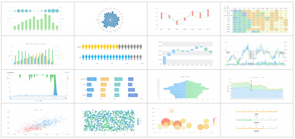
- Add visuals like charts or graphs to explain tricky data. Good visuals make it easier to understand and remember.
- Break your report into clear sections. A simple layout helps readers find information quickly and understand it better.
- Use tools like FineReport for smart reporting. This tool makes creating neat, professional reports easier.
Understanding the Purpose of a One Page Report in Malaysia
Defining the goal of your one page report
Every one-pager begins with a clear goal. You must determine what you want to achieve with your report. Are you summarizing a project, presenting a weekly report, or proposing a new idea? The purpose of the report shapes its structure and content. For example, a one-page project report focuses on key milestones and outcomes, while a weekly report highlights progress and challenges.
The 1:3:25 principle offers a helpful framework for defining your goal. This principle emphasizes clarity and accessibility:
- A one-page overview allows decision-makers to quickly grasp key actions.
- A three-page executive summary provides additional context.
- A 25-page detailed report supports recommendations with evidence.
By defining the purpose early, you ensure your report remains focused and impactful.
Identifying the target audience and their expectations in Malaysia
Understanding your audience in Malaysia is crucial. A well-crafted one-pager resonates with its readers by addressing their specific needs and expectations. For instance, executives may prefer high-level insights, while team members might need actionable details. Tailoring your content ensures your message lands effectively.
Consider these statistics that highlight the importance of knowing your audience in Malaysia:
| Statistic | Impact |
|---|---|
| Companies with well-defined personas achieve 73% higher conversion rates. | Higher conversion rates |
| Personalized messaging increases engagement by up to 50%. | Increased engagement |
| Effective use of personas boosts customer satisfaction by 10% and revenue by 7%. | Improved customer satisfaction and revenue |
| Regularly updated personas improve lead quality for 50% of businesses. | Better lead quality |
When you identify your audience in Malaysia, you can align your content with their expectations. This alignment enhances engagement and ensures your report achieves its purpose.
Aligning the report content with its intended purpose
Once you define your goal and audience in Malaysia, align your content with the purpose of the report. Start by outlining what should be included in a report. For a weekly report, focus on progress, challenges, and next steps. For a one-page project report, emphasize objectives, achievements, and key metrics.
Follow these steps for writing a report that aligns with its purpose:
- Begin with a concise title that reflects the report's goal.
- Use sections to organize your discussion or body logically.
- Include visuals like charts or graphs to support your discussion and analysis of data.
- Highlight actionable insights to guide decision-making.
By aligning your content with the purpose, you create a report that is both informative and actionable. This approach ensures your readers can quickly understand and act on the information provided.
Essential Elements of a One Page Report
Key data points and insights to include
A one page report should focus on presenting only the most critical information. Including too much data can overwhelm readers and dilute the impact of your findings. Start by identifying the key findings that align with the purpose of your report. For example, a weekly report might highlight progress updates, challenges faced, and next steps. A one page report, on the other hand, should emphasize objectives, milestones, and outcomes.
To ensure clarity, organize the elements of a report into concise sections. Use bullet points or short paragraphs to summarize the findings. Avoid unnecessary jargon and focus on actionable insights. This approach ensures that your audience in Malaysia can quickly grasp the essential details without sifting through irrelevant information.
Using visuals like charts and graphs for clarity
Visuals play a vital role in enhancing the clarity of a report. They simplify complex data and make it easier for readers to understand trends, comparisons, and relationships. For instance, a bar chart can effectively compare quantities, while a line graph is ideal for showing trends over time. Infographics are particularly useful for representing complex data visually, as they combine text and visuals to convey information in an engaging way.
| Visual Aid Type | Purpose | Effectiveness |
|---|---|---|
| Bar Chart | Compare quantities | High |
| Line Graph | Show trends over time | High |
| Infographic | Represent complex data visually | Very High |
When designing your report, choose visuals that best represent your data. Ensure they are labeled clearly and placed strategically within the report structure to support your key findings. This approach not only improves readability but also enhances the overall impact of your report.
Structuring the report for easy navigation
The structure of a report significantly influences how easily readers can navigate and understand the content. A well-organized layout enhances clarity and ensures that essential data stands out. Logical flow within the report structure makes complex information more digestible and improves communication.
- A clear layout allows readers to grasp intricate details quickly.
- Logical flow ensures effective communication of complex information.
- Strong organization highlights essential data, improving navigation.
To achieve this, divide the report into distinct sections with headings and subheadings. Use a consistent format throughout the document, such as aligning text and visuals uniformly. Incorporate white space to avoid clutter and guide the reader's eye naturally. By focusing on the structure of a report, you create a seamless reading experience that keeps your audience in Malaysia engaged.
How to Create One Page Report with FineReport in Malaysia
Starting with a clear and compelling title
A strong title sets the tone for your one page report. It immediately informs the reader about the report's purpose and grabs their attention. When crafting a title, focus on clarity and relevance. For example, a weekly report title might read, "Weekly Progress Update: Achievements and Challenges." A one-page project report could use a title like "Project Milestones and Outcomes: A Comprehensive Overview."
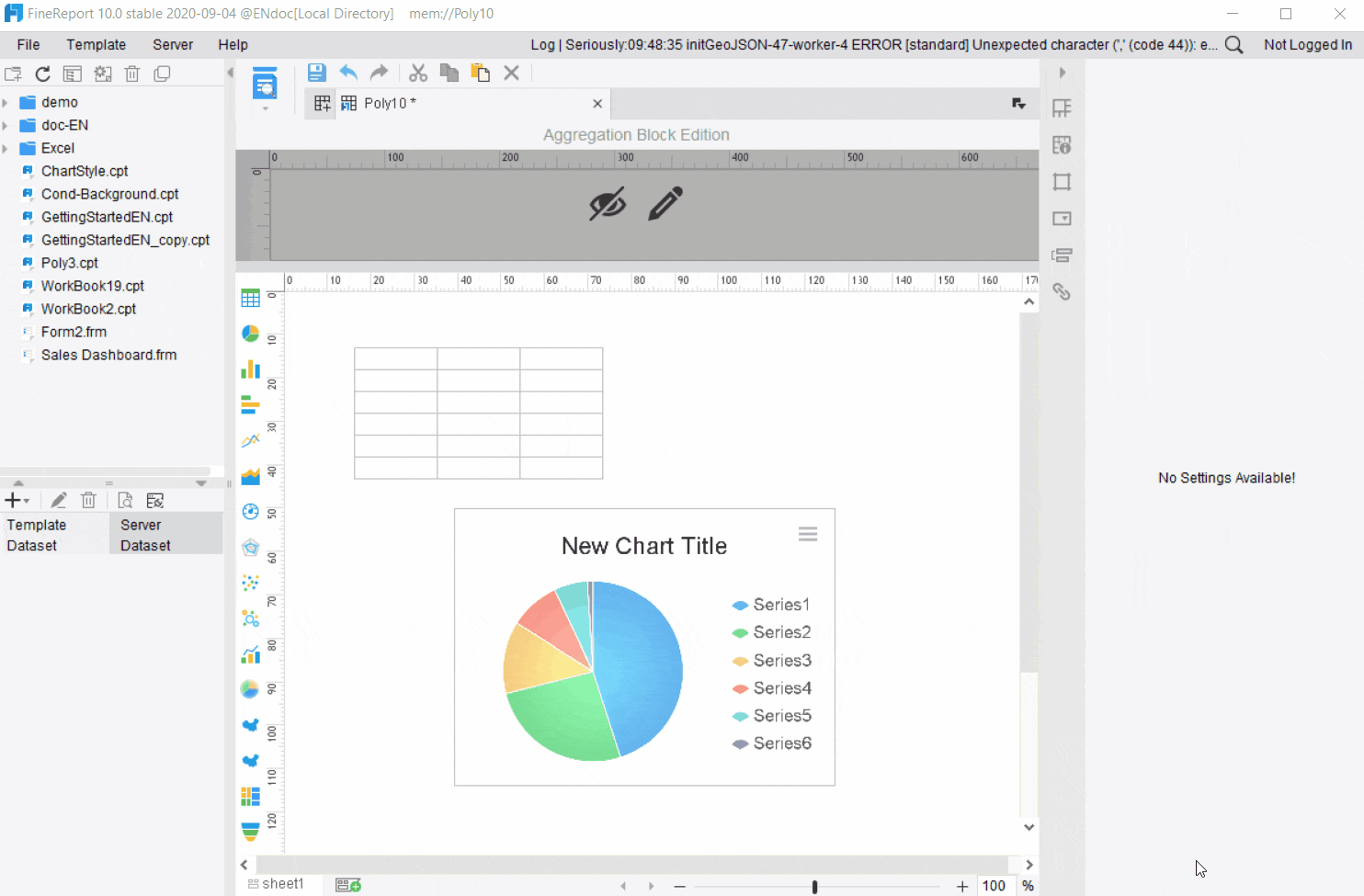
FineReport simplifies this process by allowing you to customize titles directly within its report designer. Use concise language that reflects the report's goal. Avoid vague or overly technical terms. A clear title ensures your audience in Malaysia understands the report's focus before diving into the details.
Organizing content into logical sections
The structure of your report plays a critical role in its effectiveness. Logical sections help readers navigate the content effortlessly. Begin by dividing your report into distinct parts based on its purpose. For a weekly report, you might include sections for progress updates, challenges, and next steps. A one-page project report could feature objectives, milestones, and outcomes.
FineReport's drag-and-drop interface makes it easy to organize content. Use headings and subheadings to separate sections. Incorporate white space to avoid clutter and improve readability. Charts and graphs can be placed strategically within sections to support key insights. Logical organization ensures your report delivers information in a clear and structured manner.
Choosing the right layout, fonts, and colors
The design of your report significantly impacts its readability and visual appeal. A clean layout ensures the content is easy to follow. FineReport offers customizable templates that allow you to choose layouts suited to your report's purpose. Select a layout that highlights essential data without overwhelming the reader.
Fonts and colors also play a vital role in the report's design. Use professional fonts like Arial or Calibri for clarity. Avoid overly decorative fonts that may distract from the content. Choose colors that align with your organization's branding or the report's theme. For example, use blue for a corporate report or green for an environmental project.
FineReport provides tools to adjust fonts, colors, and layouts with ease. Experiment with different combinations to find the most effective design. A well-designed report template enhances the overall impact of your one page report.
Leveraging FineReport for dynamic and pixel-perfect reports
FineReport empowers you to create reports that are not only visually stunning but also highly functional. Its robust features and user-friendly interface make it an ideal tool for designing dynamic, pixel-perfect reports that meet diverse business needs. Here’s how FineReport can transform your reporting process:
1. Dynamic Reporting for Real-Time Insights
FineReport allows you to connect to multiple data sources, enabling real-time data integration. This feature ensures your reports always reflect the latest information. Whether you’re tracking sales performance or monitoring operational metrics, FineReport keeps your data up-to-date.
Tip: Use FineReport’s drag-and-drop interface to link data fields effortlessly. This feature eliminates the need for complex coding, saving you time and effort.
Dynamic reporting also supports interactive elements like filters and drill-downs. These features let you explore data in greater detail without creating multiple reports. For example, you can click on a chart segment to view specific regional sales data.
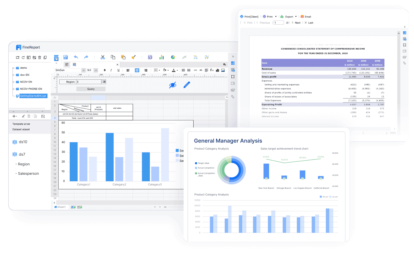
2. Pixel-Perfect Design for Professional Results
FineReport excels in creating pixel-perfect reports. This means every element in your report aligns precisely, ensuring a polished and professional appearance. You can customize layouts, fonts, and colors to match your organization’s branding.
![]()
Here’s what makes FineReport’s design capabilities stand out:
| Feature | Benefit |
|---|---|
| Customizable Templates | Save time by using pre-designed layouts. |
| Advanced Formatting | Achieve precise alignment and spacing. |
| Wide Chart Selection | Choose from over 70 chart styles for better visualization. |
Note: Pixel-perfect design is crucial for reports shared with stakeholders. It enhances readability and leaves a lasting impression.
3. Automation for Efficiency
FineReport simplifies repetitive tasks through automation. You can schedule reports to generate and distribute automatically. This feature ensures stakeholders receive timely updates without manual intervention.
For instance, you can set up a weekly sales report to be emailed to your team in Malaysia every Monday morning. FineReport handles the scheduling, so you can focus on analyzing the data instead of managing the process.
4. Seamless Integration with Existing Systems
FineReport integrates seamlessly with various databases and business systems. This compatibility ensures you can pull data from multiple sources into a single report. It also supports exporting reports in multiple formats, including PDF, Excel, and Word.
Example: If your organization uses a CRM system, FineReport can connect to it directly. This integration allows you to generate customer insights without switching between platforms.
5. Interactive Features for Enhanced Usability
FineReport includes interactive features that make your reports more engaging. You can add hyperlinks, drill-downs, and parameter queries to create a dynamic user experience. These features allow readers to navigate the report effortlessly and find the information they need.
For example, a hyperlink in your report can direct users to a detailed analysis of a specific metric. This functionality improves usability and ensures your audience in Malaysia can explore data intuitively.
6. Mobile Accessibility for On-the-Go Insights
FineReport supports mobile BI, enabling you to access reports on smartphones and tablets. This feature ensures you can stay informed even when you’re away from your desk. The mobile interface is optimized for smaller screens, providing a seamless experience.

Emoji Highlight: 📱 Mobile accessibility ensures you never miss critical updates, no matter where you are.
Why Choose FineReport?
FineReport combines advanced features with ease of use, making it a powerful tool for report creation. Its dynamic capabilities, pixel-perfect design, and automation features set it apart from traditional reporting tools. By leveraging FineReport, you can create reports that are not only informative but also visually compelling. FineReport's Web-based reports are hyperlinks designed for jumping between reports. Jumping between reports can be realized through JavaScript. While web-based reports provide a setting interface that enables report developers having no JavaScript knowledge to quickly realize the effect of jumping from one report to another.
Call to Action: Ready to elevate your reporting process? Explore FineReport’s features and start creating impactful reports today!
Best Practices for Designing One Page Report Templates in Malaysia
Keeping the report concise and focused
A concise one-pager ensures your audience in Malaysia quickly grasps the key points without feeling overwhelmed. Focus on the most critical data and insights that align with the report's purpose. Avoid unnecessary details or jargon that could distract from the main message. For example, a weekly progress report should highlight achievements, challenges, and next steps, while a project summary might emphasize milestones and outcomes.
Concise one-pager templates improve reader retention by enhancing clarity and engagement. They allow you to communicate essential information efficiently, ensuring your message remains impactful. Studies show that one-pagers encourage creative synthesis of information, making them excellent tools for summarizing complex topics.
| Benefit | Description |
|---|---|
| Efficiency | Quickly communicate essential information without overwhelming the audience. |
| Clarity | Focus on key points, ensuring that the message is clear and impactful. |
| Engagement | Use visuals and concise text to maintain the reader's interest. |
Metrics like time on page and scroll depth also highlight the importance of concise content. Aim for a report format that keeps readers engaged for 1-2 minutes and ensures they scroll through the entire page.
Using high-quality visuals to enhance understanding
Visuals are powerful tools for improving comprehension and retention. They simplify complex data, making it easier for your audience in Malaysia to understand trends and relationships. For instance, a bar chart can compare sales across regions, while a line graph can show performance over time. High-quality visuals also make your report formats more engaging and professional.
Research shows that people remember 80% of what they see compared to just 20% of what they read. This underscores the importance of integrating visuals into your one-pager templates. Effective visuals not only enhance memory retention but also make vital information accessible to a broader audience in Malaysia.
| Evidence Type | Description |
|---|---|
| Memory Retention | People remember 80% of what they see compared to 20% of what they read. |
| Clarity of Data | Visuals convey complex data succinctly, improving accessibility. |
| Comparative Analysis | Visuals provide clearer insights into data than text alone. |
When designing your report, choose visuals that align with your discussion. Ensure they are labeled clearly and placed strategically to support your key findings.
Ensuring consistency in design and layout
Consistency in design enhances the readability and professionalism of your one-pager templates. Use a uniform layout, font style, and color scheme throughout the report. This approach creates a cohesive look and ensures your audience in Malaysia can navigate the content effortlessly.
For example, align text and visuals uniformly and use white space to avoid clutter. Stick to professional fonts like Arial or Calibri and choose colors that match your organization’s branding. Consistent design not only improves navigation but also reinforces your brand identity.
FineReport simplifies this process by offering customizable templates with pre-designed layouts. These templates ensure your report maintains a polished and consistent appearance, saving you time and effort.
Testing the report for readability and impact
Testing your one page report ensures it communicates effectively and resonates with your audience in Malaysia. A well-tested report highlights key insights while maintaining clarity and engagement. To achieve this, you should evaluate its readability and overall impact before sharing it.
Start by reviewing the report’s outline. Check if the structure flows logically and aligns with the report’s purpose. Each section should connect seamlessly, guiding the reader through the content without confusion. A clear and concise outline ensures your audience in Malaysia can easily navigate the report.
Next, assess the readability of the text. Use tools like readability checkers to measure the complexity of your language. Aim for a reading level that matches your audience’s expertise. For example, if your readers are executives, focus on high-level insights. If they are team members in Malaysia, include actionable details. Simplify jargon and use short sentences to enhance comprehension.
Visual elements also play a crucial role in readability. Ensure charts, graphs, and other visuals are labeled clearly and placed strategically within the report. Test whether these visuals support the outline and reinforce the key points. A clutter-free design improves the overall impact of the report.
Finally, gather feedback from a small group of stakeholders. Share the report and ask for their impressions. Did they find the outline easy to follow? Were the visuals helpful? Did the report achieve its intended purpose? Use their input to refine the content and design.
Testing your report guarantees it meets the needs of your audience in Malaysia. By focusing on the outline, readability, and feedback, you create a report that delivers maximum impact.
FanRuan’s Role in Simplifying One Page Report Design in Malaysia
How FineReport streamlines report creation
FineReport simplifies the process of creating one page report by offering tools that are both powerful and user-friendly. Its drag-and-drop interface allows you to design reports without needing advanced technical skills. You can connect to multiple data sources, ensuring your reports always reflect the latest information. This feature eliminates the need for manual data updates, saving you time and effort.
The software also provides pre-designed templates. These templates help you maintain consistency in layout and design, which is essential for professional reporting. You can customize these templates to match your organization’s branding or specific project needs. FineReport’s automation features further enhance efficiency. You can schedule reports to generate and distribute automatically, ensuring stakeholders receive timely updates.
Tip: Use FineReport’s interactive features, like hyperlinks and drill-downs, to make your reports more engaging and easier to navigate.
Benefits of using FineReport for professional one page report
FineReport offers several advantages that make it ideal for creating professional one page report. First, it supports dynamic reporting, allowing you to include real-time data. This capability ensures your reports remain relevant and actionable. Second, its pixel-perfect design tools help you create visually appealing reports that leave a lasting impression.
The software also enhances collaboration. You can set permissions to control who can view or edit the report, ensuring data security. Additionally, FineReport integrates seamlessly with existing systems, making it easier to pull data from various sources. This integration reduces the time spent on data preparation and allows you to focus on analysis.
| Feature | Benefit |
|---|---|
| Dynamic Reporting | Keeps data up-to-date |
| Pixel-Perfect Design | Enhances visual appeal |
| Seamless Integration | Simplifies data preparation |
Examples of impactful one page report created with FineReport
One page report created with FineReport have transformed how businesses evaluate performance. These reports facilitate KPI assessment, which is crucial for measuring marketing strategies. They also enable predictive analysis, helping businesses compare actual performance against forecasts. This capability allows teams in Malaysia to identify gaps and make informed decisions.
- FineReport’s reports support a well-structured marketing KPI system, improving performance evaluation.
- Predictive analysis features enhance accountability within teams in Malaysia by quantifying the effectiveness of strategies.
- Businesses use these reports to track progress and adjust plans, ensuring better outcomes.
For example, a retail company used FineReport to create a one page sales performance report. The report included real-time sales data, regional comparisons, and predictive insights. This approach helped the company identify underperforming areas and implement targeted strategies, leading to a 15% increase in overall sales.
Note: FineReport’s ability to combine data visualization with actionable insights makes it a valuable tool for any industry.
Designing a one page report requires a clear focus on purpose, audience, and structure. Start by defining the report's goal and identifying the key data points to include. Use visuals like charts to simplify complex information and organize content into logical sections for easy navigation. FineReport can help you create professional, pixel-perfect reports with dynamic features and customizable templates. By aligning your report with its purpose and audience, you ensure it delivers maximum impact. If you want to learn how to write a report effectively, these steps will guide you toward success.
Click the banner below to try FineReport for free and empower your enterprise to transform data into productivity!

Continue Reading About One Page Report
The Best Open Source Reporting Tools for Your Business in 2025


FAQ

The Author
Lewis
Senior Data Analyst at FanRuan
Related Articles

Financial Reporting Valuation Explained: A Practical Guide to ASC 820, ASC 805, ASC 350, and ASC 718
$1 valuation is the process companies use to measure assets, liabilities, equity instruments, and reporting units for compliant $1. For CFOs, controllers, finance directors, and audit facing accounting teams, the challen
Yida Yin
Jun 25, 2026

Best Ad Reporting Tool in 2026: 8 Options Compared for Marketers and Analysts
$1 is an $1 and dashboard platform that helps teams unify ad data, build highly customized reports, and automate distribution at scale. 8 ad reporting tool options compared 1. DashThis One sentence overview: DashThis is
Yida YIn
Jun 25, 2026
Office 365 Reporting Tool Guide: Track Usage, Security, and License Waste in One Dashboard
An office 365 $1 should do more than generate static usage charts. For IT managers, operations leaders, and Microsoft 365 administrators, the real value is operational visibility: who is actually using the platform, wher
Yida Yin
Jun 25, 2026