Mastering the art of dashboard design is essential for transforming raw data into actionable insights. A well-crafted Power BI dashboard allows you to track progress, identify trends, and make decisions with confidence in Malaysia. Effective dashboards focus on relevant metrics, present data clearly, and ensure smooth navigation. Tools like FineBI and FineReport take your dashboards to the next level by simplifying complex reporting and enhancing visualizations. With these tools, you can unlock deeper insights and create dashboards that truly drive results.
Key Takeaways
- Keep your Power BI dashboard simple and clear. Show fewer metrics so users can find key details fast.
- Use the same layout and align items neatly. This looks professional and makes data easier to follow.
- Pick the best charts for your data. Use common chart types to explain clearly and avoid confusing users.
- Add slicers and filters for interactivity. These let users change views and focus on what they need.
- Use storytelling in your dashboard design. Organize data well and highlight important points to help users decide.
Best Practices for Power BI Dashboard
Keeping Dashboards Simple and Focused
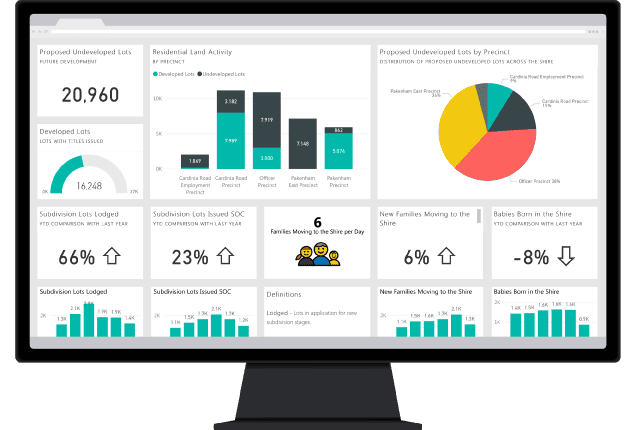
A cluttered dashboard can overwhelm users in Malaysiaand obscure critical insights. Keeping your Power BI dashboard simple and focused ensures users in Malaysia can quickly grasp the most important information. Start by identifying the key metrics that align with your audience's needs. For example, Phoenix University tailored its dashboards to display real-time student performance metrics, which improved decision-making and student outcomes. Similarly, Chevron optimized energy management by focusing on essential energy metrics.
To simplify your dashboard design, limit the number of displayed metrics. This approach helps users in Malaysia concentrate on the most relevant data. Use white space effectively to enhance clarity and guide attention to critical areas. Familiar chart types, such as bar or line charts, improve data interpretation and engagement. A logical structure further aids navigation, allowing users to discover insights effortlessly.
Using Consistent Layouts and Grid Alignment
Consistency in dashboard layout plays a vital role in user experience. A well-aligned dashboard layout ensures that users in Malaysia can navigate and interpret data without confusion. Using a grid-based alignment system helps maintain pixel-perfect precision, making your dashboard visually appealing and professional.
| Advantage | Description |
|---|---|
| Pixel-perfect alignment | Ensures elements are aligned precisely. |
| Flexibility in sizing and positioning | Allows for dynamic adjustments to layout. |
| Adaptability to different screen sizes | Ensures usability across various devices. |
By maintaining a consistent layout, you create a seamless experience for users, enabling them to focus on the data rather than the design.
Choosing the Right Visualizations for Data Insights
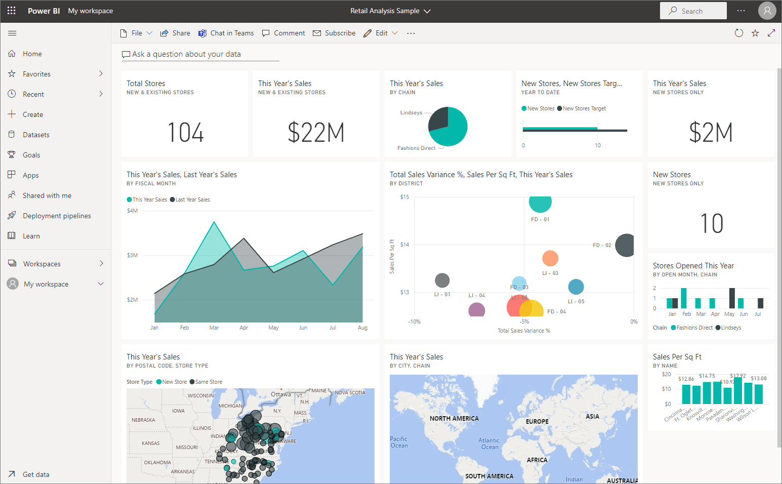
The choice of visualization can make or break your Power BI dashboards. Selecting the right charts ensures that your data tells a compelling story. For instance, Chevron used Power BI to visualize energy metrics in real time, leading to significant cost savings. The City of Los Angeles leveraged visualizations to enhance public data transparency, resulting in a 40% increase in public engagement.
When choosing visualizations, consider the type of data and the insights you want to convey. Use bar charts for comparisons, line charts for trends, and pie charts for proportions. Avoid overcomplicating your dashboard with too many chart types. Instead, focus on those that best represent your data. Templates and guides available in Power BI can help you select the most effective visualizations for your analysis in Malaysia.
Note: Always test your visualizations with a sample audience to ensure they are easy to understand and interpret.
Telling a Story Through Your Dashboard Design
A well-designed dashboard does more than just display data. It tells a compelling story that guides users in Malaysia through insights and helps them make informed decisions. Storytelling in dashboard design transforms raw numbers into meaningful narratives, making data more relatable and actionable.
To craft a compelling story, start by identifying the purpose of your dashboard. Ask yourself: What message do you want to convey? For example, a sales dashboard might focus on highlighting revenue trends and identifying top-performing products. Once you have a clear goal, structure your dashboard to lead users in Malaysia through the data logically. Begin with an overview, then dive into detailed insights, and conclude with actionable takeaways.
Here are some best practices for incorporating storytelling into your Power BI dashboards:
- Use a logical flow: Arrange your charts and visualizations in a sequence that mirrors the narrative you want to tell. Start with high-level metrics and gradually move to detailed analysis.
- Highlight key insights: Use color, size, or annotations to draw attention to the most important data points. This ensures users in Malaysia focus on what matters most.
- Incorporate interactivity: Allow users in Malaysia to explore the data by adding filters, slicers, or drill-through options. This makes the story more engaging and personalized.
- Leverage visual elements: Choose charts that best represent your data and align with your narrative. For example, line charts work well for showing trends, while bar charts are ideal for comparisons.
Data storytelling also influences decision-making by emphasizing the implications of the data. For example, a dashboard showing customer satisfaction trends can inspire action by highlighting areas for improvement. By combining narratives with visualizations, you can evoke empathy and motivate users in Malaysia to act.
Remember, storytelling is not just about presenting data; it’s about making it understandable for a wide audience. Use tools like Power BI to create dashboards that leverage our natural affinity for narratives. With the right techniques, you can turn quantitative metrics into stories that engage and inform.
Tip: Always test your dashboard with a sample audience to ensure the story resonates and the insights are clear. Feedback can help refine your design and improve its impact.
Leveraging Advanced Features in Power BI Dashboard
Enhancing Interactivity with Slicers and Filters
Slicers and filters are essential tools for making your Power BI dashboards more interactive and user-friendly. They allow users in Malaysia to customize their view, focus on specific data points, and explore insights that matter most to them. By incorporating these features, you can transform static dashboards into dynamic platforms for real-time analysis.
For example, slicers enable users in Malaysia to segment data by categories such as time, region, or product type. Filters, on the other hand, refine the data displayed on your charts, ensuring that users in Malaysia see only the most relevant information. Together, these tools empower users in Malaysia to manipulate live data and gain up-to-the-minute insights.
The table below highlights key user engagement metrics that validate the role of slicers and filters in enhancing dashboard interactivity:
| Metric | Description |
|---|---|
| Interactive Elements | Users in Malaysia can customize their view and delve deeper into the data using filters and slicers. |
| Customizable Views | Dashboards can be personalized to reflect important metrics, with options to save these views. |
| Real-Time Data Interaction | Users in Malaysia can manipulate live data for an up-to-the-minute performance snapshot. |
| Enhanced Data Literacy | Engaging with interactive dashboards improves data literacy across all organizational levels. |
By leveraging slicers and filters, you not only improve user engagement but also enhance data literacy across your organization. These features make it easier for users in Malaysia to interact with data, uncover trends, and make informed decisions.
Tip: Use slicers and filters sparingly to avoid overwhelming users. Focus on the most impactful categories to maintain clarity and usability.
Adding Custom Tooltips for Contextual Information
Custom tooltips provide an effective way to deliver additional context without cluttering your dashboard. These tooltips appear when users in Malaysia hover over a chart or data point, offering detailed insights that enhance understanding. This feature is particularly useful for complex datasets where additional information can clarify trends or anomalies.
For instance:
- In a sales dashboard, custom tooltips can display details about individual sales transactions, helping users in Malaysia quickly access essential information.
- In a financial analysis dashboard, tooltips can explain financial metrics, offering deeper insights into revenue factors.
- Company XYZ used custom tooltips to enhance their sales analysis, which led to improved sales performance and higher customer satisfaction.
Custom tooltips not only enrich the user experience but also make your dashboards more intuitive. They allow users in Malaysia to explore data at their own pace, uncovering insights that might otherwise go unnoticed. By integrating this feature, you can create dashboards that are both visually appealing and highly functional.
Note: Ensure your tooltips are concise and relevant. Overloading them with too much information can confuse users in Malaysia rather than assist them.
How FanRuan's FineReport Enhance Dashboard Design
Using FineReport for Dashboards
Common Dashboard
FineReport simplifies the creation of common dashboards by offering a user-friendly interface and robust customization options. You can connect to multiple data sources, ensuring a unified view of your business metrics. The drag-and-drop functionality allows you to design dashboards quickly, even without technical expertise. FineReport also supports over 60 chart types, enabling you to visualize data in ways that resonate with your audience.
For example, you can use bar charts to compare sales performance across regions or line charts to track trends over time in Malaysia. These visualizations make it easier to identify patterns and take action. Additionally, FineReport’s dashboards adapt seamlessly to different devices, ensuring accessibility whether you’re on a desktop or mobile device.
3D Dashboard
FineReport takes dashboard design to the next level with its 3D dashboard capabilities. These dashboards provide a more immersive and interactive experience, making complex data easier to understand. For instance, you can create 3D models to visualize factory layouts or supply chain processes. This feature is particularly useful for industries in Malaysia like manufacturing and logistics, where spatial data plays a critical role.
The 3D dashboards also support real-time data updates, allowing you to monitor operations as they happen. By integrating these advanced visualizations, you can enhance decision-making and improve operational efficiency. Here is an interactive demo created by FineReport, click to experience it.

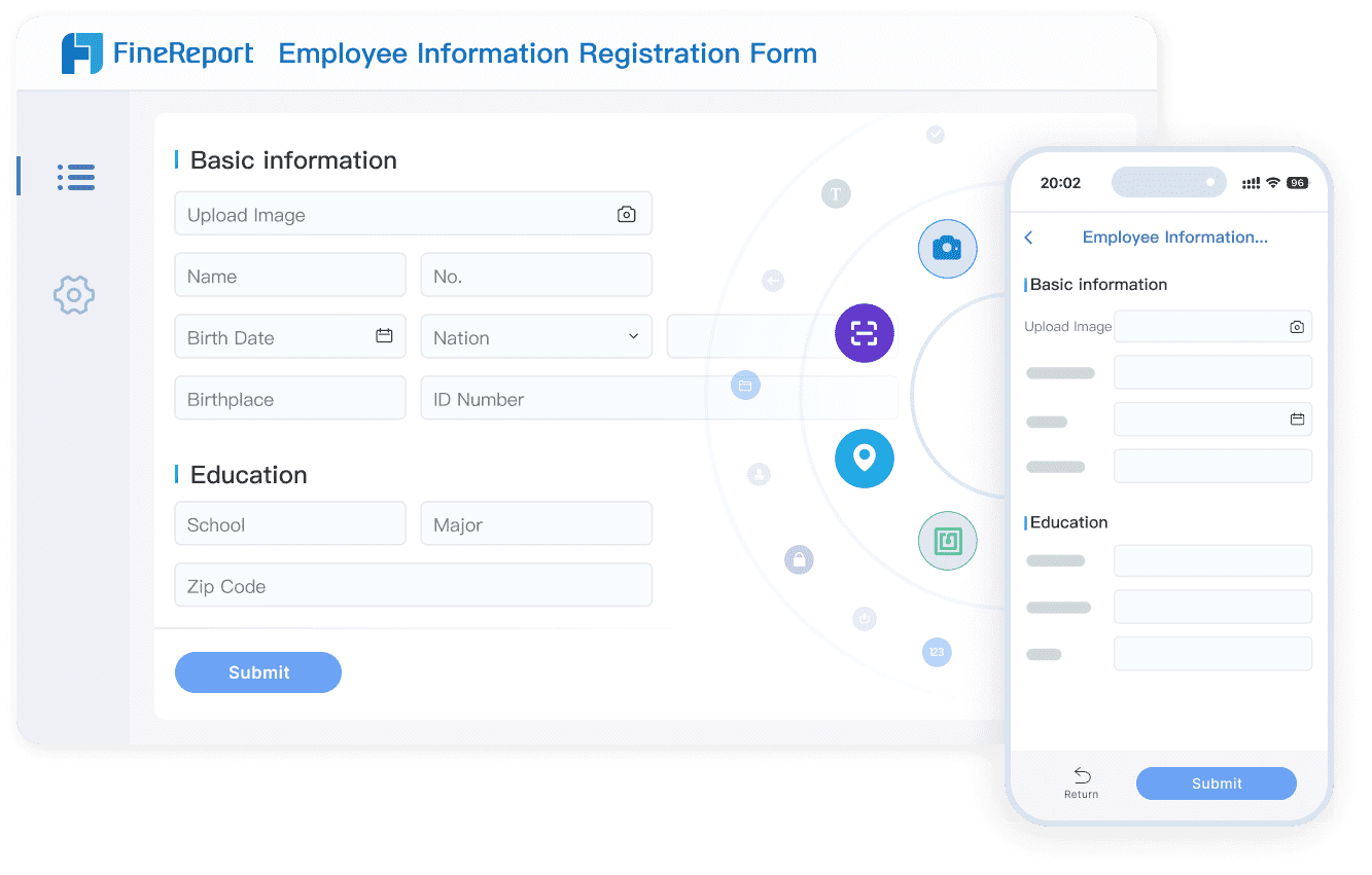
Data Entry Report
FineReport excels in creating data entry reports that streamline data collection and reporting processes. It supports online data entry and Excel imports, catering to diverse operational needs in Malaysia. You can also use conditional filtering to enhance data presentation and editing capabilities.
| Feature | Contribution to Efficiency |
|---|---|
| Multiple Data Sources | Enables integration of diverse data, reducing time spent on data collection and preparation. |
| Flexible Report Design | Allows users in Malaysia to create customized reports quickly, enhancing adaptability to business needs. |
| Complex Data Operations | Facilitates advanced data manipulation without programming, streamlining report generation. |
| Automated Report Generation | Reduces manual effort by automatically producing periodic reports based on database updates. |
These features significantly reduce manual reporting efforts, allowing you to focus on analyzing data rather than preparing it.
Decision-Making Platform
FineReport empowers organizations in Malaysia to make informed decisions through its intuitive dashboards and KPI reports. The platform provides a visual representation of key performance indicators (KPIs), offering a snapshot of your business’s actual situation. For example, KPI dashboards can highlight revenue trends or operational bottlenecks, enabling you to act swiftly.
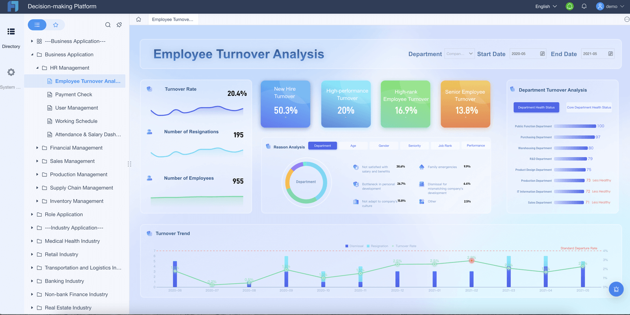
| Evidence Description | Key Points |
|---|---|
| Visual representation of KPIs | FineReport provides a snapshot of actual business situations through KPI dashboards. |
| Management tool for KPIs | KPI reports help measure and analyze vital performance metrics. |
| Intuitive dashboard insights | Dashboards offer at-a-glance insights, making data consumption easier. |
By leveraging these tools, you can measure progress, identify areas for improvement, and align your strategies with business goals in Malaysia.
Mobile Report

FineReport’s mobile reporting capabilities empower you to access critical business insights anytime, anywhere. In today’s fast-paced world, mobile accessibility is no longer a luxury—it’s a necessity. FineReport ensures that you stay connected to your data, enabling you to make informed decisions even when you’re on the move.
With FineReport, you can view dashboards and reports seamlessly on mobile devices. The platform’s adaptive design ensures that your reports look polished and remain functional across smartphones and tablets. Whether you’re in a meeting, traveling, or working remotely, FineReport keeps you updated with real-time data.
Mobile reports also enhance operational efficiency by streamlining data collection and analysis. Here’s how mobile usage improves business processes:
- Mobile data collection boosts operational efficiency by reducing manual tasks.
- It increases the speed and accuracy of data entry, minimizing errors.
- Team members gain immediate access to information, enabling faster decision-making.
FineReport’s mobile app supports interactive features like filters and drill-downs, allowing you to explore data in depth in Malaysia. You can customize your view, focus on specific metrics, and uncover insights with just a few taps. This level of interactivity ensures that you remain agile and responsive to changing business conditions in Malaysia.
Additionally, FineReport’s mobile capabilities promote collaboration. Team members can share insights and reports instantly, fostering better communication and alignment. By integrating mobile reporting into your workflow, you can enhance productivity and drive better outcomes in Malaysia.
Tip: Use FineReport’s mobile app to monitor KPIs and track performance in real time. Staying connected to your data ensures you never miss an opportunity to act.
Understanding your audience is the foundation of creating dashboards that deliver actionable information. By applying effective dashboard design principles, such as focusing on key metrics and selecting appropriate visualization types, you can ensure clarity and usability. Leveraging advanced features like slicers, filters, and dynamic titles enhances interactivity and engagement, while avoiding common mistakes ensures your dashboards remain impactful.
Tools like FineBI and FineReport complement Power BI by simplifying data analysis and expanding data visualisation capabilities. These tools enable you to create dashboards that not only identify trends but also anticipate business actions and optimize data retrieval. Features like drag-and-drop functionality and embedded reports make it easier to customize layouts and integrate insights into workflows.
In Malaysia, FineReport are supported by a dedicated local team, providing localized project implementation and technical support to ensure seamless deployment and optimized performance tailored to Malaysian enterprises.
A well-designed dashboard transforms raw data into meaningful insights. It empowers decision-makers to act with confidence, driving better outcomes for your organization in Malaysia. By following these dashboard tips and exploring complementary tools, you can unlock the full potential of your data.
Click the banner below to experience FineReport for free and empower your enterprise to convert data into productivity!
Continue Reading about Power BI Dashboard


FAQ

The Author
Lewis
Senior Data Analyst at FanRuan
Related Articles

How to Build an Investment Portfolio Reporting Dashboard for Executives: KPIs, Benchmarks, and Drill-Down Views
Investment portfolio reporting for executives is not about showing every holding, transaction, and chart your investment team can produce. It is about giving CEOs, CFOs, CIOs, boards, and investment committees a fast, re
Yida YIn
Jun 25, 2026

12 KPI Reporting Examples for Executive Dashboards: What to Show in Weekly, Monthly, and Quarterly Reviews
Executive leaders do not need more data. They need decision ready $1 examples that match how often they review the business and what actions they are expected to take. A weekly $1 should surface fast moving risks and per
Yida YIn
Jun 25, 2026

How to Build a Digital Marketing Reports Dashboard: Executive Examples, KPIs, and Templates
A $1 is the control layer that helps executives and marketing leaders turn scattered channel data into fast, confident decisions. If you are a CEO, CMO, operations director, or marketing analytics lead, the real problem
Yida Yin
May 07, 2026