You might wonder what data storytelling tips for beginners really are. These essentials help you turn data into simple stories that guide decisions and spark action. When you use data storytelling essentials, you make complex ideas easy for anyone to understand.
In business, clear data storytelling does more than just share numbers. It breaks down tough analyses so everyone, even non-technical teams, can see what matters. This approach inspires action, builds alignment, and helps your company use data in real decisions. Many beginners struggle to move from just informing to truly influencing with data, but focusing on a central message and knowing your audience can change that. Tools like FineBI make this process easier by letting you design visuals and stories without needing advanced skills.
Know Your Audience For Data Storytelling

Define Audience Needs
If you want your data storytelling to make an impact, you need to know your audience first. Every group brings its own background, expectations, and level of expertise. Some people love details and technical terms. Others just want the big picture. Before you start building your data narrative, take a moment to figure out who will listen or read your story.
Here’s a quick look at common audience types you might encounter in business settings:
To define what your audience needs, try these tips:
- Get to know your audience before you present. Chat with them or ask questions to warm up the room.
- Check what they already know about your topic.
- Think about how they reacted to similar presentations in the past.
- Investigate their roles and how they relate to your data storytelling essentials.
Tailor Data Storytelling
Once you understand your audience, you can shape your data storytelling to fit their needs. Start with research. Surveys, interviews, or even a quick poll can help you learn about their background and interests. Set clear goals for your data narrative. What do you want your audience to do or feel after your story?
Adjust your visuals and language. Use simple charts for beginners and more complex visuals for experts. Avoid jargon unless you know your audience understands it. Break down complex ideas into easy steps. Use analogies or real-life examples to make your data storytelling essentials stick.
Highlight the insights that matter most to your audience. Focus on what helps them solve problems or make decisions. Choose the best way to deliver your story—maybe a live presentation, a report, or an interactive dashboard. When you tailor your data storytelling, you turn information into action. That’s one of the most important data storytelling tips you can use.
Focus Your Message in Data Storytelling
Clarify Main Point
You want your data storytelling to make an impact, so you need to clarify your main point right from the start. A strong message helps your audience remember what matters most. When you build your data narrative, think about what you want people to do or feel after they see your story.
Here are some key elements that help you focus your message:
- Stories drive action, not numbers. Emotional narratives inspire change.
- Trust starts with reliable data. Accurate data is essential for a strong story.
- Match your message to your audience. Tailor your narrative to different stakeholders.
- Visuals clarify, not decorate. Use purposeful visualizations to support your narrative.
- Context makes insights meaningful. Explain the significance of the data.
- Measure impact, not just engagement. Track the effectiveness of your data story.
You can also use these strategies to clarify your main point:
When you use these data storytelling essentials, your message stands out and your audience stays engaged.
Remove Distractions
Distractions can weaken your data storytelling and confuse your audience. You want every part of your data narrative to support your main idea. Common distractions include not knowing your audience or leaving out important context.
Keep your visuals simple. Avoid extra colors, labels, or charts that do not add value. Stick to the data storytelling essentials and focus on what matters. When you remove distractions, your data narrative becomes clear, direct, and much more powerful. These tips help you guide your audience to the insights that matter most.
Use Effective Data Storytelling Structure
Start with Context
You want your audience to understand your data narrative from the very beginning. Starting with context is one of the data storytelling essentials that sets the stage for everything that follows. When you provide context, you clarify the story and make it easier for people to follow. You connect your visuals to insights, which helps your audience see why the data matters. Context also makes complex information easier to interpret, so your audience stays engaged.
Here are a few reasons why context matters in data storytelling:
- Context clarifies your narrative and guides your audience.
- It connects your visuals to the insights you want to share.
- Context helps people interpret complex information and stay interested.
If you skip context, your audience may feel lost or confused. You can start with a simple background, a question, or a challenge your data addresses. This approach makes your data storytelling framework stronger and helps you build a structure for impact.
Guide to Insights
After you set the context, you need to guide your audience from raw data to actionable insights. This step is a key part of data storytelling essentials. You want your data narrative to move smoothly from facts to meaning, then to action.
Many experts use proven frameworks to organize their stories. Here’s a quick look at some popular structures for impact:
You can use these techniques to guide your audience:
When you use these data storytelling tips, you help your audience move from information to action. Your data storytelling becomes more powerful, and your message sticks.
Data Storytelling with FineBI

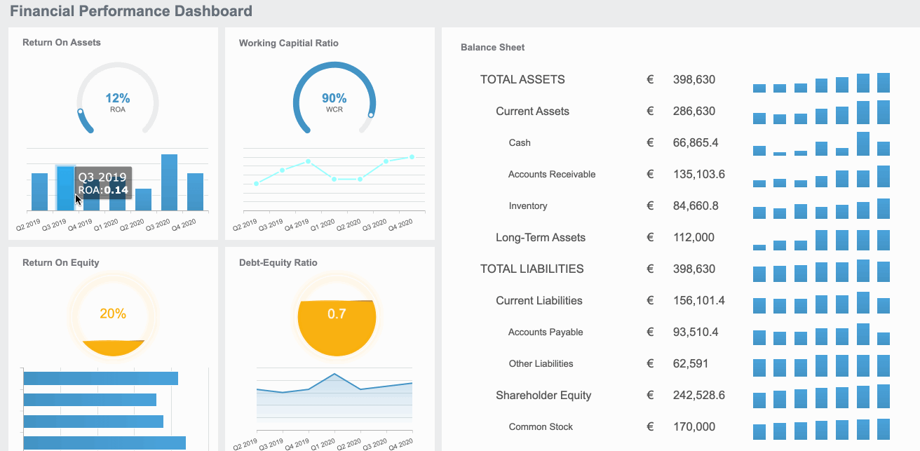
Choose the Right Visuals
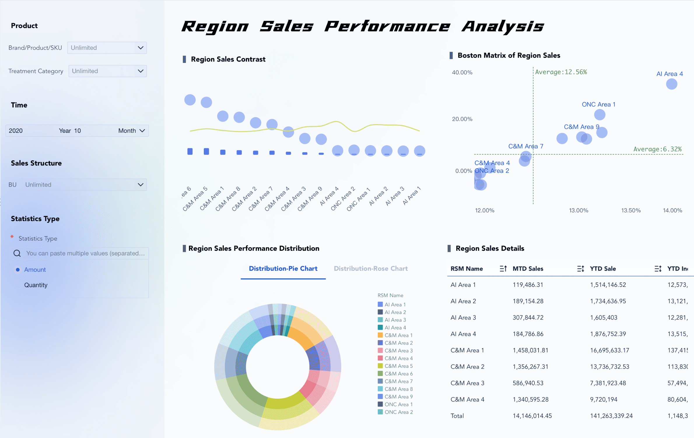
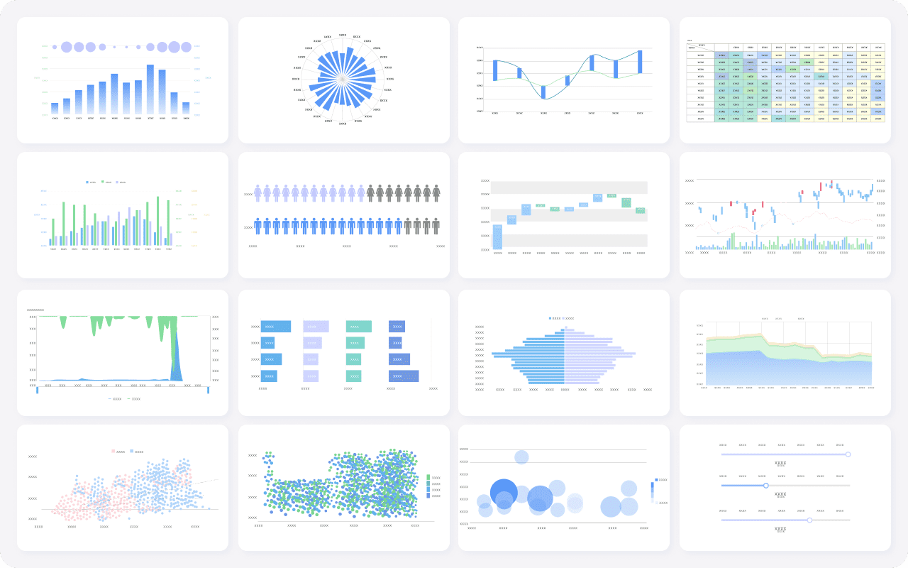
When you want to create effective data stories, picking the right visuals is one of the most important data storytelling essentials. You need to match your chart or graph to the message you want to share. Start by looking at your data. Make sure it is clean, well-structured, and relevant to your question. If you have a lot of numbers, a bar chart or line graph can show trends over time. For parts of a whole, a pie chart works well. Always ask yourself what you want your audience to see first.
Here are some simple steps to help you choose the best visual:
- Check if your data is organized and clear.
- Think about the size of your dataset. Larger sets often give more reliable results.
- Make sure your data matches the story you want to tell.
- Pick visuals that highlight the most important points.
FineBI makes this process easy for beginners. Its user-friendly interface lets you drag and drop data into different chart types. You do not need to know any coding or advanced formulas. You can also customize your visuals to fit your needs, making your data storytelling more powerful.
Enhance Effective Data Stories
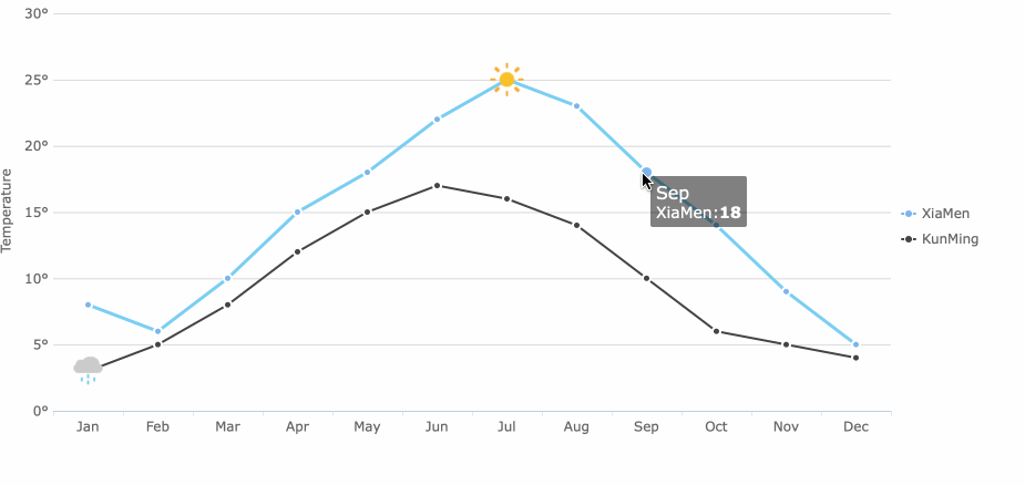
You want your audience to engage with your data storytelling, not just look at it. FineBI helps you build interactive dashboards that let users explore data on their own. With real-time analysis, you can update your visuals instantly as new data comes in. This keeps your story fresh and relevant.
FineBI stands out because it gives you:
- A drag-and-drop dashboard that anyone can use, even without technical skills.
- Self-service analytics, so you can create and share insights across your team.
- Interactive visualizations that let users filter and explore data, making patterns and trends easy to spot.
- Responsive designs that work on any device, so your audience can view your data stories anywhere.
These features help you move from static charts to dynamic, engaging data storytelling. You can see this in action with BOE, a global leader in technology. After using FineBI, BOE reduced inventory costs by 5% and improved operational efficiency by 50%. Their teams now use unified dashboards to monitor performance and make faster decisions.
If you want to follow the best data storytelling tips, start with the right visuals and use tools like FineBI. This approach turns your data storytelling essentials into real business results.
Simplify Information in Data Storytelling
Use Plain Language
You want your data storytelling to reach everyone, not just experts. Using plain language is one of the most effective ways to make your message clear. When you avoid jargon and technical terms, you help your audience focus on the story, not the complexity. Simple words and short sentences keep your data storytelling easy to follow.
Here are a few ways you can simplify your language:
- Use clear labels on every chart and table.
- Stick to consistent colors so your visuals are easy to understand.
- Choose descriptive titles that tell your audience what to expect.
- Limit the number of charts on each page to avoid clutter.
- Make sure your font sizes are readable and your color contrasts are strong.
When you use plain language, you help everyone see the value in your data storytelling. This approach is one of the data storytelling essentials that builds trust and keeps your audience engaged.
Break Down Data
Large datasets can feel overwhelming. You can make them easier to understand by breaking them into smaller, manageable pieces. This method, called data chunking, helps you highlight the most important insights without overloading your audience.
Treemaps are a great tool for this. They organize big datasets into a visual hierarchy, using nested rectangles. Each rectangle’s size shows its value, making it simple to spot patterns and trends. You can also use interactive dashboards to let your audience explore the data at their own pace.
Try to focus on three core takeaways. Highlight key insights and provide context so your audience knows why the data matters. When you break down complex information, you make your data storytelling more powerful and actionable.
Tip: Always guide your audience with clear, actionable next steps. This keeps your data storytelling focused and helps people know what to do next.
By using these tips, you turn complex data into stories that everyone can understand and act on.
Data Storytelling: Make Data Stories Relatable
Connect to Real-World Examples
You want your data narrative to stick with your audience. One of the best ways to do this is by connecting your story to real-world examples. When you use familiar situations, you make your data feel more tangible and meaningful. People remember stories that relate to their own lives or experiences.
Think about a time when you saw a chart about energy use. If the presenter compared it to the electricity needed to power your home for a month, you probably understood it right away. Real-world scenarios help bridge the gap between numbers and understanding. They turn abstract data into something your audience can picture.
Here’s why real-world examples work so well:
- They make your data narrative easier to grasp.
- Familiar situations help your audience connect emotionally.
- Stories engage different parts of the brain, which boosts comprehension and recall.
Try to use examples from your audience’s daily life or industry. If you’re talking to a sales team, show how a trend affects their monthly targets. For a group of students, relate your data to school events or popular culture. This approach is one of the data storytelling essentials that makes your message memorable.
Use Analogies
Analogies can turn complex ideas into simple ones. When you compare your data to something your audience already knows, you help them understand faster. For example, you might say, “Analyzing this dataset is like sorting a giant box of mixed-up puzzle pieces.” Suddenly, the process feels less intimidating.
Analogies work because they create mental shortcuts. Your audience doesn’t have to learn something new from scratch. Instead, they build on what they already know. This technique keeps your data narrative clear and relatable.
Here are a few tips for using analogies:
- Pick comparisons that fit your audience’s background.
- Keep your analogies simple and direct.
- Use visuals to reinforce your point when possible.
When you use real-world examples and analogies, you make your data storytelling more engaging. You help your audience see the value in your story and remember it long after your presentation ends.
Refine and Share
Review for Clarity
You want your data story to be clear and accurate before you share it with others. Reviewing your work helps you spot mistakes and make sure your message comes through. Here’s a simple process you can follow to review your data story for clarity and accuracy:
- Understand your audience. Think about who will read or view your story and adjust your presentation to fit their needs.
- Understand your data. Take time to profile your data. Check its structure, format, and completeness.
- Prepare your data. Fix any quality issues. Standardize formats and remove duplicates.
- Build your plan for telling stories with data. Decide how you want to present your findings for the most impact.
When you follow these steps, you make your story easier to understand and more trustworthy. This is a key part of effective data storytelling.
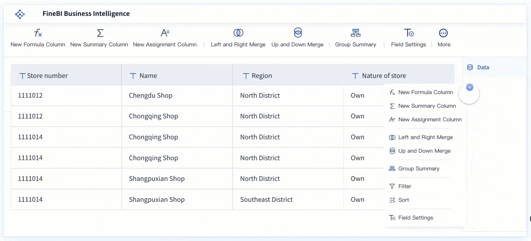
Collaborate with FineBI
Sharing and teamwork make your data stories even stronger. FineBI gives you powerful tools to collaborate and share insights with your team. You can work together on dashboards, share reports with a single click, and bring in data from many sources. This makes it easy for everyone to stay on the same page and make better decisions.
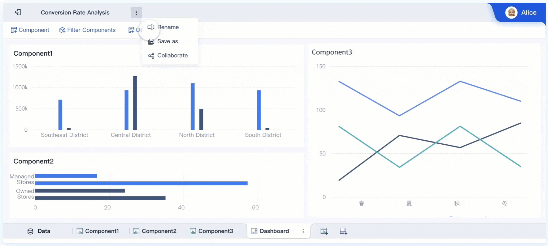
FineBI also supports role-based access, so you control who can view or edit each dashboard. This keeps your data secure while still encouraging open teamwork.
Continuous feedback is another important part of effective data storytelling. When you ask for feedback and make improvements, your stories become more credible and useful. Feedback loops help you learn from your audience and make your data stories even better over time.
By using FineBI’s collaboration and sharing features, you make your data storytelling process more effective and impactful. You turn insights into action and help your team succeed.

You now have seven practical ways to make your data storytelling clear and memorable. FineBI helps you turn insights into action with real results:
When you use these strategies, you help your team make smarter decisions and align on goals. Remember, as Brene Brown says, "Maybe stories are just data with a soul." Start sharing your own stories and see the difference.


