An Excel dashboard serves as a visual tool that transforms raw data into actionable insights. It simplifies decision-making by presenting key metrics and trends in an accessible format. In Malaysia, Excel remains indispensable for dashboard creation due to its robust features and versatility. Its user-friendly interface and extensive capabilities, such as pivot tables and advanced functions, make it ideal for data preparation, analysis, and visualization. Tools like FineBI and FineReport further enhance Excel dashboards by enabling advanced analytics and dynamic reporting. These integrations empower you to create a dashboard in Excel that meets modern business intelligence needs in Malaysia.

The foundation of any effective Excel dashboard lies in clean and accurate data. Begin by importing your data into Excel from sources like databases, CSV files, or APIs. Use Excel’s Get & Transform feature to connect to external data sources and load the data directly into your workbook. This ensures seamless integration and saves time.
Once your data is imported, focus on cleaning it. Data cleaning involves removing errors, duplicates, and inconsistencies to ensure reliability.
Tip: Deduplication and validation are critical for maintaining data integrity. Clean data ensures that your dashboard reflects accurate insights, which is essential for decision-making.
By investing time in cleaning your data, you set the stage for accurate and meaningful analytics.
PivotTables are one of Excel’s most powerful tools for summarizing and analyzing data. They allow you to organize large datasets into meaningful insights with just a few clicks. To create a PivotTable:
For example, if you’re analyzing sales data, you can:
PivotTables also support advanced features like grouping, filtering, and calculated fields. These features help you drill down into specific metrics or create custom calculations without altering the raw data.
Note: Organizing your data into tabs—such as raw data, calculations, and the final dashboard—can improve clarity and structure. This approach makes it easier to manage and update your dashboard.
By using PivotTables, you can transform raw data into actionable insights, making it easier to create a dashboard in Excel that highlights key performance indicators (KPIs).
Data visualization is the heart of any Excel dashboard. Charts and graphs make your data more accessible and engaging, helping users quickly grasp trends and patterns.
Tip: Choose the right chart type for each KPI. For example, use a line chart to track monthly sales trends or a pie chart to show market share distribution.
Excel also offers advanced visualization options like combo charts, sparklines, and conditional formatting. These features allow you to create dynamic dashboards that update automatically when the underlying data changes in Malaysia. For instance, you can use slicers and timelines to add interactivity, enabling users to filter data by specific criteria.
By combining PivotTables with charts, you can create a dashboard that not only looks professional but also delivers valuable insights for business intelligence.
The final step in creating an Excel dashboard involves assembling all components and ensuring the dashboard is polished and ready for use. This process transforms your work into a cohesive tool for business intelligence.
Measurable Outcomes of Proper Finalization:
| Measurable Outcome | Description |
|---|---|
| Visual presentation of performance measures | Enhances understanding of data at a glance. |
| Identification and correction of negative trends | Enables proactive management of issues. |
| Measurement of efficiencies/inefficiencies | Helps in optimizing processes. |
| Generation of detailed reports showing new trends | Provides insights into evolving data patterns. |
| Informed decision-making based on collected data | Supports strategic planning and actions. |
| Alignment of strategies and organizational goals | Ensures efforts are directed towards common objectives. |
| Instant visibility of all systems | Facilitates comprehensive oversight of operations. |
| Quick identification of data outliers and correlations | Aids in recognizing anomalies and relationships in data. |
| Time savings through comprehensive data visualization | Reduces the need for multiple reports, streamlining analysis. |
By assembling and finalizing your dashboard thoughtfully, you ensure it serves as a powerful tool for business intelligence. A well-designed dashboard saves time, identifies trends, and supports informed decision-making, making it indispensable for modern analytics in Malaysia.
Excel offers powerful tools like PivotTables and formulas for data analysis, but it struggles with large datasets and complex analytics. When handling extensive data, Excel often slows down or crashes, making it unsuitable for real-time decision-making. For example, while building PivotTables is essential for summarizing large datasets, the process can become cumbersome as the data grows. Similarly, dynamic dashboards that automate updates are limited by Excel’s processing capabilities.
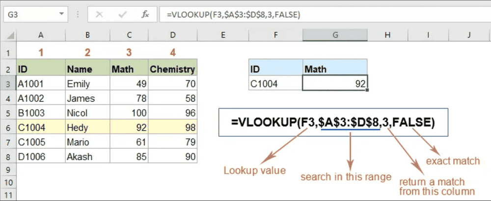
Excel’s functions, such as VLOOKUP and XLOOKUP, help retrieve and correlate data efficiently. However, these functions can become inefficient with large datasets, leading to slower performance. Automation through macros reduces repetitive tasks but requires advanced knowledge, which not all users possess. Additionally, while Excel supports statistical analysis and data visualization, it lacks the scalability needed for enterprise-level analytics.
| Challenge/Feature | Description |
|---|---|
| Building Pivot Tables | Essential for summarizing and analyzing large datasets effectively. |
| Dynamic Dashboards | Automates updates without manual data re-entry, crucial for real-time insights. |
| Data Manipulation | Functions like VLOOKUP and XLOOKUP help in retrieving and correlating data efficiently. |
| Automation and Macros | Reduces errors and saves time by automating repetitive tasks. |
| Statistical Analysis | Enables detailed analysis through complex functions like regression and standard deviation. |
Excel dashboards often lack interactivity, which limits their ability to support deeper data exploration. Users cannot easily filter or aggregate data without manual intervention. This static nature makes Excel less effective for dynamic business intelligence needs. For instance, students in analytics courses frequently report difficulties with Excel dashboards due to their limited functionality. Many struggle with trial-and-error approaches, leading to frustration and inefficiency.
Additionally, Excel’s development has not kept pace with modern analytics demands in Malaysia. Microsoft has shown little interest in enhancing Excel’s dashboarding capabilities, leaving users in Malaysia reliant on outdated features. This lack of innovation hinders Excel’s ability to meet the evolving needs of businesses in Malaysia.
Integrating Excel with advanced tools like FineBI and FineReport addresses its limitations and enhances its capabilities. FineBI connects with over 30 big data platforms and SQL data sources, allowing you to integrate Excel datasets seamlessly. This integration enables real-time data analysis and advanced visualizations, transforming static dashboards into dynamic business intelligence tools in Malaysia.
FineReport complements Excel by offering quick and flexible report production. It connects to various databases, data warehouses, and big data platforms, enabling you to build a unified data decision and management platform in Malaysia. With FineReport, you can develop pixel-perfect reports and interactive dashboards that go beyond Excel’s static functionality.
By combining Excel with these tools, you can overcome its limitations and create comprehensive solutions for data analysis and reporting. This approach ensures scalability, interactivity, and real-time insights, empowering you to make informed decisions in Malaysia.
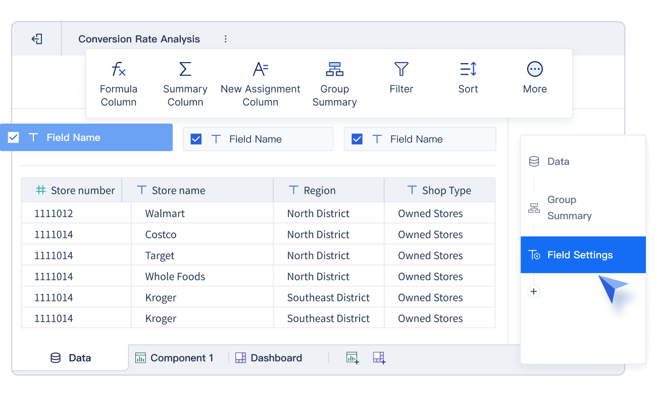
FineBI transforms your Excel dashboard into a dynamic tool for business intelligence. It simplifies data analysis with its drag-and-drop interface, allowing you to create actionable reports without technical expertise. You can connect FineBI to multiple data sources, including big data platforms and SQL databases, to unify your data for comprehensive analysis in Malaysia.

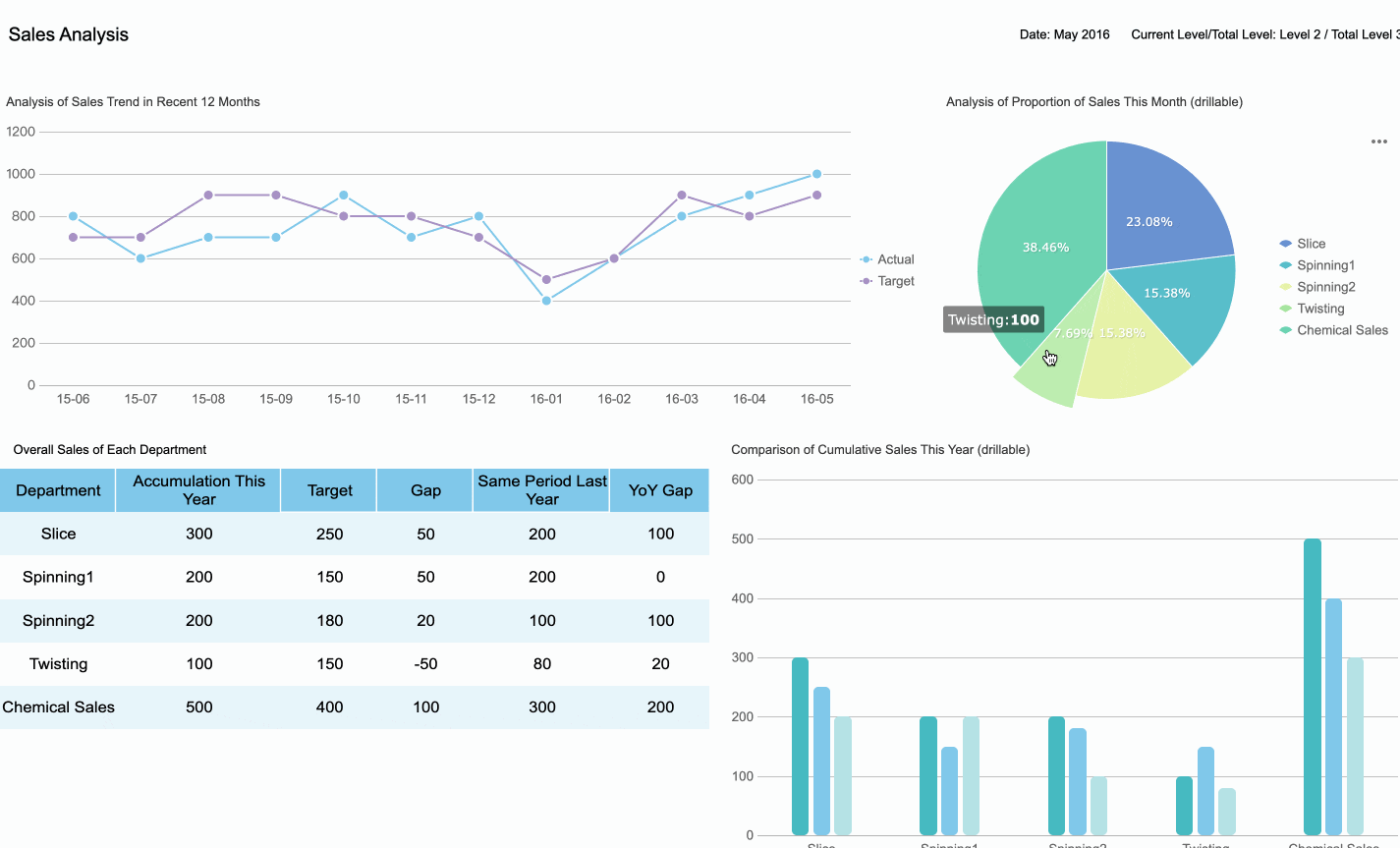
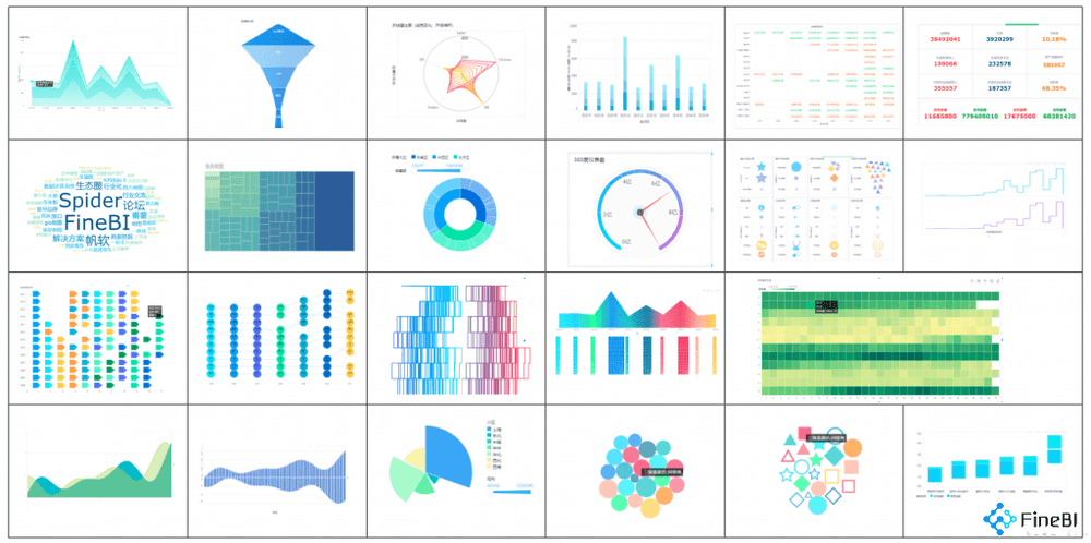
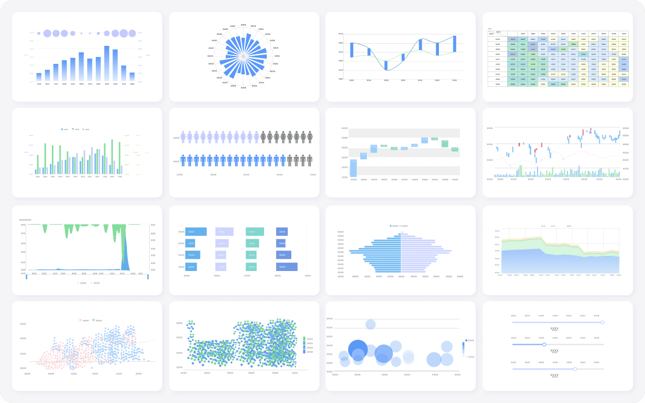
Real-time calculation and analysis ensure your decisions rely on the latest data. For example, a sales team can monitor revenue trends as they happen, enabling quick adjustments to strategies in Malaysia. FineBI’s advanced data visualization features let you customize dashboards to meet specific business needs. You can use over 60 chart types, including Gantt charts and Pareto diagrams, to present insights effectively.
FineBI also enhances collaboration. Teams in Malaysia can share dashboards and analysis templates, promoting a unified approach to data-driven decision-making. Enterprise-grade security ensures your data remains protected, even when accessed by multiple users in Malaysia.
| Feature | Benefit |
|---|---|
| Drag-and-Drop Interface | Empowers users to create actionable reports quickly without needing technical expertise. |
| Real-Time Calculation & Analysis | Ensures decisions are based on the latest data, enhancing accuracy and timeliness. |
| Advanced Data Visualization & Customization | Provides flexibility to tailor dashboards to specific business needs, improving usability. |
| Enterprise-Grade Security & Scalability | Offers robust security and reliability suitable for organizations of all sizes. |
FineBI integrates seamlessly with Excel, enabling you to elevate your dashboard’s functionality and usability.
FineReport complements Excel by streamlining report creation and visualization. Its intuitive interface allows you to design pixel-perfect reports with drag-and-drop simplicity. You can connect FineReport to various databases and data warehouses, ensuring your dashboard integrates data from multiple sources.
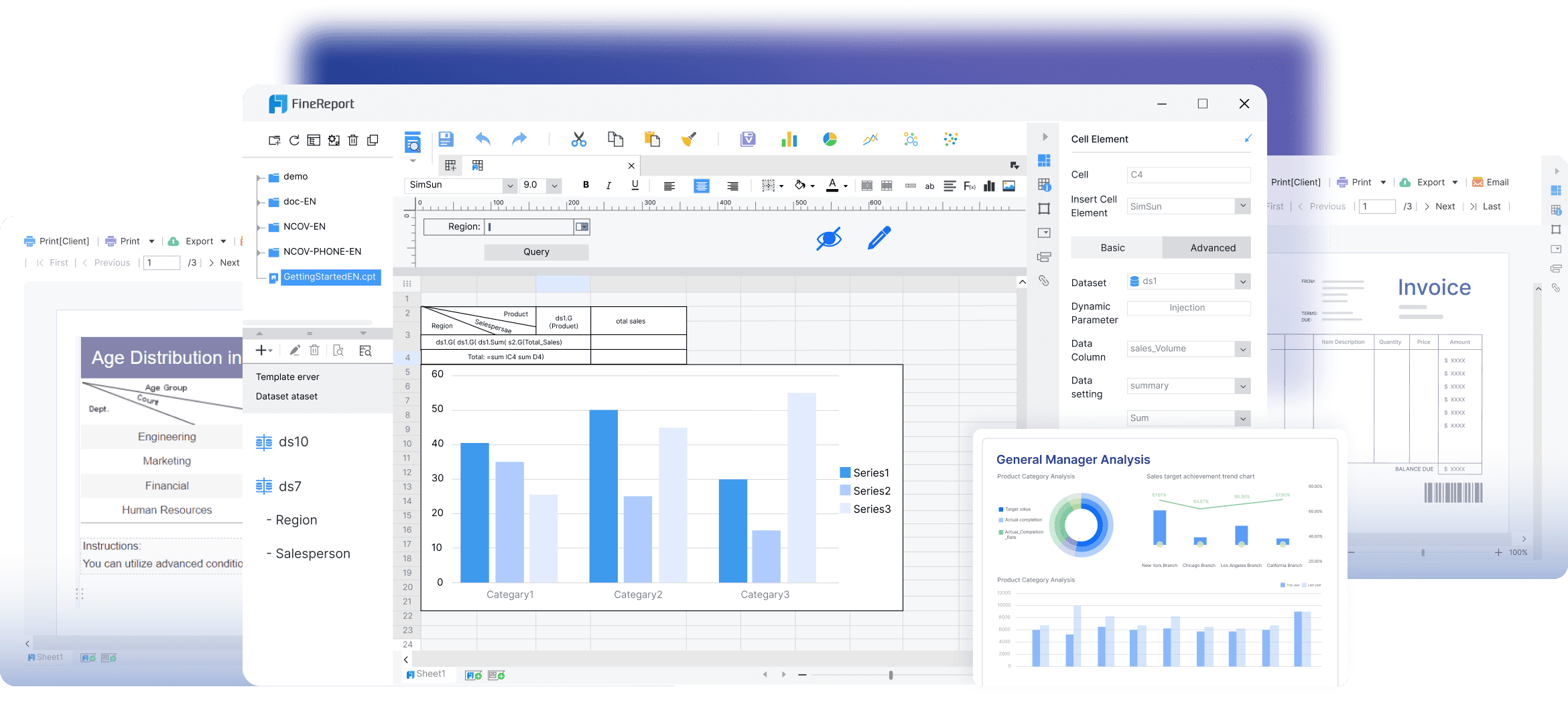
FineReport’s advanced visualization tools include over 70 chart styles, such as waterfall charts and funnel diagrams. These features help you present complex data in a clear and engaging way. For example, a marketing team in Malaysia can use FineReport to track campaign performance across regions with interactive charts.
Automated scheduling ensures reports are delivered on time. You can set tasks to run daily, weekly, or monthly, reducing manual effort. FineReport also supports mobile access, enabling you to view dashboards and reports on the go.

By integrating FineReport with Excel, you create dashboards that combine the flexibility of Excel with the power of enterprise-level reporting. This combination enhances your ability to analyze data, visualize trends, and make informed decisions. In Malaysia, FineReport and FineBI are supported by a dedicated local team, providing localized project implementation and technical support to ensure seamless deployment and optimized performance tailored to Malaysian enterprises.
Start building your own excel dashboard today by following the steps outlined in this guide. Practice regularly to refine your skills. Iterative practice helps you improve, as designing an effective dashboard often requires multiple attempts. Experiment with layouts, update based on feedback, and brainstorm new ideas to enhance your designs in Malaysia. Tools like FineBI and FineReport can elevate your dashboards, enabling advanced analytics and dynamic reporting. These tools transform excel into a powerful platform for business intelligence, helping you make data-driven decisions with confidence in Malaysia.
Click the banner below to experience FineReport for free and empower your enterprise to convert data into productivity!

Excel vs FineReport: Which Do You Need?
Why You Should Replace Excel with a BI Reporting Tool?
2025’s Best Excel Reporting Tools that Reaches Far Beyond Excel

The Author
Lewis
Senior Data Analyst at FanRuan
Related Articles

Payment Analytics Dashboard: 12 KPIs Every Operations Leader Should Track to Cut Revenue Leakage
Losing revenue to declines? Discover 12 essential KPIs to track in your payment analytics dashboard to stop leakage and manage disputes.
Lewis Chou
May 05, 2026

SOC Dashboard Explained: 12 Essential KPIs, Views, and Workflows Security Teams Use
Learn about SOC dashboards, the 12 essential KPIs for security teams, and how they centralize alerts and workflows for faster threat detection and response.
Lewis Chou
May 05, 2026

EMR Dashboard Guide: 12 Metrics to Track for Faster Clinical and Operational Decisions
Learn the 12 essential EMR dashboard metrics to track for faster clinical and operational decisions, improving patient flow and revenue cycle management.
Lewis Chou
May 05, 2026


