An orders dashboard is a centralized view of order activity that helps operations teams monitor volume, fulfillment progress, delays, cancellations, returns, and service risks in one place. Its business value is simple: it gives teams the visibility they need to act faster, prioritize exceptions, and protect customer experience before small issues become costly operational problems.
For operations managers, fulfillment leads, and support teams, the pain points are familiar. Orders are spread across ecommerce platforms, ERPs, warehouse systems, carrier portals, and customer service tools. Statuses are inconsistent. Teams waste time asking where an order is, why it is delayed, and who owns the next action. An orders dashboard solves that by turning fragmented order data into a shared execution layer for daily decision-making.
 Click To Try The Dashboard
What an orders dashboard is and why operations teams use one
In practical terms, an orders dashboard is a reporting and monitoring interface built specifically around the order lifecycle. It centralizes:
- Incoming order activity
- Current fulfillment status
- Shipment progress
- Delays and exception queues
- Returns, cancellations, and backorders
- Operational trends by team, channel, or location
Unlike a general operations dashboard, which may track broad business performance across inventory, staffing, finance, and service, an orders dashboard is focused on day-to-day execution. It is designed for teams that need to answer immediate questions such as:
- How many orders came in today?
- Which orders are aging beyond target?
- Where are fulfillment bottlenecks forming?
- Which warehouse or carrier is causing the most delays?
- How many orders are at risk of breaching SLA?
That distinction matters. A general dashboard supports management oversight. An order-specific dashboard supports operational action.
The main goals of an orders dashboard are:
- Faster visibility: See order flow and disruptions as they happen
- Better prioritization: Focus on high-risk or aging orders first
- More consistent service levels: Improve on-time shipment, reduce missed handoffs, and standardize follow-up
For enterprise teams, this is not just a reporting convenience. It is a control mechanism for maintaining throughput, reducing manual coordination, and improving customer trust.
Core KPIs to monitor in an orders dashboard
The most effective orders dashboards track a focused set of metrics tied to operational decisions. If the dashboard only shows historical totals, it becomes passive reporting. If it shows the right leading and lagging indicators, it becomes a management tool.
Key Metrics (KPIs)
- Order volume: Total number of orders received in a selected period. Often segmented by day, week, channel, product line, or region.
- Orders by channel: Distribution of orders from ecommerce, marketplace, retail, B2B portal, or direct sales sources.
- Order status breakdown: Count or percentage of orders in statuses such as new, processing, picked, packed, shipped, delivered, delayed, returned, or canceled.
- Order cycle time: Total time from order creation to delivery or completion.
- Pick-pack-ship time: Time spent moving an order through warehouse fulfillment steps.
- On-time shipment rate: Percentage of orders shipped within promised internal or customer-facing deadlines.
- Backorder rate: Share of orders impacted by unavailable inventory.
- Cancellation rate: Percentage of orders canceled before completion, often segmented by reason.
- Return rate: Percentage of fulfilled orders that are returned, useful for detecting product or service quality issues.
- Aging orders: Orders that remain open beyond a defined threshold, often highlighted by time bands.
- SLA breach rate: Percentage of orders or tickets tied to orders that miss agreed service levels.
- Exception count: Number of orders flagged for payment issues, address errors, stockouts, fraud review, shipment delay, or carrier failure.
These KPIs should not all receive equal attention. Some are operational health indicators, while others drive immediate intervention.
How to choose the right KPIs for your workflow
Choose KPIs based on what the team can actually influence.
If your fulfillment team owns warehouse execution, prioritize:
- Pick-pack-ship time
- Order status aging
- On-time shipment rate
- Backorder-related delays
If customer support handles order escalations, focus more on:
- Delayed orders
- Return volume
- Cancellation reasons
- SLA breaches for issue resolution
If operations leadership is reviewing network performance, include:
- Order volume trends
- Performance by warehouse or region
- Carrier delay patterns
- Exception rates over time
A good rule is to separate leading indicators from lagging indicators.
Leading indicators help teams intervene early:
- Aging orders
- Orders stuck in processing
- Inventory-related backorders
- Carrier handoff delays
- Queue size by exception type
Lagging indicators help teams evaluate outcomes:
- On-time shipment rate
- Cancellation rate
- Return rate
- Average cycle time
- SLA compliance
This distinction is critical. Leading indicators support daily execution. Lagging indicators support planning, root-cause analysis, and process improvement.
Data sources behind an effective order dashboard
A high-trust orders dashboard depends on strong data integration. Most organizations do not have a single source of truth for order operations, so the dashboard must unify data from several platforms.
Typical data sources include:
- Order management systems (OMS): Core order records, statuses, timestamps, and lifecycle events
- Ecommerce platforms: Channel-specific order details, cart data, payment state, and storefront metadata
- ERP systems: Financial status, invoicing, product master data, and enterprise transaction context
- Warehouse management systems (WMS): Picking, packing, fulfillment milestones, and labor execution data
- CRM platforms: Customer account information, service history, and order-related communications
- Carrier tracking feeds: Shipment scans, delivery milestones, and transit exceptions
Additional context often comes from:
- Inventory systems: Stock availability, allocation, replenishment, and stockout causes
- Payment systems: Authorization failures, chargebacks, and refund timing
- Customer service tools: Complaint volume, escalation cases, and order-related ticket categories
This layered data model is what makes an orders dashboard useful. A delayed order is one thing. A delayed order tied to a stockout, late warehouse release, and carrier handoff issue is actionable.
Real-time versus batch updates also matter. If the dashboard is expected to support same-day intervention, stale data will damage trust quickly.
- Real-time or near-real-time updates are best for exception monitoring, same-day fulfillment management, and support escalation
- Batch updates may be acceptable for executive summaries, daily reviews, and weekly trend reporting
The key is not perfection. It is transparency. Teams need to know how fresh the data is and what decisions it is safe to use the dashboard for.
Common data integration challenges
Most order reporting problems come from inconsistent definitions and poor system alignment, not from visualization itself.
Common challenges include:
- Inconsistent order IDs: Different systems may store parent orders, shipment IDs, and line-item IDs differently
- Duplicate records: Re-sync events or multi-system ingestion can inflate counts
- Delayed syncs: OMS, ERP, WMS, and carrier tools may update on different schedules
- Missing status updates: A shipment may physically move while the source platform still shows a prior state
- Multi-line complexity: One order can contain multiple products, warehouses, or shipment paths
- Partial fulfillment issues: Some systems mark the order as fulfilled even when only part of it shipped
Another major challenge is semantic inconsistency across departments. Terms like these often mean different things to different teams:
- Shipped
- Fulfilled
- Completed
- Delivered
- Returned
If finance defines completed differently from operations, dashboards will trigger endless reconciliation debates instead of faster action. Before building visuals, define the order lifecycle in business terms and make those definitions explicit.
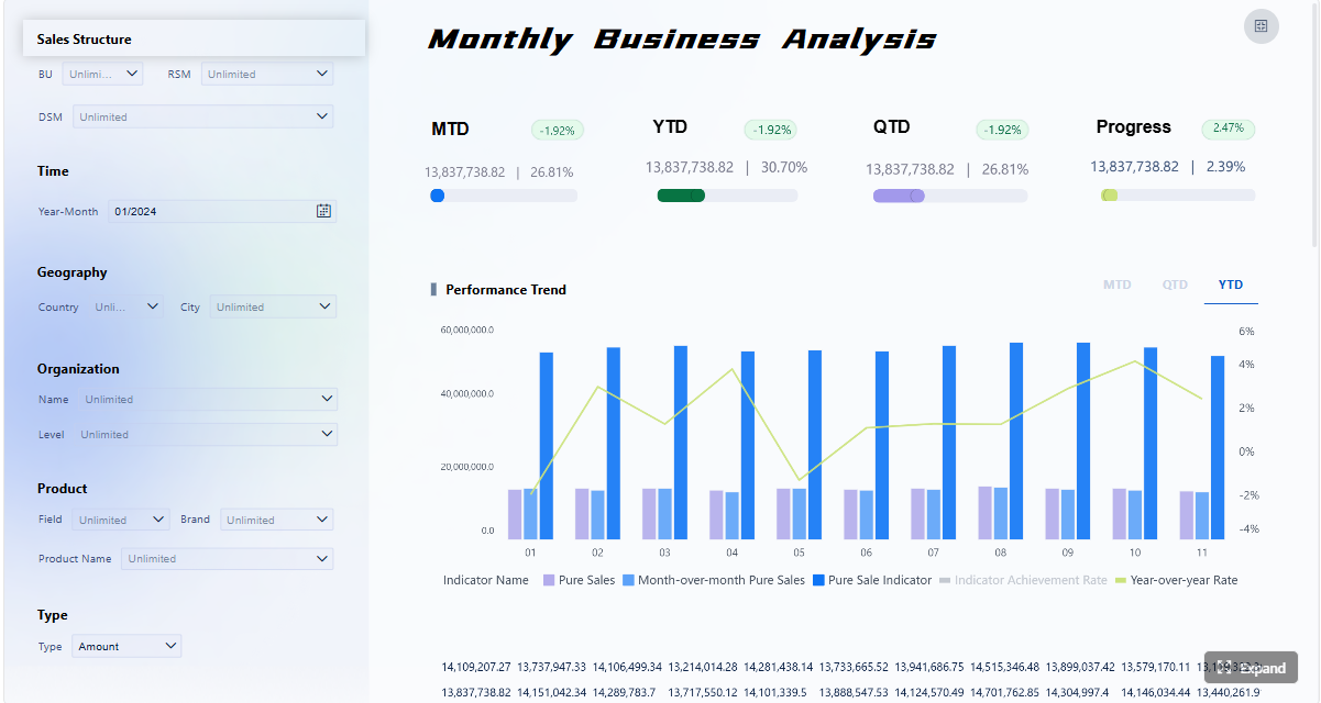
Anatomy of an orders dashboard page
A well-designed orders dashboard page should support both rapid scanning and detailed investigation. It needs to help users move from “What is happening?” to “What should I do next?” in as few clicks as possible.
Most effective layouts include four layers.
1. Top summary area
The top section should show headline KPIs and trend indicators that summarize current performance. Typical tiles or cards include:
- Total orders today
- Orders in process
- Orders delayed
- On-time shipment rate
- Backorders
- Returns or cancellations
- Orders at risk of SLA breach
Trend arrows or period comparisons help users quickly see whether conditions are improving or worsening.
2. Interactive filters
Filters are essential because different teams need different cuts of the same data. Common filters include:
- Date range
- Sales channel
- Region
- Warehouse
- Carrier
- Product category
- Customer segment
- Fulfillment status
These controls let operations managers isolate the exact segment driving a problem instead of reviewing an over-aggregated view.
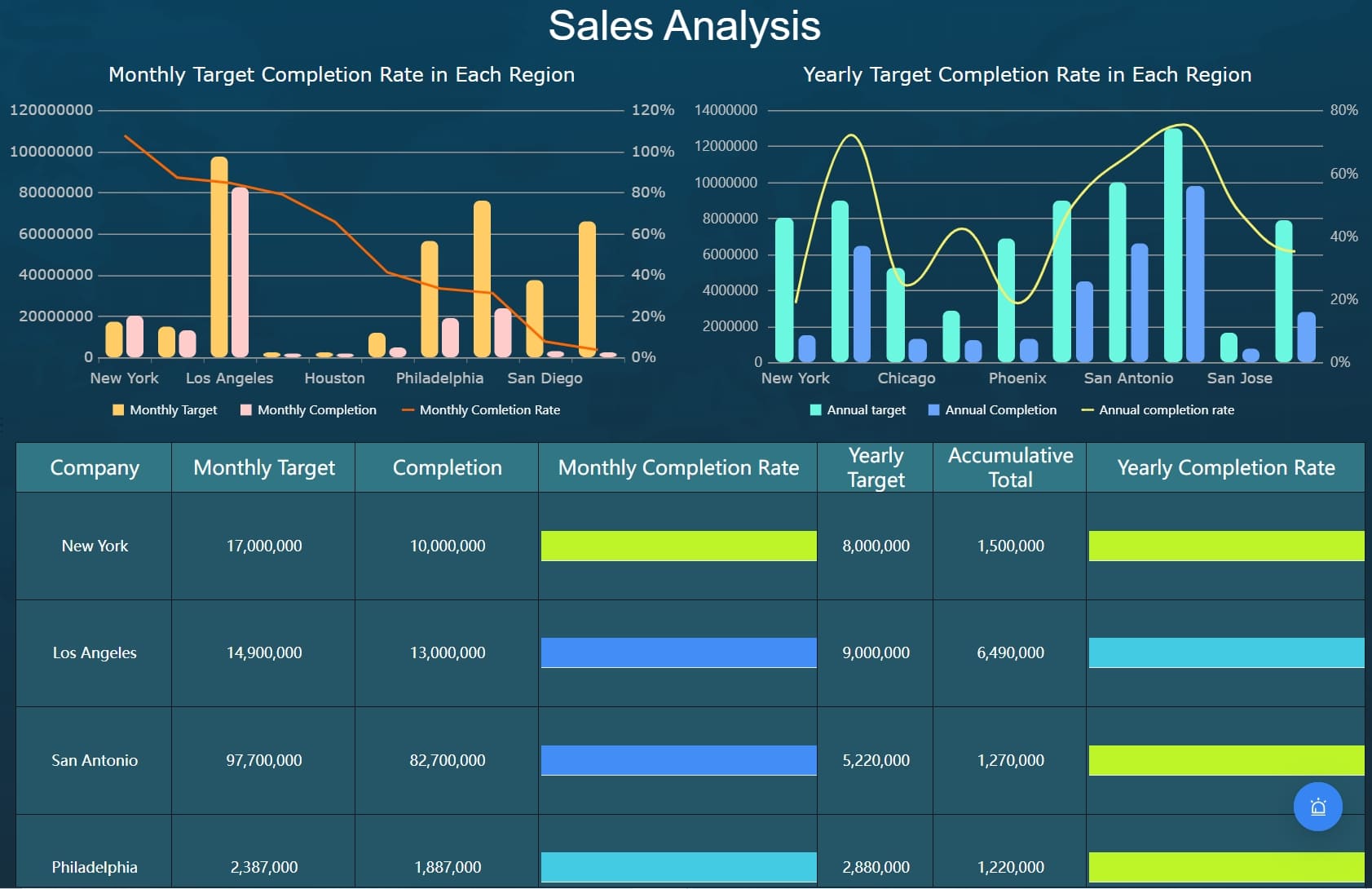
3. Operational tables and charts
The center of the dashboard usually contains the execution visuals that guide action. Common components include:
- Status distribution charts
- Aging order tables
- Backorder trend charts
- Carrier performance comparisons
- Warehouse bottleneck views
- Exception queues by type and severity
- Cancellation and return reason breakdowns
Tables remain critical in an orders dashboard because teams often need row-level visibility, not just charts. Sorting by age, status, promised date, or exception type can dramatically reduce triage time.
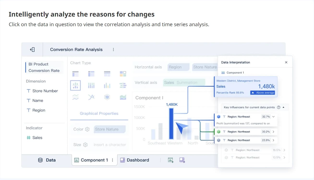
4. Drill-down investigation paths
The best dashboards do not stop at summary metrics. They allow users to click into:
- Specific orders
- Customer records
- Shipment events
- Inventory status
- Warehouse handling steps
- Support tickets
- Refund and return details
This drill-down capability turns the dashboard into an operational workspace rather than a static report.
Design elements that improve usability
Dashboard design directly affects whether teams actually use the system in daily execution.
Best-practice design elements include:
- Clear visual hierarchy: Headline KPIs first, exception-focused details second, deep analysis third
- Alert thresholds: Highlight only meaningful risk conditions
- Selective color usage: Use color to signal urgency, not decorate the page
- Status consistency: Keep labels and definitions standardized across charts and tables
- Role-based layouts: Show each user what they need most often
- Fast filtering: Reduce clicks for common workflows
- Action-friendly tables: Support sorting, search, and drill-through
Role-based views are especially important in larger organizations.
- Operations managers need performance summaries, bottleneck detection, and trend analysis
- Fulfillment teams need queue visibility, aging orders, and processing delays
- Customer support teams need shipment status, issue context, and customer-specific drill-downs
A dashboard that tries to serve every role equally often becomes too dense for all of them.
Business use cases for operations teams
An orders dashboard is most valuable when tied to real operational scenarios. It is not just for reporting on what happened. It is for helping teams decide what to do next.
Common business use cases include:
- Monitoring fulfillment performance: See where orders are moving smoothly and where they are stalling
- Reducing customer impact from delays: Surface at-risk orders before promised dates are missed
- Managing cancellations and returns: Identify operational causes and recurring patterns
- Supporting peak-period planning: Track volume surges and resource strain by warehouse or carrier
- Improving cross-functional coordination: Give operations, support, finance, and leadership one shared view of order reality
For example, an operations director can use the dashboard to compare pick-pack-ship times across fulfillment centers and shift labor where a bottleneck is forming. A support manager can use the same dashboard to identify delayed orders that require proactive outreach. A finance team can use return and refund patterns to understand the cost impact of fulfillment issues.
Examples of order tracking and optimization workflows
Here are three common workflows where an orders dashboard delivers immediate value.
1. Morning exception queue review
A fulfillment lead starts the day by filtering for open orders older than the expected processing window. The dashboard highlights:
- Orders aging beyond threshold
- Backordered items
- Payment holds
- Carrier handoff failures
- High-priority customer accounts
The team resolves the most urgent orders first, reducing same-day SLA risk.
2. Trend analysis by warehouse, carrier, or channel
An operations manager notices on-time shipment rate dropping over the last two weeks. By segmenting the dashboard, they discover:
- One warehouse has longer queue times
- One carrier is missing scan updates
- Marketplace orders have a higher cancellation rate than direct orders
That allows targeted intervention instead of broad, low-value firefighting.
3. Weekly operations review and process improvement
Leadership uses dashboard trends to review recurring patterns such as:
- Return spikes for a specific product line
- Frequent delays tied to one region
- High cancellation rates after stockout events
- SLA breaches during promotional periods
This turns operational data into process changes, staffing decisions, inventory adjustments, and carrier performance reviews.
How to evaluate and improve your dashboard over time
An orders dashboard should evolve with the operation. The first version should not try to answer every question. It should answer the most important operational questions reliably.
Start with a narrow KPI set that supports daily action:
- Order volume
- Status breakdown
- Aging orders
- On-time shipment rate
- Exception count
Then validate the data aggressively. If users do not trust the numbers, adoption will collapse. Reconcile totals against source systems, align status definitions, and make data freshness visible.
Next, gather feedback from the people using the dashboard every day. Ask:
- Which filters do they use most?
- Which alerts are useful versus noisy?
- Where do they still need spreadsheets or manual lookups?
- Which drill-down paths save time?
- Which views support decisions, not just observation?
From there, improve iteratively. Add dimensions, alerts, or role-specific views only when they support a real workflow.
The best way to measure dashboard value is not page views alone. Look at operational outcomes such as:
- Faster issue detection
- Reduced order aging
- Higher on-time shipment rate
- Lower cancellation volume
- Shorter escalation cycles
- Better cross-team alignment
If the dashboard changes how quickly teams identify, prioritize, and resolve order issues, it is delivering business value.
Build a scalable orders dashboard without managing the complexity manually
The methodology is straightforward. The execution is not.
Building an enterprise-grade orders dashboard manually means integrating multiple systems, standardizing order definitions, handling delayed syncs, designing role-based views, maintaining KPIs, and ensuring users trust the data. That is a heavy lift for teams already managing fulfillment, service, and reporting demands.
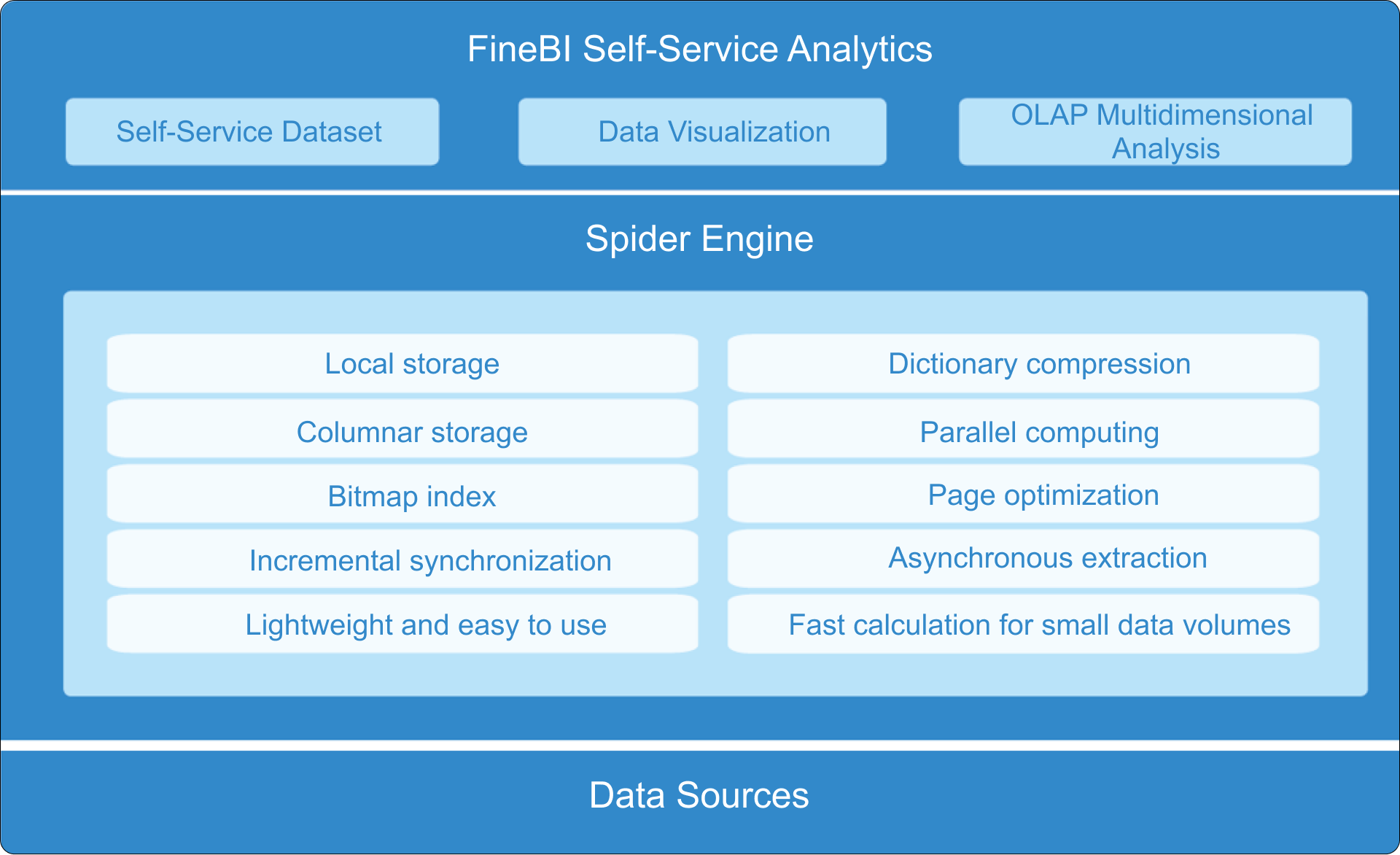
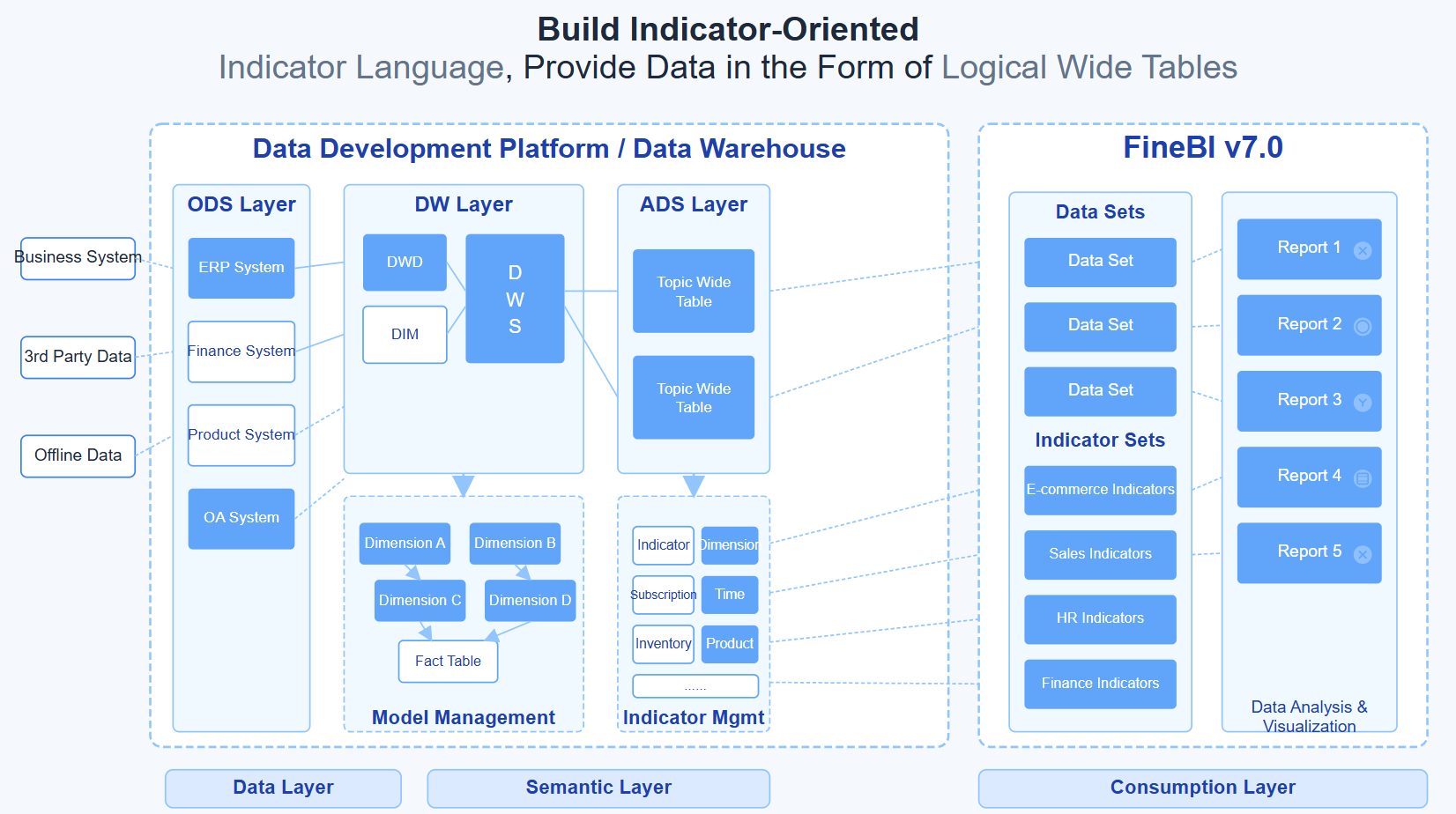
This is where FineBI becomes the practical solution.
With FineBI, organizations can use ready-made templates and automate this entire workflow instead of building and maintaining every dashboard component from scratch. FineBI helps teams:
- Connect data from ERP, OMS, WMS, CRM, ecommerce, and other operational systems
- Centralize order metrics into one governed reporting layer
- Build role-based dashboards for operations, fulfillment, support, and leadership
- Create filters, alerts, trend views, and drill-down analysis without excessive custom development
- Improve reporting speed with reusable models and self-service analytics capabilities
For enterprise decision-makers, the advantage is not just faster dashboard deployment. It is better operational consistency. Teams get a trusted environment for monitoring orders, identifying bottlenecks, and acting on exceptions before service levels suffer.
If your current order reporting depends on disconnected spreadsheets, static BI reports, or manual status checks, the cost is already showing up in delay handling, escalations, and missed optimization opportunities. Building this manually is complex; use FineBI to utilize ready-made templates and automate this entire workflow.
FAQs
An orders dashboard helps teams monitor order flow, fulfillment status, delays, cancellations, returns, and exceptions in one place. It is mainly used to spot problems quickly and improve day-to-day order execution.
The most useful KPIs usually include order volume, order status breakdown, aging orders, on-time shipment rate, cycle time, backorder rate, and exception count. The right mix depends on whether the team focuses on fulfillment, support, or operations leadership.
Most orders dashboards combine data from order management systems, ecommerce platforms, ERP systems, warehouse tools, carrier tracking systems, and customer support platforms. Bringing these sources together creates a more complete view of the order lifecycle.
An orders dashboard is focused specifically on the order lifecycle and the actions teams need to take each day. A general operations dashboard covers broader business performance across multiple functions and is less centered on immediate order issues.
Operations managers, fulfillment teams, warehouse leads, and customer support teams often benefit the most. It gives them shared visibility so they can prioritize delayed or at-risk orders faster.


The Author
Yida YIn
FanRuan Industry Solutions Expert
Related Articles

Portfolio Reporting for PMOs: 9 Executive Metrics Every Weekly Portfolio Dashboard Should Include
Weekly portfolio reporting should help executives answer three questions fast: Are we delivering the right initiatives, are we putting outcomes at risk, and what decisions need leadership this week? For PMOs, that means
Yida Yin
Jul 01, 2026

How to Build an Investment Portfolio Reporting Dashboard for Executives: KPIs, Benchmarks, and Drill-Down Views
Investment portfolio reporting for executives is not about showing every holding, transaction, and chart your investment team can produce. It is about giving CEOs, CFOs, CIOs, boards, and investment committees a fast, re
Yida YIn
Jun 25, 2026

12 KPI Reporting Examples for Executive Dashboards: What to Show in Weekly, Monthly, and Quarterly Reviews
Executive leaders do not need more data. They need decision ready $1 examples that match how often they review the business and what actions they are expected to take. A weekly $1 should surface fast moving risks and per
Yida YIn
Jun 25, 2026