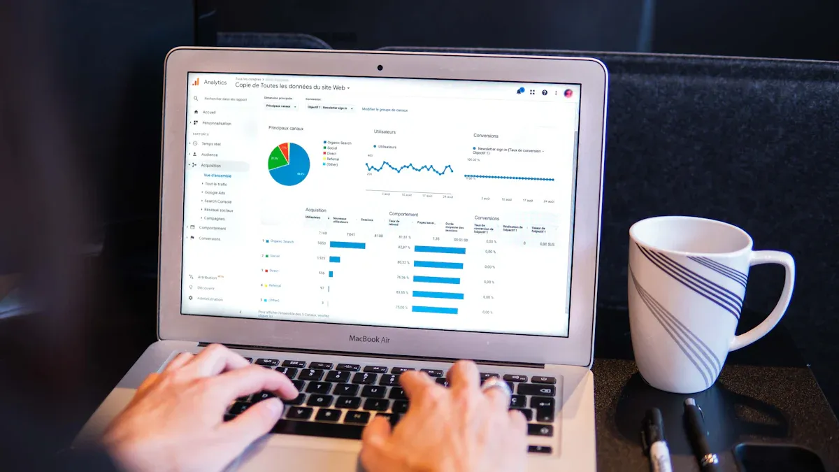
What is an operations dashboard? An operations dashboard is a visual tool that brings together key data and metrics in one place. It lets you see and understand important information about your business operations at a glance. You use it to track performance, monitor processes, and spot trends in real time.
Operational dashboards play a vital role in modern business. They give you instant access to critical data, so you can respond quickly to changes and make informed decisions. Recent studies show that real-time data analytics helps organizations act faster and stay competitive. Tools like FineBI make it easy to build dashboards that support operational excellence.
Understanding Operations Dashboard
What is an Operations Dashboard
An operations dashboard serves as a data visualization and analysis tool that brings together key performance indicators and essential business metrics on a single screen. You can use this tool to monitor your business in real time and make informed decisions quickly. Industry experts recognize that an operations dashboard is crucial for organizations because it provides vital data points to everyone, from executives to team members. This tool helps you see the big picture and focus on what matters most for your business.
The main functions and components of operational dashboards include:
- Customizable metrics that let you choose which KPIs to track and how often to update them.
- Seamless integration with tools like CRM, HR, and accounting systems, so you can view all your information in one place.
- Scalability that supports monitoring across multiple locations or departments.
- A user-friendly design that makes the dashboard easy to understand and use.
- Mobile accessibility, which allows you to check operational data from anywhere.
How Operational Dashboards Work
You can think of an operations dashboard as a workflow that starts with data and ends with actionable insights. The process involves several key steps:
| Step | Description |
|---|---|
| Data Integration | Connect to your data sources to ensure accurate and timely information flows into the dashboard. |
| Designing Dashboard Layout | Create a clean and intuitive design that highlights the most important metrics and trends. |
| Choosing Visualization Types | Select charts, graphs, or tables that best communicate your data to stakeholders. |
By following these steps, you ensure that your operational dashboards deliver clear and reliable information for daily management.
FineBI’s Role in Operations Dashboards
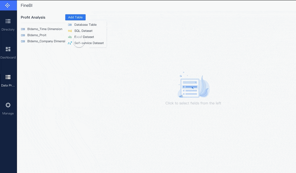
FineBI makes the creation and management of operations dashboards straightforward for business users. You do not need advanced technical skills to get started. Here is how you can use FineBI to build effective dashboards:
- Create a new dashboard by selecting the Dashboard tab and naming your project.
- Add components such as tables and charts to analyze your data visually.
- Share your dashboards with team members or generate public links for wider access.
FineBI streamlines the entire process, from connecting your data sources to sharing insights across your organization. This approach helps you focus on analysis and decision-making rather than technical setup.
Why Businesses Need Operations Dashboard
Real-Time Insights for Decision-Making
You need to make decisions quickly in today’s business environment. An operations dashboard gives you real-time insights that help you respond to changes as they happen. Many companies struggle with traditional dashboards because they require skilled users to interpret complex datasets. These dashboards often present raw numbers without context, making it hard to understand trends or spot anomalies. As a result, businesses miss opportunities for proactive decision-making.
Recent surveys show that 67% of executives feel dissatisfied with their existing tools. Most business intelligence dashboards do not provide real-time data, which means critical information can be overlooked. Timely intervention is essential for companies that operate integrated ecosystems. Real-time monitoring helps you manage data proactively and avoid costly mistakes.
| Benefit | Explanation |
|---|---|
| Immediate Insights | You get instant visibility into your business operations, so you can monitor progress and act fast. |
| Anomaly Detection | Dashboards highlight outliers and unusual patterns, allowing you to investigate issues before they grow. |
| Smarter Decisions | You make smarter choices with up-to-the-minute data, reducing delays and improving outcomes. |
For example, your sales team can use a dashboard to track progress toward monthly targets. If you see a gap, you can take action right away. Continuous monitoring of key metrics helps you flag potential issues and address them before they escalate. Companies using real-time analytics and dashboards see a 20% improvement in decision-making time. These tools transform raw data into actionable insights, enabling you to respond quickly to challenges and opportunities.
Improving Efficiency and Accountability
Operational dashboards improve efficiency by integrating data from different departments. Everyone works from the same real-time insights, which reduces miscommunication and increases productivity. When you monitor KPIs closely, you can identify potential issues before they become major problems. This proactive approach minimizes downtime and keeps your operations stable.
Dashboards also promote accountability. They align operational activities with your organization’s long-term goals. Team members stay engaged and focused because they know how their work impacts overall performance. Smart dashboards ensure that everyone has access to the same information, which enhances collaboration and transparency.
| Improvement Area | Description |
|---|---|
| Real-Time Operational Insights | Warehouse teams access critical data instantly, improving responsiveness and task optimization. |
| Improved Accuracy & Efficiency | Automated dashboards eliminate manual tracking errors and reduce reporting time. |
| Cost Savings | Companies avoid extra costs by using existing infrastructure and minimizing training needs. |
| Scalability and Flexibility | Dashboards scale easily, allowing for future enhancements without major redevelopment. |
| Enhanced User Experience | Intuitive layouts and responsive designs help users adapt quickly without extensive training. |
| Improved Decision-Making | Teams focus on high-revenue products and prioritize opportunities based on data insights. |
| Streamlined Opportunity Management | Businesses segment opportunities by probability, improving resource allocation. |
| Significant Time Savings | Automated dashboards save management days each month by eliminating manual tasks. |
| Improved Communication | Dashboards clarify corporate value drivers, enhancing communication across the organization. |
When you use dashboards for monitoring, you optimize team performance and ensure resources are used effectively. Accurate utilization and capacity control help you meet client demands without exceeding available resources. Enhanced forecasting allows for better financial planning and strategic adjustments.
Data Integration and Self-Service with FineBI
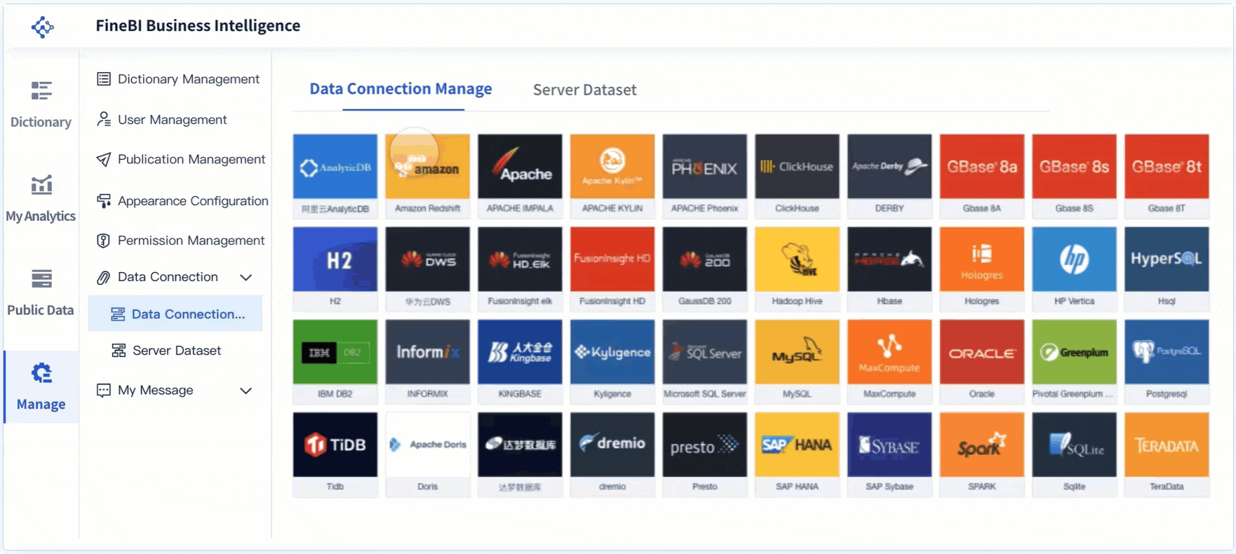
FineBI stands out by enabling seamless data integration and self-service analytics. You can connect to over 30 big data platforms and SQL data sources, including Excel datasets. Admins model data based on relationships in the data warehouse, so you can explore information without manual configurations. FineBI’s user-centric visualizations help you identify data issues easily, recommending effects based on selected data.
You can create dashboards and charts using a simple drag-and-drop model. FineBI supports self-service datasets, allowing you to add columns, filter, sort, and merge data with minimal learning costs. Automatic modeling features streamline the analytics process, making it easy for business departments to utilize their data effectively.
| Feature | Description |
|---|---|
| Data Source Connectivity | FineBI connects with a wide range of data sources, ensuring unified visibility across systems. |
| Data Modeling | You explore data relationships without manual setup, saving time and reducing errors. |
| Visual Data Analysis | FineBI recommends visual effects based on your data, making analysis straightforward. |
| Self-Service Datasets | You customize datasets to fit your needs, enhancing flexibility and control. |
| Collaboration Modes | FineBI supports data sharing and dashboard collaboration, promoting teamwork and transparency. |
FineBI’s collaboration modes allow you to share dashboards and insights across teams. This feature enhances teamwork and ensures everyone has access to the latest information. When you use FineBI, you gain the ability to create dashboards that deliver actionable insights, improve efficiency, and support data-driven decision-making.
Key Features of Operations Dashboard
Data Visualization and Interactivity
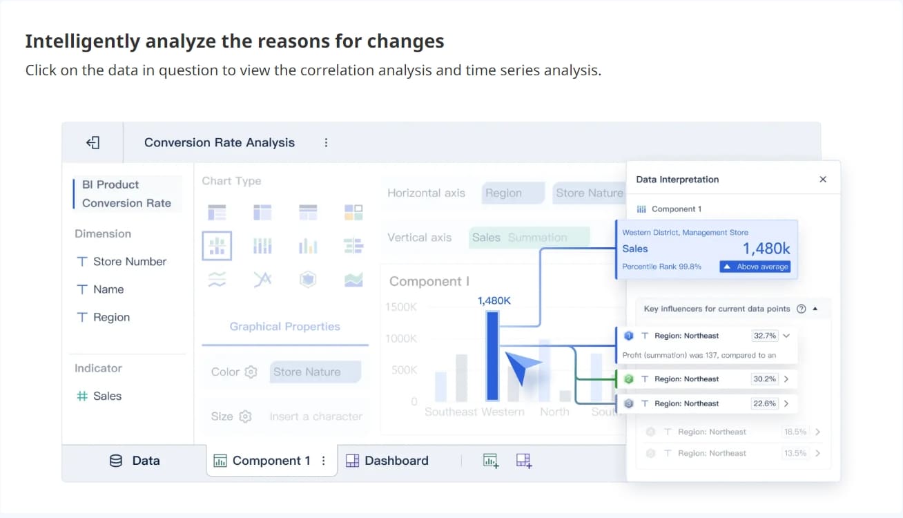
You gain the most value from an operations dashboard when you can see your data clearly and interact with it. Effective dashboards use a variety of visualization techniques to help you understand trends and patterns quickly. For example, bar charts compare categories, line charts show changes over time, and pie charts illustrate how different parts contribute to a whole. Scatter plots help you spot relationships or outliers.
A well-designed dashboard places the most important metrics at the top, groups related charts together, and uses consistent colors and styles. You can filter data to focus on what matters to you. Interactive features let you explore data, drill down for details, and adjust views based on your needs. This approach transforms you from a passive observer into an active participant, making it easier to discover insights and take action.
Tip: Test your dashboard regularly to ensure clarity and relevance. Update visuals as your business evolves.

Integration with Multiple Data Sources
An operations dashboard stands out when it brings together information from many sources. You can connect databases, cloud platforms, spreadsheets, and APIs to create a unified view. This integration ensures you always have current data for monitoring and decision-making.
| Requirement | Description |
|---|---|
| Data Integration Tools | Combine data from different systems for a complete picture. |
| Real-time Data Updates | Keep your dashboard current so you can respond quickly to changes. |
| Customizable Dashboards | Tailor your view to specific needs, such as departments or regions. |
FineBI makes this process simple. You can connect to over 60 data sources and use drag-and-drop tools to build dashboards that fit your business. Real-time synchronization and custom KPI tracking give you full visibility across your organization.
Security and Access Control
Protecting sensitive business data is essential. High-performing operational dashboards use strong security protocols, such as ISO 27001 and SOC 2, to safeguard information. Role-based access control lets you decide who can view or edit specific data. This approach enhances security, increases accountability, and creates a customized user experience.
- Enhanced security prevents unauthorized access.
- Clear permissions help you track responsibility for data use.
- Users see only the information relevant to their roles.
FineBI supports enterprise-level access control, so you can manage permissions down to individual rows and columns.
Alerts and Automated Reporting
Automated alerts and reporting features keep you informed without manual effort. Your operations dashboard can notify you of important changes or issues in real time. This capability improves accuracy, supports faster decisions, and encourages collaboration by providing a single source of truth.
- Real-time alerts enable proactive management.
- Automated reports reduce errors and save time.
- Teams work together more effectively with shared, up-to-date information.
With FineBI, you can set up alerts for key metrics and receive notifications by email or message. This ensures you never miss critical updates and can act quickly to maintain smooth operations.
Types and Applications of Operations Dashboard
Strategic, Tactical, and Operational Dashboards
You will find that not all dashboards serve the same purpose. Strategic dashboards help you track long-term goals and measure progress toward your organization’s vision. These dashboards give you a high-level overview of business health and align performance with your main objectives. Operational dashboards focus on real-time activities. You use them for daily monitoring and quick responses to changes. Tactical dashboards sit in the middle. They provide detailed analysis for mid-level managers who need to develop strategies and make informed decisions.
Here is a table that shows the main differences:
| Dashboard Type | Purpose | Audience | Time Frame |
|---|---|---|---|
| Strategic Dashboard | High-level overview of business metrics and strategic goals. | Executives | Long-term |
| Operational Dashboard | Real-time monitoring of business processes. | Junior management | Short-term |
| Tactical Dashboard | In-depth analysis for strategy and performance improvement. | Mid-level management | Varies |
Note: You should choose the dashboard type that matches your business needs and the level of detail you require.
Industry Use Cases
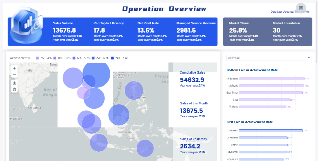
You can apply operations dashboards in many industries. In healthcare, hospitals use dashboards to track patient wait times, bed occupancy, and staff availability. This improves resource allocation and patient care. Retailers monitor daily revenue, sales trends, and customer feedback. This helps them make better decisions about inventory and promotions. Customer service teams use dashboards to track satisfaction scores and ticket resolution rates. Supply chain managers rely on dashboards for visibility into inventory levels, shipping efficiency, and vendor performance.
FineBI in Manufacturing and BOE’s Success Story
Manufacturing companies benefit greatly from operational dashboards. You can use them for production monitoring, workforce productivity, quality control, inventory management, and maintenance management. FineBI supports these needs by providing real-time insights and easy-to-use tools for tracking key metrics. For example, BOE Technology Group used FineBI to integrate data from multiple sources and standardize business metrics. This improved their operational efficiency by 50% and reduced inventory costs by 5%. You can see how dashboards help you identify trends, compare performance across factories, and make data-driven decisions. FineBI gives you the visibility and control needed to maintain high standards and drive continuous improvement.
Best Practices for Implementing Operations Dashboard
Steps to Successful Dashboard Deployment
You can achieve a successful operations dashboard rollout by following a clear process. Start by gathering user requirements and creating prototypes. Build dashboards using real data, then test for accuracy and usability. After quality checks, deploy the dashboards and set up regular maintenance to keep them relevant.
| Key Considerations | Description |
|---|---|
| Relevant Metrics | Select metrics that match user roles and business goals to avoid overload. |
| Clear Visualizations | Use intuitive visuals like line graphs and heat maps to show data clearly. |
| Interactive Elements | Add features that let users customize views and analyze data. |
| Performance & Accessibility | Optimize dashboard speed and ensure access on all devices. |
Tip: Involve end users early in the development process. This helps you create dashboards that meet real-world needs and encourages higher engagement.
You should prioritize integration with existing systems for real-time updates. Design dashboards for simplicity, using clean layouts and easy navigation. Highlight critical metrics with visual cues and include alerts for significant changes. Display key metrics on a single screen to avoid confusion and use hyperlinks for deeper performance views.
Maximizing Value with FineBI
FineBI helps you get the most out of operational dashboards by focusing on communication and usability. Position important information above the fold for quick visibility. Start with high-level summaries and allow users to drill down for details. Arrange charts logically and customize dashboards to fit user needs.
You can use web-based dashboards for centralized and real-time access. Implement alerts to monitor key performance indicators and use color strategically to highlight important data. Mandatory training for end users ensures everyone understands how to use the dashboards. Leadership should communicate the value of dashboards and connect them to organizational goals to boost adoption.
Maintaining data quality is essential. Make sure your dashboards display timely and complete information. Use color-coding and clear visuals to build trust and support effective monitoring. Regular updates and feedback sessions help you optimize dashboards and keep them aligned with business needs.
Note: When you use FineBI, you improve visibility, support better decision-making, and enhance insights across your organization.
You can drive business success by adopting an operations dashboard. With real-time data access, you monitor key metrics, spot trends, and make quick decisions. Operational dashboards help you align resources with strategic goals and respond to market changes. You save time and reduce errors through automated reporting. To get started, optimize data queries, improve dashboard design, and foster collaboration across teams. FineBI gives you the tools to turn data into actionable insights and support growth.

Continue Reading About Operations Dashboard
Best Dashboard Apps for Business Insights
What is a Call Center Dashboard and Why Does It Matter
What is a Reporting Dashboard and How Does it Work
What is An Interactive Dashboard and How Does It Work
What is a Call Center Metrics Dashboard and How Does It Work


FAQ

The Author
Lewis
Senior Data Analyst at FanRuan
Related Articles

How to Build an Investment Portfolio Reporting Dashboard for Executives: KPIs, Benchmarks, and Drill-Down Views
Investment portfolio reporting for executives is not about showing every holding, transaction, and chart your investment team can produce. It is about giving CEOs, CFOs, CIOs, boards, and investment committees a fast, re
Yida YIn
Jun 25, 2026

12 KPI Reporting Examples for Executive Dashboards: What to Show in Weekly, Monthly, and Quarterly Reviews
Executive leaders do not need more data. They need decision ready $1 examples that match how often they review the business and what actions they are expected to take. A weekly $1 should surface fast moving risks and per
Yida YIn
Jun 25, 2026

How to Build a Digital Marketing Reports Dashboard: Executive Examples, KPIs, and Templates
A $1 is the control layer that helps executives and marketing leaders turn scattered channel data into fast, confident decisions. If you are a CEO, CMO, operations director, or marketing analytics lead, the real problem
Yida Yin
May 07, 2026