A qa management dashboard is more than a reporting layer for test results. In a mature automation environment, it becomes an operational control center for quality, release risk, compliance status, and team capacity. For QA leads and engineering managers, the real value is simple: faster decisions, fewer blind spots, and earlier intervention before quality issues affect delivery.
Many teams already have data in test automation tools, defect trackers, CI/CD systems, and requirement platforms. The problem is not data scarcity. It is fragmented visibility. When quality signals live in separate systems, managers spend too much time reconciling numbers and too little time acting on them.
A well-designed dashboard solves this by answering daily questions such as:
- Are we on track for release?
- Where is automation reducing risk, and where is it failing?
- Which defects or compliance gaps need immediate escalation?
- Is the team spending too much effort maintaining tests instead of expanding coverage?
This guide explains what an effective qa management dashboard should include, which metrics matter most, and the UI/UX principles that make the dashboard usable in real operating conditions. It also outlines a practical build approach that leaders can apply without overengineering the solution.
Why a QA Management Dashboard Matters for Modern Teams
A qa management dashboard is a centralized visual workspace that consolidates testing, defect, automation, compliance, and delivery signals into one decision-ready view. Its purpose is not only to display performance. Its purpose is to help teams understand quality health, identify release risk, and coordinate action across QA, engineering, and leadership.
In modern delivery environments, quality assurance is no longer isolated within manual testing cycles. It is tied to:
- Continuous integration and deployment
- Automated regression coverage
- Requirement traceability
- Regulatory validation
- Incident prevention
- Release readiness reviews
That is why dashboard design matters. A dashboard built only for monthly reporting may satisfy governance requirements, but it often fails operationally. It tells stakeholders what happened, yet it does not help them decide what to do next.
By contrast, a dashboard designed for daily decision-making emphasizes:
- Real-time or near-real-time status
- Clear prioritization of critical issues
- Drill-down access to root causes
- Role-specific relevance
- Action cues linked to workflows
For different stakeholders, the business value looks slightly different:
| Role | Primary dashboard value |
|---|---|
| QA Lead | Monitor defect patterns, execution progress, automation effectiveness, and team workload |
| Engineering Manager | Assess release risk, build stability, escaped defects, and delivery readiness |
| Compliance Stakeholder | Review audit readiness, traceability, validation status, and unresolved exceptions |
| Executive | Get a concise view of quality trends, major risks, and operational performance |
A strong qa management dashboard creates a shared source of truth. It reduces status meeting friction, improves trust in metrics, and helps leaders move from reactive firefighting to proactive quality management.
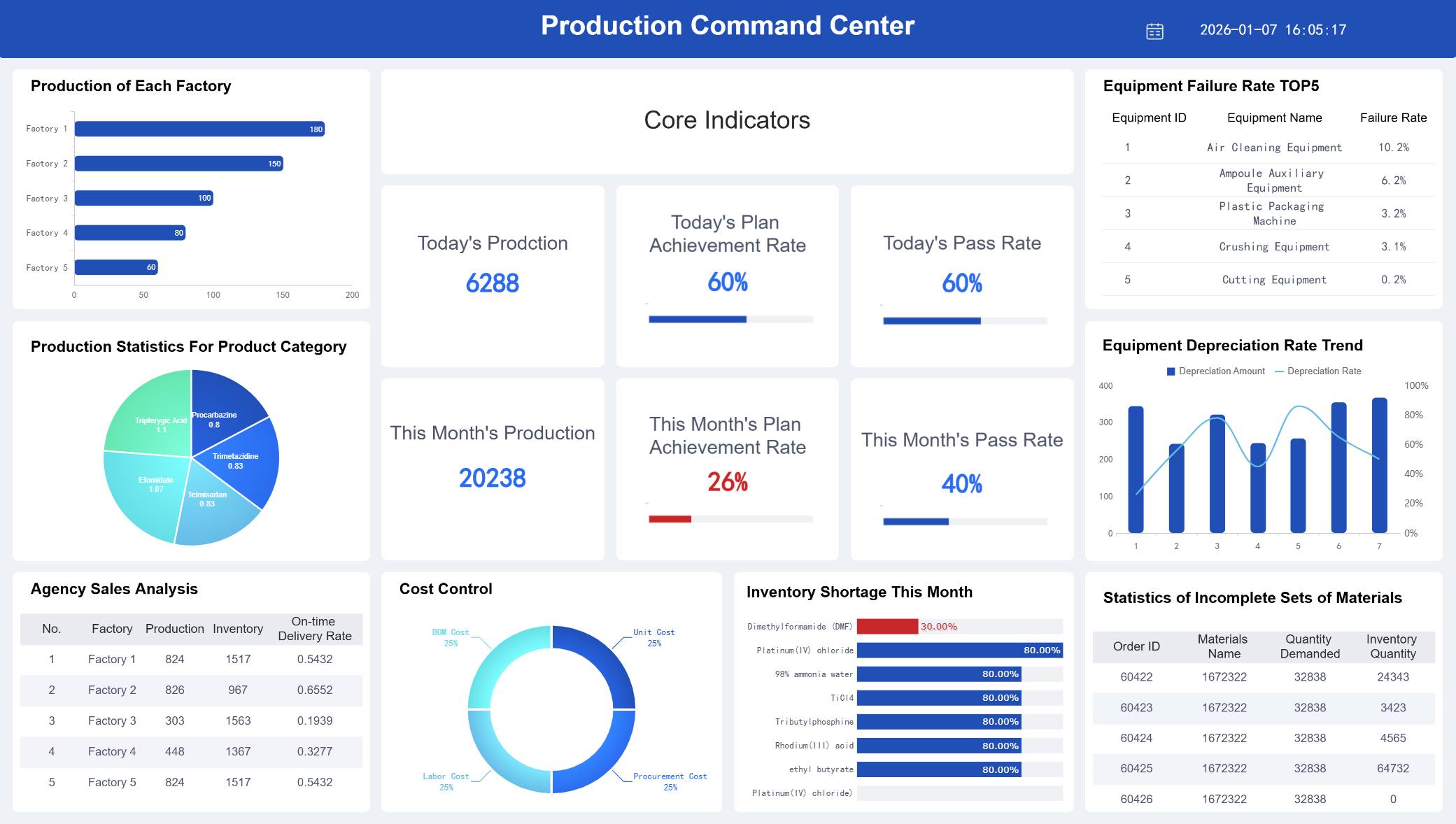
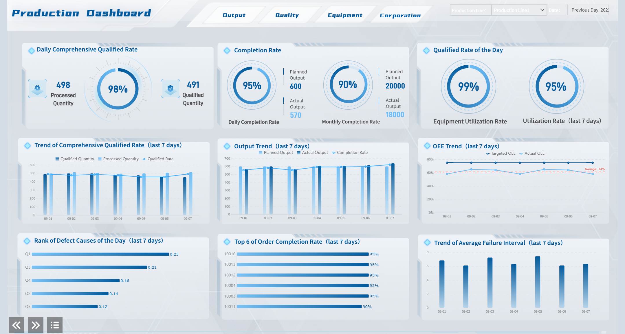 A Dashboard Demo created by FineBI
15 Must-Track Metrics to Include in Your QA Management Dashboard
The best dashboard is not the one with the most charts. It is the one that helps users make the right decisions quickly. For most organizations, the following 15 metrics provide a strong foundation across process quality, compliance risk, and team performance.
Process quality metrics
Process quality metrics show whether testing is effective, whether delivery risk is rising, and whether the organization is improving quality over time.
1. Defect leakage
Measures defects found in later stages that should have been caught earlier. High leakage usually signals weak coverage, unstable environments, or poor test design.
2. Test coverage
Shows how much of the application, requirement set, or risk area is covered by tests. Coverage should be segmented by business-critical flows, not just total test counts.
3. Pass rate trends
A single-day pass rate can be misleading. Trend views reveal whether the system is stabilizing, regressing, or fluctuating across builds and sprints.
4. Escaped defects
Tracks defects discovered in production or after release. This is one of the clearest indicators of quality system effectiveness.
5. Planned vs. completed test execution
Compares intended execution scope with actual completion. A widening gap is an early warning sign for schedule or resource risk.
6. Reopen rate for defects
Indicates whether defect resolution quality is poor or issue verification is weak. Rising reopen rates often expose coordination breakdowns between QA and engineering.
7. Build failure rate related to tests
Helps distinguish between product instability and test suite instability. This is critical in highly automated pipelines.
Compliance and risk metrics
For teams in regulated or audit-sensitive environments, compliance signals are not optional. They must be visible alongside quality and delivery indicators.
8. Audit readiness status
Reflects whether evidence, records, signoffs, and required controls are complete and current.
9. Requirement traceability coverage
Shows whether requirements are mapped to tests, defects, and validation outcomes. This is essential for regulated software and high-accountability delivery models.
10. Validation status
Tracks whether critical systems, releases, or features have completed required validation activities.
11. Issue aging
Measures how long defects, deviations, or quality events remain unresolved. Aging is particularly useful for exposing hidden operational debt.
12. High-severity open defects
Counts unresolved critical and major defects. This should always be visible near the top of the dashboard.
13. Critical incidents
Highlights production-impacting failures, compliance incidents, or customer-visible quality events requiring immediate review.
Team performance metrics
These metrics help managers understand whether automation is scaling effectively and whether the team can sustain improvement.
14. Automation rate
Shows the share of test cases or priority scenarios covered by automation. This should be broken down by regression, smoke, API, UI, and critical workflows where possible.
15. Test maintenance effort
Measures time spent updating flaky scripts, broken locators, and brittle workflows. A rising maintenance burden may mean the automation suite is losing efficiency.
In practice, many teams also monitor two supporting indicators in the same section: cycle time and workload distribution. Even if they are not headline KPIs, they add essential context. Cycle time shows how quickly tests move from creation to execution and closure. Workload distribution helps managers detect bottlenecks, uneven assignments, or overdependence on a few specialists.
The most effective approach is to pair each KPI with three design rules:
- show current value
- show trend over time
- show threshold or target
Without trend and threshold context, the metric is harder to interpret.
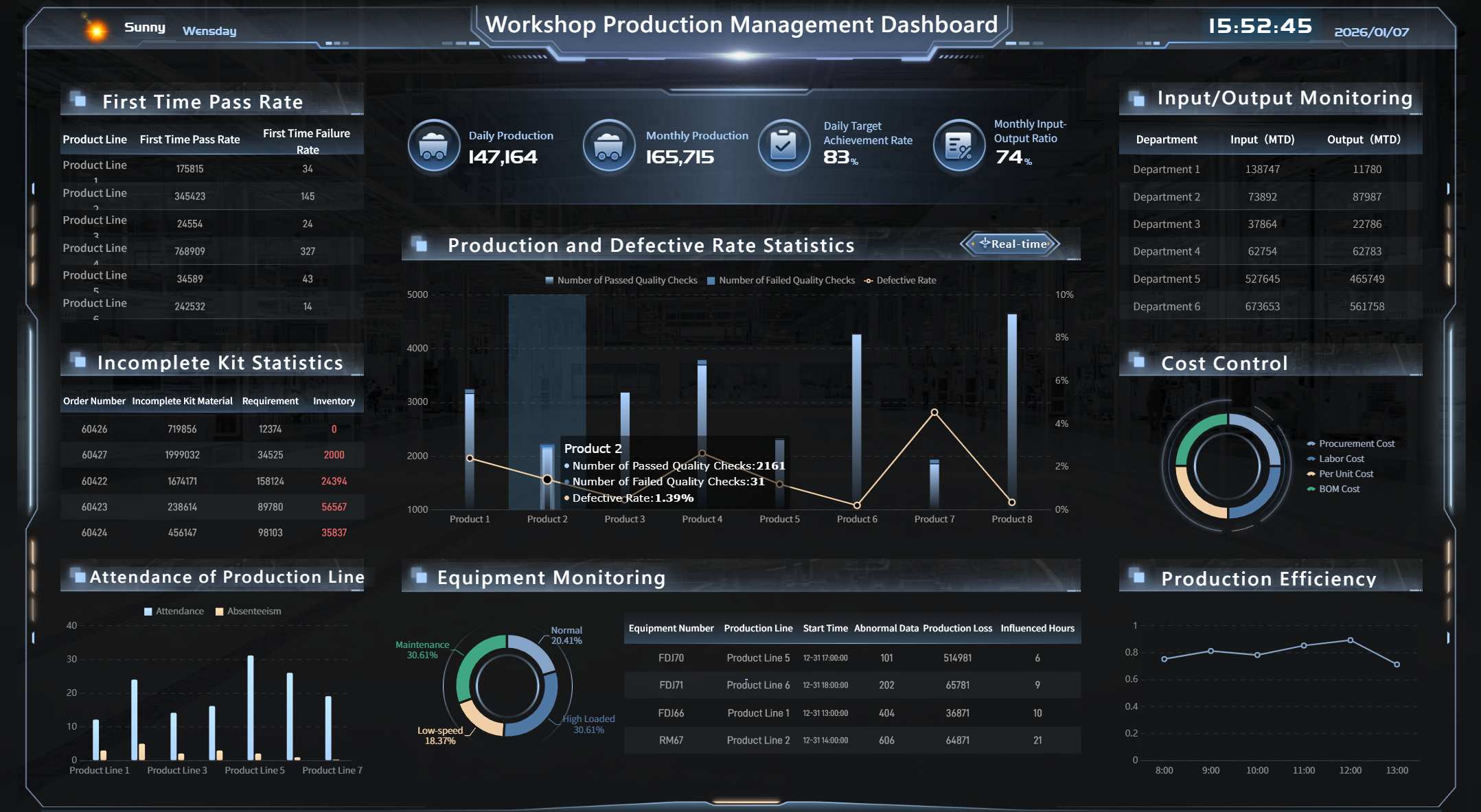 A Dashboard Example created by FineBI
5 UI/UX Best Practices for Designing an Effective QA Management Dashboard for QA Automation
A dashboard can have the right metrics and still fail if users cannot scan it, trust it, or act on it quickly. In QA automation environments, dashboard design should reduce cognitive load and speed up decision-making. The following five practices consistently improve usability and adoption.
Prioritize the most important signals first
Users should understand the state of quality in seconds, not minutes. That means the top of the dashboard must surface the highest-impact KPIs first.
Start with summary indicators such as:
- release health status
- high-severity open defects
- automation pass rate
- escaped defects
- execution completion vs. plan
These belong in a compact summary band or KPI row. Supporting diagnostics should sit below, organized by category.
A useful design pattern is a two-layer layout:
- Executive summary layer for fast status checks
- Diagnostic layer for analysis and root-cause review
This separation prevents overload. It also supports different user intents within the same experience.
Design for clarity, not visual noise
Many dashboards fail because they attempt to display everything. More charts do not equal more insight. Good UI design in a qa management dashboard is disciplined.
Use these rules:
- Apply consistent color logic, such as red for immediate risk, amber for caution, and green for on-track
- Use plain-language labels instead of tool-specific jargon
- Limit chart variety unless a new format adds real analytical value
- Group related metrics visually
- Keep spacing generous enough for rapid scanning
Avoid decorative complexity. Heavy gradients, excessive borders, and dense legends make operational dashboards harder to use. The goal is quick interpretation under meeting pressure, not visual novelty.
Also be careful with red-heavy dashboards. If every section appears critical, users lose prioritization. Reserve alert colors for exceptions that truly need action.
Make drill-downs fast and intuitive
Senior stakeholders want summary. QA managers need causes. Engineers need specifics. A good dashboard serves all three without forcing users to restart their analysis every time they click.
Drill-down design should let users move from overall status into:
- release
- team
- sprint
- product area
- environment
- test suite
- defect severity
- owner
- timeframe
The key is preserving context. If a user filters the dashboard to one product area and then drills into defect aging, that filter should remain active. Losing context creates friction and reduces trust.
Best practice is to support a logical path such as:
Release status → failed suites → top failing test cases → linked defects or build history
This flow turns the dashboard from a static report into a navigable decision tool.
 A FineBI's Drill-down Design Example
Build for action, not just observation
A dashboard should not stop at “here is the problem.” It should help users understand what to do next.
Practical action-oriented features include:
- threshold-based alerts
- status badges for SLA breaches
- “requires attention” queues
- owner-based filters
- direct links to defect tickets, test runs, or compliance records
- annotations for major incidents or release events
For example, if issue aging for critical defects exceeds threshold, the dashboard should visually flag the exception and provide a route to the responsible team or queue. If automation pass rate drops after a deployment, users should be able to inspect the impacted suites immediately.
This is especially important for recurring operational moments such as standups, release go/no-go reviews, and audit preparation sessions.
Optimize for role-based usage
Different audiences should not be forced into one overloaded screen. The most effective qa management dashboard strategy is role-based delivery built on a shared metric model.
A practical role-based structure looks like this:
| Audience | What they need to see |
|---|---|
| QA Managers | Execution status, defect backlog, automation effectiveness, maintenance effort |
| QA Engineers | Failed tests, flaky scripts, assigned defects, environment-specific issues |
| Auditors / Compliance | Traceability, validation evidence, open deviations, approval status |
| Leadership | Risk summary, quality trend, release confidence, incident exposure |
Role-based views improve adoption because each user sees what matters most without filtering through irrelevant detail. At the same time, consistency in definitions ensures everyone is still working from the same source of truth.
A dashboard that supports managers in standups, auditors in readiness reviews, and executives in monthly quality governance creates much more business value than a one-size-fits-all screen.
 A FineBI Dashboard Demo serving multiple masters created by FineBI
How to Build a Practical QA Management Dashboard
Design quality matters, but so does implementation discipline. The strongest dashboards are built from business decisions backward, not from available charts forward. Below is a pragmatic three-step approach that works well for most organizations.
Start with decision-making goals
Before selecting metrics, define the decisions the dashboard must support. This is the most important step, and it is often skipped.
Ask questions such as:
- What release decisions should this dashboard support?
- What quality risks must be visible within one minute?
- Which compliance obligations require ongoing monitoring?
- Where do managers currently rely on manual status gathering?
- Which signals should trigger escalation?
Map each metric to a real operational use case. If a metric does not support a decision, a risk signal, or an improvement action, it probably does not belong on the dashboard.
A simple planning framework is below:
| Business question | Metric | User | Action triggered |
|---|---|---|---|
| Are we ready to release? | High-severity open defects, pass rate, execution completion | QA Lead, Engineering Manager | Go/no-go review |
| Are quality issues escaping? | Escaped defects, defect leakage | QA Lead, Executive | Root-cause review |
| Are we audit-ready? | Traceability, validation status, issue aging | Compliance Stakeholder | Remediation planning |
| Is automation helping or hurting? | Automation rate, maintenance effort, flaky test trend | QA Manager | Suite optimization |
This method keeps the dashboard tightly aligned with business value.
Choose data sources and automation carefully
A qa management dashboard is only as reliable as its data model. Most teams need to integrate multiple systems, including:
- test automation platforms
- test case management tools
- defect tracking systems
- CI/CD pipelines
- requirement or ALM platforms
- incident management tools
The challenge is not only connectivity. It is semantic consistency. Terms like “passed,” “blocked,” “coverage,” or “critical defect” may be defined differently across teams. If definitions are not standardized, confidence in the dashboard will collapse.
Best practice includes:
- Define metric ownership
- Standardize KPI formulas
- Set refresh frequency by use case
- Document data exceptions clearly
- Separate source-system issues from dashboard issues
Automation should reduce reporting lag. It should not create a new layer of manual cleanup. When possible, use governed pipelines and reusable metric logic instead of rebuilding calculations in each visualization.
 A Dashboard Demo created by FineBI
Use templates and examples as a starting point
Templates can accelerate delivery, especially when teams need a first version quickly. But copying a generic layout rarely produces a high-performing dashboard.
Use templates to borrow proven patterns such as:
- KPI summary rows
- trend sections
- defect aging tables
- release risk scorecards
- role-based tabs
Then adapt them to your QA maturity, automation scope, and governance model.
Three practical implementation best practices are worth following:
-
Launch with a minimum viable dashboard
Start with the KPIs needed for weekly operational decisions. Expand after adoption. -
Validate with real users in real meetings
Review the dashboard during standups, sprint reviews, and release meetings. Observe where users hesitate or request additional context. -
Refine monthly, not annually
QA processes evolve fast. Dashboard logic should evolve with automation maturity, release practices, and compliance demands.
A dashboard becomes valuable through iterative fit, not through one-time design perfection.
Common QA Management Dashboard Mistakes and How Managers Can Avoid Them
Even well-funded dashboard projects underperform when leaders treat them as reporting artifacts instead of management tools. The most common mistakes are predictable and avoidable.
1. Relying on vanity metrics
Metrics such as total test cases executed or total bugs found may appear impressive but often lack decision value. Focus instead on risk, trend, and actionability.
How to avoid it:
Require every metric to answer a management question or trigger an operational decision.
2. Mixing strategic and operational views without hierarchy
When executives, QA engineers, and compliance teams all use one crowded screen, nobody gets what they need.
How to avoid it:
Design a clear information hierarchy and role-specific views based on a shared semantic model.
3. Ignoring data quality and refresh governance
Outdated or inconsistent numbers are worse than no dashboard at all because they create false confidence.
How to avoid it:
Assign data owners, define refresh schedules, and monitor data completeness and consistency as part of dashboard governance.
4. Failing to align with automation goals
Some dashboards report testing activity but do not show whether automation is improving speed, stability, or release quality.
How to avoid it:
Track automation rate, flaky test trends, maintenance effort, and build-related test outcomes alongside execution metrics.
5. Treating the dashboard as static
Quality risk changes as products, teams, and compliance obligations evolve. A static dashboard becomes irrelevant quickly.
How to avoid it:
Review dashboard usage regularly, retire low-value widgets, and add new views as decision needs change.
A useful management rule is this: if the dashboard is not actively used in reviews, standups, or release checkpoints, it is probably not designed for action.
Many organizations understand what their qa management dashboard should do, but struggle to deliver it consistently across teams, tools, and stakeholder groups. This is where the right BI platform becomes strategic.
FineBI helps enterprises turn fragmented QA and automation data into governed, interactive, role-based dashboards that support real operational decisions. Instead of relying on static spreadsheets or disconnected reports, teams can unify data from testing tools, defect systems, CI/CD pipelines, and business platforms into a single analytical environment.
For QA and engineering leaders, FineBI is especially useful in four areas:
- Cross-source integration: connect multiple quality and delivery data sources into one trusted model
- Self-service analysis: allow managers and analysts to explore trends, filter by release or team, and drill into exceptions without waiting for manual report updates
- Role-based dashboard design: deliver tailored views for QA leads, compliance stakeholders, and executives while maintaining consistent KPI definitions
- Operational visibility at scale: support recurring reviews, release readiness checks, and continuous improvement with dashboards that stay current
In practice, this means teams can move from manual status reconciliation to proactive quality management. A QA lead can monitor defect leakage and automation health in one place. A compliance reviewer can inspect traceability and validation gaps without requesting a separate report. Leadership can assess release confidence using clear, decision-ready summaries.
If your organization is building or redesigning a qa management dashboard, the priority is not simply adding more charts. It is creating a trusted management system for quality. FineBI provides the foundation to do that with speed, governance, and flexibility.
A successful dashboard should help teams answer three questions every day:
- What is happening now?
- Why is it happening?
- What should we do next?
When your dashboard can answer all three clearly, it stops being a reporting tool and becomes a quality leadership asset.
FAQs
It should combine test execution, pass rate trends, defect metrics, build stability, coverage, and release risk in one view. The most useful dashboards also include drill-down paths, alerts, and role-based views for QA leads, engineering managers, and compliance stakeholders.
High-value metrics usually include defect leakage, escaped defects, test coverage, pass rate trends, planned versus completed execution, defect reopen rate, and broken build rate. If your team works in a regulated environment, traceability and validation status should also be visible.
A basic reporting dashboard mainly shows what happened in testing. A QA management dashboard goes further by helping teams assess release readiness, identify risk early, and decide what action to take next.
Keep the interface focused on decision-making rather than showing every available metric. Clear visual hierarchy, consistent filters, role-specific summaries, and fast drill-downs make the dashboard more useful in daily operations.
Yes, many teams start by connecting existing data from test tools, defect trackers, CI/CD systems, and requirement platforms into a single source of truth. The key is to launch with a focused set of metrics and improve the dashboard based on real usage.


The Author
Yida Yin
FanRuan Industry Solutions Expert
Related Articles

Portfolio Reporting for PMOs: 9 Executive Metrics Every Weekly Portfolio Dashboard Should Include
Weekly portfolio reporting should help executives answer three questions fast: Are we delivering the right initiatives, are we putting outcomes at risk, and what decisions need leadership this week? For PMOs, that means
Yida Yin
Jul 01, 2026

How to Build an Investment Portfolio Reporting Dashboard for Executives: KPIs, Benchmarks, and Drill-Down Views
Investment portfolio reporting for executives is not about showing every holding, transaction, and chart your investment team can produce. It is about giving CEOs, CFOs, CIOs, boards, and investment committees a fast, re
Yida YIn
Jun 25, 2026

12 KPI Reporting Examples for Executive Dashboards: What to Show in Weekly, Monthly, and Quarterly Reviews
Executive leaders do not need more data. They need decision ready $1 examples that match how often they review the business and what actions they are expected to take. A weekly $1 should surface fast moving risks and per
Yida YIn
Jun 25, 2026